I always feel that I am not writing technology, but mood, one by one tutorials are traces of my way. Success with expertise is the most reproducible. I hope that my path will allow you to make fewer detours. I hope that I can help you erase the dust of knowledge. I hope that I can help you clear the vein of knowledge. I hope you will also have me at the top of technology in the future.
StatrlessWidget
Is a widget (widget), it is an abstract class, the control created to implement the abstract method of build.
class AppBarPage extends StatelessWidget {
  const AppBarPage({Key key}) : super(key: key);
  @override
  Widget build(BuildContext context) {
    // TODO: implement build
    return null;
  }
}
Center
Role: Used to center align text
attribute
child
Center(
  child: ,
)
Text
child: Text(
    'fenghanxuqwertyuiopasdfgjkgh',
    overflow: TextOverflow.clip,//ellipsis exceeds one line, three points fade exceeds one line, gradient clip exceeds one line clipping
    maxLines: 3,//Set the number of rows for Label
    textScaleFactor: 2,//Twice font enlargement
    textAlign: TextAlign.center,//align
    textDirection: TextDirection.ltr,
    style: TextStyle(//Set Text Style
        decoration: TextDecoration.lineThrough,//There is a line in the middle
        decorationColor: Colors.white,//There is a horizontal line color in the middle
        decorationStyle: TextDecorationStyle.dashed,//There is a dashed line in the middle
        letterSpacing: 0.0,//Left and right spacing between fonts
        fontStyle: FontStyle.italic,//Font Tilt
        fontWeight: FontWeight.w900,//Font thickness (bold)
        backgroundColor: Colors.red,//Set background color
        fontSize: 20.0,//Set text size
        color: Color.fromRGBO(234, 123, 155, 1.0),//Set Text Color
//          color: Colors.yellow, //Set Text Color
   ),
),
MaterialApp
A follow component is an App follow component which is equivalent to adding each page and then the page defaults to white. Otherwise it's black
attribute
Home - home page
title - title
Color - color
theme - theme
routes - Routing
Fixed Page Structure
return MaterialApp(
  home: Scaffold(
    appBar: AppBar(
      title: Text('Flutter Demol'),
    ),
    body: HomeContent(),
  ),
  theme: ThemeData(
    primarySwatch: Colors.yellow,//Modify Theme Colors to Navigation Bar Colors
  ),
);
Scaffold
attribute
AppBar - Displays an AppBar at the top of the mask
body - The main content displayed in the current interface
drawer - drawer menu control
Container
Container Component
attribute
child
height
width
decoration sets background and border colors
child: Container(
  child: Text('fenghanxuqwertyuiopasdfgjkgh'),
  height: 300,
  width: 300,
  decoration: BoxDecoration(
     color: Colors.blue,//Easy background color
     border: Border.all(
              color: Colors.green,//Border color
              width: 2//Border Width
     ),
     borderRadius: BorderRadius.all(Radius.circular(10.0),),//Set container rounded corners
  ),
//padding: EdgeInsets.all(20), //Interior margin between containers
  padding: EdgeInsets.fromLTRB(20, 20, 20, 20),//Internal margin between containers
//margin: EdgeInsets.all(20), //Outer distance between containers
  margin:  EdgeInsets.fromLTRB(20, 20, 20, 20),//Outer distance between containers
//transform: Matrix4.translationValues(10, 10, 10), //container displacement
//transform: Matrix4.rotationZ(0.3), //Rotate Matrix4.rotationX(0.3), Matrix4.rotationY(0.3),
//transform: Matrix4.diagonal3Values(0.5, 0.5, 0.5), //Zoom multiples
  alignment: Alignment.bottomRight,//Alignment of contents relative to containers
),
Image
There are two problems with unsuccessful loading of web pictures:
1. Connect wifi
2. Reburning requires clicking to agree to access the network
3. Is the URL valid
Load Network Picture
child: Image.network(
  'https://www.itying.com/images/upload/Image/3333333.png',
  alignment: Alignment.bottomRight,//Alignment of pictures relative to containers
  color: Colors.yellow,//Picture background color
  colorBlendMode: BlendMode.colorBurn,//Picture Blend Mode
  fit: BoxFit.cover,//Display effect cover adaptive fill paving may distort fitWidth width full filHright high fill repeat multiple picture paving
),
Picture Circle Cutting Method
Load Network Picture
child: Container(
  child: ClipOval(
    child: Image.asset('https://www.itying.com/images/flutter/2.png',
    width: 100,
    height: 100,
    fit: BoxFit.cover,),
  ),
),
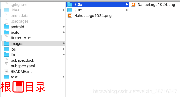
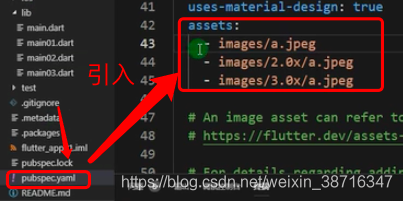
Import local pictures
child: Container(
  child: ClipOval(
    child: Image.asset('images/NahuoLogo1024.png',
    width: 100,
    height: 100,
    fit: BoxFit.cover,),
  ),
),
ListView List
The simplest list
return ListView(
// scrollDirection: Axis.horizontal, //Set Horizontal List
padding: EdgeInsets.all(10),//Set the top, bottom, left and right spacing 20
children: <Widget>[
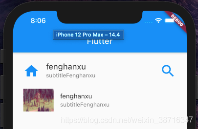
ListTile(
leading: Icon(Icons.home,color: Colors.blue,size: 40,),//Load System Icon
title: Text(
'fenghanxu',
style: TextStyle(
fontSize: 20,
),
),
subtitle: Text('subtitleFenghanxu'),
trailing: Icon(Icons.search,color: Colors.blue,size: 40,),
),
ListTile(
leading: Image.network('https://www.itying.com/images/flutter/1.png'), //Load network pictures
title: Text('fenghanxu'),
subtitle: Text('subtitleFenghanxu'),
),
],
);
Dynamic traversal of ListItem lists through a for loop
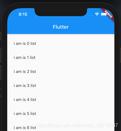
class _MyHomePageState extends State<MyHomePage> {

  List<Widget> _getData(){
    List<Widget> list = new List();
    for(var i = 0; i < 20; i++){
      list.add(ListTile(
        title: Text('i am is $i list'),
      ));
    }
    return list;
  }

  @override
  Widget build(BuildContext context) {
    return Scaffold(
      appBar: AppBar(
        title: Text(widget.title),
      ),
      body: Center(
        child: ListView(
//      scrollDirection: Axis.horizontal, //Set Horizontal List
          padding: EdgeInsets.all(10),//Set the top, bottom, left and right spacing 20
          children: _getData(),
        ),
      ),
    );
  }
}
GridView grid
GridView.count static grid layout
//GridView for Loop Data
import 'package:flutter/material.dart';
import 'res/listData.dart';

void main() => runApp(MyApp());

class MyApp extends StatelessWidget {
  @override
  Widget build(BuildContext context) {
    // TODO: implement build
    return MaterialApp(
      home: Scaffold(
        appBar: AppBar(title: Text('Flutter Demol'),),
        body: HomeContent(),
      ),
    );
  }

}


class HomeContent extends StatelessWidget {

  List<Widget> _getListData(){
    var tempList = listData.map((value){
      return Container(
        child: Column(
          children: <Widget>[
            Image.network(value['imageUrl']),
            SizedBox(
              height: 20,//The distance between picture and text is 20
            ),
            Text(
              value['title'],
              textAlign: TextAlign.center,
              style: TextStyle(
                  fontSize: 15
              ),
            )
          ],
        ),
        decoration: BoxDecoration(//Add Border
            border: Border.all(
                color: Color.fromRGBO(233, 233, 233, 0.9),
                width: 1.0
            )
        ),
      );
    });
    return tempList.toList();
  }

  @override
  Widget build(BuildContext context) {
    // TODO: implement build
    return GridView.count(
      crossAxisSpacing: 20.0,//Set the cell's left and right spacing to 20
      mainAxisSpacing: 20.0,//Set the cell spacing to 20
      padding: EdgeInsets.all(10),//Set the cell's internal spacing to 10 (around top and bottom)
      crossAxisCount: 2,//Number of control columns
      childAspectRatio: 0.9,//Only 0.7 aspect ratio of X-Y axis can be adjusted
      children: this._getListData(),
    );

  }

}
GridView.builder dynamic grid layout
//GridView Data GridView.count static grid layout
import 'package:flutter/material.dart';
import 'res/listData.dart';

void main() => runApp(MyApp());

class MyApp extends StatelessWidget {
  @override
  Widget build(BuildContext context) {
    // TODO: implement build
    return MaterialApp(
      home: Scaffold(
        appBar: AppBar(title: Text('Flutter Demol'),),
        body: HomeContent(),
      ),
    );
  }

}


class HomeContent extends StatelessWidget {

  Widget _getListData(context,index){
    return Container(
      child: Column(
        children: <Widget>[
          Image.network(listData[index]['imageUrl']),
          SizedBox(
            height: 20,//The distance between picture and text is 20
          ),
          Text(
            listData[index]['title'],
            textAlign: TextAlign.center,
            style: TextStyle(
                fontSize: 20
            ),
          )
        ],
      ),
      decoration: BoxDecoration(//Add Border
          border: Border.all(
              color: Color.fromRGBO(233, 233, 233, 0.9),
              width: 1.0
          )
      ),
    );
//    return tempList.toList();
  }

  @override
  Widget build(BuildContext context) {
    // TODO: implement build
    return GridView.builder(
      gridDelegate: SliverGridDelegateWithFixedCrossAxisCount(
        crossAxisSpacing: 10.0,//Set the cell's left and right spacing to 20
        mainAxisSpacing: 10.0,//Set the cell spacing to 20
        crossAxisCount: 2,
      ),
      itemCount: listData.length,//The number of conveniences is the number of arrays
      itemBuilder: this._getListData,//Data Method
    );

  }

}
BoxDecoration Border
BoxDecoration(
     color: Colors.blue,//Easy background color
     border: Border.all(
              color: Colors.green,//Border color
              width: 2//Border Width
     ),
     borderRadius: BorderRadius.all(Radius.circular(10.0),),//Set container rounded corners
  )
SizedBox Gap
SizedBox( height: 20,)//The distance between picture and text is 20
Padding Outer Border Control
return Padding(
  padding: EdgeInsets.fromLTRB(10, 10, 0, 0),
  child: Image.network(
      'https://www.itying.com/images/flutter/1.png', fit: BoxFit.cover),
);
Row Horizontal Layout Control
return Row(
  //Center start end space Around with fixed gaps on both sides Space Between with gaps in the middle Space Evenly with average gaps on both sides
  mainAxisAlignment: MainAxisAlignment.start,//Display mode of X-axis
  //CroAxisAlignment: CrossAxisAlignment. The end, //Y axis should be displayed in a smaller way than with a reference.
  children: <Widget>[
    IconContainer(Icons.search,color: Colors.blue,size: 30,),
    IconContainer(Icons.home,color: Colors.yellow,size: 30,),
    IconContainer(Icons.settings,color: Colors.green,size: 30,),
  ],
);
Column Vertical Layout Control
return Container(
  width: 200,
  height: 400,
  color: Colors.pink,
  child: Column(
    //Center start end space Around with fixed gaps on both sides Space Between with gaps in the middle Space Evenly with average gaps on both sides
    mainAxisAlignment: MainAxisAlignment.spaceEvenly,//Display mode of X-axis
    //CroAxisAlignment: CrossAxisAlignment. The end, //Y axis should be displayed in a smaller way than with a reference.
    children: <Widget>[
      IconContainer(Icons.search,color: Colors.blue,size: 30,),
      IconContainer(Icons.home,color: Colors.yellow,size: 30,),
      IconContainer(Icons.settings,color: Colors.orange,size: 30,),
    ],
  ),
);
Expanded Control Width Ratio to Parent View
return Container(
  width: 400,
  height: 100,
  color: Colors.pink,
  child: Row(
    //Center start end space Around with fixed gaps on both sides Space Between with gaps in the middle Space Evenly with average gaps on both sides
    mainAxisAlignment: MainAxisAlignment.spaceEvenly,//Display mode of X-axis
    //CroAxisAlignment: CrossAxisAlignment. The end, //Y axis should be displayed in a smaller way than with a reference.
    children: <Widget>[
      Expanded(
        flex: 1,
        child: IconContainer(Icons.search,color: Colors.blue,size: 30,),
      ),
      Expanded(
        flex: 2,
        child: IconContainer(Icons.home,color: Colors.yellow,size: 30,),
      ),
    ],
  ),
);
Stack
Stack uses Stack with Align to control the location of subcomponents
return  Center(
  child: Container(
    height: 400.0,
    width: 300.0,
    color: Colors.red,
    child: Stack(
      alignment: Alignment.center,
      children: <Widget>[
        Align(
          alignment: Alignment.topLeft,
          child: Icon(Icons.home,size: 40,color: Colors.white),
        ),
        Align(
          alignment: Alignment.center,
          child: Icon(Icons.search,size: 40,color: Colors.white),
        ),
        Align(
          alignment: Alignment.bottomRight,
          child: Icon(Icons.select_all,size: 40,color: Colors.white),
        ),
        Align(
          alignment: Alignment(1.0,-0.2),
          child: Icon(Icons.security,size: 40,color: Colors.white),
        ),
      ],
    ),
  ),
);
Stack uses Stack with Positioned to control the location of subcomponents
return  Center(
  child: Container(
    height: 400.0,
    width: 300.0,
    color: Colors.red,
    child: Stack(
      alignment: Alignment.center,
      children: <Widget>[
        Positioned(
          left: 10,
          child: Icon(Icons.home,size: 40,color: Colors.white),
        ),
        Positioned(
          bottom: 0,
          left: 100,
          child: Icon(Icons.search,size: 40,color: Colors.white),
        ),
        Positioned(
          right: 10,
          top: 10,
          child: Icon(Icons.select_all,size: 40,color: Colors.white),
        ),
        Positioned(
          bottom: 10,
          left: 10,
          child: Icon(Icons.security,size: 40,color: Colors.white),
        ),
      ],
    ),
  ),
);
AspectRatio sets the screen scale at which the child control is the parent control
AspectRatio adjusts the child to the set aspect ratio
return AspectRatio(
  aspectRatio: 2.0/1.0,
  child: Container(
    color: Colors.red,
  ),
);
Card Card Component Bottom Shaded Component
return Card(
  margin: EdgeInsets.all(10),
  child: Column(
    children: <Widget>[
      ListTile(
        title: Text('Zhang San',style: TextStyle(fontSize: 28)),
        subtitle: Text('Senior Engineer'),
      ),
      ListTile(
        title: Text('Tel: 15989954385'),
      ),
      ListTile(
        title: Text('Address: Fengjia Street'),
      )
    ],
  ),
);
RaisedButton highlight key
return RaisedButton(
  child: Text(this.text),
  textColor: Theme.of(context).accentColor,
  onPressed: (){

  },
);
Wrap is equivalent to unequal width key layout
    return Wrap(
      spacing: 20,//Set the left and right spacing before each small container to 20
      runSpacing: 10,//Set the top and bottom spacing before each small container to 10
//      alignment: WrapAlignment.spaceEvenly, //Whole View alignment is less useful
      runAlignment: WrapAlignment.end,
      direction: Axis.horizontal,//vertical  horizontal
      children: <Widget>[
        MyButton('Season 1'),
        MyButton('Season 1'),
        MyButton('Season 1 12'),
        MyButton('Season 1 123'),
        MyButton('Season 1 1234'),
        MyButton('Season 1 4'),
        MyButton('Season 1 3'),
      ],
    );
StatefulWidget
State component because it has a setState method
Use StatefulWidget if you want to change the data on the page
class HomeContent extends StatefulWidget {

  HomeContent({Key key}) : super(key: key);
  //Constructor Fixed Writing
  _HomeContentState createState() => _HomeContentState();

}

class _HomeContentState extends State<HomeContent> {

  @override
  Widget build(BuildContext context) {
    // TODO: implement build
    return null;
  }

}
StatelessWidget
Stateless components cannot change values inside controls
class HomeContent extends StatelessWidget {

  @override
  Widget build(BuildContext context) {
    // TODO: implement build
    return null;
  }
}