1. Emmet syntax
The predecessor of Emmet syntax is Zen coding, which uses abbreviations to improve the writing speed of html/css. This syntax has been integrated in vscade.
1.1 quickly generate HTML structure syntax
<body>
    <!-- Generate multiple labels div*3 -->
    <div></div>
    <div></div>
    <div></div>
    <!-- Parent-child level ul>li -->
    <ul>
        <li></li>
    </ul>
    <!-- Brother level div+p-->
    <div></div>
    <p></p>
    <!--  .nav Default generation div Class of -->
    <div class="nav"></div>
    <!--  #nav generates div ID by default -- >
    <div id="nav"></div>
    <!-- .demo$*5 -->
    <div class="demo1"></div>
    <div class="demo2"></div>
    <div class="demo3"></div>
    <div class="demo4"></div>
    <div class="demo5"></div>
    <!-- Several words are displayed in the generated label: div{love riki} -->
    <div>love riki</div>
    <!-- div{$}*5 -->
    <div>1</div>
    <div>2</div>
    <div>3</div>
    <div>4</div>
    <div>5</div>
</body>
- Generate labels, i.e. automatic completion function.
- If you want to generate multiple identical tags, you can use“ ✳”, For example: div ✳ 3.
- If there is a parent-child relationship label, you can enter >, such as UL > Li.
- If there are sibling labels, you can enter +, such as div+p.
- If a class name or ID name is generated, write it directly demo or #id enter.
- If the generated div class names are in order, you can use the autoincrement sign $.
- If you want to write content inside the generated tag, you can use {}.
1.2 quickly generate CSS statement syntax
<style>
    /* As long as you enter the initial letter of the attribute, the statement can be generated automatically */
    .one {
        /* ta+enter */
        text-align: center;
        /* w100+enter */
        width: 100px;
        /* h100+enter */
        height: 100px;
        text-indent: 2em;
        text-decoration: none;
    }
</style>
1.3 quick format code
Right click - > format code or shift+alt+F.
The setting save page is to automatically format the document: search format in the setting and check the option of format on save.
2. Composite selector
The compound selector is based on the basic selector and is formed by combining the basic selectors.
2.1 offspring selector
Element 1 element 2 { Style declaration }
//Element 2 is the child of element 1, separated by a space. Element 2 is the final choice. Children include sons, grandchildren
<style>
    /* I want to select the small li in ol and change it to pink */
    ol li {
        color: pink;
    }
	/* I want to select the small li in ol and change the a in li to lightblue */
    ol li a {
        color: lightblue;
    }
    /* I want to select the small li in NAV and change the a in nav to yellow */
    .nav li a {
        color: yellow;
    }
</style>
<body>
    <ol>
        <li>I am ol My child</li>
        <li>I am ol My child</li>
        <li>I am ol My child</li>
        <li><a href="#"> I'm a grandson</a></li>
    </ol>
    <ul>
        <li>I am ul My child</li>
        <li>I am ul My child</li>
        <li>I am ul My child</li>
    </ul>
    <ul class="nav">
        <li>I am ul My child</li>
        <li>I am ul My child</li>
        <li>I am ul My child</li>
        <li><a href="#"> it won't change</a></li>
        <li><a href="#"> it won't change</a></li>
        <li><a href="#"> it won't change</a></li>
        <li><a href="#"> it won't change</a></li>
    </ul>
</body>
2.2 sub selector
Only the nearest child element of an element can be selected. The parent child element is selected.
Element 1>Element 2 { Style declaration }
//Element 2 is the parent son of element 1, separated by > in the middle, and element 2 is finally selected.
<style>
    /* Only a son turns yellow */
    .nav>a {
        color: yellow;
    }
</style>
<body>
    <div class="nav">
        <a href="#"> I'm a son</a>
        <p><a href="" #>I'm a grandson</a></p>
    </div>
</body>
2.3 union selector
The union selector can select multiple groups of labels and set the same style for them. Union selector is formed by connecting all selectors with English commas.
Element 1,Element 2 { Style declaration }
div,
p {
    color: pink;
}
.pig li,
div,
p {
    color: royalblue;
}
2.4 pseudo class selector
Pseudo class selectors are used to add special effects to some selectors, such as adding special effects to links, or selecting the first song and the nth element. Pseudo class selectors are represented by colons, such as: hover,: first child.
1. Link pseudo class selector
| selector | describe |
|---|---|
| a:link | Select all links that have not been accessed |
| a:visited | Select all links that have been accessed |
| a:hover | Select the link on which the mouse pointer is located |
| a:active | Select the active link (click the link that does not pop up) |
<style>
    /* Unreached link a:link */
    a:link {
        color: #333;
        text-decoration: none;
    }

    /* Visited link a:visited Douban app, the title of the post will be grayed out*/
    a:visited {
        color: hotpink;
    }

    /* Mouse over link a:hover */
    a:hover {
        color: lightblue;
    }

    /* Press the link that does not pop up with the mouse a:active */
    a:active {
        color: goldenrod;
    }
</style>
/* Results: the link is black when it is not accessed, blue when the mouse is placed on the link, yellow when the mouse is pressed and not released, and turns pink after access.*/
- The order must be: HVHA - >: link - >: visited - >: hover - >: active.
- Because a link has a default style in the browser, we need to assign a separate style to the link in actual development.
2.: focus pseudo class selector
The focus pseudo class selector is used to select the form element that gets the focus. The focus is the cursor, for the input form element.
input:focus {
	background-color:yellow;
}
3. Element display mode
The element display mode is how the element (label) is displayed. html elements are generally divided into block elements and inline elements.
3.1 block elements
Common block elements include: h1~h6, p, div, ul, ol, li, etc., among which div tag is the most typical block element.
Characteristics of block level elements:
- Own one line.
- Width, height and inner and outer margins can be controlled.
- The default width is 100% of the parent's width.
- Is a container and box that can release internal elements or block level elements.
Note: block level elements cannot be used within text class elements. For example, div cannot be placed in the p tag.
3.2 inline elements
Common inline elements include a, strong, v, em, i, del, s, ins, u, span, etc. the span tag is the most typical inline element. In some places, inline elements are also called inline elements.
Characteristics of inline elements:
- The elements in adjacent rows are on a row, and a row can have multiple elements in a row.
- The height and width settings are invalid.
- The default width is the width of its own content.
- Inline elements can only hold text or other inline elements.
Note: a cannot be placed in a, but other block level elements can be placed.
3.3 inline block elements
Elements with the characteristics of both block elements and inline elements are called inline block elements. Common inline block elements are: img, input, td.
Characteristics of inline block elements:
- And adjacent inline elements (inline blocks), but there will be a gap between them. A row can display more than one.
- The default width is the width of its own content.
- Height, row height and inner and outer margin can be controlled.
1. 2 belongs to the characteristics of in-line elements and 3 belongs to the characteristics of block level elements.
3.4 element display mode conversion
| behavior | sentence |
|---|---|
| Convert to block element | display:block; |
| Convert to inline element | display:inline; |
| Convert to inline block element | display:inline-block; |
<style>
    a {
        width: 150px;
        height: 50px;
        background-color: hotpink;
        /* The width and height can be set by converting the in-line elements into block level elements */
        display: block;
    }

    div {
        width: 300px;
        height: 100px;
        background-color: hotpink;
        /* Convert block level elements into inline elements. Width and height cannot be set at this time */
        display: inline;
    }

    span {
        width: 100px;
        height: 30px;
        background-color: hotpink;
        /* Convert to inline block element */
        display: inline-block;
    }
</style>
3.5 single line text vertically centered
Make the line height of the text equal to the height of the box. line-height=height
/* Vertical center line height = height */
height: 40px;
line-height: 40px;
4. CSS background
Background image: in actual development, it is common in logo or some decorative small images or super large background images. The advantage is that it is very easy to control the position
4.1 background color and background picture
<style>
.color {
width: 300px;
height: 100px;
/* The default is transparent. Set the background color to transparent: transparent */
background-color: hotpink;
}
.img {
width: 600px;
height: 600px;
/* The size of this picture is 300 * 300 */
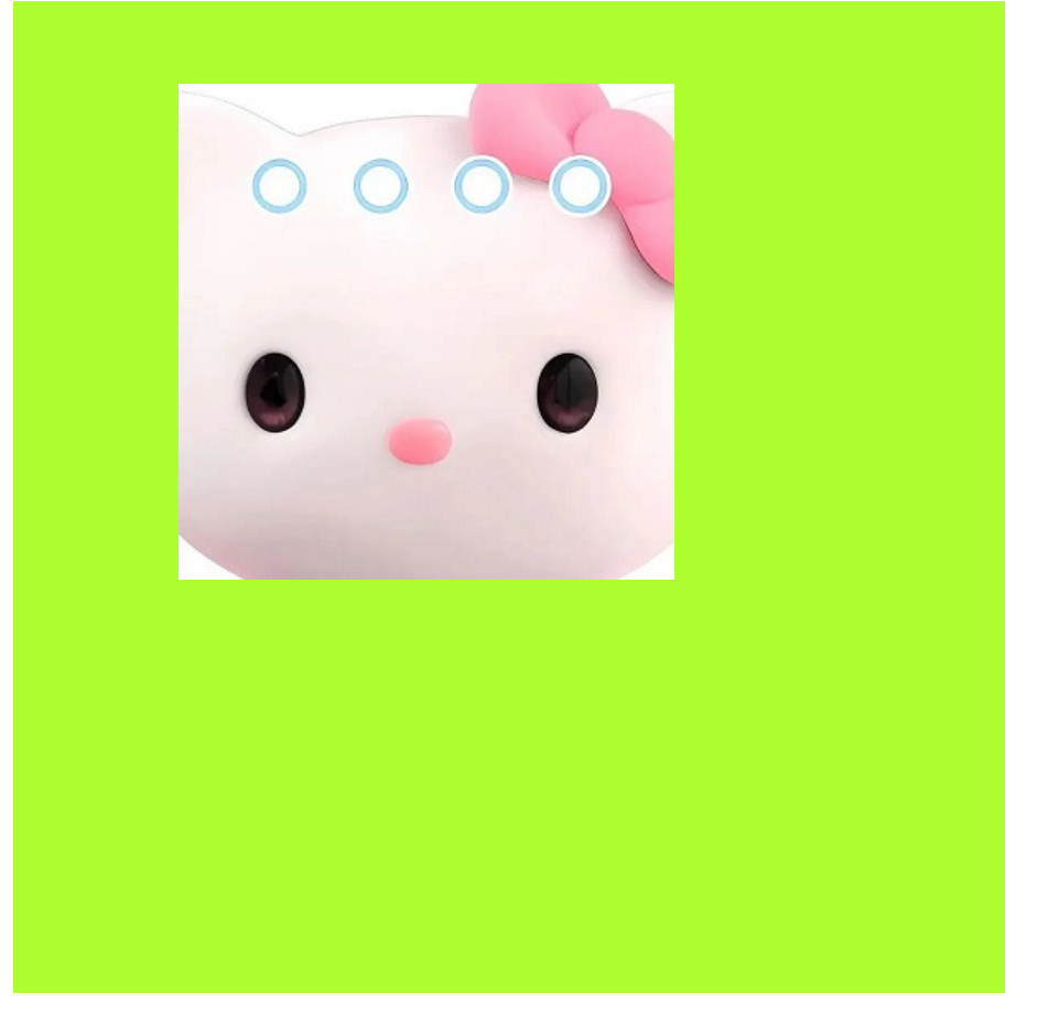
background-image: url(KITTY.jpg);
/* Background tile: background repeat default tile*/
background-repeat: no-repeat;
background-color: greenyellow;
}
</style>
4.2 location of background picture
1. Location NOUN
<style>
.img {
width: 600px;
height: 600px;
background-image: url(KITTY.jpg);
background-repeat: no-repeat;
background-color: greenyellow;
/* Location NOUN */
/* When the attribute value is a location noun, the order of X and y can be changed */
/* background-position: right center; */
/*
When there is only one parameter,
If it is horizontal: left or right, it is centered vertically by default
If it is in the vertical direction: top or bottom, the default horizontal center is in the horizontal direction
*/
/* background-position: left; */
/* background-position: top; */
background-position: center right;
}
</style>
```
### 2. Exact unit
```css
<style>
div {
width: 600px;
height: 600px;
background-image: url(KITTY.jpg);
/* Background tile: background repeat default tile*/
background-repeat: no-repeat;
background-color: greenyellow;
/* (x,y)The xy order in the coordinates cannot be changed, but the unit must be taken */
/* If only one value is written, the value must be the value of x */
background-position: 100px 50px;
}
</style>
3. Mixed unit
<style>
    body {
        background-image: url(img.jpg);
        background-repeat: no-repeat;
        /* Horizontally centered, vertically 40px */
        background-position: center 40px;
    }
</style>
4.3 fixed background image
<style>
    body {
        background-color: white;
        background-image: url(img.jpg);
        background-repeat: no-repeat;
        background-position: center top;
        color: rgb(250, 16, 145);
        font-size: 50px;
        /* Fixed background image, content walking, background image not moving */
        background-attachment: fixed;
    }
</styl
4.4 compound writing of background attributes
<style>
    body {
        /* background:Background color background picture address background tile background image rolling background image position; */
        background: black url(img.jpg) no-repeat fixed center top;
        font-size: large;
        color: hotpink;
    }
</style>
4.5 background color translucent
background:rgba(0,0,0,0);
-
r: Red G: Green B: Blue A: alpha (transparency)
-
Transparent 0 ------ > 1 opaque
-
It is customary to omit the 0 before the transparency parameter, such as:
background:rgba(0,0,0,.3);
5. Comprehensive case - colorful navigation
technology
- Mode conversion
- Single line text centered vertically
- Background related attributes
- Link pseudo class selector
code
<!DOCTYPE html>
<html lang="en">

<head>
    <meta charset="UTF-8">
    <meta http-equiv="X-UA-Compatible" content="IE=edge">
    <meta name="viewport" content="width=device-width, initial-scale=1.0">
    <title>Comprehensive case-Colorful navigation</title>
    <style>
        .nav a {
            display: inline-block;
            width: 120px;
            height: 58px;
            background-color: hotpink;
            line-height: 48px;
            color: white;
            text-decoration: none;
            text-align: center;
        }

        .nav .bg1 {
            background: url(bgimg/bg1.png) no-repeat;
        }

        .nav .bg1:hover {
            background-image: url(bgimg/bg11.png);
        }

        .nav .bg2 {
            background: url(bgimg/bg2.png) no-repeat;
        }

        .nav .bg2:hover {
            background-image: url(bgimg/bg22.png);
        }

        .nav .bg3 {
            background: url(bgimg/bg3.png) no-repeat;
        }

        .nav .bg3:hover {
            background-image: url(bgimg/bg33.png);
        }

        .nav .bg4 {
            background: url(bgimg/bg4.png) no-repeat;
        }

        .nav .bg4:hover {
            background-image: url(bgimg/bg44.png);
        }
    </style>
</head>

<body>
    <div class="nav">
        <a href="#"Class =" BG1 "> colorful navigation</a>
        <a href="#"Class =" BG2 "> colorful navigation</a>
        <a href="#"Class =" BG3 "> colorful navigation</a>
        <a href="#"Class =" BG4 "> colorful navigation</a>
    </div>

</body>

</html>
effect
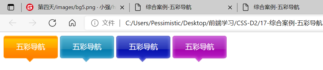
When the mouse is placed on the navigation, it will change color:
