<!DOCTYPE html>
<html lang="en">
<head>
<meta charset="UTF-8" />
<title>Form elements and their attributes</title>
</head>
<body>
<form action="http:www.baidu.com" method="get" target="_blank">
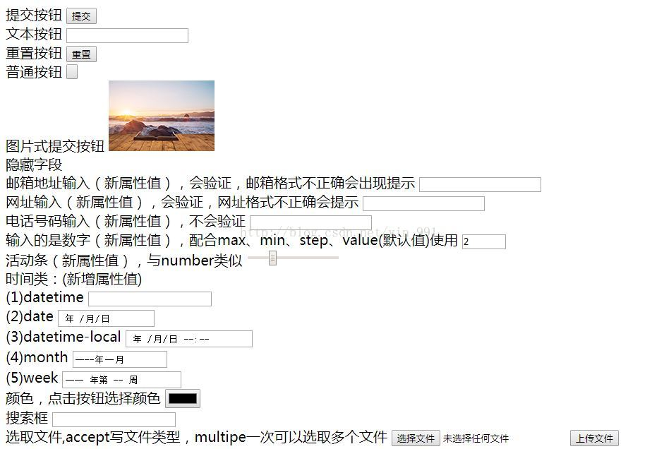
Submit button
<input type="submit" /><br />
Text button
<input type="text" /><br />
Reset button
<input type="reset" /><br />
Normal button
<input type="button" value="Button" /><br />
Picture submit button
<input type="image" src="111.png" /><br />
Hide field
<input type="hidden" value="syb" /><br />
If the mailbox attribute is not entered correctly, a prompt will appear to verify the new mailbox address (if the format is incorrect)
<input type="email" /><br />
The URL input (new attribute value) will be verified, and the URL format will be prompted if it is incorrect
<input type="url" /><br />
Phone number input (new attribute value) will not be verified
<input type="tel" /><br />
The input is a number (new attribute value), matching max,min,step,value(Default value)use
<input type="number" max="10" min="0" step="2" value="2" /><br />
Activity bar (new attribute value), and number similar
<input type="range" max="100" min="60" step="5" value="50" /><br />
Time class:(New attribute value)<br />
(1)datetime
<input type="datetime" /><br />
(2)date
<input type="date" /><br />
(3)datetime-local
<input type="datetime-local" /><br />
(4)month
<input type="month" /><br />
(5)week
<input type="week" /><br />
Color, click the button to select the color
<input type="color" /><br />
Search box
<input type="search" /><br />
Select file,accept Write file type, multipe Multiple files can be selected at a time
<input type="file" accept="image/*" multiple="multiple" /><br />
check box
<input type="checkbox" name="fx" />html
<input type="checkbox" name="fx" />css
<input type="checkbox" name="fx" checked="checked" />javascript <br />
Radio
<input type="radio" name="dx" />male <input type="radio" name="dx" />female
<input type="radio" name="dx" checked="checked" />secrecy
</form>
<form action="">
<h3>Registration interface</h3>
user name:<input
type="text"
value="Less than four words"
maxlength="4"
required="required"
autofocus="autofocus"
/><br />
<!-- The focus here is the same as that below accesskey In case of conflict, only one of the two can be selected -->
password:<input type="password" autocomplete="off" /><br />
country:<input type="text" readonly="readonly" value="Chinna" /><br />
Address:<input type="text" required="required" />
<input type="text" disabled="disabled" value="as**province**city" /><br />
Verification Code:<input type="search" placeholder="Please enter the verification code" accesskey="v" />
<input type="button" value="Click to get the verification code" /><br />
<input type="submit" value="register" />
</form>
</body>
</html>
Form element and its attributes
The Form element is used to define a Form and is the basic element for creating a Form (similar to the table that defines a Form)
Other elements of the form are contained in the form element. Its main sub elements are: input, button, select
Properties:
-
action Specify the sending address (server address) of the form
-
method This is a method to send form data to the server. There are two common methods: get,post,Useful input of type The attribute value is submit,"Submit is this button value The default value of the property
-
get and post Differences between:
(1) When the get method is submitted, the data will be attached to the web address and actively submitted to the server
(2) The data submitted by the post method will not be attached to the web address. The data will be packaged and sent to the server, waiting for the server to read the data for processing
-
You can also add one target Property that specifies the window to open in a new window
-
Input Element attributes:
(1) Type attribute: Specifies the type of input content. The default is text, a single line text box, and values such as password, submit, reset, and button
image is a picture submit button
Hidden hidden field
Email means to enter an email address (new attribute value), and the input content will be verified
url means to enter a web address (new attribute value), and the input content will be verified
tel means that the input content is a phone number (new attribute value), and the input content will not be verified
number can be used in conjunction with max, min, step and value of input to specify the maximum value, minimum value, step size and default value (new attribute value) that can be entered
Range is similar to the number type. It also indicates a certain range of input, but it is displayed in the state of an active bar
Time class (new attribute value): including datetime, datetime local, date, month, week and time
Color: you can create a color selection input box
Search (new attribute value) is used to establish a search box for users to enter keywords for search
File is used to create an input box for file selection. The type of selected file can be specified through the accept attribute, such as picture and video. The multipe attribute can be set to allow multiple files to be selected at one time
Checkbox: check box. You can set an option to the default selection status through the checked property, and click again to cancel the selection
Radio: radio box. An option can be set to the default selection state through the checked property. Click Cancel selection again. The same group of options must be set to the same name property value
(2) Name attribute: the identification name of the input content and the name when passing parameters
(3) Value attribute: default value
(4) maxlength attribute: the maximum number of words entered
(5) readonly property: read-only property. The setting content cannot be changed
(6) disabled property: set to unavailable
(7) require attribute: set the content as a required item, otherwise it cannot be submitted (new attribute)
(8) placeholder property: set the default value (dark font). When the text box gets the focus, it will be cleared. It is valid for text, url, tel, email, password and search
(9) autocomplete attribute: the attribute value is on/off, which defines whether the browser automatic memory function is enabled
(10) autofocus attribute: get focus automatically
(11) accesskey attribute: specify the shortcut key. In Windows, after specifying the shortcut key, press alt + shortcut key to get the focus
(12) tabindex attribute: Specifies the moving order between items when the tab key is pressed
As shown in the figure: