FormGenerator drag form
This paper describes the form generator project, which is based on Vue framework and ElementUI components to drag and drop forms to complete the project and secondary development
Gitee address: https://gitee.com/mrhj/form-generator?_from=gitee_search
brief introduction
Element UI form design and code generator, which can directly run the generated code in vue projects based on element; You can also export JSON forms and use the supporting parser to parse JSON into real forms.
use
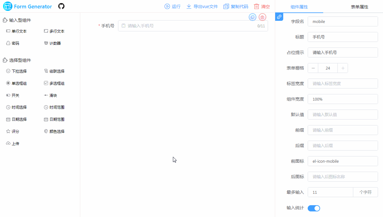
- Click the component on the left or drag the component to the drawing board to generate the corresponding component
- Set component and form properties in the right property panel according to business needs
- Click View json to view the json generation of the current canvas component and form, which is stored in the back end
- Click Run to generate the corresponding page content and vue template code based on the canvas component and the right attribute configuration. You can modify the code, click Run to generate the latest page (json will not change), or directly generate vue files and put them into the project for operation
Project principle
- Using vuedraggable third-party resource package to drag and drop components in Vue project
- In Src / components / generator / config JS to configure the json configuration of forms and components (code below)
- Drag and drop the json configuration of each component into the unified rendering array, and render the components in the palette through the render function of vue
Premise: the element UI component is registered globally in the project, so that label components such as El input can be generated directly
- Click run time to generate page, and the project uses iframe to embed the priview page in the same project (two page entry is configured in vue.config.js)
- The priview page is in Src / views / priview / main js re create new Vue through Src / components / generator / js JS and html js generates corresponding template template and script script (please see the detailed code for html and js generation)
- Generate the corresponding vue file page from the generated string template through the components and template attributes of new Vue
The following is the json configuration of components and forms
config.js Configuration of

// Form properties [right panel]
export const formConf = {
  formRef: 'elForm',
  formModel: 'formData',
  size: 'medium',
  labelPosition: 'right',
  labelWidth: 100,
  formRules: 'rules',
  gutter: 15,
  disabled: false,
  span: 24,
  formBtns: true
}
// Input type assembly [left panel]
export const inputComponents = [
  {
    // Custom configuration of components
    __config__: {
      label: 'Single line text',
      labelWidth: null,
      showLabel: true,
      changeTag: true,
      tag: 'el-input',
      tagIcon: 'input',
      defaultValue: undefined,
      required: true,
      layout: 'colFormItem',
      span: 24,
      document: 'https://element.eleme.cn/#/zh-CN/component/input',
      // Regular check rule
      regList: []
    },
    // Slot properties for components
    __slot__: {
      prepend: '',
      append: ''
    },
    // The rest are attributes that can be written directly on the component label
    placeholder: 'Please enter',
    style: { width: '100%' },
    clearable: true,
    'prefix-icon': '',
    'suffix-icon': '',
    maxlength: null,
    'show-word-limit': false,
    readonly: false,
    disabled: false
  }]
Secondary development of the project
Modify the original Element component
- Add attribute: in config Add the required attributes in JS (the attributes should be supported by the current component of element)
If you need to add configurable properties, you need to add them in Src / views / index / rightpanel Set the corresponding configuration form component in Vue
- Delete attribute: according to rightpanel The attribute display condition in Vue is used to judge the attribute in the corresponding component json for deletion and modification
Add new component
- Add other Element components, add new component json configuration in config, configure the properties according to the properties of the new Element component, and set its display properties in RightPanel
- Add custom component (not Element)
- Add component json in config and set tag as the component registration name
- In the entrance of two pages main Global registration of custom components to be added in JS
Add entity correspondence
You can cooperate with the back-end to add an entity corresponding to the form, and then modify the component field name to select an entity from the drop-down box and correspond to it
If you support multi-level one-to-one or one to many entities, you need to modify the data generation when generating the corresponding js. The original project is flat data string generation. The author suggests using the Object object generation form to generate objects level by level, and finally JSON Stringfly() is converted to a string and thrown
Add component example (take department component as an example)
- config. Add json configuration to JS
{
        // Custom configuration of components
        modelArr: [],
        codeModelArr: [],
        __config__: {
            label: 'Detail display',
            labelWidth: null,
            showLabel: true,
            tag: 'look-detail',
            tagIcon: 'detail',
            // defaultValue: undefined,
            required: true,
            layout: 'colFormItem',
            span: 24,
            // Regular check rule
            regList: [],
        },
        process: false,
        processKey: '',
        // The rest are attributes that can be written directly on the component label
    }
The style dragged to the canvas is displayed as tag, the global component look detail, and the process and processKey are equivalent to the props of the component. Remember -- remember to register the component globally
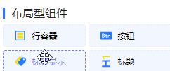
- The following figure shows the component list on the left. Drag it to the canvas to generate the component effect
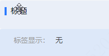
- The following figure shows the display effect after dragging the detail display and label display components. The parameter text can be modified according to the field