What are the special characters of CSS content attribute?
Today, when developing, we need to use the content attribute of CSS and add some special characters to achieve the effect of web pages. However, there are so many special characters, how can you remember them? So Google Baidu found a more complete one after searching, and summarized it here to provide convenience for children's shoes with the same needs as me and when I use them in the future.
Because these characters belong to the unicode character set, we need to declare the code adding these characters in UTF-8 format when using them;
It should also be noted that some characters have different display effects in different browsers, so you need to experiment in different browsers when using them. The recognition degree under the intelligent devices of apple and Android systems is also relatively poor, so I hope to use it with caution.
No more nonsense, dry goods:
Various arrows
Graphic styles are used for HTML (precede &#) CSS (precede \) and JavaScript (precede \ u)
⇠ 8672 21E0
⇢ 8674 21E2
⇡ 8673 21E1
⇣ 8675 21E3
↞ 8606 219E
↠ 8608 21A0
↟ 8607 219F
↡ 8609 21A1
← 8592 2190
→ 8594 2192
↑ 8593 2191
↓ 8595 2193
↔ 8596 2194
↕ 8597 2195
⇄ 8644 21C4
⇅ 8645 21C5
↢ 8610 21A2
↣ 8611 21A3
⇞ 8670 21DE
⇟ 8671 21DF
↫ 8619 21AB
↬ 8620 21AC
⇜ 8668 21DC
⇝ 8669 21DD
↚ 8602 219A
↛ 8603 219B
↮ 8622 21AE
↭ 8621 21AD
shape
Graphic styles are used for HTML (precede &#) CSS (precede \) and JavaScript (precede \ u)
⇦ 8678 21E6
⇨ 8680 21E8
⇧ 8679 21E7
⇩ 8681 21E9
↷ 8631 21B7
↶ 8630 21B6
↻ 8635 21BB
↺ 8634 21BA
⟳ 10227 27F3
⟲ 10226 27F2
⟰ 10224 27F0
⟱ 10225 27F1
↵ 8629 21B5
↯ 8623 21AF
⇵ 8693 21F5
Right arrow
Graphic styles are used for HTML (precede &#) CSS (precede \) and JavaScript (precede \ u)
➔ 10132 2794
➙ 10137 2799
➨ 10152 27A8
➲ 10162 27B2
➜ 10140 279C
➞ 10142 279E
➟ 10143 279F
➠ 10144 27A0
➤ 10148 27A4
➥ 10149 27A5
➦ 10150 27A6
➧ 10151 27A7
➵ 10165 27B5
➸ 10168 27B8
➼ 10172 27BC
➽ 10173 27BD
➺ 10170 27BA
➳ 10163 27B3
➾ 10174 27BE
Basic shape
Graphic styles are used for HTML (precede &#) CSS (precede \) and JavaScript (precede \ u)
▲ 9650 25B2
► 9658 25BA
▼ 9660 25BC
◄ 9668 25C4
❤ 10084 2764
✈ 9992 2708
★ 9733 2605
✦ 10022 2726
☀ 9728 2600
◆ 9670 25C6
◈ 9672 25C8
▣ 9635 25A3
punctuation
Graphic styles are used for HTML (precede &#) CSS (precede \) and JavaScript (precede \ u)
« 171 00AB
» 187 00BB
‹ 139 008B
› 155 009B
" 8220 201C
" 8221 201D
' 8216 2018
' 8217 2019
• 8226 2022
◦ 9702 25E6
¡ 161 00A1
¿ 191 00BF
℅ 8453 2105
№ 8470 2116
& 38 0026
@ 64 0040
℞ 8478 211E
℃ 8451 2103
℉ 8457 2109
° 176 00B0
124 007C
¦ 166 00A6
– 8211 2013
— 8212 2014
... 8230 2026
¶ 182 00B6
∼ 8764 223C
≠ 8800 2260
Legal symbol
Graphic styles are used for HTML (precede &#) CSS (precede \) and JavaScript (precede \ u)
® 174 00AE
© 169 00A9
℗ 8471 2117
™ 153 0099
℠ 8480 2120
currency
Graphic styles are used for HTML (precede &#) CSS (precede \) and JavaScript (precede \ u)
$ 36 0024
¢ 162 00A2
£ 163 00A3
¤ 164 00A4
€ 8364 20AC
¥ 165 00A5
₱ 8369 20B1
₹ 8377 20B9
mathematics
Graphic styles are used for HTML (precede &#) CSS (precede \) and JavaScript (precede \ u)
½ 189 00BD
¼ 188 00BC
¾ 190 00BE
⅓ 8531 2153
⅔ 8532 2154
⅛ 8539 215B
⅜ 8540 215C
⅝ 8541 215D
‰ 8240 2030
% 37 0025
< 60 003C
62 003E
music notation
Graphic styles are used for HTML (precede &#) CSS (precede \) and JavaScript (precede \ u)
♩ 9833 2669
♪ 9834 266A
♫ 9835 266B
♬ 9836 266C
♭ 9837 266D
♯ 9839 266F
Check and wrong numbers
Graphic styles are used for HTML (precede &#) CSS (precede \) and JavaScript (precede \ u)
Space 160 00A0
☐ 9744 2610
☑ 9745 2611
☒ 9746 2612
✓ 10003 2713
✔ 10004 2714
✕ 10005 10005
✖ 10006 2716
✗ 10007 2717
✘ 10008 2718
cross
Graphic styles are used for HTML (precede &#) CSS (precede \) and JavaScript (precede \ u)
☨ 9768 2628
☩ 9769 2629
✝ 10013 271D
✞ 10014 271E
✟ 10015 271F
✠ 10016 2720
✚ 10010 271A
† 8224 2020
✢ 10018 2722
✤ 10020 2724
✣ 10019 2723
✥ 10021 2725
Stars, asterisks, snowflakes
Graphic styles are used for HTML (precede &#) CSS (precede \) and JavaScript (precede \ u)
★ 9733 2605
✭ 10029 272D
✮ 10030 272E
☆ 9734 2606
✪ 10026 272A
✡ 10017 2721
✯ 10031 272F
✵ 10037 2735
✶ 10038 2736
✸ 10040 2738
✹ 10041 2739
✺ 10042 273A
✱ 10033 2731
✲ 10034 2732
✴ 10036 2734
✳ 10035 2733
✻ 10043 273B
✽ 10045 273D
❋ 10059 274B
❆ 10054 2746
❄ 10052 2744
❅ 10053 2745
miscellaneous
Graphic styles are used for HTML (precede &#) CSS (precede \) and JavaScript (precede \ u)
☻ 9787 263B
☺ 9786 263A
☹ 9785 2639
✉ 9993 2709
☎ 9742 260E
☏ 9743 260F
✆ 9990 2706
� 65533 FFFD
☁ 9729 2601
☂ 9730 2602
❄ 10052 2744
☃ 9731 2603
❈ 10056 2748
✿ 10047 273F
❀ 10048 2740
❁ 10049 2741
☘ 9752 2618
❦ 10086 2766
☕ 9749 9749
❂ 10050 2742
☥ 9765 2625
☮ 9774 262E
☯ 9775 262F
☪ 9770 262A
☤ 9764 2624
✄ 9988 2704
✂ 9986 2702
☸ 9784 2638
⚓ 9875 2693
☣ 9763 2623
⚠ 9888 26A0
⚡ 9889 26A1
☢ 9762 2622
♻ 9851 267B
♿ 9855 267F
☠ 9760 2620
Hand type, pencil, pen
Graphic styles are used for HTML (precede &#) CSS (precede \) and JavaScript (precede \ u)
☜ 9756 261C
☞ 9758 261E
☝ 9757 261D
☟ 9759 261F
✌ 9996 270C
✍ 9997 270D
✎ 9998 270E
✐ 10000 2710
✏ 9999 270F
✑ 10001 2711
✒ 10002 2712
Sky, plants
Graphic styles are used for HTML (precede &#) CSS (precede \) and JavaScript (precede \ u)
☽ 9789 263D
☾ 9790 263E
♂ 9794 2642
♀ 9792 2640
☿ 9791 263F
♁ 9793 2641
♃ 9795 2643
♄ 9796 2644
♅ 9797 2645
♆ 9798 2646
♇ 9799 2647
constellation
Graphic styles are used for HTML (precede &#) CSS (precede \) and JavaScript (precede \ u)
♈ 9800 2648
♉ 9801 2649
♊ 9802 264A
♋ 9803 264B
♌ 9804 264C
♍ 9805 264D
♎ 9806 264E
♏ 9807 264F
♑ 9809 2651
♒ 9810 2652
♓ 9811 2653
Chess, playing cards
Graphic styles are used for HTML (precede &#) CSS (precede \) and JavaScript (precede \ u)
♚ 9818 265A
♛ 9819 265B
♜ 9820 265C
♝ 9821 265D
♞ 9822 265E
♟ 9823 265F
♔ 9812 2654
♕ 9813 2655
♖ 9814 2656
♗ 9815 2657
♘ 9816 2658
♙ 9817 2659
♠ 9824 2660
♣ 9827 2663
♥ 9829 2665
♦ 9830 2666
♤ 9828 2664
♧ 9831 2667
♡ 9825 2661
♢ 9826 2662
Greek alphabet
Graphic styles are used for HTML (precede &#) CSS (precede \) and JavaScript (precede \ u)
Α 913 0391
Β 914 0392
Γ 915 0393
Δ 916 0394
Ε 917 0395
Ζ 918 0396
Η 919 0397
Θ 920 0398
Ι 921 0399
Κ 922 039A
Λ 923 039B
Μ 924 039C
Ν 925 039D
Ξ 926 039E
Ο 927 039F
Π 928 03A0
Ρ 929 03A1
Σ 931 03A3
Τ 932 03A4
Υ 933 03A5
Φ 934 03A6
Χ 935 03A7
Ψ 936 03A8
Ω 937 03A9
Write the method of horizontal and vertical centering of elements without fixed width and height under the condition of fixed height
flex Layout; In addition, positioning can also be used, and so on;
flex: father div: {display: flex; justify-content: center;align-items: center;};
Positioning methods, relative positioning, horizontal and vertical centering through offset elements, etc. I often use these two methods. Pay attention to compatibility when using them
How to add special styles to handheld devices?
-webkit-touch-callout:none ---------- Disable long press pop-up menu
There are many useless css codes in a project. How to find and remove these useless codes?
1.Using browser plug-ins
2.use PurifyCSS
3.chrome browser F12 Review of elements Audits,Manual deletion
What is the class naming method of css in your team? Underline or horizontal line or hump?
form .a .a-b

No humps and_,Because both are needed shift Auxiliary input, The more humps, press shift The more keys you press.
For example, what are the methods of CSS feature detection?
Native @supports The performance of is definitely the best, and there is no need to introduce external javascript ,This is the first one, but it is helpless to solve the problem of compatibility. At present, it is not the best choice.

Modernizr Powerful function, good compatibility, but need to introduce external javascript,advantage http Request, if only a few characteristic tests are carried out, it feels like killing a chicken with an ox knife.
For the required characteristic detection, use javascript Implement a simple function, and then encapsulate the methods used above:

/**

For simple CSS feature detection

@param [String] property CSS property name to be detected

@param [String] value Specific attribute values for styles

@return [Boolean] Whether it passes the inspection
*/
(function(property, value) {
// Elements for testing, hidden on the page
var ele = document.createElement('div');

// Only one parameter
if(arguments.length === 1) {
if(property in ele.style) {
return true;
}
// Case of two parameters
}else if(arguments.length === 2){
ele.style[property] = value;

 if(ele.style[property]) {
     return true;
 }
}
ele = null;
return false;
})("font-size",'10px');
How to use css to add a diagonal slash to a square?
background:linear-gradient(45deg,transparent 49.5%,deeppink 49.5%,deeppink 50.5%,transparent 50.5%);
Talk about position: what are the application scenarios for sticky
Ceiling effect
Draw a scale with css
html structure:
<div class='ruler'>
 <div class='cm'>
 <div class='mm'></div>
 <div class='mm'></div>
 <div class='mm'></div>
 <div class='mm'></div>
 <div class='mm'></div>
 <div class='mm'></div>
 <div class='mm'></div>
 <div class='mm'></div>
 <div class='mm'></div>
 </div>
 <div class='cm'>
 <div class='mm'></div>
 <div class='mm'></div>
 <div class='mm'></div>
 <div class='mm'></div>
 <div class='mm'></div>
 <div class='mm'></div>
 <div class='mm'></div>
 <div class='mm'></div>
 <div class='mm'></div>
 </div>
 <div class='cm'>
 <div class='mm'></div>
 <div class='mm'></div>
 <div class='mm'></div>
 <div class='mm'></div>
 <div class='mm'></div>
 <div class='mm'></div>
 <div class='mm'></div>
 <div class='mm'></div>
 <div class='mm'></div>
 </div>
 <div class='cm'>
 <div class='mm'></div>
 <div class='mm'></div>
 <div class='mm'></div>
 <div class='mm'></div>
 <div class='mm'></div>
 <div class='mm'></div>
 <div class='mm'></div>
 <div class='mm'></div>
 <div class='mm'></div>
 </div>
 <div class='cm'>
 <div class='mm'></div>
 <div class='mm'></div>
 <div class='mm'></div>
 <div class='mm'></div>
 <div class='mm'></div>
 <div class='mm'></div>
 <div class='mm'></div>
 <div class='mm'></div>
 <div class='mm'></div>
 </div>
 <div class='cm'>
 <div class='mm'></div>
 <div class='mm'></div>
 <div class='mm'></div>
 <div class='mm'></div>
 <div class='mm'></div>
 <div class='mm'></div>
 <div class='mm'></div>
 <div class='mm'></div>
 <div class='mm'></div>
 </div>
 <div class='cm'>
 <div class='mm'></div>
 <div class='mm'></div>
 <div class='mm'></div>
 <div class='mm'></div>
 <div class='mm'></div>
 <div class='mm'></div>
 <div class='mm'></div>
 <div class='mm'></div>
 <div class='mm'></div>
 </div>
 <div class='cm'>
 <div class='mm'></div>
 <div class='mm'></div>
 <div class='mm'></div>
 <div class='mm'></div>
 <div class='mm'></div>
 <div class='mm'></div>
 <div class='mm'></div>
 <div class='mm'></div>
 <div class='mm'></div>
 </div>
 <div class='cm'>
 <div class='mm'></div>
 <div class='mm'></div>
 <div class='mm'></div>
 <div class='mm'></div>
 <div class='mm'></div>
 <div class='mm'></div>
 <div class='mm'></div>
 <div class='mm'></div>
 <div class='mm'></div>
 </div>
 <div class='cm'>
 <div class='mm'></div>
 <div class='mm'></div>
 <div class='mm'></div>
 <div class='mm'></div>
 <div class='mm'></div>
 <div class='mm'></div>
 <div class='mm'></div>
 <div class='mm'></div>
 <div class='mm'></div>
 </div>
 <div class='cm'></div>
</div>
<div id="mentionme">
  by <a href="https://www.linkedin.com/in/artur-arsalanov-ab3a6895" target="_blank" title="Find me in  LinkedIn!">ArturArsalanov</a>
</div>
CSS Style:
.ruler {
 position: relative;
 width: 70%;
 margin: 20px auto;
 height: 14px;
}
.ruler .cm,
.ruler .mm {
 position: absolute;
 border-left: 1px solid #555;
 height: 14px;
 width: 10%;
}
.ruler .cm:after {
 position: absolute;
 bottom: -15px;
 font: 11px/1 sans-serif;
}
.ruler .mm {
 height: 5px;
}
.ruler .mm:nth-of-type(5) {
 height: 10px;
}
.ruler .cm:nth-of-type(1) {
 left: 0%;
}
.ruler .cm:nth-of-type(1):after {
 content: "0";
}
.ruler .cm:nth-of-type(2) {
 left: 10%;
}
.ruler .cm:nth-of-type(2):after {
 content: "1";
}
.ruler .cm:nth-of-type(3) {
 left: 20%;
}
.ruler .cm:nth-of-type(3):after {
 content: "2";
}
.ruler .cm:nth-of-type(4) {
 left: 30%;
}
.ruler .cm:nth-of-type(4):after {
 content: "3";
}
.ruler .cm:nth-of-type(5) {
 left: 40%;
}
.ruler .cm:nth-of-type(5):after {
 content: "4";
}
.ruler .cm:nth-of-type(6) {
 left: 50%;
}
.ruler .cm:nth-of-type(6):after {
 content: "5";
}
.ruler .cm:nth-of-type(7) {
 left: 60%;
}
.ruler .cm:nth-of-type(7):after {
 content: "6";
}
.ruler .cm:nth-of-type(8) {
 left: 70%;
}
.ruler .cm:nth-of-type(8):after {
 content: "7";
}
.ruler .cm:nth-of-type(9) {
 left: 80%;
}
.ruler .cm:nth-of-type(9):after {
 content: "8";
}
.ruler .cm:nth-of-type(10) {
 left: 90%;
}
.ruler .cm:nth-of-type(10):after {
 content: "9";
}
.ruler .cm:nth-of-type(11) {
 left: 100%;
}
.ruler .cm:nth-of-type(11):after {
 content: "10";
}
.ruler .mm:nth-of-type(1) {
 left: 10%;
}
.ruler .mm:nth-of-type(2) {
 left: 20%;
}
.ruler .mm:nth-of-type(3) {
 left: 30%;
}
.ruler .mm:nth-of-type(4) {
 left: 40%;
}
.ruler .mm:nth-of-type(5) {
 left: 50%;
}
.ruler .mm:nth-of-type(6) {
 left: 60%;
}
.ruler .mm:nth-of-type(7) {
 left: 70%;
}
.ruler .mm:nth-of-type(8) {
 left: 80%;
}
.ruler .mm:nth-of-type(9) {
 left: 90%;
}
.ruler .mm:nth-of-type(10) {
 left: 100%;
}
#mentionme{
  text-align:center;
  margin-top:10%;
}
Do you often use pseudo elements? What is it usually used in?
Clear floating
What are the application scenarios of sroll snap type attribute? What other properties are associated?
Optimize scrolling using sroll snap type
According to the CSS Scroll Snap Module Level 1 specification, CSS has added a number of attributes that can control scrolling, so that scrolling can get many beautiful interactions that originally needed the intervention of JS scripts under the control of CSS.
Tips: some of the Gif diagrams cut in this article involve container scrolling. The effect is not very good. You can click into the Demo to actually feel it.
sroll-snap-type
First, look at sroll snap type, which may be the core attribute style in the new rolling specification.
Scroll snap type: the attribute defines how a snap point in the scroll container is strictly executed.
The definition is a little difficult to understand. In short, this attribute specifies whether a container captures the internal scrolling action and how to deal with the scrolling end state.
grammar
{
scroll-snap-type: none | [ x | y | block | inline | both ] [ mandatory | proximity ]?
}
For example, suppose we want a horizontally scrollable container. After each scroll, the final dwell position of the child elements is not embarrassed to be divided, but completely presented in the container. It can be written as follows:
<ul>
    <li>1</li>
    <li>2</li>
    <li>3</li>
</ul>

ul {
    scroll-snap-type: x mandatory;
}

li {
    scroll-snap-align: center;
}
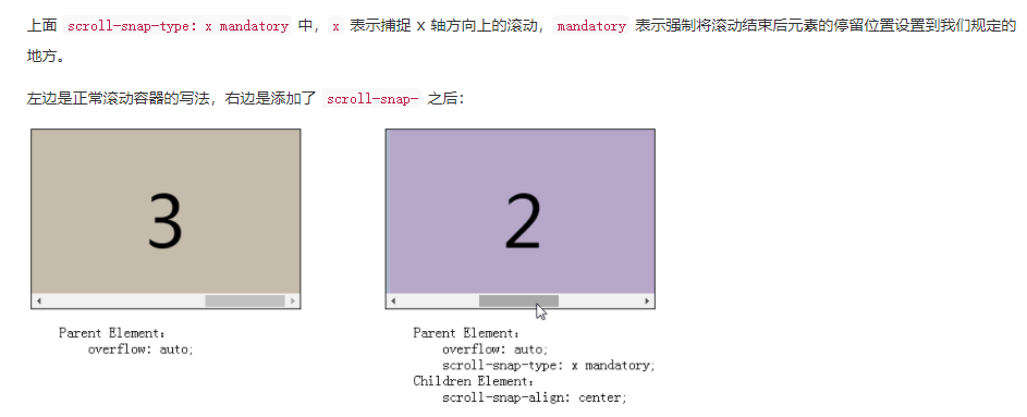
The same is true for scrolling in the y-axis direction. Simply change the scroll snap type:
ul {
scroll-snap-type: y mandatory;
}
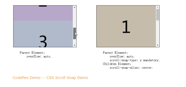
mandatory and proximity in scroll snap type
Another key point in scroll snap type is mandatory and proximity.
Mandatory: we usually use this in CSS code. Mandatory means mandatory in English. It means that after rolling, the rolling stop point will be forced to stop at the place we specify
Proximity: English means proximity, proximity and approximate. In this attribute, it means that after the rolling is completed, the rolling stop point may be the place where the rolling stops, or it may make additional movement and stop at the place we specify
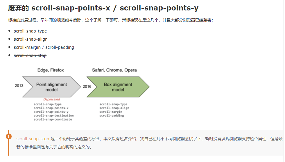
That is, the scroll container with scroll snap type: y proximity specified above may stop at the following awkward position if the scroll snap margin / scroll snap padding is not additionally set: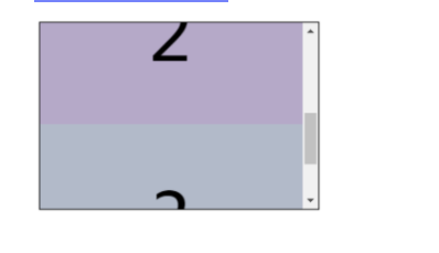
scroll-snap-type: both mandatory
Of course, there is another special case: scroll snap type: both mandatory, which means that both horizontal and vertical scrolling will be captured at the same time. It is also possible: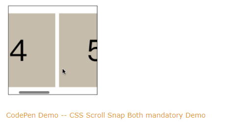
scroll-snap-align
Using scroll snap align, you can simply control the alignment of the current scrolling child element to be focused relative to the parent container in the scrolling direction.
It needs to act on the parent element. There are three optional values:
{
scroll-snap-align: start | center | end;
}
What do you mean? Look at the diagram:
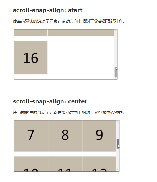
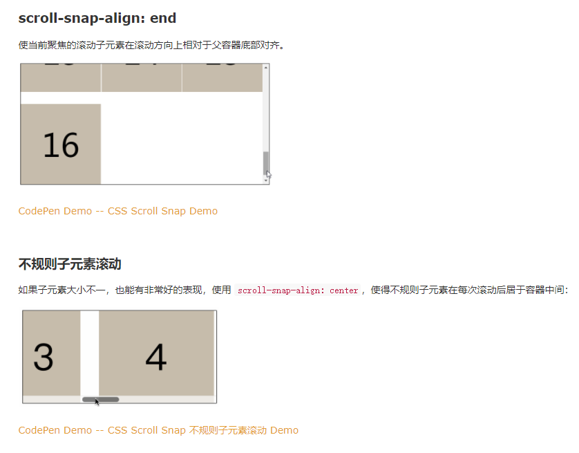
scroll-margin / scroll-padding
The above scroll snap align is easy to use and can control the alignment between the scrolling child element and the parent container. However, there are only three optional values. Sometimes we can use scroll margin or scroll padding when we want to perform some finer control
Of which:
Scroll padding is used to scroll parent containers, similar to the padding of boxes
Scroll margin is used to scroll child elements. The scroll margin of each child element can be set to different values, similar to the margin of a box
For example, under vertical scrolling, adding a scroll padding top: 30px to the scrolling parent container is equivalent to adding ` ` scroll margin top: 30px 'to each child element:
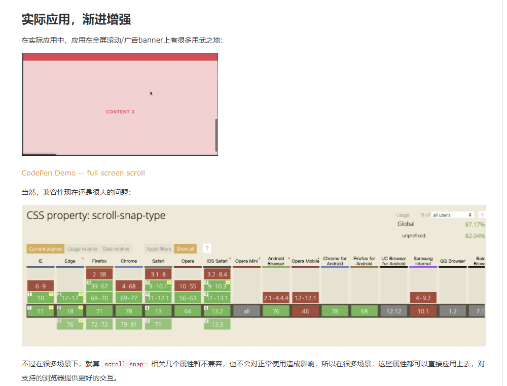
We hope that the distance between the scroll sub element and the top of the container is 30px based on scroll snap align: Start: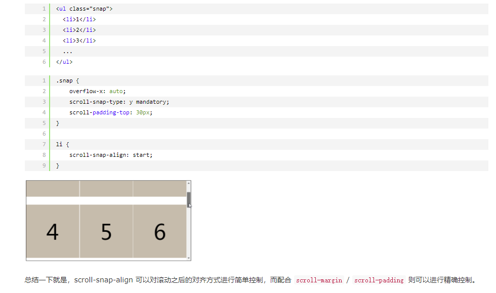
Using css to achieve a loading effect
<div class="donut"></div>
@Keyframes donut-spin {
   0% {
     transform: rotate(0deg);
   }

   100% {
     transform: rotate(360deg);
   }
}

.donut {
   display: inline-block;
   border: 4px solid rgba(0, 0, 0, 0.1);
   border-left-color: #59a782;
   border-radius: 50%;
   width: 30px;
   height: 30px;
   animation: donut-spin 1.2s linear infinite;
}
Why do css selectors match from right to left?
Matching from right to left will first eliminate many wrong matches. For a simple example, a child has only one father, but a father can have many children. It is easy to find a father from a child. Finding a designated child from a father may find the wrong child. Of course, selectors have to be optimized, or even matching from right to left will have some performance problems.
The table lists some of the css attributes you think are most "expensive" and explains why
filter Well, I've learned the representation of Gaussian fuzzy algorithm
Do you know CSS Houdini? What are its application scenarios?
Houdini It's a group of bottom layers API,They are public CSS Various parts of the engine, so that developers can expand by adding the style and layout process of the browser rendering engine CSS. Houdini It's a group API,They give developers direct access to CSS Object model( CSSOM),Enables developers to write browsers that can be resolved to CSS To create a new CSS Features without waiting for them to be implemented locally in the browser.
What are the application scenarios of css's negative margin?
Vertically and horizontally centered
 Expand element coverage through pseudo elements
Is the clear attribute valid only for block level elements? Why can't it be applied to inline elements?
block After floating, the elements have been separated from the document flow, and the order of arrangement is different, so there is an effect after clearing.
inline-block In the document stream, adding or not floating has no effect, so clearing has no effect
Have you ever used the tab size attribute of css? How many spaces does the browser display by default?
tab-size Property specifies the tab( tab)The space length of the character.

stay HTML Middle, tab( tab)The character is usually displayed as a single space character
How to make the background picture fixed without scrolling with the scroll bar
background-attachment:fixed
For example, what are the attributes related to printing?
page
page-break-before
page-break-after
page-break-inside
Please write out the shortcut of font attribute
p {
font:italic bold 12px/20px arial,sans-serif;
}
Use css to write a vertical flip picture effect
transform: rotateX(180deg); /* Vertical mirror flip */
Do you want to quote the url() in css? Tell me your understanding
You can add it or not. This is the same as html The attribute of the tag can be written in quotation marks or without quotation marks. Of course, if the attribute contains special characters such as spaces, you need to add spaces, otherwise it will cause browser parsing errors. If you want to develop good program writing habits, you'd better add quotation marks, which is a standard practice.

But in terms of security, it should be added...
Otherwise, it is easy to be xss
 because url If you put quotation marks inside, it means url The content is a string...
But if it is in the following format without quotation marks:
How to use css to display the url of a link?
.some-a-tag:before {
  content: attr(href);
}
How to use pseudo elements to increase the click hot area to increase the user experience?
.extend-via-pseudo-elem {
	position: relative;
}

.extend-via-pseudo-elem::before {
    content: '';
    position: absolute;
    top: -20px;
    right: -20px;
    bottom: -20px;
    left: -20px;
}
Using css to achieve the effect of bubble box
<!DOCTYPE html>
<html lang="en">

<head>
<meta charset="UTF-8">
<meta name="viewport" content="width=device-width, initial-scale=1.0">
<title></title>
<style>
.longen{
width:300px;
height:100px;
border:5px solid #09F;
position:relative;
background-color:#FFF;
}
.longen:before,.longen:after{
content:"";display:block;
border-width:20px;
position:absolute; bottom:-40px;
left:100px;
border-style:solid dashed dashed;
border-color:#09F transparent transparent;
font-size:0;
line-height:0;
}
.longen:after{
bottom:-33px;
border-color:#FFF transparent transparent;
}
</style>
</head>
<body>
<div class="longen">
css3 Bubble box
</div>


</body>
</html>
Have you ever used: placeholder show and: focus within? Tell me about them
:focus-within It's a CSS Pseudo class, which means that an element gets focus, or the descendant element of the element gets focus. In other words, the element itself or one of its descendants matches :focus Pseudo class( shadow DOM Offspring in the tree are also included)
:placeholder-shown CSS Pseudo class in or <textarea> Element display placeholder text Effective when.
Using css to achieve neon effect
 <div class="neon">Good evening, and good night!</div>
  body {
    display: flex;
    height: 100vh;
    justify-content: center;
    align-items: center;
    text-align: center;
    background: black;
  }

  .neon {
    color: #cce7f8;
    font-size: 2.5rem;
    font-family: 'Pacifico', cursive;
    text-transform: uppercase;
    animation: shining 0.1s alternate infinite;
  }

  @keyframes shining {
    from {
      text-shadow: 0 0 6px rgba(182, 211, 207, 0.9),
        0 0 30px rgba(182, 211, 207, 0.3), 0 0 12px rgba(15, 115, 223, 0.5),
        0 0 21px rgba(15, 115, 223, 0.9), 0 0 34px rgba(15, 115, 223, 0.8),
        0 0 54px rgba(15, 115, 223, 0.9);
    }

    to {
      text-shadow: 0 0 6px rgba(182, 211, 207, 1),
        0 0 30px rgba(182, 211, 207, 0.4), 0 0 12px rgba(15, 115, 223, 0.6),
        0 0 22px rgba(15, 115, 223, 0.8), 0 0 38px rgba(15, 115, 223, 0.9),
        0 0 60px rgba(15, 115, 223, 1);
    }
  }
When you get a new project and let you do the architecture design for the css of the project, how do you start?
Common variable (theme color)/Main void/Main font size (font, etc.)
Compiler( scss/less/postcss/stylus)
Adaptive scheme (grid)/rem/vw/pt)
Directory conventions( mixin/common/theme/module/response)
Privatization programme( scoped/css module/css in js)
In addition to using JS to track user information, what if you don't use js and use pure css?
Can use css Pseudo class of :hover :active :focus Listen to user behavior, and then give it to the specified user url Send request.

#link:active::after {

content:url('xxx/xxx?active');

}
Use css to write an animation effect of alternating traffic lights
<!DOCTYPE html>
<html lang="en">

<head>
<meta charset="UTF-8">
<meta name="viewport" content="width=device-width, initial-scale=1.0">
<title></title>
<style>
body {
margin: 0;
/* Absolute positioning makes height: 100% effective/
position: absolute;
height: 100%;
width: 100%;
}
/ The background image is centered vertically and horizontally using margin auto/
.wrap {
position: absolute;
top: 0;
left: 0;
right: 0;
bottom: 0;
margin: auto;
width: 500px;
height: 350px;
background: rgb(97, 170, 189);
}
/ Lamp frame/
.traffic-light {
/ Center code/
position: absolute;
top: 0;
left: 0;
right: 0;
bottom: 0;
margin: auto;
text-align: center;

/ Draw pattern/
width: 300px;
height: 90px;
background: #282f2f;
border-radius: 50px;
box-shadow: 0 0 0 2px #eee inset;
}
.traffic-light::after {
/ Center code/
position: absolute;
top: 50%;
left: 50%;
transform: translate(-50%, -50%);

content: '';
display: inline-block;
width: 70px;
height: 70px;
border-radius: 50%;

animation: traffic-light 5s linear 0s infinite;
}

@Keyframes traffic-light {
from {
background: transparent; / Yellow lamp/

box-shadow:
-85px 0 0 0 transparent, / Red light/
85px 0 0 0 transparent, / Green light/
-85px 0 15px 0 transparent, / Red light shadow/
0px 0 15px 0 transparent, / Yellow light shadow/
85px 0 15px 0 transparent; / Green light shadow/
}
25% {
background: transparent; / Yellow lamp/

box-shadow:
-85px 0 0 0 rgb(247, 78, 26), / Red light/
85px 0 0 0 transparent, / Green light/
-85px 0 15px 0 rgb(247, 78, 26), / Red light shadow/
0px 0 15px 0 transparent, / Yellow light shadow/
85px 0 15px 0 transparent; / Green light shadow/
}
50% {
background: rgb(231, 183, 78); / Yellow lamp/

box-shadow:
-85px 0 0 0 transparent, / Red light/
85px 0 0 0 transparent, / Green light/
-85px 0 15px 0 transparent, / Red light shadow/
0px 0 15px 0 rgb(231, 183, 78), / Yellow light shadow/
85px 0 15px 0 transparent; / Green light shadow/
}
75% {
background: transparent; / Yellow lamp/

box-shadow:
-85px 0 0 0 transparent, / Red light/
85px 0 0 0 rgb(38, 175, 84), / Green light/
-85px 0 15px 0 transparent, / Red light shadow/
0px 0 15px 0 transparent, / Yellow light shadow/
85px 0 15px 0 rgb(38, 175, 84); / Green light shadow/
}
to {
background: transparent; / Yellow lamp/

box-shadow:
-85px 0 0 0 transparent, / Red light/
85px 0 0 0 transparent, / Green light/
-85px 0 15px 0 transparent, / Red light shadow/
0px 0 15px 0 transparent, / Yellow light shadow/
85px 0 15px 0 transparent; / Green light shadow */
}
}
</style>
</head>
<body>
<div class="wrap">
<div class="traffic-light"></div>
</div>
</body>
</html>
Judge the color of the following border and explain why [Code]?
<p style="color: red;border: 1px solid;">to p set up border,But don't set it border-color</div>
red
 When the border color is not set, the border color is consistent with the current font color
What does the width of box sizing include?
This has to be based on box-sizing To calculate:

1.box-sizing: content-box;
width = width + 2border + 2padding
2.box-sizing: border-box;
width = width
 But the inside of the element will be compressed, content = width - 2border - 2padding
What are the ways to set transparency for an image?
1.opacity : 0 -> Child elements inherit
2.The outer layer is wrapped in a box and its rgba(255,255,255,0)
How can a pseudo element achieve the effect of line breaking without a line breaking label?
use\A Wrap and specify white-space: pre Preserve newline effect

.foo::after {
  content: '123\A 456';
  white-space: pre;
}
Fixed frame size, inside the picture size is not fixed, how to make the image adaptive frame?
use object-fit ,Similar usage background-size,Optional values: cover,contain,fill etc.
How to make table cells equal width display
table-layout: fixed;
width: 100%;
H5 how to disable the display of the system menu?
touch-callout:none;
user-select:none;
Draw a parallelogram with css
.parallelogram {
  margin: 30px;
  width: 200px;
  height: 100px;
  border: 1px solid slateblue;
  transform: skew(-20deg);
}
<div class="parallelogram"></div>
How to prevent triggering of mouse behavior states such as: hover and: active?
css Properties: pointer-events: none;

application
 Avoid duplicate submissions---Click the button to add the attribute so that it does not
 Link not jump---appoint a Label with this attribute
 Click the link below that is overwritten by the element above---Add this attribute to the upper element
What happens if the semicolon of css is written outside the declaration block? Explain why
In this way, the semicolon of the first rule will be placed at the beginning of the second rule, resulting in an error in the second analysis, which will be omitted.

<style>
p {color: blue}
;.p1 {color: red}
.p2 {color: green}
</style>
There are child elements under the parent element, and the child element also has a height, but why is the height of the parent element 0? Analyze the possible causes and solutions
Parent element collapse

The height of the parent element in the document flow is supported by the child element by default. When the child element leaves the document flow, it will not be able to support the height of the parent element, which will also lead to the collapse of the height of the parent element. Once the height of the parent element collapses, The position of all elements in the standard flow will move up, resulting in confusion in the layout of the whole page.
Possible situations, i.e. de labeling of child elements

    float
    Fixed positioning
    Absolute positioning

Solution

    Add a line at the bottom of the parent element <div style='clear:both;'></div>

    shortcoming:Adding meaningless empty tags violates the separation of structure and expression

    Float with parent element

    Essence is a way to make mistakes

    utilize BFC To add to the parent element CSS

    If the parent element is added overflow:auto; or display:table-cell;or display:table-caption;etc.

    utilize after Pseudo element parent element increase after Pseudo element

   parent:after{
           content: ".";
           display: block;
           height: 0px;
           clear: both;
           visibility: hidden;
      }

    More elegant improvements ---Commonly used

    .clearfix:after,
    .clearfix:before{
      content: " ";
      display: table;
    }
    .clearfix:after{
      clear: both;
    }
Using css to achieve the effect of masking
filter: blur(1px)
Using css to realize a small icon of isosceles triangle
   <style>
    .box{
      width: 0;
      height: 0;
      margin: 100px auto;
      border-width: 0px 200px 200px 200px;
      border-style: solid;
      border-color: transparent transparent red transparent;
    }
  </style>
Have you ever used the animation fill mode attribute? What application scenarios does it have
The action after the animation playback is completed. For example, you can define the return to the initial state after the animation playback is completed
Have you ever used the outline attribute? What are its application scenarios
outline (Outline) is a line drawn around the element, which is located at the periphery of the border edge and can highlight the element.
What are the functions of Min content and Max content of the width attribute
max-content After setting the element on a parent element, the width of the element will be subject to the longest one in the child element, and the child element will appear as if it has been set white-space:nowrap Same line display

min-content When the element is set on a parent element, the child element will wrap according to the shortest line break
Give an example to illustrate the application scenario of fill available with attribute
some div Element default width 100% Parent element, this behavior of making full use of available space is called fill-available.
The second example illustrates the role of the new attribute values of background repeat: round and space?
space The background image will not be scaled and will be cut
round Scale the background image to the container size (non equal scale)
How to set background virtualization using css?
filter: blur(5px);
For example, will BFC and float elements overlap each other? Why?
BFC The area will not be associated with float Overlapping element regions
 calculation BFC Floating child elements are also involved in the calculation
BFC It is an isolated independent container on the page. The child elements in the container will not affect the external elements, and vice versa
What is frame by frame animation?
(1)Associated different images, i.e. animation frames; (2) Continuous playback.
Why? float Causes the parent element to collapse
"When the element is set to float, it will automatically leave the document stream ",
Translated into vernacular, after an element floats, it will not be under the jurisdiction of the whole document flow, so its previous height in the parent element will no longer exist with the float, and at this time, the parent element will default that there is nothing in it
(The premise is that the fixed height is not set for the parent element. If the parent element itself has a fixed height, this will not happen.)
How to form BFC?
Root element
float The value of is not none
overflow The value of is not visible
display The value of is inline-block,table-cell,table-caption
position The value of is absolute or fixed
What does translate3D do?
3d Animation, on GPU hardware speedup
Can padding and margin be set for inline elements?
Vertical of inline elements padding and margin Are not considered, this is css Specification defined. inline Element can indeed set the vertical direction padding and margin Value, but inline Elemental margin and padding There is no margin effect in the vertical direction of the, that is, it does not affect the layout.
What is the difference between pseudo class and pseudo element?
A pseudo class indicates that an existing element is in a certain state, but through dom If the tree cannot represent this state, you can add styles to it through pseudo classes. for example a Elemental:hover, :active etc.

Pseudo elements are mainly used to create some original elements that do not exist dom Elements of structural tree species, e.g::before and::after Add text styles before and after some existing elements, and these added contents will be displayed in specific UI Displayed and seen by the user, these contents will not change the content of the document and will not appear in the DOM In, cannot be copied, only in CSS Render layers are added. CSS3 Recommended in::Represents a pseudo element, such as: div::before.
How do I stretch fonts using css?
letter-spacing,transform:scale
Write the cloth with the fixed child container centered horizontally and vertically under the fixed parent container
1.Parent container position: relative,Child element position: absolute;left: 50%;top: 50%;transform:translate3d(-50%,-50%,0).
2.Parent container display:flex; align-items:center;just-content:center.
Under a fixed width div, how to make the font adaptive size, do not exceed the width, and do not wrap
.item-codes{width:800px;word-break: break-all;white-space: normal;}
How to convert the unit cm to px (sometimes used in printing)
1px Length represented=2.54cm/resolving power
1cm=resolving power/2.54
What is the difference between flex and others and what are the benefits of using it?
flex It is fundamentally different from the commonly used layout with the help of positioning and floating. Logically, flex The layout is macro and provides a framework for how to arrange the elements in the page. Developers can arrange a series of elements according to the agreed rules without paying attention to details and additional operations. And with the help of float ,marging,position The layout of is more like a "skill", not a real layout. Their existence focuses on a single element or the characteristics of a scene rather than the overall situation.
:: What are the application scenarios for first letter?
Paragraph initial magnification

p:first-letter {
  font-size: 2em;
}

<p>This is a test article. This is a test article.</p>
<p>This is a test</p>
Give an example of your understanding of the white space attribute
value 	explain
normal 	Default. Whitespace is ignored by the browser.
pre 	Blank will be retained by the browser. It behaves in a similar way HTML Medium <pre> label.
nowrap 	The text does not wrap, and the text continues on the same line until it is encountered <br> Until the label.
pre-wrap 	The whitespace sequence is retained, but line breaks are performed normally.
pre-line 	Merges whitespace sequences, but preserves line breaks.
inherit 	Specifies that it should inherit from the parent element white-space The value of the property.
Day 432 why can't the content of the pseudo class be selected?
Pseudo classes are not real DOM,nothing DOM Related properties and methods
How to cancel the selected text in the page?
user-select: none;
/* browser-specific values */
-moz-user-select: none;
-webkit-user-select: none;
-ms-user-select: none;
What is keyframe animation?
A frame animation that represents a key state is called a key animation.
The so-called key frame animation is to prepare a set of time-related values for the attributes requiring animation effect. These values are extracted from the key frames in the animation sequence, while the values in other time frames can be calculated by using these key values and specific interpolation methods, so as to achieve a more smooth animation effect.
To be continued