1. What can I do if I can't remember the grammar details?
In practice, when using radial-gradient radial gradients, you will have a general grammar in your mind, but you can't remember the details, so you want to quickly find a case to see how to use it, and then apply it directly.Usually after a search, you will find that although it is a simple requirement, pages that just meet this requirement are not easy to find and messy.
Next time you encounter this scenario, come directly to this site to search for "Radial Gradient", or directly search for "Gradient", there is an article dedicated to the use of radial-gradient basic grammar.The article shows a total of 10 common use cases, which I believe will cover your use cases.
First, suppose we use the same HTML as a schematic:
<div class="radial-gradient"></div>
2. Example 1: The most basic and simple to use
The CSS is as follows:
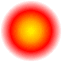
.radial-gradient {
    width: 400px; height: 200px;
    background: radial-gradient(yellow, red);
}
The end result is as follows:
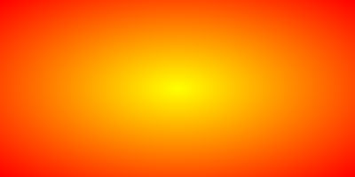
It can be seen that for radial gradients, the gradient distance and location are determined by the size of the container without specifying the gradient type and location.
For example, in this case, the ratio of width to height of the container is 2:1, and the final gradient takes on a 2:1 oval shape, and the gradient color automatically terminates with the edge of the container.
The principle is as follows:
3. Example 2: Simple circular gradient
The CSS code is as follows:
.radial-gradient {
width: 400px; height: 200px;
background: radial-gradient(circle, yellow, red);
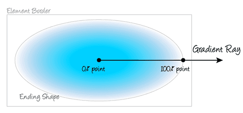
}Its gradient range (gradient end line) is illustrated below, and you will find that it is neither width nor height, but the farthest corner distance as the gradient end line:
Its gradient range (gradient end line) is illustrated below, and you will find that it is neither width nor height, but the farthest corner distance as the gradient end line:

To prove that the above conclusion is relatively simple, we can calculate the lower diagonal half length, Math.sqrt(200200 + 400400)223.6, so we set:
.radial-gradient {
    width: 400px; height: 200px;
    background: radial-gradient(223.6px circle, yellow, red);
}
You will find that the final result is almost identical to the above screenshot.The radius of 200px:
.radial-gradient {
    width: 400px; height: 200px;
    background: radial-gradient(200px circle, yellow, red);
}
If you pick up the color, you will see that the edge colors are quite different, indicating that they are not rendered by default on the shortest edge.
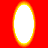
4. Example 3: Specify the starting point of the gradient
The starting point location can be specified by at, for example:
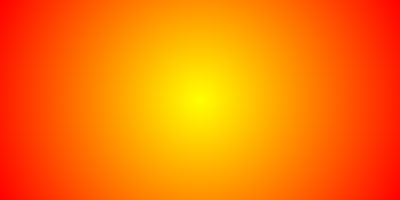
.radial-gradient {
    width: 400px; height: 200px;
    background: radial-gradient(circle at 50px 50px, yellow, red);
}
The effect is as follows:

If you want the gradient to be an ellipse in the same proportion as the container, circle can default, that is, direct radial-gradient(at 50px 50px, yellow, red).
50px 50px We can also use percentage values instead, for example:
.radial-gradient {
    width: 400px; height: 200px;
    background: radial-gradient(circle at 12.5% 25%, yellow, red);
}
The effect is identical.
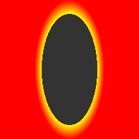
5. Example 4: Specify the end point of the gradient
radial-gradient Radial Gradient supports four keywords to specify the gradient end point location, as shown in the following table:

From the illustration above, you can see that the default value is farthest-corner.
Now we are adjusting CSS as follows:
.radial-gradient {
    width: 400px; height: 200px;
    background: radial-gradient(closest-side circle at 50px 50px, yellow, red);
}
That is, the circle gradient ends at the shortest edge and the result is as follows:
6. Example 5: Specify gradient color breakpoints
If multiple colors are specified without specifying the location of a specific breakpoint, the colors are evenly distributed between 0% and 100% of the gradient area, for example, the following four color gradients:
.radial-gradient {
    width: 200px; height: 200px;
    border: 1px solid silver;
    background: radial-gradient(closest-side circle, yellow, orange, red, white);
}
The results are as follows:
But we can't see from the naked eye if the gradient areas are evenly distributed, but we can verify our point in other ways, such as specifying CSS for the color breakpoint location:?
.radial-gradient2 {
    width: 200px; height: 200px;
    border: 1px solid gray;
    background: radial-gradient(closest-side circle, yellow, orange 33.33%, red 66.666%, white);
}
Because gradient colors default to 0% for the first color and 100% for the last color, the breakpoint positions of yellow and white above can be defaulted.
The effect is then found to be consistent with the above:
Pressing the first circle gradient will instantly cover the subsequent circles.If the two gradients differ in color, the naked eye can feel a noticeable change; however, in practice, the gradient disappears abruptly, indicating that the two gradients actually have the same effect.
7. Example 6: Radial gradient of ellipse type
For circular interfaces, we only need to specify a radius, but for radial gradients of ellipse type, we need to specify both the length of the horizontal and vertical axes, for example:
.radial-gradient {
    width: 200px; height: 200px;
    background: radial-gradient(50px 100px ellipse, transparent 40px, yellow 41px, red);
}
The first value in 50px 100px ellipse is 50px for the transverse radius and 100px for the vertical radius, so this statement represents drawing an ellipse with a height of 200px and a length of 100px.
The effect is as follows:
It is important to note that in the CSS code shown above, there is a 1px bias transition from transparent to the * dividing line, i.e. transparent 40px, yellow 41px where yellow is 41px, not set 40px, because under Chrome, if the color transitions directly to zero bias, there will be more severe jagged teeth, similar to the figure below (background color set to #333):
Sawtooth can be effectively avoided by a 1-pixel or half-pixel transition buffer.
8. Example 7: Accumulable radial gradient background
We can add several radial gradients together to achieve some effect, such as the following CSS:
.radial-gradient {
    width: 200px; height: 200px;
    background: radial-gradient(50px 100px ellipse, transparent 40px, yellow 41px, red 49px, transparent 50px),
                radial-gradient(30px circle, red, red 29px, transparent 30px);
}
The "evil king's true eye" effect has been achieved:

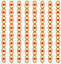
9. Example 8: Dimension control for gradient background
With background-size control and background repetition, we can achieve a progressively complex texture effect:
.radial-gradient {
    width: 200px; height: 200px;
    background: radial-gradient(5px 10px ellipse, transparent 4px, yellow 5px, red 6px, transparent 7px),
                radial-gradient(3px circle, red, red 3px, transparent 4px);
    background-size: 25px;
}
So you can see a big wave of writing wheels:
background-size is often a key property when we use radial gradients to construct simple, practical graphics. For example, to achieve a water wave effect, you can do this:
.radial-gradient {
    width: 200px; height: 100px;
    background: red;
    position: relative;
}
.radial-gradient:after {
    content: '';
    position: absolute;
    height: 10px;
    left:0 ; right: 0;
    bottom: -10px;
    background: radial-gradient(20px 15px ellipse at top, red 10px, transparent 11px);
    background-size: 20px 10px;
}
Then you have the effect shown in the following figure:
10. Example 9: Repeatable radial gradients
If you want to achieve a repeatable radial gradient, you can also use the native repeating-radial-gradient() method, which is particularly suitable for achieving a light effect that diffuses from the center.
However, the actual application scenario of repeating-radial-gradient() is actually limited compared to the repeating-linear-gradient() method.Because, in actual development, we rarely use the effect of light diffusing from the center.
In addition to some effects that are ripple in themselves, such as water waves, sound waves, or album textures:
The following CSS
.radial-gradient {
    position: relative;
    width: 262px; height: 262px;
    border-radius: 50%;
    background: linear-gradient(30deg, transparent 40%, rgba(42, 41, 40, .85) 40%) no-repeat 100% 0, linear-gradient(60deg, rgba(42, 41, 40, .85) 60%, transparent 60%) no-repeat 0 100%, repeating-radial-gradient(#2a2928, #2a2928 4px, #ada9a0 5px, #2a2928 6px);
    background-size: 50% 100%, 100% 50%, 100% 100%;
}
.radial-gradient:after {
    position: absolute;
    top: 50%; left: 50%;
    margin: -35px;
    border: solid 1px #d9a388;
    width: 68px; height: 68px;
    border-radius: 50%;
    box-shadow: 0 0 0 4px #da5b33, inset 0 0 0 27px #da5b33;
    background: #b5ac9a;
    content: '';
}
11. Example 10: Radial gradient as border-image
Radial gradients can be used not only as background maps for backgrounds, but also as border-image border maps.
For example:
.radial-gradient {
    width: 100px; height: 100px;
    border: 50px solid;
    border-image: radial-gradient(circle, transparent 50px, yellow 51px, red) 50 stretch;
}
Unfortunately, border-image does not work with border-radius at the same time. Otherwise, border-image will be fried in the sky.