Front end learning - Advanced Css
Use the front-end introductory course of Duyi to learn. The learning notes are recorded here below. I hope my front-end learning road is smooth.
Development platform: HBulider X.
Learning video: an introduction to the front end.
Reference content: rookie tutorial.
1, css habits
1.1 function before selection
In actual programming, we often use the method of function first and then selection, which makes the programming more modular and efficient.
Try the following code:
<html>
	<head>
		<meta charset="utf-8">
		<title></title>
		<style type="text/css">
			.green{
				background-color: green;
			}
			.red{
				background-color: #FF0000;
			}
			.yellow{
				background-color: yellow;
			}
			.size1{
				width: 50px;
				height: 50px;
			}
			.size2{
				width: 60px;
				height: 60px;
			}

		</style>
	</head>
	<body>
		<div class="green size2"></div>
		<div class="red size1"></div>
		<div class="yellow size1"></div>
	</body>
</html>
1.2 initialize the tag using the tag selector
The initial tag often has the default css format, so the tag selector is often used to initialize the tag.
For example, the hyperlink label is often set to have no underline;
Set the list label to no origin and the padding and margin to 0, which is more in line with the operation of programmers and people's interaction habits.
Also, wildcard labels can be used to set padding and margin to 0 for all label selectors.
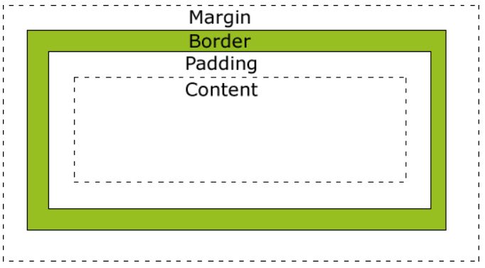
2, css box model
2.1 box introduction
All HTML elements can be regarded as boxes. In CSS, the term "box model" is used for design and layout.
CSS box model is essentially a box that encapsulates the surrounding HTML elements, including margins, borders, padding, and actual content.
The box model allows us to place elements in the space between other elements and the surrounding element frame.
The following picture illustrates the box model:
2.2 box width
When programming, we need to pay attention to the width change caused by several parts.
The total width of the element is calculated as follows:
Total element width = width + left fill + right fill + left border + right border + left margin + right margin
The final calculation formula of the total height of the element is as follows:
Total element height = height + top fill + bottom fill + top border + bottom border + top margin + bottom margin
Note: margin is not used to calculate the visible height.
Try the following:

The code is:
<html>
	<head>
		<meta charset="utf-8">
		<title></title>
		<style type="text/css">
			*{
				margin: 0px;
			}
			.content1{
				width: 10px;
				height: 10px;
				background-color: #FFFFFF;
			}
			.content2{
				width: 10px;
				height: 10px;
				padding: 10px;
				background-color: #008000;
			}
			.content3{
				width: 30px;
				height: 30px;
				padding: 10px;
				background-color: white;
			}
			.content4{
				width: 50px;
				height: 50px;
				padding: 10px;
				background-color: green;
			}
		</style>
	</head>
	<body>
		<div class="content4">
			<div class="content3">
				<div class="content2">
					<div class="content1">
					</div>
				</div>
			</div>
		</div>
	</body>
</html>
3, Layer model
3.1 positioning
Use position to locate elements. The position attribute specifies the location type of the element. The position attribute has five values: static, relative, fixed, absolute, sticky. Elements can be positioned using the top, bottom, left and right attributes. However, these properties do not work unless the position property is set first. They also work in different ways, depending on the positioning method.
3.1.1 static positioning
The default value of HTML elements, that is, no positioning, follows the normal document flow object.
Statically positioned elements are not affected by top, bottom, left and right.
3.1.2 fixed positioning
The position of the element is fixed relative to the browser window.
Even if the window is scrolling, it will not move.
3.1.3 relative positioning
Relative positioning the positioning of an element is relative to its normal position. Unlike absolute, relative retains the original position for positioning.
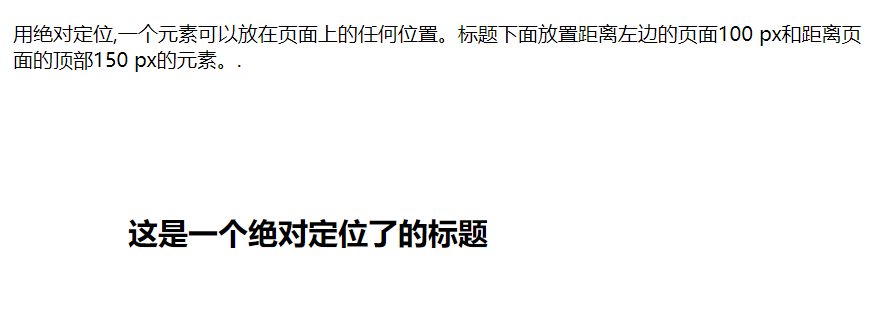
3.1.4 absolute positioning
Position out of the original position. The position of the absolutely positioned element is relative to the nearest positioned parent element. If the element has no positioned parent element, its position is relative to < HTML >
<html>
<head>
<meta charset="utf-8">
<title>Rookie tutorial(runoob.com)</title>
<style>
h2
{
	position:absolute;
	left:100px;
	top:150px;
}
</style>
</head>

<body>
<h2>This is an absolutely positioned title</h2>
<p>Absolute positioning,An element can be placed anywhere on the page. Place 100 pages to the left under the title px And 150 from the top of the page px Element..</p>
</body>
3.1.5 sticky positioning
Sticky literally means sticky, so it can be called sticky positioning.
position: sticky; Positioning is based on the user's scroll position.
The elements of sticky positioning depend on the user's scrolling and switch between position:relative and position:fixed positioning.
It behaves like position:relative; When the page scrolls beyond the target area, it behaves like position:fixed;, It will be fixed at the target position.
Element positioning is relative positioning before crossing a specific threshold, and then fixed positioning.
This specific threshold refers to one of top, right, bottom or left. In other words, specify one of the four thresholds of top, right, bottom or left to make the viscous positioning effective. Otherwise, its behavior is the same as relative positioning.
3.1.6 common positioning methods
Usually, the relative reference is used for positioning, and the absolute reference is used for absolute positioning.
The following code shows how to use absolute to position the container in the center of the page:
<html>
	<head>
		<meta charset="utf-8">
		<title></title>
		<style type="text/css">
			div{
				position: absolute;
				left: 50%;
				top: 50%;
				background-color: #FF0000;
				width: 100px;
				height: 100px;
				margin-top: -50px;
				margin-left: -50px;
			}
		</style>
	</head>
	<body>
		<div></div>
	</body>
</html>
Try the following:
Make the five rings centered in the middle of the page.
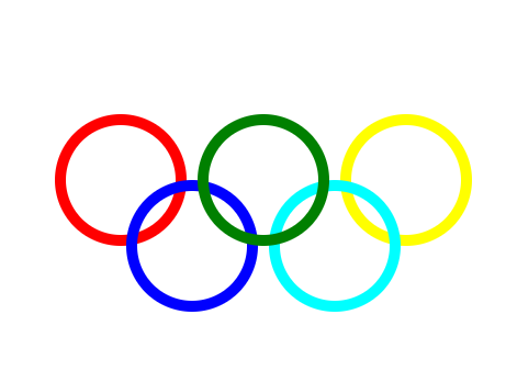
<!DOCTYPE html>
<html>
	<head>
		<meta charset="utf-8">
		<title></title>
		<style type="text/css">
			*{
				padding: 0px;
				margin: 0px;

			}
			.plat{
				position: absolute;
				width: 380px;
				height: 186px;
				left: 50%;
				top: 50%;
				margin-top: -93px;
				margin-left: -190px;
			}
			.circle1,
			.circle2,
			.circle3,
			.circle4,
			.circle5{
				position: absolute;
				width: 100px;
				height: 100px;
				border: 10px solid black;
				border-radius: 50%;
			}
			.circle1{
				border-color: #FF0000;
				left: 0;
				top: 0;
			}
			.circle2{
				border-color: #008000;
				left: 130px;
				top: 0px;
				z-index: 3;
			}
			.circle3{
				border-color: #FFFF00;
				left: 260px;
				top: 0px;
			}
			.circle4{
				border-color: blue;
				left: 65px;
				top: 60px;
			}
			.circle5{
				border-color: aqua;
				left: 195px;
				top: 60px;
			}
		</style>
	</head>
	<body>
		<div class="plat">
			<div class="circle1"></div>
			<div class="circle2"></div>
			<div class="circle3"></div>
			<div class="circle4"></div>
			<div class="circle5"></div>
		</div>
	</body>
3.2 margin collapse
3.2.1 definition of margin collapse
In the standard document stream, the margins in the vertical direction (the vertical direction and the horizontal direction will not collapse) will overlap, that is, the larger margin will cover the smaller margin, and there is only one larger margin between the two boxes in the vertical direction, which is the collapse of margin.
Note: only when the vertical outer margins of two boxes are in full contact can it be triggered.
3.2.2 solution to margin collapse
Using bfc can solve the collapse problem. bfc will learn later.
How to trigger the bfc of a box is discussed below:
1.position:absolute;
2.display:inline-block;
3.float:left/right;
4.overflow:hidden means that the overflow part is hidden.
4, Float
4.1 float
4.1.1 introduction to float
Like box model and layer model, floating is also a common model of css, which is often used in the layout of images or other elements. The horizontal floating of the element means that the element can only move left and right, not up and down.
A floating element moves as far left or right as possible until its outer edge touches the border containing a box or another floating box. The element after the floating element will surround it. Elements before floating elements will not be affected. If the image is floating right, the following text stream will surround it to the left.
4.1.2 float usage
Use < float: left >, < float: right > to float elements. If you put several floating elements together, they will be adjacent to each other if there is space.
Try the following code:
<html>
<head>
<meta charset="utf-8">
<title>Rookie tutorial(runoob.com)</title>
<style>
img
{
	float:right;
	border:1px dotted black;
	margin:0px 0px 15px 20px;
}
</style>
</head>

<body>
<p>
	In the following paragraphs,The image will float to the right. A black dashed border is added to the image.
We also added 0 for the edge px Top and right of margin,15 px bottom margin,And 20 px Left margin Image of. Keep text away from pictures:</p>
<p>
<img src="logocss.gif" width="95" height="84" />
This is some text. This is some text. This is some text.
This is some text. This is some text. This is some text.
This is some text. This is some text. This is some text.
This is some text. This is some text. This is some text.
This is some text. This is some text. This is some text.
This is some text. This is some text. This is some text.
This is some text. This is some text. This is some text.
This is some text. This is some text. This is some text.
This is some text. This is some text. This is some text.
This is some text. This is some text. This is some text.
</p>
</body>

</html>
4.1.3 precautions for float
- Floating elements produce floating streams.
All elements that produce a floating stream, block level elements cannot see them. - Floating does not mean layering.
Floating elements can be seen in elements that generate bfc, elements with text class attributes (inline) and text.
4.2 cleaning and floating
After the element floats, the surrounding elements will be rearranged. To avoid this, use the clear attribute. The clear attribute specifies that floating elements cannot appear on both sides of an element.
Because it is not easy to wrap the floating element directly with the parent element, a clear is usually added after the floating element to clear the floating element.
5, Pseudo class
5.1 pseudo class introduction
The pseudo class selection element is based on the current state of the element, or the current characteristics of the element, rather than the static flags such as id, class and attribute of the element. Because the state changes dynamically, when an element reaches a specific state, it may get the style of a pseudo class; When the state changes, it loses this style again. It can be seen that its function is somewhat similar to class, but it is based on abstraction outside the document, so it is called pseudo class.
5.2 common pseudo classes
5.2.1 anchor pseudo class
In browsers that support CSS, different states of links can be displayed in different ways
Try the following code:
<html>
<head>
<meta charset="utf-8">
<title>Rookie tutorial(runoob.com)</title>
<style>
a:link {color:#000000;}      /*  Link not visited*/
a:visited {color:#00FF00;}  /*  Link visited*/
a:hover {color:#FF00FF;}  /*  Move the mouse over the link*/
a:active {color:#0000FF;}  /*  When the mouse clicks*/
</style>
</head>
<body>
<p><b><a href="/css/" target="_blank">This is a link</a></b></p>
<p><b>be careful:</b> a:hover Must be a:link and a:visited After that, you need to strictly follow the order to see the effect.</p>
<p><b>be careful:</b> a:active Must be a:hover After that.</p>
</body>
</html>
5.2.2 first child pseudo class
You can use the: first child pseudo class to select the first child of the parent element.
Three methods of use are described below:
- Match the first < p > element
p:first-child
{
    color:blue;
}
- Match the first < I > element of all < p > elements
p > i:first-child
{
    color:blue;
}
- Matches all < I > elements in all < p > elements that are the first child element
p:first-child i
{
    color:blue;
}
6, Pseudo element
6.1 pseudo elements
CSS pseudo elements are used to add some special effects of selectors. Different from the pseudo class for elements in a special state, the pseudo element operates on the specific content in the element. Its level of operation is deeper than that of the pseudo class, so its dynamics is much lower than that of the pseudo class. In fact, the purpose of designing pseudo elements is to select the first word (parent) and first line of element content, and select the work that ordinary selectors can't do before or after some content. The content it controls is actually the same as the element, but it is only an abstraction based on the element and does not exist in the document, so it is called pseudo element.
6.2 common pseudo elements
6.2.1 before,after
The ": before" pseudo element can insert new content before the content of the element. The ": after" pseudo element can insert new content after the content of the element.
Try the following code:
<html>
<head>
<meta charset="utf-8">
<title>Rookie tutorial(runoob.com)</title>
<style>
h1:before {content:url(smiley.gif);
h1:after {content:url(smiley.gif);}
</style>
</head>

<body>
<h1>This is a heading</h1>
<p>The :before pseudo-element inserts content before an element.</p>
<h1>This is a heading</h1>
<p><b>be careful:</b>Only if !DOCTYPE Already stated IE8 This content attribute is not supported</p>
</body>
</html>
7, Example
Make the following effect: when the mouse touches the hyperlink, the color will be reversed.
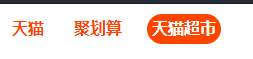
The code is:
<html>
	<head>
		<meta charset="utf-8">
		<title></title>
		<style type="text/css">
			*{
				padding: 0px;
				margin: 0px;
				color: #424242;
				font-family: arial;
			}
			a{
				text-decoration: none;
			}
			.nav{
				list-style: none;
			}
			.nav::after{
				content: "";
				display: block;
				clear: both;
			}
			.nav .list-item{
				float: left;
				height: 30px;
				margin: 10px;
				line-height: 30px;

			}
			.nav .list-item a{
				color: #f40;
				font-weight: bold;
				padding: 0 5px;
				height: 30px;
				display: inline-block;
				border-radius: 15px;

			}
			.nav .list-item a:hover{
				background-color: #f40;
				color: #fff;

			}
		</style>
	</head>

	<body>
		<ul class="nav">
			<li class="list-item">
				<a href="#"> tmall</a></li>
			<li class="list-item">
				<a href="#"> cost effective</a></li>
			<li class="list-item">
				<a href="#"> tmall supermarket</a></li>
		</ul>
	</body>
</html>