This article will show you how to achieve scaling and cropping effects such as pictures through code examples.
Pictures can be used in two ways, one as a child element and the other as a background picture.
In each application, image scaling can be roughly divided into the following situations:
(1). Make sure that the picture is filled with elements and that the excess is cut or hidden.
(2) Ensure that the length or width of the picture is filled with elements, and that the excess is cut or hidden.
Here is a code example to show each of the possibilities listed above. Friends you need can refer to it.
1. As a background picture:
The background-image property of CSS allows you to set the background picture effect of an element.
Here's a demonstration with the following pictures:
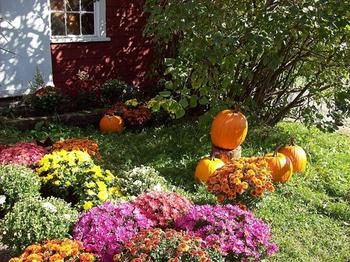
The size of the above picture is 350*262. Let's start with a code sample:
<!DOCTYPE html>
<html>
<head>
<meta charset=" utf-8">
<meta name="author" content="http://www.softwhy.com/" />
<title>background-clip attribute-web Front End Development Learning Button qun: 731771211   Detailed Tutorial Sharing</title>
<style type="text/css">
div{
  border:10px solid green;
  width:250px;
  height:180px;
}
.bg{
  background-image:url(mytest/demo/small.jpg);
  background-repeat:no-repeat
}
</style>
</head>
<body>
<div class="bg"></div>
</body>
</html>
The background-image property sets the element background picture, so the zoom effect of the background picture cannot be set.
Can only be native, adjust the position of the background picture at most, or repeat it.
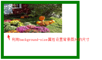
CSS3 adds the background-size property, which sets the size of the background picture.
<!DOCTYPE html>
<html>
<head>
<meta charset=" utf-8">
<meta name="author" content="http://www.softwhy.com/" />
<title>background-clip attribute-web Front End Development Learning Button qun: 731771211   Detailed Tutorial Sharing</title>
<style type="text/css">
div{
  border:10px solid green;
  width:250px;
  height:180px;
}
.bg{
  background-image:url(mytest/demo/small.jpg);
  background-size:200px 100px;
  background-repeat:no-repeat
}
</style>
</head>
<body>
<div class="bg"></div>
</body>
</html>
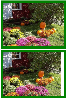
A screenshot of how the code works is as follows:
Using the background-size attribute to assign a fixed value to the length and width of the background image does not intentionally guarantee equal scale scaling.
The background-size attribute has two keyword attribute values, cover and contain, to accommodate scaling effects such as background pictures.
The code examples are as follows:
<!DOCTYPE html>
<html>
<head>
<meta charset=" utf-8">
<meta name="author" content="http://www.softwhy.com/" />
<title>background-clip attribute-web Front End Development Learning Button qun: 731771211   Detailed Tutorial Sharing</title>
<style type="text/css">
div{
  border:10px solid green;
  width:250px;
  height:180px;
  margin:5px;
}
.cover{
  background-image:url(mytest/demo/small.jpg);
  background-size:cover;
  background-repeat:no-repeat
}
.contain{
  background-image:url(mytest/demo/small.jpg);
  background-size:contain;
  background-repeat:no-repeat
}
</style>
</head>
<body>
<div class="cover"></div>
<div class="contain"></div>
</body>
</html>
A screenshot of how the code works is as follows:
Code analysis is as follows:
(1).cover: This property value guarantees that the background image will be scaled to fill the element, and the parts beyond the element will be hidden and cropped.
(2).contain: This property is similar to the cover property and scales equally, but it does not guarantee that the element will be filled, it does ensure that the element will be filled in a certain direction in length or width, for example, in the code above, because the element is filled first in height, the element in width will be discarded.
2. As a child element:
If you only want the picture to be filled with the parent element in one place, you can simply set the corresponding size to 100%.
Pictures can be scaled equally without distortion, as shown in the code sample below:
<!DOCTYPE html>
<html>
<head>
<meta charset=" utf-8">
<meta name="author" content="http://www.softwhy.com/" />
<title>background-clip attribute-Learning front-end, we are serious</title>
<style type="text/css">
div{
  border:10px solid green;
  width:300px;
  height:180px;
  margin:5px;
  overflow:hidden;
}
div img{
  height:100%
}
</style>
</head>
<body>
<div class="ant"><img src="mytest/demo/small.jpg"></div>
</body>
</html>
Setting the height of the picture to 100% ensures that the parent element is filled vertically and scaled equally.The same is true for width, but there is a problem that may arise in an extent where the parent element cannot be filled.
Unable to meet the requirement of tidy layout, here is a code sample that can scale pictures equally to fill the entire parent element, beyond partial cropping.
The code examples are as follows:
<!doctype html>
<html>
<head>
<meta charset="utf-8">
<meta name="author" content="http://www.softwhy.com/" />
<title>Learning front-end, we are serious</title>
<style>
* {
  margin:0px;
  padding:0px;
}
div {
  border:10px solid green;
  width:300px;
  height:200px;
  font-size:0px;
}
</style>
<script>
let DrawImage = (ImgBox, ImgD, iwidth, iheight) => {
  ImgBox.style.overflow = "hidden";
  console.log(ImgD);
  console.log(ImgD.width);
  if (ImgD.width > 0 && ImgD.height > 0) {
    if (ImgD.width / ImgD.height >= iwidth / iheight) {
      ImgD.height = iheight;
      ImgD.width = (image.width / image.height) * iheight;
    }
    else {
      ImgD.width = iwidth;
      ImgD.height = (ImgD.height / ImgD.width) * iwidth;
    }
  }
}
window.onload = function () {
  let odiv = document.getElementsByTagName("div")[0];
  let oimg = document.getElementById("ant");
  DrawImage(odiv, oimg, 300, 200)
}
</script>
</head>
<body>
<div><img id="ant" src="mytest/demo/small.jpg"></div>
</body>
</html>
The code above achieves the function of scaling pictures to fill parent elements, and the code analysis is as follows.
The four parameters of the function are interpreted as follows:
ImgBox: The parent element of the picture, which is its container element.
(2). ImgD: Picture element object, that is, the picture to be scaled.
(3). iwidth: The width of the container element.
(4). iheight: The height of the container element.
An overview of the scaling principle of the internal code is as follows:
(1) If the length-width ratio of the picture is larger than that of the parent element, the width of the picture is relatively larger. As long as the height of the picture is set to the height of the container, the width of the picture will exceed the height of the container and the image will be cut.
(2) If the length-width ratio of the picture is smaller than that of the parent element, the height of the picture is relatively larger. As long as the width of the picture is set to the width of the container, the height of the picture will exceed the height of the container and be cut.
(3). If the aspect ratio of the picture is exactly equal to the aspect ratio of the parent element, this is understandable as long as the width is placed to the width of the container.
These are basic math problems. I feel I can't explain them in any detail. If you have any questions, you can leave a message at the end of the article.
Share more programming knowledge, focus on v-x public number id:mtbcxx