HTML form
Learning objectives
- Be able to say the form components
- Master common HTML form elements
- Master common HTML form attributes
summary
Function of form: used to collect different types of user input
Form composition: form element (control), form area
Forms in life:

Forms in web pages:

Form Elements
A form element is a label that allows users to enter content in a form,
For example: text field, drop-down list, radio box, check box, etc.
Form element label
input tag
-
Overview: labels are the most important form elements.
Different forms can be displayed with different values of the type attribute -
Function: used to define different kinds of input controls
-
Syntax:
-
9 common types
-
type="text"
- Function: single line input field for text input
- Code demonstration
-
type="password"
- Function: define password field.
- Code demonstration
- Note: the characters in this field are masked (displayed as asterisks or filled circles)
-
type="radio"
- Function: define radio buttons, allowing users to select one of a limited number of options (radio button group needs to be specified)
- Code demonstration
-
type="checkbox"
- Function: defines a check box that allows the user to select zero or more options from a limited number of options
- Code demonstration
-
type="button"
- Function: define common buttons
- Code demonstration
- Note: the Value property defines the text displayed by the button
-
type="submit"
- Role: defines the button used to submit the form to the form handler
- Note: the value attribute of the submit button is omitted, and the button will display the default text "submit" (different browsers behave differently)
- Code demonstration
-
type="reset"
- Function: define the reset button to reset the value attribute value of the form element to its original default state
- Note: the value attribute of the submit button is omitted, and the button will display the default text "reset" (different browsers behave differently)
- Code demonstration
-
type="image"
-
Function: define the submit button in image form.
-
attribute
- src = "": specify picture address
- alt = "": specify alternate text
- Note: src attribute and alt attribute must be used in combination with
-
Code demonstration
-
-
type="file"
- Function: used for file upload
- Code demonstration
-
textarea label
- Function: define multi line input fields (text field)
- Syntax: initial value
- Note: you cannot use the value attribute to specify its initial value, which is set between the start and end tags
- Code demonstration
select tag
-
Overview: the select tab is used to define the drop-down list. The drop-down list uses the option tab to define options
-
grammar
- < select name="" id="">
< option value = "" > Beijing < / option >
< option value = "" > Shanghai < / option >
< option value = "" > Tianjin < / option >
- < select name="" id="">
Form element properties
-
name attribute
- The name of the reference element in the form, or the function of the reference element in the form after the form is submitted
- Note: the name attribute is required. Only form elements with the name attribute set can pass their values when submitting the form
- Code demonstration
-
value attribute
- Function: specify the initial value of the input field and the text content on the Modify button
- Code demonstration
-
readonly property
- Function: Specifies that the input field is read-only (cannot be modified)
- Code demonstration
-
disabled attribute
- Function: Specifies that input fields are disabled, and disabled form elements cannot be edited or submitted
- Code demonstration
-
maxlength attribute
- Function: maxlength attribute, which specifies the maximum length allowed for the input field
- Code demonstration
-
selected attribute
- Function: the specified option is pre selected when the page is loaded.
- Code demonstration
-
size attribute
- Function: Specifies the number of options visible in the drop-down list
- Code demonstration
-
The checked radio box or check box is checked by default
Form element annotation
- Function: define labels (tags) for input elements
Bind form elements by the same value of the for attribute of the tag as the id value of the related element - Syntax:
- Effect description: when the user selects the label, the browser will automatically turn the focus to the form control related to the label
form field
form label
- Syntax:
- Function: defines an HTML form field, which is an area containing form elements. Realize the collection and transmission of user information. Examples: for example, the most common interactive operations, such as registered members, post messages or article publishing, etc
- Note: the form form is one of the most common ways to implement the above operations. Other methods can also be used, such as ajax
Properties of form
-
action attribute
- Function: the action attribute of the form defines the file name of the destination file
The file defined by the action attribute usually processes the received input data.
It can be an absolute path or a relative path, or it can be an email address that receives data - Note: if the action attribute is omitted, the action will be set to the current page.
- Code demonstration
- Function: the action attribute of the form defines the file name of the destination file
-
method property
-
Function: Specifies the HTTP method for sending form data
-
Value: get (default) / post
-
get method: add the data in the form of variable=value to the URL pointed to by the action, and use "? For both Connection], and "&" connection is used between variables
-
post method: put the data in the form in the data body of the form and transfer it to the URL pointed to by the action according to the corresponding way of variables and values.
-
Code demonstration
-
Difference between get and post (understand)
Briefly explain that it is not the focus at the current stage- Purpose: get requests data from the specified resources to obtain data from the server, while POST - submits data to be processed to the specified resources to transfer data to the server
- Security: [get is not secure], because [specify the HTTP method (get or post) for sending form data:], some internal messages of the system will be displayed in front of the user. [all post operations are invisible to the user]
- Data volume: [the amount of data transmitted by get is small], which is mainly due to the limitation of URL length; Post can transfer a large amount of data, so you can only use post to upload files (of course, there is another reason, which will be mentioned later).
-
CSS user interface
Learning objectives
- Master how to clear the outline of the form input box and prohibit the multi line text input box from resizing
- Master how to define mouse style
Contour line
Overview: an outline is a line drawn around an element. It is located at the periphery of the border edge and can highlight the element.
The outline attribute specifies the style, color, and width of the element outline.
outline abbreviation
-
Set all profile properties in one declaration.
-
The attributes that can be set are (in order):
outline-color, outline-style, outline-width- Description: outline style
Outline color, outline width - Syntax: space separated
- Value: reference frame
- Description: outline style
-
be careful:
If one of the values is not set, there will be no problem, such as outline:solid #ff0000; It is also allowed.
- Code demonstration: clearing and setting input Outline of
Reset element size
Default: the text field can be resized by dragging and dropping the mouse. resize: none specifies that an element is not allowed to be resized by the user
CSS mouse style
In CSS, the cursor attribute specifies the cursor shape used when the mouse pointer is placed within the boundary of an element
-
Common values
- Default: auto
Default default cursor (usually an arrow)
auto default. The cursor set by the browser.
The crosshair cursor appears as a crosshair.
The pointer cursor appears as a pointer (one hand) indicating the link
move this cursor indicates that an object can be moved. - Code demonstration
- Default: auto
-
Other values
e-resize	This cursor indicates that the edge of the rectangular box can be moved to the right (East).
ne-resize	This cursor indicates that the edge of the rectangle can be moved up and right (North)/East).
nw-resize	This cursor indicates that the edge of the rectangle can be moved up and left (North)/West).
n-resize	This cursor indicates that the edge of the rectangular box can be moved up (North).
se-resize	This cursor indicates that the edge of the rectangle can be moved down and right (South)/East).
sw-resize	This cursor indicates that the edge of the rectangle can be moved down and left (South)/West).
s-resize	This cursor indicates that the edge of the rectangle can be moved down (South).
w-resize	This cursor indicates that the edge of the rectangular box can be moved to the left (West).
text	This cursor indicates the text.
wait	This cursor indicates that the program is busy (usually a watch or hourglass).
help	This cursor indicates the available help (usually a question mark or a balloon).
Layout skills
Classic layout:
Contour layout
Contour layout refers to the layout technique of multiple columns of child elements to achieve contour visual effect in the parent element.
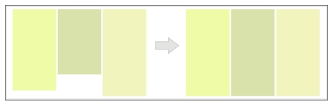
Key points of realization (requirements)
- Multi column
- Each column has a different background
- Any column becomes higher and other columns become higher synchronously
Method 1 inner and outer margin cancellation
Pseudo contour
    <div class="wrap">
        <div class="left">At present, COVID-19 nip in the bud has entered a new normal stage. How to prevent the disease is becoming more and more important. Today, the rain plan will make fuller preparations for dealing with major respiratory diseases in the future. At the same time, it will carry out a one-to-one psychological care plan for the white clothes fighting on the front line</div>
        <div class="center">At present, COVID-19's epidemic prevention has entered the new normal.</div>
        <div class="right">At present, COVID-19 nip in the bud has entered a new normal stage. How to prevent the disease is becoming more and more important. Today, Simba</div>

    </div>
.wrap{
            width:600px;
            border:10px solid #000;
            overflow: hidden;
        }
        .wrap::after{
            content:"";
            display: block;
            clear: both;
        }

        .left,.center,.right{
        	float: left;
            /* Inner margin fill background color */
            padding-bottom: 999px;
            /*
            The outer margin offsets the inner margin to ensure that the effective height of the box remains unchanged
            The height of the parent box depends on the height of the highest column. Write overflow:hidden in the parent box
            The overflow background color part can be cut off, and the background color left in the parent box gives a visual contour

             */
            margin-bottom: -999px;
            /* Box model height = height + padding bottom 999px margin bottom 999px */
        }

        .left{
            width:200px;
            /* Minimum height ---- the specified box can be greater than or equal to 100px */
            min-height:100px;
            background-color:pink;
        }
        .center{
            width:200px;
            /* Minimum height ---- the specified box can be greater than or equal to 100px */
            min-height:100px;
            background-color:yellowgreen;
        }
        .right{
            width:200px;
            /* Minimum height ---- the specified box can be greater than or equal to 100px */
            min-height:100px;
            background-color:skyblue;
        }
Principle:
Fill the background color with the inner margin, and set a large lower inner margin value,
The outer margin offsets the inner margin to ensure that the effective height of the box remains unchanged
The height of the parent box depends on the height of the highest column. Write overflow:hidden in the parent box
The overflow background color part can be cut off, and the background color left in the parent box gives a visual contour
Implementation steps
- Create a normal three column layout by floating (different column backgrounds)
- Parent container clear float
- Each column is fixed with padding bottom, and a negative margin value is specified to offset the space occupation of padding
- Parent container overflow:hidden;
Method 2 background box method
Principle: the boxes are nested layer by layer. When the height of the inner box changes, the height of the outer box will also change synchronously

Really equal height
Implementation steps
- Prepare three boxes for the background bg1,.bg2,.bg3, HTML structure, upper layer nesting
- Will left,. center,. Put the right box into the innermost background box bg3 Li
- The innermost box bg3 clear float
- Will bg2,.bg3 moves relative to the current position to form a three column background effect
- Will left,. The center can move to the corresponding background through the negative value of margin
 <div class="wrap">
        <div class="bg1">
            <div class="bg2">
                <div class="bg3">
                    <div class="left">1 At present, COVID-19 nip in the bud has entered a new normal stage. How to prevent the disease is becoming more and more important. Today, the rain plan will make fuller preparations for dealing with major respiratory diseases in the future. At the same time, it will carry out a one-to-one psychological care plan for the white clothes fighting on the front line</div>
                    <div class="center">2 At present, COVID-19's epidemic prevention has entered the new normal.</div>
                    <div class="right">3 At present, COVID-19 nip in the bud has entered a new normal stage. How to prevent the disease is becoming more and more important. Today, Simba</div>

                </div>
            </div>
        </div>
    </div>
 .wrap{
            border:1px solid #000;
            width:600px;
            overflow: hidden;

        }
        .bg1{
            background-color: pink;
        }

        .bg2{
            background-color: skyblue;
            position:relative;
            left:200px;
        }
        .bg3{
            background-color: orange;

            position:relative;
            left:200px;
        }


        .left,.center,.right{
            width:200px;
            float:left;
            min-height:100px;
        }

        .left{
            margin-left:-400px;
        }
        .center{
            margin-left:-200px;
        }

        .bg3:after{
            content:"";
            display: block;
            clear: both;
        }
Advantages and disadvantages
- Complex structure
- You can create any number of columns
- Easy to adapt by percentage
Overflow display ellipsis

Single line text overflow display ellipsis
.box {
    width: 200px;
    line-height:30px;
    height:90px;
    background-color: red;

    white-space:nowrap;
    text-overflow:ellipsis;
    overflow: hidden;
}
Multiline text overflow display ellipsis
-
Method 1: after implementation
.box {
    width: 200px;
    line-height:30px;
    height:90px;
    background-color: red;

    position:relative;
    text-align:justify;
    overflow: hidden;
}

.box:after{
    content:"...";
    position:absolute;
    right:0;
    bottom:0;
    background-color: red;

    width:1em;
}
This method has a wide range of applications, but ellipsis will also appear when the text does not exceed the travel time. This method can be optimized in combination with js.
explain:
- Set the height to an integer multiple of line height to prevent excessive text from being exposed.
- Adding a gradient background to p::after prevents the text from being displayed in half.
- Compatible ie8 requires: after to be replaced by: after.
-
Method 2: elastic box
.box {
    width: 200px;
    line-height:30px;

    background-color: red;

    /* Old version elastic box */
    display:-webkit-box;
            /* Elastic box elements arranged vertically */
    -webkit-box-orient: vertical;
             /* Controls the number of rows to display */
    -webkit-line-clamp: 4;

    overflow: hidden;
}
Note: due to the use of the CSS extension property of WebKit, this method is applicable to WebKit browser and mobile terminal
explain:
-webkit-line-clamp Used to limit the number of lines of text displayed in a block element. To achieve this effect, it needs to combine other WebKit Properties. Common combination attributes:
display: -webkit-box; The object must be displayed as an elastic box model in combination with the properties of.
-webkit-box-orient The arrangement of the child elements of the expansion box object must be set or retrieved in combination with the properties of the.
fter.
-
Method 2: elastic box
.box {
    width: 200px;
    line-height:30px;

    background-color: red;

    /* Old version elastic box */
    display:-webkit-box;
            /* Elastic box elements arranged vertically */
    -webkit-box-orient: vertical;
             /* Controls the number of rows to display */
    -webkit-line-clamp: 4;

    overflow: hidden;
}
Note: due to the use of the CSS extension property of WebKit, this method is applicable to WebKit browser and mobile terminal
explain:
-webkit-line-clamp Used to limit the number of lines of text displayed in a block element. To achieve this effect, it needs to combine other WebKit Properties. Common combination attributes:
display: -webkit-box; The object must be displayed as an elastic box model in combination with the properties of.
-webkit-box-orient The arrangement of the child elements of the expansion box object must be set or retrieved in combination with the properties of the.