catalogue
5. Filling properties of the table:
6. Spacing properties of cells:
1, List label
1. Unordered list
<ul type='Category of bullets'>
    <li>List content</li>
    <li>List content</li>
    <li>List content</li>
</ul>
2. Ordered list
<ol type='Category of bullets' start='Starting value'><!--The starting value refers to the first starting from the number of bits-->
    <li>List content</li>
    <li>List content</li>
    <li>List content</li>
</ol>
Note: where <-- Where is the annotated content -- > its annotated content will not be displayed in the web page.
3. Tessellation of lists
<ul type='Category of bullets'>
   <li>List content</li>
       <ol type='Bullet category'>
           <li>List content</li>
       </ol>
   <li>List content</li>
       <ul type='Bullet category'>
           <li>List content</li>
       </ul>
   <li>List content</li>
</ul>
Inlay the list in the list. The ordered list and unordered list can be inlaid at will
2, Table label
1. Role of table labels
(1) Used for layout: when making regular web pages, tables will appear more neat and easy to make.
(2) It is used as the control of information management page (control refers to the control for users and the encapsulation of data and methods)
2. Table label
<table border='Width of border line' align='Table alignment on page' bgcolor='The background color of the table' background='Background picture of the table'>
    <caption>Table title</caption>
    <thead> <!--A semantic tag that indicates that the next row is the header of the table-->
        <tr align='Alignment of rows' bgcolor='The background color of the row' background='Background picture'>
            <th width='Column width' >Table content</th>
        </tr>
    </thead>
    <tbody><!--A semantic tag that represents the body of the next behavior table-->
        <tr align='Cell alignment'>
            <td>Table content</td>
        <tr>
    </tbody>
</table>
< caption > Title < / caption > defines the table title and is automatically centered
< thead > < / thead > is a semantic tag indicating that the next row is the header of the table
< tr > < / TR > represents the row of the table, and a < tr > < / TR > represents a row
< th > < / th > indicates the column header, in which the text will be automatically bold and centered
The < tbody > < tbody > semantic tag represents the main part of the following behavior table
<td>< / td > represents the main part of the table
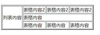
3. Merging of cells
(1) Cross column merge: a cell spans more than one column. Add colspan in the < td > tag. The value of this attribute is the number of columns occupied
<table>
    <tr>
        <td colspan='3'>List content</td>
    </tr>
</table>
Indicates that a cell occupies three columns
(2) Cross row merge: a cell spans more than one row. Add rowspan in the < td > tag. The value of this attribute is the number of rows occupied
<table>
    <tr>
        <td rowspan='3'>List content</td>
    </tr>
</table>
Indicates that a cell occupies three rows

4. Table border properties:
Use the border property to set the thickness of the border line
<table border='2'>
    <tr>
        <td>List content</td>
    </tr>
</table>
The larger the value of border, the thicker the border line
5. Filling properties of the table:
Use the cellpadding property to set the cell content and the margin between cells
<table cellpadding='4'>
    <tr>
        <td>List content</td>
    </tr>
</table>
The greater the value of cellpadding, the greater the distance between the text content and the border line
6. Spacing properties of cells:
Use the cellspacing property to set the spacing between cells
<table cellspacing='2'>
    <tr>
        <td>List content</td>
    </tr>
</table>
The greater the value of cellsnapping, the greater the spacing between cells
3, Form
1. Use
(1) User registration
(2) Collect information
(3) Information feedback - Questionnaire
(4) Search engine
2. Label
(1) Form label:
All dimming spaces must be placed under this label
<form></form>
action attribute: the address of the remote server where the form data is submitted (url of the server)
Method attribute: submission method of form data
<form action="Remote server for form data submission" method="GET">
    <input type="text"/>
</form>
(2) Form control:
1. input control:
a. Single line input text box: < input type ='text '/ >
The input content can be displayed, and the number of characters can be limited
b. Password box: < input type ='password '/ >
When the password is entered in the password box, the typed password cannot be displayed in the form of**
c. Reset button: < input type ='reset 'value =' text displayed on the button '/ >, if there is no value attribute, the button will display' reset 'by default
Note: it is valid only when it is placed in < form > < / form >
d. Submit button: < input type ='submit '/ >, submit the form data to the URL specified by the action
e. Radio button: < input type ='radio 'name =' name of control 'checked / >, attribute' checked 'means selected
f. Check box: < input type ='checkbox '/ > multiple options can be selected
g. Number: < input type ='number '> Only numbers can be entered in the box
h. Date selection box: < input type ='datar '>
i. Time selection box: < input type ='time '>
j. Hidden controls: < input type ='hidden '> will no longer be displayed on the page
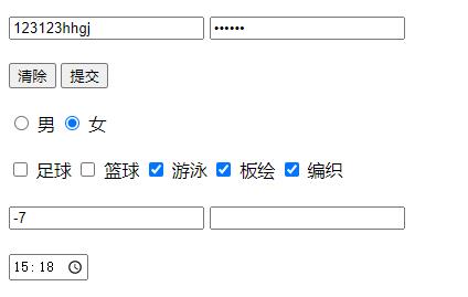
    <form action="#">
        <input type="text">
        <input type="password">
        <br><br>
        <input type="reset" value="eliminate">
        <input type="submit">
        <br><br>
        <input type="radio" name="sex" id="c1">
        <label for="c1">male</label>
        <input type="radio" name="sex" id="c2">
        <label for="c2">female</label>
        <br><br>
        <input type="checkbox" name="hobby" id="h1">
        <label for="h1">Football</label>
        <input type="checkbox" name="hobby" id="h2">
        <label for="h2">Basketball</label>
        <input type="checkbox" name="hobby" id="h3">
        <label for="h3">Swimming</label>
        <input type="checkbox" name="hobby" id="h4">
        <label for="h4">Ubee </label>
        <input type="checkbox" name="hobby" id="h5">
        <label for="h5">weave</label>
        <br><br>
        <input type="number">
        <input type="data">
        <br><br>
        <input type="time">
        <br><br>
        <input type="hidden">
    </form>
Note: if the radio box is bound with text, you need to set id, and the values of radio and id attributes should be the same as those of label's for attribute. You can find the corresponding label of the name attribute value in the background through the name attribute value

2. select control:
Drop down list control
    <select name="place">
        <option value="">Shaanxi Province</option>
        <option value="">Heilongjiang Province</option>
        <option value="">Jilin Province</option>
    </select>
3. textarea control: a text area where you can enter multiple rows and columns of data
<textarea cols='30' rows='10'></textarea>

The cols attribute value sets the length of the horizontal text box, and the rows attribute value sets the length of the vertical text box
4. button control:
Button control
< button type = 'type of button' > < / button >
Value of type attribute: a. type='button ': normal button, excluding default function
b. type='reset ': reset button
b. type='submit ': Submit button to submit the value of the form control to the remote server
5. Label control: used to display text
be careful:
a. All form controls (labels) can have id attribute, and the attribute value of id cannot be repeated
b. All form controls have a value attribute, and the value of the value attribute will be submitted to the remote server
c. All form controls have a name attribute. In the background, you can find the corresponding label through the value of the name attribute
d. The disabled attribute indicates whether input is available (grayed out)
e. The readonly property indicates that the value of input is read-only
f. The attribute placeholder of the single line text input box (< input type ='text '/ >) acts as a prompt
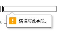
g. The required attribute indicates that input is required
h. The maxlength property indicates the maximum length of input
i. The tabIndex property is used to set the tab order of the form control
j. The title property is used to set the prompt text when the mouse passes by
<form action="#">
        <input type="text" id="r1" value="123456" readonly>
        <input type="password" maxlength="15" required title="Must fill in">
        <br><br>
        <input type="checkbox" name="hobby" id="h1" checked disabled>
        <label for="h1">Football</label>
</form>
