Getting started with the BootStrap framework
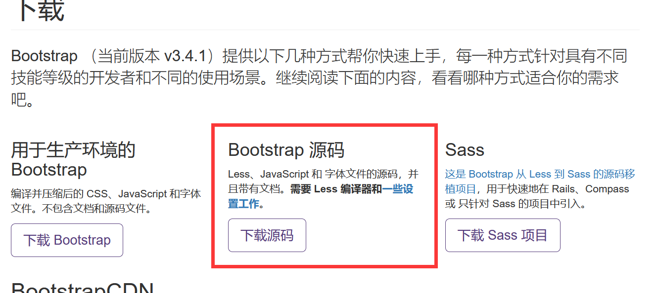
- Download bootstrap source code https://v3.bootcss.com/getting-started/
2. Download jQuery JS file: https://jquery.com/
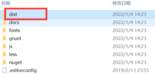
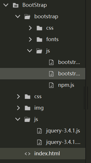
3. Create a new project, copy the dist folder in the bootstrap folder to the project package, and rename it bootstrap;
4. JQuery Copy the js file to the js folder.
5. Layout container
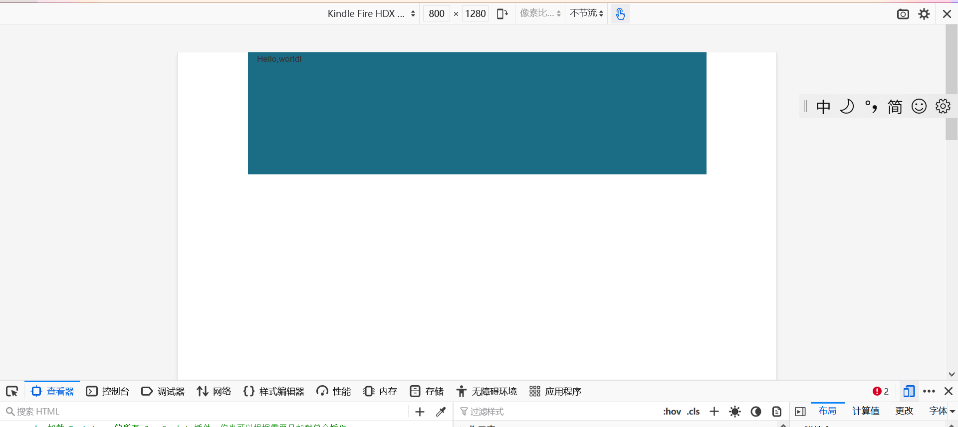
(1). The container class is used for containers with fixed width and supporting responsive layout
<!--container Class is used for containers with fixed width and support responsive layout-->
		<div class="container" style="background-color: #1B6D85; height: 200px;">
			Hello,world!
		</div>
(2) The container fluid class is used for containers that are 100% wide and occupy all viewport s
6. Grid system
BootStrap provides a responsive, mobile device first streaming grid system. With the increase of screen or viewport size, the system will be automatically divided into up to 12 columns. The grid system is used to create a page layout through a combination of row s or columns, and your content can be put into these created layouts.
The implementation of the grid system makes a powerful responsive grid system by defining the container size, dividing it equally into 12 copies (there are also 24 or 32 copies, but 12 copies are the most common), adjusting the internal and external margins, and finally combining the media query. The grid system in bootstrap framework is to divide the container into 12 parts.
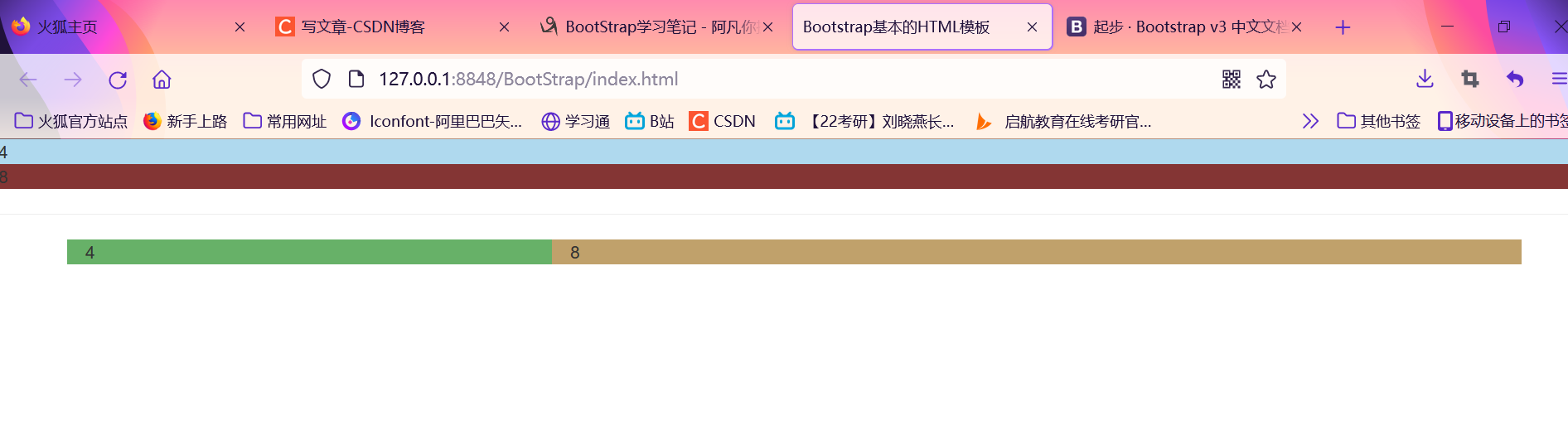
<div style="background-color: #AFD9EE;">4</div>
		<div style="background-color: #843534;">8</div>
		<hr/>
		<div class="container" >
			<!-- Row element -->
			<div class= "row">
				 <!-- Column element  col-xs-numerical value col-sm-numerical value col-md-numerical value col-lg-numerical value -->
				 <div class="col-md-4" style="background-color: #67B168;">4</div>
				 <div class="col-md-8" style="background-color: #C0A16B;">8</div>
			</div>
		</div>
 be careful:
1. Column combination
The total number of columns cannot exceed 12. If it is greater than 12, the whole column will be automatically switched to the downlink.
2. Column offset
Add col MD offset - [] on the column element, where [] is the number of combinations to offset. The principle is to ensure that the number of columns and offset columns does not exceed 12
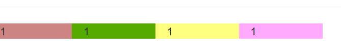
<div class="row">
			<div class="col-md-1" style="background-color: #CE8483;">1</div>
			<div class="col-md-1 col-md-offset-1" style="background-color: #CE8483;">1</div>
			<div class="col-md-1" style="background-color: #CE8483;">1</div>
			<div class="col-md-1 col-md-offset-5" style="background-color: #CE8483;">1</div>
		</div>
3. Column sorting
Change the order of columns, change the left and right floating, and set the floating distance
Add the class name col MD push - [] col MD pull - [], where [] is the number of combinations to move.
 4. Column nesting
Add one or more row containers to a column, and then insert columns into the row containers.
<div class="row">
			<div class="col-md-6" style="background-color: #101010;">
				<div class="row">
					<div class="col-md-1" style="background-color: #CE8483;">1</div>
					<div class="col-md-9" style="background-color: #55aa00;">1</div>
					<div class="col-md-1" style="background-color: #ffff7f;">1</div>
					<div class="col-md-1" style="background-color: #ffaaff;">1</div>
				</div>
			</div>
		</div>
 7. Common styles
(1) Title
In order to use the same style for non Title elements and titles, six class names of h1~h6 are specially defined, and subtitle labels can be used after them.
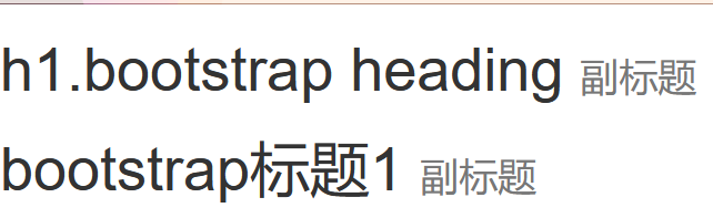
<h1>
			h1.bootstrap heading
			<small>
				Subtitle
			</small>
		</h1>
		<div class="h1">
			bootstrap Title 1
			<span class="small">Subtitle</span>
		</div>
(2) Paragraph
Highlight the content through the lead (the function is to increase the text font size, bold the text, and deal with the line height and margin accordingly)
Small size
Bold
Italics
<p>adopt lead To highlight the content(The function is to increase the text font size,Bold text,And yes<i>Row height</i>and margin Also do<em>corresponding</em>Treatment of)</p>
		<p class="lead">adopt lead To highlight<small>emphasize</small>content(Function is<b>enlarge</b>Text font size,<strong>Bold</strong>text,And for row height and margin Also do the corresponding treatment)</p>
 (3) Emphasize
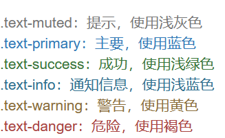
A set of class names are defined to emphasize the class name. All emphasized classes are represented by color
. text muted: prompt, use light gray
. text primary: primary, in blue
. text success: success, use light green
. text Info: notification information, in light blue
. text warning: warning, use yellow
. text danger: danger, use brown
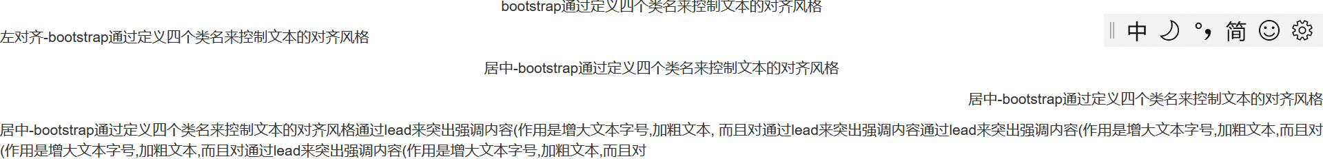
(4) Alignment effect
<p style="text-align: center;">bootstrap Control the alignment style of text by defining four class names</p>
		<p class="text-left">Align left-bootstrap Control the alignment style of text by defining four class names</p>
		<p class="text-center">Center-bootstrap Control the alignment style of text by defining four class names</p>
		<p class="text-right">Center-bootstrap Control the alignment style of text by defining four class names</p>
		<p class="text-justify">Center-bootstrap Control the text alignment style by defining four class names lead To highlight the content(The function is to increase the text font size,Bold text,
				And yes lead To highlight the content through lead To highlight the content(The function is to increase the text font size,Bold text,And yes
				(The function is to increase the text font size,Bold text,And yes lead To highlight the content(The function is to increase the text font size,Bold text,And yes
		</p>
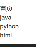
8. List
<!-- Go to point list -->
		<ul class="list-unstyled">
			<li>home page</li>
			<li>java</li>
			<li>python</li>
			<li>html</li>
		</ul>
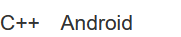
<!-- Inline list definition list -->
		<ul class="list-inline">
			<li>C++</li>
			<li>Android</li>
		</ul>
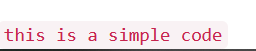
9. Code
<code>this is a simple code</code>
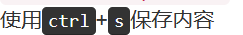
<p>use<kbd>ctrl</kbd>+<kbd>s</kbd>Save content</p>
<pre>
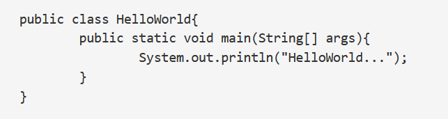
public class HelloWorld{
public static void main(String[] args){
System.out.println("HelloWorld...");
}
}
</pre>
<!-- Add scroll bar -->
<pre class="pre-scrollable">
<ol>
<li>.....</li>
<li>.....</li>
<li>.....</li>
<li>.....</li>
<li>.....</li>
<li>.....</li>
<li>.....</li>
<li>.....</li>
<li>.....</li>
<li>.....</li>
<li>.....</li>
<li>.....</li>
</ol>
</pre>
 10.Bootstrap plug-in
BootStrap rookie tutorial: https://www.runoob.com/bootstrap/bootstrap-intro.html
(1) Navigation
(2) Drop down menu
(3) Modal box
Override child forms in parent form