Jump straight to the end Get the complete source code
In this article, I'll show you how to use HTML and CSS code to create Glass login form . You can convert any simple design into a glass design. To do this, you only need to change the code a little. First, use background color semi transparent, such as RGBA (255255255,0.13). Secondly, we need to use the backdrop filter: blur (10px) to blur the background. Finally, you need to use borders to enhance its beauty.
🎪 Online presentation address
http://haiyong.site/bolitailogin
You can watch the live demonstration to see how it works. If you want to create a glassy login form using HTML and CSS code, please follow the following tutorial.
As you can see in the above demonstration, it is built like a normal login form. Two colored circles are created on the web page.
🥇 Step 1: design a web page
I designed the web page using the following small amount of CSS code. Here I use black as the background color of the web page.
*,
*:before,
*:after{
    padding: 0;
    margin: 0;
    box-sizing: border-box;
}
body{
    background-color: #080710;
}
Output:

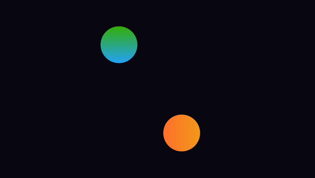
🥈 Step 2: create two colored circles in the background
I created two colored circles on the page using the following HTML and CSS code. Although these two circles are not part of the design, I created these two circles to design the background. However, in this case, you can use any other image.
The circle has a width and height of 200 pixels and uses 50% of the border radius to make it completely circular. Position: absolute to keep it in the same position.
<div class="background">
   <div class="shape"></div>
   <div class="shape"></div>
</div>
.background{
    width: 430px;
    height: 520px;
    position: absolute;
    transform: translate(-50%,-50%);
    left: 50%;
    top: 50%;
}
.background .shape{
    height: 200px;
    width: 200px;
    position: absolute;
    border-radius: 50%;
}
Using the following CSS code, I designed the two and used different colors. I used a blue-green gradient in the background of the first sphere. In the case of the second circle, I used a red yellow gradient.
.shape:first-child{
    background: linear-gradient(
        #1845ad,
        #23a2f6
    );
    left: -80px;
    top: -80px;
}
.shape:last-child{
    background: linear-gradient(
        to right,
        #ff512f,
        #f09819
    );
    right: -30px;
    bottom: -80px;
}
Output:
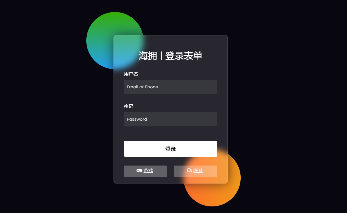
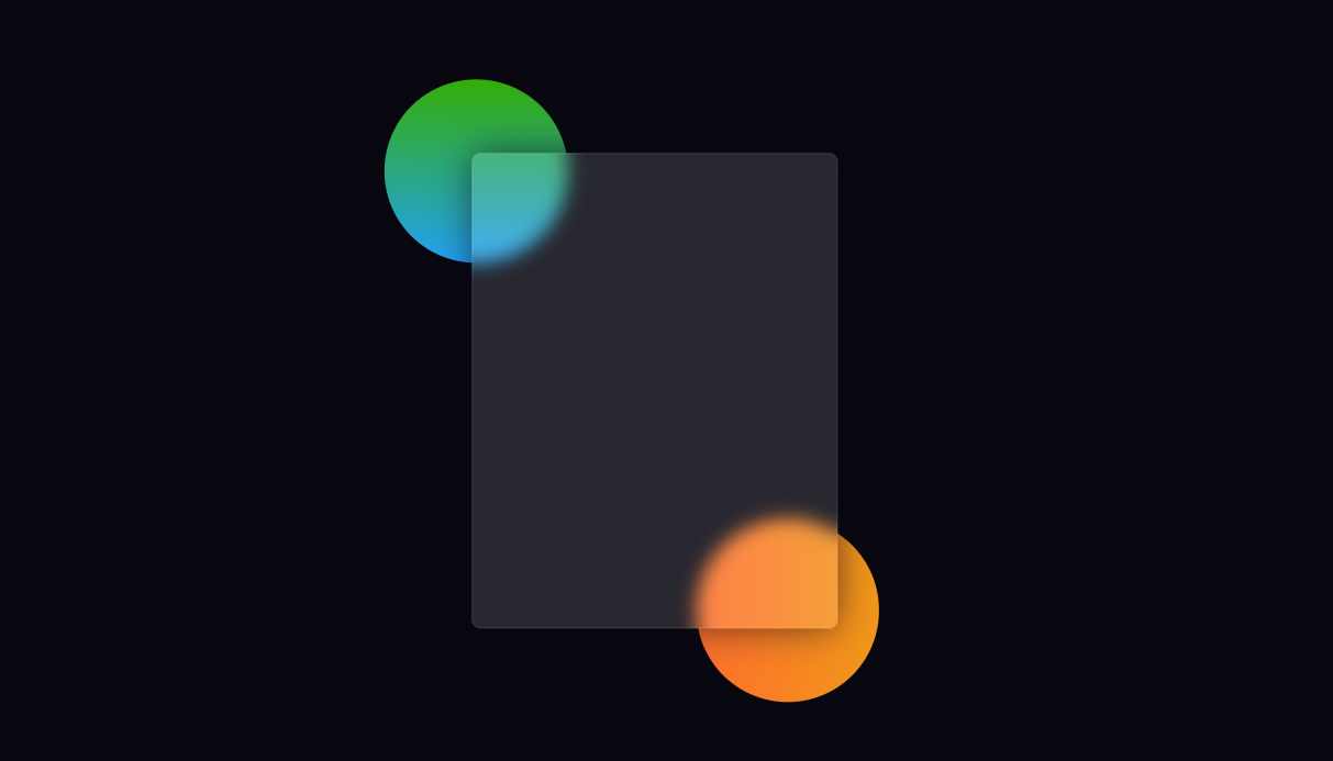
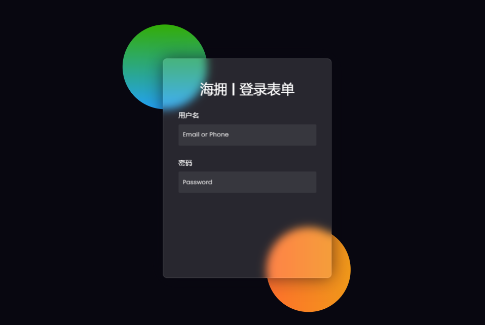
📰 Step 3: create the basic structure of the glassy login form
We created the basic structure of this login form using the following HTML and CSS code. The glass effect login form has a width of 400px and a height of 520px
I used the background color translucent here. Border radius: 10px is used to make the four corners a little round. If you watch the demo, you will see that the color in the background of this login form is a little blurred. To do this, use the backdrop filter: blur (10px).
<form>

</form>
form{
    height: 520px;
    width: 400px;
    background-color: rgba(255,255,255,0.13);
    position: absolute;
    transform: translate(-50%,-50%);
    top: 50%;
    left: 50%;
    border-radius: 10px;
    backdrop-filter: blur(10px);
    border: 2px solid rgba(255,255,255,0.1);
    box-shadow: 0 0 40px rgba(8,7,16,0.6);
    padding: 50px 35px;
}
form *{
    font-family: 'Poppins',sans-serif;
    color: #ffffff;
    letter-spacing: 0.5px;
    outline: none;
    border: none;
}
Output:
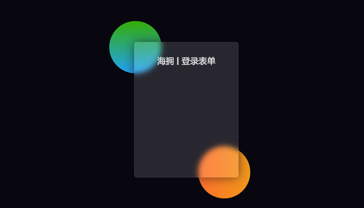
📲 Step 4: add a title to the form
Now using this code, I create a title in the form. I used font size: 32px to increase the text size of the title and text align: Center to keep the text in the middle.
<h3>Hai Yong | login form </h3>
form h3{
    font-size: 32px;
    font-weight: 500;
    line-height: 42px;
    text-align: center;
}
Output:
🎯 Step 5: create an input location for input
Using the code below, I created a place to enter my email ID and password. For this purpose, I use the input function of HTML. I used a 50px high input box and a translucent background color.
<label for="username">user name</label>
   <input type="text" placeholder="Email or Phone" id="username">

 <label for="password">password</label>
   <input type="password" placeholder="Password" id="password">
label{
    display: block;
    margin-top: 30px;
    font-size: 16px;
    font-weight: 500;
}
input{
    display: block;
    height: 50px;
    width: 100%;
    background-color: rgba(255,255,255,0.07);
    border-radius: 3px;
    padding: 0 10px;
    margin-top: 8px;
    font-size: 14px;
    font-weight: 300;
}
::placeholder{
    color: #e5e5e5;
}
Output:
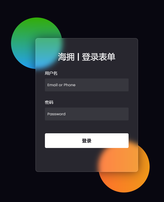
🏆 Step 6: add the login button in the glass login form
Now I have created a login button in the Glassmorphism login form. This login button does not have a specific size.
I've used padding to give this size. The background color of this button is all white, and font size: 18px is used.
<button>Sign in</button>
button{
    margin-top: 50px;
    width: 100%;
    background-color: #ffffff;
    color: #080710;
    padding: 15px 0;
    font-size: 18px;
    font-weight: 600;
    border-radius: 5px;
    cursor: pointer;
}
Output:
🍺 Step 7: create two social buttons
I created two social media buttons at the end. The length of the two buttons is 150px and the background color is translucent.
Here I use the icon I activated using the CDN link of font awesome.
<div class="social">
   <a href="http://haiyong.site/moyu">
   	<div class="go"><i class="fas fa-gamepad"></i>game</div>
   </a>
   <a href="http://haiyong.site/contact">
   	<div class="fb"><i class="far fa-comments"></i>contact</div>
   	</a>
 </div>
.social{
  margin-top: 30px;
  display: flex;
}
.social div{
  background: red;
  width: 150px;
  border-radius: 3px;
  padding: 5px 10px 10px 5px;
  background-color: rgba(255,255,255,0.27);
  color: #eaf0fb;
  text-align: center;
}
.social div:hover{
  background-color: rgba(255,255,255,0.47);
}
.social .co{
  margin-left: 25px;
}
.social i{
  margin-right: 4px;
}
Output:
At this point, the glass login form we created with HTML and CSS has been completed.
🛬 wuhu ! Take off!
I hope that through this article, you have learned how to use HTML and CSS to make glass login forms. I've made more types of gadgets Using HTML, CSS and JavaScript before. You can see these designs if you like.
Simple countdown timer using HTML, CSS, and JS
Random password generator using HTML, CSS and JS
Online music player using HTML, CSS and JS
Make a great weather Web application using HTML, CSS, JS, and API s
Create responsive and filterable game + tool presentation pages using HTML, CSS and JS
11 lovely Valentine's Day Games and animations based on HTML/CSS/JS [Valentine's Day theme]
I have written a technical blog for a long time and mainly published it through CSDN. This is my tutorial on Web glassy login form. I like to share technology and happiness through articles. You can visit my blog: https://haiyong.blog.csdn.net/ For more information. I hope you will like it! 😊
💌 You are welcome to put forward your opinions and suggestions in the comment area! 💌
🎡 Complete source code download
If you really learn something new from this article, like it, collect it and share it with your little friends. 🤗 Finally, don't forget ❤ or 📑 Support it.
Complete source code: Click here to download
The free source code can be obtained through the public reply code below 👇🏻👇🏻👇🏻