1 Preface
Hi, everyone, this is senior student Dan Cheng. Today I'd like to introduce a project to you
Emotional analysis of film review based on GRU
You can use it for graduation design
Bi design help, problem opening guidance, technical solutions
🇶746876041
2 project introduction
This example will analyze and visualize the meteorological data in the northern coastal area of Italy. First of all, we will use the matplotlib Library in Python to chart the data, then call the SVM Library in the scikit-learn library to do regression analysis on the data, and finally draw our conclusion with the support of chart analysis.
Why Italy? Because there are ready-made data sets, if you want to analyze data from other places, you can collect and crawl.
3 start analysis
Meteorological data is a kind of data that can be easily found on the Internet. Many websites provide previous meteorological data such as air pressure, temperature, humidity and rainfall. A meteorological data file can be obtained by specifying the location and date. These measurements are collected by the weather station. Data sources such as meteorological data cover a wide range of information. The purpose of data analysis is to convert the original data into information and then information into knowledge. Therefore, it is very appropriate to take meteorological data as the object of data analysis to explain the whole process of data analysis.
3.1 impact of Ocean on local climate
Italy is a peninsula country surrounded by the sea. Why limit your choice to Italy? Because the problem we study is just related to a typical behavior of Italians, that is, we like to hide by the sea in summer to avoid the hot inland. Italy is a peninsula country. It is not a problem to find sea areas that can be studied, but how to measure the impact of the ocean on different places far and near? This raises a big problem. In fact, Italy is mostly mountainous, almost far from the sea, and there are few inland areas that can be used as a reference. In order to measure the impact of the ocean on the climate, I exclude mountains, because mountains may introduce many other factors, such as altitude.
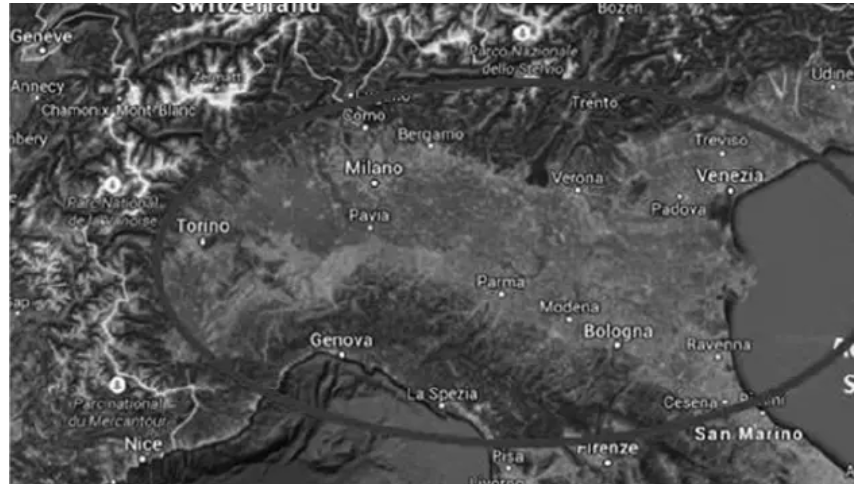
The Po River Basin in Italy is very suitable for studying the impact of the ocean on the climate. This plain starts from the Adriatic Sea in the East and extends hundreds of kilometers inland (see Figure 1). Although there are many mountains around it, it weakens the influence of the mountains because it is very broad. In addition, the region has dense cities and towns, which is also convenient to select a group of cities far and near the sea. The maximum distance between the two cities is about 400 kilometers.
The first step is to select 10 cities as the reference group. When selecting cities, pay attention that they should represent the whole plain area
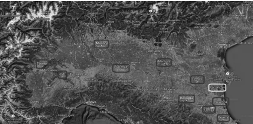
As shown in Figure 2, we selected 10 cities. Then their weather data will be analyzed. Five cities are within 100 kilometers from the sea, and the other five are 100 ~ 400 kilometers from the sea.
The list of cities selected as the sample is as follows:
- Ferrara (Ferrara)
- Torino (Turin)
- Mantova (Mantova)
- Milano (Milan)
- Ravenna (Ravenna)
- Asti (Asti)
- Bologna (Bologna)
- Piacenza (Piacenza)
- Cesena (Cesena)
- Faenza (farnza)
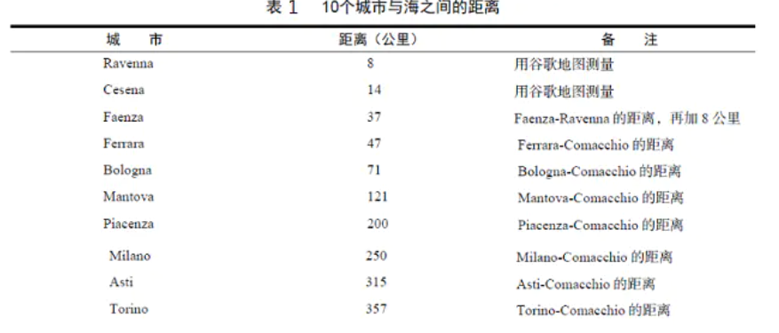
Next, we need to calculate how far these cities are from the sea. Here, the service provided by the timenow website is used to calculate the distance between other cities based on the coastal city Comacchio:
3.2 importing datasets
After downloading the data set, import the relevant package, load the relevant data and start the correlation analysis.
import numpy as np
import pandas as pd
import datetime
df_ferrara = pd.read_csv('WeatherData/ferrara_270615.csv')
df_milano = pd.read_csv('WeatherData/milano_270615.csv')
df_mantova = pd.read_csv('WeatherData/mantova_270615.csv')
df_ravenna = pd.read_csv('WeatherData/ravenna_270615.csv')
df_torino = pd.read_csv('WeatherData/torino_270615.csv')
df_asti = pd.read_csv('WeatherData/asti_270615.csv')
df_bologna = pd.read_csv('WeatherData/bologna_270615.csv')
df_piacenza = pd.read_csv('WeatherData/piacenza_270615.csv')
df_cesena = pd.read_csv('WeatherData/cesena_270615.csv')
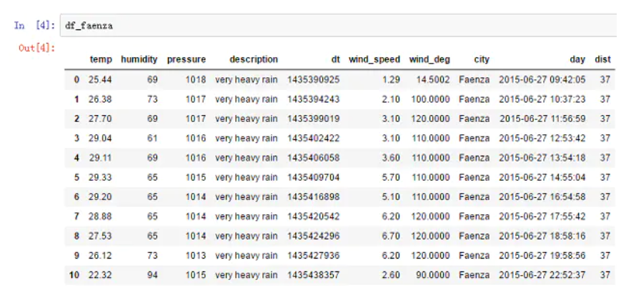
df_faenza = pd.read_csv('WeatherData/faenza_270615.csv')
To view the dataset structure:
3.3 temperature data analysis
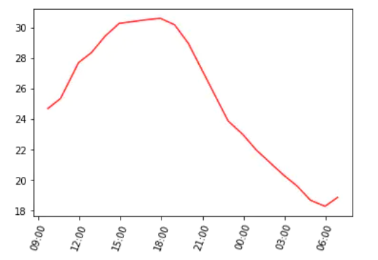
A very simple analysis method is to analyze the change trend of temperature in a day. Take the city of Milan as an example.
# Temperature and date data
x1 = df_milano['day']
y1 = df_milano['temp']

# Convert date data to datetime format
day_milano = [parser.parse(x) for x in x1]

fig, ax = plt.subplots()
# Adjust the x-axis coordinate scale to rotate it by 70 degrees for easy viewing
plt.xticks(rotation=70)
hours = mdates.DateFormatter('%H:%M')
# Sets the format of the X-axis display
ax.xaxis.set_major_formatter(hours)
ax.plot(day_milano ,y1, 'r')
It can be seen from the figure that the temperature trend is close to a sinusoidal curve. The temperature rises gradually from the morning, and the highest temperature occurs between 2:00 and 6:00 p.m. then the temperature gradually decreases and reaches the lowest value at 6:00 a.m. the next day.
The purpose of data analysis is to try to explain whether we can evaluate how the ocean affects the temperature and whether it can affect the temperature trend. Therefore, we can look at the temperature trend of several different cities at the same time. This is the only way to verify that the analysis direction is correct.
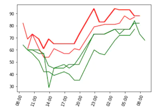
Therefore, I choose three cities closest to the sea and three cities farthest from the sea.
# Read temperature and date data
y1 = df_ravenna['temp']
x1 = df_ravenna['day']
y2 = df_faenza['temp']
x2 = df_faenza['day']
y3 = df_cesena['temp']
x3 = df_cesena['day']
y4 = df_milano['temp']
x4 = df_milano['day']
y5 = df_asti['temp']
x5 = df_asti['day']
y6 = df_torino['temp']
x6 = df_torino['day']

# Convert date from string type to standard datetime type
day_ravenna = [parser.parse(x) for x in x1]
day_faenza = [parser.parse(x) for x in x2]
day_cesena = [parser.parse(x) for x in x3]
day_milano = [parser.parse(x) for x in x4]
day_asti = [parser.parse(x) for x in x5]
day_torino = [parser.parse(x) for x in x6]

fig, ax = plt.subplots()
plt.xticks(rotation=70)
hours = mdates.DateFormatter('%H:%M')
ax.xaxis.set_major_formatter(hours)

ax.plot(day_ravenna,y1,'r',day_faenza,y2,'r',day_cesena,y3,'r')
ax.plot(day_milano,y4,'g',day_asti,y5,'g',day_torino,y6,'g')
The temperature curves of the three cities closest to the sea use red, while the curves of the three cities farthest from the sea use green.
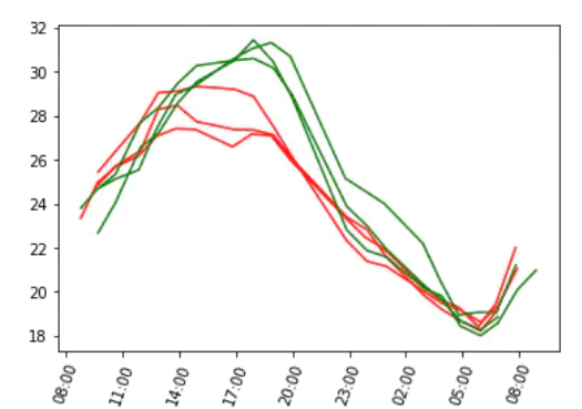
Result analysis: the maximum temperature of the three cities closest to the sea is much lower than that of the three cities farthest from the sea, and the minimum temperature seems to have little difference.
We can do in-depth research along this direction, collect the highest temperature and lowest temperature in 10 cities, and use a linear graph to represent the relationship between the temperature maximum point and the distance from the sea.
# dist is a list of the distance from the city to the sea
dist = [df_ravenna['dist'][0],
    df_cesena['dist'][0],
    df_faenza['dist'][0],
    df_ferrara['dist'][0],
    df_bologna['dist'][0],
    df_mantova['dist'][0],
    df_piacenza['dist'][0],
    df_milano['dist'][0],
    df_asti['dist'][0],
    df_torino['dist'][0]
]

# temp_max is a list of the highest temperatures in each city
temp_max = [df_ravenna['temp'].max(),
    df_cesena['temp'].max(),
    df_faenza['temp'].max(),
    df_ferrara['temp'].max(),
    df_bologna['temp'].max(),
    df_mantova['temp'].max(),
    df_piacenza['temp'].max(),
    df_milano['temp'].max(),
    df_asti['temp'].max(),
    df_torino['temp'].max()
]

# temp_min is a list of the lowest temperatures in each city
temp_min = [df_ravenna['temp'].min(),
    df_cesena['temp'].min(),
    df_faenza['temp'].min(),
    df_ferrara['temp'].min(),
    df_bologna['temp'].min(),
    df_mantova['temp'].min(),
    df_piacenza['temp'].min(),
    df_milano['temp'].min(),
    df_asti['temp'].min(),
    df_torino['temp'].min()
Maximum temperature
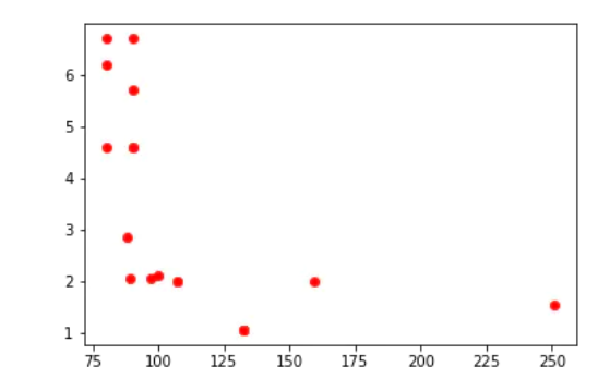
First draw the maximum temperature.
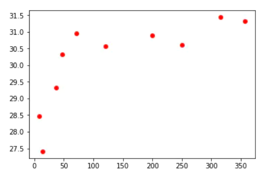
As shown in the figure, the assumption that the ocean has a certain impact on meteorological data is correct (at least for one day). Moreover, it can be found from the figure that the impact of the ocean decays rapidly. 60 ~ 70 kilometers away from the sea, the temperature has climbed to a high level.
Two straight lines are obtained by linear regression algorithm (SVR of scikit learn Library), which represent two different temperature trends respectively.
(this code will run for a long time)
from sklearn.svm import SVR

# dist1 is a collection of cities near the sea, and dist2 is a collection of cities far from the sea
dist1 = dist[0:5]
dist2 = dist[5:10]

# Change the structure of the list. dist1 is now a collection of five lists
# Then we will see that the reshape() function in numpy has the same function
dist1 = [[x] for x in dist1]
dist2 = [[x] for x in dist2]

# temp_max1 is the corresponding maximum temperature of the city in dist1
temp_max1 = temp_max[0:5]
# temp_max2 is the corresponding maximum temperature of the city in dist2
temp_max2 = temp_max[5:10]

# We call the SVR function and specify the use of linear fitting function in the parameters
# And set C to 1000 to fit the data as much as possible (because you don't need accurate prediction and don't worry about over fitting)
svr_lin1 = SVR(kernel='linear', C=1e3)
svr_lin2 = SVR(kernel='linear', C=1e3)

# Add data and fit (this step may take a long time, about 10 minutes, take a break:)
svr_lin1.fit(dist1, temp_max1)
svr_lin2.fit(dist2, temp_max2)

# For the reshape function, see the detailed discussion later in the code
xp1 = np.arange(10,100,10).reshape((9,1))
xp2 = np.arange(50,400,50).reshape((7,1))
yp1 = svr_lin1.predict(xp1)
yp2 = svr_lin2.predict(xp2)
Then draw
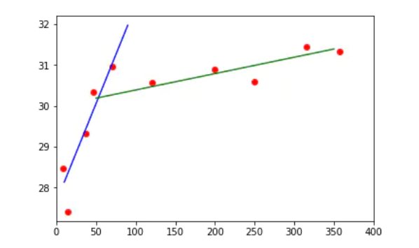
As can be seen above, within 60 kilometers from the sea, the temperature rises rapidly, from 28 degrees to 31 degrees, and then the growth rate gradually eases (if it continues to grow), and there will be a slight increase in the longer distance. These two trends can be represented by two straight lines, and the expression of the straight line is:
y = ax + b (where a is the slope and b is the intercept.)
Consider the intersection of these two straight lines as the dividing point between the areas affected and not affected by the ocean, or at least the dividing point with weak ocean influence.
3.4 humidity data analysis
Investigate the humidity trend of three offshore cities and three inland cities on the same day.
# Read humidity data
y1 = df_ravenna['humidity']
x1 = df_ravenna['day']
y2 = df_faenza['humidity']
x2 = df_faenza['day']
y3 = df_cesena['humidity']
x3 = df_cesena['day']
y4 = df_milano['humidity']
x4 = df_milano['day']
y5 = df_asti['humidity']
x5 = df_asti['day']
y6 = df_torino['humidity']
x6 = df_torino['day']

# Redefine the fig and ax variables
fig, ax = plt.subplots()
plt.xticks(rotation=70)

# Convert time from string type to standard datetime type
day_ravenna = [parser.parse(x) for x in x1]
day_faenza = [parser.parse(x) for x in x2]
day_cesena = [parser.parse(x) for x in x3]
day_milano = [parser.parse(x) for x in x4]
day_asti = [parser.parse(x) for x in x5]
day_torino = [parser.parse(x) for x in x6]

# Expression of specified time
hours = mdates.DateFormatter('%H:%M')
ax.xaxis.set_major_formatter(hours)

#Represented on the diagram
ax.plot(day_ravenna,y1,'r',day_faenza,y2,'r',day_cesena,y3,'r')
ax.plot(day_milano,y4,'g',day_asti,y5,'g',day_torino,y6,'g')
From the picture, it seems that the humidity in offshore cities is greater than that in inland cities, and the humidity difference throughout the day is about 20%.
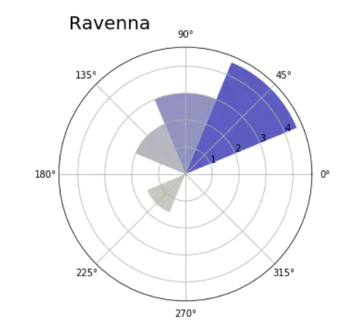
3.5 wind direction frequency rose chart
In the collected meteorological data of each city, the following two are related to wind:
- Wind force (wind direction)
- wind speed
Analysis of the data shows that the wind speed is not only associated with the time period of a day, but also with a value between 0! 360 degrees. (each measurement contains the direction of the wind.)
For wind data, making it into a linear graph is not the best choice. Here, try to make a scatter diagram:
But the chart is not strong enough.
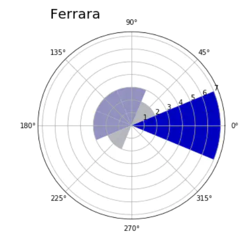
To represent 360 degree data points, it is best to use another visualization method: polar map. First create a histogram, that is, divide 360 degrees into eight bin elements, each bin is 45 degrees, and divide all data points into these eight bin elements.
def showRoseWind(values,city_name,max_value):
    N = 8

    # theta = [pi*1/4, pi*2/4, pi*3/4, ..., pi*2]
    theta = np.arange(0.,2 * np.pi, 2 * np.pi / N)
    radii = np.array(values)
    # Coordinate system for drawing polar map
    plt.axes([0.025, 0.025, 0.95, 0.95], polar=True)

    # The list contains the rgb value of each sector. The larger x is, the closer the corresponding color is to blue
    colors = [(1-x/max_value, 1-x/max_value, 0.75) for x in radii]

    # Draw each sector
    plt.bar(theta, radii, width=(2*np.pi/N), bottom=0.0, color=colors)

    # Set polar map title
    plt.title(city_name, x=0.2, fontsize=20)
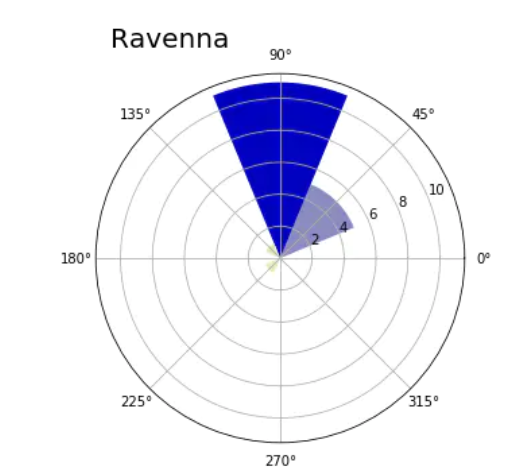
After defining the showRoseWind() function, it is also very simple to view the wind direction of other cities.
3.6 calculate the distribution of mean wind speed
Even other data related to wind speed can be represented by polar map.
Define RoseWind_Speed function to calculate the average wind speed of each of the eight bin elements divided into 360 degree range.
def RoseWind_Speed(df_city):
    # degs = [45, 90, ..., 360]
    degs = np.arange(45,361,45)
    tmp = []
    for deg in degs:
        # Get wind_ Average wind speed data of DEG in the specified range
        tmp.append(df_city[(df_city['wind_deg']>(deg-46)) & (df_city['wind_deg']<deg)]
        ['wind_speed'].mean())
    return np.array(tmp)
4 finally - design help
Bi design help, problem opening guidance, technical solutions
🇶746876041