
Author: Han Xinzi@ShowMeAI
Tutorial address: http://www.showmeai.tech/tutorials/84
Article address: http://www.showmeai.tech/article-detail/178
Notice: All Rights Reserved. Please contact the platform and the author for reprint and indicate the source
introduction
This is one of the most widely used cases of video and audio data processing of HDFS, and presents the results of video and audio data storage.
1. Experimental environment
- (1)Linux: Ubuntu 16.04
- (2)Python: 3.8
- (3)Hadoop: 3.1.3
- (4)Spark: 2.4.0
- (5) Web framework: Flash 1.0.3
- (6) Visualizer: Echarts
- (7) Development tool: Visual Studio Code
To support Python visual analysis, you can run the following command to install the flash component:
sudo apt-get install python3-pip
pip3 install flask
2. Experimental data set
1) Data set description
Data set and source code download
Link: https://pan.baidu.com/s/1C0VI6w679izw1RENyGDXsw
Extraction code: show
The data set of this case comes from Kaggle platform, and the data name is albums CSV, which contains the data of 100000 music albums (you can download it through the above Baidu online disk address). The main fields are described as follows:
- album\_title: music album name
- genre: album type
- year\_of\_pub: album release year
- num\_of\_tracks: number of singles per album
- num\_of\_sales: album sales
- rolling\_ stone\_ Critical: rating of rolling stone website
- mtv\_ Critical: the score of MTV, the world's largest music television network
- music\_ maniac\_ Critical: the score of music talent
2) Upload data to HDFS
(1) Start the HDFS component in Hadoop and run the following command on the command line:
/usr/local/hadoop/sbin/start-dfs.sh
(2) Log in to the user creation directory on hadoop and run the following command on the command line:
hdfs dfs -mkdir -p /user/hadoop
(3) Put the data set albums. In the local file system Upload CSV to distributed file system HDFS:
hdfs dfs -put albums.csv
3.pyspark data analysis
1) Establish engineering documents
(1) Create folder code
(2) Create a project under code Py file
(3) Create a static folder under code to store static files
(4) Create a data directory under the code/static folder to store the json data generated by analysis
2) Conduct data analysis
In this paper, the music album data set albums CSV carried out a series of analysis, including:
(1) Count the number of albums of each type
(2) Count the total sales of all types of albums
(3) Count the number of albums and singles released each year in recent 20 years
(4) Analyze the sales volume of the top five album types in each year
(5) Analyze the average score of the top five album types in different scoring systems
3) Code implementation
- Get data set and code → official GitHub of ShowMeAI https://github.com/ShowMeAI-Hub/awesome-AI-cheatsheets
- Running code segment and learning → online programming environment http://blog.showmeai.tech/python3-compiler
project.py code is as follows:
from pyspark import SparkContext
from pyspark.sql import SparkSession
import json

#Count the number of albums of each type (only ten album types with a total number greater than 2000 are displayed)
def genre(sc, spark, df):
    #Count the total number of albums of each type according to the genre field, and filter out the records with the number greater than 2000
    #And take out 10 types for display
    j = df.groupBy('genre').count().filter('count > 2000').take(10)
    #Convert the list data into json string and write it to the json file in the static/data directory
    f = open('static/data/genre.json', 'w')
    f.write(json.dumps(j))
    f.close()

#Count the total sales of various types of albums
def genreSales(sc, spark, df):
    j = df.select('genre', 'num_of_sales').rdd\
        .map(lambda v: (v.genre, int(v.num_of_sales)))\
            .reduceByKey(lambda x, y: x + y).collect()
    f = open('static/data/genre-sales.json', 'w')
    f.write(json.dumps(j))
    f.close()

#Count the number of albums and singles released each year
def yearTracksAndSales(sc, spark, df):
    #Add the number of albums and singles in the same year and sort them by year
    result = df.select('year_of_pub', 'num_of_tracks').rdd\
        .map(lambda v: (int(v.year_of_pub), [int(v.num_of_tracks), 1]))\
            .reduceByKey(lambda x, y: [x[0] + y[0], x[1] + y[1]])\
                .sortByKey()\
                .collect()

    #In order to facilitate visualization, each field in the list is stored separately
    ans = {}
    ans['years'] = list(map(lambda v: v[0], result))
    ans['tracks'] = list(map(lambda v: v[1][0], result))
    ans['albums'] = list(map(lambda v: v[1][1], result))
    f = open('static/data/year-tracks-and-sales.json', 'w')
    f.write(json.dumps(ans))
    f.close()

#Take out the top five album types with total sales
def GenreList(sc, spark, df):
    genre_list = df.groupBy('genre').count()\
        .orderBy('count',ascending = False).rdd.map(lambda v: v.genre).take(5)
    return genre_list


#Analyze the sales of the top five types of albums in each year
def GenreYearSales(sc, spark, df, genre_list):
    #Filter out the top five albums with the type of total sales, add and sort the sales of albums of the same type and year.
    result = df.select('genre', 'year_of_pub', 'num_of_sales').rdd\
        .filter(lambda v: v.genre in genre_list)\
            .map(lambda v: ((v.genre, int(v.year_of_pub)), int(v.num_of_sales)))\
                .reduceByKey(lambda x, y: x + y)\
                    .sortByKey().collect()

    #In order to facilitate the extraction of visual data, the data is stored in a format suitable for visualization
    result = list(map(lambda v: [v[0][0], v[0][1], v[1]], result))
    ans = {}
    for genre in genre_list:
        ans[genre] = list(filter(lambda v: v[0] == genre, result))
    f = open('static/data/genre-year-sales.json', 'w')
    f.write(json.dumps(ans))
    f.close()

#The average score of the top five album types in different scoring systems
def GenreCritic(sc, spark, df, genre_list):
    #Filter out the top five albums with the same type of total sales, and average the rolling stone score, mtv score and music talent score of the same type of albums
    result = df.select('genre', 'rolling_stone_critic', 'mtv_critic', 'music_maniac_critic').rdd\
        .filter(lambda v: v.genre in genre_list)\
        .map(lambda v: (v.genre, (float(v.rolling_stone_critic), float(v.mtv_critic), float(v.music_maniac_critic), 1)))\
        .reduceByKey(lambda x, y : (x[0] + y[0], x[1] + y[1], x[2] + y[2], x[3] + y[3]))\
        .map(lambda v: (v[0], v[1][0]/v[1][3], v[1][1]/v[1][3], v[1][2]/v[1][3])).collect()

    f = open('static/data/genre-critic.json', 'w')
    f.write(json.dumps(result))
    f.close()


#Code entry

if __name__ == "__main__":
    sc = SparkContext( 'local', 'test')
    sc.setLogLevel("WARN")
    spark = SparkSession.builder.getOrCreate()
    file = "albums.csv"
    df = spark.read.csv(file, header=True)  #dataframe

    genre_list = GenreList(sc, spark, df)

    genre(sc, spark, df)
    genreSales(sc, spark, df)
    yearTracksAndSales(sc, spark, df)
    GenreYearSales(sc, spark, df, genre_list)
    GenreCritic(sc, spark, df, genre_list)
4) Code run
(1) In the Ubuntu terminal window, log in with hadoop user, run su hadoop on the command line, and enter the user password.
(2) Enter the directory where the code is located.
(3) In order to be able to read albums in HDFS CSV file, run on the command line:
/usr/local/hadoop/sbin/start-dfs.sh
(4) Run on the command line:
spark-submit project.py
4. Visualization
=======
The visualization of this case is based on Echarts, and the realized visualization page is deployed on the web server based on flash framework.
- Get data set and code → official GitHub of ShowMeAI https://github.com/ShowMeAI-Hub/awesome-AI-cheatsheets
- Running code segment and learning → online programming environment http://blog.showmeai.tech/python3-compiler
1) Related code structure
(1) Create a new visualizationflash. In the code directory Py file to store the flash application.
(2) Create a new folder named templates under the code directory to store html files.
(3) Create a new folder named js in the code/static directory to store js files.
2) Establish flash application
At sparkflash Copy the following code from the. Py file:
from flask import render_template
from flask import Flask
# from livereload import Server

app = Flask(__name__)

@app.route('/')
def index():
    #Using render_template() method to render the template
    return render_template('index.html')

@app.route('/<filename>')
def req_file(filename):
    return render_template(filename)

if __name__ == '__main__':
    app.DEBUG=True#Code debugging takes effect immediately
    app.jinja_env.auto_reload = True#Template debugging takes effect immediately
app.run()#Use the run() function to make the application run on the local server
3) Download js file
(1) Download jQuery from the website( https://cdn.bootcss.com/jquery/3.4.1/jquery.min.js ), save it as jquery.min.js file, saved in code/static/js directory.
(2) Download Echarts from the official website download interface( https://echarts.apache.org/zh/download.html ), save it as echarts-gl.min.js file, saved in code/static/js directory.
4) Echarts visualization
(1) Create a new index in the code/templates directory HTML file. Copy the following code:
<!DOCTYPE html>
<html lang="en">

<head>
    <meta charset="UTF-8">
    <meta name="viewport" content="width=device-width, initial-scale=1.0">
    <meta http-equiv="X-UA-Compatible" content="ie=edge">
    <title>Music</title>
</head>

<body>
    <h2>Music album analysis</h2>
    <ul style="line-height: 2em">
        <li><a href="genre.html">Statistical chart of the number of albums of each type</a></li>
        <li><a href="genre-sales.html">Sales statistics of various types of albums</a></li>
        <li><a href="year-tracks-and-sales.html">Statistical chart of the number of albums and singles released each year in recent 20 years</a></li>
        <li><a href="genre-year-sales.html">Sales volume analysis chart of the top five album types in each year</a></li>
        <li><a href="genre-critic.html">Score analysis chart of the top five album types in total sales</a></li>
    </ul>
</body>
</html>

index.html It is the main page, which displays the link of the page where each statistical analysis chart is located. Click any link to jump to the corresponding page.
(2) Create a new genere in the code/templates directory HTML file. Copy the following code:
<!DOCTYPE html>
<html>

<head>
    <meta charset="utf-8">
    <title>ECharts</title>
    <!-- introduce echarts.js -->
    <script src="static/js/echarts-gl.min.js"></script>
    <script src="static/js/jquery.min.js"></script>
</head>

<body>
    <!-- by ECharts Prepare one with size (width and height) Dom -->
    <a href="/">Return</a>
    <br>
    <br>
    <div id="genre" style="width: 480px;height:500px;"></div>
    <script type="text/javascript">
        $.getJSON("static/data/genre.json", d => {
            _data = d.map(v => ({
                name: v[0],
                value: v[1]
            }))
            // Initialize the ecarts instance based on the prepared dom
            var myChart = echarts.init(document.getElementById('genre'), 'light');

            // Specify configuration items and data for the chart
            option = {
                title: {
                    text: 'Statistical chart of the number of albums of each type',
                    subtext: 'As can be seen from the figure Indie Type has the largest number of albums.',
                    // x: 'center'
                    x: 'left'
                },
                tooltip: {
                    trigger: 'item',
                    formatter: "{a} <br/>{b} : {c} ({d}%)"
                },
                legend: {
                    x: 'center',
                    y: 'bottom',
                    data: d.map(v => v[0])
                },
                toolbox: {
                    show: true,
                    feature: {
                        mark: { show: true },
                        dataView: { show: true, readOnly: false },
                        magicType: {
                            show: true,
                            type: ['pie', 'funnel']
                        },
                        restore: { show: true },
                        saveAsImage: { show: true }
                    }
                },
                calculable: true,
                series: [
                    {
                        name: 'Radius mode',
                        type: 'pie',
                        radius: [30, 180],
                        center: ['50%', '50%'],
                        roseType: 'radius',
                        label: {
                            normal: {
                                show: false
                            },
                            emphasis: {
                                show: true
                            }
                        },
                        lableLine: {
                            normal: {
                                show: false
                            },
                            emphasis: {
                                show: true
                            }
                        },
                        data: _data
                    }
                ]
            };

            // Use the configuration item and data you just specified to display the chart.
            myChart.setOption(option);
        })
    </script>
</body>
</html>
This is done by reading code / static / data / generic Using the data in JSON, draw a rose chart to show the number of albums of various types.
(3) Create a new generic sales in the code/templates directory HTML file. Copy the following code:
<!DOCTYPE html>
<html>

<head>
    <meta charset="utf-8">
    <title>ECharts</title>
    <!-- introduce echarts.js -->
    <script src="static/js/echarts-gl.min.js"></script>
    <script src="static/js/jquery.min.js"></script>
</head>

<body>
    <a href="/">Return</a>
    <br>
    <br>
    <!-- by ECharts Prepare one with size (width and height) Dom -->
    <div id="genre-sales" style="width: 1000px;height:550px;"></div>
    <script type="text/javascript">
        $.getJSON("static/data/genre-sales.json", d => {
            console.log(d);

            // Initialize the ecarts instance based on the prepared dom
            var myChart = echarts.init(document.getElementById('genre-sales'), 'light');

            var dataAxis = d.map(v => v[0]);
            var data = d.map(v => parseInt(v[1])/1e6);

            option = {
                title: {
                    text: 'Sales statistics of various types of albums',
                    subtext: 'This figure counts the sales volume and of various types of albums, as can be seen from the figure Indie The type of album sold the highest, nearly 4.7 billion. Pop Types of albums ranked second, with about 3.9 billion.',
                    x: 'center',
                    // bottom: 10
                    padding: [0, 0, 15, 0]
                },
                color: ['#3398DB'],
                tooltip: {
                    trigger: 'axis',
                    axisPointer: {            // Axis indicator, axis trigger active
                        type: 'shadow'        // The default is straight line, and the options are: 'line' | 'shadow'
                    }
                },
                grid: {
                    left: '3%',
                    right: '4%',
                    bottom: '3%',
                    containLabel: true
                },
                xAxis: [
                    {
                        type: 'category',
                        data: dataAxis,
                        axisTick: {
                            show: true,
                            alignWithLabel: true,
                            interval: 0
                        },
                        axisLabel: {
                            interval: 0,
                            rotate: 45,
                        }
                    }
                ],
                yAxis: [
                    {
                        type: 'value',
                        name: '# Million Albums',
                        nameLocation: 'middle',
                        nameGap: 50
                    }
                ],
                series: [
                    {
                        name: 'Direct access',
                        type: 'bar',
                        barWidth: '60%',
                        data: data
                    }
                ]
            };

            // Use the configuration item and data you just specified to display the chart.
            myChart.setOption(option);

        })
    </script>
</body>
</html>
This is done by reading code / static / data / generic sales Using the data in JSON, draw a histogram to display the total sales of various types of albums.
(4) Create a new year tracks and sales in the code/templates directory HTML file. Copy the following code:
<!DOCTYPE html>
<html>

<head>
    <meta charset="utf-8">
    <title>ECharts</title>
    <!-- introduce echarts.js -->
    <script src="static/js/echarts-gl.min.js"></script>
    <script src="static/js/jquery.min.js"></script>
</head>

<body>
    <a href="/">Return</a>
    <br>
    <br>
    <!-- by ECharts Prepare one with size (width and height) Dom -->
    <div id="canvas" style="width: 1000px;height:550px;"></div>
    <script type="text/javascript">
        $.getJSON("static/data/year-tracks-and-sales.json", d => {
            console.log(d)
            // Initialize the ecarts instance based on the prepared dom
            var myChart = echarts.init(document.getElementById('canvas'), 'light');

            var colors = ['#5793f3', '#d14a61', '#675bba'];

            option = {
                title: {
                    text: 'Trends in the number of albums and singles in the past 20 years',
                    padding: [1, 0, 0, 15]
                    // subtext: 'the figure shows the change trend of the number of albums and singles released from 2000 to 2019. It can be seen from the figure that the number of albums has changed very little and basically stabilized at about 5000; The number of singles fluctuated slightly, about 10 times the number of albums. "
                },
                tooltip: {
                    trigger: 'axis'
                },
                legend: {
                    data: ['Number of singles', 'Number of albums'],
                    padding: [2, 0, 0, 0]
                },
                toolbox: {
                    show: true,
                    feature: {
                        dataZoom: {
                            yAxisIndex: 'none'
                        },
                        dataView: { readOnly: false },
                        magicType: { type: ['line', 'bar'] },
                        restore: {},
                        saveAsImage: {}
                    }
                },
                xAxis: {
                    type: 'category',
                    boundaryGap: false,
                    data: d['years'],
                    boundaryGap: ['20%', '20%']
                },
                yAxis: {
                    type: 'value',
                    // type: 'log',
                    axisLabel: {
                        formatter: '{value}'
                    }
                },
                series: [
                    {
                        name: 'Number of singles',
                        type: 'bar',
                        data: d['tracks'],
                        barWidth: 15,
                    },
                    {
                        name: 'Number of albums',
                        type: 'bar',
                        data: d['albums'],
                        barGap:  '-100%',
                        barWidth: 15,
                    }
                ]
            };

            // Use the configuration item and data you just specified to display the chart.
            myChart.setOption(option);

        })
    </script>
</body>
</html>
This is done by reading code / static / data / year tracks and sales Based on the data in JSON, draw a histogram to show the number of albums and singles released each year in the past 20 years.
(5) Create a new gene year sales in the code/templates directory HTML file. Copy the following code:
<!DOCTYPE html>
<html>
<head>
<meta charset="utf-8">
<title>ECharts</title>
<!-- introduce echarts.js -->
<script src="static/js/echarts-gl.min.js"></script>
<script src="static/js/jquery.min.js"></script>
</head>
<body>
<a href="/">Return</a>
<br>
<br>
<!-- by ECharts Prepare one with size (width and height) Dom -->
<div id="genre-year-sales" style="width: 1000px;height:550px;"></div>
<script type="text/javascript">
$.getJSON("static/data/genre-year-sales.json", d => {
console.log(d);
// Initialize the ecarts instance based on the prepared dom
var myChart = echarts.init(document.getElementById('genre-year-sales'), 'light');
option = {
legend: {},
tooltip: {
trigger: 'axis',
showContent: false
},
dataset: {
source: [
['year', ...d['Indie'].map(v => `${v[1]}`)],
...['Indie', 'Pop', 'Rap', 'Latino', 'Pop-Rock'].map(v => [v, ...d[v].map(v1 => v1[2])])
]
},
xAxis: { type: 'category' },
yAxis: { gridIndex: 0 },
grid: { top: '55%' },
series: [
{ type: 'line', smooth: true, seriesLayoutBy: 'row' },
{ type: 'line', smooth: true, seriesLayoutBy: 'row' },
{ type: 'line', smooth: true, seriesLayoutBy: 'row' },
{ type: 'line', smooth: true, seriesLayoutBy: 'row' },
{ type: 'line', smooth: true, seriesLayoutBy: 'row' },
{
type: 'pie',
id: 'pie',
radius: '30%',
center: ['50%', '25%'],
label: {
formatter: '{b}: {@2000} ({d}%)' //b is the data name and d is the percentage
},
encode: {
itemName: 'year',
value: '2000',
tooltip: '2000'
}
}
]
};
myChart.on('updateAxisPointer', function (event) {
var xAxisInfo = event.axesInfo[0];
if (xAxisInfo) {
var dimension = xAxisInfo.value + 1;
myChart.setOption({
series: {
id: 'pie',
label: {
formatter: '{b}: {@[' + dimension + ']} ({d}%)'
},
encode: {
value: dimension,
tooltip: dimension
}
}
});
}
});
// Use the configuration item and data you just specified to display the chart.
myChart.setOption(option);
})
</script>
</body>
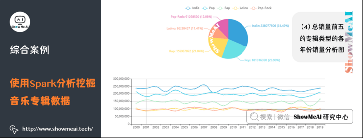
</html>This is done by reading code / static / data / generic year sales According to the data in JSON, draw a fan chart and a broken line chart to show the proportion of the sales of various types of albums in the total sales in different years and the sales changes of the top five album types in each year.
(6) Create a new generic critical.xml file in the code/templates directory HTML file. Copy the following code:
<!DOCTYPE html>
<html>
<head>
<meta charset="utf-8">
<title>ECharts</title>
<!-- introduce echarts.js -->
<script src="static/js/echarts-gl.min.js"></script>
<script src="static/js/jquery.min.js"></script>
</head>
<body>
<a href="/">Return</a>
<br>
<br>
<!-- by ECharts Prepare one with size (width and height) Dom -->
<div id="genre-critic" style="width: 1000px;height:550px;"></div>
<script type="text/javascript">
$.getJSON("static/data/genre-critic.json", d => {
console.log(d);
// Initialize the ecarts instance based on the prepared dom
var myChart = echarts.init(document.getElementById('genre-critic'), 'light');
option = {
legend: {},
tooltip: {},
dataset: {
source: [
['genre', ...d.map(v => v[0])],
['rolling_stone_critic', ...d.map(v => v[1])],
['mtv_critic', ...d.map(v => v[2])],
['music_maniac_critic', ...d.map(v => v[3])]
]
},
xAxis: [
{ type: 'category', gridIndex: 0 },
{ type: 'category', gridIndex: 1 }
],
yAxis: [
{ gridIndex: 0 , min: 2.7},
{ gridIndex: 1 , min: 2.7}
],
grid: [
{ bottom: '55%' },
{ top: '55%' }
],
series: [
// These series are in the first grid.
{ type: 'bar', seriesLayoutBy: 'row' , barWidth: 30},
{ type: 'bar', seriesLayoutBy: 'row' , barWidth: 30},
{ type: 'bar', seriesLayoutBy: 'row' , barWidth: 30 },
// These series are in the second grid.
{ type: 'bar', xAxisIndex: 1, yAxisIndex: 1 , barWidth: 35},
{ type: 'bar', xAxisIndex: 1, yAxisIndex: 1 , barWidth: 35},
{ type: 'bar', xAxisIndex: 1, yAxisIndex: 1 , barWidth: 35},
{ type: 'bar', xAxisIndex: 1, yAxisIndex: 1 , barWidth: 35}
]
};
// Use the configuration item and data you just specified to display the chart.
myChart.setOption(option);
})
</script>
</body>
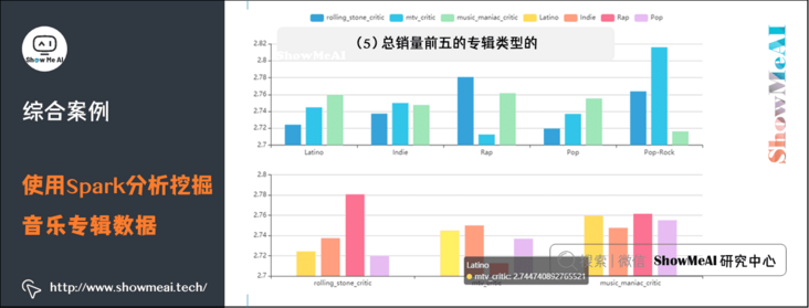
</html>This is done by reading code / static / data / generic critical Based on the data in JSON, draw a column chart to show the average score of the top five album types in different scoring systems.
5) web application startup
① In another Ubuntu terminal window, log in as a hadoop user, run su hadoop on the command line, and enter the user password.
② Enter the directory where the code is located.
③ Run the following command on the command line:
spark-submit VisualizationFlask.py
④ Open in browser http://127.0.0.1:5000/ , you can see the following interface:
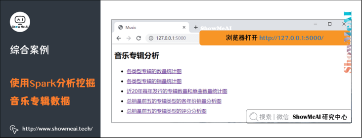
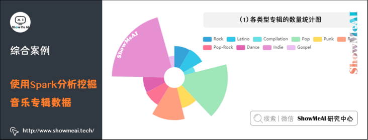
(1) Statistical chart of the number of albums of each type
As can be seen from the figure, Indie has the largest number of albums.
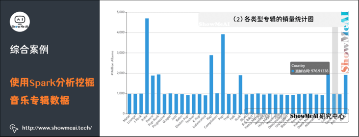
(2) Sales statistics of various types of albums
The figure counts the sales volume and of various types of albums. It can be seen from the figure that Indie has the highest sales volume, nearly 4.7 billion. Pop album sales ranked second, about 3.9 billion.
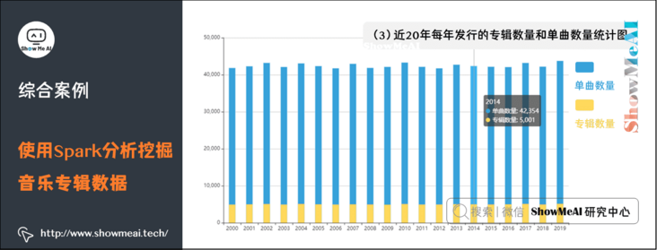
(3) Statistical chart of the number of albums and singles released each year in recent 20 years
(4) Sales volume analysis chart of the top five album types in each year
(5) Score analysis chart of the top five album types in total sales
5. References
- Quick search of data science tools | Spark User Guide (RDD version) http://www.showmeai.tech/article-detail/106
- Quick search of data science tools | Spark User Guide (SQL version) http://www.showmeai.tech/article-detail/107
ShowMeAI related articles recommended
- Illustrated big data | introduction: big data ecology and Application
- Graphic big data | distributed platform: detailed explanation of Hadoop and map reduce
- Illustrated big data | practical case: Hadoop system construction and environment configuration
- Illustrated big data | practical case: big data statistics using map reduce
- Illustrated big data | practical case: Hive construction and application case
- Graphic big data | massive database and query: detailed explanation of Hive and HBase
- Graphic big data | big data analysis and mining framework: Spark preliminary
- Graphic big data | Spark operation: big data processing analysis based on RDD
- Graphic big data | Spark operation: big data processing analysis based on Dataframe and SQL
- Illustrating big data covid-19: using spark to analyze the new US crown pneumonia epidemic data
- Illustrated big data | comprehensive case: mining retail transaction data using Spark analysis
- Illustrated big data | comprehensive case: Mining music album data using Spark analysis
- Graphic big data | streaming data processing: Spark Streaming
- Graphic big data | Spark machine learning (Part I) - workflow and Feature Engineering
- Graphical big data | Spark machine learning (Part 2) - Modeling and hyperparametric optimization
- Graphic big data | Spark GraphFrames: graph based data analysis and mining
ShowMeAI series tutorial recommendations
- Proficient in Python: Tutorial Series
- Graphic data analysis: a series of tutorials from introduction to mastery
- Fundamentals of graphic AI Mathematics: a series of tutorials from introduction to mastery
- Illustrated big data technology: a series of tutorials from introduction to mastery
- Graphical machine learning algorithms: a series of tutorials from introduction to mastery