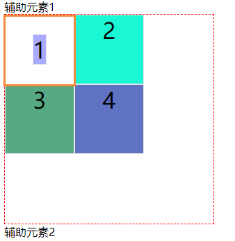
1, Grid layout overview
First, Grid layout and Flex layout With certain similarity, you can specify the location of multiple items in the container. However, the Grid layout is far more powerful than the Flex layout!
- Flex layout is a grid layout. You can only specify the location of the "project" for the grid. It can be regarded as a one-dimensional layout.
- Grid layout is to divide the container into "rows" and "columns", generate cells, and then specify the cell of "project", which can be regarded as a two-dimensional layout.
2, Basic concepts
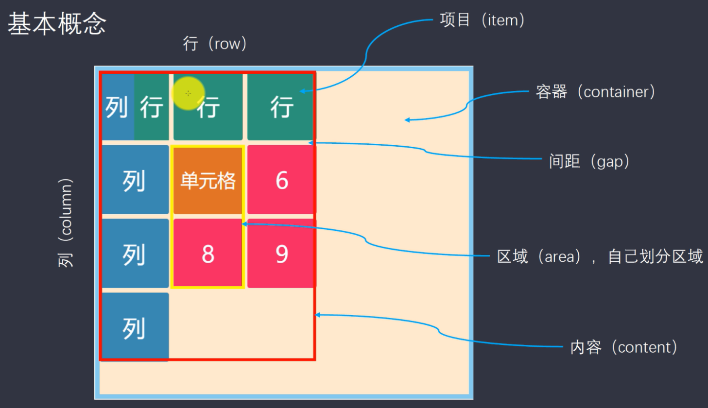
(1) Containers and items
The area with grid layout is called "container". The sub elements located in the container by grid are called "item s".
<div class="container">
  <div class="item"><p>1</p></div>
  <div class="item"><p>2</p></div>
  <div class="item"><p>3</p></div>
</div>
In the above code, if If the display:grid attribute is set in the container, it is the grid layout container and its internal child nodes An item is called a project
Note: the project can only be the top-level child element of the container, and does not contain the child elements of the project, so the p element is not a project. The Grid layout is only valid for projects
(2) Rows and columns
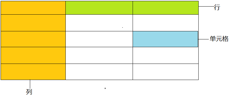
The horizontal area in the container is called "row", the vertical area is called "column", and the cross area between rows and columns is called "cell"
(3) Grid line
The line that divides the mesh is called "grid line". Horizontal grid lines divide trips and vertical grid lines divide columns.
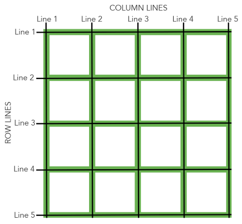
This is a grid with 4 rows and 4 columns. There are 5 horizontal grid lines and 5 vertical grid lines
3, Container properties
The attributes defined on the container are called container attributes
(1)display
- display: grid specifies that a container adopts block level grid layout
<!DOCTYPE html>
<html>
    <head>
        <meta charset="utf-8">
        <title></title>
        <style type="text/css">
            .container{
                display: grid;
                grid-template-columns: 50px 50px;
                grid-template-rows: 50px 50px;
                border: 3px solid #9575CD;
            }
            .item {
              font-size: 2em;
              text-align: center;
              border: 1px solid #e5e4e9;
            }
            .item-1 {
              background-color: #aaaaff;
            }

            .item-2 {
              background-color: #1bf6d5;
            }

            .item-3 {
              background-color: #56a982;
            }

            .item-4 {
              background-color: #6072c2;
            }
        </style>
    </head>
    <body>
<span>Auxiliary element 1</span>
<div class="container">
    <div class="item item-1">1</div>
    <div class="item item-2">2</div>
    <div class="item item-3">3</div>
    <div class="item item-4">4</div>
</div>
<span>Auxiliary element 2</span>
    </body>
</html>

- Display: inline grid specifies that a container adopts an inline grid layout
.container{
    display: inline-grid;
    grid-template-columns: 50px 50px;
    grid-template-rows: 50px 50px;
    border: 3px solid #9575CD;
}
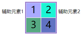
Special note: after the grid layout is set, the settings of float, display: inline block, display: table cell, vertical align and column - * of container sub elements (projects) will become invalid.
.item {
  font-size: 2em;
  text-align: center;
  border: 1px solid #e5e4e9;
  float: right; /* Set all items right float (fail) */
}

It can be seen from the result that the sub item does not float to the far right (failure)
(2) Grid template columns and grid template rows
The grid template columns property defines the column width of each column
The grid template rows property defines the row height of each row
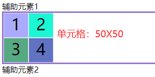
- Use absolute units
.container{
    display: grid;
    grid-template-columns: 50px 50px; /* Define two columns with a column width of 50px */
    grid-template-rows: 50px 50px; /* Define two rows with a height of 50px */
    border: 3px solid #9575CD;
}
- Use percentage Division
.container{
    display: grid;
    grid-template-columns: 20% 10%; /* Define two columns with column width of 20% and 10% */
    grid-template-rows: 40% 30%; /* Define two rows with row height of 40% and 30% */
    border: 3px solid #9575CD;
}

- repeat() function
It can be seen from the above example that the same value can be written repeatedly. If there are many grids, it will appear very bloated. At this time, you can use the reap() function to optimize
.container{
    display: grid;
    grid-template-columns: repeat(2,150px);
    grid-template-rows: repeat(2,50px);
}
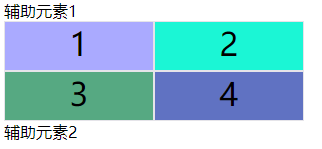
The reap() function receives two values. The first value is the number of repetitions and the second value is the value that needs to be repeated. In addition, it is also possible to repeat a certain pattern:
.container{
    display: grid;
    grid-template-columns: repeat(2,150px 50px);
}

Repeat (2150px, 50px): indicates that the pattern is repeated. Four columns are defined. The first and third columns are 150px, and the second and fourth columns are 50px
- Auto fill keyword
The auto fill value is used for automatic filling. It is used when the cell size needs to be fixed and the container size is uncertain
.container{
    display: grid;
    grid-template-columns: repeat(auto-fill,50px);
}

Repeat (auto fill, 50px): set the width of each column to 50px and fill it automatically until the container can't place more columns, and then wrap it (examples are as follows):
.container{
    display: grid;
    width: 150px;
    border: 1px dashed red;
    grid-template-columns: repeat(auto-fill,50px);
}
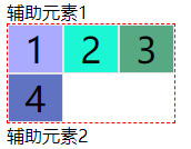 (wrap)
- fr keyword
The fr keyword is used to represent a proportional relationship (abbreviation for fraction, meaning "fragment")
.container{
    display: grid;
    grid-template-columns: 1fr 5fr;
}

1fr 5fr: indicates that two columns are set, the column width is 1fr and 5fr respectively, and the second column is 5 times that of the first column
In addition, fr can be used in combination with the unit of absolute length:
.container{
    display: grid;
    grid-template-columns:50px 1fr 2fr;
}

50px 1fr 2fr: indicates that the width of the first column is 50px, and the width of the second column is half of that of the third column
- auto keyword
The auto keyword indicates that the browser determines its own length
.container{
    display: grid;
    grid-template-columns: 50px auto 50px auto;
}

50px auto 50px auto means that the second and fourth columns are automatically filled, which is equivalent to flex:1
(3) Row gap and column gap
The row gap property sets the spacing between rows (row spacing)
The column gap property sets the interval between columns (column spacing)
.container{
    display: grid;
    grid-template-columns: 50px 50px;
    grid-template-rows: 50px 50px;
    row-gap: 20px; /* The row spacing is 20px */
    column-gap: 10px; /* The column spacing is 10px */
}
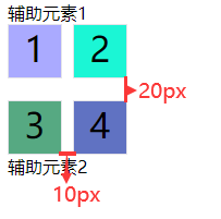
In addition, these two attributes have a composite attribute: gap
gap syntax:
gap: <row-gap> <column-gap>;
.container{
    row-gap: 20px;
    column-gap: 10px;
    /* Equivalent to */
    gap: 20px 10px;
}
Note: if gap has only one value, the second value is equal to the first value by default
Popularity: these three attribute names were originally prefixed by grid -. At present, the grid prefix has been deleted in the latest standard, but it can still be used~
(4)grid-auto-flow
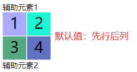
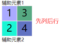
After the grid is divided, the sub elements in the container are automatically placed in each grid in the order of "first, then column" by default (fill the first row first and start the second row at the beginning)
The grid auto flow attribute specifies the sorting order by itself. The default value is row. You can set column, similar to flex direction.container{ display: grid; grid-template-columns: 50px 50px; grid-template-rows: 50px 50px; grid-auto-flow: row; /* Default value */ }
.container{
    display: grid;
    grid-template-columns: 50px 50px;
    grid-template-rows: 50px 50px;
    grid-auto-flow: column; /* Column before row */
}
(5) Justify items and align items
The justify items property sets the horizontal position of the cell contents (left, middle, right)
The align items property sets the vertical position (top, middle and bottom) of the cell content
Syntax:
.container {
  justify-items: start | end | center | stretch;
  align-items: start | end | center | stretch;
}
You are not mistaken. The attribute values of these two attributes are exactly the same. You can use these values:
- Start: align the start edge of the cell.
- End: aligns the end edge of the cell.
- Center: center inside the cell.
- Stretch: stretch to fill the entire width of the cell (default).
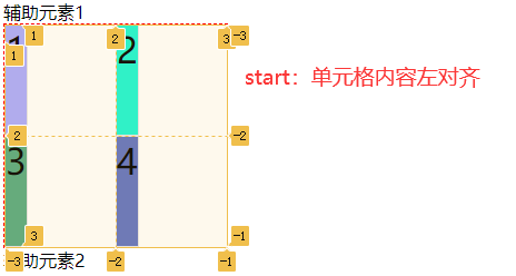
start: align the contents of the cell with the header:
.container{
    display: grid;
    width: 200px;
    border: 1px dashed red;
    grid-template-columns: 100px 100px;
    grid-template-rows: 100px 100px;
    justify-items: start;
}
The effect is shown in the figure:
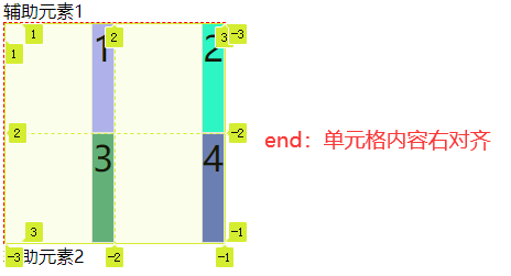
End: align the contents of the cell to the end:
.container{
    display: grid;
    width: 200px;
    border: 1px dashed red;
    grid-template-columns: 100px 100px;
    grid-template-rows: 100px 100px;
    justify-items: end; /* Align end edges of cells */
}
The effect is shown in the figure:
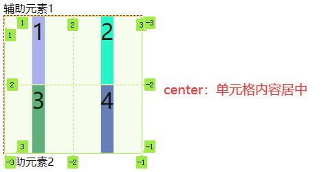
Center: center inside the cell:
.container{
    display: grid;
    width: 200px;
    border: 1px dashed red;
    grid-template-columns: 100px 100px;
    grid-template-rows: 100px 100px;
    justify-items: center; /* Center inside cell */
}
The effect is shown in the figure:
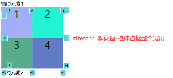
Stretch: occupy the entire width of the cell (stretch):
.container{
    display: grid;
    width: 200px;
    border: 1px dashed red;
    grid-template-columns: 100px 100px;
    grid-template-rows: 100px 100px;
    justify-items: stretch; /* Default - the stretch occupies the entire width */
}
The effect is shown in the figure:
Here, we only demonstrate the "justify items" attribute, which corresponds to the left, middle and right of the cell. I believe you also feel that the value of "align items" is the same, which corresponds to the upper, middle and lower parts of the cell. We won't demonstrate it here. Interested partners try it by themselves
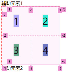
Similarly, these two attributes have a composite attribute: place items
Syntax:
place-items: <align-items> <justify-items>;
The first value is the vertical position of the cell content, and the second value is the horizontal position of the cell
.container{
    display: grid;
    width: 200px;
    border: 1px dashed red;
    grid-template-columns: 100px 100px;
    grid-template-rows: 100px 100px;
    place-items: center center; /* The cell contents are centered horizontally and vertically */
}
The effect is shown in the figure:
Note: if the second value is omitted, it is equal to the first value by default
(6) Justify content and align content
The justify content attribute is the horizontal position (left, middle, right) of the entire content area inside the container
The align content attribute is the vertical position (top, middle and bottom) of the entire content area
Pay attention to distinguish between justify items and align items. One is the position of the content relative to the cell, and the other is the position of the whole content area relative to the parent container!!!
Syntax:
.container {
  justify-content: start | end | center | stretch | space-around | space-between | space-evenly;
  align-content: start | end | center | stretch | space-around | space-between | space-evenly;
}
You are not mistaken. The attribute values of these two attributes are exactly the same. You can use these values:
-
Start - aligns the start border of the container.
-
End - aligns the end border of the container.
-
Center - center inside the container.
-
Stretch - when the item size is not specified, the stretch occupies the entire mesh container.
-
Space around - equal spacing on both sides of each item. Therefore, the spacing between items is twice as large as the spacing between items and container borders.
-
Space between - the space between items is equal, and there is no space between items and container borders.
-
Space evenly - the interval between items is equal, and the interval between items and container border is the same length.
Similarly, I only demonstrate the justify content attribute here. The align content attribute is exactly the same, but in different directions. Interested partners can try it by themselves~~
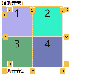
Start: align the start border of the container.
.container{
    display: grid;
    width: 300px;
    border: 1px dashed red;
    grid-template-columns: 100px 100px;
    grid-template-rows: 100px 100px;
    justify-content: start;/* Align the start border of the container (default) */
}
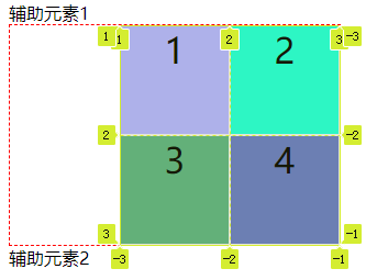
End: aligns the end border of the container.
.container{
    justify-content: end;/* Align the end border of the container */
}
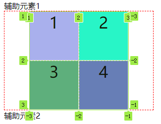
Center: center inside the container.
.container{
    justify-content: center;/* Center inside container */
}
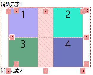
Space around: the space on both sides of each item is equal. The spacing between items is twice as large as the spacing between items and the container border.
.container{
    justify-content: space-around;/* The spacing on both sides of each item is equal. The spacing between items is twice as large as the spacing between items and the container border */
}
Space between: the space between items is equal, and there is no space between items and container borders.
.container{
    justify-content: space-between;/* The interval between items is equal, and there is no interval between items and container borders. */
}
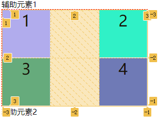
Space evenly: the interval between items is equal, and the interval between items and container border is the same length.
.container{
    justify-content: space-evenly;/* The interval between items is equal, and the interval between items and container border is the same length. */
}
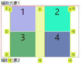
I believe you have learned after reading these attribute values Flex layout I'm sure my little friends are familiar with it. The alignment of items and containers in flex layout is similar to these
Similarly, these two attributes also have a composite attribute: place content
Syntax:
place-content: <align-content> <justify-content>
The first value is the vertical position of the whole content relative to the container, and the second value is the horizontal position of the whole content relative to the container
.container{
    display: grid;
    width: 300px;
    height: 300px;
    border: 1px dashed red;
    grid-template-columns: 100px 100px;
    grid-template-rows: 100px 100px;
    place-content: center center; /* The overall content is horizontally and vertically centered */
}
The effect is shown in the figure:
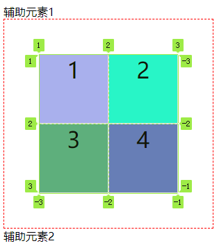
Note: if the second value is omitted, it is equal to the first value by default
4, Project properties
Note: project attributes need to be defined on the project to be effective!
(1)grid-column-start,grid-column-end,grid-row-start,grid-row-end
These four attributes are used to specify the location of an item and locate the sub grid line according to the four borders of the item
-
Grid column start attribute: the vertical grid line where the left border is located
-
Grid column end attribute: the vertical grid line where the right border is located
-
Grid row start attribute: the horizontal grid line where the top border is located
-
Grid row end attribute: the horizontal grid line where the lower border is located
The code snippet shown below is also based on the previous example:
.container{
    display: grid;
    width: 300px;
    height: 300px;
    border: 1px dashed red;
    grid-template-columns: 100px 100px;
    grid-template-rows: 100px 100px;
}
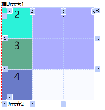
.item-1 {
    grid-column-start: 2;/* Starts at the second grid line */
    grid-column-end: 4;/* Ends at the fourth grid line */
    background-color: #aaaaff;
}
The effect is shown in the figure:
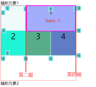
Only item 1 is specified, and other items are automatically laid out. To facilitate observation, locate again:
.item-1 {
    grid-column-start: 2;/* Vertical first */
    grid-column-end: 4; /* Vertical fourth */
    grid-row-start: 1;/* Horizontal first */
    grid-row-end: 3;/* Horizontal third root */
    background-color: #aaaaff;
}
The effect is as follows:
These four attribute values can also use the span keyword to represent "span", just like the cell merging colspan and rowspan of table
.item-1 {
    grid-column-start: span 2;/* Across two grid lines */
    /* Equivalent to */
    grid-column-end: span 2;/* Across two grid lines */
    background-color: #aaaaff;
}
The effect is shown in the figure:
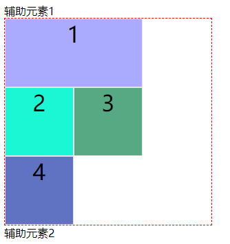
This result is believed that some small partners will say why other child elements do not continue to be arranged after the first child element?
What I want to say is grid template columns: 100px 100px; I only set two columns. If it is changed to grid template columns: 100px 100px 100px; In this way, the remaining space of the container can be filled~
Note: using these four attributes, if items overlap, use the z-index attribute to specify the overlapping order of items
(2) Grid column and grid row
Grid column: the short form of the combination of grid column start and grid column end
Grid row: the combined shorthand form of grid row start attribute and grid row end
Syntax:
.item {
  grid-column: <start-line> / <end-line>;
  grid-row: <start-line> / <end-line>;
}
Have a chestnut:
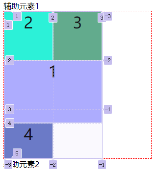
.item-1 {
    grid-column: 1 / 3; /* Occupy the first and third roots in the horizontal direction */
    grid-row: 2 / 4; /* Occupy the 2nd and 4th in the vertical direction */
    background-color: #aaaaff;
}
The effect is shown in the figure:
Note: the slash and the following part can be omitted and span a grid by default
(3) Justify self and align self
The justify self property sets the horizontal position of the cell content (left, middle and right), which is exactly the same as the usage of the justify items property, but only works on a single item.
The align self property sets the vertical position (top, middle and bottom) of the cell content, which is exactly the same as the use of the align items property, and only works on a single item.
Syntax:
.item {
  justify-self: start | end | center | stretch;
  align-self: start | end | center | stretch;
}
Value:
-
Start: align the start edge of the cell.
-
End: aligns the end edge of the cell.
-
Center: center inside the cell.
-
Stretch: stretch to fill the entire width of the cell (default)
.item-1 {
    justify-self: start; /* Specifies the left alignment of the item cell */
    background-color: #aaaaff;
}
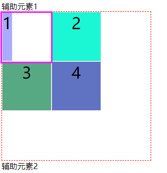
Here I will demonstrate one. Everything else is the same. You can try it yourself
The place self attribute is a combined shorthand form of the align self attribute and the justify self attribute
Syntax:
place-self: <align-self> <justify-self>;
example:
.item-1 {
    place-self: center center;
    background-color: #aaaaff;
}
