layout
What is layout
Layout is to divide the pages into pieces according to their own ideals, arrange them in order, and save them for the contents
Several ways of layout
- Table layout (not commonly used now)
- div+position+float layout
- grid layout (generally responsible for comparing regular pages)
- flex layout (generally applicable to the layout of mobile terminal)
Introduction to basic knowledge
When the display is used to lay out the container, the child elements under the container become the project.
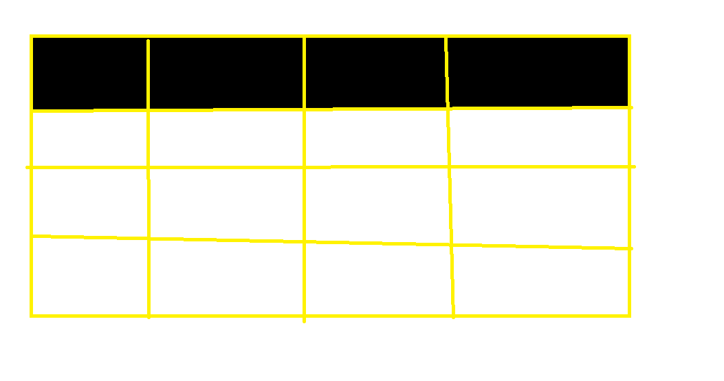
Line: black part in the figure
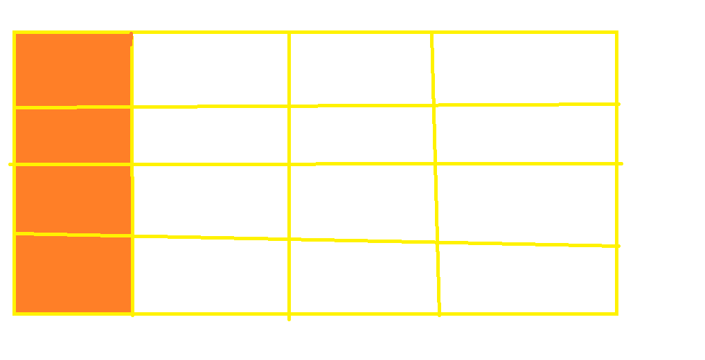
Columns: orange part of the diagram
Cells: each gray part in the diagram
Grid line: yellow line in the figure (note that n rows or columns will have n+1 lines)
Rails: the middle of two grid lines
Grid
What is grid layout
Grid layout is grid layout, which divides web pages into grids one by one, and then combines these grids to make a variety of layouts.
Usage (create rows and columns)
By setting the CSS attribute display: grid (block level element) or display: inline grid (inline block element)
Note: after the grid layout is set, the settings of float, display: inline block, display: table cell, vertical align and column of container child elements will become invalid.
attribute
| grid | describe |
|---|---|
| grid-template-rows | that 's ok |
| grid-template-columns | column |
| grid-template | Rows and columns |
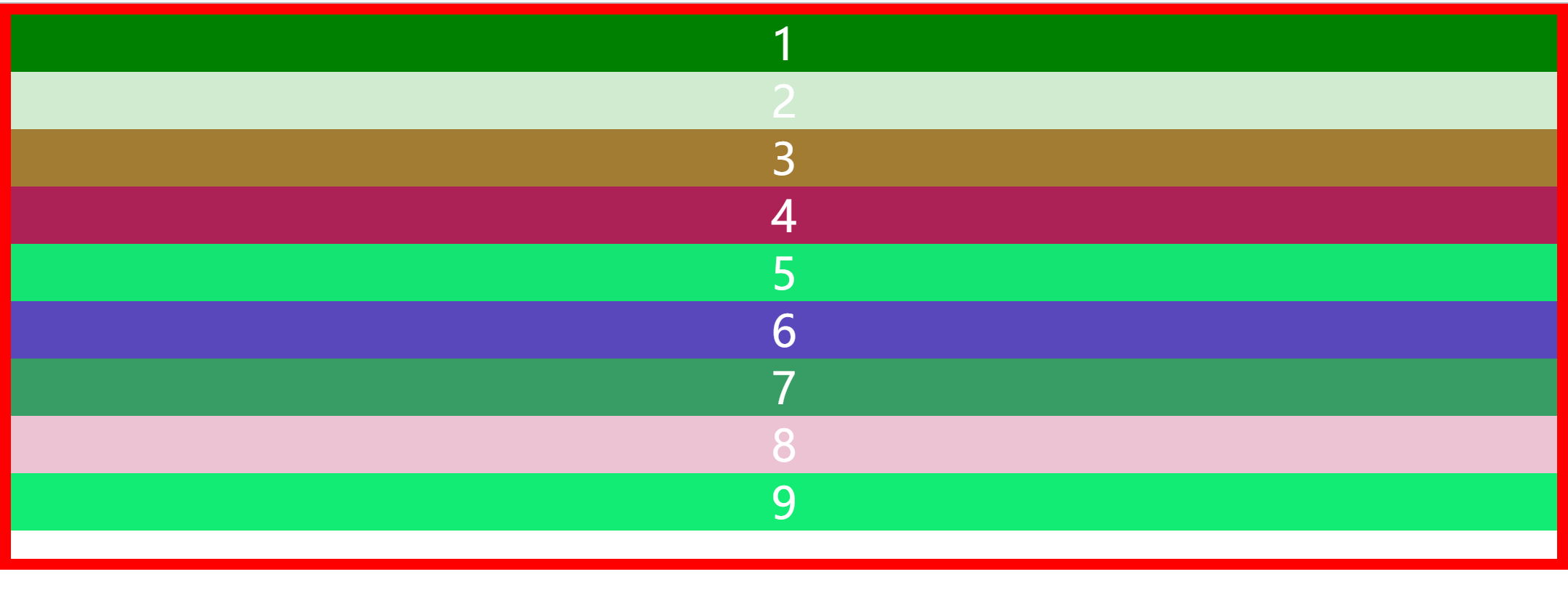
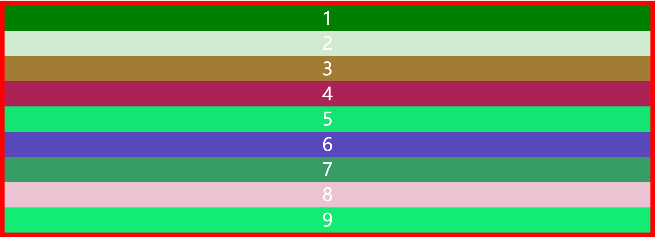
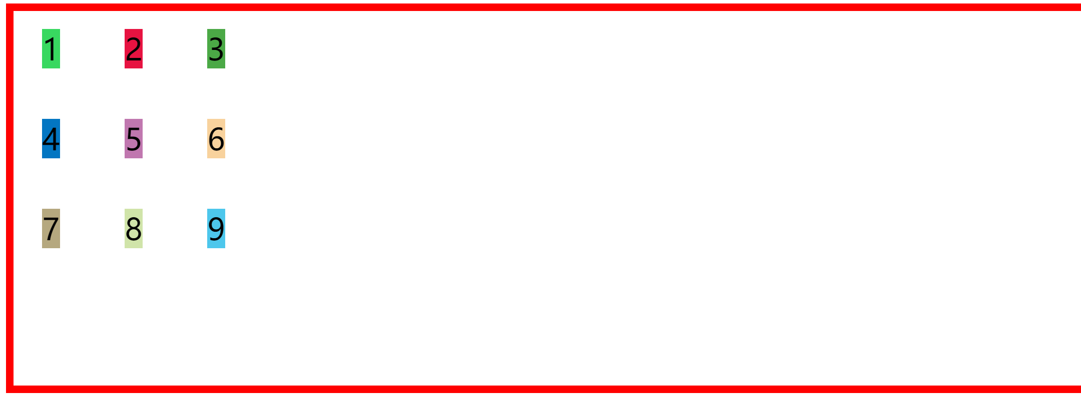
When we put 9 divs into the container, the 9 divs are orderly arranged in the container, but it is obvious that the container is not completely filled
<!DOCTYPE html>
<html lang="en">

<head>
    <meta charset="UTF-8">
    <meta http-equiv="X-UA-Compatible" content="IE=edge">
    <meta name="viewport" content="width=device-width, initial-scale=1.0">
    <title>Document</title>
</head>
<style>
    *{
        border: 0;
        padding: 0;;
        margin: 0;
        position:sticky;
    }
    body {
        height: 100%;
        color: white;
        font-size: 40px;
        text-align: center;
        border: 10px solid red;
        height: 500px;
    }


    .div1 {
        background-color: green;
    }


    .div2 {
        background-color: rgb(209, 235, 209);

    }

    .div3 {
        background-color: rgb(163, 124, 51);
    }

    .div4 {
        background-color: rgb(172, 33, 86);
    }

    .div5 {
        background-color: rgb(20, 228, 114);
    }

    .div6 {
        background-color: rgb(89, 72, 187);
    }

    .div7 {
        background-color: rgb(56, 156, 101);
    }

    .div8 {
        background-color: rgb(236, 195, 211);
    }

    .div9 {
        background-color: rgb(18, 236, 116);
    }
</style>

<body>
    <div class="div1">1</div>
    <div class="div2">2</div>
    <div class="div3">3</div>
    <div class="div4">4</div>
    <div class="div5"> 5</div>
    <div class="div6">6</div>
    <div class="div7">7</div>
    <div class="div8">8</div>
    <div class="div9">9</div>

</body>

</html>
The renderings are as follows
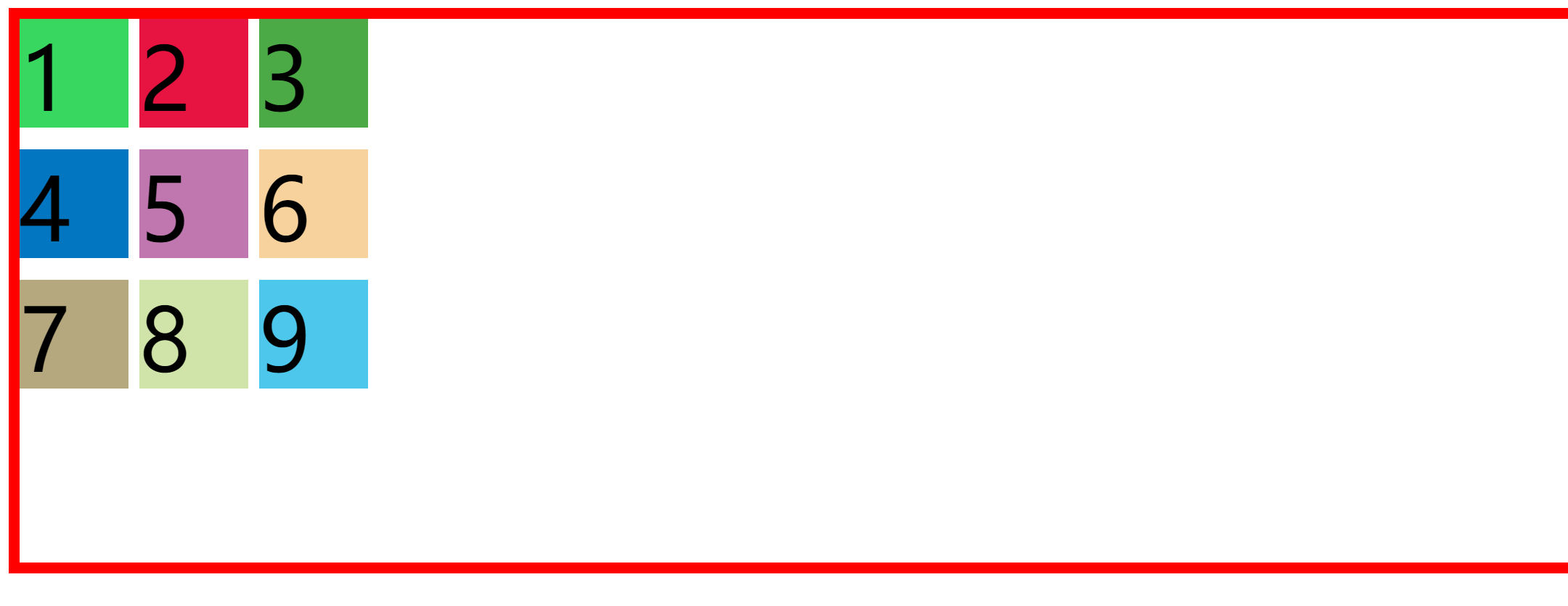
However, when we add display to the body part
    body {
     	height: 100%;
        color: white;
        font-size: 40px;
        text-align: center;
        display: grid;
        border: 10px solid red;
        height: 500px;
    }
We will find that 9 div are evenly distributed in the container and the container is completely filled
The renderings are as follows:
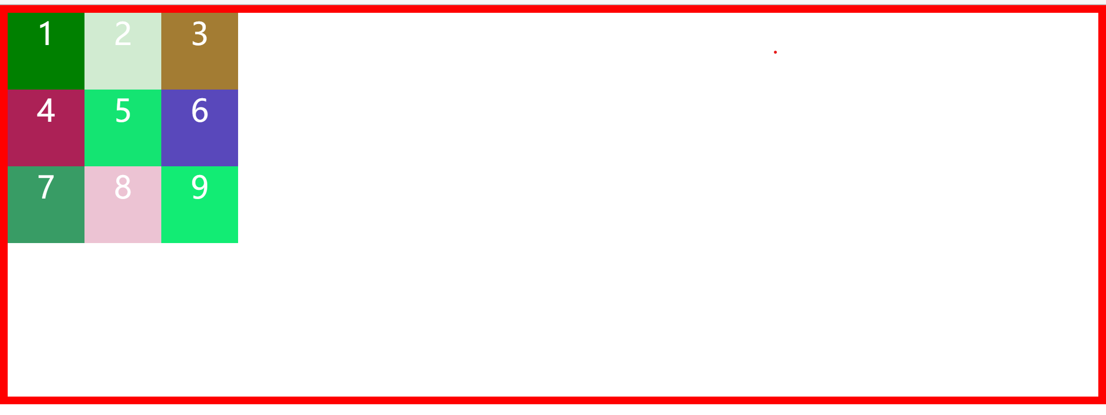
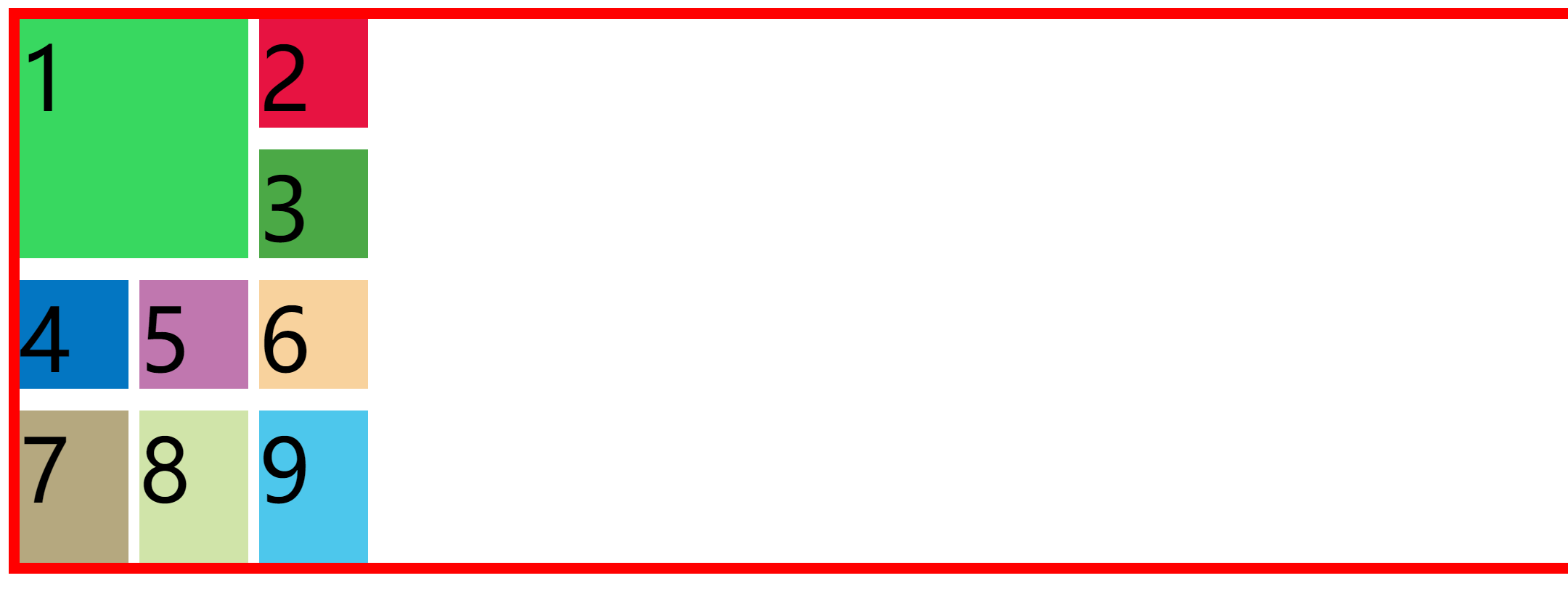
In order to facilitate layout, we can add width and height to each row and column when dividing
body {
    height: 100%;
    color: white;
    font-size: 40px;
    text-align: center;
    display: grid;
    grid-template-columns: 100px 100px 100px;
    grid-template-rows: 100px 100px 100px;
    border: 10px solid red;
    height: 500px;
}
The rendering is like this. Pay attention to several rows and columns during the setting process
In setting the width and height, we can have multiple methods
- Specific values, such as 100px and 100vx;
- Percentage: 50%;
- Proportion: n fr (there are several FR in total, accounting for a fraction of n) for example: 1fr, 2fr, the latter one is twice as much as the former one
- Auto: the length is determined by the browser itself. When auto is the maximum value, it is equivalent to Max content. As the minimum value, it represents the maximum value of the minimum length and width (min width / min height) of the cell in the track.
- Max content indicates the cell with the largest adaptive content for the track length of the grid.
- Min content indicates the cell with the smallest adaptive content for the track length of the grid.
- Minmax (minimum, maximum): defines a closed interval of length and width (if the maximum is less than the minimum, the maximum is ignored and minmax (minimum, maximum) is regarded as the minimum.)
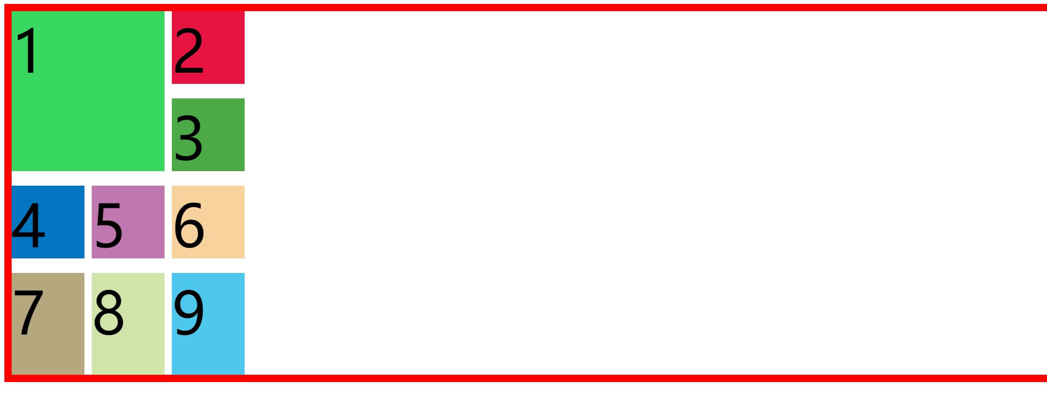
In our opinion, it is troublesome to write the width and height of rows and columns. We use abbreviations
grid-template: grid-template-rows/grid-template-columns; repet is also used to easily partition multiple rows and columns
For example, set three 100px rows.
body {
    height: 100%;
    color: white;
    font-size: 40px;
    text-align: center;
    display: grid;
    grid-template-columns: repeat(3,100px);
   	grid-template-rows: repeat(3,100px);
    border: 10px solid red;
    height: 500px;
}
The renderings are as follows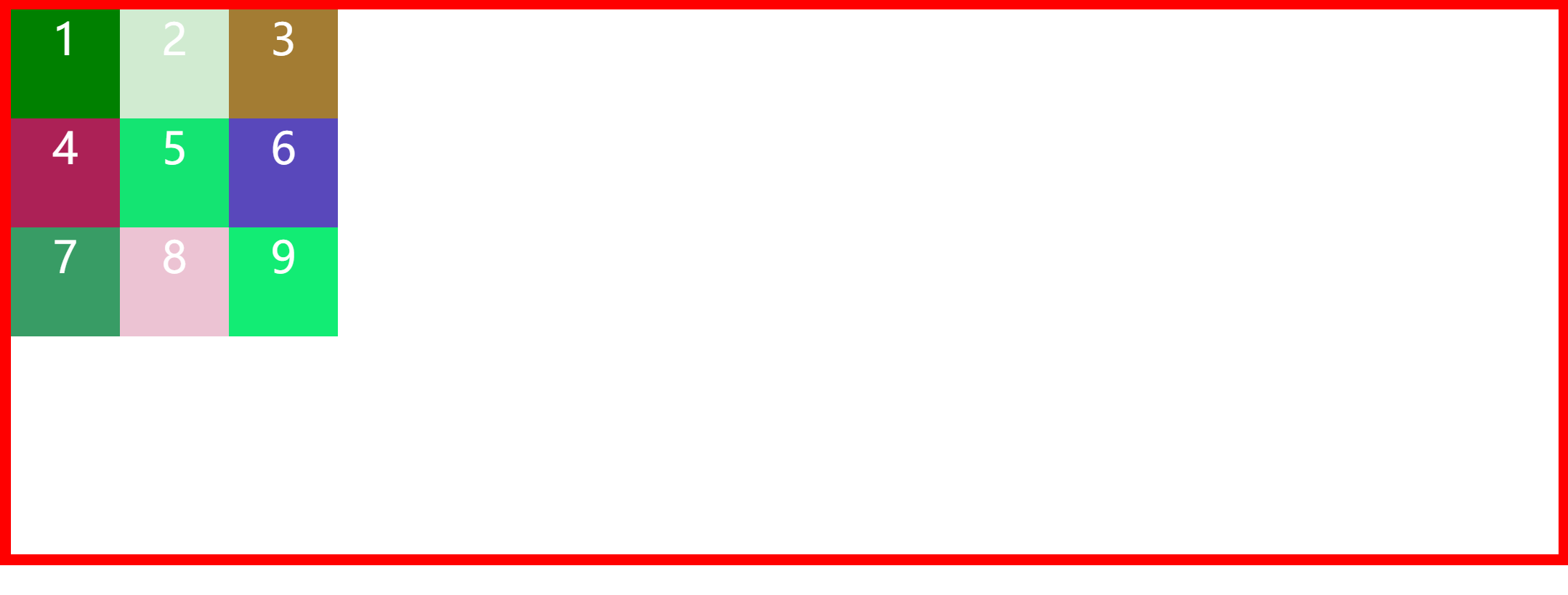
Project properties
Location properties
| position | describe |
|---|---|
| justify-content | Horizontal position |
| align-content | Vertical position |
| Value | describe |
|---|---|
| start | Initial arrangement |
| end | End arrangement |
| center | center alignment |
| stretch | Arrange each element evenly. The 'auto'-sized elements are stretched to fit the size of the container |
| space-around | Arrange each element evenly and allocate the same space around each element |
| space-between | Arrange each element evenly. The first element is placed at the beginning and the last element is placed at the end |
| space-evenly | Arrange each element evenly, and the spacing between each element is equal |
| flex-start | Arrange from the beginning of the line |
| flex-end | Start at the end of the line |
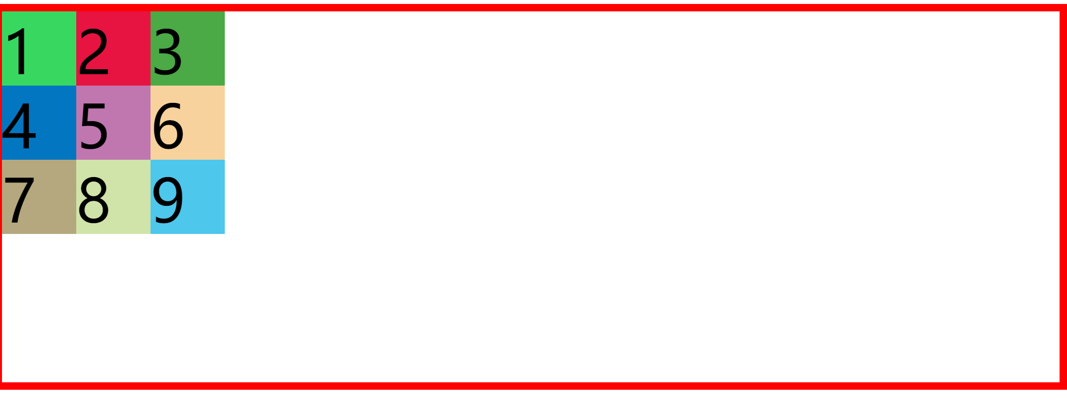
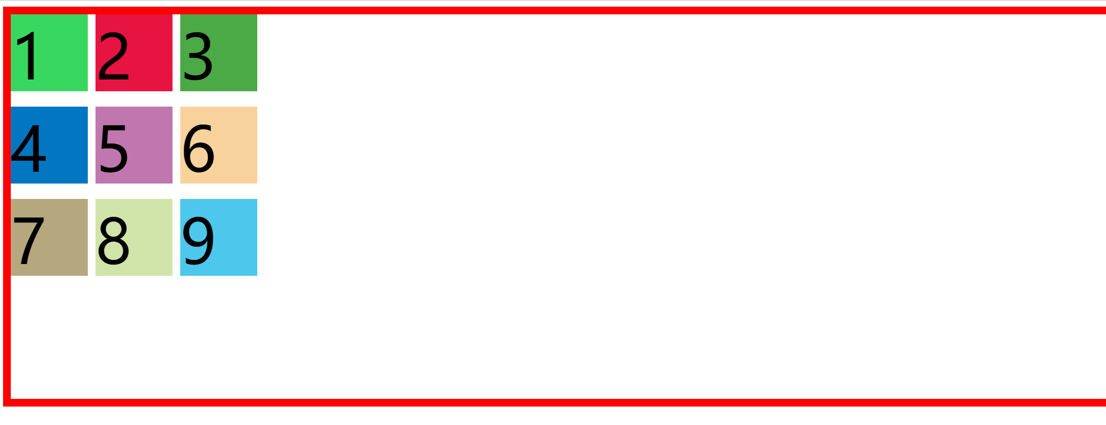
Next, let's test the difference between them. Let's set up a grid layout first
<!DOCTYPE html>
<html lang="en">
<head>
    <meta charset="UTF-8">
    <meta http-equiv="X-UA-Compatible" content="IE=edge">
    <meta name="viewport" content="width=device-width, initial-scale=1.0">
    <title>Document</title>
</head>
<style>
    .container{
        height: 500px;
        width: 100%;
        border: 10px solid red;
        display: grid;
        grid-template-rows: repeat(3,100px);
        grid-template-columns: repeat(3,100px);
        justify-content:start;
    }
    .item {
        font-size: 80px;

    }
    .item-1 {
        background-color: #38d860;
    }

    .item-2 {
        background-color: #e71341;

    }

    .item-3 {
        background-color: #4ba946;
    }

    .item-4 {
        background-color: #0376c2;
    }

    .item-5 {
        background-color: #c077af;
    }

    .item-6 {
        background-color: #f8d29d;
    }

    .item-7 {
        background-color: #b5a87f;
    }

    .item-8 {
        background-color: #d0e4a9;
    }

    .item-9 {
        background-color: #4dc7ec;
    }
</style>
<body>
    <div class="container">
        <div class="item item-1">1</div>
        <div class="item item-2">2</div>
        <div class="item item-3">3</div>
        <div class="item item-4">4</div>
        <div class="item item-5">5</div>
        <div class="item item-6">6</div>
        <div class="item item-7">7</div>
        <div class="item item-8">8</div>
        <div class="item item-9">9</div>

    </div>
</body>
</html>
The renderings are as follows

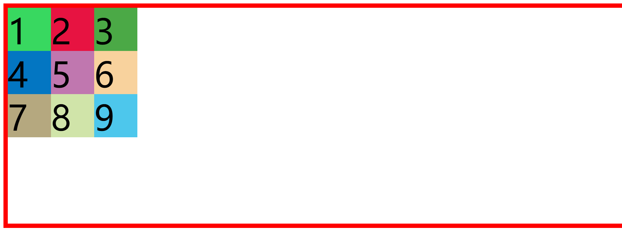
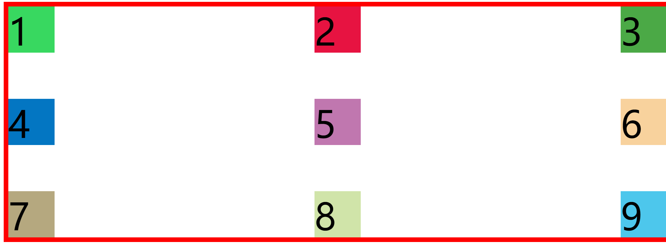
When we set the position to start; Time
    .container{
        height: 500px;
        width: 100%;
        border: 10px solid red;
        display: grid;
        grid-template-rows: repeat(3,100px);
        grid-template-columns: repeat(3,100px);
        justify-content:start;
        align-content: start;
    }
The renderings are as follows
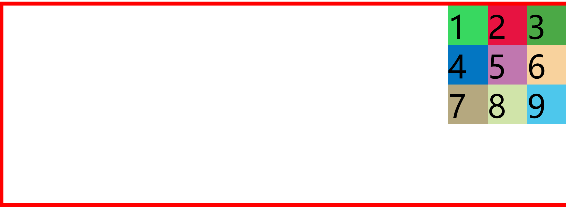
When we set the position to end; Time
    .container{
        height: 500px;
        width: 100%;
        border: 10px solid red;
        display: grid;
        grid-template-rows: repeat(3,100px);
        grid-template-columns: repeat(3,100px);
        justify-content:end;
        align-content: end;
    }
The renderings are as follows
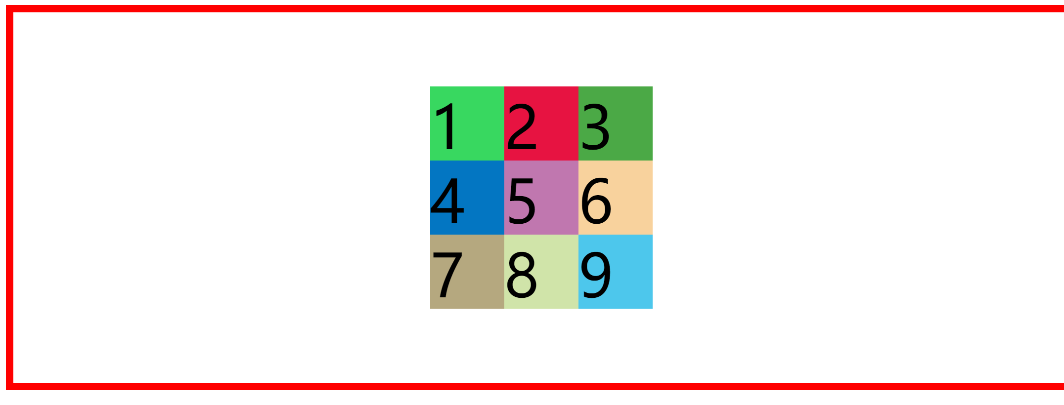
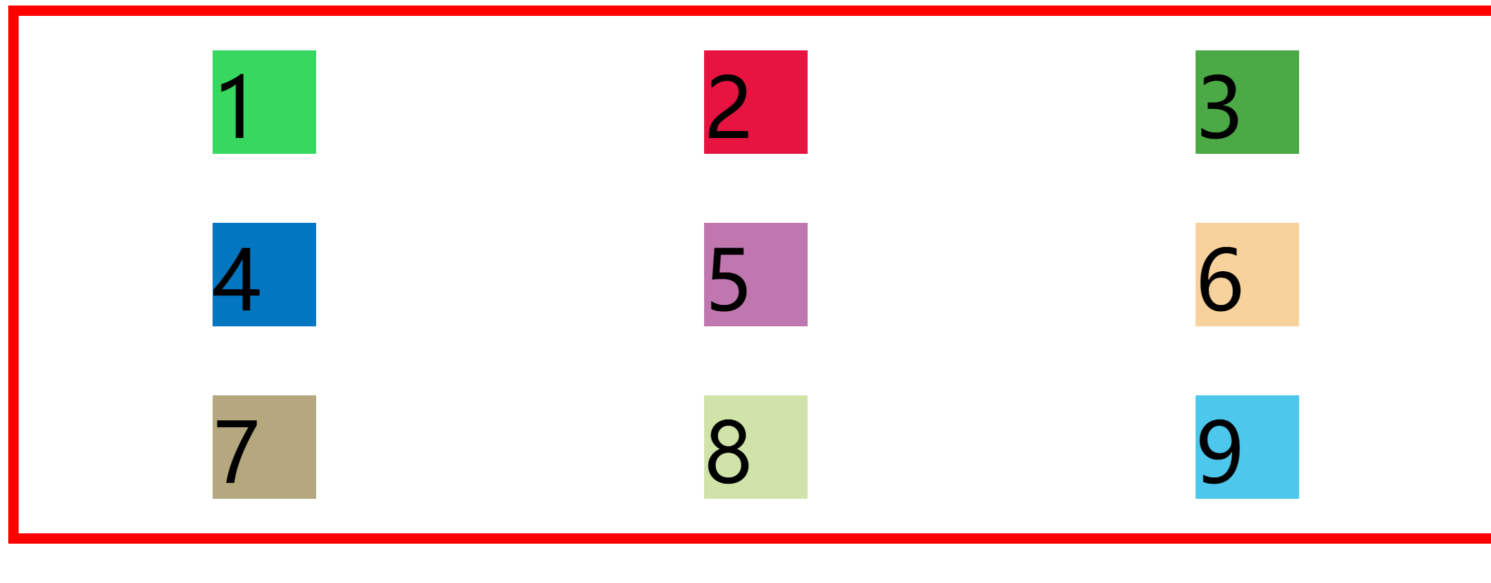
When we set the location to center; Time
    .container{
        height: 500px;
        width: 100%;
        border: 10px solid red;
        display: grid;
        grid-template-rows: repeat(3,100px);
        grid-template-columns: repeat(3,100px);
        justify-content:center;
        align-content: center;
    }
The renderings are as follows
When we set the position to stretch; Time
      .container{
        height: 500px;
        width: 100%;
        border: 10px solid red;
        display: grid;
        grid-template-rows: repeat(3,100px);
        grid-template-columns: repeat(3,100px);
        justify-content:stretch;
        align-content: stretch;
      }
The renderings are as follows
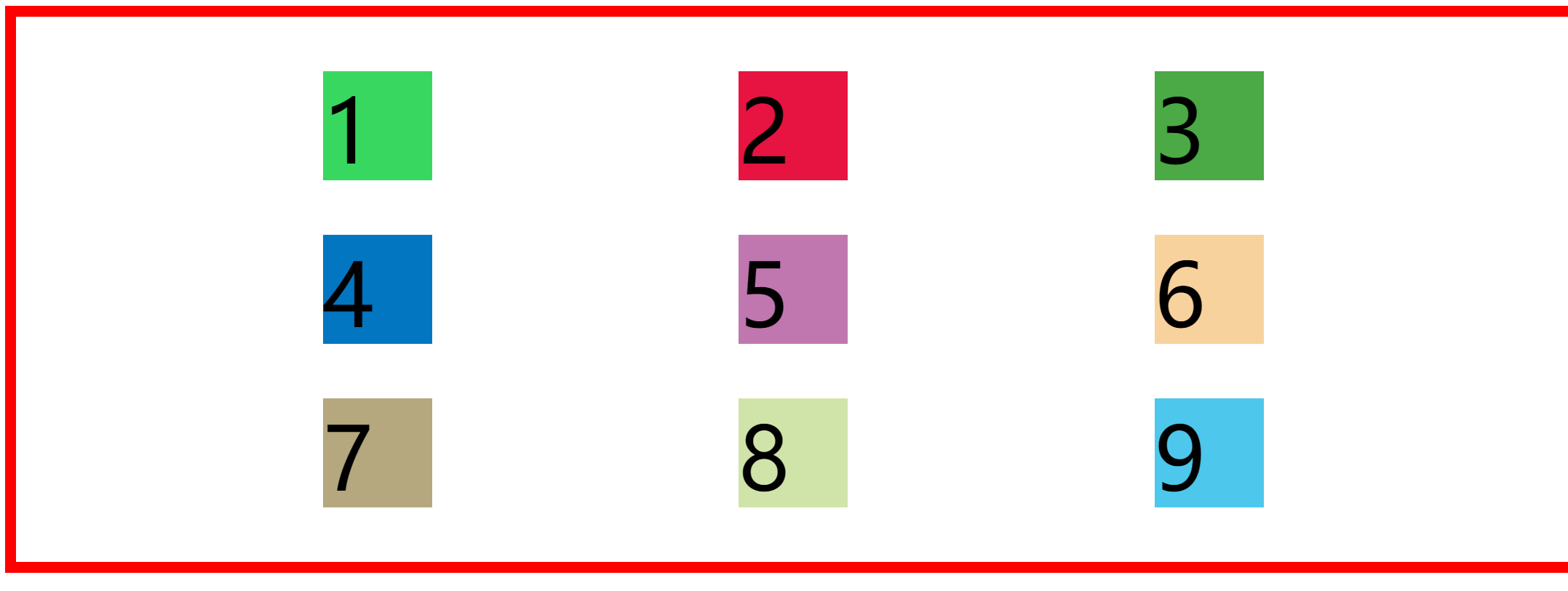
When we set the position to space evenly; Time
      .container{
        height: 500px;
        width: 100%;
        border: 10px solid red;
        display: grid;
        grid-template-rows: repeat(3,100px);
        grid-template-columns: repeat(3,100px);
        justify-content:space-evenly;
        align-content: space-evenly;
      }
The renderings are as follows
When we set the position to space between; Time
      .container{
        height: 500px;
        width: 100%;
        border: 10px solid red;
        display: grid;
        grid-template-rows: repeat(3,100px);
        grid-template-columns: repeat(3,100px);
        justify-content:space-between;
        align-content: space-between;
      }
The renderings are as follows
When we set the position to space around; Time
      .container{
        height: 500px;
        width: 100%;
        border: 10px solid red;
        display: grid;
        grid-template-rows: repeat(3,100px);
        grid-template-columns: repeat(3,100px);
        justify-content:space-around;
        align-content: space-around;
      }
The renderings are as follows
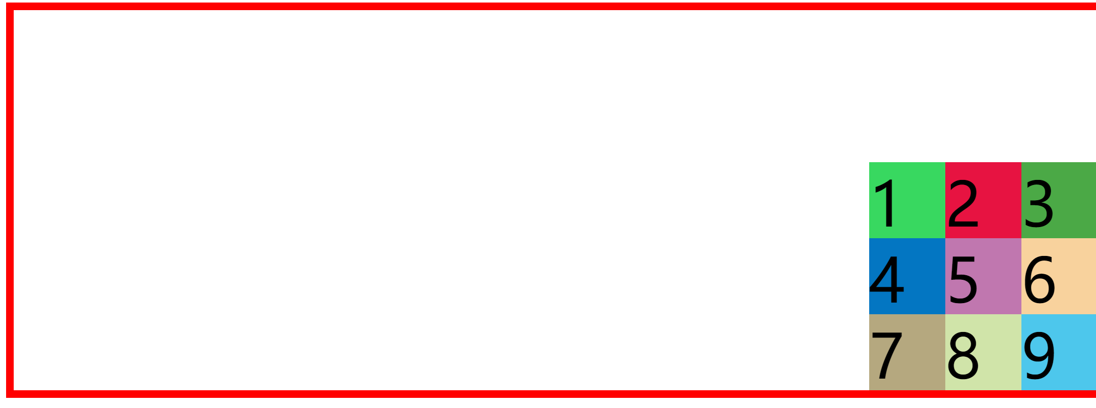
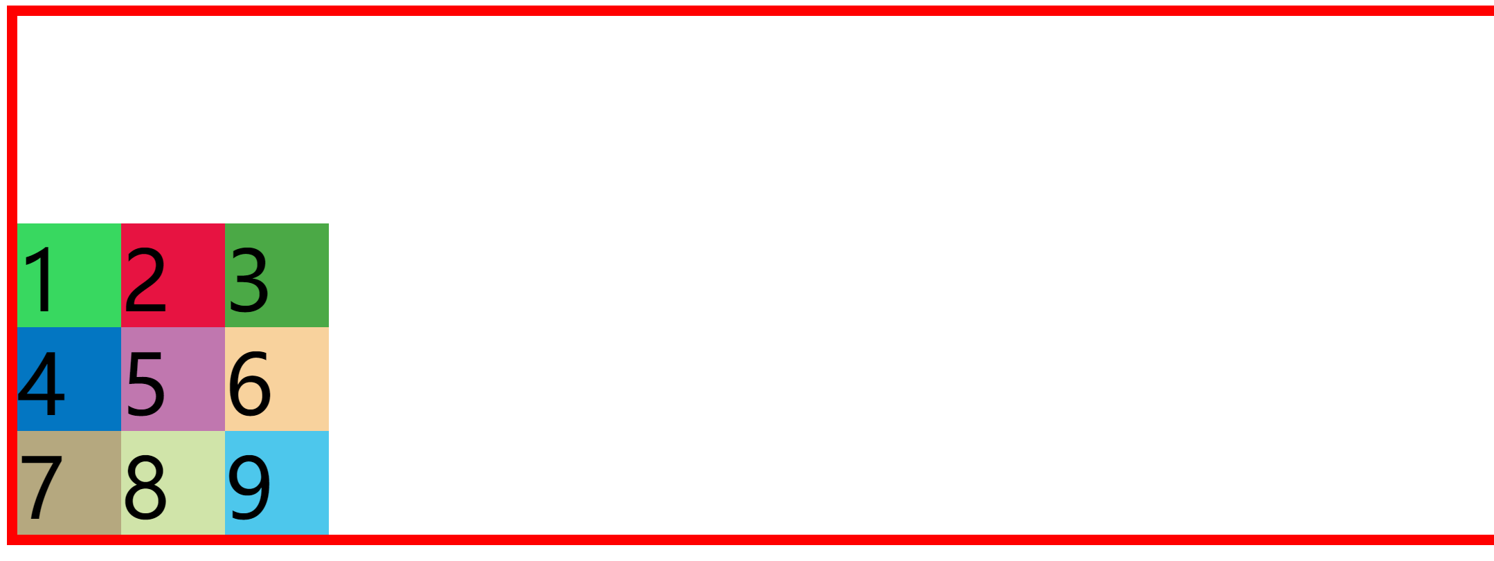
When we set the horizontal position to flex end; Time
      .container{
        height: 500px;
        width: 100%;
        border: 10px solid red;
        display: grid;
        grid-template-rows: repeat(3,100px);
        grid-template-columns: repeat(3,100px);
        justify-content:flex-end;
        align-content: start;
      }
The renderings are as follows
When we set the horizontal position to flex start; Time
      .container{
        height: 500px;
        width: 100%;
        border: 10px solid red;
        display: grid;
        grid-template-rows: repeat(3,100px);
        grid-template-columns: repeat(3,100px);
        justify-content:flex-start;
        align-content: end
      }
The renderings are as follows
Specify the project location (similar to the merging of tables)
- Use grid column and grid row attributes (mainly grid lines)
- Using grid template areas: attribute
| attribute | |
|---|---|
| grid-column-start | Column start line |
| grid-column-end | Column end line |
| grid-row-start | Line start line |
| grid-row-end | Line end line |
Use grid column and grid row attributes (mainly grid lines)
example:
<!DOCTYPE html>
<html lang="en">
<head>
    <meta charset="UTF-8">
    <meta http-equiv="X-UA-Compatible" content="IE=edge">
    <meta name="viewport" content="width=device-width, initial-scale=1.0">
    <title>Document</title>
</head>
<style>
      .container{
        height: 500px;
        width: 100%;
        border: 10px solid red;
        display: grid;
        grid-template-rows: repeat(3,100px);
        grid-template-columns: repeat(3,100px);
        gap: 20px 10px;
      }
    .item {
        font-size: 80px;
    }
    .item-1 {
        background-color: #38d860;
        grid-column-start: 1;
        grid-column-end: 3;
        grid-row-start: 1;
        grid-row-end: 3;

    }

    .item-2 {
        background-color: #e71341;

    }

    .item-3 {
        background-color: #4ba946;
    }

    .item-4 {
        background-color: #0376c2;
    }

    .item-5 {
        background-color: #c077af;
    }

    .item-6 {
        background-color: #f8d29d;
    }

    .item-7 {
        background-color: #b5a87f;
    }

    .item-8 {
        background-color: #d0e4a9;
    }

    .item-9 {
        background-color: #4dc7ec;
    }
</style>
<body>
    <div class="container">
        <!-- option item -->
        <div class="item item-1">1</div>
        <div class="item item-2">2</div>
        <div class="item item-3">3</div>
        <div class="item item-4">4</div>
        <div class="item item-5">5</div>
        <div class="item item-6">6</div>
        <div class="item item-7">7</div>
        <div class="item item-8">8</div>
        <div class="item item-9">9</div>

    </div>
</body>
</html>
The effects are as follows:
grid-column-start: 1;
grid-column-end: 3;
Represents merging from the first line of the column to the three lines of the column. In the example, there are three columns, and there should be four (refer to the grid lines at the beginning of the article)
When using these four attributes, you can also use the keyword span to span several cells.
    .item-1 {
        background-color: #38d860;
        grid-column-start: span 2;
        grid-row-start: span 2;

    }
The renderings are as follows

Similarly, these four attributes can be abbreviated to two attributes
    .item-1 {
        background-color: #38d860;
        grid-column: 1/3;
        grid-row-start: span 2;
    }
The renderings are as follows

These four attributes can also be abbreviated to one attribute
   .item-1 {
        background-color: #38d860;
        grid-area: 1/1/3/3;

    }
Note: grid area: < row start > / < column start > / < row end > / < column end >;
The renderings are as follows
Using grid template areas: attribute
First, name each cell. Note that it is separated by semicolons. At the same time, each line must have quotation marks. By default, the name of its area corresponds to the item one by one. You can also set the grid area of each project, so that you can change the location of the project.
<!DOCTYPE html>
<html lang="en">
<head>
    <meta charset="UTF-8">
    <meta http-equiv="X-UA-Compatible" content="IE=edge">
    <meta name="viewport" content="width=device-width, initial-scale=1.0">
    <title>Document</title>
</head>
<style>
      .container{
        height: 500px;
        width: 100%;
        border: 10px solid red;
        display: grid;
        grid-template-rows: repeat(3,100px);
        grid-template-columns: repeat(3,100px);
        gap: 20px 10px;
        grid-template-areas: 'a b c'
                             'd e f'
                             'h i j';
      }
    .item {
        font-size: 80px;
    }
    .item-1 {
        background-color: #38d860;

    }

    .item-2 {
        background-color: #e71341;
    }

    .item-3 {
        background-color: #4ba946;
    }

    .item-4 {
        background-color: #0376c2;
    }

    .item-5 {
        background-color: #c077af;
    }

    .item-6 {
        background-color: #f8d29d;
    }

    .item-7 {
        background-color: #b5a87f;
    }

    .item-8 {
        background-color: #d0e4a9;
    }

    .item-9 {
        background-color: #4dc7ec;
    }
</style>
<body>
    <div class="container">
        <!-- option item -->
        <div class="item item-1">1</div>
        <div class="item item-2">2</div>
        <div class="item item-3">3</div>
        <div class="item item-4">4</div>
        <div class="item item-5">5</div>
        <div class="item item-6">6</div>
        <div class="item item-7">7</div>
        <div class="item item-8">8</div>
        <div class="item item-9">9</div>

    </div>
</body>
</html>
The effect is as follows
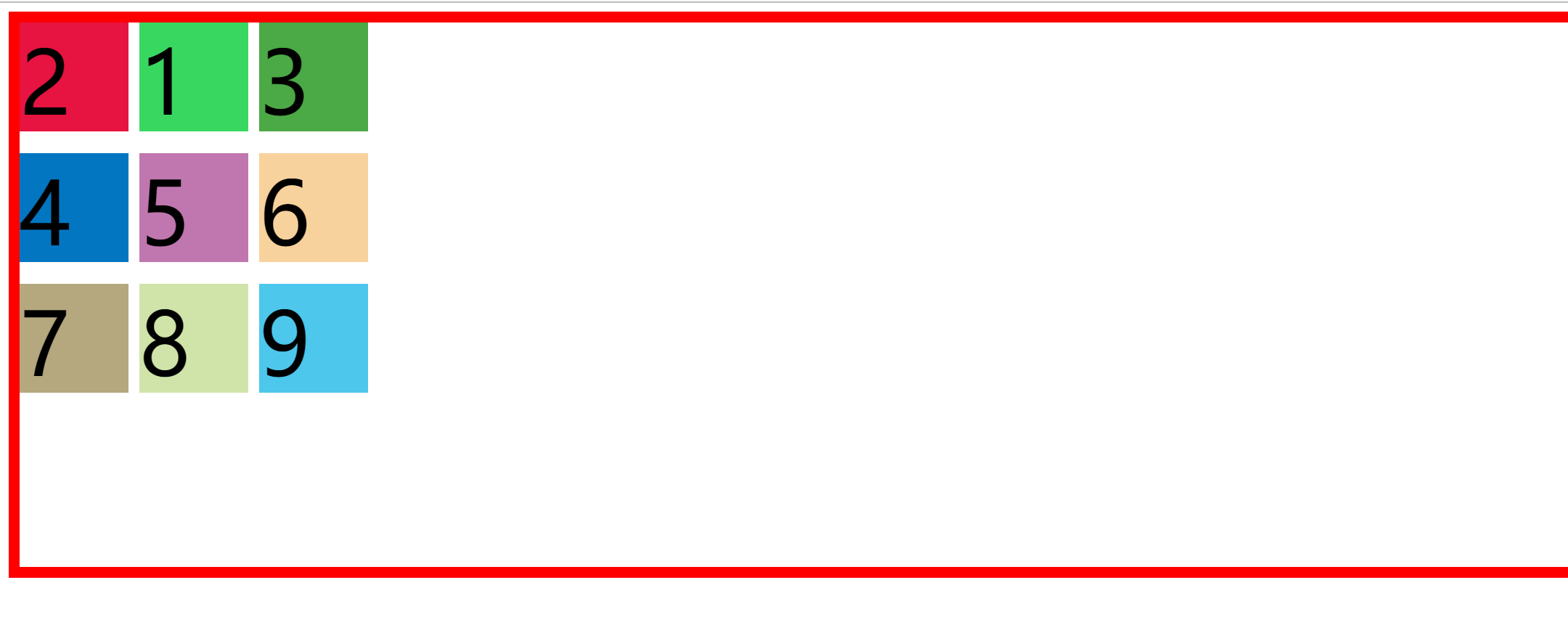
We can exchange two of the project locations
    .item-1 {
        background-color: #38d860;
        grid-area: b;
    }

    .item-2 {
        background-color: #e71341;
        grid-area: a;
    }
The renderings are as follows:
We can also merge cells
<!DOCTYPE html>
<html lang="en">
<head>
    <meta charset="UTF-8">
    <meta http-equiv="X-UA-Compatible" content="IE=edge">
    <meta name="viewport" content="width=device-width, initial-scale=1.0">
    <title>Document</title>
</head>
<style>
      .container{
        height: 500px;
        width: 100%;
        border: 10px solid red;
        display: grid;
        grid-template-rows: repeat(3,100px);
        grid-template-columns: repeat(3,100px);
        gap: 20px 10px;
        grid-template-areas: 'a a c'
                             'a a f'
                             'h i j';
      }
    .item {
        font-size: 80px;
    }
    .item-1 {
        background-color: #38d860;
        grid-area: a;
    }

    .item-2 {
        background-color: #e71341;
    }

    .item-3 {
        background-color: #4ba946;
    }

    .item-4 {
        background-color: #0376c2;
    }

    .item-5 {
        background-color: #c077af;
    }

    .item-6 {
        background-color: #f8d29d;
    }

    .item-7 {
        background-color: #b5a87f;
    }

    .item-8 {
        background-color: #d0e4a9;
    }

    .item-9 {
        background-color: #4dc7ec;
    }
</style>
<body>
    <div class="container">
        <!-- option item -->
        <div class="item item-1">1</div>
        <div class="item item-2">2</div>
        <div class="item item-3">3</div>
        <div class="item item-4">4</div>
        <div class="item item-5">5</div>
        <div class="item item-6">6</div>
        <div class="item item-7">7</div>
        <div class="item item-8">8</div>
        <div class="item item-9">9</div>

    </div>
</body>
</html>
The renderings are as follows:

Cell content properties
| attribute | describe |
|---|---|
| justify-self | Horizontal position |
| align-self | Vertical position |
| Value | describe |
|---|---|
| start | start |
| end | end |
| center | middle |
| stretch | Arrange each element evenly (default) |
example:
<!DOCTYPE html>
<html lang="en">
<head>
    <meta charset="UTF-8">
    <meta http-equiv="X-UA-Compatible" content="IE=edge">
    <meta name="viewport" content="width=device-width, initial-scale=1.0">
    <title>Document</title>
</head>
<style>
         .container{
        height: 500px;
        width: 100%;
        border: 10px solid red;
        display: grid;
        grid-template-rows: repeat(3,100px);
        grid-template-columns: repeat(3,100px);
        row-gap: 20px;
        column-gap: 10px;
      }
    .item {
        font-size: 40px;
        align-self: center;
        justify-self: center;
    }
    .item-1 {
        background-color: #38d860;
    }

    .item-2 {
        background-color: #e71341;
    }

    .item-3 {
        background-color: #4ba946;
    }

    .item-4 {
        background-color: #0376c2;
    }

    .item-5 {
        background-color: #c077af;
    }

    .item-6 {
        background-color: #f8d29d;
    }

    .item-7 {
        background-color: #b5a87f;
    }

    .item-8 {
        background-color: #d0e4a9;
    }

    .item-9 {
        background-color: #4dc7ec;
    }
</style>
<body>
    <div class="container">
        <!-- option item -->
        <div class="item item-1">1</div>
        <div class="item item-2">2</div>
        <div class="item item-3">3</div>
        <div class="item item-4">4</div>
        <div class="item item-5">5</div>
        <div class="item item-6">6</div>
        <div class="item item-7">7</div>
        <div class="item item-8">8</div>
        <div class="item item-9">9</div>

    </div>
</body>
</html>
The renderings are as follows:
Grid track properties
There are mainly two track attributes: row gap and column gap. Next, let's apply them
      <!DOCTYPE html>
<html lang="en">
<head>
    <meta charset="UTF-8">
    <meta http-equiv="X-UA-Compatible" content="IE=edge">
    <meta name="viewport" content="width=device-width, initial-scale=1.0">
    <title>Document</title>
</head>
<style>
         .container{
        height: 500px;
        width: 100%;
        border: 10px solid red;
        display: grid;
        grid-template-rows: repeat(3,100px);
        grid-template-columns: repeat(3,100px);
        row-gap: 20px;
        column-gap: 10px;
      }
    .item {
        font-size: 80px;
    }
    .item-1 {
        background-color: #38d860;
    }

    .item-2 {
        background-color: #e71341;
    }

    .item-3 {
        background-color: #4ba946;
    }

    .item-4 {
        background-color: #0376c2;
    }

    .item-5 {
        background-color: #c077af;
    }

    .item-6 {
        background-color: #f8d29d;
    }

    .item-7 {
        background-color: #b5a87f;
    }

    .item-8 {
        background-color: #d0e4a9;
    }

    .item-9 {
        background-color: #4dc7ec;
    }
</style>
<body>
    <div class="container">
        <!-- option item -->
        <div class="item item-1">1</div>
        <div class="item item-2">2</div>
        <div class="item item-3">3</div>
        <div class="item item-4">4</div>
        <div class="item item-5">5</div>
        <div class="item item-6">6</div>
        <div class="item item-7">7</div>
        <div class="item item-8">8</div>
        <div class="item item-9">9</div>

    </div>
</body>
</html>
The renderings are as follows
At the same time, they can also be abbreviated as (Note: the front is row spacing, and the back is column spacing)
      .container{
        height: 500px;
        width: 100%;
        border: 10px solid red;
        display: grid;
        grid-template-rows: repeat(3,100px);
        grid-template-columns: repeat(3,100px);
        gap: 20px 10px;
      }
The renderings are as follows
Responsive layout
What is responsive layout
Responsive layout, in short, is that a website can be compatible with multiple terminals - rather than making a specific version for each terminal.
This concept was born to solve the problem of mobile Internet browsing.
Responsive layout can provide more comfortable interface and better user experience for users of different terminals.
How to make responsive layout
Set auto fit and auto fill in repeat
Comparison of two methods
common ground:
- Is to create as many tracks as possible
- Then, the space of less than one orbit is evenly distributed to the existing orbit
difference
- The last step of auto fit is to fold the empty orbit and evenly distribute the space of the empty orbit to the orbits of existing elements
- In the last step of auto fill, the empty track is left blank and will not be folded
Note: Auto fit and auto fill display differences only when the container width is greater than the sum of the minimum widths of the child elements
<!DOCTYPE html>
<html lang="en">
<head>
<meta charset="UTF-8">
<meta http-equiv="X-UA-Compatible" content="IE=edge">
<meta name="viewport" content="width=device-width, initial-scale=1.0">
<title>Document</title>
</head>
<style>
.box1,
.box2 {
height: 200px;
display: grid;
grid-gap: 10px;
}
.box1 {
background: #f8c009;
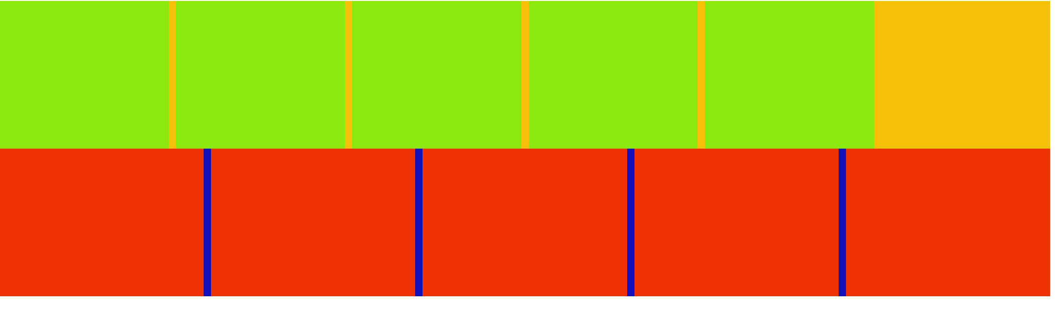
/* Create as many tracks as possible according to the width of 100px and distribute them evenly (remaining space empty tracks) */
grid-template-columns: repeat(auto-fill, minmax(200px, 1fr));
}
.box1 > div {
background: #8ae90e;
}
.box2 {
background: #1310bb;
/* Create as many tracks as possible according to the width of 100px, and evenly distribute the remaining space */
grid-template-columns: repeat(auto-fit, minmax(200px, 1fr));
}
.box2 > div {
background: #f03102;
}
</style>
<body>
<div class="box1">
<div></div>
<div></div>
<div></div>
<div></div>
<div></div>
</div>
<div class="box2">
<div></div>
<div></div>
<div></div>
<div></div>
<div></div>
</div>
</body>
</html>
The effect comparison is as follows