Kaggle case: predictive classification of cardiac patients based on a random forest
Hello, my name is Peter~
A kaggle case shared today: predictive classification of cardiac patients based on the RandomForest model. The knowledge points involved in this paper mainly include:
- Data preprocessing and type transformation
- Establishment and Interpretation of Random Forest Model
- Drawing and Interpretation of Partially Dependent Diagram PDP
- Use and Interpretation of AutoML Machine Learning SHAP Library (Personal Promotion)

Reading Guide
Of all the applications of machine-learning, diagnosing any serious disease using a black box is always going to be a hard sell. If the output from a model is the particular course of treatment (potentially with side-effects), or surgery, or the absence of treatment, people are going to want to know why.
In all applications of machine learning, it is always difficult to diagnose any serious disease using black boxes. If the output of the model is a specific course of treatment (which may have side effects), surgery, or efficacy, people will wonder why.
This dataset gives a number of variables along with a target condition of having or not having heart disease. Below, the data is first used in a simple random forest model, and then the model is investigated using ML explainability tools and techniques.
The dataset provides many variables and target conditions for people with or without heart disease. Next, the data is used for a simple random forest model, which is then studied using ML interpretability tools and techniques.
Original notebook address: https://www.kaggle.com/tentotheminus9/what-causes-heart-disease-explaining-the-model And you can refer to the original literature if you are interested in it.
Import Library
This case involves several libraries in different directions:
- Data Preprocessing
- A variety of visual drawings; Especially the visualization of shap, the use of model explanatory modules (this library will be written later)
- Random Forest Model
- Model evaluation, etc.
import numpy as np
import pandas as pd
import matplotlib.pyplot as plt
import seaborn as sns
from sklearn.ensemble import RandomForestClassifier
from sklearn.tree import DecisionTreeClassifier
from sklearn.tree import export_graphviz
from sklearn.metrics import roc_curve, auc
from sklearn.metrics import classification_report
from sklearn.metrics import confusion_matrix
from sklearn.model_selection import train_test_split
import eli5
from eli5.sklearn import PermutationImportance
import shap
from pdpbox import pdp, info_plots
np.random.seed(123)

pd.options.mode.chained_assignment = None
Data Exploration EDA
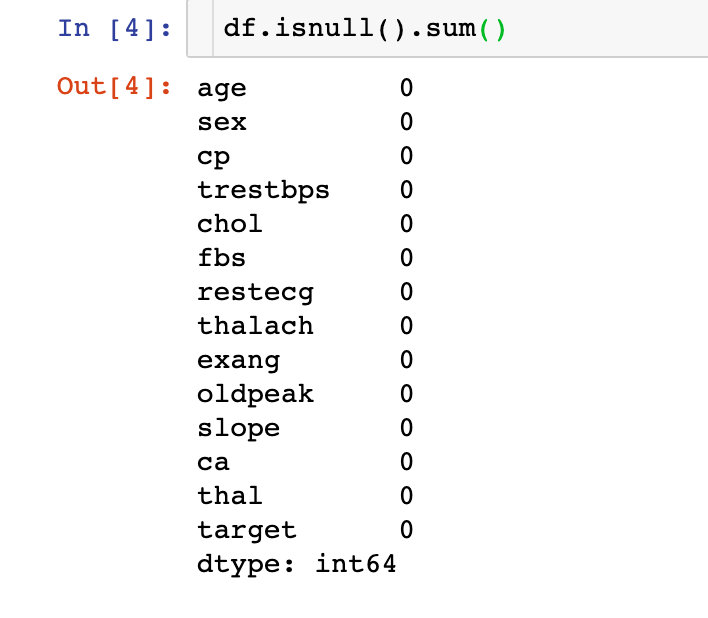
1. Importing data
2. Missing Values
The data is perfect, there are no missing values!
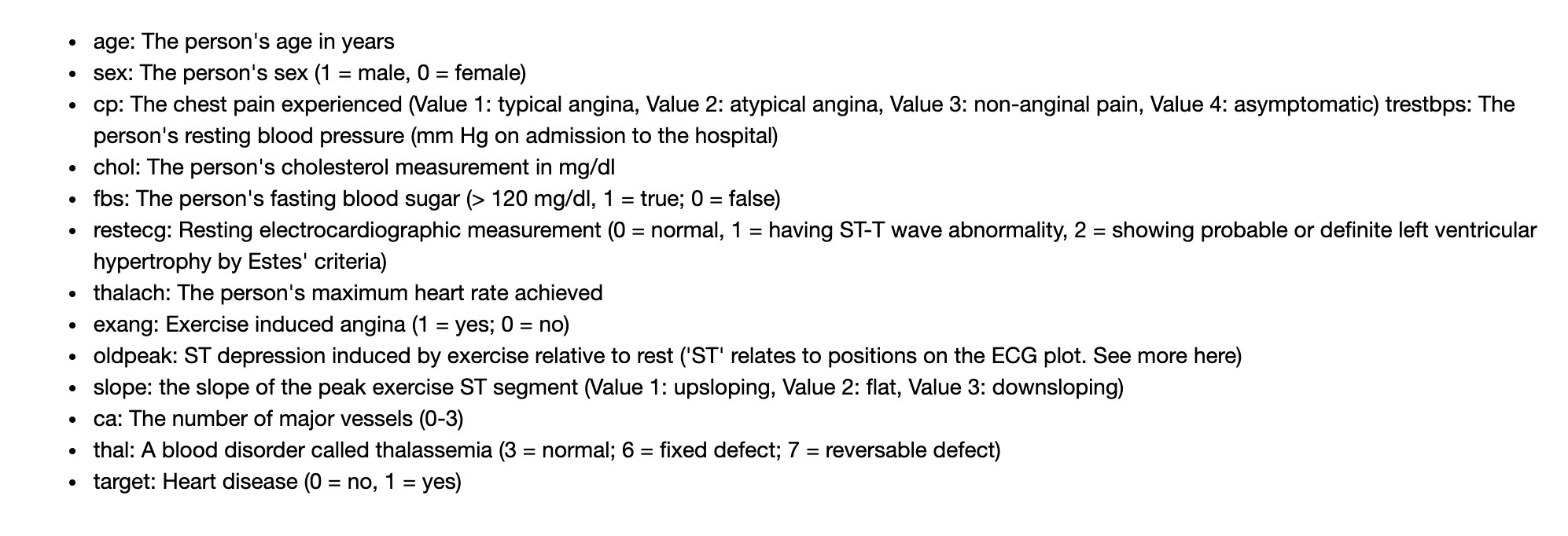
Field Meaning
Here we will focus on the meaning of each field. Peter's recently exported datasets have slightly different field names from those in the original notebook. We have made a one-to-one correspondence for you. Here are the specific Chinese meanings:
-
Age: age
-
Sex sex 1=male 0=female
-
Type of cp chest pain; 4 Value scenarios
-
1: Typical angina pectoris
-
2: Atypical angina
-
3: Non-angina pectoris
-
4: Asymptomatic
-
-
trestbps resting blood pressure
-
chol Serum Cholesterol
-
fbs fasting blood glucose >120mg/dl:1=true; 0=false
-
restecg resting electrocardiogram (values 0,1,2)
-
Maximum heart rate achieved by thalach
-
Exercise-induced angina (1=yes;0=no)
-
ST value caused by oldpeak relative to resting exercise (ST value is related to location on electrocardiogram)
-
slope of ST Segment of slope Motion Peak
- 1:upsloping tilt up
- 2:flat flat
- 3:downsloping down
-
ca The number of major vessels(0-3)
-
thal A blood disorder called thalassemia, a blood disease called thalassemia (3 = normal; 6 = fixed defect; 7 = reversible defect)
-
target was not ill (0=no; 1=yes)
The original English meaning of notebook;
Below is the correspondence that Peter organized. The current version is the standard in this article:
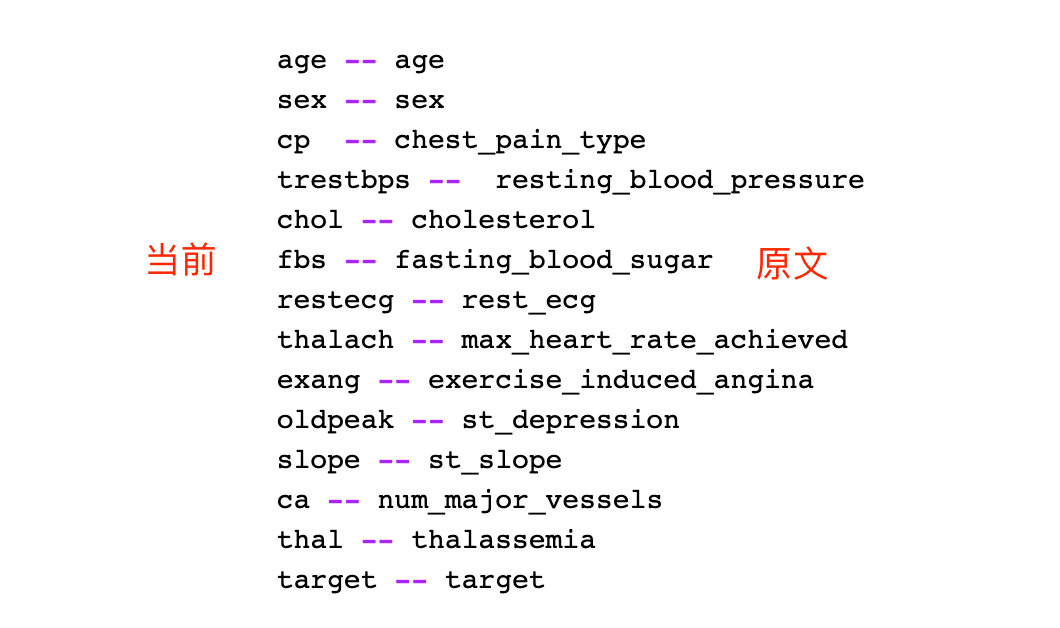
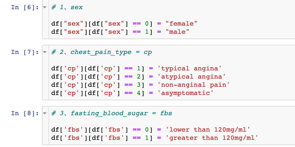
Field Conversion
Transform Encoding
Convert some fields one by one. Take the sex field for example: 0 becomes female and 1 becomes male in the data
# 1,sex

df["sex"][df["sex"] == 0] = "female"
df["sex"][df["sex"] == 1] = "male"
Field Type Conversion
# Specify data type
df["sex"] = df["sex"].astype("object")
df["cp"] = df["cp"].astype("object")
df["fbs"] = df["fbs"].astype("object")
df["restecg"] = df["restecg"].astype("object")
df["exang"] = df["exang"].astype("object")
df["slope"] = df["slope"].astype("object")
df["thal"] = df["thal"].astype("object")
Generate dummy variable
# Generate dummy variable
df = pd.get_dummies(df,drop_first=True)
df
Random Forest
Fractional data
# Generating feature and dependent variable datasets
X = df.drop("target",1)
y = df["target"]

# The slicing ratio is 8:2
X_train, X_test, y_train, y_test = train_test_split(X,y,test_size=0.2,random_state=10)

X_train
modeling
rf = RandomForestClassifier(max_depth=5)
rf.fit(X_train, y_train)
Three key attributes
Three important attributes of a random forest:
- Viewing trees in the forest: estimators_
- Out-of-pocket accuracy score: oob_score_, Must be oob_ The scope parameter is only available when True is selected
- Importance of variables: feature_importances_
Decision Tree Visualization
Here we select the visualization of the second tree:
# View the second tree
estimator = rf.estimators_[1]

# All attributes
feature_names = [i for i in X_train.columns]
#print(feature_names)
# Specify data type
y_train_str = y_train.astype('str')
# 0-no 1-disease
y_train_str[y_train_str == '0'] = 'no disease'
y_train_str[y_train_str == '1'] = 'disease'
# Value of training data
y_train_str = y_train_str.values
y_train_str[:5]
The specific code for the drawing is:
# Drawing Display

export_graphviz(
    estimator,   # Pass in the second tree
    out_file='tree.dot',   # Export file name
    feature_names = feature_names,  # Property Name
    class_names = y_train_str,  # Final categorical data
    rounded = True,
    proportion = True,
    label='root',
    precision = 2,
    filled = True
)

from subprocess import call
call(['dot', '-Tpng', 'tree.dot', '-o', 'tree.png', '-Gdpi=600'])

from IPython.display import Image
Image(filename = 'tree.png')
The visualization of decision trees allows us to see the specific classification process, but it does not solve which features or attributes are important. Later, we will explore the characteristic importance of some attributes.
Model Score Validation
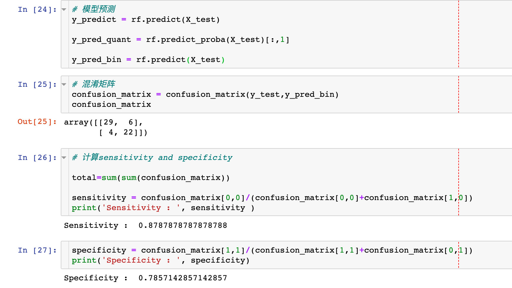
Regarding the confusion matrix and using specificity and sensitivity to describe the performance of the classifier:
# model prediction
y_predict = rf.predict(X_test)
y_pred_quant = rf.predict_proba(X_test)[:,1]
y_pred_bin = rf.predict(X_test)

# Confusion Matrix
confusion_matrix = confusion_matrix(y_test,y_pred_bin)
confusion_matrix

# Calculate sensitivity and specificity
total=sum(sum(confusion_matrix))
sensitivity = confusion_matrix[0,0]/(confusion_matrix[0,0]+confusion_matrix[1,0])
specificity = confusion_matrix[1,1]/(confusion_matrix[1,1]+confusion_matrix[0,1])
Draw ROC curve
fpr, tpr, thresholds = roc_curve(y_test, y_pred_quant)

fig, ax = plt.subplots()
ax.plot(fpr, tpr)

ax.plot([0,1],[0,1],
        transform = ax.transAxes,
        ls = "--",
        c = ".3"
       )

plt.xlim([0.0, 1.0])
plt.ylim([0.0, 1.0])

plt.rcParams['font.size'] = 12

# Title
plt.title('ROC Curve')
# Names of the two axes
plt.xlabel('False Positive Rate (1 - Specificity)')
plt.ylabel('True Positive Rate (Sensitivity)')
# Gridlines
plt.grid(True)
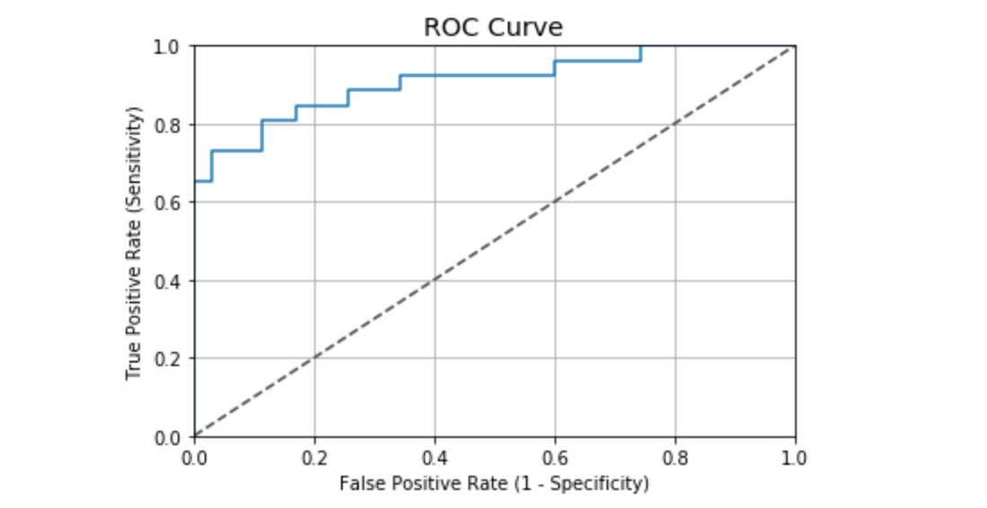
ROC curve values in this case:
auc(fpr, tpr)
# Result
0.9076923076923078
According to the general ROC curve evaluation criteria, the performance of the case is good:
- 0.90 - 1.00 = excellent
- 0.80 - 0.90 = good
- 0.70 - 0.80 = fair
- 0.60 - 0.70 = poor
- 0.50 - 0.60 = fail
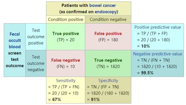
Supplementary Knowledge Points: Evaluation Index of Classifier
Consider a two-class situation where the categories are 1 and 0, and we treat 1 and 0 as positive and negative classes, respectively. Based on the actual and predicted results, there are four final results, as shown in the table below:
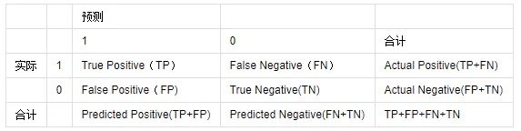
Common evaluation criteria:
1. ACC:classification accuracy, describing the classification accuracy of the classifier
The formula is ACC=(TP+TN)/(TP+FP+FN+TN)
2,BER: balanced error rate
The formula is: BER=1/2*(FPR+FN/(FN+TP))
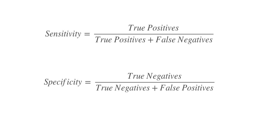
3. TPR:true positive rate, describing the proportion of all positive cases identified to all positive cases
The formula is TPR=TP/ (TP+FN)
4. FPR:false positive rate, which describes the proportion of all negative cases in which negative cases are identified as being correct
The formula is FPR= FP / (FP + TN)
5. TNR:true negative rate, describing the proportion of all negative cases identified
The formula is: TNR= TN / (FP + TN)
6,PPV: Positive predictive value
The formula is PPV=TP/ (TP + FP)
7,NPV: Negative predictive value
Calculation formula: NPV=TN / (FN + TN)
TPR is sensitivity and TNR is specificity.
Classic graphics from Wikipedia:
Interpretability
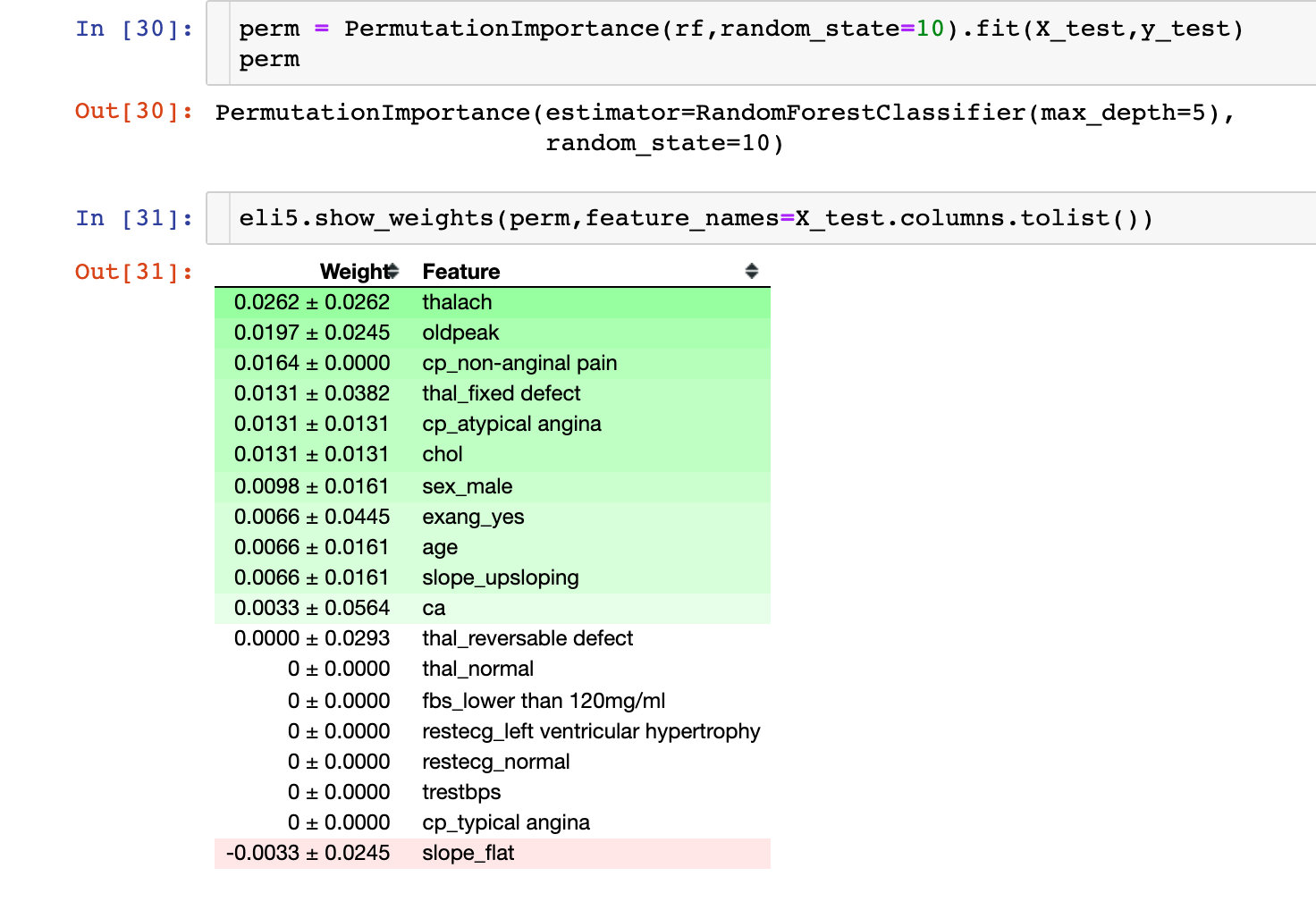
Permutation Importance
The following is an explanation of the results of the machine learning model. The first thing to look at is the importance of each variable to the model. Permutation Importance for Key Considerations:
Partial dependence plots (PDP)
One-dimensional PDP
Partial Dependencies are used to explain the relationship between a feature and a target value y, usually by drawing a Partial Dependence Plot(PDP). That is, the value of PDP in X1 is the average value predicted by the original model after replacing the first variable in the training set with X1.
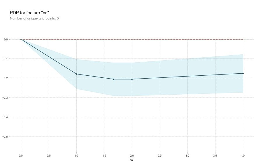
Important: View the relationship between a single feature and a target value
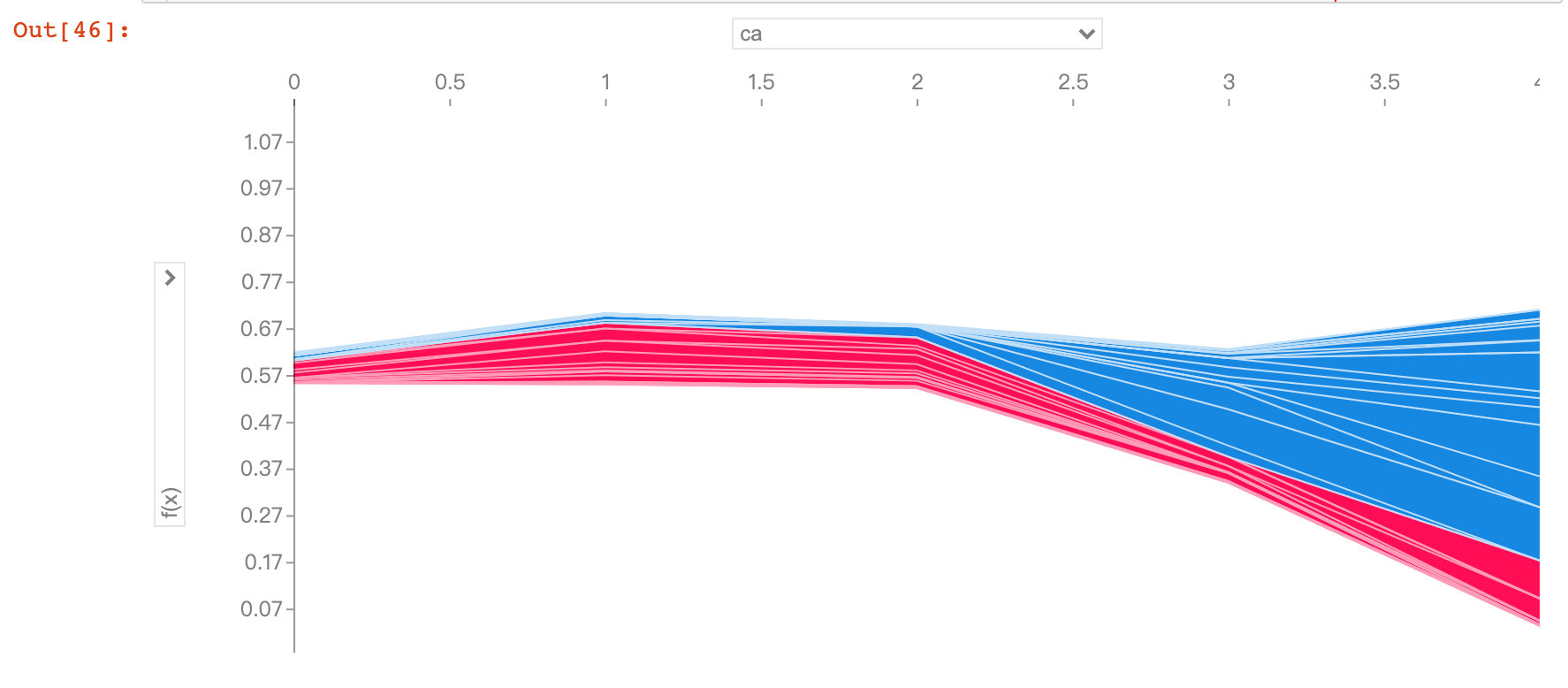
Field ca
base_features = df.columns.values.tolist()
base_features.remove("target")

feat_name = 'ca'  # ca-num_major_vessels original
pdp_dist = pdp.pdp_isolate(
    model=rf,  # Model
    dataset=X_test,  # Test Set
    model_features=base_features,  # The characteristic variable; Remove Target Value
    feature=feat_name  # Specify a single field
)

pdp.pdp_plot(pdp_dist, feat_name)  # Two parameters passed in
plt.show()
As the ca field increases, the risk of disease decreases. The ca field means the number of blood vessels (num_major_vessels), which means that as the number of blood vessels increases, the prevalence decreases.
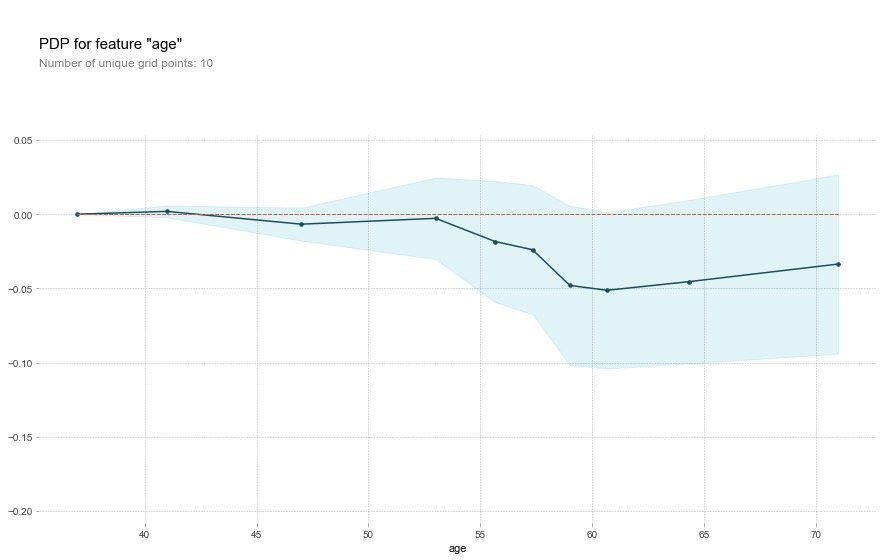
Field age
feat_name = 'age'

pdp_dist = pdp.pdp_isolate(
    model=rf,
    dataset=X_test,
    model_features=base_features,
    feature=feat_name)

pdp.pdp_plot(pdp_dist, feat_name)
plt.show()
For the age field, the original description:
That's a bit odd. The higher the age, the lower the chance of heart disease? Althought the blue confidence regions show that this might not be true (the red baseline is within the blue zone).
Translator: This is a bit strange. The older you get, the less likely you are to have heart disease? Although the blue confidence interval indicates that this may not be true (the red baseline is in the blue area)
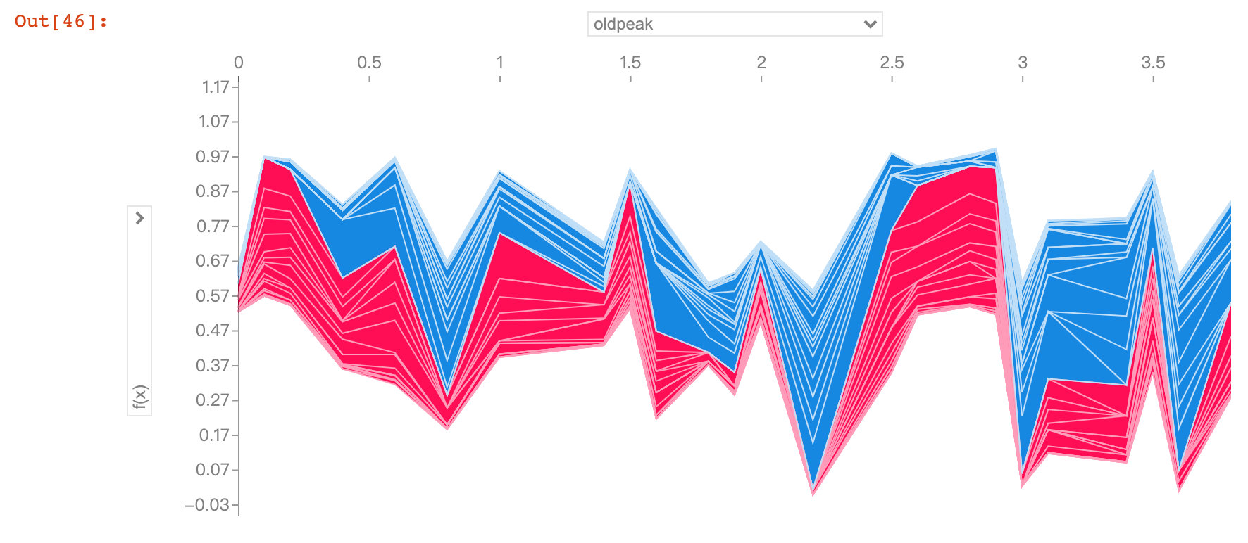
Field oldpeak
feat_name = 'oldpeak'

pdp_dist = pdp.pdp_isolate(
    model=rf,
    dataset=X_test,
    model_features=base_features,
    feature=feat_name)

pdp.pdp_plot(pdp_dist, feat_name)
plt.show()
The oldpeak field also showed that the higher the value, the lower the risk.
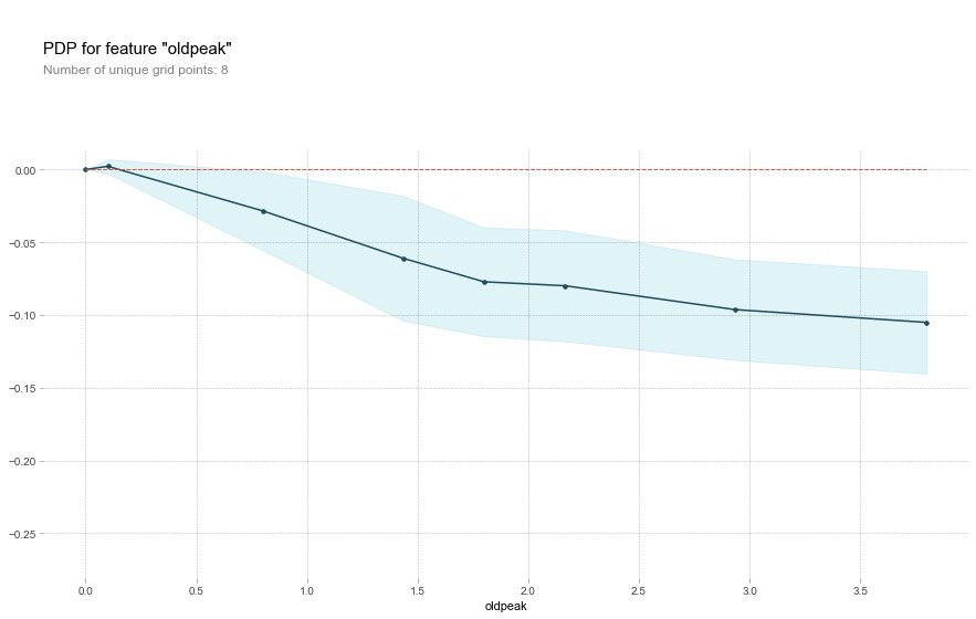
This variable is called the "ST depression induced by relative rest exercise". Under normal conditions, the higher the value, the higher the risk. However, the above image shows the opposite result.
The authors conclude that the depression amount may also be related to the slope type. The original abstract is as follows, so the author draws a 2D-PDP graph
Perhaps it's not just the depression amount that's important, but the interaction with the slope type? Let's check with a 2D PDP
2D-PDP Diagram
Looking at slope_upsloping, slope_ The relationship between flat and oldpeak:
inter1  =  pdp.pdp_interact(
    model=rf,  # Model
    dataset=X_test,  # Feature dataset
    model_features=base_features,  # Features
    features=['slope_upsloping', 'oldpeak'])

pdp.pdp_interact_plot(
    pdp_interact_out=inter1,
    feature_names=['slope_upsloping', 'oldpeak'],
    plot_type='contour')
plt.show()

## ------------

inter1  =  pdp.pdp_interact(
    model=rf,
    dataset=X_test,
    model_features=base_features,
    features=['slope_flat', 'oldpeak']
)

pdp.pdp_interact_plot(
    pdp_interact_out=inter1,
    feature_names=['slope_flat', 'oldpeak'],
    plot_type='contour')
plt.show()
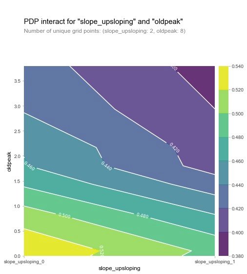
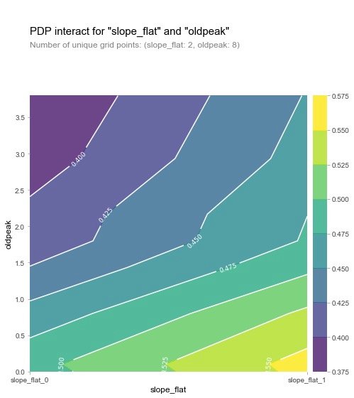
From the two graphs, we can see that when the oldpeak value is low, the prevalence is higher (yellow), which is a strange phenomenon. The author then made the following visualization explorations of SHAP: analysis of individual variables.
SHAP Visualization
For an introduction to SHAP, refer to the article: https://zhuanlan.zhihu.com/p/83412330 and https://blog.csdn.net/sinat_26917383/article/details/115400327
SHAP is a model interpretation package developed by Python that can interpret the output of any machine learning model. Some of the functions used by SHAP are as follows:
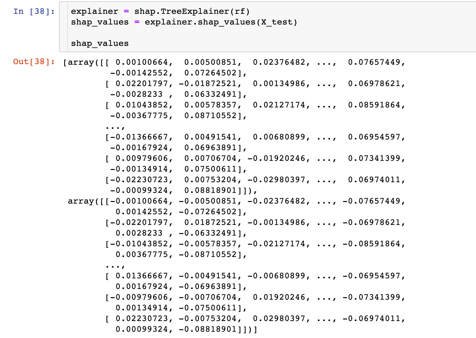
Explainer
An explainer needs to be created prior to model interpretation in SHAP, which supports many types of explainers, such as deep, gradient, kernel, linear, tree, sampling. In this case, let's take Tree as an example:
# Incoming Random Forest Model rf
explainer = shap.TreeExplainer(rf)
# Data passed in eigenvalues in explainer to calculate shap values
shap_values = explainer.shap_values(X_test)
shap_values
Feature Importance
Take the mean of the absolute value of each feature's SHAP value as the importance of that feature and get a standard bar graph (multi-class produces stacked bar graphs:
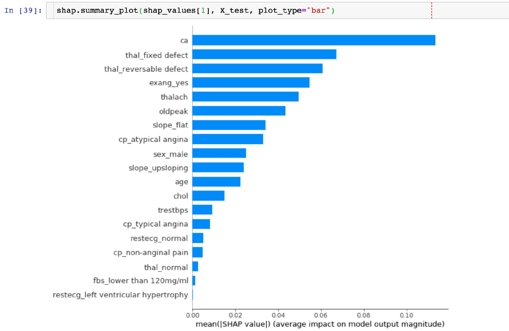
CONCLUSION: The highest SHAP value in the ca field can be visually observed.
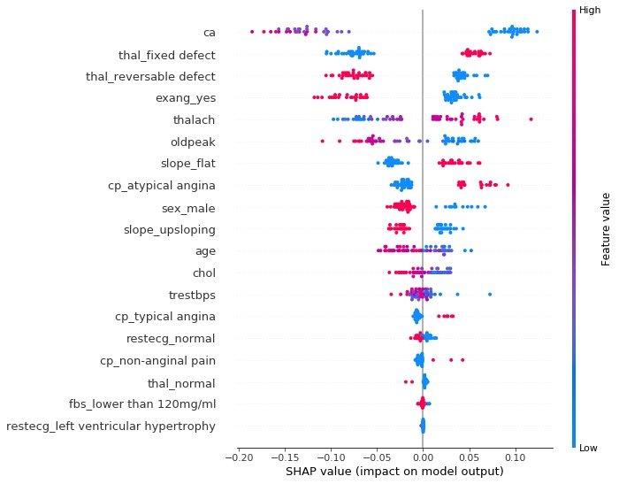
summary_plot
The summary plot plots the SHAP values of each feature for each sample, which provides a better understanding of the overall pattern and allows for the discovery of predicted outliers.
- Each row represents a feature, and the horizontal coordinate is the SHAP value
- A point represents a sample, and a color represents the value of the eigenvalue (high red, low blue)
individual difference
To examine the impact of different characteristic attributes of a single patient on its outcome, the original text describes:
Next, let's pick out individual patients and see how the different variables are affecting their outcomes
def heart_disease_risk_factors(model, patient):

    explainer = shap.TreeExplainer(model)  # Set up explainer
    shap_values = explainer.shap_values(patient)  # Calculate shape values
    shap.initjs()
    return shap.force_plot(
      explainer.expected_value[1],
      shap_values[1],
      patient)
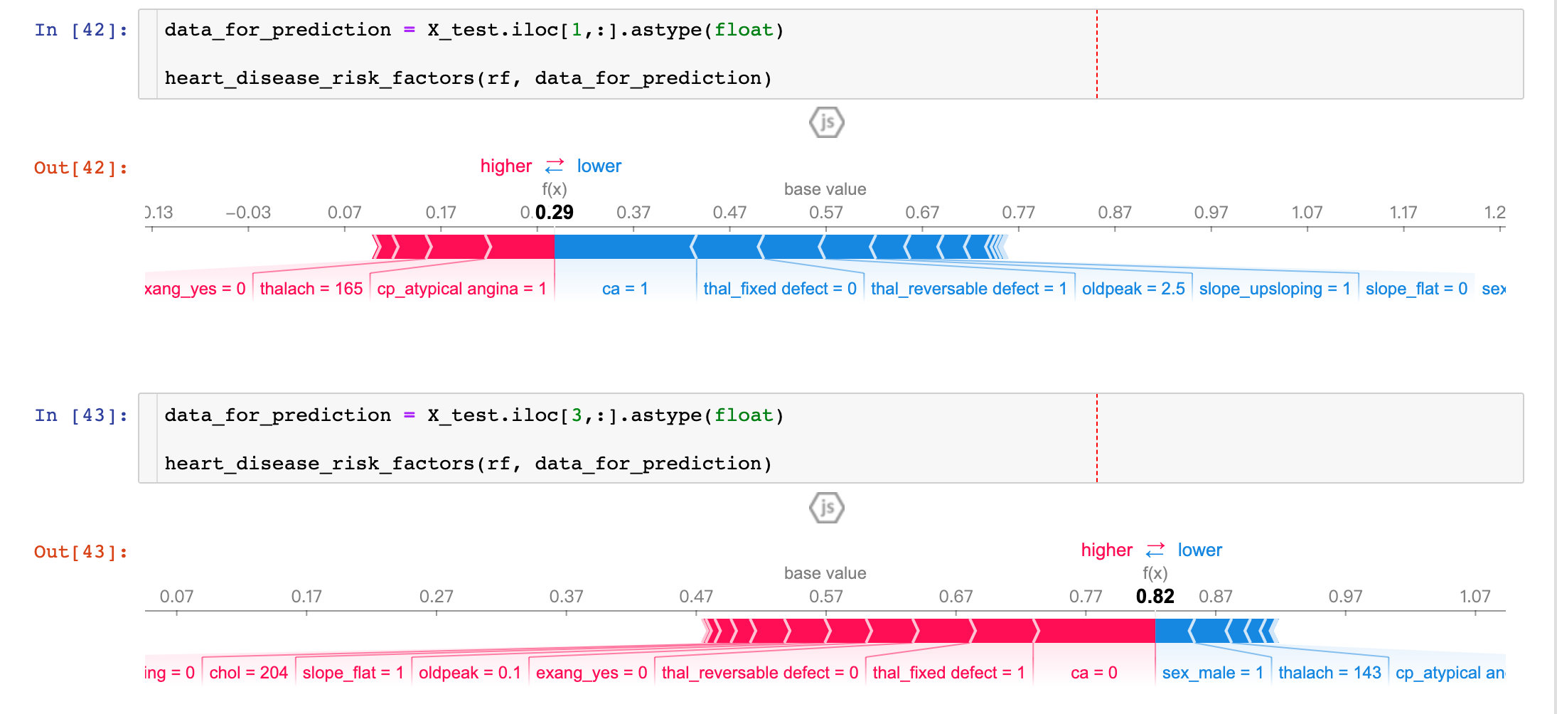
Results from two patients show that:
- P1: The prediction accuracy is as high as 29% (baseline is 57%), more factors are concentrated in ca, thal_ Fixed_ Blue parts such as defect, oldpeak, etc.
- P3: Prediction accuracy is as high as 82%, more influential factors are sel_male=0, thalach=143, etc.
By comparing different patients, we can see the predictive rate and major influencing factors among different patients.
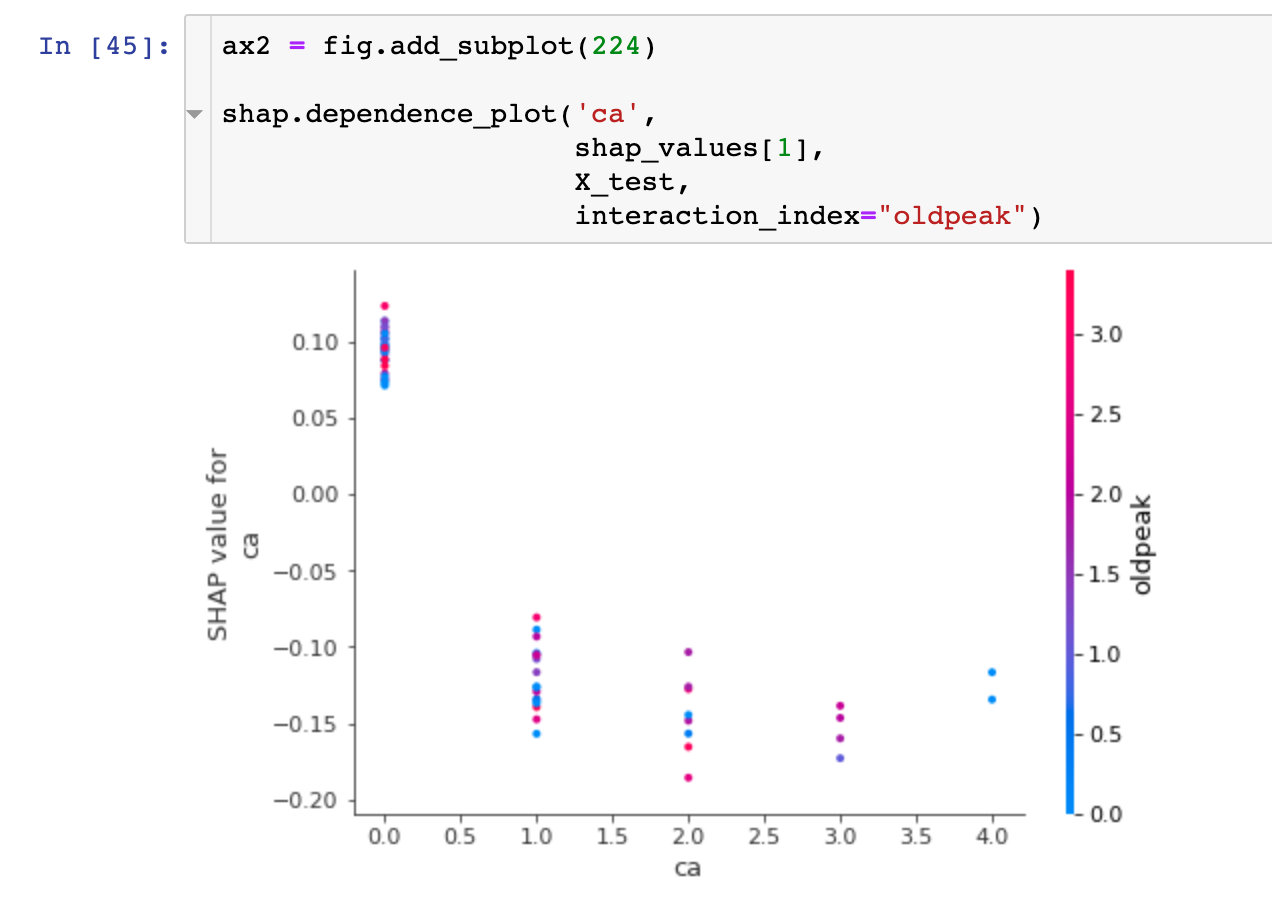
dependence_plot
To understand how a single feature affects the output of a model, we can compare the SHAP value of the feature with that of all samples in the dataset:
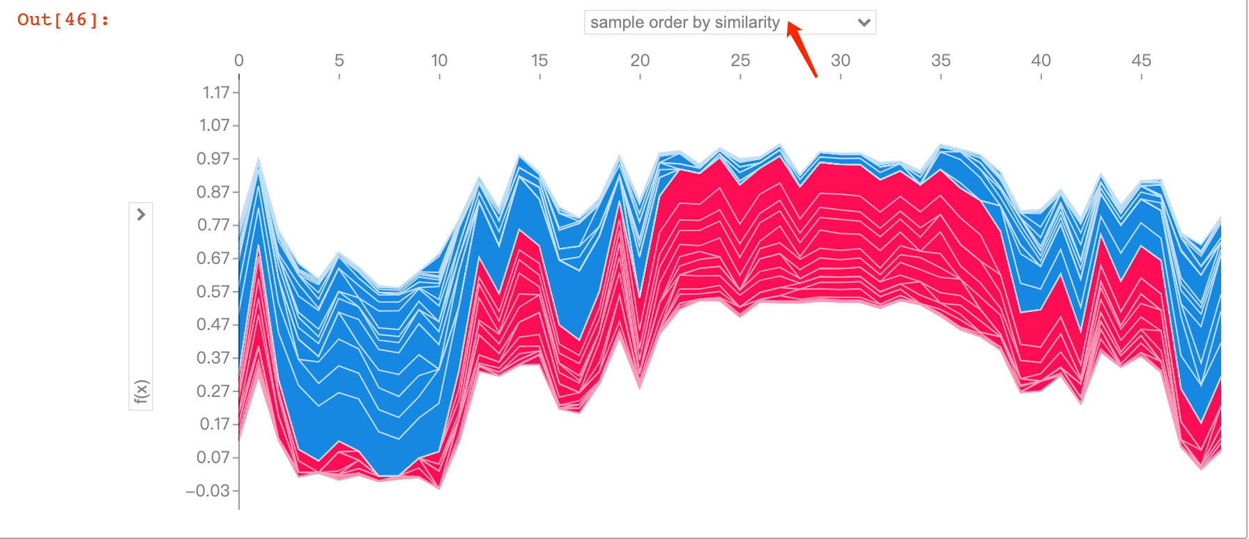
Visual Exploration of Diversity
The following figure explores predictions and influencing factors for multiple patients. With the interaction of jupyter notebook, we were able to observe the impact of different feature attributes on the first 50 patients:
shap_values = explainer.shap_values(X_train.iloc[:50])
shap.force_plot(explainer.expected_value[1],
                shap_values[1],
                X_test.iloc[:50])