On June 1, the mobile tour of Moore Manor was officially opened. The little blogger went to download it for the first time. It's so fun that with this blog, let's see how to realize this lovely (magical) little Moore!!
Realization effect
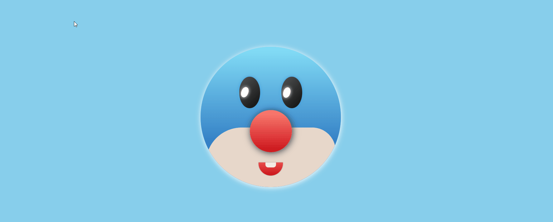
Hahaha, is this little Moore's head very magical? The blogger tried his best! Isn't it cute~~
Implementation process
1. Define HTML tags
Face is the whole round face, eyes is the outer box of two eyes, nose and mouse mouth
<div class="face">
    <div class="eyes">
        <div class="eyeIn">
            <div class="eye"></div>
        </div>
        <div class="eyeIn">
            <div class="eye"></div>
        </div>
    </div>
    <div class="nose"></div>
    <div class="mouse"></div>
</div>
2. Draw face
Given a 400px*400px round face, the background color is a set of light blue gradients
Background: linear gradient (RGB (132, 222, 247), RGB (14, 84, 175)): gradient background color.
Box shadow: 1px 2px 15px white: add shadow to make it clear.
.face {
    position: relative;
    display: flex;
    justify-content: center;
    align-items: center;
    width: 400px;
    height: 400px;
    border-radius: 50%;
    background: linear-gradient(rgb(132, 222, 247), rgb(14, 84, 175));
    box-shadow: 1px 2px 15px white;
    overflow: hidden;
}
3. Draw oval eyes
.eyes .eyeIn {
    position: relative;
    width: 60px;
    height: 90px;
    display: block;
    background: linear-gradient(135deg, rgb(82, 83, 83), rgb(14, 15, 15));
    margin: 0 30px;
    border-radius: 50%;
    box-shadow: 0px 0px 10px rgb(54, 161, 230);
}
4. Draw eye beads
The drawing of eyeballs adopts the pseudo class in an eye box to define the eyeballs. In this way, the rotation position of the eyeballs can be adjusted by controlling the size of the eye box
.eyes .eye {
    position: relative;
    top: 20px;
    width: 60px;
    height: 60px;
    border-radius: 50%;
}

.eyes .eye::before {
    content: '';
    position: absolute;
    top: 50%;
    left: 15px;
    transform: translate(-50%, -50%);
    width: 20px;
    height: 30px;
    background-color: white;
    border-radius: 50%;
    box-shadow: 0px 0px 10px white;
}
5. Draw the mouth
Drawing teeth through pseudo elements is ugly, but at least there are teeth. We don't accept refutation! At the same time, add transition attributes to the mouth, so that there is a transition effect when the mouse moves in
.mouse {
    position: absolute;
    top: 330px;
    width: 70px;
    height: 50px;
    box-shadow: 0px 0px 2px rgb(106, 119, 119);
    border-bottom-left-radius: 50px;
    border-bottom-right-radius: 50px;
    background: linear-gradient(rgb(244, 71, 78), rgb(201, 20, 25));
    transition: .5s;
}

.mouse::before {
    position: absolute;
    left: 20px;
    content: '';
    width: 30px;
    height: 14px;
    background-color: rgb(245, 237, 230);
    border-bottom-left-radius: 8px;
    border-bottom-right-radius: 8px;
}
6. Move the mouse into the avatar
When the mouse moves into the portrait of little Moore, let little Moore put his mouth away. It's magical!
.face:hover .mouse {
    height: 20px;
    transition: .5s;
}
7. Eyes follow the mouse
This part is the soul of little Moore. It realizes the effect of eyes moving with the mouse. It's really a little strange, as if someone is staring at you!
This involves a mathematical problem. We need to realize the claimed effect. We need to make the current position of the mouse, the center of the eye circle, and the center of the eye circle collinear. Therefore, we first calculate the coordinates of the center of the circle x,y, and use the getBoundingClientRect() method in the following code
This method is used to obtain the position of the left, top, right and bottom of an element in the page relative to the browser window. What is returned is a rectangular object, including four attributes: left, top, right and bottom. Represents the distance between each edge of the element and the upper and left sides of the page.
clientWidth is used to obtain the width of the element, half of which is the position of the center of the circle, so that we can obtain the coordinates of the center of the circle (x,y)
Then, through the atan2(X,y) method under Math, return the radian system of the included angle between the point (x,y) and the X coordinate axis. We pass in e.pageX - x, e.pageY - y, that is, the coordinates of the mouse when the center of the eye circle is the coordinate origin. The radian system obtained is the radian of the mouse corresponding to the linear position on the circle, that is, the radian of the eye to rotate, In this way, the eyes can be rotated to the corresponding position, which can be realized. It will be found in the following code
let rot = (rad * (180 / Math.PI) * -1) + 270
The purpose of adding 270 here is to calculate from the 0deg position, and the initial position of the eye is on the left
window.addEventListener('mousemove', (e) => {
    let eye = document.querySelectorAll('.eye')
    eye.forEach(eye => {
        // Get eye center coordinates
        let x = (eye.getBoundingClientRect().left) + (eye.clientWidth / 2)
        let y = (eye.getBoundingClientRect().top) + (eye.clientHeight / 2)
        // radian
        let rad = Math.atan2(e.pageX - x, e.pageY - y)
        // Angle of rotation
        let rot = (rad * (180 / Math.PI) * -1) + 270
        // Make the eyes move by rotating
        eye.style.transform = 'rotate(' + rot + 'deg)'
    })
})
The lovely little Moore is finished. Although there are many deficiencies, it is still very cute~~