Creating a simple transition effect in css can be achieved in the following steps
(1) Declare the initial state style of the element in the default style
(2) Declare the final state style of transition elements, such as suspended state
(3) In the default style, add some different styles by adding transition functions
1. Deformation
2D deformation: rotation deformation, scaling deformation, oblique cutting deformation, displacement deformation
// Rotation deformation: clockwise angle is positive and counterclockwise angle is negative
transform: rotate(45deg);
// Custom transform origin:
transform-origin:0 0; //Rotate with the upper left corner as the center point
transform-origin:0 100px; //Rotate with the lower left corner as the center point
// Scale deformation, larger than 1 means to enlarge, and small fish 1 means to shrink
transform: scale(3);
// sx means the width is scaled to sx times of the original element, and sy means the height is scaled to SY times of the original element
// For example, the original width is 1000px and the height is 500px, which is reduced to 300px and 100px
transform: scale(300/1000,100/500);
transform: scale(.3,.2);
// Oblique cutting deformation (x oblique cutting angle, y oblique cutting angle), counterclockwise is the positive direction and clockwise is the negative direction
transform: skew(10deg,20deg)
// Displacement deformation (move right, move down)
transform:translate(100px,200px);
3D deformation:
// x represents rotation about the horizontal axis, y represents rotation about the vertical axis, and z is equivalent to rotation about the plane
transform: rorateX(30deg);
transform: rorateY(60deg);
transform: rorateZ(45deg);
2. transition attribute
The transition function of css3 is very simple: the transition of css3 allows the attribute values of css to transition smoothly within a certain time interval. This effect can be triggered when the mouse clicks, gets the focus, is clicked or changes any element, and smoothly changes the attribute value of css with animation effect.
The css3 transition is declared with the general style on the element. The browser applies transitions whenever the target properties change. In addition to using JavaScript to trigger actions, you can also trigger actions through some pseudo classes in css, such as: hover,: focus,: active,: target and: checked.
Here are the steps to create a simple transition using css:
(1) Declare the initial state style of the element in the default style
(2) Declare the final style of the transition element, such as the suspended state
(3) In the default style, add some different styles by adding transition functions.
So, what attributes can participate in the transition?
1. All numeric types can participate in the transition: such as width, height, left, top, border radius, bottom, etc
2. Background color and text color can be transited
3. All deformations (including 2D and 3D can be transited)
transition:width 1s linear 0s;
// Indicates that the width participates in the transition, the animation duration is 1s, changes at a constant speed, and the delay is 0s
Four small attributes of transition:
Transition property which properties are to be transitioned
Transition duration animation events
Transition property animation change curve (slow effect)
Transition property animation delay time (how many s to wait to start the transition)
// All indicates that all properties participate in the transition
transition:all 1s linear 0s;
Transition cushioning
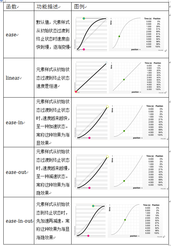
Transition timing function property
The transition timing function property refers to the "jogging function" of the transition. It is mainly used to specify the transition speed of the browser and the operation progress during the transition, including the following functions:
For example, change the width of the element from 100px to 300px
<style>
        div{
        width:100px;
        height:100px;
        background:red;
        transition:width 2s ease-in;
        }
        div:hover{
        width:300px;
        }
    </style>
Limitations of transition
(1) transition requires event triggering, so it cannot occur automatically when the web page is loaded.
(2) transition is one-time and cannot be repeated unless it is triggered again and again.
(3) transition can only define start and end states, not intermediate states, that is, there are only two states.
(4) A transition rule can only define the change of one attribute and cannot involve multiple attributes.
CSS Animation is proposed to solve these problems.
3.animation
@keyframes rule
Keyframes are called keyframes, which are similar to those in flash. In css3, it mainly starts with "@ keyframes", followed by the animation name and a pair of curly brackets {...}. In the brackets are some style rules in different time periods
The style rule in a "@ keyframes" can be composed of multiple percentages. For example, create more percentages between "0%" and "100%". Add different styles to the elements that need animation effect in each percentage, so as to achieve a changing effect.
It should be noted that when defining animation names in @ keyframes, 0% and 100% can also be represented by the keywords from and to, where 0% corresponds to from and 100% corresponds to to to
@keyframes changecolor{
  0%{
    background: red;
  }
  20%{
    background:blue;
  }
  40%{
    background:orange;
  }
  60%{
    background:green;
  }
  80%{
    background:yellow;
  }
  100%{
    background: red;
  }
}
amount to
@keyframes changecolor{
  from{
    background: red;
  }
  20%{
    background:blue;
  }
  40%{
    background:orange;
  }
  60%{
    background:green;
  }
  80%{
    background:yellow;
  }
  to{
    background: red;
  }
}
Attribute value of animation: infinite automatic execution; alternate is executed alternately (always executed). Forwards keeps the status. You can also increase the number of executions
// Keep state after animation execution
animation: r 1s linear 0s forwards;

// The animation is executed 3 times
animation: r 1s linear 0s 3;

// Animation always executes
animation: r 1s linear 0s infinite;
// The square background color changes from red to green, always alternating
<style>
        div{
        width:100px;
        height:100px;
        background:red;
        animation: changeColor 1s linear 0s infinite alternate;
        }
        @keyframes changeColor{
            from {
                background: red;
            }
            to {
                background: green;
            }
        }
    </style>
// After the square background color changes from red to green, it remains green
<style>
        div{
        width:100px;
        height:100px;
        background:red;
        animation: changeColor 3s linear 0s forwards;
        }
        @keyframes changeColor{
            from {
                background: red;
            }
            to {
                background: green;
            }
        }
    </style>
// The square background color changes from red to green three times, and then changes back to the original red
<style>
        div{
        width:100px;
        height:100px;
        background:red;
        animation: changeColor 3s linear 0s 3;
        }
        @keyframes changeColor{
            from {
                background: red;
            }
            to {
                background: green;
            }
        }
    </style>