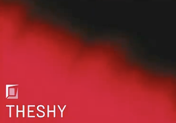
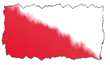
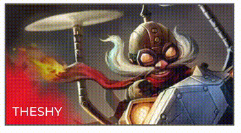
Recently, the S11 LPL spring competition started. In the process of watching the competition, I found a new and interesting mask effect in the Ban/Pick selection stage of the new season, as shown in the following figure:
Of course, it is a dynamic effect. In the process of selecting a candidate, there will be a breathing effect:
The Gif image is a bit blurred. Generally speaking, it is a mask effect close to fog. Moreover, it can change dynamically.
This article will explore how we can achieve similar effects in CSS.
Achieve smoky mask effect
First, let's try to implement such a dynamic mask:
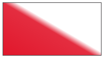
Assuming that there is no blurred edge and smoky effect, it is actually a gradient:
<div></div>
div {
width: 340px;
height: 180px;
border: 2px solid #5b595b;
background: linear-gradient(
rgba(229, 23, 49, 1),
rgba(229, 23, 49, .9) 48%,
transparent 55%,
);
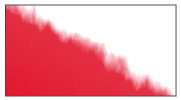
}Through the above code, we can get:
Well, it looks really ordinary. How can we use it to get an atomization effect?
When it comes to smoke, smart students should be able to think of filters. Of course, they are SVG's < feturbulence > filters.
Yes, it's it again. It's really interesting. My two recent articles on it-- Amazing!! CSS can also achieve smoke effect?,Amazing!! Can CSS also realize Aurora? You can read it together.
The type="fractalNoise" of < feturbulence > is very easy to use when simulating cloud and fog effects. The filter uses Perlin noise function to create an image, which can realize translucent smoke or wavy image, and is used to realize some special textures.
Here, we use the < feturbulence > filter to simply process the above graphics:
<div></div>

<svg width="0">
  <filter id="filter">
    <feTurbulence id="turbulence" type="fractalNoise" baseFrequency=".03" numOctaves="20" />
    <feDisplacementMap in="SourceGraphic" scale="30" />
  </filter>
</svg>
In CSS, you can use filter: url() to introduce the filter to the corresponding element:
div {
...
filter: url(#smoke);
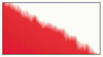
}Effect of elements acting on the filter:
Because I added a border to the element, the whole border was also atomized. This is not what we want. We can use pseudo elements to transform it. The border acts on the container, use pseudo elements to realize gradient, and use filters on pseudo elements:
div {
    position: relative;
    width: 340px;
    height: 180px;
    border: 2px solid #5b595b;

    &::before {
        content: "";
        position: absolute;
        left: 0;
        top: 0;
        right: 0;
        bottom: 0;
        background: linear-gradient(
            30deg,
            rgba(229, 23, 49, 1),
            rgba(229, 23, 49, .9) 48%,
            transparent 55%,
        );
        filter: url(#smoke);
    }
}
The effects after transformation are as follows:
OK, it's a step closer, but there are many flaws around that haven't been filled. No problem. Let's change the top \ left \ right \ bottom of the positioning to make the pseudo element exceed the parent container. The parent container can set overflow: hidden:
div {
    ....
    overflow: hidden;

    &::before {
        ....
        left: -20px;
        top: -10px;
        right: -20px;
        bottom: -20px;
        background: linear-gradient(
            30deg,
            rgba(229, 23, 49, 1),
            rgba(229, 23, 49, .9) 48%,
            transparent 55%,
        );
        filter: url(#smoke);
    }
}
After adjustment, see the effect:
It feels a little like that. Next, we just need to make the smoke element move. In order to make the whole effect coherent (because SVG animation itself does not support features like animation fill mode: Alternate), we still need to write some JavaScript code to control the overall cycle of the animation.
The approximate code is as follows:
const filter = document.querySelector("#turbulence");
let frames = 1;
let rad = Math.PI / 180;
let bfx, bfy;

function freqAnimation() {
    frames += .35;

    bfx = 0.035;
    bfy = 0.015;

    bfx += 0.006 * Math.cos(frames * rad);
    bfy += 0.004 * Math.sin(frames * rad);

    bf = bfx.toString() + " " + bfy.toString();
    filter.setAttributeNS(null, "baseFrequency", bf);

    window.requestAnimationFrame(freqAnimation);
}

window.requestAnimationFrame(freqAnimation);
In fact, there is only one thing that this code does, which is to make the baseFrequency attribute of the #turbulence filter of SVG loop infinitely in an interval, that's all. By changing the baseFrequency, the whole smoke changes continuously.
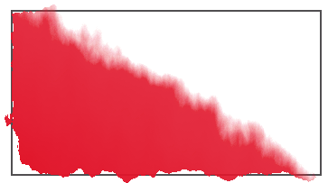
So far, we have got a complete and moving smoke mask:
Add the pictures in the following box to get the effect of the effect picture given at the beginning:
Complete code, you can stamp here-- CodePen Demos -- LPL BAN PICK MASK Effect
Realize the mask effect of breathing state
On the basis of the above, adding the effect of breathing is actually very simple.
We only need to change one position of the gradient. There are many methods. Here I give a more elegant but less compatible method - CSS @property.
Simply modify the above code:
@property --per {
    syntax: "<percentage>";
    inherits: false;
    initial-value: 22%;
}
div::before {
    ...
    background: linear-gradient(
        30deg,
        #ff0020,
        rgba(229, 23, 49, .9) var(--per),
        transparent calc(var(--per) + 8%),
    );
    filter: url(#smoke);
    animation: change 2s infinite ease-out;
}
@keyframes change {
    50% {
        --per: 18%;
    }
}
In this way, the breathing effect is achieved:
Complete code, you can stamp here-- CodePen Demos -- LPL BAN PICK MASK Effect
last
Well, this article ends here. I hope this article will help you:)
If you want Get to get the most interesting CSS information, don't miss my official account -- iCSS front end interesting news. 😄
More wonderful CSS technical articles are summarized in my Github -- iCSS , continuously updated. Welcome to a star subscription collection.
If you have any questions or suggestions, you can communicate more. The original articles are limited in writing and lack of talent and learning. If there is anything wrong in the article, please let me know.