As data scientists or machine learning practitioners, integrating interpretability into machine learning models can help decision makers and other stakeholders have more visibility and understand the interpretation of model output decisions.
In this article, I will introduce two models, life and shake, which can help understand the decision-making process of the model.
Model
We will use the diabetes dataset from Kaggle. The main focus is interpretability, so we don't spend much time trying to have fancy models.
# Load useful libraries
import pandas as pd
from sklearn.model_selection import train_test_split
from sklearn.ensemble import RandomForestClassifier
from sklearn.model_selection import cross_val_score
`
# Read data set
df = pd.read_csv("./data/diabetes.csv")

# Separate Features and Target Variables
X = df.drop(columns='Outcome')
y = df['Outcome']

# Create Train & Test Data
X_train, X_test, y_train, y_test = train_test_split(X, y,test_size=0.3,
                                                    stratify =y,
                                                    random_state = 13)

# Build the model
rf_clf = RandomForestClassifier(max_features=2, n_estimators =100 ,bootstrap = True)

# Make prediction on the testing data
y_pred = rf_clf.predict(X_test)

# Classification Report
print(classification_report(y_pred, y_test))
rf_clf.fit(X_train, y_train)
SHAP
It is short for Shapley additional explanations. The purpose of this method is to explain the prediction of examples / observations by calculating the contribution of each feature to the prediction.
# Import the SHAP library
import shap

# load JS visualization code to notebook
shap.initjs()

# Create the explainer
explainer = TreeExplainer(rf_clf)

"""
Compute shap_values for all of X_test rather instead of
a single row, to have more data for plot.
"""
shap_values = explainer.shap_values(X_test)

print("Variable Importance Plot - Global Interpretation")
figure = plt.figure()
shap.summary_plot(shap_values, X_test)
SHAP has many visual diagrams for model interpretation, but we will focus on several of them.
Summary chart of feature importance
print("Variable Importance Plot - Global Interpretation")
figure = plt.figure()
shap.summary_plot(shap_values, X_test)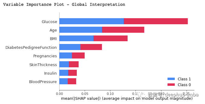
We can draw the following conclusions from the above figure:
- It shows a list of important features, from the most important to the least important (from top to bottom).
- All the features seem to contribute equally to the two categories of diabetes (tag = 1) or undiagnosed (tag = 0), as basically occupy 50% of the rectangle.
- According to the model, Glucose is the feature that contributes the most to the prediction, and Age is the second feature that contributes the most
- Pregnancies is the fifth most predictive feature.
Summary chart of specific classification results
# Summary Plot Deep-Dive on Label 1
shap.summary_plot(shap_values[1], X_test)
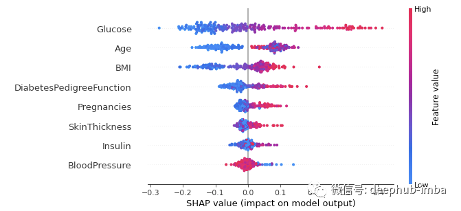
For classification problems, each tag has a snap value. In our example, we use a 1 (True) prediction to display a summary of such results. The diagram is shown as follows:
- The importance and ranking of features are the same as the summary chart. The higher the ranking, the higher the importance.
- Each point in the graph represents the eigenvalue of a single data instance.
- The color indicates whether the feature is high (red) or low (blue).
- The X-axis represents a positive or negative contribution to the predicted output
When we apply these analyses to features, we come to the following conclusions:
For glucose: we see that most high values (red dots) have a positive contribution to the predicted output (positive on the X axis). In other words, if the sugar level of a single data instance is high, the chance to get 1 Results (diagnosed with diabetes) will increase significantly, while low (blue dot) will reduce the probability of being diagnosed as diabetes (negative X axis).
For age: the same analysis was performed for age. The higher the age is, the more likely the patient is diagnosed with diabetes.
On the other hand, the model seems confusing when it comes to minors, because we can observe almost the same number of data points on each side of the vertical line (X-axis = 0). Since age characteristics seem confusing for analysis, we can use the correlation diagram below to obtain more fine-grained information.
Correlation diagram (dependency diagram)
# Dependence Plot on Age feature
shap.dependence_plot('Age', shap_values[1], X_test, interaction_index="Age")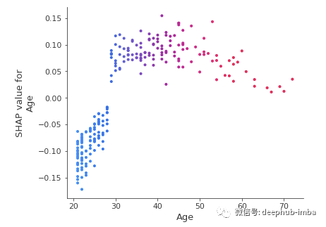
From the correlation map, we can clearly see that patients under 30 are at lower risk of being diagnosed with diabetes, while those aged over 30 are at higher risk of being diagnosed with diabetes.
LIME
It is the abbreviation of Local Interpretable Model Agnostic Explanation. Local means that it can be used to explain individual predictions of machine learning models.
It is also very simple to use. It only needs two steps: (1) import the module, (2) use the training value, feature and target fitting interpreter.
# Import the LimeTabularExplainer module
from lime.lime_tabular import LimeTabularExplainer

# Get the class names
class_names = ['Has diabetes', 'No diabetes']

# Get the feature names
feature_names = list(X_train.columns)

# Fit the Explainer on the training data set using the LimeTabularExplainer
explainer = LimeTabularExplainer(X_train.values, feature_names = feature_names,
                                 class_names = class_names, mode = 'classification')
We use class in the code_ Names creates two tags instead of 1 and 0, because using names is more intuitive.
Explain the single example
The explanation here is for a single instance in the test data
#Perform the explanation on the 8th instance in the test data
explaination = explainer.explain_instance(X_test.iloc[8], rf_clf.predict_proba)

# show the result of the model's explaination
explaination.show_in_notebook(show_table = True, show_all = False)
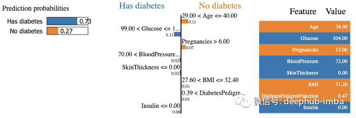
The model predicts the diabetes in 73% patients with a confidence level, and explains the prediction because blood glucose level is above 99 and blood pressure is above 70. On the right, we can see the values of patient characteristics.
summary
In this article, you will learn how to explain your machine learning model using shake and life. Now, you can also analyze the interpretability of the built model, which can help decision makers and other stakeholders gain more visibility and understand the interpretation of the decisions that lead to the output of the model., You can find the two python packages included in this article in the resources below. Read their documentation to find more advanced ways to use them.
Author: Zoumana Keita