Let's take a look at the difference between the customized bottom navigation (Figure 1) and the non customized navigation (Figure 2)

Figure 1
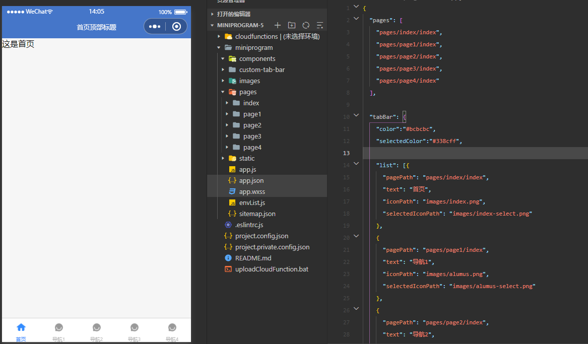
Figure 2
How to implement custom bottom navigation
- Need to be in app Add "custom":true to the configuration item "tabBar" of JSON. After adding this attribute, the following list configuration item will become invalid
So if you customize the bottom navigation bar, you don't need to be in app list is configured in JSON. - Create a folder at the same level as pages with the name of custom tab bar. The folder name is specified and can only be called this.
- After the folder is created, the content of the bottom navigation is written
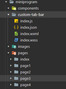
custom-tab-bar/index.js
Click to view the codeComponent({
properties: {
},
data: {
list: [{
"pagePath": "pages/index/index",
"text": "home page",
"iconPath": "images/index.png",
"selectedIconPath": "images/index-select.png"
},
{
"pagePath": "pages/page1/index",
"text": "Navigation 1",
"iconPath": "images/alumus.png",
"selectedIconPath": "images/alumus-select.png"
},
{
"pagePath": "pages/page2/index",
"text": "Navigation 2",
"iconPath": "images/alumus.png",
"selectedIconPath": "images/alumus-select.png"
},
{
"pagePath": "pages/page3/index",
"text": "Navigation 3",
"iconPath": "images/alumus.png",
"selectedIconPath": "images/alumus-select.png"
},
{
"pagePath": "pages/page4/index",
"text": "Navigation 4",
"iconPath": "images/alumus.png",
"selectedIconPath": "images/alumus-select.png"
}],
currentindex: 0
},
methods: {
switchTab(e) {
let url = '/' + e.currentTarget.dataset.path
this.setData({
currentindex: e.currentTarget.dataset.index
})
wx.switchTab({
url: url,
})
}
}
})
{
    "usingComponents": {},
    "navigationBarTitleText": "",
    "navigationBarBackgroundColor": "#4576c9",
    "navigationBarTextStyle": "white"
  }
<view class="tabar">
    <view wx:for="{{list}}" wx:key="index"  class="item"  data-index="{{index}}" data-path="{{item.pagePath}}" bindtap="switchTab">
      <image  class="image" src="{{currentindex==index?('../'+item.selectedIconPath):('../'+item.iconPath)}}"></image>
        <view class="{{currentindex==index?'color':''}}">{{item.text}}</view>
    </view>
</view>
.tabar {
    height: 140rpx;
    width: 100vw;
    position: fixed;
    bottom: 0;
    left: 0;
    display: flex;
    border-top: 1px solid #f3f3f3;
}
.tabar .item {
    width: 20vw ;
    height: 140rpx;
    color: #bcbcbc;
    display: flex;
    flex-direction: column;
    justify-content: center;
    align-items: center;
    font-size: 28rpx;
    background-color: white;

}
.tabar .item  .image {
    width: 60rpx;
    height: 60rpx;
}
.tabar .item .color {
    color: #4576c9;
}
app.js
Click to view the codeApp({
onLaunch: function () {
if (!wx.cloud) {
console.error('Please use 2.2.3 Or above to use cloud capabilities');
} else {
wx.cloud.init({
// env Parameter Description:
// The env parameter determines which cloud environment resources will be requested by default for the next cloud development call (wx.cloud.xxx) initiated by the applet
// Please fill in the environment ID here. You can open the cloud console to view the environment ID
// If it is not filled in, the default environment (the first created environment) will be used
// env: 'my-env-id',
traceUser: true,
});
}
this.globalData = {};
},
editTabBar: function () {
//Using getCurrentPages, you can get an array of all page objects in the current load. The last of the array is the current page.
var curPageArr = getCurrentPages(); //Get loaded page
var curPage = curPageArr[curPageArr.length - 1]; //Gets the object of the current page
var pagePath = curPage.route; //Current page url
if (pagePath.indexOf('/') != 0) {
pagePath = '/' + pagePath;
}
var tabBar = this.globalData.tabBar;
for (var i = 0; i < tabBar.list.length; i++) {
tabBar.list[i].active = false;
if (tabBar.list[i].pagePath == pagePath) {
tabBar.list[i].active = true; //Set the current page status according to the page address
}
}
curPage.setData({
tabBar: tabBar
});
}
});

The home page is the first page, so the value of currentindex is set to 0, followed by page1 page is 1, page2 page is 2
Here is a simple bottom navigation. You can customize more complex bottom navigation according to your project's business needs. The location may not be at the bottom. You can modify the style file under the custom tab bar.
If the console has the following warning
Just in project config. The "checkSiteMap" found in the JSON file can be changed to false.