brief introduction
The geographic map drawing has been published by the younger martial brother and younger martial sister system for several periods. Specific tweets can be seen:
- What kind of spark will the merger of Leaflet and Gaode spark?
- Leaflet and Gaud continue to collide with sparks!
- mapview package for spatial geographic data visualization
- leaflet package for spatial geographic data visualization and its expansion
- tmap package for spatial geographic data visualization and its expansion
- ggplot2 package for spatial geographic data visualization and its expansion
- Introduction to spatial geographic data visualization
There are many tutorials about Chinese map drawing on the Internet, but there are very few provincial and municipal map drawing. This tweet is to solve this problem. The following tweets mainly take Zhejiang Province and Wenzhou City as examples to draw provincial / municipal maps with leaflet package.
Draw provincial map
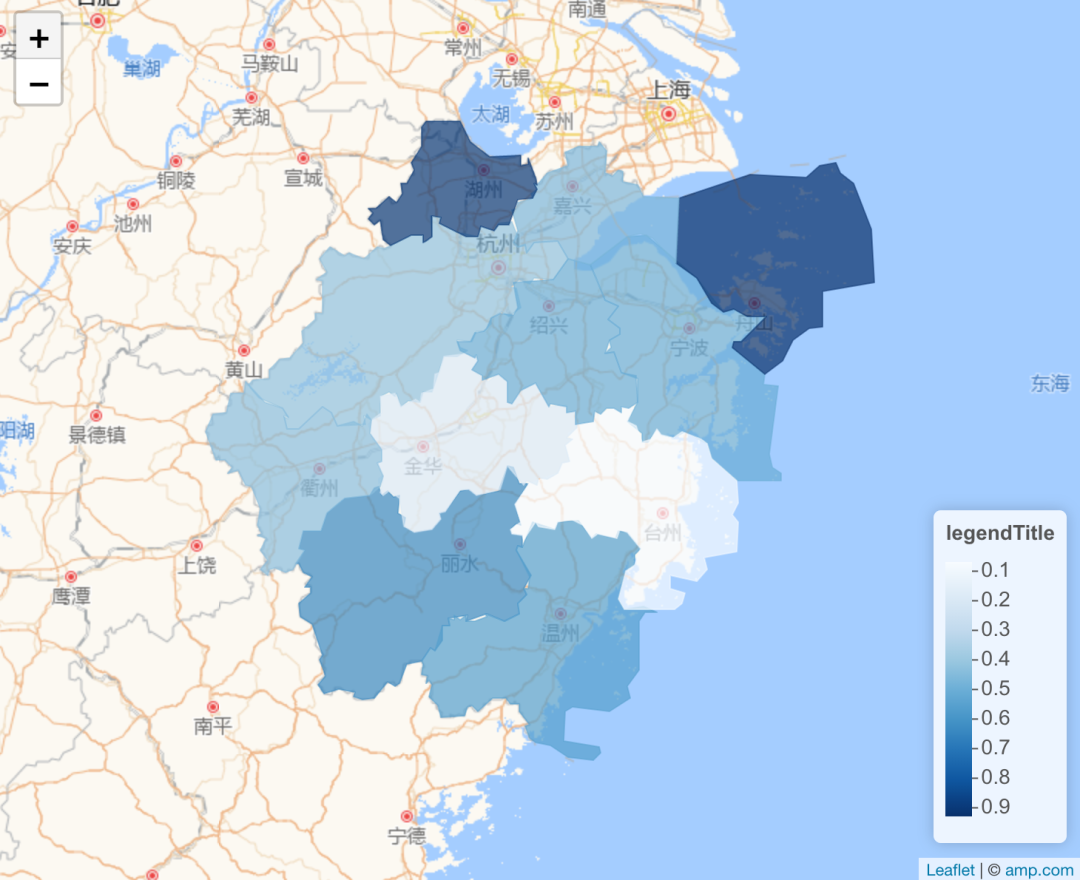
First, use regionNames() to import the names of cities in Zhejiang Province. dem_data can be the data that readers want to fill in the map (for example, GDP, air quality index and other data of each city). Use leafletGeo() to create a data frame of sp object.
Note: DEM here_ Data can be continuous or discrete variables (GDP ranking of each city). The following example uses runif() to randomly generate continuous data.
library(leaflet) #Load package
library(leafletCN)
region = regionNames("Zhejiang")
dem_data = runif(length(region)) # Use your own data here
dat = data.frame(region,dem_data)
map = leafletGeo("Zhejiang", dat)
After building the dataset, draw. Load the map amap of Gaode, set the boundaries and colors of each city, and add legends to get the following html graphics.
#Coloring link
pal <- colorNumeric(
  palette = "Blues",
  domain = map$value)

#Load Gaode map amap
leaflet(map) %>% amap() %>%
  #Add box boundary and color
  addPolygons(stroke = TRUE,
              smoothFactor = 2,
              fillOpacity = 0.7,
              weight = 1,
              color = ~pal(value),
              popup = ~htmltools::htmlEscape(popup)
  ) %>%
  #Add bottom right border
  addLegend("bottomright", pal = pal, values = ~value,
            title = "legendTitle",
            labFormat = leaflet::labelFormat(prefix = ""),
            opacity = 1)
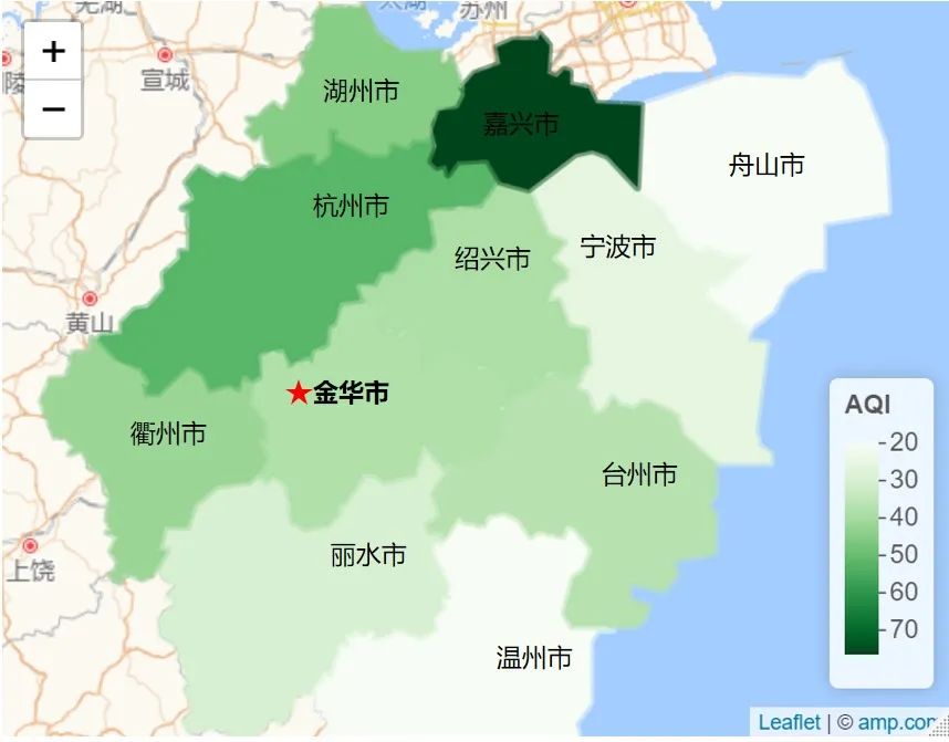
Due to the limited ability of small editing, the following figure is the text manually added through ppt (painted with palette = "Greens", the data comes from real data, and other codes are the same), and then applied to your own paper. If you want to publish in English journals, it is recommended not to appear in Chinese in the picture.
Draw a city map
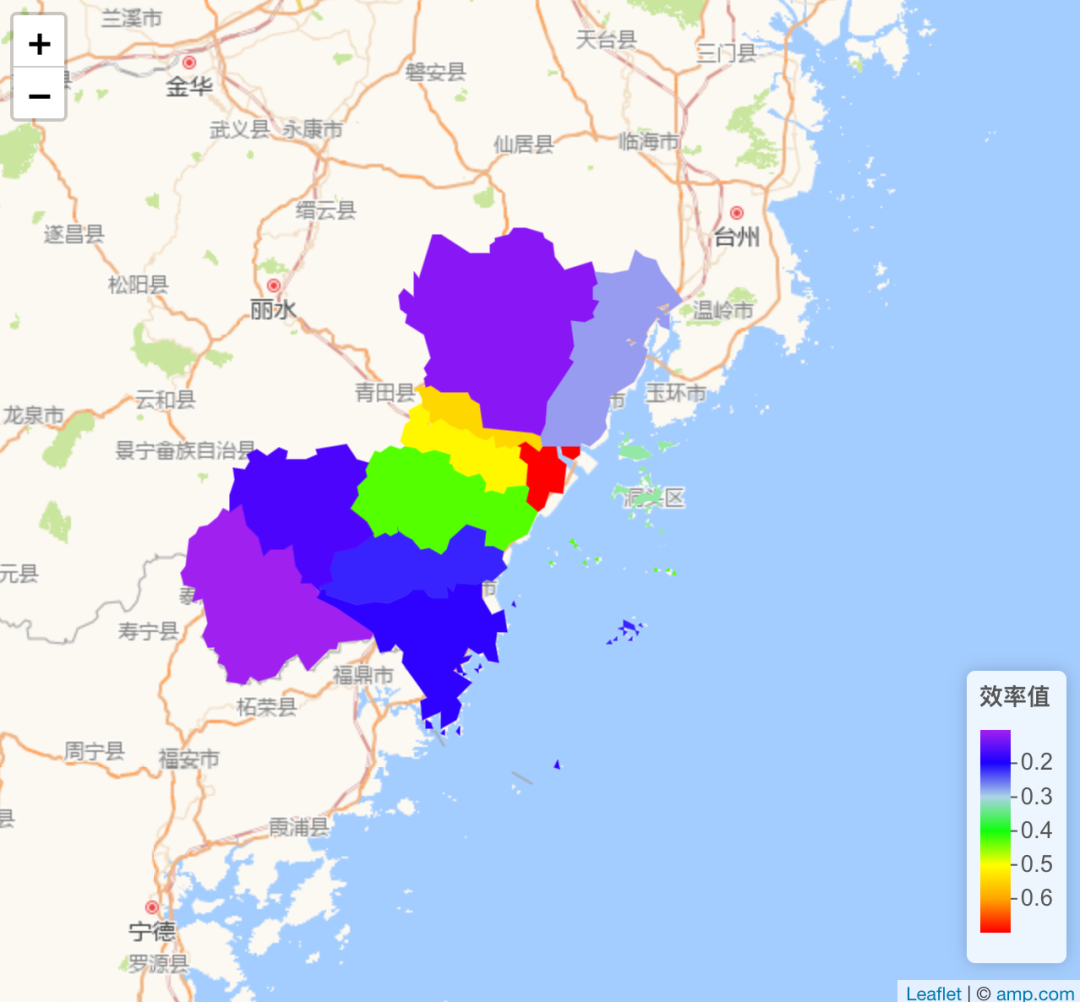
Drawing a municipal map is similar to drawing a provincial map. You only need to change it in regionNames(), and others are almost the same. The map of Wenzhou drawn below has made some small expansion. 1. Use real case data; 2. Fill color changes. dplyr package is mainly used in data processing full_join(), I won't introduce the details too much.
#===============================================================
#========================Mapping of Wenzhou City=======================
#===============================================================


library(leafletCN)
library(dplyr)
library(leaflet)
#demomap("Wenzhou")


#Main function -- geojsonmap: map color marking function
data = read.csv("Operating efficiency of districts and counties.csv",header=T)
data$mean = apply(data[,2:13],1,mean)
colnames(data) = c('region',as.character(2009:2020),"mean")
dim(data)
region = regionNames("Wenzhou City")
dat = data.frame(region,runif(length(region)))
data1 = full_join(dat,data[,c(1,8)])
data2 = data1[,-2]
map = leafletGeo("Wenzhou City", data2)

#Coloring link heat colors(6,rev = T)
# c("#FFFF00FF","#FF0000FF","#00FF00FF","#00FFFFFF","#FF00FFFF","#0000FFFF")
pal <- colorNumeric(
palette = c("purple","blue","lightblue","green","yellow","orange",'red'),
domain = map$value)

#Load Gaode map amap
leaflet(map) %>% amap() %>%
#Add box boundary and color
    addPolygons(stroke = TRUE,
                smoothFactor = 1,
                fillOpacity = 1,
                weight = 1,
                color = ~pal(value),
                popup = ~htmltools::htmlEscape(popup)
    ) %>%
    #Add bottom right border
    addLegend("bottomright", pal = pal, values = ~value,
              title = "Efficiency value",
              labFormat = leaflet::labelFormat(prefix = ""),
              opacity = 2)
Xiaobian has something to say
- This tweet mainly introduces how to use leaflet package to draw provincial / municipal maps, and takes Zhejiang Province and Wenzhou as cases. Readers can use the function to save the picture and use it in the paper.
- However, there are still several problems in the provincial and municipal drawing of this tweet, and the Xiaobian has not been able to solve them through code: 1 How to highlight the name of each city / county above the fill color? 2. Some cities and counties have changed (from county to district), but the leaflet package has not been updated in time. How should we deal with it?
- The above are the problems of Xiaobian in actual scientific research. My "stupid" method is: Drawing details will not be changed? Then use AI! . Or use ppt to modify it manually. If readers have any good ideas, you can leave a message to share. Thank you very much.