css animation
I. Realizing Animation Style
       @keyframes Animation name{
			from {

			}
			to{

			}
		}
Or = = = "
        @ keyframes animation name{
			10% {

			}
			20%{

			}
			...
			100%{

			}
		}
II. Animation Applications
animation-name: animation name;
animation-name:xiyouji;
animation-duration: animation duration
5s;
animation-delay: Delay of animation
1s
animation-direction
reverse / alternate
animation-fill-mode: Which style to keep after animation
forwards. Retain the style of the last frame / backwards retain the style of the first frame
animation-iteration-count: Number of animation executions
4 / infinite
animation-timing-function: Time curve of animation execution
linear / steps
animation-play-state:; animation playback status
running / paused
animation: sketch form
animation: 4s linear 0s infinite alternate move_eye
Third-party animation library (animate.css)
It encapsulates the general animation style of css3 and is highly professional.
Recommend
https://daneden.github.io/animate.css/
- Introducing Animation Library
- Adding class to the element
4. Attached with "Breathing Lamp" and "Dream Journey to the West" animation code
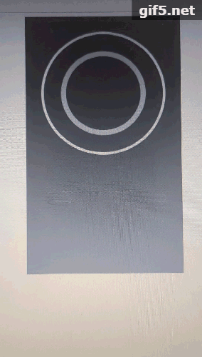
1. Breathing lamp
<!DOCTYPE html>
<html lang="en">
<head>
	<meta charset="UTF-8">
	<title>Internal breathing lamp</title>
	<style>
		div {
			box-sizing: border-box;
		}
		/*container*/
		.container {
			width: 300px;
			height: 500px;
			background-color: #666;
			margin: 0 auto;
		}
		/*Square*/
		.container > .box {
			height: 300px;
			padding: 10px;

			animation-name: x;
			animation-duration: 9s;
			animation-timing-function: linear;
			animation-iteration-count: infinite;
		}
		/*Outer circle*/
		.container > .box > .outer {
			height: 100%;
			border-radius: 50%;
			border:5px solid #ededed;
			padding: 30px;

			animation-name: y;
			animation-duration: 9s;
			animation-timing-function: linear;
			animation-iteration-count: infinite;
		}

		/*Inner circle*/
		.container > .box > .outer > .inner {
			height: 100%;
			border-radius: 50%;
			border: 10px solid #ccc;
		}

		/*Animation definition*/
		@keyframes x {
			25%{
				padding: 20px;
			}
			50% {
				padding: 30px;
			}
			100%{
				padding: 30px;
			}
		}

		@keyframes y {
			25% {
				padding: 40px;
			}
			50% {
				padding: 30px;
			}
			75% {
				padding: 42px;
			}
			100%{
				padding: 30px;
			}
		}

	</style>
</head>
<body>
	<div class="container">
		<div class="box">
			<div class="outer">
				<div class="inner"></div>
			</div>
		</div>
	</div>
</body>
</html>
Design sketch:
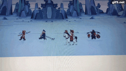
2. A Dream Journey to the West
<!DOCTYPE html>
<html lang="en">
<head>
	<meta charset="UTF-8">
	<title>Fantasy Westward Journey</title>
	<link rel="stylesheet" href="../common.css">
	<style>
		.content {
			position: absolute;
			width: 950px;
			left: 50%;
			margin-left: -475px;
			bottom: 300px;
		}
		.content > ul {

		}
		.content > ul::after {
			display: block;
			content: "";
			clear: both;
		}
		.content > ul >li {
			width: 200px;
			height: 180px;
			margin-right: 50px;
			float: left;
			overflow:hidden;
		}

		.content > ul >li:last-child {
			margin-right: 0;
		}
		.content > ul >li > div {
			width: 1600px;
			height: 180px;
			font-size: 0;

			animation-name: dong;
			animation-duration: 1s;
			/*animation-delay: 1s;*/
			animation-iteration-count: infinite;
			/*animation-direction: reverse;*/
			animation-timing-function: steps(8);
		}
		.content > ul >li > div > img {
			width: 100%;
		}
		/*1. Defining animation*/
		@keyframes dong {
			from {
				margin-left: 0
			}
			to {
				margin-left: -1600px;
			}
		}
		html,body,.main {
			height: 100%;
		}
		.main {
			position: relative;
			width: 100%;
			overflow: hidden;
		}
		.main > .bg {
			position: relative;
			width: 3920px;
			height: 100%;
			background-image: url('./images/bg.jpg');
			background-repeat: repeat-x;

			animation-name: bg;
			animation-duration: 30s;
			animation-timing-function: linear;
			animation-iteration-count: infinite;
		}
		@keyframes bg {
			from {
				left:-1920px;
			}
			to {
				left: 0;
			}
		}
	</style>
</head>
<body>
	<div class="main">
		<!-- background -->
		<div class="bg"></div>
		<!-- 4 masters and apprenticeship -->
		<div class="content">
			<ul>
				<li>
					<div><img src="./images/wk.png" alt=""></div>
				</li>
				<li>
					<div><img src="./images/bj.png" alt=""></div>
				</li>
				<li>
					<div><img src="./images/ts.png" alt=""></div>
				</li>
				<li>
					<div><img src="./images/ss.png" alt=""></div>
				</li>
			</ul>
		</div>
	</div>
</body>
</html>
Design sketch: