HTML+css+js make a 3D rotating album and love time
I'm just a novice Xiaobai. I studied at home for several days and referred to many works of the great God. Then I studied the research, combined with self understanding, modified and made a 3D rotating album with love timing, and later I also added background music.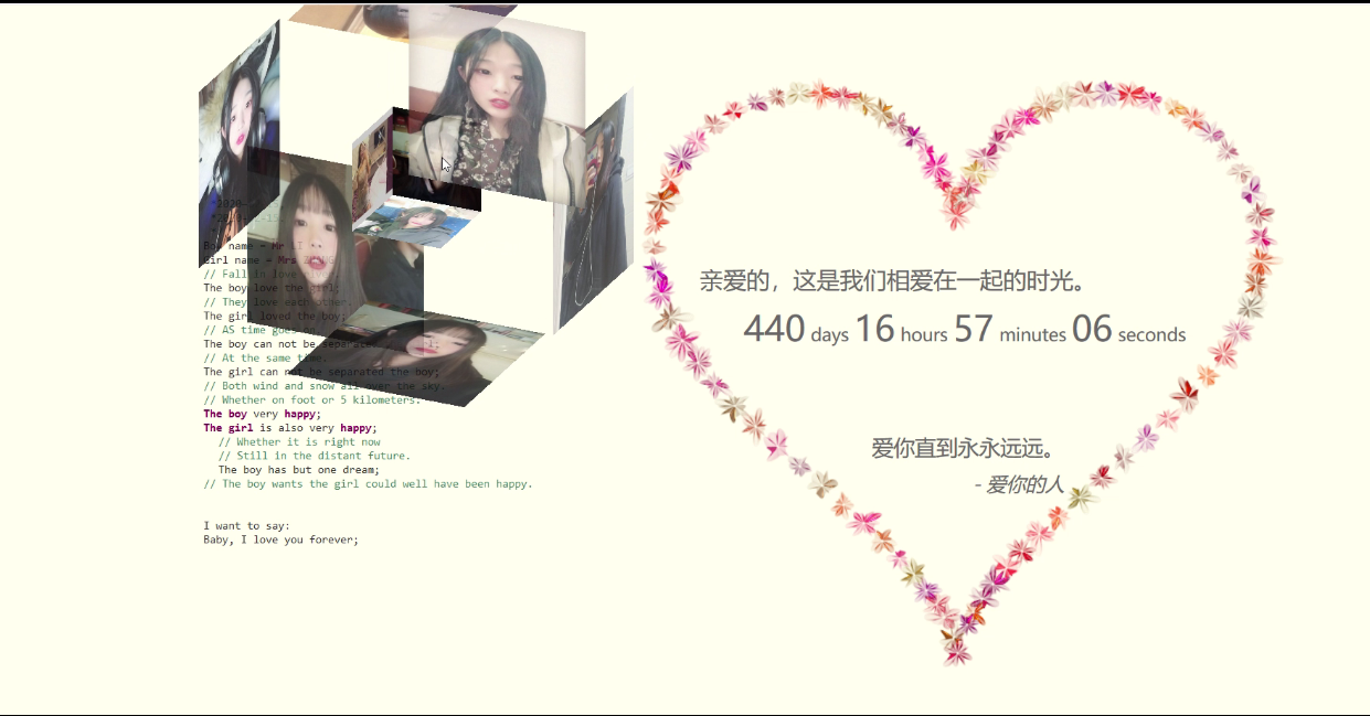
It's like this: 3D album and love timing
Then I also made it into a website, a secondary website hanging under Sina cloud. The steps are very simple, just follow the steps.
Step 1 registered address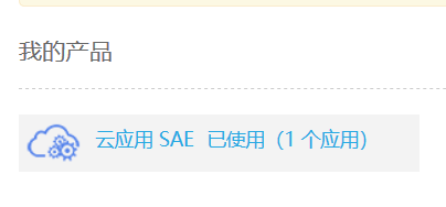

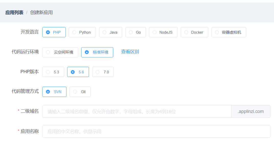

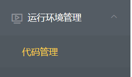


Big God doesn't need to read. Novice Xiaobai may be the same as me after reading. I don't understand. So just as I did, just follow the steps, find the icons in turn and click them in. The fourth step is to find the application click management, find the code management, create a new version, default to 1, and upload the code package.
Here, I'd like to share the code of 3D album HTML5 for new people like me.


    <span class="in_front">
            <img src="z/7.jpg" class="in_pic">
        </span>
    <span class="in_back">
             <img src="z/8.jpg" class="in_pic">
        </span>
    <span class="in_left">
            <img src="z/9.jpg" class="in_pic">
        </span>
    <span class="in_right">
            <img src="z/10.jpg" class="in_pic">
        </span>
    <span class="in_top">
            <img src="z/11.jpg" class="in_pic">
        </span>
    <span class="in_bottom">
            <img src="z/12.jpg" class="in_pic">
        </span>

</div>
<style>
    .wrap {
        width: 100px;
        height: 100px;
        margin: 150px;
        position: relative;
    }

    .cube {
        width: 50px;
        height: 50px;
        margin: 0 auto;
        transform-style: preserve-3d;
        animation: rotate linear 20s infinite;
    }

    @-moz-keyframes rotate {
        from {
            transform: rotateX(0deg) rotateY(0deg);
        }
        to {
            transform: rotateX(360deg) rotateY(360deg);
        }
    }
    @-webkit-keyframes rotate {
        from {
            transform: rotateX(0deg) rotateY(0deg);
        }
        to {
            transform: rotateX(360deg) rotateY(360deg);
        }
    }
    @-o-keyframes rotate {
        from {
            transform: rotateX(0deg) rotateY(0deg);
        }
        to {
            transform: rotateX(360deg) rotateY(360deg);
        }
    }
    .cube div {
        position: absolute;
        width: 200px;
        height: 200px;
        opacity: 0.8;
        transition: all .4s;
    }

    .pic {
        width: 200px;
        height: 200px;
    }

    .cube .out_front {
        transform: rotateY(0deg) translateZ(100px);
    }

    .cube .out_back {
        transform: translateZ(-100px) rotateY(180deg);
    }

    .cube .out_left {
        transform: rotateY(-90deg) translateZ(100px);
    }

    .cube .out_right {
        transform: rotateY(90deg) translateZ(100px);
    }

    .cube .out_top {
        transform: rotateX(90deg) translateZ(100px);
    }

    .cube .out_bottom {
        transform: rotateX(-90deg) translateZ(100px);
    }
`.cube span {
display: block;
width: 100px;
height: 100px;
position: absolute;
top: 50px;
left: 50px;
}
.cube .in_pic {
width: 100px;
height: 100px;
}
.cube .in_front {
transform: rotateY(0deg) translateZ(50px);
}
.cube .in_back {
transform: translateZ(-50px) rotateY(180deg);
}
.cube .in_left { transform: rotateY(-90deg) translateZ(50px);
}
.cube .in_right { transform: rotateY(90deg) translateZ(50px);
}
.cube .in_top { transform: rotateX(90deg) translateZ(50px);
}
.cube .in_bottom { transform: rotateX(-90deg) translateZ(50px);
}
.cube:hover .out_front { transform: rotateY(0deg) translateZ(200px);
}
.cube:hover .out_back { transform: translateZ(-200px) rotateY(180deg); }
.cube:hover .out_left { transform: rotateY(-90deg) translateZ(200px);
}
.cube:hover .out_right { transform: rotateY(90deg) translateZ(200px);
}
.cube:hover .out_top { transform: rotateX(90deg) translateZ(200px);
}
.cube:hover .out_bottom { transform: rotateX(-90deg) translateZ(200px);
}

