preface
The 2020 Tokyo Olympic Games has been open for many days. I still remember that when I was a child, I watched the 2008 Beijing Olympic Games. The theme song was Beijing welcomes you. At that time, I went to primary school. Almost every game of the Chinese team must be seen. At that time, my blood was boiling. The time has passed by 2021, and I have changed from a primary school student to a programmer who keeps typing code every day 👩💻, I don't have much time to watch the Olympic Games, but I think of something to do. Since I'm a programmer, what can I do for the Olympic Games? The first thing I thought of was the number of Olympic medals 🏅 Visualization, because only looking at the tabular data, can not reflect the awesome power of China 🐂, No more nonsense, just write.
Data acquisition
Let's take a look at the table of the number of Olympic medals. It must be obtained by the interface. I can't write it by hand, and it is updated every day. Should I change it every day? It must not be so. At that time, I thought of being a crawler, using the puppeter to simulate the behavior of the browser, and then obtain the native dom of the page, and then get the data of the table, Then I got excited and wrote the following code:
const puppeteer = require('puppeteer')

async function main() {
  // Start the chrome browser
  const browser = await puppeteer.launch({
    // //Specify the path to the browser
    // executablePath: chromiumPath,
    // Whether it is headless browser mode. The default is headless browser mode
    headless: false,
  })

  // A new page is created in a default browser context
  const page1 = await browser.newPage()

  // The blank page just asked for the specified URL
  await page1.goto(
    'https://tiyu.baidu.com/tokyoly/home/tab/%E5%A5%96%E7%89%8C%E6%A6%9C/from/pc'
  )

  // Wait for the title node to appear
  await page1.waitForSelector('title')

  // Use the method provided by page to obtain nodes

  // Get node with js
  const titleDomText2 = await page1.evaluate(() => {
    const titleDom = document.querySelectorAll('#kw')
    return titleDom
  })
  console.log(titleDomText2, 'View data---')
  // screenshot
  //await page1.screenshot({ path: 'google.png' })
  //   await page1.pdf({
  //     path: './baidu.pdf',
  //   })
  browser.close()
}
main()
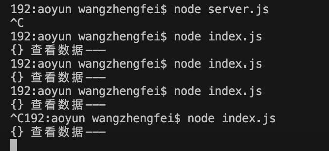
Then when I was excited to go to the results, I found that it was empty. Did Baidu make an anti crawler agreement? After all, I'm a novice crawler. I've been doing it for a long time. Still didn't get it out. If there is a big man meeting, welcome to instruct me!
However, this puppeter, this library is a bit of a cow's hide. It can realize web page screenshots, generate pdf and intercept requests. In fact, it feels a bit like automated testing. Interested students can learn by themselves, which is not the focus of this article.
Interface acquisition
Then this time began to crazy Baidu, began to look for ready-made api, really broken iron shoes, no place to find, it took no time. I found it. It turns out that some big guys have started to do it. At this time, I have a problem directly requesting that interface locally. The front end has to deal with the problem - cross domain. I have a headache looking at things, but it doesn't matter. I start a server directly from the node. I request the interface from the node, and then the background will cross domains under configuration, and the interface data will be obtained directly. I use express for the background service, and the built server will be fooled directly. The code is as follows:
const axios = require('axios')
const express = require('express')
const request = require('request')
const app = express()

const allowCrossDomain = function (req, res, next) {
  res.header('Access-Control-Allow-Origin', '*')
  res.header('Access-Control-Allow-Methods', 'GET,PUT,POST,DELETE')
  res.header('Access-Control-Allow-Headers', 'Content-Type')
  res.header('Access-Control-Allow-Credentials', 'true')
  next()
}
app.use(allowCrossDomain)

app.get('/data', (req, res) => {
  request(
    {
      url: 'http://apia.yikeapi.com/olympic/?appid=43656176&appsecret=I42og6Lm',
      method: 'GET',
      headers: { 'Content-Type': 'application/json' },
    },
    function (error, response, body) {
      if (error) {
        res.send(error)
      } else {
        res.send(response)
      }
    }
  )
})
app.listen(3030)
In this way, I realized the interface forwarding and solved the cross domain problem. On the front desk, I directly used fetch to request data and then did a layer of data conversion, but this interface can't request frequently and crash at any time. It's really annoying. OK, so I directly did an operation, saved the data in localstorage, and then refreshed it regularly. The time is about one brush a day. This ensures the validity of the data. The code is as follows:
getData() {
  let curTime = Date.now()
  if (localStorage.getItem('aoyun')) {
    let { list, time } = JSON.parse(localStorage.getItem('aoyun'))
    console.log(curTime - time, 'View time difference')
    if (curTime - time <= 24 * 60 * 60 * 60) {
      this.data = list
    } else {
      this.fetchData()
    }
  } else {
    this.fetchData()
  }
}

fetchData() {
  fetch('http://localhost:3030/data')
    .then((res) => res.json())
    .then((res) => {
      const { errcode, list } = JSON.parse(res.body)
      if (errcode === 100) {
        alert('Interface requests are too frequent')
      } else if (errcode === 0) {
        this.data = list
        const obj = {
          list,
          time: Date.now(),
        }
        localStorage.setItem('aoyun', JSON.stringify(obj))
      }
    })
    .catch((err) => {
      console.log(err)
    })
}
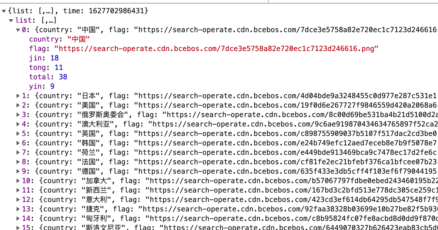
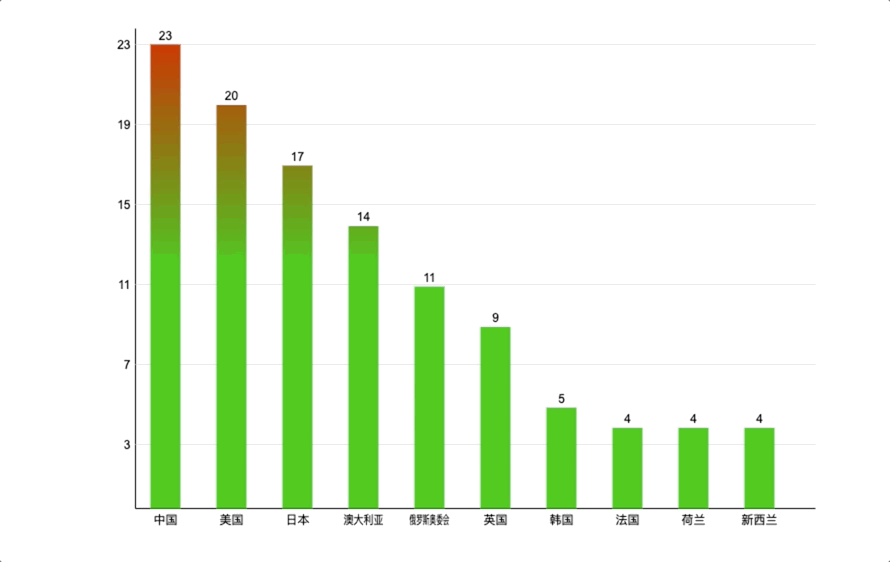
The data is shown in the figure below:
Representation of histogram
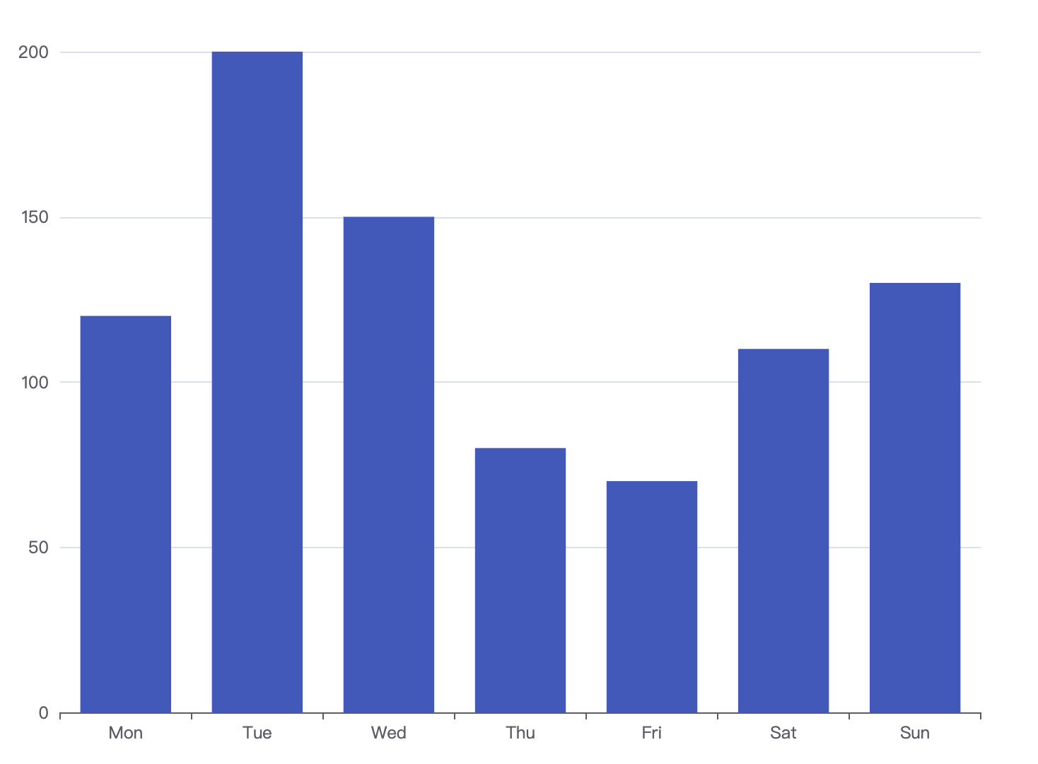
In fact, I thought a lot of ways to express the number of Chinese gold medals. Finally, I chose to use 2d histogram to express it, and made animation effects at the same time to show every fast gold medal 🏅 It's not easy. I still use the original handwritten histogram instead of the Echarts library. Let's first look at the histogram:
Some elements can be analyzed from the figure
- x-axis, y-axis and some straight lines, so I just want to encapsulate a method of drawing straight lines
- There are many rectangles, encapsulating a method of drawing rectangles
- There are also some scales and scales
- The last is the animation effect of an entry
Canvas initialization
Create a canvas on the page, get some properties of the canvas, and bind a move event to the canvas. The code is as follows:
get2d() {
    this.canvas = document.getElementById('canvas')
    this.canvas.addEventListener('mousemove', this.onMouseMove.bind(this))
    this.ctx = this.canvas.getContext('2d')
    this.width = canvas.width
    this.height = canvas.height
  }
Draw coordinate axis
In essence, the coordinate axis is also a straight line. The two points of the straight line correspond to different ends. Therefore, I directly encapsulate a method of drawing a straight line:
  // Method of drawing lines
  drawLine(x, y, X, Y) {
    this.ctx.beginPath()
    this.ctx.moveTo(x, y)
    this.ctx.lineTo(X, Y)
    this.ctx.stroke()
    this.ctx.closePath()
  }
Some people may not be familiar with canvas. Here I'd like to say roughly, open a path, move the brush to the starting point, then draw a straight line to the end point, and then stroke the edge. This step is canvas rendering. It's very important. Many small white lines don't come out without writing, and then close the path. over!
To draw the coordinate axis, we first determine where the origin is. We first shrink the canvas inward by a padding distance, and then calculate the actual width and height of the canvas.
The code is as follows:
initChart() {
  // Leave an inner margin
  this.padding = 50
  // Calculate the actual width and height of the canvas
  this.cHeight = this.height - this.padding * 2
  this.cWidth = this.width - this.padding * 2
  // Calculate the origin
  this.originX = this.padding
  this.originY = this.padding + this.cHeight
}
With the origin, we can draw the X-axis and Y-axis, as long as we add the corresponding width and height of the actual canvas. The code is as follows:
 //Set canvas style
  this.setCanvasStyle()
  // Draw x axis
  this.drawLine(
    this.originX,
    this.originY,
    this.originX,
    this.originY - this.cHeight
  )
  // Draw Y axis
  this.drawLine(
    this.originX,
    this.originY,
    this.originX + this.cWidth,
    this.originY
  )
The first function is to set the style of canvas brush. In fact, it's nothing. Let's look at the effect:
Many people think it's over here. Hahaha, you think too much. canvas, the width of the line I set is 1px. Why does the width of the line look like 2px? We can't find this problem without careful observation, so we should learn to think about what the problem is? In fact, this problem is also what I found from looking at the Echarts source code. Learning without thinking is lost, and thinking without learning is dangerous!
Colored egg - how does canvas draw a 1PX straight line
Let me give you an example here, and you will understand that suppose I want to draw a straight line from (50, 10) to (200, 10). To draw this line, the browser first reaches the initial starting point (50, 10). This line width is 1px, so leave 0.5px on both sides. So basically, the initial starting point extends from (50, 9.5) to (50, 10.5). Now browsers cannot display 0.5 pixels on the screen - the minimum threshold is 1 pixel. The browser has no choice but to extend the boundary of the starting point to the actual pixel boundary on the screen. It will add 0.5 times "garbage" on both sides. So now, the initial starting point is extended from (50, 9) to (50, 11), so it looks 2px wide. The situation is as follows:
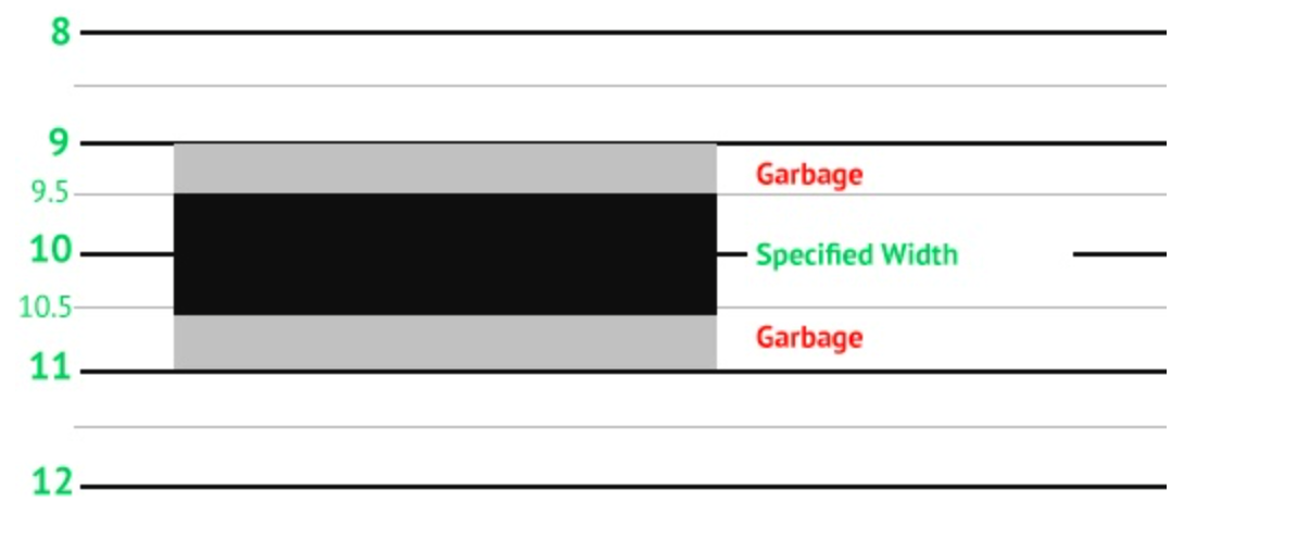
Now you should understand that the original browser can't display 0.5 pixels. Wow, it's rounded. If we know the problem, we must have a solution
Pan canvas
ctx.translate (x,y) this method:
translate() method to translate the canvas according to the horizontal direction of the original x point and the vertical direction of the original y point
As shown in the figure:
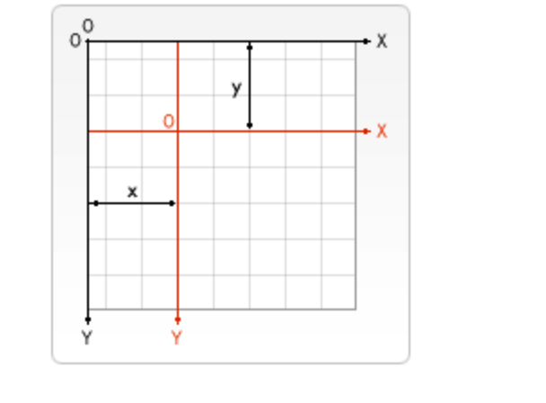
To be more straightforward, after you translate the canvas, all the points you drew before will be relatively offset. So, back to our problem, what is the solution? I offset the whole canvas downward by 0.5, so the original coordinates (50, 10) become (50.5, 10.5) and (200.5, 10.5) ok. Then the browser still needs to reserve pixels for painting, so it is OK from (50.5, 10) to (50.5, 11), which is 1px. Let's try it
The code is as follows:
this.ctx.translate(0.5, 0.5)
// Draw x axis
this.drawLine(
  this.originX,
  this.originY,
  this.originX,
  this.originY - this.cHeight
)
// Draw Y axis
this.drawLine(
  this.originX,
  this.originY,
  this.originX + this.cWidth,
  this.originY
)
this.ctx.translate(-0.5, -0.5)
After the offset, we still need to restore the past, and we should pay great attention to it. I drew two pictures for comparison:
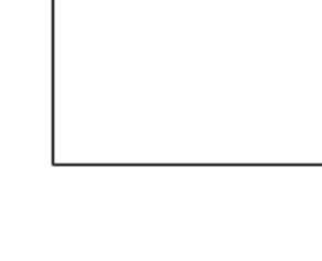 After offset
 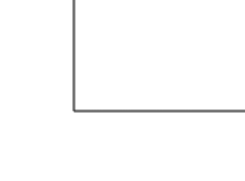 Before offset
I won't say much. If I see here, I think it's helpful to you or learn something, I hope you can praise me 👍, Comment, add collection.
Draw ruler
Now we only have x-axis and Y-axis, which are bare. I add some rulers at the bottom of x-axis and Y-axis. The ruler corresponding to X-axis must be the name of each country. The general idea is to segment the data and then fill it.
The code is as follows:
drawXlabel() {
  const length = this.data.slice(0, 10).length
  this.ctx.textAlign = 'center'
  for (let i = 0; i < length; i++) {
    const { country } = this.data[i]
    const totalWidth = this.cWidth - 20
    const xMarker = parseInt(
      this.originX + totalWidth * (i / length) + this.rectWidth
    )
    const yMarker = this.originY + 15
    this.ctx.fillText(country, xMarker, yMarker, 40) // written words
  }
}
Here, I intercepted the top 10 countries. First, leave 20px blank on both sides. Let's first define the width of each histogram, assuming that 30 corresponds to this above Rectwidth, and then the coordinates of each text are actually easy to calculate. The initial x + the number of split ends + the width of the rectangle can be drawn
As shown in the figure:

After drawing the x-axis, we begin to draw the Y-axis. The general idea of the Y-axis is to segment with the maximum number of medals. Here I'll divide it into six segments.
// Defines the number of segments for the Y axis
this.ySegments = 6
//Defines the maximum width of the font
this.fontMaxWidth = 40
Next, we start to calculate the Y coordinate of each point on the Y axis. The X coordinate is actually very easy to calculate. As long as the X of the origin coordinate is shifted to the left for a few distances, it is mainly to calculate the Y axis coordinate. It must be noted here that our coordinates are relative to the upper left corner, so the Y axis coordinate should decrease upward.
drawYlabel() {
  const { jin: maxValue } = this.data[0]
  this.ctx.textAlign = 'right'
  for (let i = 1; i <= this.ySegments; i++) {
    const markerVal = parseInt(maxValue * (i / this.ySegments))
    const xMarker = this.originX - 5
    const yMarker =
      parseInt((this.cHeight * (this.ySegments - i)) / this.ySegments) +
      this.padding +
      20
    this.ctx.fillText(markerVal, xMarker, yMarker) // written words
  }
}
The largest data is the first data of the array, and then each ruler is the proportion. Since we decrease the coordinates of the Y axis, the corresponding coordinates should be the share of 1 -, because this is only the actual height of the icon, which is converted to the canvas, plus the inner margin we set originally, and because we add text, Text also occupies a certain pixel, so 20 is added. OK, the y-axis drawing is over. With the coordinates of each break of the y-axis, draw several solid lines behind it.
The code is as follows:
this.drawLine(
  this.originX,
  yMarker - 4,
  this.originX + this.cWidth,
  yMarker - 4
)
The final rendering is as follows:
Draw rectangle
everything isReady, let's start drawing rectangles. In the same way, we first encapsulate the method of drawing rectangles, and then we just need to pass in the corresponding data.
The canvas native rect method is used here. The parameters are understood as follows:
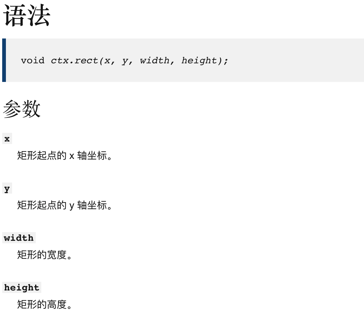
The width of the rectangle is customized. The height of the rectangle is the height of the corresponding number of medals in the canvas, so we just need to determine the starting point of the rectangle. Here, the (x,y) of the rectangle is actually the point in the upper left corner.
The code is as follows:
//Draw square
drawRect(x, y, width, height) {
  this.ctx.beginPath()
  this.ctx.rect(x, y, width, height)
  this.ctx.fill()
  this.ctx.closePath()
}
The first step is to do a point mapping. When drawing the Y axis, put all the points of the canvas on the Y axis in an array. Remember to put the y of the origin in it. So just calculate the proportion of each medal in the headquarters? Then subtract the y value of the origin to get the real Y-axis coordinates. The coordinate of the X axis is relatively simple. Add the X coordinate of the origin (proportion / total length) and then add half of the rectangular width. This principle is the same as drawing text, but the text should be centered.
The code is as follows:
drawBars() {
  const length = this.data.slice(0, 10).length
  const { jin: max } = this.data[0]
  const diff = this.yPoints[0] - this.yPoints[this.yPoints.length - 1]
  for (let i = 0; i < length; i++) {
    const { jin: count } = this.data[i]
    const barH = (count / max) * diff
    const y = this.originY - barH
    const totalWidth = this.cWidth - 20
    const x = parseInt(
      this.originX + totalWidth * (i / length) + this.rectWidth / 2
    )
    this.drawRect(x, y, this.rectWidth, barH)
  }
}
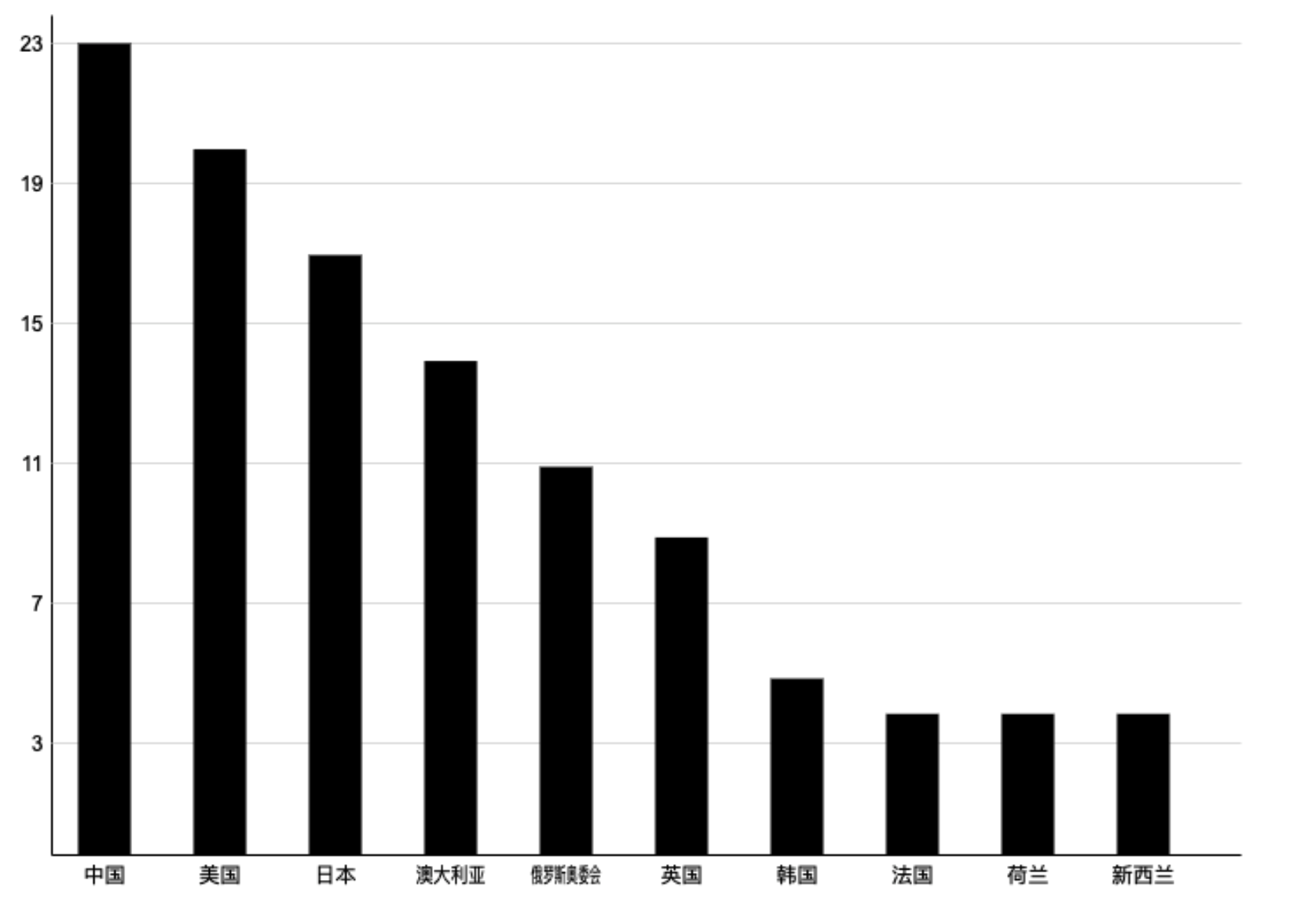
The effect drawing is as follows:
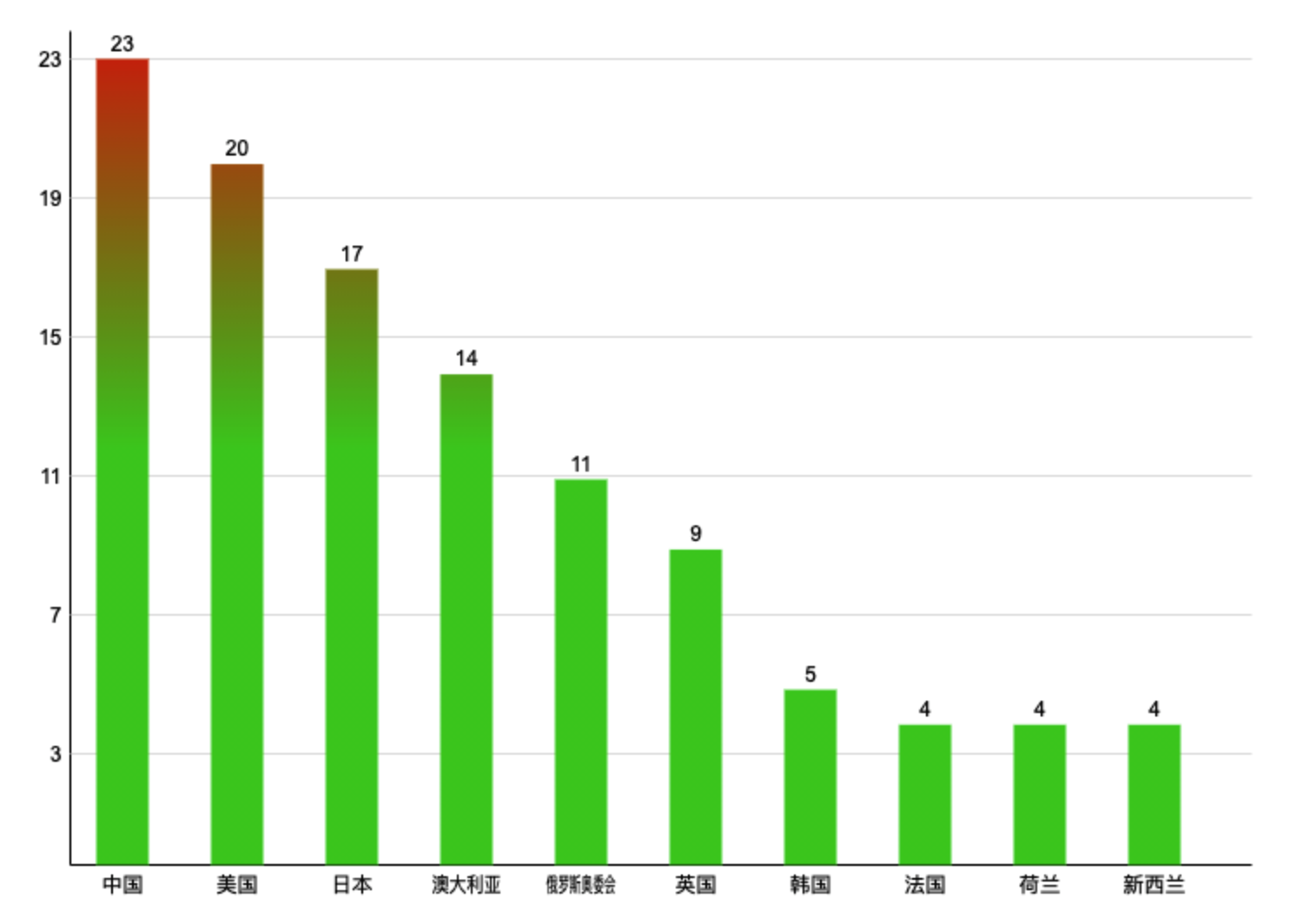
Rectangular interactive optimization
Black and bald are also ugly. A person who doesn't know doesn't know which country won how many fast gold medals.
- Add a gradient to the rectangle
- Add some text
Now add some text on the basis of drawing a rectangle. The code is as follows:
this.ctx.save()
this.ctx.textAlign = 'center'
this.ctx.fillText(count, x + this.rectWidth / 2, y - 5)
this.ctx.restore()
The gradient is designed to an api of Canvas, createLinearGradient
The createLinearGradient() method needs to specify four parameters to represent the start and end points of the gradient segment respectively.
Then I'll start. First of all, make sure to create a gradient:
getGradient() {
  const gradient = this.ctx.createLinearGradient(0, 0, 0, 300)
  gradient.addColorStop(0, 'green')
  gradient.addColorStop(1, 'rgba(67,203,36,1)')
  return gradient
}
Then, we will transform drawReact, where restore and save are used to prevent text styles from being polluted.
//Draw square
drawRect(x, y, width, height) {
  this.ctx.save()
  this.ctx.beginPath()
  const gradient = this.getGradient()
  this.ctx.fillStyle = gradient
  this.ctx.strokeStyle = gradient
  this.ctx.rect(x, y, width, height)
  this.ctx.fill()
  this.ctx.closePath()
  this.ctx.restore()
}
As shown in the figure:
Add animation effects
A static light can't see our cowhide 🐂, So the effect of animation has to increase slowly, right. In fact, we can think 🤔 In the whole animation process, there are actually two changes. The height and text of the histogram, the coordinate axis and the x coordinate of the histogram are unchanged, so I just need to define two variables, a starting value and a total value. The height and text size are actually multiplied by the corresponding height in each frame.
The code is as follows:
// Motion related
this.ctr = 1
this.numctr = 100
Let's transform the drawBars method:
// What is the proportion of each time
const dis = this.ctr / this.numctr

// The height of the histogram is multiplied by the corresponding scale
const barH = (count / max) * diff * dis

// The text is rounded here because it may not be divisible
this.ctx.fillText(
  parseInt(count * dis),
  x + this.rectWidth / 2,
  y - 5
)

// Finally, execute the animation
if (this.ctr < this.numctr) {
  this.ctr++
  requestAnimationFrame(() => {
    this.ctx.clearRect(0, 0, this.width, this.height)
    this.drawLineLabelMarkers()
  })
}
Add one at a time until it is larger than the total, and then continue to redraw. You can form an animation effect. Let's look at the gif chart:
summary
This article ends here. I'd like to summarize:
- How does canvas draw a straight line of 1px? There are pits in it
- There is also how to design animation. It's good to look for those changes and deal with them
- How to do linear gradient in canvas.
- Reptile I failed, I have nothing to summarize, but one thing: the puppet man library, you can play.
This article is the second to realize the visualization chart by canvas. Later, I will continue to share various visualization charts, such as pie chart, tree chart, K-line chart and so on
While writing articles, I am also constantly thinking about how to express better. If you are interested in visualization, like collection and attention 👍 Come on!, You can pay attention to me
For the data visualization column, share an article every week, either 2d or three JS. I will write every article with my heart, never forget it.
We work together for China 🇨🇳 Olympic refueling! awesome
Source code acquisition
Pay attention to the official account [front end graphics], reply to the Olympic Games, two words, you can get all the source code.