Foreword: This is the author's own understanding and arrangement after learning. If there are any mistakes or doubts, please correct them and I will keep updating them.
iconfont Font Icon
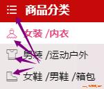
In our needs, we often see some small graphics, or icons, such as the Skycat website:
These small graphics can be replaced by pictures. Usually we cut these graphics and make them into sprite pictures.
Principle of Wizard Map: Put a lot of small pictures together into a big picture, and then set the position of the background image to display the picture;
The advantages of Wizard Map are: reducing the number of requests from the server and reducing the pressure of the server;
sprites is a good wizard-making tool.
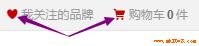
Of course, there are other ways to make these small graphics, such as the Font Icon iconfont used by Skycat in the picture above.
Font icon, as its name implies, is a kind of font. Like font, it is vector. We also call it vector icon. If we zoom in or out, it will not be distorted.
There are many font icon libraries in the network. Here I introduce the use of iconfont:
Official website: http://www.iconfont.cn/
I won't say how to make it, let's use it directly (ah, in fact, the picture I painted is too ugly);
I was going to write about how to use it, but iconfont seems to have been upgraded again, adding symbol s to support multi-color icons (which involves the knowledge of SVG). The GIF diagram of the official website's help document also explains how to use it. Let me write about the pits I encountered when I first used it.
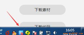
- Download Code button, I hope you can find it directly. Well, I looked for it for a while. By default, I was asked to set the color and size. This is to get the material. The front end just needs the code. Click Undo, and then...
I don't know if it's my computer problem (1366*768) or what's going on? The "Download Code" button is half blocked by my toolbar at the bottom of windows. Um, this one...
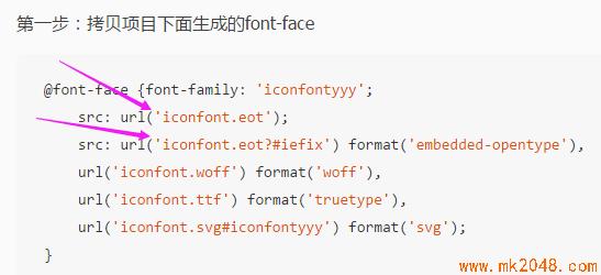
- When we download the font icon, it is a file. When we define the font type in css, don't forget to set the path correctly.
- If we use iconfont's online project (no downloaded files), when the project members update the icon, if we want to use the new icon, we also update the "online link";
- Font does not support multicolor. If we download files, we can only use font color to set monochrome. If you want to use multi-color icons, you have to use symbols to refer to online links; symbols refer to js files, font-class refers to css files, the two ways of writing are also different;
CSS small icon
Masters use css to produce all kinds of pure css graphics, I will just list a few I use more;
Triangle
Look at this article. Arrangement and Representation of border Triangle Shadows and Multiple Borders ;
Menu (three-way bar)
The border upper border double line and the lower border solid line can also be used in the opposite way:

The code is as follows:


<!DOCTYPE html>
<html>
    <head>
        <meta charset="UTF-8">
        <title></title>
        <style type="text/css">
            *{
                padding: 0;
                margin: 0;
            }
            .menu{
                margin: 100px;
                width: 55px;
                height: 10px;
                border-top: 30px double #f00;
                border-bottom: 10px solid #f00;
                /*Use border upper bounding double line and lower bounding solid line, or vice versa*/
            }
        </style>
    </head>
    <body>
        <div class="menu"></div>
    </body>
</html>
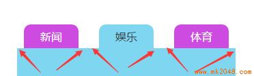
Inner concave angle
Master's method, click here Using css3 attribute radial gradient to do:
The radial gradient of the background image can be set: the position of the center, the size of the gradient, the shape of the gradient, the color width at the center,... And the color width at the end.

The code is as follows:
<!DOCTYPE html>
<html>
    <head>
        <meta charset="UTF-8">
        <title></title>
        <style type="text/css">
            *{padding: 0;margin: 0;}
            a{text-decoration: none;cursor: pointer;}
            li{list-style: none;}
            /*Clear floating*/
            .clearfix:before, /*:before Handling overlap of margin*/
            .clearfix:after {
                content: "";
                display: table;
            }
            .clearfix:after {
                clear: both;
            }
            .clearfix {
                zoom: 1;
            }

            .test{
                margin: 100px 0 0 100px ;
            }
            .list{
                margin-left: -20px;
            }
            .content{
                width: 320px;
                background: #7fd6f1;
                min-height: 200px;
            }
            .item .active{
                background: #7fd6f1;
                color: #333;
            }
            .item{
                float: left;
                margin-left: 30px;
            }
            .item a{
                display: block;
                background: #ce4be2;
                width: 80px;
                height: 35px;
                text-align: center;
                line-height: 35px;
                color: #fff;
                border-radius: 10px 10px 0 0;
                position: relative;
            }
            .item a:after{
                content: "";
                display: block;
                position: absolute;
                right: -9px;
                 /*I wonder if you find that there is actually a change of 1px at the edge. The radian is not very natural to the end. Here we can actually move the position inward 1px.*/
                bottom: 0;
                width: 10px;
                height: 10px;
                 background: -webkit-radial-gradient(100% 0%, farthest-side, transparent 0%, transparent 8px, transparent 9px, #ce4be2 100%);
                 background: -o-radial-gradient(100% 0%, farthest-side, transparent 0%, transparent 8px, transparent 9px, #ce4be2 100%);
                 background: -moz-radial-gradient(100% 0%, farthest-side, transparent 0%, transparent 8px, transparent 9px, #ce4be2 100%);
                 background: radial-gradient(100% 0%, farthest-side, transparent 0%, transparent 8px, transparent 9px, #ce4be2 100%);
                 /*The radial gradient of the background image can be set: the center position, the size, the shape, the color width at the center,... And the color width at the end.*/
                 /*By default, the center of the circle is the center. Here we set the center to the left and right vertices of the element.*/
                 /*The size of the gradient defaults to farthest-side, which we set here*/
                 /*Gradient shape defaults to ellipse (ellipse), we have to set it to circle (circle), but the same width of the ellipse is not a circle, so..*/
                 /*The color and width settings change when we are 1 PX away from the element width, so here is 10-1 = 9 px.*/
            }
            .item a:before{
                content: "";
                display: block;
                position: absolute;
                left: -9px;
                bottom: 0;
                width: 10px;
                height: 10px;
                 background: -webkit-radial-gradient(0% 0%, farthest-side, transparent 0%, transparent 8px, transparent 9px, #ce4be2 100%);
                 background: -o-radial-gradient(0% 0%, farthest-side, transparent 0%, transparent 8px, transparent 9px, #ce4be2 100%);
                 background: -moz-radial-gradient(0% 0%, farthest-side, transparent 0%, transparent 8px, transparent 9px, #ce4be2 100%);
                 background: radial-gradient(0% 0%, farthest-side, transparent 0%, transparent 8px, transparent 9px, #ce4be2 100%);
            }
            .item .active:after{
                background: -webkit-radial-gradient(100% 0%, farthest-side, transparent 0%, transparent 8px, transparent 9px, #7fd6f1 100%);
                 background: -o-radial-gradient(100% 0%, farthest-side, transparent 0%, transparent 8px, transparent 9px, #7fd6f1 100%);
                 background: -moz-radial-gradient(100% 0%, farthest-side, transparent 0%, transparent 8px, transparent 9px, #7fd6f1 100%);
                 background: radial-gradient(100% 0%, farthest-side, transparent 0%, transparent 8px, transparent 9px, #7fd6f1 100%);
            }
            .item .active:before{
                background: -webkit-radial-gradient(0% 0%, farthest-side, transparent 0%, transparent 8px, transparent 9px, #7fd6f1 100%);
                 background: -o-radial-gradient(0% 0%, farthest-side, transparent 0%, transparent 8px, transparent 9px, #7fd6f1 100%);
                 background: -moz-radial-gradient(0% 0%, farthest-side, transparent 0%, transparent 8px, transparent 9px, #7fd6f1 100%);
                 background: radial-gradient(0% 0%, farthest-side, transparent 0%, transparent 8px, transparent 9px, #7fd6f1 100%);
            }
        </style>
    </head>
    <body>
        <div class="test">
            <ul class="list clearfix">
                <li class="item">
                    <a href="javascript:;" >Journalism</a>
                </li>
                <li class="item">
                    <a href="javascript:;" class="active">entertainment</a>
                </li>
                <li class="item">
                    <a href="javascript:;">Sports</a>
                </li>
            </ul>
            <div class="content"></div>
        </div>
    </body>
</html>
Peach heart
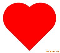
The code is as follows:
<!DOCTYPE html>
<html>
    <head>
        <meta charset="UTF-8">
        <title></title>
        <style type="text/css">
            /**{padding: 0;margin: 0;}*/
            .wrapper{
                margin: 100px;
                width: 300px;
                height: 300px;
                border: 1px solid #0ff;
            }
            .test{
                display:inline-block;
                margin:50px;
                height: 100px;
                width: 100px;
                background-color: red;
                transform: rotate(-45deg);
            }
            .test::before , .test::after{
                display:block;
                content:"";
                width: 100px;
                height: 100px;
                background-color: red;
                border-radius: 50%;
                margin-top:-50%;
            }
            .test:after{
                margin-left:50%;
            }
        </style>
    </head>
    <body>
        <div class="wrapper">
            <div class="test"></div>
        </div>
    </body>
</html>
Back to the top

    <style>
        *{padding: 0;margin: 0;}
        .goTop{
            position:fixed;
            right:10px;
            bottom: 10px;
            height:50px;
            width: 50px;
            text-align:center;
            background-color: lightblue;
            border-radius: 20%;
            overflow: hidden;
        }
        .goTop:hover:before{
            top:50%;
        }
        .goTop:hover .directTop{
            visibility: hidden;
        }
        .goTop:before{
            position: absolute;
            top: -50%;
            left: 50%;
            transform: translate(-50%,-50%);
            content:'Back to the top';
            width: 40px;
            color:peru;
            font-weight:bold;
        }
        .directTop{
            visibility: visible;
            display:inline-block;
            margin-top: 20px;
            height:20px;
            width: 20px;
            border: 3px solid;
            border-color: white transparent transparent white;
            transform:rotate(45deg);
        }
    </style>

    <body style="height:2000px;">
        <div class="goTop">
            <div class="directTop"></div>
        </div>
    </body>
There are also many classic graphics produced by css, which will be sorted out later.
In fact, the icons and pictures produced by css are very good, depending on the demand. I prefer font icons and pictures, which are more efficient and simple.