Hello, everyone. I'm Bowl week Not the "bowl of porridge" you want, but the front end you don't want to be drunk 👨🏻💻, If I'm lucky to get your favorite articles, I'm lucky to ~
This is [ From scratch front end Image and Background Image in HTML and CSS
Write not easy to reload, please get permission
Write before
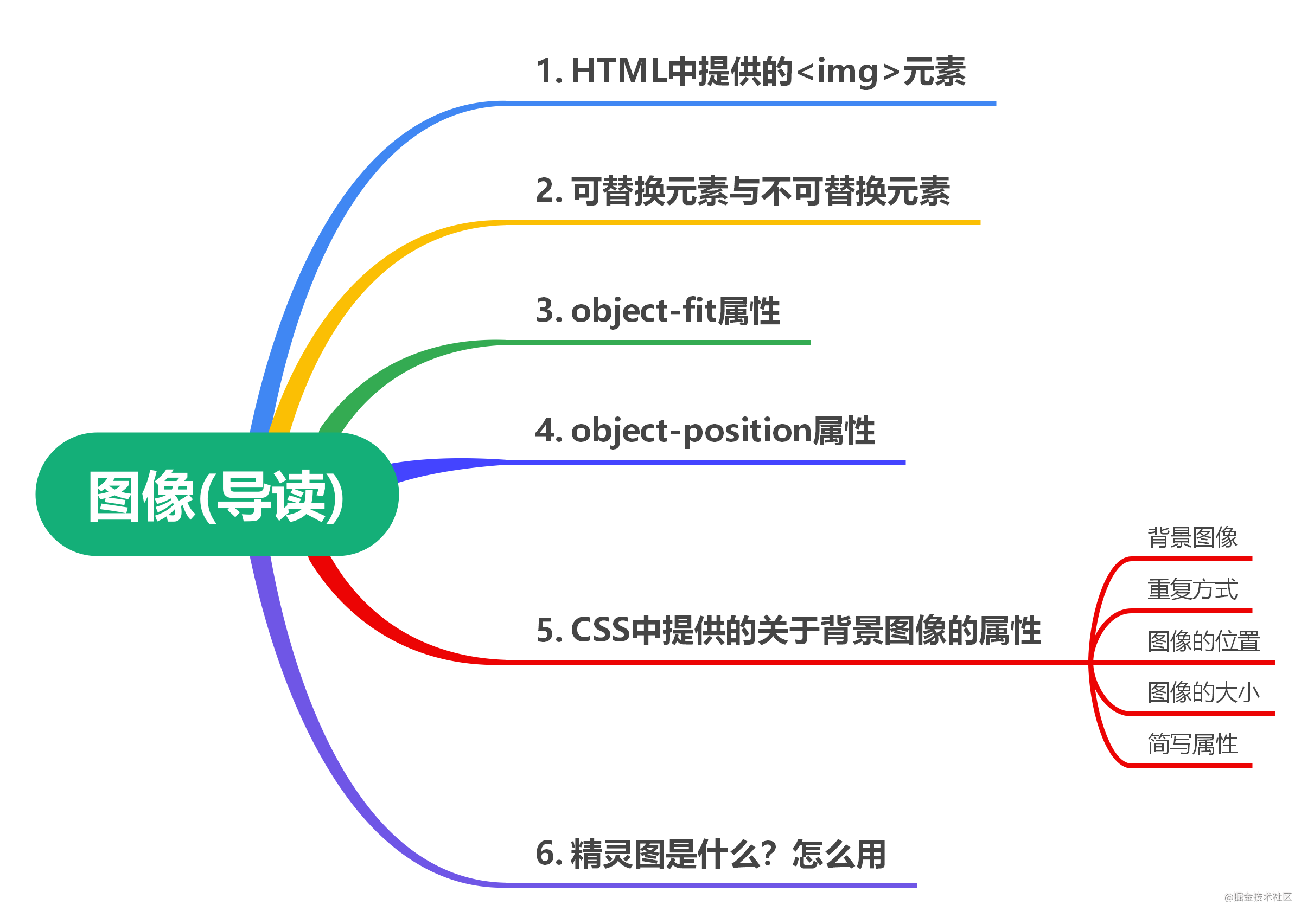
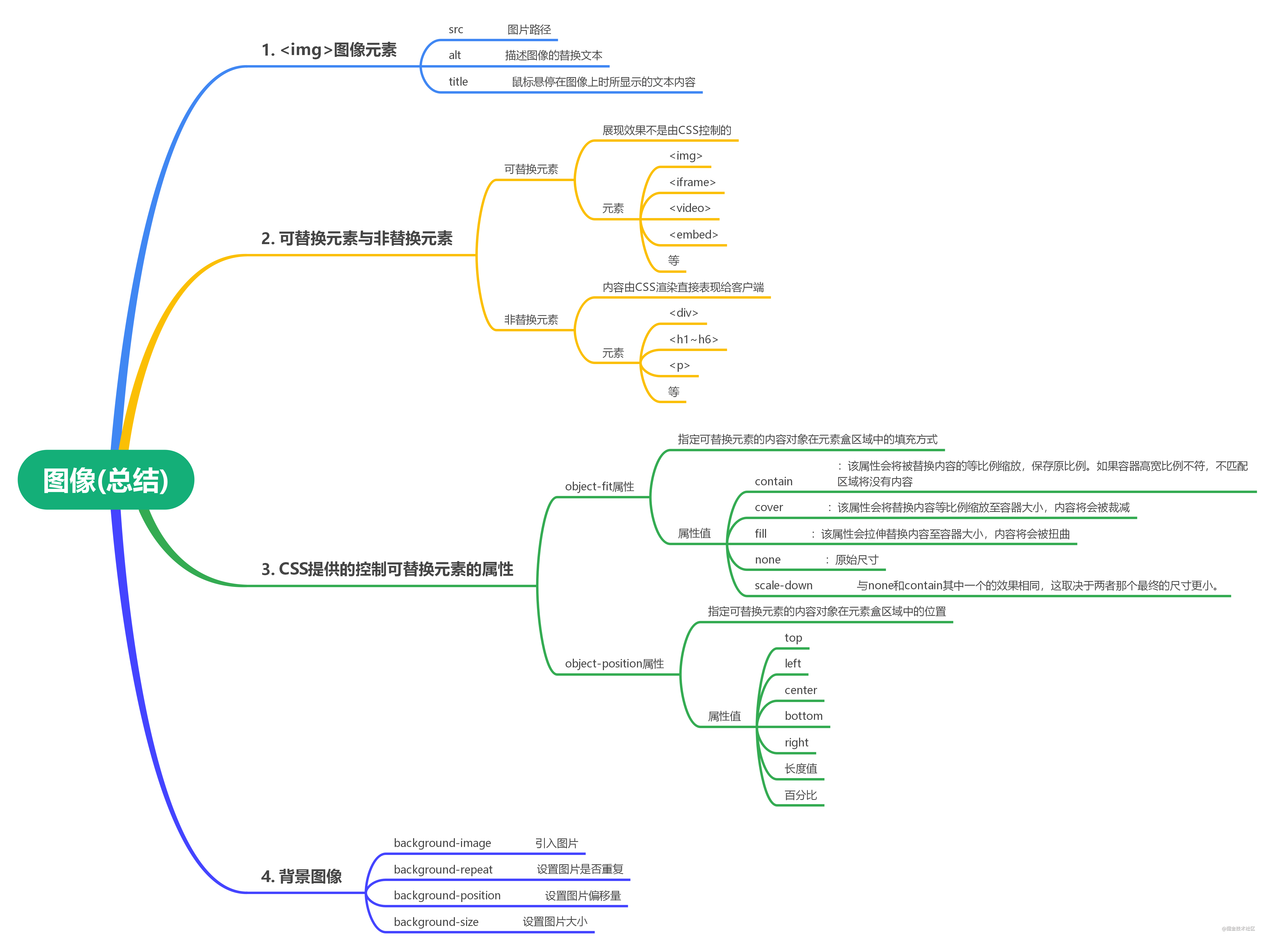
In this article, we will learn about images in HTML and CSS. The contents of this article are as follows:
<img>image elements
HTML provides an <img>element for representing an image on a page, which is an empty element. Use the src attribute to introduce a path to a picture, which can be either a relative path or an absolute path.
tips: reference for relative and absolute paths Relative and absolute paths
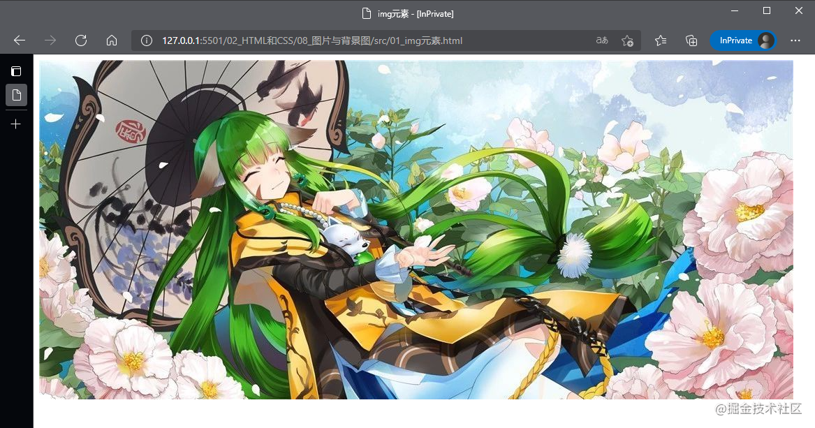
Usage of the <img>element in the following code example:
<body>
    <img src="./../image/4.jpg" />
</body>
The results of the code run are as follows:
Common attributes for <img>elements are as follows:
-
src: Represents the address of the picture. This property is required.
-
Alt: Used to define the replacement text that describes the image. When the browser cannot display the specified picture properly, the content of the property value is displayed. This property is optional, but there is no difference between this property and a null value. Image is a key part of the content when alt attribute is not available. When blank, the image is not a critical part of the content, and nonvisual browsers will ignore it when rendering.
-
title: The text content displayed when the mouse hovers over the image.
The HTML standard does not specify the image format supported by the <img>element, or the image format that must be supported. Therefore, different browsers may support different image formats. Approximately supported image formats are JPEG, GIF, PNG, APNG, SVG, BMP, BMP ICO, and PNG ICO.
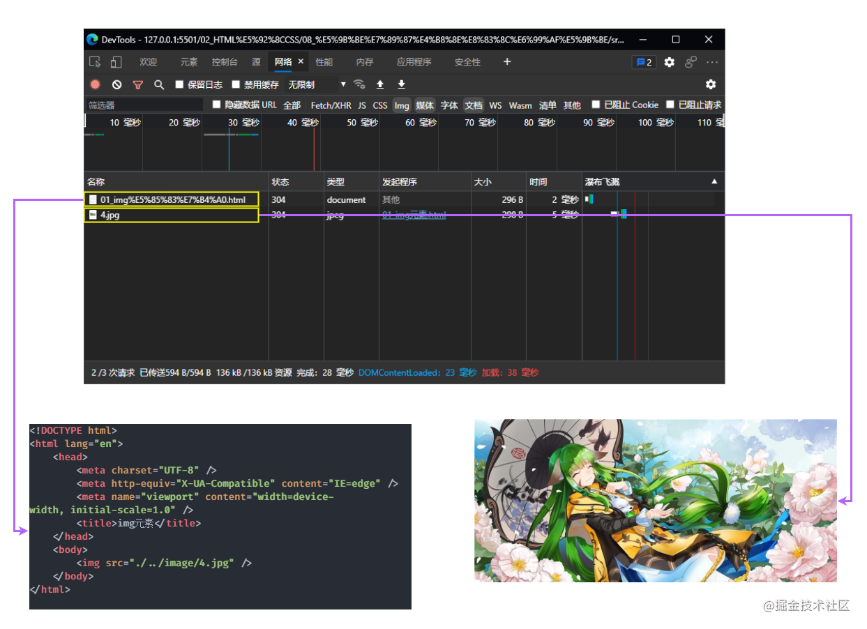
It is worth noting that technically, the <img>element does not embed an image in an HTML page, it just takes a place on the HTML page and specifies the path to the image file. Therefore, when browsers load parse HTML pages, they load image files separately. As shown in the following figure:
Specify width and height for the image
It is easy to specify width and height for <img>elements in two ways, the first being width and height, which are attributes provided through <img> Another way is through CSS, which is generally controlled by using CSS. It is important to note that the aspect ratio must be consistent with the aspect ratio of the original image, otherwise the image will be stretched.
The following code shows specifying a width and height for the <img>element:
<!DOCTYPE html>
<html lang="en">
    <head>
        <meta charset="UTF-8" />
        <title>by img Specify width and height</title>
        <style>
            .image {
                /* If only one side is specified, the other half will scale automatically */
                width: 500px;
            }
        </style>
    </head>
    <body>
        <!-- Also specify the width and height that will stretch the picture if not saved -->
        <img width="500px" height="300px" src="./../image/4.jpg" alt="Sister Rong Rong" />
        <img class="image" src="./../image/4.jpg" alt="Second Boss" />
    </body>
</html>
The results of the code run are as follows:
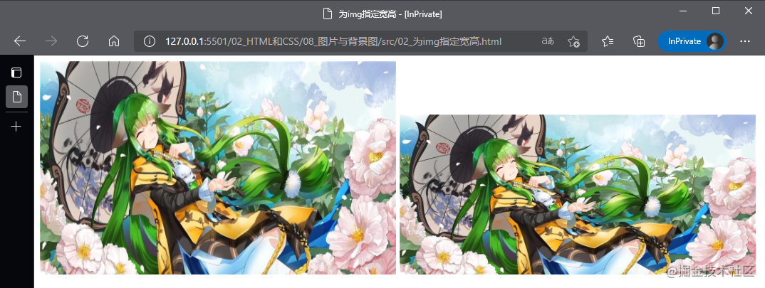
In the code above, we specify both width and height for the first <img>and the ratio of width to height does not match the original image, resulting in the final image being stretched.
Replaceable and non-replaceable elements
Replaceable elements, also known as replaced element s, are not controlled by CSS. They are external objects whose appearance is rendered independently of CSS.
Non-replaced elements, also known as non-replaced element s, are rendered directly by CSS to the client.
Replaceable elements
A CSS rendering model does not consider rendering this content without CSS rendering control, and elements themselves generally have a fixed size, such as <img>elements whose default size is the size of the picture, which are called replaceable elements. For replaceable elements, the browser determines the specific display content of the element based on its label and attributes, such as the width and height attributes of the <img>element.
-
The content of the replaceable element is not affected by the style of the current document. CSS can affect the location of the replaceable element, but not the content of the replaceable element itself.
-
For example, a browser reads and displays picture information based on the value of the SRC attribute of the <img>tag. The content of the picture is determined by the src, and CSS does not consider rendering the content of the picture.
-
Common replaceable elements in CSS are <iframe>, <video>, <embed>, etc. in addition to <img>. Some elements are treated as replaceable elements under certain circumstances, such as <option>, <audio>, <canvas>, <object>, <applet>, <input>, etc.
Non-replacement element
Non-replaceable elements are elements whose content is contained in the document and whose content can be controlled by CSS rendering.
-
The content of non-replacement elements does not exceed the model scope of CSS, which takes into account the content of non-replacement elements when rendering.
-
Most elements of HTML are non-replaceable, that is, their content is expressed directly to the browser, such as <div>, <p>, <h1>~<h6>, <table>, and so on.
Properties of replaceable elements provided by CSS
Between the properties of replaceable elements, CSS provides two properties that control the position or positioning of content objects contained in replaceable elements within the box area of the element.
object-fit attribute
The object-fit attribute provided by CSS specifies how content objects of replaceable elements are populated in the element box area. The attribute values for this element are as follows:
-
contain: This property scales the replaced content equally to preserve the original scale. If the ratio of container height to width does not match, the mismatched area will have no content
-
cover: This property scales the replacement content to the container size in equal proportion, and the content will be trimmed
-
fill: This property stretches the replacement content to the container size, and the content will be distorted
-
none: original size
-
scale-down: Same effect as either none or contain, depending on which final size is smaller.
The following code shows the use of the object-fit attribute:
The HTML structure is as follows:
<body>
    <div>
        <h5>contain</h5>
        <img class="contain" src="../image/2.jpg" />
    </div>
    <div>
        <h5>cover</h5>
        <img class="cover" src="../image/2.jpg" />
    </div>
    <div>
        <h5>fill</h5>
        <img class="fill" src="../image/2.jpg" />
    </div>
    <div>
        <h5>none</h5>
        <img class="none" src="../image/2.jpg" />
    </div>
    <div>
        <h5>scale-down</h5>
        <img class="scale-down" src="../image/2.jpg" />
    </div>
</body>
The CSS code is as follows:
body { margin: 0; padding: 0 20px; }
div { float: left; margin-right: 24px; }
img {
    width: 320px;
    height: 180px;
    border: 1px solid #000;
}
/* Adaptive effect */
.contain { object-fit: contain; }
/* Filling effect */
.cover { object-fit: cover; }
/* Stretch effect */
.fill { object-fit: fill; }
/* Original effect */
.none { object-fit: none; }
/* Fit Fill Option Two */
.scale-down { object-fit: scale-down; }
The result of the code is as follows:

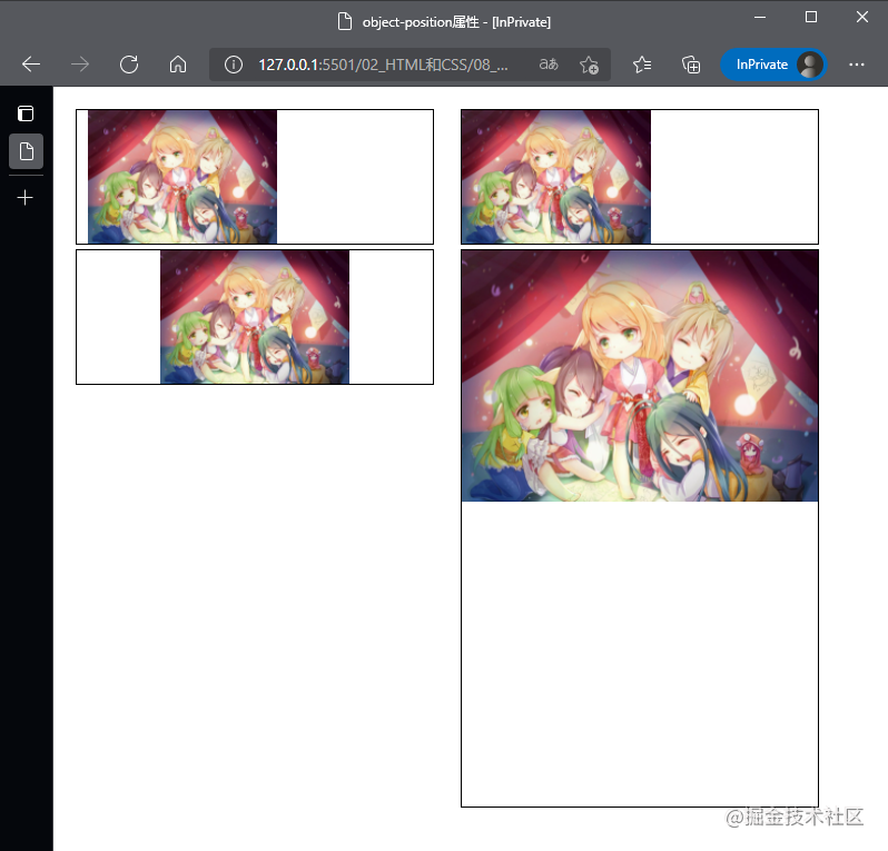
object-position attribute
The object-position provided by CSS specifies the position of the content object of the replaceable element in the element box area. This property can accept either two values or one value, which we will discuss separately:
-
When receiving a value, if the value is a length value, a percentage, or a center, it represents both horizontal and vertical positions. If the value is left or right, it indicates the horizontal direction. If the value is top, bottom, this value represents the vertical direction
-
When two values are received, the first value represents the horizontal direction, and the values that can be received are left, center, right, and length values or percentages; The second value represents the vertical direction and can receive top, center, bottom, and length values or percentages.
The following code shows the use of the object-position attribute:
The HTML structure is as follows:
<body>
    <div>
        <img class="length" src="../image/2.jpg" />
    </div>
    <div>
        <img class="left" src="../image/2.jpg" />
    </div>
    <div>
        <img class="center" src="../image/2.jpg" />
    </div>
    <div>
        <img class="top" src="../image/2.jpg" />
    </div>
</body>
The CSS code is as follows:
body {
    margin: 0;
    padding: 20px;
}
div {
    float: left;
    margin-right: 24px;
}
img {
    width: 320px;
    height: 120px;
    border: 1px solid #000;
    object-fit: contain;
}
.length {
    object-position: 10px;
}
.left {
    object-position: left;
}
.center {
    object-position: center;
}
.top {
    object-position: top;
    height: 500px;
}
The result of the code is as follows:
background image
The background image in CSS refers mainly to the content related to the backgroundproperty, which is actually a shorthand property and can be divided into the following attributes:
-
background-image attribute
-
background-repeat attribute
-
background-position attribute
-
background-size attribute
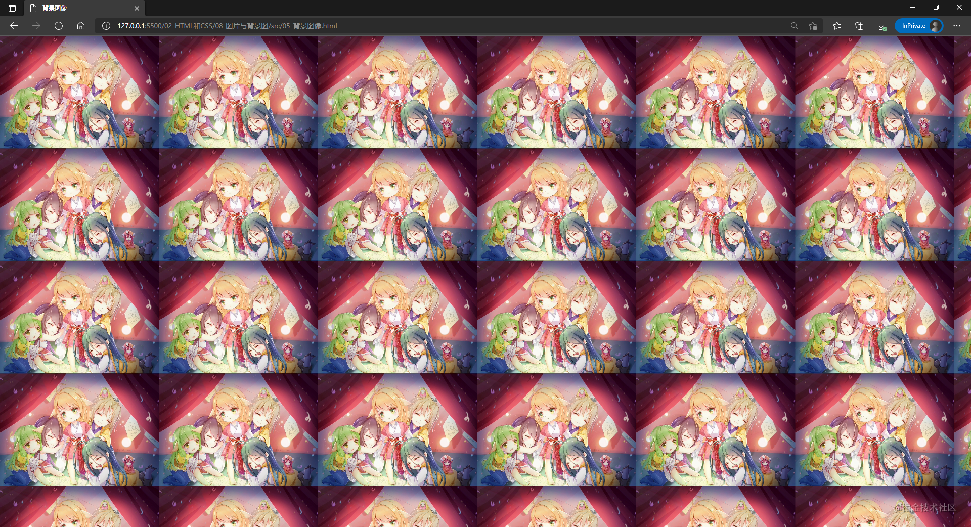
background image
Use the background-image attribute to introduce one or more background images, and use the url() function, which values the path of the image and splits multiple images by commas.
The following code shows the use of the background-image attribute:
body {
    background-image: url('./../image/2.jpg');
}
The results of the code run are as follows:
Tiling method
The background-repeat property sets how the background image is repeated. Background images can be repeated or not repeated horizontally, vertically, or on both axes. The attribute has four values, as follows:
-
repeat: The image is repeated both horizontally and vertically. If the last image cannot be displayed completely, it will be cropped.
-
no-repeat: The image will not repeat in both horizontal and vertical directions.
-
Space: The image is repeated both horizontally and vertically. The first and last duplicate images are fixed to the edge of the element, and the white space is evenly distributed between the duplicate images.
-
round: As the size of the browser window increases, duplicate images are stretched (there is no gap between duplicate images) to fill the browser window.
Since the background-repeat attribute is divided into horizontal and vertical duplicates, the value of the attribute is two:
-
First value: Repeats the horizontal image. You can use one of these four values.
-
Second value: Repeats the vertical image. You can use one of these four values.
Of course, the background-repeat property can also be set using a single value, as follows:
| Single Value | Equivalent to Double Value |
|---|---|
| repeat-x | repeat no-repeat |
| repeat-y | no-repeat repeat |
| repeat | repeat repeat |
| space | space space |
| round | round round |
| no-repeat | no-repeat no-repeat |
The following code shows the use of the background-repeat attribute
<!DOCTYPE html>
<html lang="en">
<head>
<meta charset="UTF-8" />
<meta http-equiv="X-UA-Compatible" content="IE=edge" />
<meta name="viewport" content="width=device-width, initial-scale=1.0" />
<title>Tiling method</title>
<style>
div {
background-image: url('../image/icon.png');
width: 144px;
height: 84px;
}
.no-repeat { background-repeat: no-repeat; }
.repeat { background-repeat: repeat; }
.repeat-x { background-repeat: repeat-x; }
.repeat-y { background-repeat: repeat-y; }
</style>
</head>
<body>
<p>no-repeat</p>
<div class="no-repeat"> </div>
<p>repeat</p>
<div class="repeat"> </div>
<p>repeat-x</p>
<div class="repeat-x"> </div>
<p>repeat-y</p>
<div class="repeat-y"> </div>
</body>
</html>
The results of the code run are as follows:
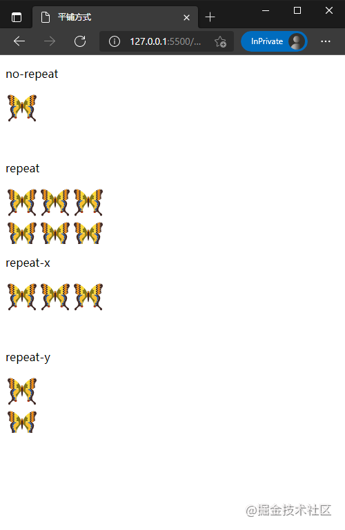
Image Position
The background-position property provided in CSS is used to set the position of the background image, and its value and usage are consistent with the object-positon property, which is not described here.
Image Size
The background-size property provided by CSS sets the size of the background image to be displayed on an HTML page. It has four types of values, as follows:
-
Cover: Zoom the background image to cover the background area completely. The part of the background image may not be visible.
-
Include: Zoom the background image to fully load the background area, which may be partially blank.
-
A value: Sets the width of the background image to this value and the height value to auto.
-
Two values: the first value sets the width of the background image, and the second value sets the height of the background image.
The background-size property is similar to the object-fit property, so there is no code demonstration here.
summary
Preview: Next article we'll learn about lists in HTML and how to handle list styles