preface
In 2004, Cameron Adams wrote an article entitled< Resolution dependent layout >The post describes a way to create a design that adapts to a variety of screen resolutions. This method requires JavaScript to detect the resolution of the screen and load the appropriate CSS.
In 2008, Zoe Mickley Gillenwater released Her works , it describes and standardizes different ways of establishing variable sites, trying to find the best balance between filling the screen and completely maintaining a fixed size.
The word "responsive design" is First proposed by Ethan Marcotte in 2010 , he described it as a mixture of three technologies: streaming layout + elastic layout, and then + media query., But almost a decade after this article was written, responsive work on the Web has become the default. Modern CSS layout is basically responsive, and we have built new things in the Web platform, which makes it easy to design responsive sites.
1, AWD and RWD
Adaptive Web Design (Adaptive Web Design) and Responsive web design (RWD) are similar, but they are different.
| Technical principle | characteristic | Design method | ||
|---|---|---|---|---|
| Adaptive layout | Create multiple static layouts, and each static layout corresponds to a screen resolution range. Changing the screen resolution can switch different static parts (the position of page elements changes), but in each static layout, the page elements do not change with the adjustment of window size. | When the screen resolution changes, the position of the elements in the page will change, but the size will not change | Use @ media media query to switch different styles for devices with different sizes and media. Under the excellent response range design, it can give the best experience to the equipment within the adaptation range. It is actually a fixed layout under the same equipment. | |
| Responsive layout | It combines streaming layout + elastic layout, and then uses it with media query technology. The layout is defined for different screen resolutions. At the same time, in each layout, the concept of flow layout is applied to make the page element width automatically adapt with the window adjustment. That is, create multiple fluid layouts corresponding to a screen resolution range. Responsive layout can be regarded as the integration of flow layout and adaptive layout design. | There will be a layout style under each screen resolution, that is, the position and size of elements will change | Media query + streaming layout. Generally, media query and grid system are used to cooperate with relative layout units for layout. In fact, it is a general term for comprehensive response, flow and other technologies to return different styles to different devices of a single web page through CSS. |
difference
The most fundamental difference
- Adaptive design refers to the "adaptation" of web content according to the device,
- Responsive design is that the layout of the web page responds to the size of the screen.
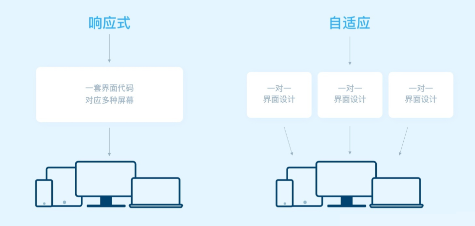
Application scenario:
- Adaptive: from the aspect of page personalization and multi-function, when the website has complex functions, frequent user interaction and large number of users. Adaptive design is more appropriate. For example, e-commerce websites can better provide customers with comprehensive functions and good interactive experience services.
- Responsive: considering the convenience of operation and maintenance, it is recommended to use responsive when there are few interactions, few functions and infrequent upgrades. For example, display company homepage, etc.
Responsive layout there are three ways to handle layout and content:
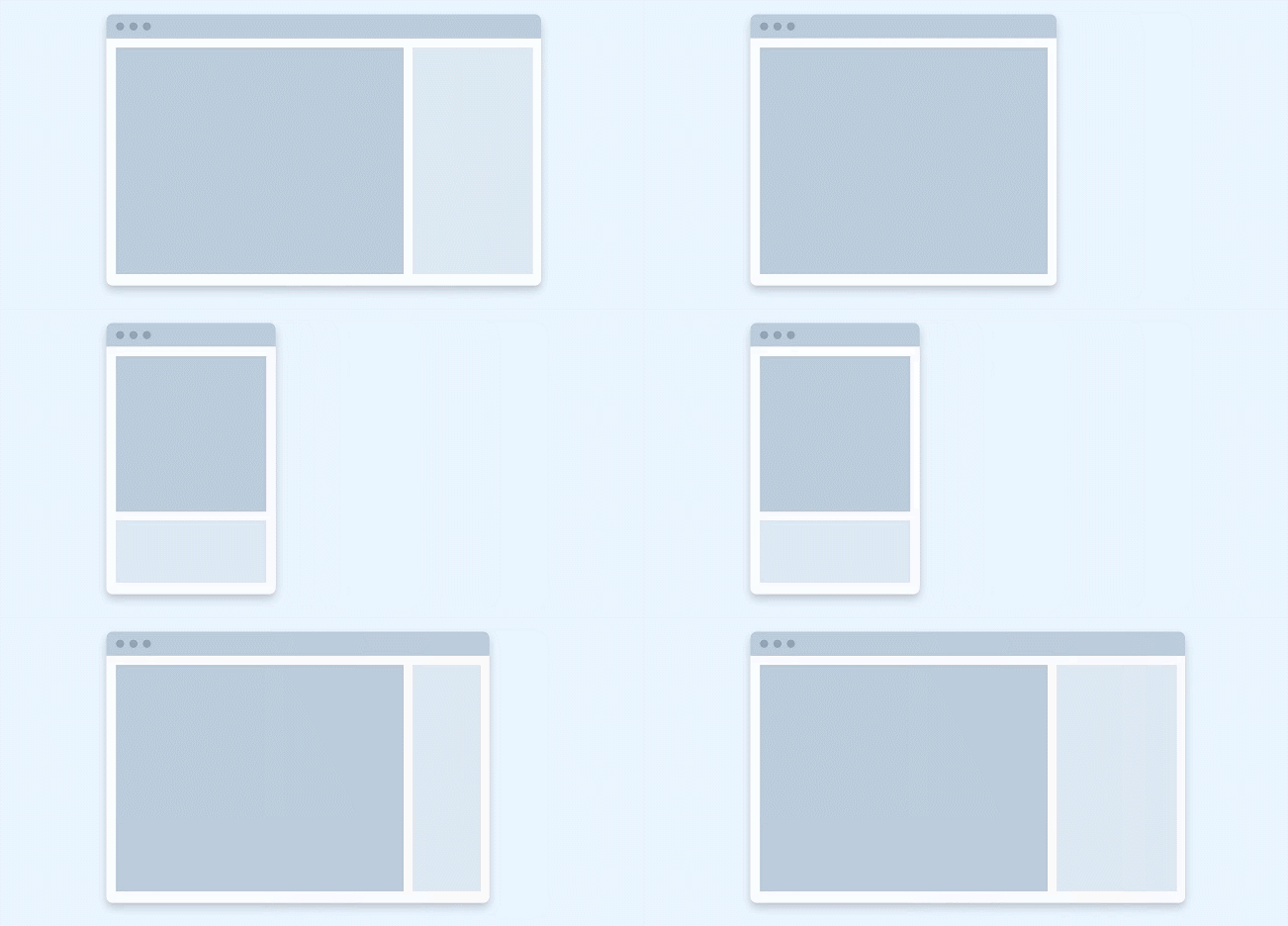
Line feed: we can better adapt the visual area by changing the page structure and layout. In most cases, it will lead to content stacking.
Resize: resize components and html elements, fill in blank space and wrap lines if necessary;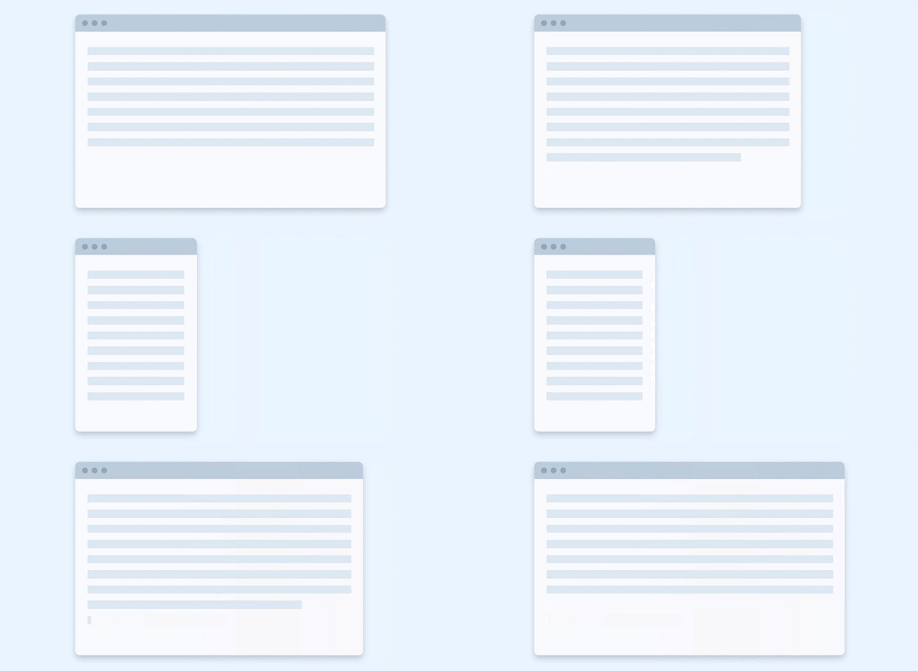
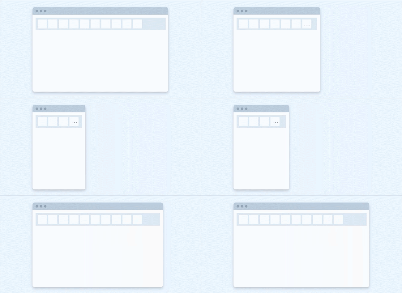
Show / hide: hide or show components in the visible area (components still exist)
2, Implementation of responsive layout
1. CSS3 media queries
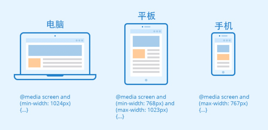
Add multiple media queries to the style sheet, and adjust the whole page or part of the page by setting breakpoints (points during media query and style change) to achieve the best effect of adapting to various screen sizes.
Common matching features of media query
| mdedia features | describe |
|---|---|
| width/height | Browser width and height |
| max-width | Effective when less than the maximum width |
| min-width | Effective when less than the minimum width |
| device-width/device-height | Device screen resolution width and height |
| resolution | Device resolution |
| orientation | Portrait (longitudinal), when the height is greater than the width; Landscape (transverse), when the height is less than the width |
Feature matching operator
- and
// Indicates that the minimum width is limited to 700px. CSS code takes effect when the browser width is greater than or equal to 700px and horizontal
@media (min-width: 700px) and (orientation: landscape) {
 ...
 }
- Comma, separated
// Indicates that the maximum width is limited to 500px. It takes effect when the browser width is less than or equal to 500px or when the handheld device is horizontal
@media (max-width: 500px), handheld and (orientation: landscape) {
 ...
 }
Media query import
- link introduction method
<link rel="stylesheet" type="text/css" href="styleB.css" media="screen and (min-width: 600px) and (max-width: 800px)">
- @media import
@media screen and (max-width: 990px){
    .container{
        background: orange;
    }
}
2. Grid view
Responsive grid view: first, ensure that all HTML elements have box sizing attribute and are set to border box, and ensure that the margin and border are included between the width and height of the element.
<!DOCTYPE html>
<html>
<head>
<meta name="viewport" content="width=device-width, initial-scale=1.0"/>
<style>
* {
    box-sizing:border-box;
}
.gridwrapper {
	overflow:auto;
	position:relative;
	height:250px;
}
.gridcontent {
	width:8.33%;
	margin:0;
	xborder-left:1px solid grey;
    border-right:1px solid grey;
	height:100%;
	float:left;
	background-color:#84c754;
	background-color:#f1f1f1;
}
</style>
</head>
<body>

<div style="position:absolute;opacity:0.9;width:auto;left:8px;right:10px;">
<div class="gridcontainer">
<div class="gridwrapper" style="height:90px;">
	<div class="gridcontent" style="width:100%;background:#9933cc;border-right-color:transparent;">

	</div>
</div>
<div class="gridwrapper" style="height:230px;">
	<div class="gridcontent" style="background-color:#ffffff;border:none;width:25%;padding-top:15px;">
	<div style="background-color:#33b5e5;border:none;width:100%;height:15%;margin-bottom:10px;"></div>
	<div style="background-color:#33b5e5;border:none;width:100%;height:15%;margin-bottom:10px;"></div>
	<div style="background-color:#33b5e5;border:none;width:100%;height:15%;margin-bottom:10px;"></div>
	<div style="background-color:#33b5e5;border:none;width:100%;height:15%;"></div>
	</div>
	<div class="gridcontent" style="background-color:#ffffff;border:none;"></div>
	<div class="gridcontent" style="background-color:#ffffff;border:none;"></div>
	<div class="gridcontent" style="background-color:#ffffff;border:none;"></div>
	<div class="gridcontent" style="background-color:#ffffff;border:none;"></div>
	<div class="gridcontent" style="background-color:#ffffff;border:none;"></div>
	<div class="gridcontent" style="background-color:#ffffff;border:none;"></div>
	<div class="gridcontent" style="background-color:#ffffff;border:none;width:25%;padding-top:15px;">
        <div style="background-color:#33b5e5;border:none;width:100%;height:92%;"></div>
	</div>
</div>
<div class="gridwrapper" style="height:50px;">
	<div class="gridcontent" style="width:100%;background:#0099cc;border-right-color:transparent;">

	</div>
</div>

</div>
</div>
<div class="gridcontainer" style="opacity:0.1;">
<div class="gridwrapper" style="height:370px;">
	<div class="gridcontent" style="background-color:#ffffff;border-right:1px solid #000000;border-left:1px solid #000000;"></div>
	<div class="gridcontent" style="background-color:#ffffff;border-right:1px solid #000000;"></div>
	<div class="gridcontent" style="background-color:#ffffff;border-right:1px solid #000000;"></div>
	<div class="gridcontent" style="background-color:#ffffff;border-right:1px solid #000000;"></div>
	<div class="gridcontent" style="background-color:#ffffff;border-right:1px solid #000000;"></div>
	<div class="gridcontent" style="background-color:#ffffff;border-right:1px solid #000000;"></div>
	<div class="gridcontent" style="background-color:#ffffff;border-right:1px solid #000000;"></div>
	<div class="gridcontent" style="background-color:#ffffff;border-right:1px solid #000000;"></div>
	<div class="gridcontent" style="background-color:#ffffff;border-right:1px solid #000000;"></div>
	<div class="gridcontent" style="background-color:#ffffff;border-right:1px solid #000000;"></div>
	<div class="gridcontent" style="background-color:#ffffff;border-right:1px solid #000000;"></div>
	<div class="gridcontent" style="background-color:#ffffff;border-right:1px solid #000000;"></div>
</div>
</div>

<p>Resetting the browser window size automatically scales the grid.</p>
</body>
</html>
3. Multi column layout column count
The oldest of these layouts is multiple columns, that is, when you specify a column count, it means how many columns you want to divide your content into. The browser then calculates the size of these columns, which changes with the size of the screen.
.container {
  column-count: 3;
}
If you specify column width instead, you are specifying a minimum width. The browser will create as many columns of this width as possible, as long as they can be properly placed in the container, and then share the remaining space between all columns. Therefore, the number of columns will change with the amount of space.
.container {
  column-width: 10em;
}
4. flex layout
reference resources: https://blog.csdn.net/qq_38987146/article/details/113990426
5. Grid system
reference resources: https://blog.csdn.net/qq_38987146/article/details/113990426
6. Responsive image
The simplest way to process a responsive image: take an image with the largest size you need, and then scale it. This is still a method used today
Image/video {
  max-width: 100%;
  height: auto;
}
This approach has two disadvantages:
- The image may be displayed much smaller than its original size, so as to waste bandwidth;
- The width height ratio of the image at the mobile end and the desktop end may not be the same, and the display image may not be the same. These two cannot be solved simply by scaling the image.
Reasonable responsive image, using < picture > elements and < img > ` ` srcset and sizes features, solves these two problems, allowing browsers to select the most appropriate image for the device, so as to ensure that users download the image with the size suitable for the device they use.
srcset: <img-URL> <A width descriptor >/<A pixel density descriptor)>
- width descriptor: the width of the image. The value is a positive integer, in w;
- pixel density descriptor: the pixel density of the picture. The value is a positive floating-point number, in x.
sizes: <media-condition> <source-size-value>,<default>
- Media condition: condition setting of media query
- Source size value: the image selection value when the query conditions are met
- Default: the default selection value when the query criteria are not met
Display the same image
-
Resolution switching: different sizes
To display the same image content, depending on the device, but larger or smaller, use img two new attributes: srcset and sizes , to provide some additional source images and tips to help the browser select the correct image.
<img srcset="elva-fairy-480w.jpg 480w,
             elva-fairy-800w.jpg 800w"
     sizes="(max-width: 600px) 480px,
            800px"
     src="elva-fairy-800w.jpg"
     alt="Elva dressed as a fairy">
The browser will check the device width, determine that the first one in the sizes list is the true media condition, get the media, query the slot size, and load the image referenced in the srcset list that is the same as the slot size. If not, load the first image larger than the selected slot size. That is, if the viewport width is 480px, the (max width: 600px) media condition will be true, so the browser selects the 480px slot, elva-fair-480w Jpg will be loaded because its inherent width (480W) is the closest bit size.
-
Same size, different resolution
Supports multiple display resolutions, but everyone sees your image in the same actual size on the screen. You can allow the browser to select the appropriate resolution image sizes by using srcsetx descriptor and not using x descriptor - a simpler syntax!<img srcset="elva-fairy-320w.jpg, elva-fairy-480w.jpg 1.5x, elva-fairy-640w.jpg 2x" src="elva-fairy-640w.jpg" alt="Elva dressed as a fairy">
Display different images
To change the displayed image to fit different image display sizes
<picture>
  <source media="(max-width: 799px)" srcset="elva-480w-close-portrait.jpg">
  <source media="(min-width: 800px)" srcset="elva-800w.jpg">
  <img src="elva-800w.jpg" alt="Chris standing up holding his daughter Elva">
</picture>
- Media contains the attributes of the media condition: if the viewport width is 799px or less, < source > displays the image of the first element. If the viewport width is 800px or more, it will be the second. If no media condition returns true or the browser does not support the < picture > element, elva-800w will be displayed by default jpg.
- Srcset image path. The srcset here can also be used in conjunction with the sizes attribute of the image.
7. Responsive typesetting
-
em/rem responsive typesetting
html { font-size: 1em; } h1 { font-size: 2rem; } @media (min-width: 1200px) { h1 { font-size: 4rem; } } -
vw responsive typesetting uses viewport units to achieve responsive typesetting
Reactive typesetting can also be achieved using viewport units VW. 1vw is equal to one percent of the width of the viewport, that is, if you use VW to set the font size, the font size will always change with the size of the viewport.
h1 {
  font-size: 6vw;
}
There is a problem with this. The text is strongly related to the viewport, and zooming is not valid for text defined only by vw. So you should never set text only in viewport units.
You can solve this problem by using calc() and combining vw units with scalable units, such as em or rem.
h1 {
  font-size: calc(1.5rem + 3vw);
}
9. Set viewport
A viewport is a visual area of a user's web page. Setting purpose: to avoid the problem caused by the virtual "window" of mobile browser when the virtual "window" is wider than the screen.
<meta name="viewport" content="width=device-width, initial-scale=1">
This attribute controls the size of the apparent window width. It can be set to the actual specific pixel width= 600 or set the width value for special devices.
The properties of the viewport settings are as follows:
- Width: controls the size of the viewport. You can specify a value, such as 600, or a special value, such as device width is the width of the device (the unit is the pixel of CSS when it is scaled to 100%).
- Height: corresponding to width, specify the height.
- Initial scale: initial scale, that is, the scale when the page is load ed for the first time.
- Maximum scale: the maximum scale to which the user is allowed to zoom.
- Minimum scale: the minimum scale to which the user is allowed to zoom.
- User scalable: can users scale manually
reference resources:
- https://www.zhihu.com/question/20976405
- https://developer.mozilla.org/zh-CN/docs/Learn/CSS/CSS_layout/Responsive_Design
- https://www.zhihu.com/question/20976405
- https://www.runoob.com/css/css-rwd-images.html