This record is my learning notes for participating in datawhale data analysis (Titanic mission project). Please give me more advice on the shortcomings.
Data visualization
Mainly introduce Python data visualization libraries Matplotlib and seaborn. You may find the data very interesting in the study of this chapter. In the process of playing the game, data visualization can let us better see the results of each key step, which can be used to optimize the scheme. It is a very useful skill.
Import the required related libraries
import numpy as np
import pandas as pd
import matplotlib.pyplot as plt
import seaborn as sns
1, What are the most basic visual patterns? Which scenarios are applicable? (for example, a line chart is suitable for visualizing the trend of an attribute value over time)
There are a variety of visual views. The 10 commonly used views include scatter chart, broken line chart, histogram, bar chart, box line chart, pie chart, thermodynamic chart, spider chart, binary variable distribution and pairwise relationship.
According to the relationship between data:
Comparison: compare the relationship between various categories of data, or their change trend over time, such as line chart;
Contact: view the relationship between two or more variables, such as scatter diagram;
Composition: the percentage of each part in the whole, or the percentage change over time, such as pie chart;
Distribution: focus on the distribution of a single variable or multiple variables, such as histogram.
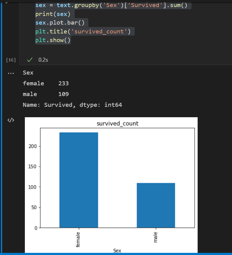
1. Visually display the distribution of survival numbers between men and women in the Titanic data set (try with histogram).
Histogram
Using the matplotlib Toolkit: using PLT Bar (x, height) function. X represents the position sequence of x value, and height represents the numerical sequence of y axis, that is, the height of the column.
sex = text.groupby('Sex')['Survived'].sum()
print(sex)
sex.plot.bar()
plt.title('survived_count')
plt.show()
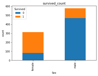
2. Visually display the proportion of survival and death of men and women in the Titanic data set (try using the histogram).
(1)
plt.plot() usage
Format: PLT plot(x, y, ls=’-’, lw=2, label=‘xxx’, color=‘g’ )
x: Value on X axis
y: Value on y-axis
ls: line style
lw: line width
Label: label text
(2)
Using seaborn Toolkit: SNS Barplot (x = none, y = none, data = none), where data is Dataframe type and x,y are variables in data.
text.groupby(['Sex','Survived'])['Survived'].count().unstack().plot(kind='bar',stacked='True')
plt.title('survived_count')
plt.ylabel('count')
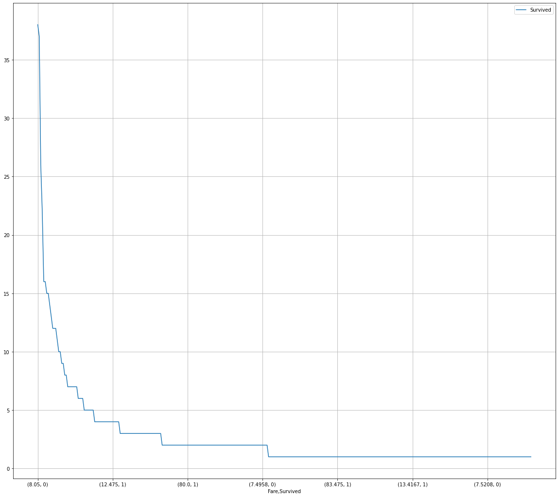
3. Visually display the distribution of people's survival and death toll at different ticket prices in the Titanic data set. (try the broken line chart) (the horizontal axis shows different ticket prices, and the vertical axis shows the number of survivors)
In Matplotlib, we can directly use PLT The plot() function, of course, needs to sort the data according to the size of the X-axis in advance. If it is not sorted, it will be messy and unable to clearly show the data trend
Use SNS Lineplot (x, y, data = none) function. Where x and y are subscripts in data. Data is the data we want to pass in, generally of DataFrame type
fare_sur = text.groupby(['Fare'])['Survived'].value_counts().sort_values(ascending=False)
fig = plt.figure(figsize=(20, 18))
fare_sur.plot(grid=True)
plt.legend()
plt.show()
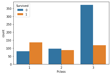
4. Visually display the distribution of survival and death of people at different positions in the Titanic data set. (try histogram)
sns.countplot(x="Pclass", hue="Survived", data=text)
[thinking] after seeing the previous data visualization, talk about your first feeling and your summary
1. Find the regularity of data at a glance
2. The type of graphics used for data presentation and selection is very important. Accurate use of graphics will accurately present data rules
5. Visually display the distribution of life survival and death toll at different ages in the Titanic data set. (unlimited expression)
facet = sns.FacetGrid(text, hue="Survived",aspect=3)
facet.map(sns.kdeplot,'Age',shade= True)
facet.set(xlim=(0, text['Age'].max()))
facet.add_legend()

6. Visually display the age distribution of people at different positions in the Titanic dataset. (try the line chart)
text.Age[text.Pclass == 1].plot(kind='kde')
text.Age[text.Pclass == 2].plot(kind='kde')
text.Age[text.Pclass == 3].plot(kind='kde')
plt.xlabel("age")
plt.legend((1,2,3),loc="best")
