Dead work
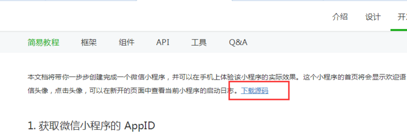
In order to develop the Wechat widget program, we need to do some preparatory work, first enter https://mp.weixin.qq.com/debu... Download Quick Development Source Pack
Then enter https://mp.weixin.qq.com/debu... To download the Wechat Developer Tool, then decompress the source package and install the Wechat Developer Tool. After installing the development software, you can see it on the desktop.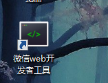
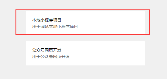
Then click on the entry to confirm the login by scanning the code of the mobile phone, and then select the local widget project after scanning the code.
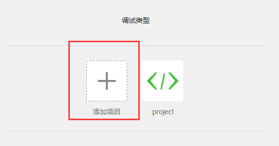
After choosing to add items
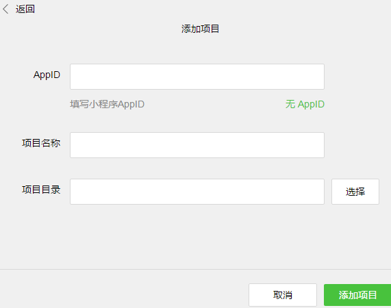
If you want to learn the Weixin applet, if you don't publish it for the time being, you can click on AppID. If you want to publish it later, you can apply for the account number of Weixin applet on the official website. You can send an AppID to you. You can choose the project name at will. The project directory will enter the source code package that we just downloaded and decompressed, and then you will enter the interface of Weixin development.
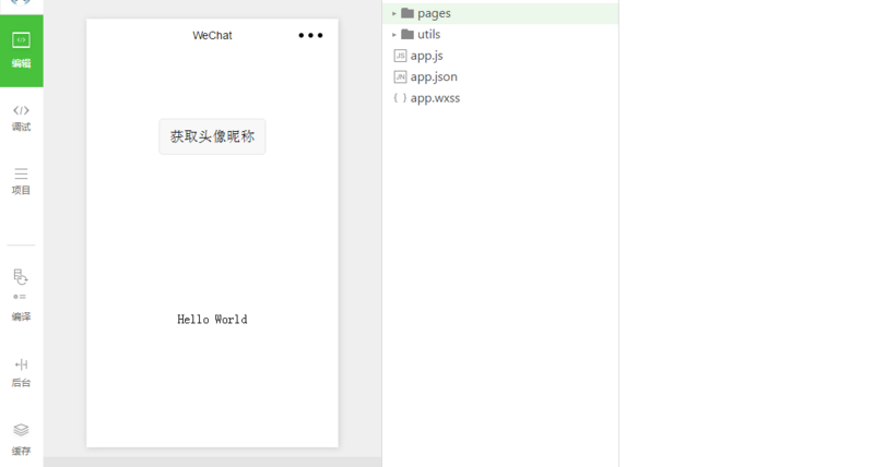
After understanding the development interface, we can develop a simple Wechat applet.
Widget configuration file
First, let's talk about the three global files of the applet:
app.js: Small program scripts that declare global variables and listen to life cycle functions for small programs
app.json: Global configuration file, such as how many pages the applet has, the color content of window title, navigation bar configuration, window color and so on. Note: No comment can be added to this page.
app.wxss: Store Common Styles
There are two other files. One is utils, which mainly contains some general tool classes. The key point is pages, which is a folder for all pages. Small program pages are mainly composed of three files, wxml, wxss, JS and json.
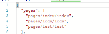
You can delete the files in pages, and then create your own file name. At present, you can delete the default two files index and logs in pages. But if you create a new page file, you have to declare it in app.json. Here's to note that in the pages array in app.json, the first page declared is the home page of the Wechat applet.
Entering the Development Phase
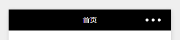
Change the top navigation style
If you want to change the top navigation style of a page, you need to modify it in the json file of the current page. For example, to modify the top navigation of the index page, you set it in index.json
{
  "navigationBarTitleText": "home page",
  "navigationBarBackgroundColor": "black",
  "navigationBarTextStyle": "#fff"
}
If you want to modify the top navigation of all pages, you need to modify it in app.json
  "window": {
    "backgroundTextStyle": "light",
    "navigationBarBackgroundColor": "#fff",
    "navigationBarTitleText": "WeChat",
    "navigationBarTextStyle": "black"
  }
}
If the top navigation is also set in index.json, the priority is index.json, and the default style is to set the top navigation in app. json.
The index page sets the top navigation as follows:
- Page Jump Problem
First, there is a navigator tag in the Wechat applet, which you can understand as a tag in the web.
In the wxml file:
   <! - Jump to a new page - >.
    <navigator url=". /test/test">navigator jump </navigator>
   <! - Jump to the current page - >.
    <navigator url=". / test/test" open-type= "redirect">redirect jump </navigator>
Of course, besides writing jumps directly in wxml, you can also write jumps in another way
In wxml:
   <text bindtap="navigatorFunc">navigator Jump</text>
   <text bindtap="enterTest">redirect Jump</text>
In the js file:
 enterTest:function(){
    wx.redirectTo({
      url: '../test/test',
    })
  },

  navigatorFunc:function(){
     wx.navigateTo({
       url: '../test/test',
     })
  },
-
3. Create a Rotary Planting Map
In wxml:
<swiper indicator-dots="{{indicatorDots}}"
        autoplay="{{autoplay}}" interval="{{interval}}" duration="{{duration}}">
      <block wx:for="{{imgUrls}}">
        <swiper-item>
           <navigator url="{{item.link}}" hover-class="navigator-hover">
            <image src="{{item.url}}" class="slide-image"/>
           </navigator>
        </swiper-item>
      </block>
</swiper>
swiper can't be placed inside any element, otherwise the rotation will go wrong.
In wxss:
.slide-image{
  width: 100%;
}
Set the width of the picture to cover the entire screen
In js:
 data: {
      imgUrls: [
        {
          link: '/pages/index/index',
          url: 'http://www.wallcoo.com/holiday/2015%20New%20Year%2001/images/2015_celebrating_wallpaper_164701524.jpg'
        }, {
          link: '/pages/logs/logs',
          url: 'http://www.wallcoo.com/holiday/2015%20New%20Year%2001/images/2015_celebrating_wallpaper_164701516.jpg'
        }, {
          link: '/pages/test/test',
          url: 'http://www.wallcoo.com/holiday/2015%20New%20Year%2001/images/2015_celebrating_wallpaper_164701517.jpg'
        }
      ],
      // Do you need bottom rotation dots?
      indicatorDots: true,
      // Whether to Play Automatically
      autoplay: true,
      // Automatic playback interval
      interval: 5000,
      // Sliding animation time
      duration: 1000,

  },
The link is a jump link and the URL is the address of the picture, but the picture address can't be the local address, it must be the online picture address or base64 is the picture.
The operation results are as follows:

-
4. Bottom Navigation Bar Switching
Add:
"tabBar": {
    "color": "#000",
    "selectedColor": "#1296db",
    "borderStyle": "white",
    "list": [
      {
        "selectedIconPath": "images/1-1.png",
        "iconPath": "images/1.png",
        "pagePath": "pages/index/index",
        "text": "home page"
      },
      {
          "selectedIconPath": "images/1-1.png",
          "iconPath": "images/1.png",
        "pagePath": "pages/logs/logs",
        "text": "Journal"
      },
      {
          "selectedIconPath": "images/1-1.png",
          "iconPath": "images/1.png",
        "pagePath": "pages/test/test",
        "text": "test"
      }
    ]
  }
Selected IconPath is the bottom icon when selected, iconPath is the bottom icon when unchecked, pagePath is the path when clicked, text is the top text content, color is the bottom text color, selected color text text is the color, note: bottom navigation switch button can not exceed five.
Operating screenshots:
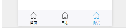
It should be noted here that when your page path has been changed into the bottom navigation switch, other pages to enter this page path switch code can not be used to switch the normal code, the correct code is as follows:
In js:
  wx.switchTab({
    url: 'pages/test/test',
  })
Or in wxml:
<navigator url="/pages/index/index" open-type="switchTab">Jump button</navigator>
The above two are equivalent.
-
5. Form submission and clearance
In wxml:
<!-- form -->
   <form bindsubmit="formSubmit" bindreset="formReset">
       <view class="group">
          <view class="title">User name:</view>
          <view class="cont">
             <input type="text" name="username" placeholder="enter one user name"/>
          </view>
          <view class="clear"></view>
       </view>

        <view class="group">
          <view class="title">Gender:</view>
          <view class="cont">
               <radio-group name="gender">
                  <label><radio value="1"/>male</label>
                  <label><radio value="0"/>female</label>
                </radio-group>
          </view>
          <view class="clear"></view>
       </view>

       <view class="group">
          <view class="title">food: </view>
          <view class="cont">
              <checkbox-group name="hobby">
                 <label><checkbox value="0"/>Cake</label>
                 <label><checkbox value="1"/>steak</label>
                 <label><checkbox value="1"/>Chop bone</label>
              </checkbox-group>
          </view>
          <view class="clear"></view>
       </view>

       <view class="group">
          <view class="title">Agree!</view>
          <view class="cont">
             <switch name="isagree"/>
          </view>
          <view class="clear"></view>
       </view>

       <view class="group">
          <button form-type="submit">Submit Form</button>
          <button form-type="reset">Clear the form</button>
       </view>
    </form>
In wxss:
.clear{
  clear: both;
}
.title{
  float: left;
  width: 100px;
  text-align: right;
}
.cont{
  float: left;
}
input{
  border:1px solid gainsboro;
}
.group{
  margin-top:20px;
}
In js:
  // Submit form functions
  formSubmit:function(e){
      console.log(e);
      console.log("The form has been submitted!");
      console.log("User name:"+e.detail.value.username);
      console.log("Gender:" + (e.detail.value.gender==1?"male":"female"));
  },

  // Clear form functions
  formReset:function(e){
    console.log("The form is empty!");
  },
The results are as follows:
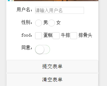
Note: formSubmit is the function that executes after submitting the form. The data submitted by the form is in e.detail.value. It is important to note here that the tag that stores the data must have the name attribute value in order to obtain the data.
-
Popup
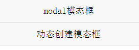
1. Modal section
In wxml:
<view class="modalBox">
<button bindtap="modalFunc">modal modal modal box </button>
<button bindtap="create Modal"> dynamically create modal box </button>
</view>
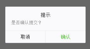
<! - Tip box - >
<modal title= "prompt" confirm-text= "confirm" cancel-text= "cancel" hidden="{{modal Hidden}" mask bindconfirm= "confirmFunc" bindcancel= "cancelFunc">
Are submissions confirmed?
</modal> In js:
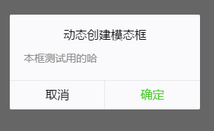
 data: {
    //false shows that true is hidden
    modalHidden:true
  },

  // Modal box appears
  modalFunc:function(){
    // Display prompt box
    this.setData({
      modalHidden: false
    });
  },

  // Dynamic creation of modal boxes
  createModal:function(){
    wx.showModal({
      title: 'Dynamic creation of modal boxes',
      content: 'Ha for testing this box',
      success: function (res) {
        if (res.confirm) {
          console.log('User Click OK')
        } else if (res.cancel) {
          console.log('User Click Cancel')
        }
      }
    })
  },

  // Confirmation function
  confirmFunc:function(){
    console.log("Click OK!");
    // Close the prompt box
    this.setData({
      modalHidden: true
    });
  },

  // Cancellation function
  cancelFunc:function(){
    console.log("Click Cancel!");
      // Close the prompt box
    this.setData({
      modalHidden: true
    });
  },
The results are as follows:
2. Tip box
In wxml:
<view class="modalBox">
  <button bindtap="toastFunc">toast prompt box </button>
   <button bindtap="create Toast">Create toast prompt box dynamically </button>
</view>


<! - Tip box - >
  <toast hidden="{toastHidden}">Submitted successfully </toast>
In js:
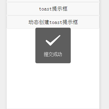
  data: {
     //false shows that true is hidden
    toastHidden:true
  },

  // Prompt box appears
  toastFunc:function(){
    // Display prompt box
    this.setData({
      toastHidden: false
    });

    // Two seconds later the prompt box disappeared
    var that = this;
    setTimeout(function(){
      that.setData({
        toastHidden: true
      });
    },2000);

  },

  // Create prompt box dynamically
  createToast:function(){
     wx.showToast({
       title: 'Successful setup',
     })
  },
The screenshots are as follows:
These are the basic contents of the Wechat applet. If there are any new discoveries in the future, this article will be updated again.