1. Built in colors in ionic4.x
primary secondary tertiary success warning danger dark medium light
Only one color needs to be remembered, such as success, because it can be found in the project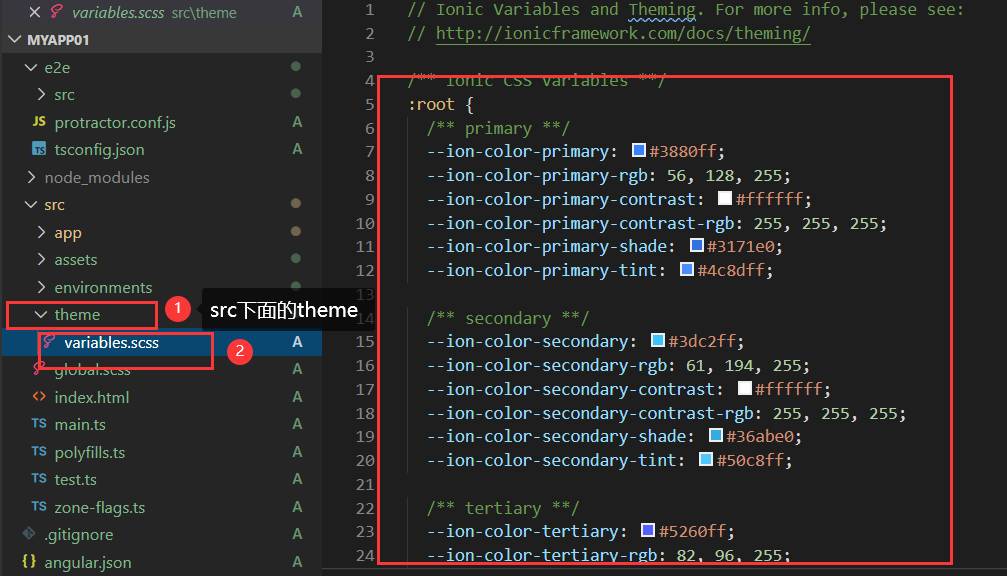
Use of color: directly add color to the label, enter i-color to enter the drop-down prompt, you can choose a color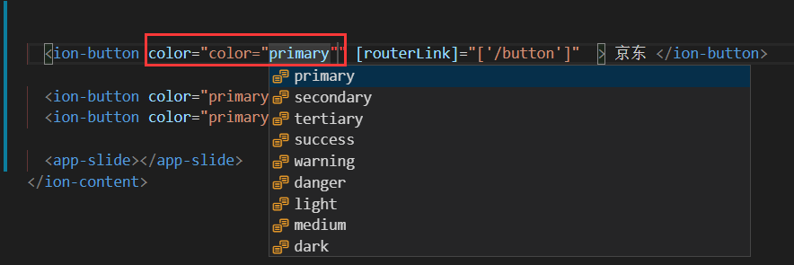
2. Button component in ionic4.x
1. The ion button component can define a button
<ion-button>Default</ion-button>
Enter i-button to enter as prompted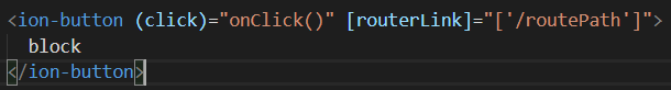
routerLink is the jump page, / followed by the jump position
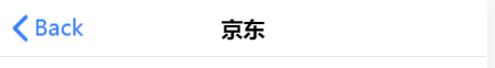
Enter i-back-button press the prompt to enter the return button, which can only be placed in the middle of the ion toolbar label,
Ion back button must be in ion buttons, slot is the position, and start description is at the start position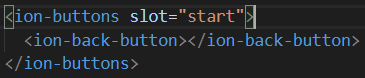
2. The color attribute defines the color of the button
<ion-button color="primary"> primary </ion-button>
<ion-button color="secondary"> secondary </ion-button>
<ion-button color="tertiary"> tertiary </ion-button>
<ion-button color="success"> success </ion-button>
<ion-button color="warning"> warning </ion-button>
<ion-button color="danger"> danger </ion-button>
<ion-button color="dark"> dark </ion-button>
<ion-button color="medium"> medium </ion-button>
<ion-button color="light"> light </ion-button>
3.expand to set the width of the button
This property allows you to specify the width of the button. By default, a button is an inline block, but setting this property changes the button to a full width block element.
  <ion-button color="primary" expand="block">block</ion-button>//fillet
  <ion-button color="primary" expand="full">block</ion-button>//Square corner
Design sketch: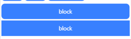
4.fill set background fill
This property determines the button's background and border color. By default, a button has a fixed background, unless the button is in the
Inside the toolbar, if the button is at the top of the toolbar, the button has a transparent background by default.
<ion-button fill="outline" expand="block">  </ion-button>

  <ion-button fill="solid">
    <icon-icon  slot="icon-only" name="add"></icon-icon>
  </ion-button>

  <ion-button fill="clear">
    <icon-icon  slot="icon-only" name="add"></icon-icon>
  </ion-button>/
clear a button with a transparent background similar to a flat button
outline button with transparent background and visible border
The solid button has a filled background. Used for buttons in toolbars.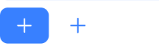
5. Set button size
<ion-button size="large">
    Set the size of the button
  </ion-button>
  <ion-button size="small">
    Set the size of the button
  </ion-button>
small button
default button
large button
6.mode decides which platform style to use
<ion-button mode='ios' color="primary">ios Buttons for the platform</ion-button>
 <ion-button mode='md' color="primary">android Buttons for the platform</ion-button>
It has two sets of button styles installed, one is Android and the other is ios, so the styles can be changed automatically according to the platform
7. Button combination Icon
<ion-button color="primary">
    <ion-icon name="add-circle-outline" slot="start"></ion-icon>
    left icon
  </ion-button>//Icon to the left of text
  <ion-button color="primary">
    right icon
    <ion-icon name="add-circle-outline" slot="end"></ion-icon>
  </ion-button>//Icon to the right of text
</ion-content>
3. Icons in ionic
Document of components of ionic Chinese network: https://ionicons.com/
Name specifies the name of the icon: < ion icon name = "arrow dropright circle" > < / ion icon >
slot specifies the location of the icon:
<ion-button>
<ion-icon slot="start" name="star"></ion-icon>
Left Icon
</ion-button>
<ion-button>
Right Icon
<ion-icon slot="end" name="star"></ion-icon>
</ion-button>
<ion-button fill="clear" color="success">
<ion-icon slot="icon-only" name="add"></ion-icon>
</ion-button>
4,ion-header,ion-footer,ion-content,ion-toobar,icon-title,icon-button,icon-back-button
Official documents of ionic: https://ionicframework.com/docs/api/toolbar
Ion content content at the bottom of ion footer
Ion toolbar is mainly used for the head and bottom, fixed at the top or bottom of the page.
Ion Title put in the ion toolbar to specify the name of the navigation
The ion buttons group is mainly used in the ion toolbar. The buttons in the toolbar should be placed inside the ion buttons.
Ion back button return button, put it in ion buttons
Properties in ion buttons
| secondary | The element is on the left side of the content in ios mode and directly on the right side of the content in md mode. |
|---|---|
| primary | The element is on the right side of the content in ios mode and the rightmost in md mode |
| start | On the left side of content in LTR and on the right side of content in RTL. |
| – | – |
| end | Right side of content in LTR, left side of content in RTL |
usage
<ion-toolbar>
<ion-title>Title Only</ion-title>
</ion-toolbar>
<ion-toolbar>
<ion-buttons slot="start">
<ion-back-button></ion-back-button>
</ion-buttons>
<ion-title>Back Button</ion-title>
</ion-toolbar>
<ion-toolbar>
<ion-buttons slot="secondary">
<ion-button>
<ion-icon slot="icon-only" name="contact"></ion-icon>
</ion-button>
<ion-button>
<ion-icon slot="icon-only" name="search"></ion-icon>
</ion-button>
</ion-buttons>
<ion-title>Default Buttons</ion-title>
<ion-buttons slot="primary">
<ion-button color="secondary">
<ion-icon slot="icon-only" name="more"></ion-icon>
</ion-button>
</ion-buttons>
</ion-toolbar>

