Following Swing's old example, JavaFX still provides three text input boxes: a single-line input box TextField, a password input box PasswordField, and a multi-line input box TextArea. These input boxes are derived from the abstract class TextInputControl, so they have a common editing method. There are mainly two common types of input boxes:
setEditable: Set whether the input box can be edited. Represents editability for true and non-editability for false.
setPromptText: Sets the prompt in the input box to indicate what text the user can enter.
The difference between a text input box and a text label is that the text in the input box allows editing, while the label text does not allow editing. Nevertheless, the input box still displays text on the interface, so it has the same method as the Label control:
setPrefSize: Set the recommended width of the input box.
setText: Set the text of the input box.
setFont: Set the font of the input box.
setBackground: Set the background of the input box.
As for other methods of Label control, such as setAlignment, setTextFill, setWrapText, setGraphic, the TextInputControl class is not provided because of the details involved. In addition, the three input boxes of JavaFX have their own merits, which will be explained in detail next.
1. Single-line input box TextField
The TextField control corresponds to Swing's JTextField, which can only enter one line of text, and provides the following two proprietary methods:
setAlignment: Set the alignment of input boxes. This method is equivalent to the same name method of Label control.
setPrefColumnCount: Sets the recommended number of columns in the input box.
The following is a code snippet that adds a single-line input box to the interface:
		Button btn1 = new Button("Single line input box"); // Create a button
		btn1.setOnAction(new EventHandler<ActionEvent>() { // Setting the Click Event of the Button
			@Override
			public void handle(ActionEvent arg0) { // Handling click events
				HBox hbox = new HBox(); // Create a horizontal box
				Label label = new Label("Please enter your cell phone number:"); // Create a label
				TextField field = new TextField(); // Create a single-line input box
				field.setPrefSize(200, 50); // Recommended width and height for setting one-line input box
				field.setEditable(true); // Can you edit a single-line input box?
				field.setPromptText("Please enter your cell phone number."); // Tips for setting up one-line input boxes
				field.setAlignment(Pos.CENTER_LEFT); // Setting the alignment of single-line input boxes
				field.setPrefColumnCount(11); // Number of recommended columns for setting single-line input boxes
				hbox.getChildren().addAll(label, field); // Add a single line input box to the horizontal box
				borderPane.setCenter(hbox); // Place the horizontal box in the center of the border pane
			}
		});
		flowPane.getChildren().add(btn1); // Add a button to the streaming pane
Run the application that contains the above test code. The window interface after clicking the button is shown in the following figure. The text filled in in in the TextField can be seen in plain text.

2. PasswordField
The PasswordField control corresponds to Swing's JPasswordField, which actually inherits from TextField. The only difference is that the input text is replaced by dots, and the setting method of echo characters is not provided. The following is a code snippet that adds a password input box to the interface:
		Button btn2 = new Button("Password Input Box"); // Create a button
		btn2.setOnAction(new EventHandler<ActionEvent>() { // Setting the Click Event of the Button
			@Override
			public void handle(ActionEvent arg0) { // Handling click events
				HBox hbox = new HBox(); // Create a horizontal box
				Label label = new Label("Please input a password:"); // Create a label
				PasswordField field = new PasswordField(); // Create a password entry box
				field.setPrefSize(200, 50); // Setting the recommended width and height of the password input box
				field.setEditable(true); // Can you edit the password input box?
				field.setPromptText("Please input a password"); // Tips for setting password input boxes
				field.setAlignment(Pos.CENTER_LEFT); // Setting the alignment of password input boxes
				field.setPrefColumnCount(11); // Number of recommended columns for setting password input boxes
				hbox.getChildren().addAll(label, field); // Add a password input box to the horizontal box
				borderPane.setCenter(hbox); // Place the horizontal box in the center of the border pane
			}
		});
		flowPane.getChildren().add(btn2); // Add a button to the streaming pane
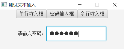
Running an application that contains the above test code, the window interface after clicking the button is shown in the following figure. The text filled in in PasswordField is shown in ciphertext.
3. Multi-line input box TextArea
The TextArea control corresponds to Swing's JTextArea, which allows multiple lines of text to be input, and the text is fixed and aligned to the upper left corner, so the control does not have the setAlignment method, instead, it has the setWrapText newline method. Several additional methods for TextArea are described below:
setWrapText: Sets whether the input box text supports automatic line breaking. This method is equivalent to the same name method of Label control.
setPrefColumnCount: Sets the recommended number of columns in the input box.
setPrefRowCount: Sets the recommended number of rows in the input box.
The following is a code snippet that adds a multi-line input box to the interface:
		Button btn3 = new Button("Multi-line input box"); // Create a button
		btn3.setOnAction(new EventHandler<ActionEvent>() { // Setting the Click Event of the Button
			@Override
			public void handle(ActionEvent arg0) { // Handling click events
				HBox hbox = new HBox(); // Create a horizontal box
				hbox.setPrefSize(300, 80); // Recommended width and height for setting horizontal boxes
				Label label = new Label("Please enter the evaluation:"); // Create a label
				TextArea area = new TextArea(); // Create a multi-line input box
				area.setMaxHeight(85); // Set the maximum height of the multi-line input box
				//area.setMaxWidth(300); // Set the maximum width of the multi-line input box
				area.setPrefSize(200, 50); // Recommended width and height for setting multi-line input boxes
				area.setEditable(true); // Can you edit a multi-line input box?
				area.setPromptText("Please enter the evaluation"); // Tips for setting up multi-line input boxes
				area.setWrapText(true); // Sets whether the multi-line input box supports automatic line breaking. true means support and false means no support.
				area.setPrefColumnCount(11); // Number of recommended columns for setting multi-line input boxes
				area.setPrefRowCount(3); // Set the recommended number of rows for a multi-line input box
				hbox.getChildren().addAll(label, area); // Add a multi-line input box to the horizontal box
				borderPane.setCenter(hbox); // Place the horizontal box in the center of the border pane
			}
		});
		flowPane.getChildren().add(btn3); // Add a button to the streaming pane
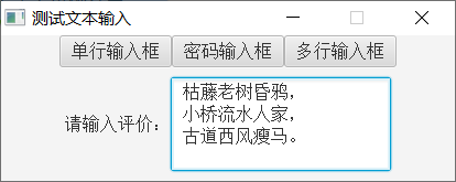
Running an application that contains the above test code, the window interface after clicking the button is shown in the figure below. It can be seen that TextArea does support multi-line text input.
Continue to fill in the text in the multi-line input box. Once the total height of the text exceeds the height of the input box, the scroll bar will be automatically displayed on the right side of the input box. At this time, the window interface is shown in the following figure.
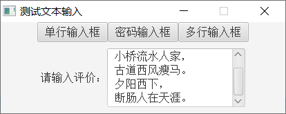
As can be seen from the diagram, JavaFX TextArea integrates scrollbar controls by default, without the need for programmers to operate manually like Swing's JTextArea.
See more Java technology articles< Java Development Notes (Preface) Chapter Program Directory>