1, Course overview
Usually, the Java language is used to develop background programs. The so-called background programs are programs deployed on the server side. They work silently, and users can't see any interface. Therefore, in many cases, learning java will feel very boring.
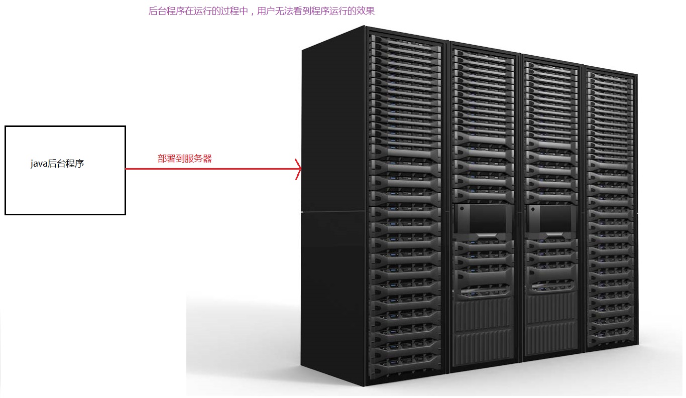
In fact, we can also use the java language to complete the development of graphical interface programs, and learning graphical interface programming will be much more interesting, because what we see is what we get, that is, the execution effect of most of the code we write can be seen through the graphical interface.
java uses AWT and Swing related classes to complete graphical interface programming. The full name of AWT is abstract window toolkit. It is the GUI library first provided by sun company. This GUI library provides some basic functions, but the functions of this GUI library are relatively limited, so sun company later provided Swing library. By using the graphical interface component library provided by AWT and Swing, the graphical interface programming of java is very simple. The program only needs to create the required graphical components in turn and organize these components together in an appropriate way to develop a very beautiful user interface.
The java development platform explained this time is jdk9. I hope you can also use jdk9 when practicing after class, because the effects of GUI libraries provided by different versions of JDK are slightly different.
2, AWT programming
2.1 AWT introduction
When JDK 1.0 is released, Sun provides a set of basic GUI class libraries, which are expected to run on all platforms. This set of basic class libraries is called "abstract window toolkit", which provides basic graphical components for Java applications. AWT is a window framework. It extracts common components from window systems of different platforms. When the program runs, it delegates the creation and action of these components to the running platform where the program is located. In short, when writing graphical interface applications using AWT, the program only specifies the location and behavior of interface components, and does not provide a real implementation. The JVM calls the local graphical interface of the operating system to create peers consistent with the platform.
The graphical interface application created by AWT has the same interface style as the running platform. For example, on the Windows operating system, it shows the Windows style; On UNIX operating system, it shows UNIX style. Sun hopes to achieve the goal of "Write Once, Run Anywhere" in this way.
2.2 AWT inheritance system
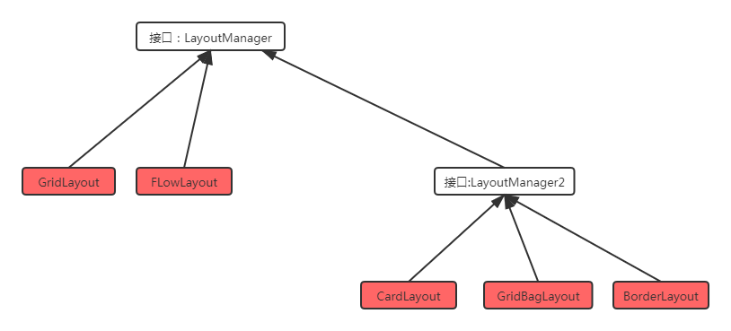
All classes related to AWT programming are placed in the java.awt package and its sub packages. There are two base classes in AWT programming: Component and MenuComponent.
- Component: represents an object that can be displayed graphically and interact with users, for example, Button represents a Button, TextField represents a text box, etc;
- MenuComponent: represents the menu component of the graphical interface, including subclasses such as MenuBar and Menultem.
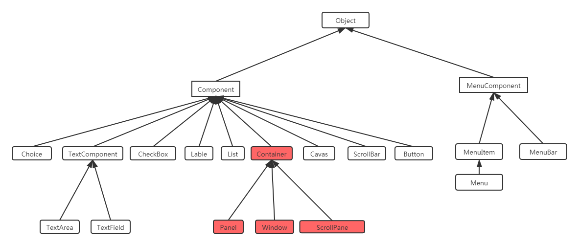
Container is a special Component, which represents a container that can hold ordinary components.
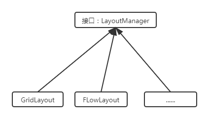
Another very important interface in AWT is LayoutManager. If there are multiple components in a container, the container needs to use LayoutManager to manage the layout of these components.
2.3 Container
2.3.1 Container inheritance system
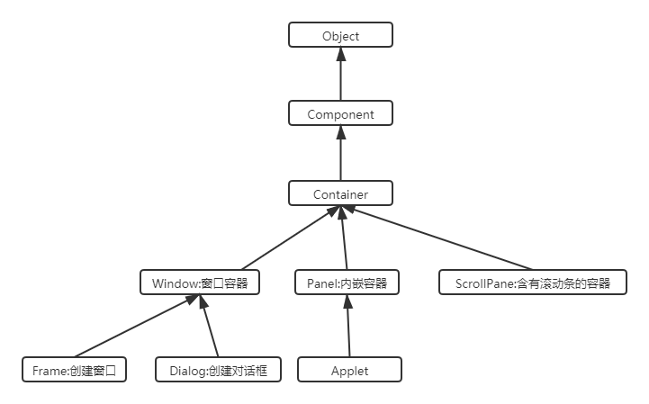
- Winow is a top-level window that can exist independently. By default, BorderLayout is used to manage its internal component layout;
- The Panel can accommodate other components, but it cannot exist independently. It must be embedded in other containers. By default, FlowLayout is used to manage its internal component layout;
- ScrollPane is a container with scroll bars. It cannot exist independently. By default, BorderLayout is used to manage its internal component layout;
2.3.2 common API
As a base class, Component provides the following common methods to set the size, location, visibility, etc. of components.
| Method signature | Method function |
|---|---|
| setLocation(int x, int y) | Set the location of the component. |
| setSize(int width, int height) | Sets the size of the component. |
| setBounds(int x, int y, int width, int height) | At the same time, set the position and size of components. |
| setVisible(Boolean b): | Set the visibility of the component. |
As the Container root class, Container provides the following methods to access the components in the Container
| Method signature | Method function |
|---|---|
| Component add(Component comp) | Add other components to the container (the component can be either a normal component or a container) and return the added components. |
| Component getComponentAt(int x, int y): | Returns the component of the specified point. |
| int getComponentCount(): | Returns the number of components in the container. |
| Component[] getComponents(): | Returns all components within the container. |
2.3.3 container demonstration
2.3.3.1 Window
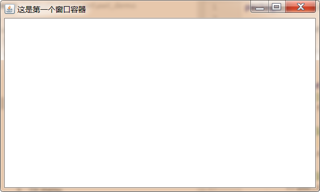
import java.awt.*;

public class FrameDemo {

    public static void main(String[] args) {
        //1. Create a window object
        Frame frame = new Frame("This is the first window container");

        //Set the position and size of the window

        frame.setBounds(100,100,500,300);

        //Set window visible
        frame.setVisible(true);
    }
}
2.3.3.2 Panel
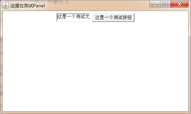
public class PanelDemo {
    public static void main(String[] args) {
        //1. Create Frame container object
        Frame frame = new Frame("Here's the test Panel");
        //2. Create a Panel container object
        Panel panel = new Panel();

        //3. Add components to the Panel container
        panel.add(new TextField("This is a test text"));
        panel.add(new Button("This is a test button"));

        //4. Add Panel to Frame
        frame.add(panel);

        //5. Set the position and size of the Frame
        frame.setBounds(30,30,500,300);

        //6. Set Frame visible
        frame.setVisible(true);
    }
}
The IDEA uses utf-8 to encode by default, but the current code we execute is on the windows system, and the default code of the windows operating system is gbk, so it will be garbled. If garbled code occurs, you only need to set a jvm parameter - Dfile.encoding=gbk in Edit Configurations – modify options – add VM options before running the current code.
2.3.3.3 ScrollPane
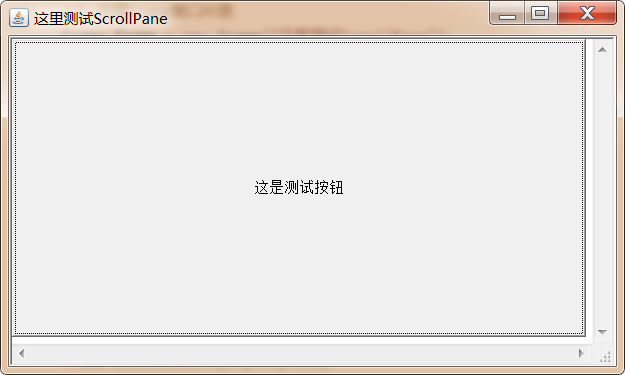
import java.awt.*;

public class ScrollPaneDemo {

    public static void main(String[] args) {
        //1. Create Frame window object
        Frame frame = new Frame("Test here ScrollPane");

        //2. Create a ScrollPane object and specify that there is a scroll bar by default
        ScrollPane scrollPane = new ScrollPane(ScrollPane.SCROLLBARS_ALWAYS);

        //3. Add components to ScrollPane
        scrollPane.add(new TextField("This is the test text"));
        scrollPane.add(new Button("This is the test button"));

        //4. Add ScrollPane to the Frame
        frame.add(scrollPane);

        //5. Set the position and size of the Frame
        frame.setBounds(30,30,500,300);

        //6. Set Frame visible
        frame.setVisible(true);

    }
}
The program clearly adds a text box and a button to the ScrollPane container, but you can only see one button, but you can't see the text box. Why? This is because ScrollPane uses the BorderLayout layout manager, which causes only one component in the container to be displayed. The next section will introduce you to the layout manager in detail.
2.4 LayoutManager layout manager
Previously, we introduced a method setboundaries() in Component that can set the location and size of the current container, but we need to be clear about one thing. If we manually set the location and size of the Component, the program will not be universal, for example:
Label label = new Label("Hello, world");
A label component is created. In many cases, we need to make the width and height of the label component consistent with the width and height of the string "Hello, world". This size is called the optimal size. Due to differences in operating systems, for example, on windows, we need to set the width and height of the label component to 100px and 20px respectively, but on Linux operating system, we may need to set the width and height of the label component to 120px and 24px respectively to achieve the same effect.
If we want our programs to have the same use experience under different operating systems, manually setting the location and size of components is undoubtedly a disaster, because there are too many components that need to set the size and location under different operating systems. In order to solve this problem, Java provides a LayoutManager layout manager, which can automatically adjust the component size according to the running platform. Programmers do not need to manually set the size and location of components, but only need to select an appropriate layout manager for the container.
2.4.1 FlowLayout
In the FlowLayout layout manager, components flow (arrange) in a certain direction like water flow. When encountering obstacles (boundaries), they fold back and start arranging again. By default, the FlowLayout layout manager arranges all components from left to right. When it encounters a boundary, it will fold back to the next line and start again.
| Construction method | Method function |
|---|---|
| FlowLayout() | Create a FlowLayout layout manager using the default alignment and the default vertical and horizontal spacing. |
| FlowLayout(int align) | Creates a FlowLayout layout manager using the specified alignment and the default vertical and horizontal spacing. |
| FlowLayout(int align,int hgap,int vgap) | Creates a FlowLayout layout manager with the specified alignment and the specified vertical and horizontal spacing. |
For the arrangement direction of components in FlowLayout (from left to right, from right to left, from middle to both sides, etc.), this parameter should use the static constants of FlowLayout class: FlowLayout. LEFT, FlowLayout. CENTER, FlowLayout. RIGHT. The default is left alignment.
The middle distance of components in FlowLayout is set by an integer. The unit is pixels. The default is 5 pixels.
Code demonstration:
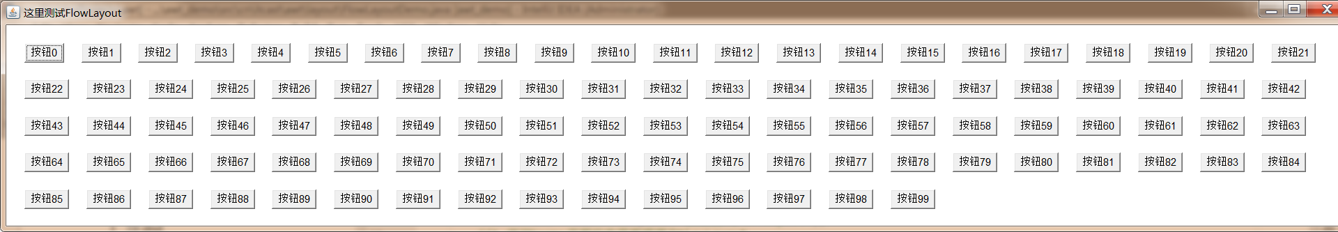
import java.awt.*;

public class FlowLayoutDemo {

    public static void main(String[] args) {
        //1. Create Frame object
        Frame frame = new Frame("Test here FlowLayout");
        //2. Modify the layout manager of the Frame container to FlowLayout
        frame.setLayout(new FlowLayout(FlowLayout.LEFT,20,20));

        //3. Add 100 button s to the Frame
        for (int i = 0; i < 100; i++) {
            frame.add(new Button("Button"+i));
        }

        //4. Set the Frame to the optimal size
        frame.pack();
        //5. Set Frame visible
        frame.setVisible(true);
    }
}
2.4.2 BorderLayout
BorderLayout divides containers into five areas: EAST, SOUTH, WEST, NORTH and CENTER. Common components can be placed in any of these five areas. The layout diagram of the BorderLayout layout manager is shown in the figure.
When the container size using BorderLayout is changed, the NORTH, SOUTH and CENTER areas are adjusted horizontally, while the EAST, WEST and CENTER areas are adjusted vertically. There are two points to note when using BorderLayout:
- When adding components to a container that uses the BorderLayout layout manager, you need to specify which area to add to. If you do not specify which area to add to, it will be added to the middle area by default;
- If multiple components are added to the same area, the later placed components will overwrite the first placed components;
| Construction method | Method function |
|---|---|
| BorderLayout() | Use the default horizontal and vertical spacing to create the BorderLayout layout manager. |
| BorderLayout(int hgap,int vgap): | Creates a BorderLayout layout manager with the specified horizontal and vertical spacing. |
Code demo 1:
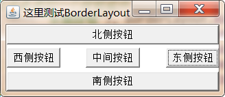
import java.awt.*;

public class BorderLayoutDemo1 {

    public static void main(String[] args) {
        //1. Create Frame object
        Frame frame = new Frame("Test here BorderLayout");
        //2. Specify the layout manager of the Frame object as BorderLayout
        frame.setLayout(new BorderLayout(30,5));
        //3. Add a button component to the specified Frame
        frame.add(new Button("East button"), BorderLayout.EAST);
        frame.add(new Button("West button"), BorderLayout.WEST);
        frame.add(new Button("South button"), BorderLayout.SOUTH);
        frame.add(new Button("North button"), BorderLayout.NORTH);
        frame.add(new Button("Middle button"), BorderLayout.CENTER);
        //4. Set the Frame to the optimal size
        frame.pack();
        //5. Set Frame visible
        frame.setVisible(true);
    }
}
If you do not put components into an area, the area will not be blank, but will be occupied by other areas
Code demo 2:
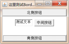
import java.awt.*;

public class BorderLayoutDemo2 {

    public static void main(String[] args) {
        //1. Create Frame object
        Frame frame = new Frame("Test here BorderLayout");
        //2. Specify the layout manager of the Frame object as BorderLayout
        frame.setLayout(new BorderLayout(30,5));
        //3. Specify the South and north of the Frame, put a button, and put a Panel in the middle area

        frame.add(new Button("South button"), BorderLayout.SOUTH);
        frame.add(new Button("North button"), BorderLayout.NORTH);

        Panel panel = new Panel();
        panel.add(new TextField("Test text"));
        panel.add(new Button("Middle button"));

        frame.add(panel, BorderLayout.CENTER);

        //4. Set the Frame to the optimal size
        frame.pack();
        //5. Set Frame visible
        frame.setVisible(true);
    }
}
2.4.3 GridLayout
The GridLayout layout manager divides the container into grids separated by vertical and horizontal lines, and each grid occupies the same area size. When adding components to a container that uses the GridLayout layout manager, they are added to each grid from left to right and from top to bottom by default. Different from FlowLayout, the size of each component placed in the GridLayout layout manager is determined by the area where the component is located (each component will automatically occupy the whole area).
| Construction method | Method function |
|---|---|
| GridLayout(int rows,in t cols) | Divide the container into multiple grids with the specified number of rows and columns, as well as the default horizontal and vertical spacing |
| GridLayout(int rows,int cols,int hgap,int vgap) | Divide the container into multiple grids with the specified number of rows and columns, as well as the specified horizontal and vertical spacing. |
Case:
Use Frame+Panel to complete a calculator effect with FlowLayout and GridLayout.
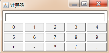
code:
import java.awt.*;

public class GridLayoutDemo{

    public static void main(String[] args) {

        //1. Create a Frame object and set the title to calculator
        Frame frame = new Frame("Calculator");

        //2. Create a Panel object and place a TextField component in the Panel
        Panel p1 = new Panel();
        p1.add(new TextField(30));

        //3. Put the above Panel into the north area of the Frame
        frame.add(p1,BorderLayout.NORTH);

        //4. Create a Panel object and set its layout manager to GridLayout
        Panel p2 = new Panel();
        p2.setLayout(new GridLayout(3,5,4,4));

        //5. Place 15 buttons in the above Panel. The contents are: 0,1,2,3,4,5,6,7,8,9, +, -, *, /
        for (int i = 0; i < 10; i++) {
            p2.add(new Button(i+""));
        }
        p2.add(new Button("+"));
        p2.add(new Button("-"));
        p2.add(new Button("*"));
        p2.add(new Button("/"));
        p2.add(new Button("."));

        //6. Add the above Panel to the middle area of the Frame
        frame.add(p2);
        //7. Set the Frame to the best size
        frame.pack();

        //8. Set Frame visible
        frame.setVisible(true);

    }
}
2.4.4 GridBagLayout
The GridBagLayout layout manager is the most powerful but also the most complex. Different from the GridLayout layout manager, a component can span one or more grids in the GridBagLayout layout layout manager, and the sizes of each grid can be set to be different from each other, thus increasing the flexibility of layout. When the size of the window changes, the GridBagLayout layout layout manager can also accurately control the stretching of various parts of the window.
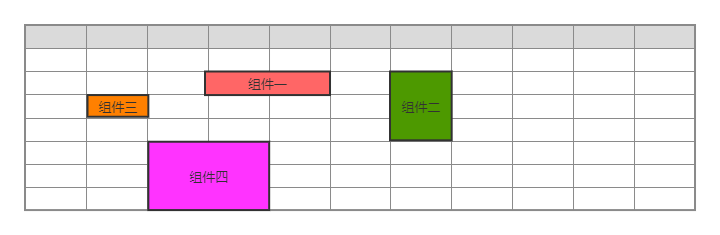
In the GridBagLayout layout, each component can occupy multiple grids. At this time, when we add components to the container, we need to control how many grids each component occupies. The GridBagConstraints class provided by java is bound to specific components to complete specific size and span settings.
GridBagConstraints API:
| Member variable | meaning |
|---|---|
| gridx | Sets the horizontal index of the grid where the upper left corner of the GUI component controlled by this object is located |
| gridy | Set the vertical index of the grid where the upper left corner of the GUI component controlled by this object is located |
| gridwidth | Set how many grids the GUI component controlled by this object spans horizontally. If the attribute value is gridbagconstraints.retain, it indicates that the current component is the last component horizontally. If the attribute value is gridbagconstraints.relax, it indicates that the current component is the penultimate component horizontally. |
| gridheight | Set how many grids the GUI component controlled by this object spans vertically. If the attribute value is gridbagconstraints.retain, it indicates that the current component is the last component vertically. If the attribute value is gridbagconstraints.relax, it indicates that the current component is the penultimate component vertically. |
| fill | How to adjust components when the "display area" is larger than the "component": Gridbagconstraints.none: GUI components are not expanded GridBagConstraints.HORIZONTAL: GUI components expand horizontally to occupy blank areas GridBagConstraints.VERTICAL: GUI components expand vertically to occupy empty areas GridBagConstraints.BOTH: GUI components expand horizontally and vertically to occupy the blank area |
| ipadx | Set the size of the horizontal internal filling of the GUI component controlled by the object, that is, how much more to increase based on the minimum size of the component |
| ipady | Set the size of the vertical internal filling of the GUI component controlled by the object, that is, how much to increase based on the minimum size of the component |
| insets | Sets the size of the external fill of the GUI component controlled by the object, that is, the distance between the component boundary and the display area boundary |
| weightx | Set the horizontal proportion of the excess space occupied by the GUI component controlled by the object. Suppose that the horizontal line of a container includes three GUI components, and their horizontal increase proportions are 1, 2 and 3 respectively. However, when the container width increases by 60 pixels, the width of the first component increases by 10 pixels and the width of the second component increases by 20 pixels, The width of the third component is increased by 30 pixels. If the increase ratio is 0, it means that it will not increase. |
| weighty | Sets the vertical proportion of excess space occupied by GUI components controlled by this object |
| anchor | Set the positioning mode of the GUI component controlled by the object in its display area: GridBagConstraints. Center (middle) GridBagConstraints.NORTH (upper and middle) GridBagConstraints.NORTHWEST (upper left corner) GridBagConstraints.NORTHEAST (upper right corner) GridBagConstraints.SOUTH (middle lower) GridBagConstraints.SOUTHEAST (lower right corner) GridBagConstraints.SOUTHWEST (lower left corner) GridBagConstraints.EAST (middle right) GridBagConstraints.WEST (middle left) |
To use GridBagLayout:
1.establish GridBagLaout A layout manager object, and setting the layout manager object to the container; two.establish GridBagConstraints Object and set the control properties of the object: gridx: Used to specify the horizontal index of the component in the grid; gridy: Used to execute the vertical index of the component in the grid; gridwidth: Used to specify how many grids the component spans horizontally; gridheight: Used to specify how many grids the component spans vertically; three.call GridBagLayout Object setConstraints(Component c,GridBagConstraints gbc )Method to add the component to the container c and GridBagConstraints Object association; four. Add components to the container;
Case:
Use the Frame container to set the GridBagLayout layout manager to achieve the effect in the following figure:
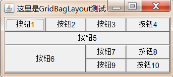
Demo code:
import java.awt.*;

public class GridBagLayoutDemo {

    public static void main(String[] args) {
        //1. Create Frame object
        Frame frame = new Frame("Here is GridBagLayout test");

        //2. Create GridBagLayout object
        GridBagLayout gbl = new GridBagLayout();

        //3. Set the layout manager of the Frame object to GridBagLayout
        frame.setLayout(gbl);

        //4. Create GridBagConstraints object
        GridBagConstraints gbc = new GridBagConstraints();

        //5. Create a Button array with a capacity of 10
        Button[] bs = new Button[10];

        //6. Traverse the array and initialize each Button
        for (int i = 0; i < bs.length; i++) {
            bs[i] = new Button("Button"+(i+1));
        }

        //7. Set the fill property of all GridBagConstraints objects to GridBagConstraints.BOTH. When there is a blank area, the component will automatically expand to fill the blank area
        gbc.fill=GridBagConstraints.BOTH;

        //8. Set the weightx of the GridBagConstraints object to 1, indicating that the horizontal expansion scale is 1
        gbc.weightx=1;

        //9. Add the first three buttons in the array to the frame
        addComponent(frame,bs[0],gbl,gbc);
        addComponent(frame,bs[1],gbl,gbc);
        addComponent(frame,bs[2],gbl,gbc);

        //10. Set the gridwidth of GridBagConstraints to gridbagconstraints.remember, indicating that the current component is the last component in the horizontal direction
        gbc.gridwidth=GridBagConstraints.REMAINDER;

        //11. Add the fourth button in the button array to the frame
        addComponent(frame,bs[3],gbl,gbc);


        //12. Set the weight of GridBagConstraints to 1, indicating that the vertical expansion ratio is 1
        gbc.weighty=1;

        //13. Add the fifth button in the button array to the frame
        addComponent(frame,bs[4],gbl,gbc);

        //14. Set gridweight and gridwidth of GridBagConstraints to 2, indicating that vertical and horizontal will occupy two grids
        gbc.gridheight=2;
        gbc.gridwidth=2;

        //15. Add the sixth button in the button array to the frame
        addComponent(frame,bs[5],gbl,gbc);

        //16. Set gridweight and gridwidth of GridBagConstraints to 1, indicating that the vertical will occupy 1 grid
        gbc.gridwidth=1;
        gbc.gridheight=1;
        //17. Add the 7th button in the button array to the frame
        addComponent(frame,bs[6],gbl,gbc);

        //18. Set the gridwidth of GridBagConstraints to gridbagconstraints.remember, indicating that the current component is the last component in the horizontal direction
        gbc.gridwidth=GridBagConstraints.REMAINDER;

        //19. Add the 8th button in the button array to the frame
        addComponent(frame,bs[7],gbl,gbc);

        //20. Set the gridwidth of GridBagConstraints to 1, which means that the vertical will occupy 1 grid
        gbc.gridwidth=1;

        //21. Add the 9th and 10th buttons in the button array to the frame
        addComponent(frame,bs[8],gbl,gbc);
        addComponent(frame,bs[9],gbl,gbc);

        //22. Set the frame to the optimal size
        frame.pack();

        //23. Set frame visible
        frame.setVisible(true);
    }

    public static void addComponent(Container container,Component c,GridBagLayout gridBagLayout,GridBagConstraints gridBagConstraints){
        gridBagLayout.setConstraints(c,gridBagConstraints);
        container.add(c);
    }
}
2.4.5 CardLayout
The CardLayout layout manager manages its components in time rather than space. It regards all components added to the container as a stack of cards (each card is actually a Component), and only the top Component is visible each time. Like a deck of playing cards, they are stacked together, and only the top card can be seen at a time
| Method name | Method function |
|---|---|
| CardLayout() | Create a default CardLayout layout manager. |
| CardLayout(int hgap,int vgap) | Create the CardLayout layout manager by specifying the spacing between the card and the left and right boundaries of the container (C hgap) and the upper and lower boundaries (Cvgap) |
| first(Container target) | Displays the first card in the target container |
| last(Container target) | Displays the last card in the target container |
| previous(Container target) | Displays the previous card in the target container |
| next(Container target) | Displays the last card in the target container |
| show(Container taget,String name) | Displays the card with the specified name in the target container |
Case:
Use Frame, Panel and CardLayout to complete the effect in the figure below. Click the button at the bottom to switch cards
Demo code:
import java.awt.*;
import java.awt.event.ActionEvent;
import java.awt.event.ActionListener;

public class CardLayoutDemo {

    public static void main(String[] args) {
        //1. Create Frame object
        Frame frame = new Frame("Test here CardLayout");

        //2. Create a String array to store the names of different cards
        String[] names = {"First sheet","Second sheet","Third sheet","Sheet 4","Sheet 5"};

        //3. Create a Panel container p1 and set its layout manager to CardLayout to store multiple cards
        CardLayout cardLayout = new CardLayout();
        Panel p1 = new Panel();
        p1.setLayout(cardLayout);

        //4. Store five Button buttons in p1, and the name is taken from the String array
        for (int i = 0; i < 5; i++) {
            p1.add(names[i],new Button(names[i]));
        }

        //5. Create a Panel container p2 to store five buttons to complete card switching
        Panel p2 = new Panel();

        //6. Create 5 buttons and set listeners for the buttons
        ActionListener listener = new ActionListener() {
            @Override
            public void actionPerformed(ActionEvent e) {
                String command = e.getActionCommand();
                switch (command){
                    case "Previous":
                        cardLayout.previous(p1);
                        break;
                    case "Next":
                        cardLayout.next(p1);
                        break;
                    case "First sheet":
                        cardLayout.first(p1);
                        break;
                    case "Last one":
                        cardLayout.last(p1);
                        break;
                    case "Third sheet":
                        cardLayout.show(p1,"Third sheet");
                        break;
                }
            }
        };

        Button b1 = new Button("Previous");
        Button b2 = new Button("Next");
        Button b3 = new Button("First sheet");
        Button b4 = new Button("Last one");
        Button b5 = new Button("Third sheet");
        b1.addActionListener(listener);
        b2.addActionListener(listener);
        b3.addActionListener(listener);
        b4.addActionListener(listener);
        b5.addActionListener(listener);

        //7. Add 5 buttons to p2
        p2.add(b1);
        p2.add(b2);
        p2.add(b3);
        p2.add(b4);
        p2.add(b5);


        //8. Add p1 to the middle area of the frame
        frame.add(p1);


        //9. Add p2 to the bottom area of the frame
        frame.add(p2,BorderLayout.SOUTH);

        //10 set the optimal size of the frame and make it visible
        frame.pack();
        frame.setVisible(true);
    }
}
2.4.6 BoxLayout
To simplify development, Swing introduces a new layout manager: BoxLayout. BoxLayout can place GUI components vertically and horizontally. BoxLayout provides the following simple constructor:
| Method name | Method function |
|---|---|
| BoxLayout(Container target, int axis) | Specifies to create a BoxLayout layout manager based on the target container, and the components in the layout manager are arranged in the axis direction. Axis has BoxLayout. X_ Axis and BoxLayout. Y_ Axis (longitudinal) two directions. |
Case 1:
Use Frame and BoxLayout to complete the following effect:
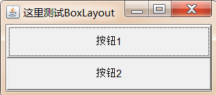
Demo code 1:
import javax.swing.*;import java.awt.*;public class BoxLayoutDemo1 { public static void main(String[] args) { //1. Create a frame object frame = new frame ("test BoxLayout here"); / / 2. Create a BoxLayout layout manager, specify the container as the above frame object, and specify the component arrangement direction as vertical BoxLayout BoxLayout = new BoxLayout (frame, BoxLayout. Y_axis); frame.setlayout (BoxLayout) ; / / 3. Add two buttons to the frame object frame.add(new Button("button 1"); frame.add(new Button("button 2")); / / 4. Set the optimal size of the frame and see frame. Pack(); frame. Setvisible (true);}}
In the java.swing package, a new container Box is provided. The default layout manager of the container is BoxLayout. In most cases, the Box container is used to accommodate multiple GUI components, and then the Box container is added to other containers as a component to form the overall window layout.
| Method name | Method function |
|---|---|
| static Box createHorizontalBox() | Create a Box container that arranges components horizontally. |
| static Box createVerticalBox() | Create a Box container that arranges components vertically. |
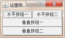
Case 2:
Use Frame and Box to complete the following effect:
Demo code 2:
import javax.swing.*;import java.awt.*;public class BoxLayoutDemo2 { public static void main(String[] args) { //1. Create a frame object frame = new frame ("BoxLayout is tested here"); / / 2. Create a horizontal box and add two buttons box hbox = box. Createhorizontalbox(); hBox.add(new Button("horizontal button I"); hBox.add(new Button("horizontal button II")) ; / / 3. Create a vertical box and add two buttons. Box VBox = box. Createverticalbox(); VBox. Add (New button) (vertical button I)); VBox. Add (New button II)); / / 4. Add the box container to the frame container. Frame. Add (hbox, borderlayout. North); frame. Add (VBox) ; / / 5. Set the optimal size of the frame and make it visible frame. Pack(); frame. Setvisible (true);}}
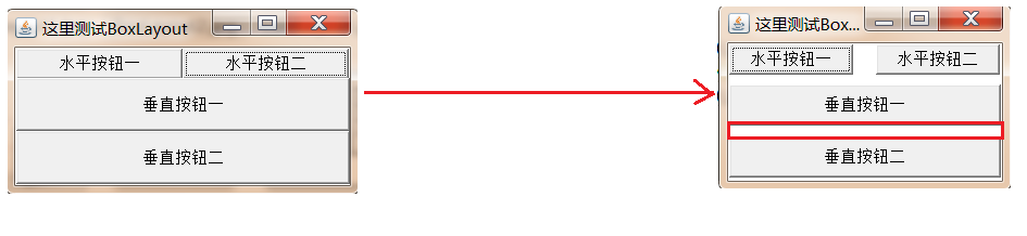
Through the previous two BoxLayout demonstrations, we will find that there is no spacing between the components in the container managed by it, which is not particularly beautiful, but there will be some spacing between the components in the previous layouts. How to set the spacing for the components using BoxLayout?
In fact, it is very simple. We only need to add intervals where the original components need intervals, and each interval can be a component, but the component has no content and only plays a role of separation.
In the Box class, five convenient static methods are provided to generate these interval components:
| Method name | Method function |
|---|---|
| static Component createHorizontalGlue() | Create a horizontal Glue (a gap that can be stretched simultaneously in both directions) |
| static Component createVerticalGlue() | Create a vertical Glue (spacing that can be stretched in both directions) |
| static Component createHorizontalStrut(int width) | Create a horizontal struts (spacing that can be stretched in the vertical direction) with a specified width (the width is fixed and cannot be stretched) |
| static Component createVerticalStrut(int height) | Create a vertical struts (spacing that can be stretched horizontally) with a specified height (the height is fixed and cannot be stretched) |
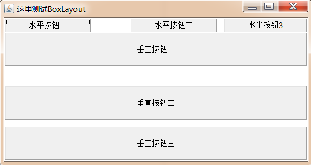
Case 3:
Use Frame and Box to complete the following effect:
Demo code 3:
import javax.swing.*;import java.awt.*;public class BoxLayoutDemo3 { public static void main(String[] args) { //1. Create a frame object frame = new frame ("BoxLayout is tested here"); / / 2. Create a horizontal box and add two buttons box hbox = box. Createhorizontalbox(); hBox.add(new Button("horizontal button"); hBox.add(Box.createHorizontalGlue()); / / an interval that can be stretched in both directions hbox. Add (New button( "Horizontal button 2"); hbox. Add (box. Createhorizontalstruts (10)); / / the horizontal interval is fixed, and the vertical direction can stretch hBox.add(new Button("horizontal button 3"); / / 3. Create a vertical box and add two buttons. Box VBox = box. Createverticalbox(); vBox.add(new Button("vertical button 1"); vBox.add(Box.createVerticalGlue()); / / an interval that can be stretched in both directions VBox. Add (New button 2)); vBox.add(Box.createVerticalStrut(10)); / / the vertical interval is fixed, and the horizontal direction can stretch VBox. Add (New button 3)); / / 4. Add the box container to the frame container frame. Add (hbox, borderlayout. North) ; frame. Add (VBox); / / 5. Set the optimal size of frame and visible frame. Pack(); frame. Setvisible (true);}}
2.5 common components in AWT
2.5.1 basic components
| Component name | function |
|---|---|
| Button | Button |
| Canvas | Canvas for drawing |
| Checkbox | Check box component (also used as radio box component) |
| CheckboxGroup | It is used to combine multiple Checkbox components into a group. Only one Checkbox component in a group can be selected, that is, all become radio box components |
| Choice | Drop down selection box |
| Frame | Window, which is used to create a window in the GUI program |
| Label | Label class for placing suggestive text |
| List | JU table box component, which can add multiple entries |
| Panel | The basic container class cannot exist alone and must be placed in other containers |
| Scrollbar | Slider component. If you need the user to enter a value in a certain range, you can use the slider component, such as the slider used to set the three RGB values in the palette. When creating a slider, you must specify its direction, initial value, slider size, minimum value and maximum value. |
| ScrollPane | Container assembly with horizontal and vertical scroll bars |
| TextArea | Multiline text field |
| TextField | Single line text box |
The usage of these AWT components is relatively simple. You can consult the API documentation to obtain their respective constructor methods, member methods and other details.
Case:
Achieve the following effect:
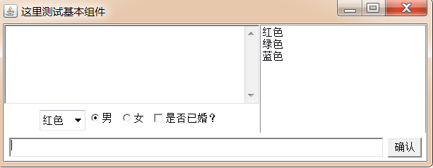
Demo code:
import javax.swing.*;import java.awt.*;public class BasicComponentDemo { Frame frame = new Frame("Here we test the basic components"); //Define a button Button ok = new Button("confirm")// Define a CheckboxGroup cbg = new CheckboxGroup()// Define a radio Box, which is initially selected and added to the cbg group. Checkbox male = new Checkbox("male", cbg, true)// Define a radio Box, which is initially unselected and added to the cbg group. Checkbox female = new Checkbox("female", cbg, false)// Define a check Box, which is initially unselected. Checkbox married = new Checkbox("married?", false)// Define a drop-down selection Box Choice colorChooser = new Choice()// Define a list selection Box List colorList = new List(6, true)// Define a multiline text field with 5 rows and 20 columns TextArea ta = new TextArea(5, 20)// Define a 50 column single line text field textfield TF = new textfield (50); Public void init() {/ / drag down the selection Box to add the content colorChooser.add("red"); colorChooser.add("green"); colorChooser.add("blue"); / / add the content colorList.add("red"); colorList.add("green"); colorList.add("blue") to the list selection Box ; / / create a Panel container for loading buttons and text boxes Panel bottom = new Panel(); bottom. Add (TF); bottom. Add (OK); / / add the bottom to the bottom of the frame frame frame.add(bottom,BorderLayout.SOUTH); / / create a Panel container and load drop-down selection boxes, radio boxes and check boxes Panel checkpanel = new Panel() ; checkpanel. Add (colorchooser); checkpanel. Add (male); checkpanel. Add (female); checkpanel. Add (married); / / create a Box container arranged vertically to load multiline text fields and checkpanel Box topLeft = Box. Createverticalbox(); topLeft. Add (TA); topLeft. Add (checkpanel) ; / / create a horizontally arranged Box container and load topLeft and list selection Box box Box top = Box. Createhorizontalbox(); top. Add (topLeft); top. Add (colorList); / / add top to the middle area of the frame frame frame frame.add(top); / / set the optimal size of the frame and see frame. Pack(); frame. Setvisible (true);} public static void main(String[] args) { new BasicComponentDemo().init(); }}
2.5.2 Dialog box
2.5.2.1 Dialog
Dialog is a subclass of Window class. It is a container class and belongs to a special component. Dialog box is a top-level Window that can exist independently, so its usage is almost the same as that of ordinary Window, but the following two points should be paid attention to when using dialog box:
- Dialog boxes usually depend on other windows, that is, they usually need to have a parent window;
- There are two types of dialog boxes: non modal and modal. When a modal dialog box is opened, the modal dialog box is always above its parent window. The parent window cannot obtain focus until the modal dialog box is closed.
| Method name | Method function |
|---|---|
| Dialog(Frame owner, String title, boolean modal) | Create a dialog object: owner: the parent window of the current dialog box Title: the title of the current dialog box Modal: whether the current dialog box is a modal dialog box, true/false |
Case 1:
Achieve the following effect through Frame, Button and Dialog:
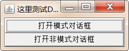
Demo code 1:
import java.awt.event.ActionEvent;
import java.awt.event.ActionListener;

public class DialogDemo1 {

    public static void main(String[] args) {

        Frame frame = new Frame("Test here Dialog");

        Dialog d1 = new Dialog(frame, "model dialog box", true);
        Dialog d2 = new Dialog(frame, "modeless dialog box ", false);

        Button b1 = new Button("Open the Mode dialog box");
        Button b2 = new Button("Opens the modeless dialog box");

        //Sets the size and location of the dialog box
        d1.setBounds(20,30,300,400);
        d2.setBounds(20,30,300,400);

        //Bind b1 and b2 to listen for events
        b1.addActionListener(new ActionListener() {
            @Override
            public void actionPerformed(ActionEvent e) {
                d1.setVisible(true);
            }
        });
        b2.addActionListener(new ActionListener() {
            @Override
            public void actionPerformed(ActionEvent e) {
                d2.setVisible(true);
            }
        });

        //Add button to frame
        frame.add(b1);
        frame.add(b2,BorderLayout.SOUTH);

        //Set the optimal size of the frame and make it visible
        frame.pack();
        frame.setVisible(true);

    }
}
In the Dialog box, you can customize the content according to your needs
Case:
Click the button to pop up a mode dialog box with the following contents:
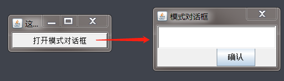
Demo code:
public class DialogDemo2 {

    public static void main(String[] args) {

        Frame frame = new Frame("Test here Dialog");

        Dialog d1 = new Dialog(frame, "model dialog box", true);

        //Add content to dialog box
        Box vBox = Box.createVerticalBox();

        vBox.add(new TextField(15));
        vBox.add(new JButton("confirm"));
        d1.add(vBox);

        Button b1 = new Button("Open the Mode dialog box");

        //Sets the size and location of the dialog box
        d1.setBounds(20,30,200,100);


        //Bind listening events to b1
        b1.addActionListener(new ActionListener() {
            @Override
            public void actionPerformed(ActionEvent e) {
                d1.setVisible(true);
            }
        });


        //Add button to frame
        frame.add(b1);

        //Set the optimal size of the frame and make it visible
        frame.pack();
        frame.setVisible(true);

    }
}
2.5.2.1 FileDialog
The Dialog class also has a subclass: FileDialog, which represents a file Dialog box for opening or saving files. It should be noted that FileDialog cannot specify modal or non modal, because FileDialog depends on the implementation of the running platform. If the file Dialog box of the running platform is modal, FileDialog is also modal; Otherwise it is modeless.
| Method name | Method function |
|---|---|
| FileDialog(Frame parent, String title, int mode) | Create a file dialog box: Parent: Specifies the parent window Title: dialog title mode: file dialog type. If FileDialog.load is specified, it is used to open the file. If FileDialog.SAVE is specified, it is used to save the file |
| String getDirectory() | Gets the absolute path of the opened or saved file |
| String getFile() | Gets the file name of the opened or saved file |
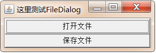
Case 2:
Use Frame, Button and FileDialog to complete the following effect:
Demo code 2:
import java.awt.*;import java.awt.event.ActionEvent;import java.awt.event.ActionListener;public class FileDialogTest { public static void main(String[] args) { Frame frame = new Frame("Test here FileDialog"); FileDialog d1 = new FileDialog(frame, "Select the file to load", FileDialog.LOAD); FileDialog d2 = new FileDialog(frame, "Select the file to save", FileDialog.SAVE); Button b1 = new Button("Open file"); Button b2 = new Button("Save file"); //Add event B1. Addactionlistener (New actionlistener() {@ override public void actionperformed (ActionEvent E) {d1.setvisible (true); / / print the file path and name selected by the user system. Out. Println ("file path selected by the user:" + D1. Getdirectory()) ; system. Out. Println ("user selected file name:" + D1. Getfile());}}; System.out.println("-------------------------------"); B2. Addactionlistener (New actionlistener() {@ override public void actionperformed (ActionEvent E) {d2.setvisible (true); / / print the file path and name selected by the user system.out.println ("file path selected by the user: + D2. Getdirectory()); system.out.println( "User selected file name:" + d2.getFile());}}); / / add the button to the frame frame frame. Add (B1); frame. Add (B2, borderlayout. South); / / set the optimal size of the frame and make it visible frame. Pack(); frame. Setvisible (true);}}
2.6 event handling
Previously, we introduced how to place various components to get rich and colorful graphical interfaces, but these interfaces can not respond to any user operations. For example, click "X" in the upper right corner of all previous windows Button, but the window will not close because in AWT programming, all user operations must be completed through a set of event processing mechanism, and the Frame and component itself have no event processing capability.
2.6.1 GUI event handling mechanism
definition:
When some operation occurs on a component, it will automatically trigger the execution of a piece of code.
There are four important concepts involved in GUI event processing mechanism, which need to be understood:
Event source: the place where the operation takes place, usually referring to a component, such as a button, window, etc;
Event: operations that occur on the event source can be called events. The GUI will encapsulate all events into an event object. If you need to know the details of the event, you can get them through the event object.
Event listener: when an event occurs on an event source, the event listener can process the event.
Register listener: bind an event listener (A) to an event source through an event (B) © In fact, when event B occurs on event source C, the code of event listener A will be executed automatically.
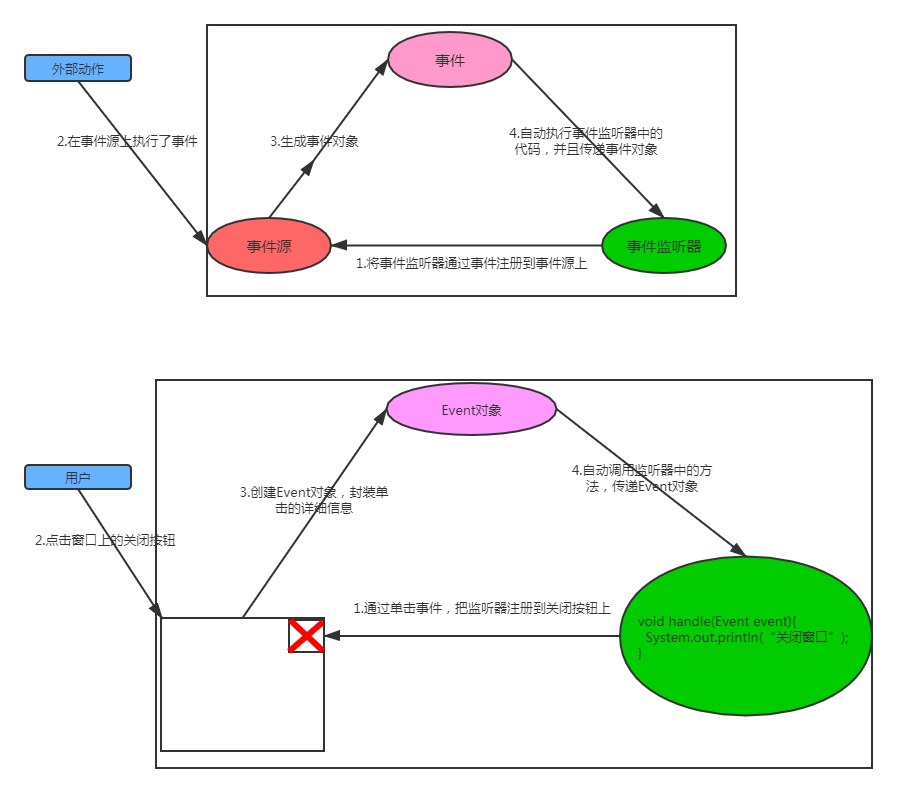
Use steps:
1. Create event source component object;
2. Customize the class, implement the xxlistener interface and rewrite the method;
3. Create event listener object (custom class object)
4. Call the addxlistener method of the event source component object to register and listen
Case:
After completing the effect shown in the figure below, click OK to display hello world in a single line text field:
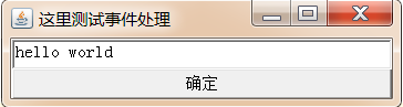
Demo code:
public class EventDemo1 { Frame frame = new Frame("Test event handling here"); //Event source button = new button ("OK"); TextField tf = new TextField(30); public void init() {/ / register to listen to button.addActionListener(new MyActionListener()); / / add components to the frame frame frame. Add (TF); frame. Add (button, borderlayout. South); / / set the optimal size of the frame and make it visible frame. Pack(); frame. Setvisible (true);} //Custom event listener classprivate class myactionlistener implements actionlistener {@ override public void actionperformed (ActionEvent E) {system.out.println ("user clicked OK"); tf.settext ("Hello world");}} public static void main (string [] args) {new eventdemo1() .init(); }}
2.6.2 common events and event listeners in Gui
Event listeners must implement event listener interfaces. AWT provides a large number of event listener interfaces to implement different types of event listeners and listen to different types of events. AWT provides rich event classes to encapsulate specific operations on different components. The event classes of AWT are subclasses of AWTEvent class, which is a subclass of EventObject.
2.6.2.1 events
AWT classifies events into two categories:
1. Low level events: these events are based on a specific action. For example, mouse events such as entering, clicking, dragging and dropping, and focus events such as getting focus and losing focus.
| event | Trigger timing |
|---|---|
| ComponentEvent | Component event, which is triggered when the component size changes, the position moves, and the display / hide state changes. |
| ContainerEvent | Container event. This event is triggered when a component is added or deleted in the container. |
| WindowEvent | Window event, which is triggered when the window state changes (such as opening, closing, maximizing and minimizing). |
| FocusEvent | Focus event, which is triggered when the component gets focus or loses focus. |
| KeyEvent | Keyboard event, which is triggered when the key is pressed, released and clicked. |
| MouseEvent | Mouse event, which is triggered when clicking, pressing, releasing and moving the mouse. |
| PaintEvent | Component drawing event. This event is a special event type. It is triggered when the GUI component calls the update/paint method to render itself. This event is not dedicated to the event processing model. |
2. Advanced events: these events are not based on a specific action, but defined according to the function meaning.
| event | Trigger timing |
|---|---|
| ActionEvent | An action event is triggered when a button or menu item is clicked and the Enter key is pressed in the TextField |
| AjustmentEvent | Adjustment event, which is triggered when the slider is moved on the slider bar to adjust the value. |
| ltemEvent | Option event, which is triggered when the user selects or deselects an item. |
| TextEvent | Text event, which is triggered when the text in the text box and text field changes. |
2.6.2 event listener
Different events need to be monitored by different listeners. Different listeners need to implement different listener interfaces. When a specified event occurs, the event listener will call the included event handler (instance method) to process the event.
| Event category | Description information | Listener interface name |
|---|---|---|
| ActionEvent | Activate component | ActionListener |
| ItemEvent | Some items were selected | ItemListener |
| MouseEvent | Mouse movement | MouseMotionListener |
| MouseEvent | Mouse click, etc | MouseListener |
| KeyEvent | keyboard entry | KeyListener |
| FocusEvent | Component receives or loses focus | FocusListener |
| AdjustmentEvent | Moved components such as scroll bars | AdjustmentListener |
| ComponentEvent | Object movement, zoom, display, hide, etc | ComponentListener |
| WindowEvent | The window received a window level event | WindowListener |
| ContainerEvent | Added or deleted components in container | ContainerListener |
| TextEvent | The text field or text area has changed | TextListener |
2.6.3 cases
Case 1:
Listen to the Frame container and add components through ContainerListener;
Listen to the content changes of textfile through TextListener;
Listen to the selection status changes of Choice items through ItemListener;
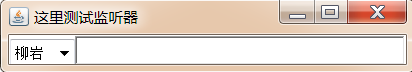
Demo code 1:
import java.awt.*;import java.awt.event.ContainerAdapter;import java.awt.event.ContainerEvent;import java.awt.event.TextEvent;import java.awt.event.TextListener;public class ListenerDemo1 { public static void main(String[] args) { Frame frame = new Frame("Here's the test listener"); //Create a single line TextField tf = new TextField(30)// Add TextListener to the text field to listen for content changes tf. Addtextlistener (New TextListener() {@ override public void textvaluechanged (textevent E) {system. Out. Println ("current content: + tf.getText());}})// Register a ContainerListener listener for frame and listen to the addition of components in the container. Frame. Addcontainerlistener (New containeradapter() {@ override public void componentadded (containerevent E) {component child = e.getchild(); system. Out. Println ("new component added in container:" + child);} }); // Add tf to frame. Add (tf)// Set the optimal size of the frame and see frame. Pack(); frame.setVisible(true); }}
Case 2:
Set WindowListner for the Frame to listen to the action of the user clicking X. if the user clicks x, the current window will be closed
Demo code 2:
import java.awt.*;import java.awt.event.WindowAdapter;import java.awt.event.WindowEvent;public class ListenerDemo2 { public static void main(String[] args) { Frame frame = new Frame("Test here WindowListener"); frame.addWindowListener(new WindowAdapter() { @Override public void windowClosing(WindowEvent e) { System.exit(0); } }); frame.setBounds(200,200,500,300); frame.setVisible(true); }}
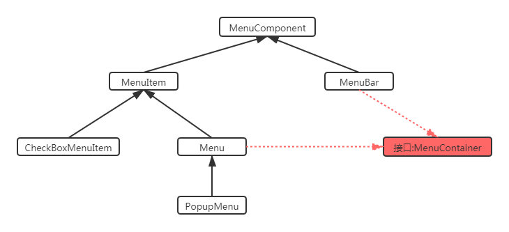
2.7 menu components
As explained earlier, to build a GUI interface is to put some GUI components into a container according to a certain layout. As like as two peas, the menu is a very important component of the menu. In the actual development, besides the main interface, there is a more important content that is menu related components. It can be used conveniently by menu related components. In AWT, the menu related components are exactly the same as those previously learned. Only menu bar, menu and menu items should be combined to follow certain layout. Just put it in a container.

Common menu related components are given in the following table:
| Menu component name | function |
|---|---|
| MenuBar | Menu bar, container for menus. |
| Menu | Menu components, containers for menu items. It is also a subclass of Menultem, so it can be used as a menu item |
| PopupMenu | Context menu component (right-click menu component) |
| Menultem | Menu item component. |
| CheckboxMenuItem | Check box menu item component |
The following figure shows the integration system diagram of common menu related components:
Use of menu related components:
1. Prepare menu item components, which can be MenuItem and its subclass objects
2. Prepare the Menu component Menu or PopupMenu (right-click the pop-up submenu) and add the Menu item component prepared in step 1;
3. Prepare the Menu bar component and add the Menu component Menu prepared in step 2;
4. Add the menu bar component prepared in step 3 to the window object for display.
Tips:
1. If you want to add a dividing line between the Menu items of a Menu, you only need to call Menu add (new MenuItem(-)).
2. If you want to associate the shortcut key function with a menu item, you only need to set it when creating the menu item object. For example, to associate the ctrl+shif + / shortcut key with a menu item, you only need: new MenuItem("menu item name"), new menusshortcut (keyevent. Vk_q, true);
Case 1:
Use the common menu components in awt to complete the effect shown in the figure below
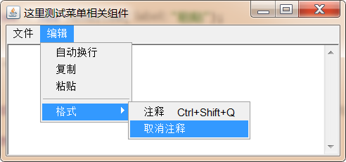
Demo code 1:
import java.awt.*;import java.awt.event.ActionEvent;import java.awt.event.ActionListener;public class SimpleMenu { //Create a window private Frame frame = new Frame("test menu related components here"); / / create a menu bar component private MenuBar menuBar = new MenuBar(); / / create a file menu component private Menu fileMenu = new Menu("file"); / / create an edit menu component private Menu editMenu = new Menu("Edit") ; / / create a new menu item private MenuItem newItem = new MenuItem("new"); / / create a save menu item private MenuItem saveItem = new MenuItem("save"); / / create an exit menu item private MenuItem exitItem = new MenuItem("exit"); / / create an auto wrap selection box menu item private checkboxmenuitem autowrap = new checkboxmenuitem( "Auto wrap"); / / create and copy menu item private MenuItem copyItem = new MenuItem("copy"); / / create and paste menu item private MenuItem pasteItem = new MenuItem("paste"); / / create Format menu private Menu formatMenu = new Menu("format"); / / create comment menu item private MenuItem commentItem = new MenuItem("comment") ; / / create the uncomment menu item private MenuItem cancelItem = new MenuItem("uncomment"); / / create a text field private textarea TA = new textarea (6, 40); public void init() {/ / define the menu event listener actionlistener = new actionlistener() {@ override public void actionperformed (ActionEvent E) {string command = e.getactioncommand(); ta.append ("click" + Command + "menu \ n"); if (command.equals ("exit") {System.exit(0);}}} ; / / register listeners for comment menu items and Exit menu items commentitem.addactionlistener (listener); exititem.addactionlistener (listener); / / add menu items fileMenu.add (newitem); fileMenu.add (saveitem); fileMenu.add (exititem) for file menu fileMenu ; / / add the menu item editMenu.add (autowrap); editMenu.add (copyitem); editMenu.add (pasteitem); / / add the menu item formatMenu.add (commentitem); formatMenu.add (cancelitem) for the format menu formatMenu ; / / add the format menu to the edit menu as the secondary menu editMenu.add (New MenuItem ("-"); editMenu.add (formatMenu); / / add the file menu and edit menu to the menu bar menubar.add (fileMenu); menubar.add (editMenu); / / set the menu bar to the frame.setMenuBar(menuBar) window ; / / add the text field to the frame frame.add(ta); / / set the optimal size of the frame and see frame. Pack(); frame. Setvisible (true);} public static void main (string [] args) {new simplemenu(). Init();}}
Case 2:
Achieve the following effect through PopupMenu:
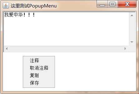
Implementation idea:
1. Create PopubMenu menu component;
2. Create multiple MenuItem menu items and add them to PopupMenu;
3. Add PopupMenu to the target component;
4. In order to right-click the component with PopubMenu menu, register the mouse monitoring event. When the user releases the right button, the menu will pop up.
Demo code 2:
import java.awt.*;
import java.awt.event.MouseAdapter;
import java.awt.event.MouseEvent;

public class PopupMenuTest {

    private Frame frame = new Frame("Test here PopupMenu");

    //Create PopubMenu menu
    private PopupMenu popupMenu = new PopupMenu();

    //Create menu bar

    private MenuItem commentItem = new MenuItem("notes");
    private MenuItem cancelItem = new MenuItem("note off");
    private MenuItem copyItem = new MenuItem("copy");
    private MenuItem pasteItem = new MenuItem("preservation");


    //Create a text field
    private TextArea ta = new TextArea("I love China!!!", 6, 40);

    //Create a Panel
    private  Panel panel = new Panel();

    public void init(){

        //Add menu items to PopupMenu
        popupMenu.add(commentItem);
        popupMenu.add(cancelItem);
        popupMenu.add(copyItem);
        popupMenu.add(pasteItem);

        //Set panel size
        panel.setPreferredSize(new Dimension(300,100));

        //Add PopupMenu to the panel
        panel.add(popupMenu);

        //Register mouse events for panel
        panel.addMouseListener(new MouseAdapter() {
            @Override
            public void mouseReleased(MouseEvent e) {
                boolean flag = e.isPopupTrigger();
                //Judge whether the current mouse operation triggers the PopupMenu operation
                if (flag){
                    //Let PopupMenu display on the panel and follow the mouse event
                    popupMenu.show(panel,e.getX(),e.getY());
                }
            }
        });

        //Add ta to the middle area of the frame

        frame.add(ta);

        //Add the panel to the bottom of the frame
        frame.add(panel,BorderLayout.SOUTH);

        //Set the optimal size of the frame and make it visible;
        frame.pack();
        frame.setVisible(true);

    }

    public static void main(String[] args) {
        new PopupMenuTest().init();
    }

}
2.8 drawing
Many programs, such as various small games, need to draw various graphics in the window. In addition, even when developing Java EE Projects, sometimes they must "dynamically" generate various graphics and charts to the client, such as graphic verification code, statistical chart, etc., which need to use the drawing function of AWT.
2.8.1 component drawing principle
We have learned many components before, such as Button, Frame, Checkbox, etc. different components display different graphics. In fact, the graphics displayed by these components are essentially completed with AWT drawings.
In AWT, Graphics objects really provide drawing functions. What is the relationship between Component components and Graphics objects so that Component can draw its own Graphics? In the Component class, the following three methods are provided to complete the drawing and refreshing of Component Graphics:
paint(Graphics g): draw the appearance of the component;
update(Graphics g): internally call the paint method to refresh the component appearance;
repaint(): call the update method to refresh the component appearance;
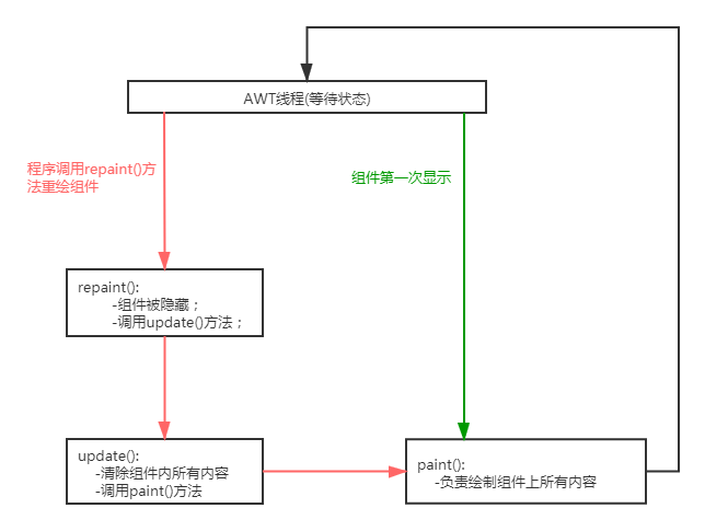
Generally, the update and paint methods are called by the AWT system. If the program wants the system to redraw components, it can call the repaint method.
2.8.2 use of graphics class
In real life, if we need to draw a picture, first we have to prepare a piece of paper, and then take a brush and match it with some colors, we can draw all kinds of shapes on the paper, such as circles, rectangles and so on.

Drawing in the program is the same. It also needs Canvas, brush, paint and so on. AWT provides Canvas class as Canvas and Graphics class as brush. You can set the color of the brush by calling setColor() method of Graphics object.
Drawing steps:
1. Customize the class, inherit the Canvas class, and rewrite the paint(Graphics g) method to complete the drawing;
2. within the paint method, the color, fonts and other attributes of the brush should be set by calling setColor() and setFont() of the Graphics object before starting to draw.
3. Call the drawXxx() method of the Graphics brush to start drawing.
In fact, the core of drawing is to use the Graphics brush to draw Graphics of what color and style on the Canvas, so the core is on the brush. The following table lists some common methods in the Graphics class:
| Method name | Method function |
|---|---|
| setColor(Color c) | Set color |
| setFont(Font font) | Set font |
| drawLine() | draw a straight line |
| drawRect() | draw rectangle |
| drawRoundRect() | Draw rounded rectangle |
| drawOval() | Draw ellipse |
| drawPolygon() | draw a polygon |
| drawArc() | Draw an arc |
| drawPolyline() | Draw polyline |
| fillRect() | Fill rectangular area |
| fillRoundRect() | Fill rounded rectangular areas |
| fillOval() | Fill elliptical area |
| fillPolygon() | Fill polygon area |
| fillArc() | Fill the sector corresponding to the arc |
| drawImage() | draw bitmap |
Case:
Use AWT drawing API to complete the effect shown in the figure below
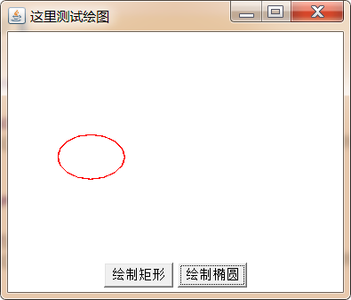
Demo code:
import java.awt.*;import java.awt.event.ActionEvent;import java.awt.event.ActionListener;import java.util.Random;public class SimpleDraw { private final String RECT_SHAPE="rect"; private final String OVAL_SHAPE="oval"; private Frame frame = new Frame("Here's the test plot"); private Button drawRectBtn = new Button("draw rectangle"); private Button drawOvalBtn = new Button("Draw ellipse"); //It is used to save what kind of graphics the current user needs to draw. Private string shape = ""; private MyCanvas drawArea = new MyCanvas(); Public void init() {/ / add the click event drawrectbtn.addactionlistener (New actionlistener() {@ override public void actionperformed (ActionEvent E) {shape = rect_shape; drawarea. Retain();}}); drawovalbtn.addactionlistener (New actionlistener()) {@ override public void actionperformed (ActionEvent E) {shape = oval_shape; drawarea. Retain();}}); / / define a panel and load two buttons panel P = new panel(); p.add (drawrectbtn); p.add (drawovalbtn) ; / / add the panel to the frame bottom frame.add(p,BorderLayout.SOUTH); / / set the Canvas size drawarea. Setpreferredsize (new dimension (300200)); / / add the Canvas to the frame frame frame. Add (drawarea); frame. Pack(); frame. Setvisible (true);} public static void main (string [] args) {new simpledraw(). Init();} / / 1. Custom class, inherit Canvas class, override paint method private class mycanvas extends Canvas {@ override public void paint (graphics g) {random r = new random(); if (shape. Equals (rect_shape)) {/ / draw rectangle g.setcolor (color. Black) G. drawRect (r.nextint (200), r.nextint (100), 40,60);} if (shape. Equals (oval_shape)) {/ / draw ellipse g.setcolor (color. Red); g.drawoval (r.nextint (200), r.nextint (100), 60,40);}}}}}
Java can also be used to develop some animations. The so-called animation is to redraw new images at a certain interval (usually less than 0.1 second). The difference between the two images is small, and the naked eye looks like the so-called animation.
In order to call the repaint() method of the component again at a certain interval, you can use the Timer class provided by Swing. The Timer class is a Timer, which has the following constructor:
Timer(int delay, ActionListener listener): the system automatically triggers the event handler method in the ActionListener listener every delay milliseconds. Within the method, we can call the repaint method of the component to complete the component redrawing.
Case 2:
Use AWT drawing technology and Timer timer to complete the pinball game in the figure below.
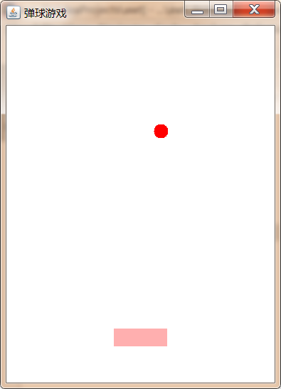
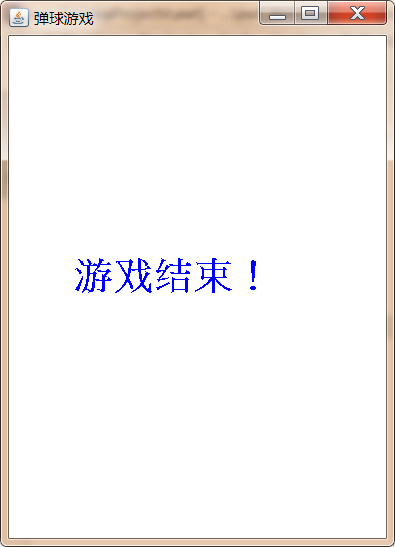
Demo code 2:
import javax.swing.*;import java.awt.*;import java.awt.event.*;public class PinBall { //Desktop width private final int TABLE_WIDTH = 300; // Desktop height private final int TABLE_HEIGHT = 400; // Height and width of racket private final int RACKET_WIDTH = 60; private final int RACKET_HEIGHT = 20; // private final int BALL_SIZE = 16; // Define the longitudinal running speed of the small ball private int ySpeed = 10// Small ball lateral running speed private int xSpeed = 5// Define the initial coordinates of the small ball private int ballx = 120; private int ballY = 20; // Define the initial coordinates of the racket. The x coordinate will change and the Y coordinate will not change. Private int rackex = 120; private final int RACKET_ Y = 340; // Declare timer private Timer timer// Define the mark of the end of the game private boolean isLose = false// Declare a desktop private MyCanvas tableArea = new MyCanvas()// Create a window object private frame = new frame ("pinball game"); public void init() {/ / set the optimal size of the desktop area tableArea.setPreferredSize(new Dimension(TABLE_WIDTH,TABLE_HEIGHT)); / / add the desktop to frame.add(tableArea); / / define the keyboard listener keylistener = new keyadapter() {/ / monitor the keyboard ←→ press. When the specified key is pressed, the horizontal coordinates of the racket will increase or decrease @ override public void keypressed (keyevent E) {int keycode = e.getkeycode(); if (keycode = = keyevent. Vk_left) {/ / ← / / if you don't reach the left boundary, you can continue to move left if (rackex > 0) {rackex - = 10;}} if (keycode = = keyevent. Vk_right) {/ / → / / if you don't reach the right boundary, you can continue to move right if (rackex < table_width-racket_width) {rackex + = 10;}}}}; / / add keyboard events frame.addkeylistener (keylistener) and tableArea.addkeylistener (keylistener) for the window and tableArea respectively ; / / define ActionListener, which is used to monitor the changes of the small ball. ActionListener TimerTask = new ActionListener() {@ override public void actionperformed (ActionEvent E) {/ / the small ball touches the left and right borders if (ballx < = 0 | ballx > = table_width-ball_size) {XSPEED = - XSPEED;} / / if the height of the ball exceeds the position of the racket and the lateral direction is not within the range of the racket, the game ends if (ball > racket_y & & (ballx < rackex | ballx > rackex + racket_width)) {/ / end timer timer.stop() ; / / set the end of the game flag to true islose = true; / / redraw the interface tableArea. Repeat();} / / if the ball is horizontally within the racket range and reaches the racket position or the top position, the ball bounces if (ball < = 0|| (ball > = racket_y-ball_size & & ballx > = rackex & & ballx < = rackex + racket_width)) {yspeed = - yspeed;} / / update the coordinates of the ball ballx + = XSPEED; Bally + = yspeed; / / redraw the tableArea. Repeat();}} ; / / set the timer. The timed task is TimerTask timer = new timer (100, TimerTask); timer. Start(); / / set the optimal size of the frame and view frame. Pack(); frame. Setvisible (true);} public static void main (string [] args) {new pinball(). Init();} private class mycanvas extensions canvas {/ / rewrite the paint method to draw @ override public void paint (graphics g) {/ / judge whether the game is over if (isLose) {/ / end g.setcolor (color. Blue); g.setfont (new font ("times", font.bold, 30)); g.drawstring ("game over!", 50200);}else {/ / no end / / set the color and draw the ball g.setcolor (color. Red); g.filloval (ballx, ball, ball_size, ball_size); / / set the color and draw the racket g.setcolor (color. Pink); g.fillrect (rackex, racket_y, racket_width, racket_height);}}}}
2.8.3 processing bitmap
If you only draw some simple geometric graphics, the graphics effect of the program is still monotonous. AWT also allows you to draw bitmaps on components. Graphics provides the drawimage() method to draw bitmaps. This method requires an Image parameter to represent bitmaps one by one. Through this method, you can draw the specified bitmaps.
To use bitmap:
1. Create a subclass object BufferedImage(int width,int height,int ImageType) of Image. When creating, you need to specify the width, height and type attributes of the bitmap; at this time, it is equivalent to generating a picture in memory;
As like as two peas, 2. calls the getGraphics() method of the BufferedImage object to get the brush, and then you can draw the picture in memory, drawing the same way as before.
3. Call the drawImage() method of the component to draw the BufferedImage in memory to the specific component at one time.
Benefits of using bitmap drawing components:
Using bitmap to draw components is equivalent to realizing the buffer of the diagram. At this time, the graphics are not directly drawn to the components, but first drawn to the BufferedImage in memory. After all the graphics are drawn, the one-time images can be displayed on the components, so that the user's experience will be better.
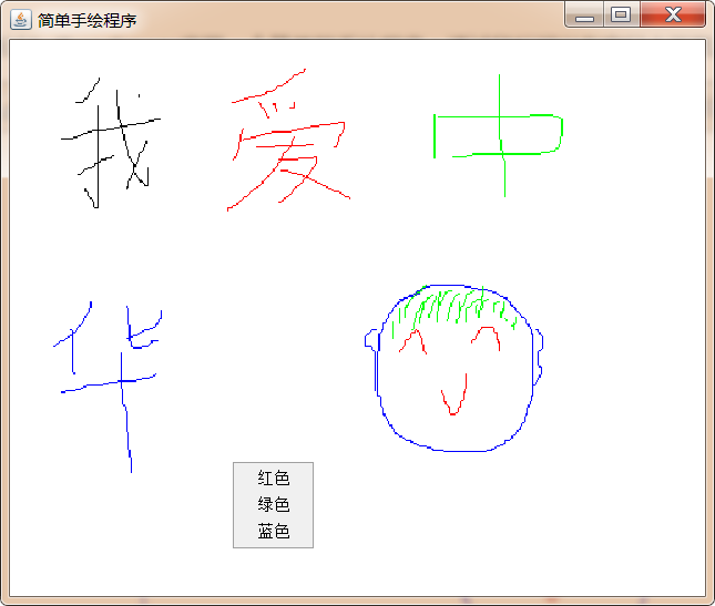
Case:
A simple hand drawing program is realized through BufferedImage: you can draw pictures in the window through the mouse.
Demo code:
import java.awt.*;
import java.awt.event.*;
import java.awt.image.BufferedImage;

public class HandDraw {

    //Defines the width and height of the drawing area
    private final int AREA_WIDTH = 500;
    private final int AREA_HEIGHT = 400;

    //Define a variable to save the coordinates of the mouse when the mouse was dragged last time
    private int preX = -1;
    private int preY = -1;

    //Defines a right-click menu for setting the color of the brush
    private PopupMenu colorMenu = new PopupMenu();
    private MenuItem redItem = new MenuItem("gules");
    private MenuItem greenItem = new MenuItem("green");
    private MenuItem blueItem = new MenuItem("blue");

    //Define a BufferedImage object
    private BufferedImage image = new BufferedImage(AREA_WIDTH,AREA_HEIGHT,BufferedImage.TYPE_INT_RGB);
    //Gets the brush associated with the BufferedImage object
    private Graphics g = image.getGraphics();

    //Define window objects
    private Frame frame = new Frame("Simple hand drawing program");

    //Define canvas objects
    private Canvas drawArea =  new Canvas(){
        @Override
        public void paint(Graphics g) {
            //Draw the bitmap image to the 0,0 coordinate point
            g.drawImage(image,0,0,null);
        }
    };

    //Define a Color object to save the brush Color set by the user. The default is black
    private Color forceColor = Color.BLACK;

    public void init(){
        //Define color menu item click listener
        ActionListener menuListener = new ActionListener() {
            @Override
            public void actionPerformed(ActionEvent e) {
                String command = e.getActionCommand();
                switch (command){
                    case "gules":
                        forceColor=Color.RED;
                        break;
                    case "green":
                        forceColor = Color.GREEN;
                        break;
                    case "blue":
                        forceColor = Color.BLUE;
                        break;
                }
            }
        };

        //Add click events for three menu items
        redItem.addActionListener(menuListener);
        greenItem.addActionListener(menuListener);
        blueItem.addActionListener(menuListener);

        //Add menu items to the right-click menu
        colorMenu.add(redItem);
        colorMenu.add(greenItem);
        colorMenu.add(blueItem);

        //Add the right-click menu to the drawing areadrawarea
        drawArea.add(colorMenu);

        //Set the iamge picture background to white
        g.fillRect(0,0,AREA_WIDTH,AREA_HEIGHT);

        //Sets the size of the drawing areadrawarea
        drawArea.setPreferredSize(new Dimension(AREA_WIDTH,AREA_HEIGHT));

        //Setting the mouse movement listener in the drawing areadrawarea
        drawArea.addMouseMotionListener(new MouseMotionAdapter() {
            //Used to draw images
            @Override
            public void mouseDragged(MouseEvent e) {//Pressing the mouse button and dragging triggers
                //If the coordinates of the last mouse are in the drawing area, start drawing
                if (preX>0 && preY>0){
                    //Sets the currently selected brush color
                    g.setColor(forceColor);
                    //To draw a line, you need to have two groups of coordinates, one is the coordinates when the mouse was dragged last time, and the other is the coordinates of the current mouse
                    g.drawLine(preX,preY,e.getX(),e.getY());
                }

                //Update preX and preY
                preX = e.getX();
                preY = e.getY();

                //Redraws the drawArea component
                drawArea.repaint();

            }
        });

        drawArea.addMouseListener(new MouseAdapter() {

            //Used to pop up the right-click menu
            @Override
            public void mouseReleased(MouseEvent e) {//Releasing the mouse button triggers
                boolean popupTrigger = e.isPopupTrigger();
                if (popupTrigger){
                    //Display the colorMenu to the drawing area of drawArea and follow the mouse
                    colorMenu.show(drawArea,e.getX(),e.getY());
                }

                //Reset preX and preY to - 1 when the mouse is released
                preX = -1;
                preY = -1;

            }
        });

        //Add drawArea to frame
        frame.add(drawArea);

        //Set the optimal size of the frame and make it visible
        frame.pack();
        frame.setVisible(true);
    }
    public static void main(String[] args) {
        new HandDraw().init();
    }
}
2.8.4 use of imageio
In real life, many software support opening existing pictures on the local disk, then editing them, and then saving them to the local disk again. If you want to use AWT to complete this function, you need to use the ImageIO class to operate the picture files on the local disk.
| Method name | Method function |
|---|---|
| static BufferedImage read(File input) | Read local disk picture file |
| static BufferedImage read(InputStream input) | Read local disk picture file |
| static boolean write(RenderedImage im, String formatName, File output) | Output picture files to local disk |
Case:
Write a picture viewing program to support save operation

Demo code:
import javax.imageio.ImageIO;import java.awt.image.BufferedImage;import java.io.File;public class ReadAndSaveImage { private Frame frame = new Frame("picture viewer "); private BufferedImage image; private class MyCanvas extends Canvas{ @Override public void paint(Graphics g) { if (image!=null){ g.drawImage(image,0,0,image.getWidth(),image.getHeight(),null); } } } private MyCanvas imageComponent = new MyCanvas(); public void init() throws Exception{ //Set menu item menubar MB = new menubar(); Menu menu = new menu ("file"); MenuItem openItem = new MenuItem("open"); MenuItem saveItem = new MenuItem("save as"); Openitem. Addactionlistener (E - > {/ / in the pop-up dialog box, select the local image FileDialog odialog = new FileDialog (frame); odialog.setvisible (true); / / read the image selected by the user string dir = odialog. Getdirectory(); string file = odialog. Getfile(); try {image = imageio. Read (new file (DIR, file)); imagecomponent. Retain();} catch (IOException E1) {E1. Printstacktrace();}}; saveitem. Addactionlistener (E - > {/ / a dialog box pops up and saves it as FileDialog sDialog = new FileDialog(frame), "save picture" ,FileDialog.SAVE); sDialog.setVisible(true); String dir = sDialog.getDirectory(); String file = sDialog.getFile(); try { ImageIO.write(image,"JPEG",new File(dir,file)); } catch (IOException e1) { e1.printStackTrace(); } }); mb.add(menu); menu.add(openItem); menu.add(saveItem); frame.setMenuBar(mb); frame.add(imageComponent); frame.setBounds(200,200,800,600); frame.setVisible(true); frame.addWindowListener(new WindowAdapter() { @Override public void windowClosing(WindowEvent e) { System.exit(0); } }); } public static void main(String[] args) throws Exception { new ReadAndSaveImage().init(); }}
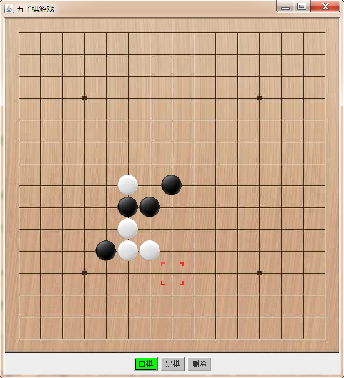
2.8.5 Gobang
Next, we use the drawing technology we learned before to play a Gobang game.
Demo code:
import javax.imageio.ImageIO;import javax.swing.*;import java.awt.*;import java.awt.event.*;import java.awt.image.BufferedImage;import java.io.File;public class Gobang { //Define three bufferedimages, which respectively represent chessboard, sunspot and white sub graph private bufferedimage table; private BufferedImage black; private BufferedImage white; // Define a bufferedimage, which represents the selection box private BufferedImage selected to be displayed when the mouse moves// Define the width and height of the chessboard. The defined size here is consistent with the size of the given board.jpg picture, because the chessboard background is a private final int table loaded through the picture_ WIDTH = 535; private final int TABLE_ HEIGHT = 536; // Define the number of children in each row and column in the chessboard. This number is consistent with the number in the given board.jpg, which is 15 Private Final int board_ SIZE = 15; // Define the size ratio of each piece to the total width of the chessboard; Width of each piece 535 / 15 = 35 Private Final int rate = table_ WIDTH/BOARD_ SIZE; // Define the offset value between the effective area of the chessboard and the coordinates of the background image. The X coordinate moves 5 pixels to the right and the Y coordinate moves 6 pixels down. private final int X_OFFSET = 5; private final int Y_OFFSET = 6; /* Define a two-dimensional array to act as chess pieces at each position on the chessboard; The index of the array needs to have a corresponding relationship with the coordinates of the chess piece on the chessboard: for example, the real drawing coordinates of the chess piece at the index [2] [3] should be: xpos = 2*RATE+X_OFFSET=75; ypos = 3*RATE+Y_OFFSET=111; */ private int[][] board = new int[BOARD_SIZE][BOARD_SIZE];// If 0 is stored, it means there are no pieces. If 1 is stored, it means black. If 2 is stored, it means white. / / define the Gobang game window private JFrame f = new JFrame("Gobang game")// Define the Canvas component corresponding to the Gobang board private class chess board extensions JPanel {/ / rewrite the paint method to implement painting @ override public void paint (graphics g) {/ / draw the Gobang board g.drawImage(table,0,0,null); / / draw the red box if of the selected point (selectX > 0 & & selectY > 0) {g.drawimage (selected, selectX * rate + x_offset, selectY * rate + y_offset, null);} / / traverse the array and draw pieces for (int i = 0; I < board_size; I + +) {for (int j = 0; J < board_size; j + +) {/ / draw black if (Board [i] [J] = = 1) {g.drawimage (black, I * rate + x_offset, J * rate + y_offset, null);} / / draw white chess if (Board [i] [J] = = 2) {g.drawimage (white, I * rate + x_offset, J * rate + y_offset, null);}}}}}}} private ChessBoard chessBoard = new ChessBoard() ; / / define a variable to record the corresponding chess piece index in the board array corresponding to the currently selected coordinate point; private int selectX = - 1; private int selectY = - 1; / / define a variable to record whether the current user selects white or black chess or clear, clear: 0, black chess: 1, white chess: 2; private int chessCategory = 1; / / define a Panel and place points Click button Panel P = new Panel(); private button whitebtn = new button ("white chess"); private Button blackBtn = new Button("black chess"); private Button clearBtn = new Button("delete"); public void updatebtncolor (color whitebtncolor, color blackbtncolor, color clearbtncolor) {whitebtn.setbackground (whitebtncolor) ; blackbtn.setbackground (blackbtncolor); clearbtn.setbackground (clearbtncolor);} public void init() throws exception {/ / the color of the initialization button updatebtncolor (color. Light_gray, color. Green, color. Light_gray); whitebtn.addactionlistener (New actionlistener()) { @Override public void actionPerformed(ActionEvent e) { chessCategory = 2; updateBtnColor(Color.GREEN,Color.LIGHT_GRAY,Color.LIGHT_GRAY); } }); blackBtn.addActionListener(new ActionListener() { @Override public void actionPerformed(ActionEvent e) { chessCategory=1; updateBtnColor(Color.LIGHT_GRAY,Color.GREEN,Color.LIGHT_GRAY); } }); clearBtn.addActionListener(new ActionListener() { @Override public void actionPerformed(ActionEvent e) { chessCategory=0; updateBtnColor (color. Light_gray, color. Light_gray, color. Green);}}; p.add (whitebtn); p.add (blackbtn); p.add (clearbtn); / / put the Panel at the bottom of the frame f.add(p,BorderLayout.SOUTH); / / initialize black, white and chessboard, and check the box table = imageio.read (new file ("awt_demo \ \ board. JPG")) ; black = imageio.read (new file ("awt_demo \ \ black. GIF"); white = imageio.read (new file ("awt_demo \ \ white. GIF"); selected = imageio.read (new file ("awt_demo \ \ selected. GIF"); / / initialize the board array. By default, there are no chessmen at all positions. For (int i = 0; I < board_size; I + +) {for (int j = 0; J < board_size; j + +) {Board [i] [J] = 0;}} / / set the optimal size of chessBoard.setPreferredSize(new Dimension(TABLE_WIDTH,TABLE_HEIGHT)); / / register the mouse listener chessBoard.addMouseListener(new MouseAdapter()) for chessboard {/ / clicking the mouse will trigger @ override public void mouseClick (mouseevent E) {/ / convert the coordinates of the user's mouse into the coordinates of the chess piece int XPOS = (e.getx() - x_offset) / rate; int YPOS = (e.gety() - y_offset) / rate; Board [XPOS] [YPOS] =Chesscategory; / / redraw chessboard chessboard. Retain();} / / when the mouse exits the chessboard area, reset the selected coordinates and redraw chessboard. Make sure the red check box displays correctly @ override public void mouseexited (mouseevent E) {selectX = - 1; selectY = - 1; chessboard. Reply();}}); / / register a mouse movement listener for chessBoard.addMouseMotionListener(new MouseMotionAdapter()) {/ / when the mouse moves, correct selectX and selectY and redraw the chessboard. Make sure the red check box is displayed correctly @ override public void mousemoved (mouseevent E) {/ / convert the mouse coordinates into the chess piece index selectX = (e.getx() - x_offset) / rate; selectY = (e.gety() - y_offset) /Rate; chessboard. Retain();}}); / / add chessboard to the frame f.add(chessBoard); / / set the optimal size of the frame and see f.pack(); f.setvisible (true);} public static void main (string [] args) throws exception {new gobang(). Init();}}
3, Swing programming
3.1 Swing overview
The previous chapter has introduced the relationship between AWT and swing, so it is not difficult to know that AWT components are rarely used when developing graphical interface programs in Java, and swing components are used most of the time. Swing is implemented in 100% pure Java and no longer depends on the GUI of the local platform, so it can maintain the same interface appearance on all platforms. Swing components independent of the local platform are called lightweight components; AWT components that depend on the local platform are called heavyweight components.
Because all components of Swing are implemented in Java and no longer call the GUI of the local platform, the display speed of Swing graphical interface is slower than that of AWT graphical interface. However, compared with the rapidly developing hardware facilities, this small speed difference is not harmful.
Advantages of using Swing:
1. Swing components no longer depend on the GUI of the local platform and do not need to adopt the GUI intersection of various platforms. Therefore, swing provides a large number of graphical interface components, far exceeding the set of graphical interface components provided by AWT.
2. Swing components no longer depend on the local platform GUI, so there will be no platform related bug s.
3. Swing components can ensure the same graphical interface appearance when running on various platforms.
These advantages provided by Swing make the Java graphical interface program truly achieve the goal of "Write Once, Run Anywhere".
Swing features:
1. Swing components adopt MVC (model view controller) design mode:
Model(Model): Used to maintain various states of components; view(View): Is the visual representation of components; controller(Controller):It is used to control the response to various events and components. When the model changes, it will notify all views that depend on it, and the view will update itself according to the model data. Swing use UI Agents to wrap views and controllers, and a model object to maintain the state of the component. For example, a button JButton There is a model that maintains its status information ButtonModel Object. Swing The component model is set automatically, so it is generally used JButton,Without concern ButtonModel Object. two. Swing It performs consistently on different platforms and has the ability to provide a display appearance that is not supported by the local platform. because Swing use MVC Mode to maintain each component, so when the appearance of the component is changed, the status information of the component is updated(Maintained by model)No impact. So, Swing Plug in look and feel can be used (Pluggable Look And Feel, PLAF)To control the appearance of components so that Swing The graphical interface can have different appearance when running on the same platform, and users can choose the appearance they like. In contrast, in AWT In the graphical interface, because the peer classes that control the appearance of components are related to the specific platform, so AWT Components always have the same look and feel as the local platform.
3.2 usage of swing basic components
3.2.1 Swing component hierarchy
Swing component inheritance system diagram:
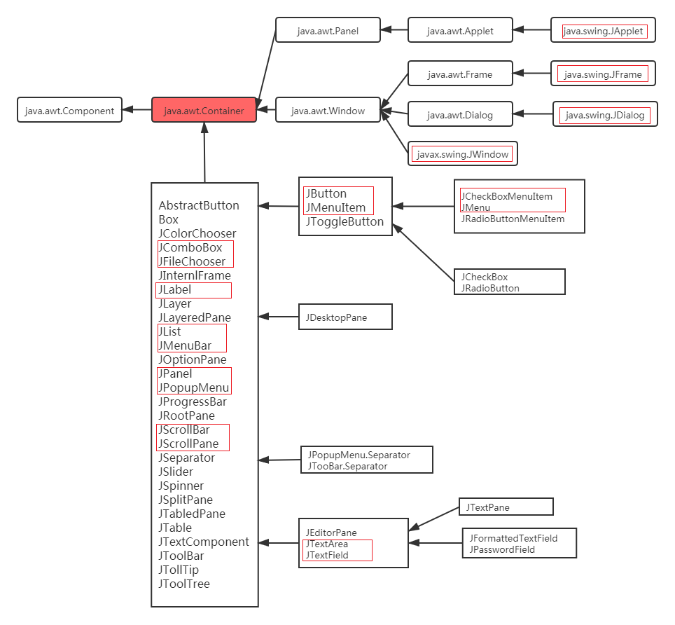
Most Swing components are direct or indirect subclasses of JComponent abstract class (not all Swing components). JComponent class defines the general methods of all subclass components. JComponent class is a subclass of java.awt.Container class in AWT, which is also one of the connections between AWT and Swing. Most Swing component classes inherit the Container class, so Swing components can be used as containers (JFrame inherits the Frame class).
Correspondence between Swing components and AWT components:
In most cases, you only need to add a J in front of the AWT component name to get its corresponding Swing component name, with several exceptions:
1. JComboBox: corresponds to the Choice component in AWT, but has more functions than the Choice component.
2. JFileChooser: corresponds to the FileDialog component in AWT.
3. JScrollBar: corresponds to the Scrollbar component in AWT. Note the case difference of the b letter in the class names of the two components.
4. Jccheckbox: corresponds to the Checkbox component in AWT. Note the case difference of b letter in the class names of the two components.
5. Jccheckboxmenuitem: corresponds to the CheckboxMenuItem component in AWT. Note the case difference of the b letter in the class names of the two components.
Swing components are classified by function:
1. Top level containers: JFrame, JApplet, JDialog and JWindow.
2. Intermediate containers: JPanel, JScrollPane, JSplitPane, JToolBar, etc.
3. Special containers: intermediate containers with special functions on the user interface, such as JIntemalFrame, JRootPane, JLayeredPane, JDestopPane, etc.
4. Basic components: components that realize human-computer interaction, such as JButton, JComboBox, JList, JMenu, JSlider, etc.
5. Display components of non editable information: components that display non editable information to users, such as JLabel, jpprogressbar, JToolTip, etc.
6. Display components of editable information: components that display formatted information that can be edited to users, such as JTable, JTextArea, JTextField, etc.
7. Special dialog box components: components that can directly generate special dialog boxes, such as JColorChooser and JFileChooser.
3.2.2 Swing implementation of AWT components
Swing provides corresponding implementations for all AWT components except Canvas. Swing components are more powerful than AWT components. Compared with AWT components, swing components have the following four additional functions:
-
You can set prompt information for Swing components. Use the setToolTipText() method to set prompt information that is helpful to the user for the component.
-
Many Swing components, such as buttons, labels and menu items, can use icons to decorate themselves in addition to text. In order to allow icons to be used in Swing components, Swing provides an implementation class for the Icon interface: Imagelcon, which represents an image Icon.
-
Support plug-in appearance style. Each JComponent object has a corresponding ComponentUI object to complete all painting, event processing, size determination, etc. The ComponentUI object depends on the currently used PLAF. The appearance style of the graphical interface can be changed by using the UIManager.setLookAndFeel() method.
-
Support setting border. Swing components can set one or more borders. Swing provides a variety of borders for users to use. You can also create composite borders or design your own borders. A blank border can be used to increase components and assist the layout manager to reasonably layout components in the container.
Each Swing component has a corresponding UI class. For example, JButton component has a corresponding ButtonUI class as UI proxy. For the class name of the UI agent of each Swing component, always remove the J of the Swing component class name, and then add the UI suffix. UI proxy class is usually an abstract base class. Different plafs have different UI proxy implementation classes. The Swing class library contains several sets of UI agents, which are placed under different packages. Each set of UI agent contains the ComponentUI implementation of almost all Swing components. Each set of such implementation is called a PLAF implementation. Taking JButton as an example, the inheritance hierarchy of its UI agent is as follows:
If you need to change the appearance style of the program, you can use the following code:
//Container: JFrame jf = new JFrame();try {/ / set the appearance style UIManager.setLookAndFeel("com.sun.java.swing.plaf.windows.WindowsLookAndFeel"); / / refresh the appearance of jf container and its internal components swingutilities. Updatecomponenttreeui (jf);} catch (exception E) {e.printstacktrace();}
Case:
Use Swing components to achieve the interface effect in the following figure:
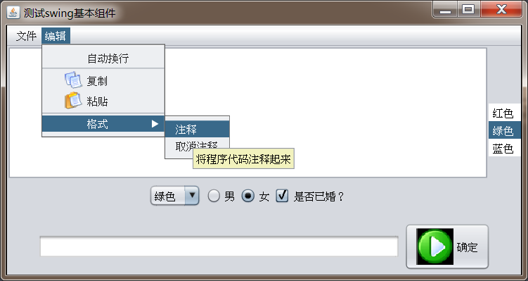
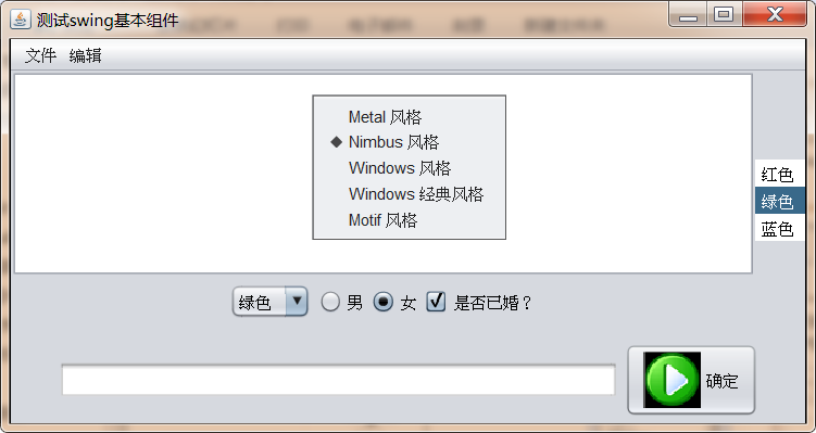
Demo code:
import cn.itcast.swing.util.ImagePathUtil;

import javax.swing.*;
import java.awt.*;
import java.awt.event.ActionEvent;
import java.awt.event.ActionListener;
import java.awt.event.InputEvent;

public class SwingComponentDemo {


    JFrame f = new JFrame("test swing Basic components");

    //Define a button and assign an icon to it
    Icon okIcon = new ImageIcon(ImagePathUtil.getRealPath("2\\ok.png"));
    JButton ok = new JButton("determine",okIcon);

    //Define a radio button, which is initially selected
    JRadioButton male = new JRadioButton("male",true);
    //Define a radio button, which is initially selected
    JRadioButton female = new JRadioButton("female",false);

    //Define a ButtonGroup and combine male and female to realize radio selection
    ButtonGroup bg  = new ButtonGroup();

    //Define a check box that is initially unchecked
    JCheckBox married = new JCheckBox("Are you married?",false);

    //Define an array to store colors
    String[] colors = { "gules", "green " , "blue " };

    //Define a drop-down selection box to display colors
    JComboBox<String> colorChooser = new JComboBox<String>(colors);

    //Set a list box to show the color
    JList<String> colorList = new JList<String>(colors);

    //Define a multiline text field with 8 rows and 20 columns
    JTextArea ta = new JTextArea(8,20);

    //Define a 40 column single line text field
    JTextField name = new JTextField(40);

    //Define menu bar
    JMenuBar mb = new JMenuBar();

    //define menus
    JMenu file = new JMenu("file");
    JMenu edit = new JMenu("edit");

    //Create a menu item and specify an icon
    JMenuItem newItem = new JMenuItem("newly build",new ImageIcon(ImagePathUtil.getRealPath("2\\new.png")));
    JMenuItem saveItem = new JMenuItem("preservation",new ImageIcon(ImagePathUtil.getRealPath("2\\save.png")));
    JMenuItem exitItem = new JMenuItem("sign out",new ImageIcon(ImagePathUtil.getRealPath("2\\exit.png")));

    JCheckBoxMenuItem autoWrap = new JCheckBoxMenuItem("Auto wrap");
    JMenuItem copyItem = new JMenuItem("copy",new ImageIcon(ImagePathUtil.getRealPath("2\\copy.png")));
    JMenuItem pasteItem = new JMenuItem("paste",new ImageIcon(ImagePathUtil.getRealPath("2\\paste.png")));

    //Define the secondary menu, which will be added to editing in the future
    JMenu format = new JMenu("format");
    JMenuItem commentItem = new JMenuItem("notes");
    JMenuItem cancelItem = new JMenuItem("note off");

    //Define a right-click menu to set the appearance style of the program
    JPopupMenu pop = new JPopupMenu();

    //Defines a ButtongGroup object, which is used to combine style buttons to form radio buttons
    ButtonGroup flavorGroup = new ButtonGroup();

    //Define five radio button menu items for setting program style
    JRadioButtonMenuItem metalItem = new JRadioButtonMenuItem("Metal style",true);
    JRadioButtonMenuItem nimbusItem = new JRadioButtonMenuItem("Nimbus style",true);
    JRadioButtonMenuItem windowsItem = new JRadioButtonMenuItem("Windows style",true);
    JRadioButtonMenuItem classicItem = new JRadioButtonMenuItem("Windows Classic style",true);
    JRadioButtonMenuItem motifItem = new JRadioButtonMenuItem("Motif style",true);


    //Initialization interface
    public void init(){

        //------------------------Combined main area------------------------
        //Create a JPanel that loads text boxes and buttons
        JPanel bottom = new JPanel();
        bottom.add(name);
        bottom.add(ok);

        f.add(bottom, BorderLayout.SOUTH);

        //Create a JPanel that loads drop-down selection boxes and three jchekboxes
        JPanel checkPanel = new JPanel();
        checkPanel.add(colorChooser);
        bg.add(male);
        bg.add(female);

        checkPanel.add(male);
        checkPanel.add(female);
        checkPanel.add(married);

        //Create a vertically arranged Box and load checkPanel and multiline text fields
        Box topLeft = Box.createVerticalBox();

        //JViewPort using JScrollPane as a common component
        JScrollPane taJsp = new JScrollPane(ta);
        topLeft.add(taJsp);
        topLeft.add(checkPanel);

        //Create a horizontal Box and load topLeft and colorList
        Box top = Box.createHorizontalBox();
        top.add(topLeft);
        top.add(colorList);

        //Add the top Box to the middle of the window
        f.add(top);

        //---------------------------Combination menu bar----------------------------------------------
        //Add shortcut key ctrl+N for newItem
        newItem.setAccelerator(KeyStroke.getKeyStroke('N', InputEvent.CTRL_MASK));
        newItem.addActionListener(new ActionListener() {
            @Override
            public void actionPerformed(ActionEvent e) {
                ta.append("The user clicked the "new" menu\n");
            }
        });


        //Add menu item for file
        file.add(newItem);
        file.add(saveItem);
        file.add(exitItem);

        //Add menu item for edit
        edit.add(autoWrap);
        edit.addSeparator();
        edit.add(copyItem);
        edit.add(pasteItem);
        //Add a prompt for commentItem
        commentItem.setToolTipText("Annotate the program code");

        //Add menu items to the format menu
        format.add(commentItem);
        format.add(cancelItem);

        //Add a separator to the edit
        edit.addSeparator();

        //Add format to edit to form a secondary menu
        edit.add(format);

        //Add edit file to the menu bar
        mb.add(file);
        mb.add(edit);

        //Set menu bar to window
        f.setJMenuBar(mb);

        //------------------------Combined right-click menu-----------------------------

        flavorGroup.add(metalItem);
        flavorGroup.add(nimbusItem);
        flavorGroup.add(windowsItem);
        flavorGroup.add(classicItem);
        flavorGroup.add(motifItem);

        //Create event listeners for 5 style menus
        ActionListener flavorLister = new ActionListener() {
            @Override
            public void actionPerformed(ActionEvent e) {
                String command = e.getActionCommand();
                try {
                    changeFlavor(command);
                } catch (Exception e1) {
                    e1.printStackTrace();
                }
            }
        };

        //Register listeners for 5 style menu items
        metalItem.addActionListener(flavorLister);
        nimbusItem.addActionListener(flavorLister);
        windowsItem.addActionListener(flavorLister);
        classicItem.addActionListener(flavorLister);
        motifItem.addActionListener(flavorLister);

        pop.add(metalItem);
        pop.add(nimbusItem);
        pop.add(windowsItem);
        pop.add(classicItem);
        pop.add(motifItem);

        //Call setComponentPopupMenu of ta component to set the right-click menu without using events
        ta.setComponentPopupMenu(pop);

        // Set eject program when window is closed
        f.setDefaultCloseOperation(JFrame.EXIT_ON_CLOSE);

        //Set the optimal size of jFrame and make it visible
        f.pack();
        f.setVisible(true);


    }

    //Define a method to change the interface style
    private void changeFlavor(String command) throws Exception{
        switch (command){
            case "Metal style":
                UIManager.setLookAndFeel("javax.swing.plaf.metal.MetalLookAndFeel");
                break;
            case "Nimbus style":
                UIManager.setLookAndFeel("javax.swing.plaf.nimbus.NimbusLookAndFeel");
                break;
            case "Windows style":
                UIManager.setLookAndFeel("com.sun.java.swing.plaf.windows.WindowsLookAndFeel");
                break;
            case "Windows Classic style":
                UIManager.setLookAndFeel("com.sun.java.swing.plaf.windows.WindowsClassicLookAndFeel");
                break;
            case "Motif style":
                UIManager.setLookAndFeel("com.sun.java.swing.plaf.motif.MotifLookAndFeel");
                break;
        }

        //Update the UI of the top-level container and all components in the f window
        SwingUtilities.updateComponentTreeUI(f.getContentPane());
        //Update mb menu bar and UI of all components of each
        SwingUtilities.updateComponentTreeUI(mb);
        //Update the UI of the right-click menu and all internal menu items
        SwingUtilities.updateComponentTreeUI(pop);
    }


    public static void main(String[] args) {
        new SwingComponentDemo().init();
    }

}
Attention to details:
1. The shortcut key specified in the swing menu item must be set through the component name. setAccelerator(keyStroke.getKeyStroke("uppercase letter", InputEvent.CTRL_MASK)) method, where KeyStroke represents a KeyStroke action, and the KeyStroke action can be specified directly through the corresponding letter of the key.
2. When updating the style of JFrame, SwingUtilities.updateComponentTreeUI(f.getContentPane()) is called; This is because if you directly update the JFrame itself, the JFrame will also be updated. The JFrame is a special container, and the JFrame still partially depends on the graphics components of the local platform. If you force JFrame update, it may cause the window to lose its title bar and border.
3. To set a right-click menu for a component, you don't need to use a listener. You just need to call the setComponentPopupMenu() method, which is simpler.
4. Close the JFrame window without a listener. Just call the setDefaultCloseOperation(JFrame.EXIT_ON_CLOSE) method, which is simpler.
5. If you need a component to support scroll bars, just put the component into JScrollPane and use JScrollPane.
3.2.3 setting borders for components
In many cases, we often like to set borders for different components to make the hierarchy of the interface more obvious. The Border object is provided in swing to represent a Border. The following figure is the inheritance system diagram of Border:
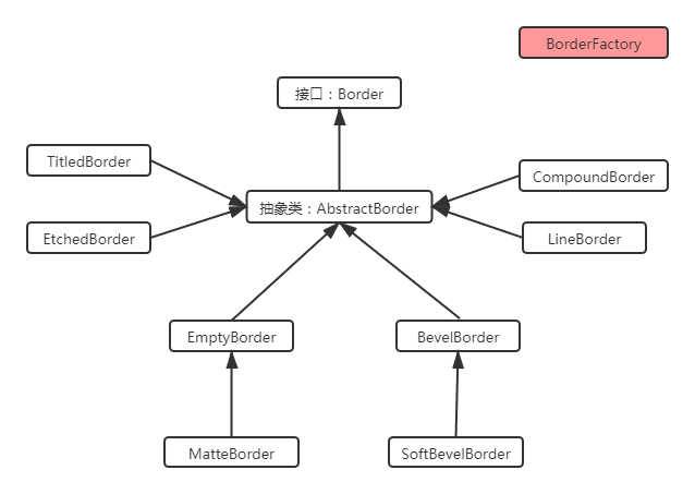
Special Border:
1. TitledBorder:Its function is not to directly add borders to other components, but to set the title for other borders. When creating objects of this class, you need to pass in another Border Object; 2. ComoundBorder:It is used to combine the other two borders. When creating an object of this class, you need to pass in the other two borders Border Object, one as the inner border and one as the outer border of the seat
To set a border for a component:
1. use BorderFactory perhaps XxxBorder establish Border Instance object of; 2. call Swing Component setBorder(Border b)Method to set the border for the component;
Case:
Please use Border to achieve the following effect:
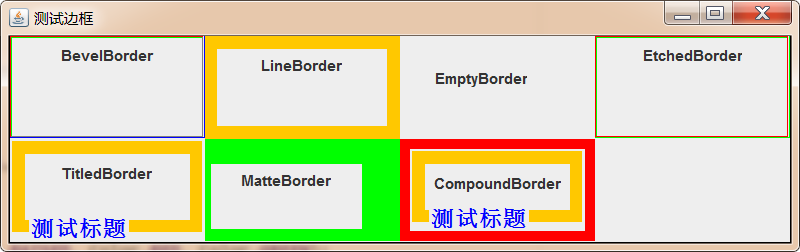
Demo code:
import javax.swing.*;import javax.swing.border.*;import java.awt.*;public class BorderTest { JFrame jf = new JFrame("Test border"); public void init(){ //Set Jframe to grid layout jf.setLayout(new GridLayout(2,4))// Create a raised oblique border, and set the colors of the four edges, border BB = borderfactory.createlevelborder (bevelborder.raised, color.red, color.green, color.blue, color. Gray); jf.add(getPanelWithBorder(bb,"BevelBorder")); // Create lineborder LB = borderfactory.createlineborder (color. Orange, 10); jf.add(getPanelWithBorder(lb,"LineBorder")); // When creating an emptyborder, a blank border will be left around the component. Border EB = borderfactory.createemptyborder (20, 5, 10, 30); jf.add(getPanelWithBorder(eb,"EmptyBorder")); // Create etchedorder, border ETB = borderfactory.createetchedorder (etchedorder.raised, color.red, color. Green); jf.add(getPanelWithBorder(etb,"EtchedBorder")); // Create titledorder and add titledorder TB = new titledorder (LB, "test title", titledorder.left, titledorder.bottom, new font ("stsong", font.bold, 18), color. Blue) to the original border; jf.add(getPanelWithBorder(tb,"TitledBorder")); // Directly create matteborder, which is a subclass of emptyborder. Emptyborder is left blank, and matteborder can fill the blank area with color. Matteborder MB = new matteborder (20,5,10,30, color. Green); jf.add(getPanelWithBorder(mb,"MatteBorder")); // Create a compoundborder directly, and combine the two borders into a new border. Compoundborder CB = new compoundborder (New lineborder (color. Red, 8), TB); jf.add(getPanelWithBorder(cb,"CompoundBorder")); jf.setDefaultCloseOperation(Jframe.EXIT_ON_CLOSE); jf.pack(); jf.setVisible(true); } Public JPanel getpanelwithborder (border border, string bordername) {JPanel JPanel = new jpanel(); JPanel. Add (New jlabel (bordername)); / / set the border for the panel JPanel. Setborder (border); return JPanel;} public static void main (string [] args) {new bordertest(). Init();}}
3.2.4 create toolbar using JToolBar
Swing provides a JToolBar class to create a toolbar, and you can add multiple tool buttons to the JToolBar.
JToolBar API:
| Method name | Method function |
|---|---|
| JToolBar( String name , int orientation) | Create a toolbar object with name and orientation. Its orientation value can be SwingConstants.HORIZONTAL or SwingConstants.VERTICAL |
| JButton add(Action a) | Add corresponding tool buttons for JToolBar toolbar through Action object |
| addSeparator( Dimension size ) | Adds a separator of the specified size to the toolbar |
| setFloatable( boolean b ) | Sets whether the toolbar can be dragged |
| setMargin(Insets m) | Sets the margin between the toolbar and tool buttons |
| setOrientation( int o ) | Sets the orientation of the toolbar |
| setRollover(boolean rollover) | Set the rollover status for this toolbar |
add(Action a) method:
The add(Action a) method in the above API is difficult to understand. Why? As mentioned earlier, the Action interface is a sub interface of ActionListener, so it represents an event listener. Here, the add method is adding a tool button to the toolbar. Why is an event listener passed?
First of all, it should be clear that no matter the menu item in the menu bar or the tool button in the toolbar, it must be clicked to complete some operations. Therefore, JToolBar and JMenu provide a more convenient method to add sub components. The following things will be done inside this method:
1. Create a component for the container(For example, create a tool button in the toolbar);2. from Action Object to set the component(For example, by name To set the text, through lcon To set the icon) ;3. hold Action Register the listener to the component just created;
Case:
Use the JToolBar component to complete the following effect:
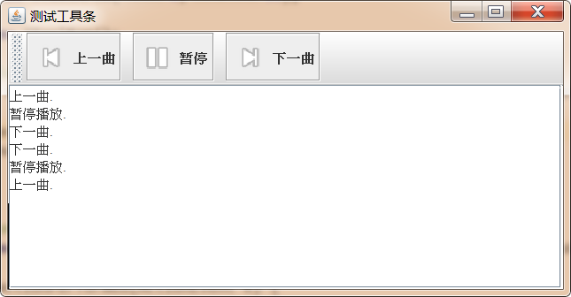
Demo code:
import cn.itcast.swing.util.ImagePathUtil;

import javax.swing.*;
import java.awt.*;
import java.awt.event.ActionEvent;

public class JToolBarTest {

    JFrame jf = new JFrame("Test toolbar");

    JTextArea jta = new JTextArea(6,35);
    //Create toolbar
    JToolBar jtb = new JToolBar();

    //Create a "previous song" Action, which is used to create tool buttons
    Action pre = new AbstractAction("Last song",new ImageIcon(ImagePathUtil.getRealPath("2\\pre.png"))) {
        @Override
        public void actionPerformed(ActionEvent e) {
            jta.append("Last song.\n");
        }
    };

    //Create a pause Action
    Action pause = new AbstractAction("suspend",new ImageIcon(ImagePathUtil.getRealPath("2\\pause.png"))) {
        @Override
        public void actionPerformed(ActionEvent e) {
           jta.append("Pause playback.\n");
        }
    };

    // Create "next song" Action
    Action next = new AbstractAction("Next song",new ImageIcon(ImagePathUtil.getRealPath("2\\next.png"))) {
        @Override
        public void actionPerformed(ActionEvent e) {
            jta.append("Next song.\n");
        }
    };

    public void init(){

        //Add scroll bar to JTextArea
        jf.add(new JScrollPane(jta));

        //Create a button as an Action and add the button to the Panel
        JButton preBtn = new JButton(pre);
        JButton pauseBtn = new JButton(pause);
        JButton nextBtn = new JButton(next);


        //Add an Action object to the toolbar, which will be converted into a tool button
        jtb.add(preBtn);
        jtb.addSeparator();
        jtb.add(pauseBtn);
        jtb.addSeparator();
        jtb.add(nextBtn);

        //Add toolbar to window
        jf.add(jtb,BorderLayout.NORTH);

        jf.setDefaultCloseOperation(JFrame.EXIT_ON_CLOSE);

        jf.pack();
        jf.setVisible(true);
    }

    public static void main(String[] args) {
        new JToolBarTest().init();
    }
}
3.2.5 JColorChooser and JFileChooser
Swing provides two dialog boxes, JColorChooser and JFileChooser, which can easily select colors and local files.
3.2.5.1 JColorChooser
JColorChooser is used to create a color selector dialog box. The usage of this class is very simple. You can quickly generate a color selection dialog box by calling its static method:
public static Color showDialog(Component component, String title,Color initialColor) /* Parameters: Component: Specifies the parent component of the current dialog box title: the name of the current dialog box initialColor: Specifies the default selected color Return value: Returns the color selected by the user*/
Case:
Use the color selector to complete the following functions:
Click the button to change the background color of the text field
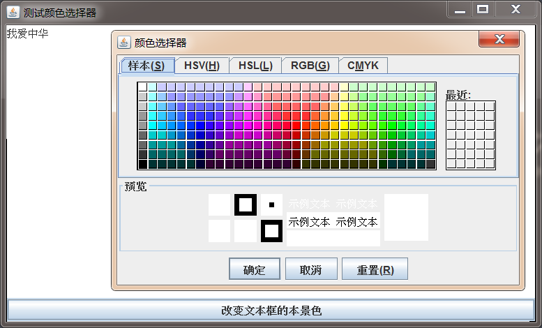
Demo code:
import javax.swing.*;import java.awt.*;import java.awt.event.ActionEvent;public class JColorChooserDemo { JFrame jFrame = new JFrame("Test color selector"); JTextArea jta = new JTextArea("I love China",6,30); JButton button = new JButton(new AbstractAction("Change the color of the text box"){ @Override public void actionPerformed(ActionEvent e) { //Pop up the color selector Color result = JColorChooser.showDialog(jFrame, "color selector", color. White); jta.setBackground(result); } }); public void init(){ jFrame.add(jta); jFrame.add(button,BorderLayout.SOUTH); jFrame.setDefaultCloseOperation(JFrame.EXIT_ON_CLOSE); jFrame.pack(); jFrame.setVisible(true); } public static void main(String[] args) { new JColorChooserDemo().init(); }}
3.2.5.2 JFileChooser
The function of JFileChooser is basically similar to that of FileDialog in AWT. It is also used to generate open file and save file dialog boxes. Unlike FileDialog, JFileChooser does not need to rely on the GUI of the local platform. It is implemented by 100% pure Java, has exactly the same behavior on all platforms, and can have the same appearance style on all platforms.
Steps to use JFileChooser:
- To create a JFileChooser object:
JFileChooser chooser = new JFileChooser("D:\\a");//Specifies the default open local disk path
- Call a series of optional methods of JFileChooser to initialize
setSelectedFile(File file)/setSelectedFiles(File[] selectedFiles):Sets the default selected file setMultiSelectionEnabled(boolean b): Set whether multiple choices are allowed. The default is single choice setFileSelectionMode(int mode): You can select contents, such as files, folders, etc. by default, only files can be selected
- Open file dialog box
showOpenDialog(Component parent):Open the file load dialog box and specify the parent component showSaveDialog(Component parent):Open the file save dialog box and specify the parent component
- Get the result selected by the user
File getSelectedFile():Gets a file selected by the user File[] getSelectedFiles():Get multiple files selected by the user
Case:
Use JFileChooser to complete the following effect:
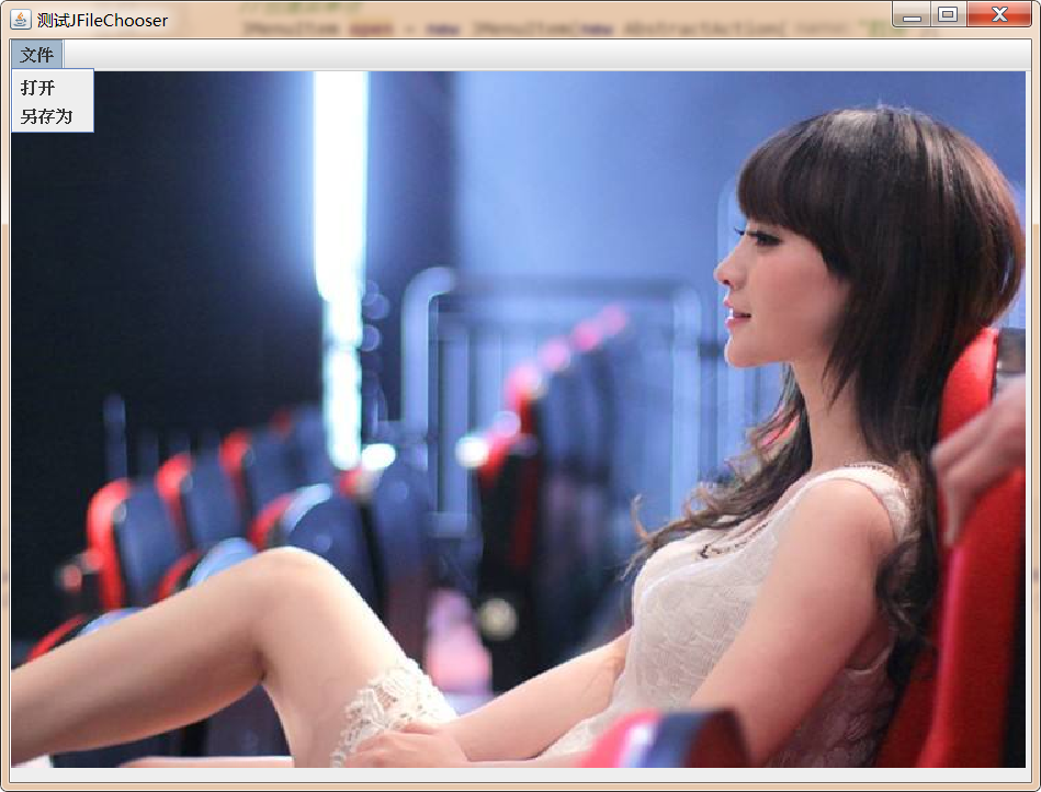
Demo code:
import javax.imageio.ImageIO;import javax.swing.*;import java.awt.*;import java.awt.event.ActionEvent;import java.awt.image.BufferedImage;import java.io.File;import java.io.IOException;public class JFileChooserDemo { //Create window object JFrame jf = new JFrame("test JFileChooser")// Create open file dialog box JFileChooser chooser = new JFileChooser("..)// Create menu bar JMenuBar jmb = new JMenuBar()// Create menu JMenu jMenu = new JMenu("file")// Create menu item JMenuItem open = new JMenuItem(new AbstractAction("open") {@ override public void actionperformed (ActionEvent E) {chooser.showopendialog (JF); file imagefile = chooser. Getselectedfile(); try {image = imageio.read (imagefile); drawarea. Retain() ; } catch (IOException e1) { e1.printStackTrace(); } } }); Jmenuitem save = new jmenuitem (New abstractaction ("save as") {@ override public void actionperformed (ActionEvent E) {chooser.setfileselectionmode (JFileChooser. Directories_only); chooser.showsavedialog (JF); file dir = chooser. Getselectedfile(); try {imageio.write (image, "JPEG", new file (DIR, "a.jpg");} catch (exception E1) {E1. Printstacktrace();}}}); / / used to record the BufferedImage image selected by the user; / / display the image class mycanvas extensions JPanel {@ override public void paint (graphics g) {if (image! = null) {g.drawimage (image, 0,0, null);}}} JPanel drawarea = new mycanvas(); public void init() {/ / set the size of the image display area drawarea.setpreferredsize (new dimension (500300)); jf.add (drawarea); / / assemble and set the menu bar jmenu.add (open); jmenu.add (save) ; JMB. Add (JMenu); JF. Setjmenubar (JMB); / / display JF. Setdefaultcloseoperation (JFrame. Exit_on_close); JF. Pack(); JF. Setvisible (true);} public static void main (string [] args) {new jfilechooserdemo(). Init();}}
3.2.7 using JOptionPane
3.2.7.1 basic overview
It is very convenient to create some simple dialog boxes through jooptionpane. Swing has added corresponding components to these dialog boxes without programmers adding components manually. Jooptionpane provides the following four methods to create dialog boxes.
| Method name | Method function |
|---|---|
| showMessageDialog/showInternalMessageDialog | The message dialog box tells the user that something has happened. The user can only click OK, which is similar to the alert function of JavaScript. |
| showConfirmDialog/showInternalConfirmDialog | A confirmation dialog box is used to confirm a problem to the user. The user can select yes, no ~ cancel and other options. It is similar to the comfim function of JavaScript. This method returns which button the user clicked |
| showInputDialog/showInternalInputDialog | The input dialog box prompts for some information, similar to the prompt function of JavaScript. This method returns the string entered by the user. |
| showOptionDialog/showInternalOptionDialog | The custom options dialog box allows you to use custom options. It can replace the dialog box generated by showConfirmDialog, but it is more complex to use. |
The above methods have many overloaded forms. Select one of the most complete forms. The parameters are explained as follows:
showXxxDialog(Component parentComponent, Object message, String title, int optionType, int messageType, Icon icon, Object[] options, Object initialValue)--Parameter interpretation: parentComponent: Parent component of the current dialog box message: The information displayed on the dialog box can be string, component, picture, etc title: Title of the current dialog box optionType: Type of button displayed on the current dialog: DEFAULT_OPTION,YES_NO_OPTION,YES_NO_CANCEL_OPTION,OK_CANCEL_OPTIONmessageType:Type of current dialog box:ERROR_MESSAGE,INFORMATION_MESSAGE,WARNING_MESSAGE,QUESTION_MESSAGE,PLAIN_MESSAGEicon:Icon in the upper left corner of the current dialog box options:Options for customizing the drop-down list initialValue:Default check in custom options
After the user interacts with the dialog box, the return values of different types of dialog boxes are as follows:
- showMessageDialog: no return value.
- showlnputDialog: returns the string entered or selected by the user.
- showConfirmDialog: returns an integer representing the options selected by the user.
- showOptionDialog: returns an integer representing the options selected by the user. If the user selects the first item, it returns 0; if the second item is selected, it returns 1... And so on.
The dialog generated by showConfirmDialog has the following return values:
- YES OPTION: the user returns after clicking yes.
- NO OPTION: the user returns after clicking the "no" button.
- CANCEL OPTION: the user returns after clicking the Cancel button.
- OK OPTION: the user returns after clicking OK.
- CLOSED OPTION: the user returns after clicking the "x" button in the upper right corner of the dialog box.
3.2.7.2 demonstration of four dialog boxes
Message dialog box:
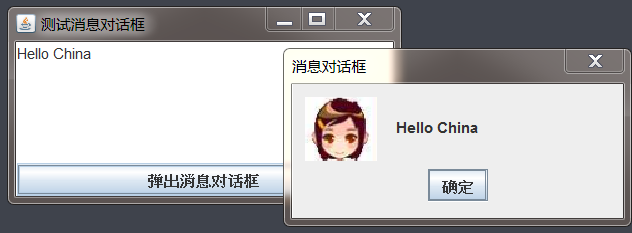
import cn.itcast.swing.util.ImagePathUtil;import javax.swing.*;import java.awt.*;import java.awt.event.ActionEvent;public class MessageDialogTest { JFrame jf = new JFrame("Test message dialog box"); JTextArea jta = new JTextArea(6, 30); JButton btn = new JButton(new AbstractAction("The message dialog box pops up") { @Override public void actionPerformed(ActionEvent e) { //Jooptionpane. Showmessagedialog (JF, JTA. Gettext(), message dialog, jooptionpane. Error_message); / / jooptionpane. Showmessagedialog (JF, JTA. Gettext(), message dialog, jooptionpane. Information_message); / / jooptionpane. Showmessagedialog (JF, JTA. Gettext(), message dialog, jooptionpane. Warning_message) ; / / jooptionpane.showmessagedialog (JF, JTA. Gettext(), message dialog box, jooptionpane. Query_message); / / jooptionpane.showmessagedialog (JF, JTA. Gettext(), message dialog box, jooptionpane. Place_message); jooptionpane.showmessagedialog (JF, JTA. Gettext(), message dialog box, jooptionpane. Warning_message, new imageicon (ImagePathUtil.getRealPath("2\female.png"))); } }); public void init(){ jf.add(jta); jf.add(btn, BorderLayout.SOUTH); jf.setDefaultCloseOperation(JFrame.EXIT_ON_CLOSE); jf.pack(); jf.setVisible(true); } public static void main(String[] args) { new MessageDialogTest().init(); }}
Confirmation dialog box:
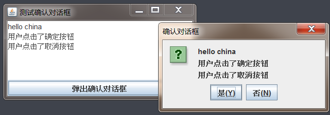
import javax.swing.*;
import java.awt.*;
import java.awt.event.ActionEvent;

public class ConfirmDialogTest {


    JFrame jf = new JFrame("Test confirmation dialog box");

    JTextArea jta = new JTextArea(6, 30);

    JButton btn = new JButton(new AbstractAction("A confirmation dialog box pops up") {

        @Override
        public void actionPerformed(ActionEvent e) {

            int result = JOptionPane.showConfirmDialog(jf, jta.getText(), "Confirmation dialog box",JOptionPane.YES_NO_OPTION, JOptionPane.QUESTION_MESSAGE);
            if (result == JOptionPane.YES_OPTION){
                jta.append("\n The user clicked the OK button");
            }

            if (result==JOptionPane.NO_OPTION){
                jta.append("\n The user clicked the Cancel button");
            }

        }
    });


    public void init(){
        jf.add(jta);
        jf.add(btn, BorderLayout.SOUTH);

        jf.setDefaultCloseOperation(JFrame.EXIT_ON_CLOSE);
        jf.pack();
        jf.setVisible(true);
    }

    public static void main(String[] args) {
        new ConfirmDialogTest().init();
    }

}
Input dialog box:
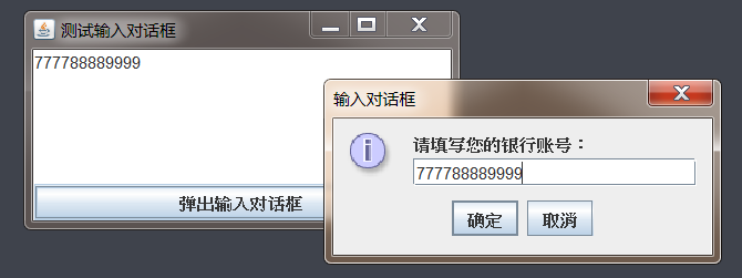
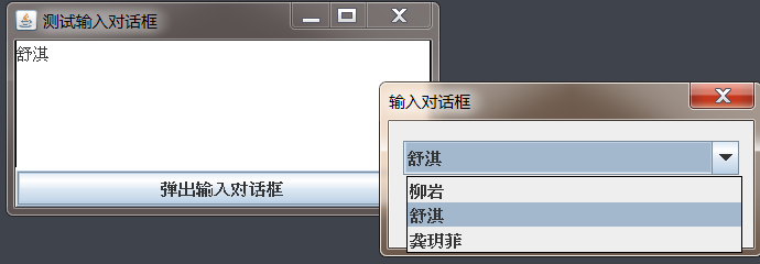
import javax.swing.*;import java.awt.*;import java.awt.event.ActionEvent;public class InputDialogTest { JFrame jf = new JFrame("Test input dialog box"); JTextArea jta = new JTextArea(6, 30); JButton btn = new JButton(new AbstractAction("The input dialog box pops up") { @Override public void actionPerformed(ActionEvent e) { /* String result = JOptionPane.showInputDialog(jf, "Please fill in your bank account number: "," input dialog box ", JOptionPane.INFORMATION_MESSAGE); if(result!=null){ jta.append(result.toString()); } */ Object result = JOptionPane.showInputDialog(jf, "", "Input Dialog ", JOptionPane.DEFAULT_OPTION, null, new String[]{"Liuyan", "Shu Qi", "Gong Yuefei"}, "Shu Qi"); if (result!=null){ jta.append(result.toString()); } } }); public void init(){ jf.add(jta); jf.add(btn, BorderLayout.SOUTH); jf.setDefaultCloseOperation(JFrame.EXIT_ON_CLOSE); jf.pack(); jf.setVisible(true); } public static void main(String[] args) { new InputDialogTest().init(); }}
Options dialog box:
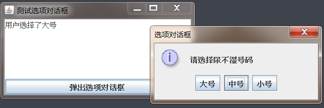
import javax.swing.*;import java.awt.*;import java.awt.event.ActionEvent;public class OptionDialogTest { JFrame jf = new JFrame("Test options dialog box"); JTextArea jta = new JTextArea(6, 30); JButton btn = new JButton(new AbstractAction("The options dialog box pops up") { @Override public void actionPerformed(ActionEvent e) { int result = JOptionPane.showOptionDialog(jf, "Please select a diaper number", "options dialog ",JOptionPane.DEFAULT_OPTION,JOptionPane.INFORMATION_MESSAGE, null,new String[]{"Tuba","medium , please","trumpet"},"medium , please"); switch (result){ case 0: jta.setText("User selected large"); break; case 1: jta.setText("User selected medium"); break; case 2: jta.setText("User selected small"); break; } } }); public void init(){ jf.add(jta); jf.add(btn, BorderLayout.SOUTH); jf.setDefaultCloseOperation(JFrame.EXIT_ON_CLOSE); jf.pack(); jf.setVisible(true); } public static void main(String[] args) { new OptionDialogTest().init(); }}
3.3 special containers in swing
Swing provides containers with special functions that can be used to create more complex user interfaces.
3.3.1 using JSplitPane
JSplitPane is used to create a split panel. It can split a component (usually a container) into two parts and provide a split bar. Users can drag the split bar to adjust the size of the two parts.
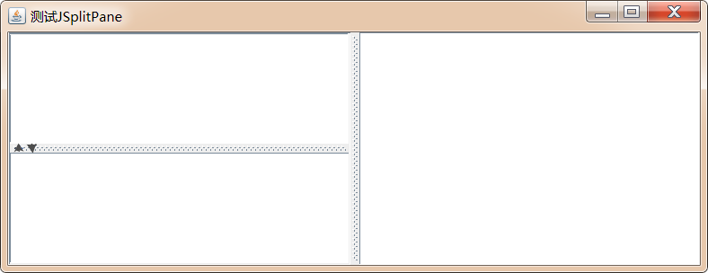
JSplitPane usage steps:
- Create a JSplitPane object
The following construction method can be used to create JSplitPane object JSplitPane(int newOrientation, Component newLeftComponent,Component newRightComponent) newOrientation: appoint JSplitPane Split direction of container: If the value is JSplitPane.VERTICAL_SPLIT,Vertical segmentation; If the value is JSplitPane.HORIZONTAL_SPLIT,Is horizontal segmentation; newLeftComponent: Components on the left or upper side; newRightComponent: Components on the right or lower side;
- Set whether to turn on continuous layout support (optional)
setContinuousLayout(boolean newContinuousLayout): The default is off, if set to true,The continuous layout support is turned on, but the efficiency will be lower because the continuous layout support requires continuous redrawing of components
- Set whether to support one touch display (optional)
setOneTouchExpandable(boolean newValue): The default is off, if set to true,Then open"One touch display"Support of
- Other settings
setDividerLocation(double proportionalLocation):Set the position of the separator bar to JSplitPane A percentage of setDividerLocation(int location): Sets the position of the separator bar by pixel value setDividerSize(int newSize): Sets the size of the separator bar by pixel value setLeftComponent(Component comp)/setTopComponent(Component comp)/setRightComponent(Component comp)/setBottomComponent(Component comp):Sets the component at the specified location
Case:
Use JSplitPane to achieve the following effect:
Click the book name on the right to display the picture of the book in the upper left and the description of the book in the lower left
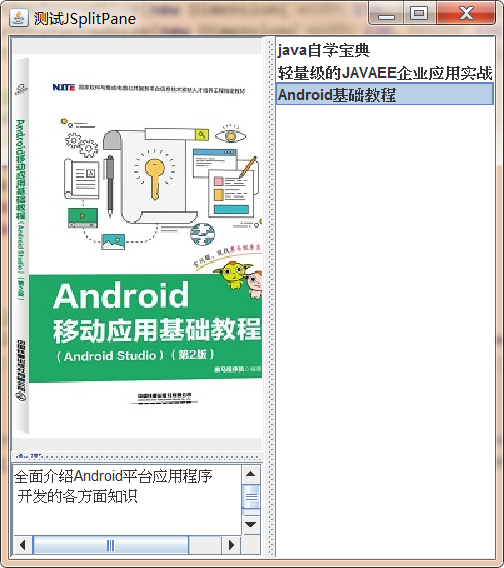
Demo code:
public class Book { private String name; private Icon icon; private String desc; public Book(String name, Icon icon, String desc) { this.name = name; this.icon = icon; this.desc = desc; } public String getName() { return name; } public void setName(String name) { this.name = name; } public Icon getIcon() { return icon; } public void setIcon(Icon icon) { this.icon = icon; } public String getDesc() { return desc; } public void setDesc(String desc) { this.desc = desc; } @Override public String toString() { return name; }}import cn.itcast.swing.util.ImagePathUtil;import javax.swing.*;import javax.swing.event.ListSelectionEvent;import javax.swing.event.ListSelectionListener;import java.awt.*;public class SplitPaneTest { Book[] books = {new Book("java Self study dictionary", new ImageIcon(ImagePathUtil.getRealPath("3\\java.png")), "Domestic about Java Programming the most comprehensive book \n Understand and learn"), new Book("Lightweight JAVAEE Enterprise application practice", new ImageIcon(ImagePathUtil.getRealPath("3\\ee.png")), "SSM Integrated development of classic books, the value of ownership"), new Book("Android Basic tutorial", new ImageIcon(ImagePathUtil.getRealPath("3\\android.png")), "Comprehensive introduction Android Platform application\n Knowledge of all aspects of development") }; JFrame jf = new JFrame("test JSplitPane"); //List display books JList < book > booklist = new JList < > (Books); JLabel bookCover = new JLabel(); JTextArea bookDesc = new JTextArea(); Public void init() {/ / set the optimal size for the three components booklist.setpreferredsize (new dimension (150400)); bookcover.setpreferredsize (new dimension (220330)); bookdesc.setpreferredsize (new dimension (220,70)); / / add an event listener booklist.addlistselectionlistener (New listselectionlistener()) to the list {@ override public void valuechanged (listselectionevent) {book book = booklist. Getselectedvalue(); bookcover. Seticon (book. Geticon()); bookdesc. Settext (book. Getdesc());}}); / / create a vertical split panel JSplitPane left = new JSplitPane(JSplitPane.VERTICAL_SPLIT,bookCover,new JScrollPane(bookDesc)); / / open the "one touch and display" feature left.setOneTouchExpandable(true); / / set the size of the separator bar left.setDividerSize(10); / / set the split panel to adjust the optimal layout according to the size of the component left. Resettopreferences() ; / / create a horizontal partition panel JSplitPane content = new JSplitPane(JSplitPane.HORIZONTAL_SPLIT, left, bookList); / / set content.setcontinuouslayout (true); jf.add (content); jf.setdefaultcloseoperation (JFrame. Exit_on_close); JF. Pack(); jf.setvisible (true);} public static void main(String[] args) { new SplitPaneTest().init(); }}
3.3.2 use JTabledPane
JTabbedPane can easily place multiple tabs on the window. Each tab is equivalent to a component placement area with the same size as the external container. In this way, you can place more components in a container, for example, right-click the "my computer" icon on the desktop and click "properties" in the pop-up shortcut menu Menu page, you can see a "system properties" dialog box, which contains several tabs.
If you need to use JTabbedPane to create a tab on the window, you can follow the following steps:
- Create JTabbedPane object
JTabbedPane(int tabPlacement, int tabLayoutPolicy): tabPlacement: Specify the placement position of the label title. You can choose SwingConstants Four constants in: TOP,LEFT,BOTTOM,RIGHT tabLaoutPolicy: Specifies the layout policy when the window cannot accommodate the label page title. You can choose JTabbedPane.WRAP_TAB_LAYOUT and JTabbedPane.SCROLL_TAB_LAYOUT
- Add, delete, modify and query through the JTabbedPane object heap label
addTab(String title, Icon icon, Component component, String tip):Add label title:Name of the label icon:Label Icon component:Component corresponding to label tip:Prompt for placing the cursor on the label insertTab(String title, Icon icon, Component component, String tip, int index):Insert tab title:Name of the label icon:Label Icon component:Component corresponding to label tip:Prompt for placing the cursor on the label index:At which index is the tab inserted setComponentAt(int index, Component component):Modify the component corresponding to the tab index:Which index label is modified component:Component corresponding to label removeTabAt(int index): index:Which index label is deleted
- Sets the tab currently displayed
setSelectedIndex(int index):Sets which index label is selected
- Set other properties of JTabbedPane
setDisabledIconAt(int index, Icon disabledIcon): Sets the disabled icon at the specified location to icon,The icon can also be null Indicates that the Disabled Icon is not used. setEnabledAt(int index, boolean enabled): Sets whether the tab at the specified location is enabled. setTitleAt(int index, String title): Set the title of the specified location tab to title,Should title Can be null,This indicates that the title of the tab is set to be empty. setToolTipTextAt(int index, String toolTipText): Sets the prompt text for the specified location tab.
- Set listener for JTabbedPane
addChangeListener(ChangeListener l)
Case:
Please use JTabbedPane to complete the following functions:
Demo code:
import javax.swing.*;
import javax.swing.event.ChangeEvent;
import javax.swing.event.ChangeListener;

public class JTabbedPaneTest {
    JFrame jf = new JFrame("test JTabbedPane");


    JTabbedPane tabbedPane = new JTabbedPane(SwingConstants.TOP,JTabbedPane.WRAP_TAB_LAYOUT);

    public void init(){


        //Set jf size
        jf.setBounds(400,400,400,400);
        //Setting jf size cannot be changed
        jf.setResizable(false);


        ImageIcon icon = new ImageIcon(ImagePathUtil.getRealPath("3\\open.gif"));
        //Add label
        tabbedPane.addTab("user management ",icon,new JList<String>(new String[]{"User one","User 2","User III"}));
        tabbedPane.addTab("Commodity management",new JList<String>(new String[]{"Commodity I","Commodity II","Commodity III"}));
        tabbedPane.addTab("Order management",icon,new JList<String>(new String[]{"Order one","Order 2","Order III"}));

        //Set the second label to be selected by default
        tabbedPane.setSelectedIndex(1);
        //The first label cannot be set
        tabbedPane.setEnabledAt(0,false);

        tabbedPane.addChangeListener(new ChangeListener() {
            @Override
            public void stateChanged(ChangeEvent e) {
                int selectedIndex = tabbedPane.getSelectedIndex();
                JOptionPane.showMessageDialog(jf,"Section is selected"+(selectedIndex+1)+"Tags");
            }
        });


        jf.add(tabbedPane);
        jf.setDefaultCloseOperation(JFrame.EXIT_ON_CLOSE);
        jf.setVisible(true);

    }


    public static void main(String[] args) {
        new JTabbedPaneTest().init();
    }
}
3.3.3 use JLayeredPane, JDesktopPane and JInternalFrame
3.3.3.1 JLayeredPane
JLayeredPane is a container representing hierarchical depth, which allows components to overlap each other when needed. When adding a component to the JLayeredPane container, you need to specify a depth index for the component, where the component in the layer with higher hierarchical index is above the component in other layers.
JLayeredPane also divides the hierarchical depth of the container into several default layers. The program just puts the components into the corresponding layers, so it is easier to ensure the correct overlap of components without specifying a specific depth index for components. JLayeredPane provides the following default layers:
- DEFAULT_LAYER: most components are located in the standard layer, which is the bottom layer;
- PALETTE_LAYER: the palette layer is above the default layer. This layer is useful for floating toolbars and palettes, so it can be above other components.
- MODAL_LAYER: this layer is used to display modal dialog boxes. They will appear above all toolbars, palettes, or standard components in the container.
- POPUP_LAYER: this layer is used to display the right-click menu. Pop ups associated with dialog boxes, tooltips and common components will appear on the corresponding dialog boxes, tooltips and common components.
- DRAG_LAYER: this layer is used to place components in the drag and drop process (see the next section for drag and drop operations). Components in drag and drop operations are above all components. Once the drag and drop operation is completed, the component will be reassigned to its normal layer.
JLayeredPane method:
- moveToBack(Component c): move the current component c to the last position of all components in the layer;
- moveToFront(Component c): move the current component c to the first position of all components in the layer;
- setLayer(Component c, int layer): change the layer of component c;
It should be noted that if a component is added to the JLayeredPane to be displayed, the position and size of the component displayed in the container must be manually set.
Case:
Use JLayeredPane to complete the following effect:
Demo code:
import cn.itcast.swing.util.ImagePathUtil;import javax.swing.*;import java.awt.*;public class JLayeredPaneTest { JFrame jf = new JFrame("test JLayeredPane"); JLayeredPane layeredPane = new JLayeredPane(); //Customize the component, inherit JPanel private class ContentPanel extensions JPanel {public ContentPanel (int XPOS, int YPOS, string title, string ICO) {/ / set the border setborder (borderfactory. Createitledorder (borderfactory. Createetchedorder()), jlabel label = new jlabel (New imageicon (imagepathutil. Getrealpath))( "3 \ \" + ICO)); add (label); setboundaries (XPOS, YPOS, 160220);}} public void init() {/ / add three components to LayeredPane and add components to JLayeredPane. You must manually set the display position and size of the components before layeredPane.add(new ContentPanel(10,20,"java self-study dictionary", "Java. PNG") , JLayeredPane. Model_layer; LayeredPane. Add (New ContentPanel (100,60, "Android basic tutorial", "Android. PNG"), JLayeredPane. Default_layer); LayeredPane. Add (New ContentPanel (80100, "lightweight javaEE enterprise application", "EE. PNG"), JLayeredPane. Drag_layer); LayeredPane. Setpreferredsize (new dimension (300400)); JF. Add (LayeredPane) ; jf.pack(); jf.setDefaultCloseOperation(JFrame.EXIT_ON_CLOSE); jf.setVisible(true); } public static void main(String[] args) { new JLayeredPaneTest().init(); }}
3.3.3.2 JDesktopPane and JInternalFrame
JDesktopPane is a subclass of JLayeredPane. This container is more commonly used in development. Many applications need to start multiple internal windows to display information (typically, such as IDEA and NotePad + +). These internal windows belong to the same external window. When the external window is minimized, these internal windows are hidden. In Windows environment, this
This kind of user interface is called multiple document interface (MDI).
This MDI interface can be created very simply by using Swing. Generally, the internal window has its own title bar, title, icon and three window buttons, and it is allowed to drag to change the size and position of the internal window, but the internal window cannot drag out the external window.
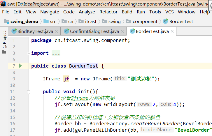
JDesktopPane needs to be used in combination with JIntemalFrame, where JDesktopPane represents a virtual desktop and JIntemalFrame is used to create internal windows. Create internal windows using JDesktopPane and JIntemalFrame as follows:
- Create a JDesktopPane object to represent the virtual desktop
JDesktopPane()
- Create an internal window using JIntemalFrame
JInternalFrame(String title, boolean resizable, boolean closable, boolean maximizable, boolean iconifiable):
	title: Internal window title
	resizable:Can I change the size
	closeble: Can I close it
	maximizable: Can I maximize
	iconifiable:Can it be minimized
- Once the internal window is obtained, the usage of the window is basically similar to that of an ordinary window. You can specify the layout manager of the window, add components to the window, change window icons, etc.
- Display the internal window in an appropriate size and position. Similar to the ordinary window, the default size of the window is 0x0 pixels, located at 0, 0 position (at the upper left corner of the virtual desktop) and hidden by default. The program can display the internal window through the following code:
reshape(int x, int y, int width, int height):Set the size of the internal window and the position in the external window;
show():Set internal window visible
- Add the internal window to the JDesktopPane container, and then add the JDesktopPane container to other containers.
Case:
Please use JDesktopPane and JInternalFrame to complete the following effect:
Demo code:
import cn.itcast.swing.util.ImagePathUtil;import javax.swing.*;import java.awt.*;import java.awt.event.ActionEvent;public class JInternalFrameTest { final int DESKTOP_WIDTH = 480; final int DESKTOP_HEIGHT = 360; final int FRAME_DISTANCE = 20; //Create external window JFrame jf = new JFrame("test JInternalFrame")// Create a virtual desktop JDesktopPane desktop = new JDesktopPane()// Define the size of the internal window as private int width = 230; private int height = DESKTOP_ HEIGHT; // Define the horizontal axis coordinate of the next internal window private int nextFrameX = 0// Define two menus for the external window JMenu fileMenu = new JMenu("file")// Define action, which is used to quickly create menu items and tool buttons. Action newAction = new AbstractAction("new", new imageicon (imagepathutil. Getrealpath ("3 \ \ new. PNG")) {@ override public void actionperformed (ActionEvent E) {/ / create internal window JInternalFrame iframe = new JInternalFrame("new document") , true,true,true,true); / / add an 8-row and 40 column text box iframe.add (New JScrollPane (New jtextarea (8,40)); / / add the internal window to the virtual desktop desktop desktop.add(iframe); / / set the original position of the internal window iframe.reshape(nextFrameX,0,width,height) ; / / make the window visible iframe.show(); / / calculate the position of the next internal window nextframex + = frame_distance; if (nextframex > desktop_width) {nextframex = 0;}}}; Action exitaction = new abstractaction ("exit", new imageicon (imagepathutil. Getrealpath ("3 \ \ exit. PNG")) {@ override public void actionperformed (ActionEvent E) {/ / end the current program system. Exit (0);}}; Public void init() {/ / install the menu bar jmenubar menubar = new jmenubar(); jf.setjmenubar (menubar); menubar.add (FileMenu); filemenu.add (newaction); filemenu.add (exitaction); / / set the optimal size of the virtual desktop desktop.setPreferredSize(new Dimension(DESKTOP_WIDTH,DESKTOP_HEIGHT)) ; / / add the virtual desktop to the external window JF. Add (desktop); JF. Pack(); JF. Setdefaultcloseoperation (JFrame. Exit_on_close); JF. Setvisible (true);} public static void main (string [] args) {new jinternalframetest(). Init();}}
3.4 implementation progress bar of jpprocessbar, ProcessMonitor and BoundedRangeModel
Progress bar is a GUI component widely used in the graphical interface. When copying a large file, the operating system will display a progress bar to identify the proportion of completion of the copy operation: when starting Eclipse and other programs, because more resources need to be loaded, the startup speed is slow, and the program will also display a progress bar during the startup process, Used to indicate the percentage of software startup completed
3.4.1 create progress bar
To create a progress bar using jpprogressbar:
- Create jpprogressbar object
public JProgressBar(int orient, int min, int max): orint:direction min:minimum value max:Maximum
- set a property
setBorderPainted(boolean b):Sets whether the progress bar has a border setIndeterminate(boolean newValue):Set whether the current progress bar is a progress bar with uncertain progress. If so, you will see a slider move left and right in the progress bar setStringPainted(boolean b): Sets whether the progress bar displays the current percentage of completion
- Gets and sets the progress status of the current progress bar
setValue(int n):Set current progress value double getPercentComplete():Gets the percentage of completion of the progress bar String getStrin():Returns the current value of the progress string
Case:
Please use jpprogressbar to complete the following effect:
Demo code:
import javax.swing.*;import java.awt.*;import java.awt.event.ActionEvent;import java.awt.event.ActionListener;public class JProgressTest { JFrame jf = new JFrame("Test progress bar"); //Create a vertical progress bar jpprogressbar = new jpprogressbar (jpprogressbar. Horizontal); Jcheckbox indeterminate = new jcheckbox ("uncertain progress"); JCheckBox noBorder = new JCheckBox("no border drawn"); Public void init() {box = new box (BoxLayout. Y_axis); box. Add (indeterminate); box. Add (nobord); JF. Setlayout (New flowlayout()); JF. Add (box); / / add the progress bar to the JF window jf.add(bar); / / set the maximum and minimum values of the progress bar bar. Setminimum (0); bar. Setmaximum (100) ; / / set the completion percentage of the progress bar.setStringPainted(true); / / decide whether to draw the progress bar border according to the selection. Noborder. Addactionlistener (New actionlistener() {@ override public void actionperformed (ActionEvent E) {boolean flag = noborder. Isselected() ; bar. Setborderpainted (! Flag);}}); / / determine whether it is an uncertain progress bar indeterminate. Addactionlistener (New actionlistener() {@ override public void actionperformed (ActionEvent E) {boolean flag = indeterminate. Isselected() ; bar. Setindeterminate (flag); / / do not draw percentage because the drawing percentage bar. Setstringpainted (! Flag);}}); jf.setdefaultcloseoperation (JFrame. Exit_on_close); JF. Pack(); jf.setvisible (true) ; / / continuously change the completion progress of the progress bar through a loop for (int i = 0; I < = 100; I + +) {/ / change the completion progress of the progress bar. SetValue (I); try {thread. Sleep (1000);} catch (interruptedexception E) {e.printstacktrace();}}} public static void main(String[] args) { new JProgressTest().init(); }}
In the program just now, the progress of the progress bar is constantly updated through the for loop, which is only for demonstration. Such operation is meaningless in actual development. Usually, the completion of a time-consuming task is continuously detected, and then the progress of the progress bar is updated. The following code improves the above code through Timer timer and Runnable interface. The running result does not change, and the knowledge is modified to the logic of progress bar progress update.
import javax.swing.*;
import javax.swing.event.ChangeEvent;
import javax.swing.event.ChangeListener;
import java.awt.*;
import java.awt.event.ActionEvent;
import java.awt.event.ActionListener;

public class JProgressTest2 {

    JFrame jf = new JFrame("Test progress bar");
    //Create a vertical progress bar
    JProgressBar bar = new JProgressBar(JProgressBar.HORIZONTAL);

    JCheckBox indeterminate = new JCheckBox("Uncertain progress");
    JCheckBox noBorder = new JCheckBox("Do not draw borders");

    public void init(){

        Box box = new Box(BoxLayout.Y_AXIS);
        box.add(indeterminate);
        box.add(noBorder);

        jf.setLayout(new FlowLayout());
        jf.add(box);

        //Add progress bar to jf window
        jf.add(bar);

        //Turn on time-consuming tasks
        SimulatedActivity simulatedActivity = new SimulatedActivity(100);
        new Thread(simulatedActivity).start();


        //Set the maximum and minimum values of the progress bar
        bar.setMinimum(0);
        bar.setMaximum(simulatedActivity.getAmount());

        //Set the percentage of drawing completion in the progress bar
        bar.setStringPainted(true);

        //Determines whether to draw the progress bar border according to the selection
        noBorder.addActionListener(new ActionListener() {
            @Override
            public void actionPerformed(ActionEvent e) {
                boolean flag = noBorder.isSelected();
                bar.setBorderPainted(!flag);
            }
        });

        //Determine whether it is an uncertain progress bar according to the selection
        indeterminate.addActionListener(new ActionListener() {
            @Override
            public void actionPerformed(ActionEvent e) {
                boolean flag = indeterminate.isSelected();
                bar.setIndeterminate(flag);
                //The percentage is not drawn because the percentage was previously set
                bar.setStringPainted(!flag);
            }
        });

        jf.setDefaultCloseOperation(JFrame.EXIT_ON_CLOSE);
        jf.pack();
        jf.setVisible(true);


        //Through the timer, continuously read the current value in the simulatedActivity and update the progress of the progress bar
        Timer timer = new Timer(300, new ActionListener() {
            @Override
            public void actionPerformed(ActionEvent e) {
                bar.setValue(simulatedActivity.getCurrent());
            }
        });
        timer.start();
        //Monitor the change of the progress bar. If the progress is 100%, stop the timer
        bar.addChangeListener(new ChangeListener() {
            @Override
            public void stateChanged(ChangeEvent e) {
                if (   bar.getValue()==bar.getMaximum()){
                    timer.stop();
                }
            }
        });


    }

    public static void main(String[] args) {
        new JProgressTest2().init();
    }

    //Define a thread task to simulate time-consuming operations
    private class SimulatedActivity implements Runnable{
        //Memory visible
        private volatile int current = 0;
        private int amount;

        public SimulatedActivity(int amount) {
            this.amount = amount;
        }

        public int getCurrent() {
            return current;
        }

        public void setCurrent(int current) {
            this.current = current;
        }


        public int getAmount() {
            return amount;
        }

        public void setAmount(int amount) {
            this.amount = amount;
        }

        @Override
        public void run() {
            //Through the loop, constantly modify the value of current to simulate the amount of task completion
            while(current<amount){
                try {
                    Thread.sleep(50);
                } catch (InterruptedException e) {
                    e.printStackTrace();
                }
                current++;
            }
        }
    }
}
We have learned before that in fact, the interface and data of many components in Swing adopt the design idea of MVC:
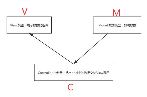
Swing components mostly separate appearance display from internal data, and jpprogressbar is no exception. Jpprogressbar components have a built-in Model object for saving its status data, which is represented by BoundedRangeModel object. The program calls the method of jpprogressbar object to complete the setting of progress percentage and monitor the data change of progress bar, In fact, it is completed through its built-in BoundedRangeModel object. The following code is an improvement on the previous code. It completes data setting, acquisition and monitoring through BoundedRangeModel.
import javax.swing.*;import javax.swing.event.ChangeEvent;import javax.swing.event.ChangeListener;import java.awt.*;import java.awt.event.ActionEvent;import java.awt.event.ActionListener;public class JProgressTest3 { JFrame jf = new JFrame("Test progress bar"); //Create a vertical progress bar jpprogressbar = new jpprogressbar (jpprogressbar. Horizontal); Jcheckbox indeterminate = new jcheckbox ("uncertain progress"); JCheckBox noBorder = new JCheckBox("no border drawn"); Public void init() {box box = new box (BoxLayout. Y_axis); box. Add (indeterminate); box. Add (nobord); JF. Setlayout (New flowlayout()); JF. Add (box); / / add the progress bar to JF window jf.add(bar); / / open the time-consuming task simulatedActivity simulatedactivity = new simulatedActivity (100) ; new thread (simulatedActivity). Start(); / / set the maximum and minimum values of the progress bar bar. Getmodel(). Setminimum (0); bar. Getmodel(). Setmaximum (simulatedActivity. Getamount()); / / set the completion percentage of drawing in the progress bar bar.setStringPainted(true) ; / / decide whether to draw the progress bar border according to the selection. Noborder. Addactionlistener (New actionlistener() {@ override public void actionperformed (ActionEvent E) {boolean flag = noborder. Isselected(); bar. Setborderpainted (! Flag);}}) ; / / determine whether it is an indeterminate progress bar indeterminate. Addactionlistener (New actionlistener() {@ override public void actionperformed (ActionEvent E) {boolean flag = indeterminate. Isselected(); bar.setindeterminate (flag) ; / / do not draw the percentage because the drawing percentage bar.setstringpainted (! Flag);}}); jf.setdefaultcloseoperation (JFrame. Exit_on_close); JF. Pack(); jf.setvisible (true) was set previously ; / / continuously read the current value in the simulatedActivity through the timer and update the progress of the progress bar timer timer timer = new timer (300, new actionlistener() {@ override public void actionperformed (ActionEvent E) {bar. Getmodel(). SetValue (simulatedActivity. Getcurrent());}}) ; timer. Start(); / / listen for changes in the progress bar. If the progress is 100%, stop the timer bar. Getmodel(). Addchangelistener (New changelistener() {@ override public void statechanged (changeevent E) {if (bar. Getmodel(). Getvalue() = = bar. Getmodel(). Getmaximum()) {timer. Stop();}}});} public static void main (string [] args) {new jprogresstest3(). Init();} / / define a thread task to simulate time-consuming operations private class SimulatedActivity implements Runnable {/ / visible memory private volatile int current = 0; private int amount; public simulatedActivity (int amount) {this.amount = amount;} public int getcurrent() {return current;} public void setcurrent (int current) {this.current = current;} Public int getamount() {return amount;} public void setamount (int amount) {this.amount = amount;} @ override public void run() {/ / continuously modify the value of current through a loop to simulate the task completion while (current < amount) {try { Thread.sleep(50); } catch (InterruptedException e) { e.printStackTrace(); } current++; } } }}
3.4.2 create progress dialog box
The usage of ProgressMonitor is basically similar to that of jpprogressba, except that ProgressMonitor can directly create a progress dialog box, which provides the following constructor to complete the creation of the dialog box:
public ProgressMonitor(Component parentComponent,Object message,String note, int min,int max): parentComponent:Parent component of dialog box message:Description of the dialog box note:Prompt information of dialog box min:Minimum value of progress bar max:Maximum value of progress bar
The progress bar contained in the dialog box created with ProgressMonitor is very fixed. The program can't even set whether the progress bar contains a border (always contains a border), can't set uncertain progress, and can't change the direction of the progress bar (always horizontal).
Case:
Use ProgressMonitor to complete the following effect:
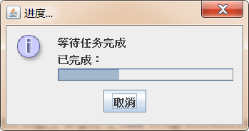
Demo code:
import javax.swing.*;import java.awt.event.ActionEvent;import java.awt.event.ActionListener;public class ProgressMonitorTest { Timer timer; public void init(){ final SimulatedActivity simulatedActivity = new SimulatedActivity(100); final Thread targetThread= new Thread(simulatedActivity); targetThread.start(); ProgressMonitor dialog = new ProgressMonitor(null, "Wait for the task to complete", "Completed:", 0, simulatedActivity.getAmount()); timer = new Timer(300, new ActionListener() { @Override public void actionPerformed(ActionEvent e) { dialog.setProgress(simulatedActivity.getCurrent()); if (dialog.isCanceled()){ timer.stop(); targetThread.interrupt(); System.exit(0); } } }); timer.start(); System.out.println("aaa"); } public static void main(String[] args) { new ProgressMonitorTest().init(); } //Define a thread task to simulate time-consuming operations private class SimulatedActivity implements Runnable {/ / visible memory private volatile int current = 0; private int amount; public simulatedactivity (int amount) {this. Amount = amount;} public int getcurrent() {return current;} public void setCurrent(int current) { this.current = current; } public int getAmount() { return amount; } public void setAmount(int amount) { this.amount = amount; } @Override public void run() {/ / continuously modify the value of current through the loop to simulate the task completion while (current < amount) {try {thread. Sleep (50);} catch (interruptedexception E) {e.printstacktrace();} current + +;}}}}}
3.5 list box implemented by JList and JComboBox
No matter from which point of view, JList and JComboBox are very similar. They both have a list box, but the list box of JComboBox needs to be pulled and displayed in the following way; Both JList and JComboBox can change the presentation of list items by calling the setRendererO method. Even the models that maintain the two components are similar. JList uses ListModel, JComboBox uses ComboBoxModel, and ComboBoxModel is a subclass of ListModel.
3.5.1 simple list box
Steps to implement a simple list box using JList or JComboBox:
- Create a JList or JComboBox object
JList(final E[] listData):establish JList Object, put listData Each item in the array is converted into a list item display JList(final Vector<? extends E> listData):establish JList Object, put listData Each item in the array is converted into a list item display JComboBox(E[] items):JComboBox(Vector<E> items):
- Set the appearance and behavior of JList or JComboBox
---------------------------JList----------------------------------------------addSelectionInterval(int anchor, int lead):Add the selected item based on the selected list item anchor reach lead All list items in the index range setFixedCellHeight(int height)/setFixedCellWidth(int width):Sets the height and width of the list item setLayoutOrientation(int layoutOrientation): Sets the layout direction of the list box setSelectedIndex(int index): Set default selection setSelectedIndices(int[] indices): Set multiple list items selected by default setSelectedValue(Object anObject,boolean shouldScroll): Set the default selected item and scroll to the item display setSelectionBackground(Color selectionBackground): Sets the background color of the selected item setSelectionForeground(Color selectionForeground): Sets the foreground color of the selected item setSelectionInterval(int anchor, int lead):Set from anchor reach lead All list items in the range are selected setSelectionMode(int selectionMode): Set the selection mode. There is no limit by default. It can also be set as single selection or regional selection setVisibleRowCount(int visibleRowCount): Set the height of the list box to show how many row and column table items---------------------------JComboBox---------------------------------------------- setEditable(boolean aFlag): Set whether the value of the list text box can be modified directly. The default value is No setMaximumRowCount(int count): Set the height of the list box to show how many row and column table items setSelectedIndex(int anIndex): Set default selection setSelectedItem(Object anObject): Set the default selected item according to the value of the list item
- Set the listener to listen to the changes of list items. JList is completed through addListSelectionListener and JComboBox is completed through addItemListener
Case:
Use JList and JComboBox to complete the following effect:
Demo code:
import javax.swing.*;import javax.swing.border.EtchedBorder;import javax.swing.border.TitledBorder;import javax.swing.event.ListSelectionEvent;import javax.swing.event.ListSelectionListener;import java.awt.*;import java.awt.event.ItemEvent;import java.awt.event.ItemListener;import java.util.List;import java.util.Vector;public class ListTest { JFrame mainWin = new JFrame("List box test"); String[] books = {"java Self study dictionary","Lightweight javaEE Enterprise application practice","Android Basic tutorial","jQuery Practical course","SpringBoot Enterprise development"}; //Create a JList object with a string array JList < string > booklist = new JList < > (Books); JComboBox<String> bookSelector; // Define the panel where the layout selection button is located. JPanel layoutpanel = new jpanel(); ButtonGroup layoutGroup = new ButtonGroup(); // Define the panel where the select mode button is located. JPanel selectmodepanel = new jpanel(); ButtonGroup selectModeGroup = new ButtonGroup(); JTextArea favorite = new JTextArea(4,40); Public void init() {/ / set the visual height of JList to display three list items at the same time. bookList.setVisibleRowCount(3); / / set JList to select the third to fifth items by default. Booklist.setselectioninterval (2,4); addlayoutbutton ("scroll vertically", JList. Vertical); addlayoutbutton ("wrap vertically", JList. Vertical_wrap) ; addlayoutbutton ("horizontal wrap", JList. Horizontal_wrap); addselectmodebutton ("unlimited", listselectionmodel. Multiple_interval_selection); addselectmodebutton ("single selection", listselectionmodel. Single_selection); addselectmodebutton ("single range", listselectionmodel. Single_interval_selection) ; box listbox = box. Createverticalbox(); / / place JList components in JScrollPane and JScrollPane in box listbox.add (New JScrollPane (Booklist)); listbox.add (layoutpanel); listbox.add (selectmodepanel); / / add event listener booklist.addlistselectionlistener to JList (new ListSelectionListener() { @Override public void valueChanged(ListSelectionEvent e) { List<String> selectedValuesList = bookList.getSelectedValuesList(); favorite.setText(""); for (String s : selectedValuesList) { favorite.append(s+"\n"); } }}); / / define a Vector object Vector < string > bookcollection = new Vector < > (); list < string > books = list. Of ("Java self-study classic", "lightweight javaEE enterprise application practice", "Android basic tutorial", "jQuery practice tutorial", "SpringBoot enterprise development"); bookCollection.addAll(books) ; / / create jcombobox object bookselector = new jcombobox < > (bookcollection); / / add event listener bookselector. Additemlistener (New itemlistener() {@ override public void itemstatechanged (itemevent E) {object selectedItem = bookselector. Getselecteditem()) ; favorite. Settext (selectedItem. Tostring());}}); / / set the list item editable bookSelector.setEditable(true) of jcombobox. / / set the visual height of the drop-down list to display up to 4 list items bookselector.setmaximumrowcount (4); JPanel panel = new jpanel(); panel.add (bookselector) ; box box = box. Createhorizontalbox(); box. Add (listbox); box. Add (panel); JPanel favoritepanel = new jpanel(); favoritepanel. Setlayout (New borderlayout()); favoritepanel. Add (New jscrollpanel (favorite)); favoritepanel. Add (New jlabel ("your favorite book:"), borderlayout. North); mainwin.add (box); mainwin. Add (favoritepanel, borderlayout. South); mainwin. Setdefaultcloseoperation (JFrame. Exit_on_close); mainwin. Pack(); mainwin. Setvisible (true);} public void addlayoutbutton (string label, int orientation) {layoutpanel. Setborder (New titledorder (New etchedorder(), "determine option layout")) ; JRadioButton button = new JRadioButton (label); layoutpanel. Add (button); / / the first button is selected by default if (layoutgroup. Getbuttoncount() = = 0) {button. Setselected (true);} layoutgroup. Add (button); button. Addactionlistener (E - > {/ / change the layout direction of the list items in the list box booklist. Setlayoutorientation (orientation);});} public void addselectmodebutton (string label, int selectmode) {selectmodepanel.setborder (New titledorder (New etchedorder(), "confirm selection mode"); JRadioButton button = new JRadioButton (label) ; selectModePanel.add(button); if (selectModeGroup.getButtonCount()==0){ button.setSelected(true); } selectModeGroup.add(button); button.addActionListener(e->{ bookList.setSelectionMode(selectMode); }); } public static void main(String[] args) { new ListTest().init(); } }
3.5.2 ListModel and ComboBoxModel of list items are not forced to be stored
Like JProgressBar, JList and JComboBox also adopt MVC design mode. JList and JComboBox are only responsible for appearance display, while the state data at the bottom of the component is maintained by the corresponding Model. The Model corresponding to JList is the ListModel interface, and the Model corresponding to JComboBox is the ComboBox interface. The code is as follows:
public interface ListModel<E>{ int getSize(); E getElementAt(int index); void addListDataListener(ListDataListener l); void removeListDataListener(ListDataListener l);}public interface ComboBoxModel<E> extends ListModel<E> { void setSelectedItem(Object anItem); Object getSelectedItem();}
From the above interface, this ListMode l does not even force the storage of all list items in JList regardless of the storage form of all list items. As long as the implementation class of ListModel provides getSize() and getElementAt() methods, JList can generate a list box according to the ListModel object. ComboBoxModel inherits the ListModel and adds "selection item" The selection item represents the list items visible in the display area of JComboBox.
When using JList and JComboBox, in addition to using the Model implementation classes provided by jdk, programmers can also define their own Model implementation classes and implement the corresponding methods according to their needs.
Case:
Customize NumberListModel and NumberComboBoxModel implementation classes, allowing the use of numeric ranges to create JList and JComboBox
Demo code:
import javax.swing.*;import java.math.BigDecimal;import java.math.RoundingMode;public class NumberListModel extends AbstractListModel<BigDecimal> { protected BigDecimal start; protected BigDecimal end; protected BigDecimal step; public NumberListModel(double start,double end,double step) { this.start = new BigDecimal(start); this.end = new BigDecimal(end); this.step = new BigDecimal(step); } @Override public int getSize() { int floor = (int) Math.floor(end.subtract(start).divide(step,2, RoundingMode.HALF_DOWN).doubleValue()); return floor+1; } @Override public BigDecimal getElementAt(int index) { return BigDecimal.valueOf(index).multiply(step).add(start).setScale(1,RoundingMode.HALF_DOWN); }}import javax.swing.*;import java.math.BigDecimal;import java.math.RoundingMode;public class NumberComboBoxModel extends NumberListModel implements ComboBoxModel<BigDecimal> { //Private int selectid = 0 is used to save the index of the item selected by the user; Public NumberComboBoxModel (double start, double end, double step) {super (start, end, step);} / / set the option @ override public void setselecteditem (object anitem) {if (anitem instanceof BigDecimal) {BigDecimal target = (BigDecimal) anitem; selectid = target.subtract (super. Start). Divide (super.step, 2, roundingmode. Half_down). Intvalue();}} / / get the index of the selected item @ override public BigDecimal getselecteditem() {return BigDecimal. Valueof (selectid). Multiply (step). Add (start). Setscale (1, roundingmode. Half_down);} }Import javax. Swing. *; import javax. Swing. Event. Listselectionevent; import javax. Swing. Event. Listselectionlistener; import Java. AWT. *; import Java. AWT. Event. Itemevent; import Java. AWT. Event. Itemlistener; import Java. Math. BigDecimal; import Java. Util. List; public class listmodeltest {JFrame mainwin = new JFrame ("test ListModel") ; / / create a JList based on the NumberListModel object JList < BigDecimal > numScopeList = new JList < > (New NumberListModel (1,21,2)); / / create a jcombobox based on the NumberComboBoxModel object jcombobox < BigDecimal > numscopeselector = new jcombobox < > (New NumberComboBoxModel (0.1,1.2,0.1)); jtextfield showval = new jtextfield (10) ; public void init() {/ / JList visual height can display four list items numScopeList.setVisibleRowCount(4); / / by default, the third to fifth items numScopeList.setSelectionInterval(2,4); / / set each list item to have the specified height and width numScopeList.setfixedcellheight (30) ; numScopeList. Setfixedcellwidth (90); / / add a listener for numScopeList numscopelist. Addlistselectionlistener (New listselectionlistener() {@ override public void valuechanged (listselectionevent E) {/ / get all the numbers selected by the user list < BigDecimal > selectedvalueslist = numScopeList. Getselectedvalueslist(); showval. Settext (""); for (BigDecimal: selectedvalueslist) {showval. Settext (showval. Gettext() + BigDecimal. Tostring() + ",");} }}); / / set the visual height of the drop-down list to display five list items numscopeselector. Setmaximumrowcount (5); box = box. Createhorizontalbox(); box. Add (New JScrollPane (numScopeList)); JPanel P = new jpanel(); p.add (numscopeselector); box. Add (P) ; / / add listener numscopeselector.additemlistener (New itemlistener() {@ override public void itemstatechanged (itemevent E) {object value = numscopeselector. Getselecteditem(); showval. Settext (value. Tostring());}}) ; JPanel bottom = new jpanel(); bottom. Add (New jlabel ("the value you select is:"); bottom. Add (showval); mainwin. Add (box); mainwin. Add (bottom, borderlayout. South); mainwin. Setdefaultcloseoperation (JFrame. Exit_on_close); mainwin. Pack(); mainwin. Setvisible (true);} public static void main (String[] args) { new ListModelTest().init(); }}
3.5.3 forced storage of DefaultListModel and defaultcomboxmodel of list items
The previous section just introduced how to create JList and JComboBox objects. When calling JList and JComboBox construction methods, pass in array or Vector as parameters, and these array elements or collection elements will be used as list items. When using JList or JComboBox, you often need to dynamically add and delete list items. For example, JCombox provides the following methods to complete the addition and deletion operations:
addItem(E item):Add a list item insertItemAt(E item, int index): Inserts a list item at the specified index removeAllItems(): Delete all list items removeItem(Object anObject): Deletes the specified list item removeItemAt(int anIndex): Deletes the list item at the specified index
JList does not provide these similar methods. If you need to create a JList object that can add and delete list items, you should explicitly use DefaultListModel as the construction parameter when creating JLi st. because DefaultListModel is the Model of JList and it is responsible for maintaining all list data of JList components, you can add it to DefaultListModel Add and delete elements to add and delete list items to JList objects. DefaultListModel provides the following methods to add and delete elements:
add(int index, E element): In this ListModel Inserts the specified element at the specified location. addElement(E obj): Adds the specified element to the ListModel End of. insertElementAt(E obj, int index): In this ListModel Inserts the specified element at the specified location. Object remove(int index): Delete the ListModel Middle refers to the element at the location removeAllElements(): Delete the ListModel And set its size to zero. removeElement(E obj): Delete the ListModel The first element in the that matches the parameter. removeElementAt(int index): Delete the ListModel The element at the specified index in. removeRange(int Enterprise omIndex , int toIndex): Delete the ListModel All elements within the specified range in. set(int index, E element) : Will this ListModel Replace the element at the specified index with the specified element. setElementAt(E obj, int index): Will this ListModel Replace the element at the specified index with the specified element.
Case:
Use DefaultListModel to complete the following effect:
Demo code:
import javax.swing.*;import java.awt.*;import java.awt.event.ActionEvent;import java.awt.event.ActionListener;public class DefaultListModelTest { JFrame mainWin = new JFrame("test DefaultListModel"); //Define a JList object JList < string > booklist// Define a DefaultListModel object DefaultListModel < string > bookModel = new DefaultListModel < > (); JTextField bookName = new JTextField(20); JButton removebtn = new JButton ("delete selected books"); JButton addBtn = new JButton("add specified book"); public void init() {/ / add the elements bookModel.addElement("java self-study dictionary"); bookModel.addElement("lightweight javaEE enterprise application practice"); bookModel.addElement("Android basic tutorial"); bookModel.addElement("jQuery practice tutorial"); bookModel.addElement("SpringBoot enterprise development") ; / / create a JList object according to the DefaultListModel. Booklist = new JList < > (bookModel); / / set the maximum visual height bookList.setVisibleRowCount(4); / / set that only bookList.setSelectionMode(ListSelectionModel.SINGLE_SELECTION) can be selected; / / add an event listener addbtn.addactionlistener for addbtn (New actionlistener() {@ override public void actionperformed (ActionEvent E) {/ / add a list item if (! Bookname. Gettext(). Trim(). Equals ("") {bookModel. Addelement (bookname. Gettext());}}}) ; / / add an event listener for removebtn. Addactionlistener (New actionlistener() {@ override public void actionperformed (ActionEvent E) {int selectedindex = booklist. Getselectedindex(); if (selectedindex > = 0) {bookModel. Remove (selectedindex);} } }); JPanel p = new JPanel(); p.add(bookName); p.add(addBtn); p.add(removeBtn); mainWin.add(new JScrollPane(bookList)); mainWin.add(p, BorderLayout.SOUTH); mainWin.setDefaultCloseOperation(JFrame.EXIT_ON_CLOSE); mainWin.pack(); mainWin.setVisible(true); } public static void main(String[] args) { new DefaultListModelTest().init(); }}
3.5.4 using ListCellRenderer to change the appearance of the list
JList and JComboBox in the previous program adopt simple string list items. In fact, JList and JComboBox can also support icon list items. If the icon array is passed in when creating JList or JComboBox, the list items of JList and JComboBox created are icons.
If you want a list item to be a more complex component, for example, if you want to have an icon for each list item like a QQ program, you need to use the implementation class object of the ListCellRenderer interface to customize the rendering process of each item component:
public interface ListCellRenderer<E>{ Component getListCellRendererComponent( JList<? extends E> list,//List component E value, / / the value index of the current list item int index, / / the current list item D Boolean isselected, / / whether the current list item is selected (boolean cellHasFocus)// Does the current list item get focus}
Through the setcellrenderer (ListCellRenderer <? Super E > cellrenderer) method of JList, the user-defined ListCellRenderer object is passed to JList, and the list item components can be drawn according to the user-defined rules.
Case:
Use ListCellRenderer to achieve the following effect:
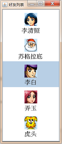
Demo code:
import cn.itcast.swing.util.ImagePathUtil;

import javax.swing.*;
import java.awt.*;

public class ListCellRendererTest {

    private JFrame mainWin = new JFrame("Friends list");

    private String[] friends = {
            "Li Qingzhao",
            "Socrates",
            "Li Bai",
            "Nongyu",
            "Tiger head"
    };

    //Define a JList object
    JList friendsList = new JList(friends);

    public void init() {
        //Set JList to use ImageCellRenderer as the list item renderer
        friendsList.setCellRenderer(new ImageCellRenderer());

        mainWin.add(new JScrollPane(friendsList));
        mainWin.setDefaultCloseOperation(JFrame.EXIT_ON_CLOSE);
        mainWin.pack();
        mainWin.setVisible(true);

    }


    public static void main(String[] args) {
        new ListCellRendererTest().init();
    }

    class ImageCellRenderer extends JPanel implements ListCellRenderer {


        private ImageIcon icon;
        private String name;
        //Defines the background color for drawing cells
        private Color background;
        //Defines the foreground color of the drawing cell
        private Color foreground;


        @Override
        public Component getListCellRendererComponent(JList list, Object value, int index, boolean isSelected, boolean cellHasFocus) {

            icon = new ImageIcon(ImagePathUtil.getRealPath("9\\" + value + ".gif"));
            name = value.toString();
            background = isSelected ? list.getSelectionBackground() : list.getBackground();
            foreground = isSelected ? list.getSelectionForeground() : list.getForeground();

            //Returns the current JPanel object as the list item renderer
            return this;
        }

        @Override
        protected void paintComponent(Graphics g) {
            int width = icon.getImage().getWidth(null);
            int height = icon.getImage().getHeight(null);

            //Fill background rectangle
            g.setColor(background);
            g.fillRect(0,0,getWidth(),getHeight());

            g.setColor(foreground);
            //Draw friends' avatars
            g.drawImage(icon.getImage(),getWidth()/2-width/2,10,null);

            //Draw friend nicknames
            g.setFont(new Font("SansSerif",Font.BOLD,18));
            g.drawString(name,getWidth()/2-name.length()*10,height+30);
        }


        @Override
        public Dimension getPreferredSize() {
            return new Dimension(60,80);
        }
    }
}
3.6 JTree and TreeModel implementation tree
The tree is also a GUI component widely used in the graphical user interface. For example, when using Windows Explorer, you will see the directory tree as shown in the following figure:
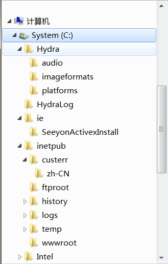
The tree shown in the above figure represents the tree in the computer world, which is abstracted from the actual tree in nature. The tree in the computer world is composed of a series of nodes with strict parent-child relationship. Each node can be the child node of its upper level node or the parent node of its lower level node. Therefore, the same node can be either a parent node or a child node (similar to a person, he is both the father of his son and the son of his father).
According to whether a node contains child nodes or not, nodes can be divided into the following two categories:
Common node: a node containing child nodes;
Leaf node: a node without child nodes;
According to whether a node has a unique parent node, nodes can be divided into the following two categories:
Root node: a node without a parent node. In a computer, a tree can only have one root node
Normal node: a node with a unique parent node
Using Jtree, TreeModel and their related auxiliary classes in Swing, we can easily develop trees in the computer world.
3.6.1 create tree
Swing uses a JTree object to represent a tree. The nodes in the JTree tree can be identified by TreePath. This object encapsulates the current node and all its parent nodes.
When a node has child nodes, the node has two states:
Expanded status: when the parent node is in expanded status, its child nodes are visible;
Collapsed state: when the parent node is in collapsed state, its child nodes are invisible.
If a node is visible, its parent nodes (including direct and indirect parent nodes) must be in the expanded state. As long as any parent node is in the folded state, the node is invisible.
Common construction methods of JTree:
JTree(TreeModel newModel):Create using the specified data model JTree Object, which displays the root node by default. JTree(TreeNode root): use root Create as root node JTree Object, which displays the root node by default. JTree(TreeNode root, boolean asksAllowsChildren): use root Create as root node JTree Object, which displays the root node by default. asksAllowsChildren The parameter controls which node is a leaf node. If the parameter is true ,Only when the program uses setAllowsChildren(false)When explicitly setting a node that does not allow adding child nodes(You will not have child nodes in the future) ,This node will be deleted JTree As leaf node:If the parameter is false ,Then, as long as a node has no child nodes at that time(Whether or not you have child nodes in the future) ,This node will be deleted JTree As leaf nodes.
TreeNode inheritance system and usage:
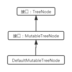
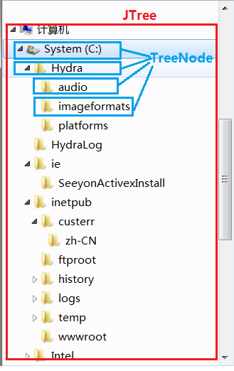
When building the directory tree, you can first create many DefaultMutableTreeNode objects, call their add method to build the child parent structure, and finally build a JTree according to the root node.
Case:
Use JTree and TreeNode to complete the following effect:
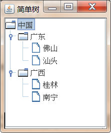
Demo code:
import javax.swing.*;import javax.swing.tree.DefaultMutableTreeNode;public class SimpleJTree { JFrame jf = new JFrame("Simple tree"); JTree tree; DefaultMutableTreeNode root; DefaultMutableTreeNode guangdong; DefaultMutableTreeNode guangxi; DefaultMutableTreeNode foshan; DefaultMutableTreeNode shantou; DefaultMutableTreeNode guilin; DefaultMutableTreeNode nanning; public void init(){ //Create all nodes in sequence, root = new DefaultMutableTreeNode("China"); guangdong = new DefaultMutableTreeNode("Guangdong"); guangxi = new DefaultMutableTreeNode("Guangxi"); foshan = new DefaultMutableTreeNode("Foshan"); shantou = new DefaultMutableTreeNode("Shantou"); guilin = new DefaultMutableTreeNode("Guilin"); nanning = new DefaultMutableTreeNode("Nanning")// Establish the parent-child hierarchical relationship through the add() method Guangdong. Add (Foshan); guangdong.add(shantou); guangxi.add(guilin); guangxi.add(nanning); root.add(guangdong); root.add(guangxi); // Create JTree tree = new JTree (root) according to the root node; jf.add(new JScrollPane(tree)); jf.setDefaultCloseOperation(JFrame.EXIT_ON_CLOSE); jf.pack(); jf.setVisible(true); } public static void main(String[] args) { new SimpleJTree().init(); }}
Other appearance setting methods of JTree:
tree.putClientProperty( "JTree.lineStyle", "None"):There is no connecting line between the setting nodes tree.putClientProperty("JTree.lineStyle" , "Horizontal"): Set that there are only horizontal split lines between nodes tree.setShowsRootHandles(true): Set the root node to have"Expand and collapse"Icon tree.setRootVisible(false): Hide root node
DefaultMutableTreeNode other member methods:
Enumeration breadthFirstEnumerationO/preorderEnumeration(): Traverse the subtree with this node as the root in breadth first order, and return the enumeration object composed of all nodes. Enumeration depthFirstEnumerationO/postorderEnumeration(): Traverse the subtree with this node as the root in the order of depth first, and return the enumeration object composed of all nodes. DefaultMutableTreeNode getNextSibling(): Returns the next sibling node of this node. TreeNode getParent(): Returns the parent node of this node. If this node has no parent node, return null . TreeNode[] getPath(): Returns an array of all nodes from the root node to this node. DefaultMutableTreeNode getPreviousSibling(): Returns the previous sibling node of this node. TreeNode getRoot(): Returns the root node of the tree containing this node. TreeNode getSharedAncestor(DefaultMutableTreeNode aNode): Return this node and aNode The nearest common ancestor. int getSiblingCount(): Returns the number of sibling nodes of this node. boolean isLeaf(): Returns whether the node is a leaf node. boolean isNodeAncestor(TreeNode anotherNode): judge anotherNode Is it the ancestor node of the current node(Include parent node) . boolean isNodeChild(TreeNode aNode): If aNode Is a child of this node, returns true. boolean isNodeDescendant(DefaultMutableTreeNode anotherNode): If anotherNode Is the descendant of this node, including the node itself, the child node of this node or the descendant of the child node of this node true . boolean isNodeRelated(DefaultMutableTreeNode aNode) : When aNode Returns when the node is in the same tree as the current node true . boolean isNodeSibling(TreeNode anotherNode): return anotherNode Whether it is the sibling node of the current node. boolean isRoot(): Returns whether the current node is the root node. Enumeration pathFromAncestorEnumeration(TreeNode ancestor): Returns the enumeration object composed of all nodes from the specified ancestor node to the current node.
3.6.2 dragging and editing tree nodes
The tree generated by JTree is not editable by default. Nodes cannot be added, deleted, or node data can not be changed: if you want to make a JTree object editable, you can call the setEditable(boolean b) method of JTree, and pass in true to turn the tree into an editable tree (nodes can be added, deleted, or node data can be changed).
To edit a tree node:
- Get the currently selected node:
There are two ways to get the currently selected node: I: adopt JTree Object, for example TreePath getSelectionPath()Wait, get one TreePath Object, including all nodes on the path from the root node to the current node; call TreePath Object Object getLastPathComponent()Method to get the currently selected node II: call JTree Object Object getLastSelectedPathComponent() Method to obtain the currently selected node
- Call a series of methods related to addition, deletion and modification of DefaultTreeModel data model to complete editing. After the method is executed, JTree will be redrawn automatically
Case:
Use JTree, DefaultTreeModel, DefaultMutableTreeNode and TreePath to complete the following effect:
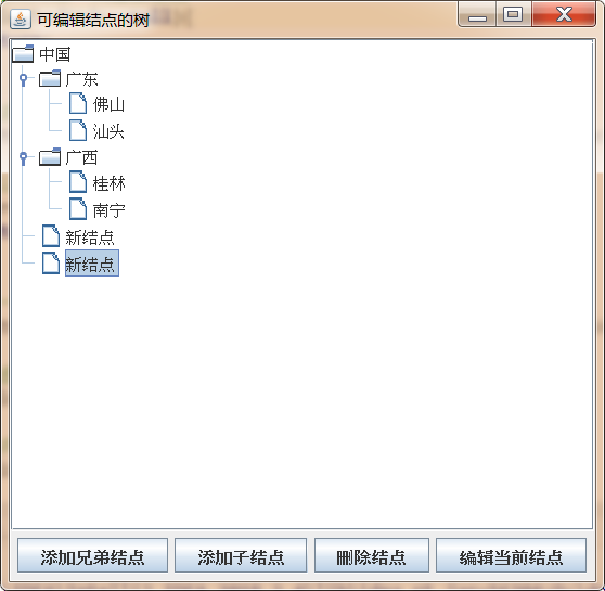
Demo code:
import javax.swing.*;import javax.swing.tree.*;import java.awt.*;import java.awt.event.MouseAdapter;import java.awt.event.MouseEvent;import java.awt.event.MouseListener;public class EditTree { JFrame jf ; JTree tree; //The data model object associated with JTree is DefaultTreeModel model// Define several initial nodes DefaultMutableTreeNode root = new DefaultMutableTreeNode("China"); DefaultMutableTreeNode guangdong = new DefaultMutableTreeNode("Guangdong"); DefaultMutableTreeNode guangxi = new DefaultMutableTreeNode("Guangxi"); DefaultMutableTreeNode foshan = new DefaultMutableTreeNode("Foshan"); DefaultMutableTreeNode shantou = new DefaultMutableTreeNode("Shantou"); DefaultMutableTreeNode guilin = new DefaultMutableTreeNode("Guilin"); DefaultMutableTreeNode nanning = new DefaultMutableTreeNode("Nanning")// Define the TreePath to be dragged TreePath movepath// Define the button and complete the operation JButton addSiblingBtn = new JButton("add sibling node"); JButton addChildBtn = new JButton("add child node"); JButton deleteBtn = new JButton("delete node"); JButton editBtn = new JButton("Edit current node"); public void init() {/ / establish a parent-child hierarchical relationship through the add() method Guangdong. Add (Foshan); Guangdong. Add (Shantou); Guangxi. Add (Guilin); Guangxi. Add (Nanning); root. Add (Guangdong); root. Add (Guangxi); JF = new JFrame ("tree of editable nodes"); tree = new JTree(root) ; / / get the data model associated with JTree. TreeModel object model = (DefaultTreeModel) tree.getModel(); / / set JTree editable tree.setEditable(true); / / create a mouse event listener MouseListener ml = new MouseAdapter() {/ / press the mouse button to obtain the dragged node @ override public void mousePressed (mouseevent E) {/ / if you need to uniquely determine a node, you must obtain TreePath through TreePath TP = tree.getpathforlocation (e.getx(), e.gety()); if (TP! = null) {movepath = TP;}} / / loosening the tree indicates that the parent node @ override public void mousereleased (mouseevent E) {TreePath TP = tree.getpathforlocation (e.getx(), e.gety()); if (TP! = null & & movepath! = null) {/ / prevent dragging if (movepath. Isdecedent (TP) & & movepath! = TP) {joptionpane.showmessagedialog (JF, "the target node is the child node of the moved node and cannot be moved!", "illegal move", JOptionPane.WARNING_MESSAGE);} //It is not moving to the child node, and pressing and releasing the mouse is not the same node. If (movepath! = TP) {/ / add method deletes the node from the original parent node, and then adds the node to the new node defaultmutabletreenode startparentnode= (DefaultMutableTreeNode) tp.getLastPathComponent(); DefaultMutableTreeNode moveNode = (DefaultMutableTreeNode) movePath.getLastPathComponent(); tartParentNode.add(moveNode); movePath=null; tree.updateUI(); } } } }; / / add a mouse listener tree. AddMouseListener (ML); JPanel panel = new jpanel(); addsiblingbtn. Addactionlistener (E - > {/ / get the selected node defaultmutabletreenode selectednode = (defaultmutabletreenode) tree. Getlastselectedpathcomponent() ; / / if the node is empty, directly return if (selectednode = = null) {return;} / / get the parent node of the selected node DefaultMutableTreeNode parent = (DefaultMutableTreeNode) selectedNode.getParent(); / / if the parent node is empty, directly return if (parent = = null) {return;} / / create a new node DefaultMutableTreeNode newNode = new DefaultMutableTreeNode("new node"); / / obtain the index of the selected node int selectedIndex = parent.getIndex(selectedNode); / / insert the new node model.insertnodeinto at the selected position (newnode, parent, selectedindex); / / ------------ display new node -------------- / / get all nodes from the root node to the new node TreeNode[] pathToRoot = model.getPathToRoot(newNode); / / create TreePath treepath = new TreePath (pathtoroot) using the specified node array ; / / display the specified TreePath tree. Scrollpathtovisible (TreePath);}); panel. Add (addsiblingbtn); addchildbtn. Addactionlistener (E - > {/ / get the selected node defaultmutabletreenode selectednode = (defaultmutabletreenode) tree. Getlastselectedpathcomponent(); if (selectednode = = null) {return;} / / create a new node DefaultMutableTreeNode newNode = new DefaultMutableTreeNode("new node"); / / model.insertNodeInto(newNode,selectedNode,selectedNode.getChildCount()); add using the TreeModel method without manually refreshing the UI selectednode.add (newnode); / / add by using the TreeNode method. You need to refresh the UI manually. / / a new node is displayed. TreeNode[] pathToRoot = model.getPathToRoot(newNode); TreePath treepath = new TreePath (pathtoroot); tree.scrollpathtovisible (TreePath); / / manually brush the UI tree. Updateui();}); panel.add (addChildBtn); deleteBtn.addActionListener(e -> { DefaultMutableTreeNode selectedNode = (DefaultMutableTreeNode) tree.getLastSelectedPathComponent(); if (selectedNode!=null && selectedNode.getParent()!=null){ model.removeNodeFromParent(selectedNode); } }); panel.add(deleteBtn) ; / / implement the listener editbtn. Addactionlistener (E - > {TreePath selectionpath = tree. Getselectionpath(); if (selectionpath! = null) {/ / edit the selected node tree. Starteditingatpath (selectionpath);}}); panel. Add (editbtn); JF. Add (new JScrollPane(tree)); jf.add(panel, BorderLayout.SOUTH); jf.setDefaultCloseOperation(JFrame.EXIT_ON_CLOSE); jf.pack(); jf.setVisible(true); } public static void main(String[] args) { new EditTree().init(); }}
3.6.3 listening for node events
Modify the selection mode of JTree:
JTree specifically provides a TreeSelectionModel object to save the information of the selected state of the JTree. That is, two model objects are hidden behind the JTree component. TreeModel is used to save all node data of the JTree, and TreeSelectionModel is used to save all selected state information of the JTree.
The program can change the selection mode of JTree, but it must first obtain the TreeSelectionMode1 object corresponding to the JTree, and then call the setSelectionMode(int mode) of the object; Method to set the selection mode of the JTree, where the model can have the following three values:
- TreeSelectionModel.CONTIGUOUS_TREE_SELECTION: multiple treepaths can be selected consecutively.
- TreeSelectionModel.DISCONTIGUOUS_TREE_SELECTION: this option has no restrictions on selection.
- TreeSelectionModel.SINGLE_TREE_SELECTION: only one TreePath can be selected at a time.
Add listeners to JTree:
- addTreeExpansionListener(TreeExpansionListener tel): adds a listener for tree node expansion / collapse events.
- Addtreeselectionlister (treeselectionlister TSL): adds a listener for tree node selection events.
Case:
Achieve the following effect:
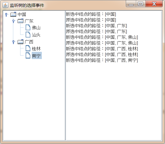
Demo code:
import javax.swing.*;import javax.swing.tree.DefaultMutableTreeNode;public class SelectJTree { JFrame jf = new JFrame("Listen for tree selection events"); JTree tree; DefaultMutableTreeNode root = new DefaultMutableTreeNode("China"); DefaultMutableTreeNode guangdong = new DefaultMutableTreeNode("Guangdong"); DefaultMutableTreeNode guangxi = new DefaultMutableTreeNode("Guangxi"); DefaultMutableTreeNode foshan = new DefaultMutableTreeNode("Foshan"); DefaultMutableTreeNode shantou = new DefaultMutableTreeNode("Shantou"); DefaultMutableTreeNode guilin = new DefaultMutableTreeNode("Guilin"); DefaultMutableTreeNode nanning = new DefaultMutableTreeNode("Nanning"); JTextArea eventTxt = new JTextArea(5, 20); public void init() { //Establish the parent-child hierarchical relationship through the add() method Guangdong. Add (Foshan); guangdong.add(shantou); guangxi.add(guilin); guangxi.add(nanning); root.add(guangdong); root.add(guangxi); tree = new JTree(root); // Add listener tree. Addtreeselectionlistener (E - > {if (e.getoldleadselectionpath()! = null) {eventtxt. Append ("path of original selected node:" + e.getoldleadselectionpath(). Tostring() + "\ n");} eventtxt. Append ("path of newly selected node:" + e.getnewleadselectionpath(). Tostring() + "\ n");}) ; tree.setShowsRootHandles(true); tree.setRootVisible(true); Box box = Box.createHorizontalBox(); box.add(new JScrollPane(tree)); box.add(new JScrollPane(eventTxt)); jf.add(box); jf.pack(); jf.setDefaultCloseOperation(JFrame.EXIT_ON_CLOSE); jf.setVisible(true); } public static void main(String[] args) { new SelectJTree().init(); }}
3.6.4 use DefaultTreeCellRenderer to change the appearance of nodes
The default appearance of JTree is relatively single. It provides the following ways to change the appearance of nodes:
- Use DefaultTreeCellRenderer to directly change the appearance of nodes. In this way, you can change the font, color and icon of all nodes in the whole tree.
- Specify the extension class object of DefaultTreeCellRenderer for JTree as the node renderer of JTree, which is responsible for using different fonts, colors and icons for different nodes. This is usually used to change the appearance of nodes.
- Specify a node renderer for JTree that implements the TreeCellRenderer interface. This renderer can freely draw any content for different nodes, which is the most complex but flexible node renderer.
The first method is the simplest, but the least flexible, because it will change the appearance of all nodes of the whole tree. In this case, all nodes in Jtree still use the same icon, which is equivalent to replacing all default icons of nodes in Jtree as a whole. The node icon specified by the user may not be more beautiful than the Jtree default icon.
DefaultTreeCellRenderer provides the following methods to modify the appearance of nodes:
setBackgroundNonSelectionColor(Color newColor): Sets the background color for non selected nodes. setBackgroundSelectionColor(Color newColor): Sets the background color of the node when it is selected. setBorderSelectionColor(Color newColor): Sets the border color of the selected node. setClosedIcon(Icon newIcon): Sets the icon of a non leaf node in the collapsed state. setFont(Font font) : Sets the font of the node text. setLeaflcon(Icon newIcon): Sets the icon for the leaf node. setOpenlcon(Icon newlcon): Sets the icon of a non leaf node in the expanded state. setTextNonSelectionColor(Color newColor): Sets the color of node text when it is not selected. setTextSelectionColor(Color newColor): Set the color for drawing node text in the selected state.
Case:
Use DefaultTreeCellRenderer to complete the following effect:
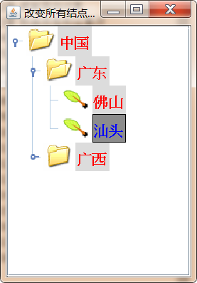
Demo code:
import cn.itcast.swing.util.ImagePathUtil;import javax.swing.*;import javax.swing.tree.DefaultMutableTreeNode;import javax.swing.tree.DefaultTreeCellRenderer;import java.awt.*;public class ChangeAllCellRender { JFrame jf = new JFrame("Change the appearance of all nodes"); JTree tree; DefaultMutableTreeNode root = new DefaultMutableTreeNode("China"); DefaultMutableTreeNode guangdong = new DefaultMutableTreeNode("Guangdong"); DefaultMutableTreeNode guangxi = new DefaultMutableTreeNode("Guangxi"); DefaultMutableTreeNode foshan = new DefaultMutableTreeNode("Foshan"); DefaultMutableTreeNode shantou = new DefaultMutableTreeNode("Shantou"); DefaultMutableTreeNode guilin = new DefaultMutableTreeNode("Guilin"); DefaultMutableTreeNode nanning = new DefaultMutableTreeNode("Nanning"); public void init(){ //Establish the parent-child hierarchical relationship through the add() method Guangdong. Add (Foshan); guangdong.add(shantou); guangxi.add(guilin); guangxi.add(nanning); root.add(guangdong); root.add(guangxi); tree = new JTree(root); // Create a DefaultTreeCellRenderer object. DefaultTreeCellRenderer cellRenderer = new DefaultTreeCellRenderer()// Set the background color of non selected nodes cellrenderer.setbackgroundnonselectioncolor (new color (220))// Set the background color of the selected node cellrenderer.setbackgroundselectioncolor (new color (140140))// Set the border color of the selected node cellRenderer.setBorderSelectionColor(Color.BLACK)// Set the icon cellRenderer.setClosedIcon(new ImageIcon(ImagePathUtil.getRealPath("10\close.gif")) of the non leaf node in the collapsed state// Set the font of node text cellRenderer.setFont(new Font("SansSerif",Font.BOLD,16))// Set the leaf node icon cellRenderer.setLeafIcon(new ImageIcon(ImagePathUtil.getRealPath("10\leaf.png"))// Set the non leaf node icon in the expanded state to run cellRenderer.setOpenIcon(new ImageIcon(ImagePathUtil.getRealPath("10\open.gif"))// Set the node text color cellRenderer.setTextNonSelectionColor(new Color(255,0,0))// Set the text color of the selected node cellrenderer.settextselectioncolor (new color (0,0255)); tree.setCellRenderer(cellRenderer); tree.setShowsRootHandles(true); tree.setRootVisible(true); jf.add(new JScrollPane(tree)); jf.pack(); jf.setDefaultCloseOperation(JFrame.EXIT_ON_CLOSE); jf.setVisible(true); } public static void main(String[] args) { new ChangeAllCellRender().init(); }}
3.6.5 extend DefaultTreeCellRenderer to change node appearance
The DefaultTreeCellRenderer implementation class implements the TreeCellRenderer interface, which has only one method for drawing node content: gettreecellrendercomponent(), which is responsible for drawing JTree nodes. When learning JList, if you want to draw the appearance of list items of JList, you need to implement the ListCellRenderer interface and return a Component object by overriding the gettreecellrendercomponent() method, which is the node Component of JTree. The two are very similar
Defaulttreecellrender RER class inherits JLabel. When implementing gettreecellrendercomponent() method, it returns this, that is, a special JLabel object. If you need to change the appearance of a node according to its content, you can extend the DefaultTreeCellRenderer class again and override the gettreecellrendercomponent () method it provides again.
Case:
The custom class inherits DefaultTreeCellRenderer and overrides gettreecellrendercomponent() method to achieve the following effect:
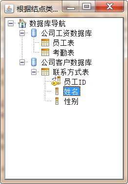
Demo code:
import cn.itcast.swing.util.ImagePathUtil;import javax.swing.*;import javax.swing.tree.DefaultMutableTreeNode;import javax.swing.tree.DefaultTreeCellRenderer;import java.awt.*;public class ExtendsDefaultCellTreeRenderer { JFrame jf = new JFrame("Define icons according to node type"); JTree tree; //Define several initial nodes DefaultMutableTreeNode root = new DefaultMutableTreeNode(new NodeData(DBObjectType.ROOT, "database navigation"); DefaultMutableTreeNode salaryDb = new DefaultMutableTreeNode(new NodeData(DBObjectType.DATABASE, "company salary database"); DefaultMutableTreeNode customerDb = new DefaultMutableTreeNode(new NodeData(DBObjectType.DATABASE, "company customer database"); DefaultMutableTreeNode employee = new DefaultMutableTreeNode(new NodeData(DBObjectType.TABLE, "employee table"); Defaultmutabletreenode append = new defaultmutabletreenode (New NodeData (dbobjecttype. Table, "attendance table"); DefaultMutableTreeNode concat = new DefaultMutableTreeNode(new NodeData(DBObjectType.TABLE, "contact information table"); DefaultMutableTreeNode id = new DefaultMutableTreeNode(new NodeData(DBObjectType.INDEX, "employee ID"); Defaultmutabletreenode name = new defaultmutabletreenode (New NodeData (dbobjecttype. Column, "name"); DefaultMutableTreeNode gender = new DefaultMutableTreeNode(new NodeData(DBObjectType.COLUMN, "gender"); public void init() {/ / establish the parent-child relationship of the node through the add method of the node. Root.add (salarydb); root.add (customerdb); salarydb.add (employee); salarydb.add (append); customerdb.add (concat); concat.add (ID); concat.add (name); concat.add (gender); tree = New JTree (root) ; tree.setcellrenderer (New myrenderer()); tree.setshowsroot handles (true); tree.setrootvisible (true); / / set the windows appearance style try {uimanager.setlookandfeel ("com. Sun. Java. Swing. Plaf. Windows. Windowslookandfeel");} catch (exception E) {e.printstacktrace();} //Update the UI appearance of JTree swingutilities.updatecomponenttreeui (tree); JF. Add (New JScrollPane (tree)); JF. Pack(); JF. Setdefaultcloseoperation (JFrame. Exit_on_close); JF. Setvisible (true);} public static void main (string [] args) {new extendsdefaultcelltreerer(). Init();} Class myrenderer extensions defaulttreecellrenderer {/ / initialize 5 icons imageicon rooticon = new imageicon (imagepathutil. Getrealpath ("10 \ \ root. GIF"); imageicon databaseicon = new imageicon (imagepathutil. Getrealpath ("10 \ \ database. GIF"); imageicon tableicon = new imageicon (imagepathutil. Getrealpath ("10 \ \ table. GIF")) ; ImageIcon columnIcon = new ImageIcon(ImagePathUtil.getRealPath("10\column.gif")); ImageIcon indexIcon = new ImageIcon(ImagePathUtil.getRealPath("10\index.gif")); @Override public Component getTreeCellRendererComponent(JTree tree, Object value, boolean sel, boolean expanded, boolean leaf, int row, boolean hasFocus) {/ / execute the parent class's default node drawing operation super.gettreecellrendercomponent (tree, value, SEL, expanded, leaf, row, hasfocus); defaultmutabletreenode node = (defaultmutabletreenode) value; NodeData data = (NodeData) node. Getuserobject() ; / / determine the node icon imageicon icon = null according to the nodeType in the node data; switch (data. NodeType) { case DBObjectType.ROOT: icon = rootIcon; break; case DBObjectType.DATABASE: icon = databaseIcon; break; case DBObjectType.TABLE: icon = tableIcon; break; case DBObjectType.C Olumn: icon = columnicon; break; case dbobjecttype. Index: icon = indexicon; break;} / / change the icon this.seticon (icon); return this;}} //Define a NodeData class to encapsulate node data class NodeData {public int nodeType; public string NodeData; public NodeData (int nodeType, string NodeData) {this.nodetype = nodeType; this.NodeData = NodeData;} @ override public string tostring() {return this. NodeData;}} / / define an interface that contains the constant interface dbobjecttype {int root = 0; int database = 1; int table = 2; int column = 3; int index = 4;}}
3.6.6 implement TreeCellRenderer interface to change node appearance
This method of changing the appearance of nodes is the most flexible. When the program implements the TreeCellRenderer interface, it also needs to implement the gettreecellrendercomponent() method, which can return any type of component, which will be used as the node of JTree. In this way, the appearance of nodes can be changed to the greatest extent.
Case:
The custom class inherits the JPanel class, implements the TreeCellRenderer interface, and completes the following effect:
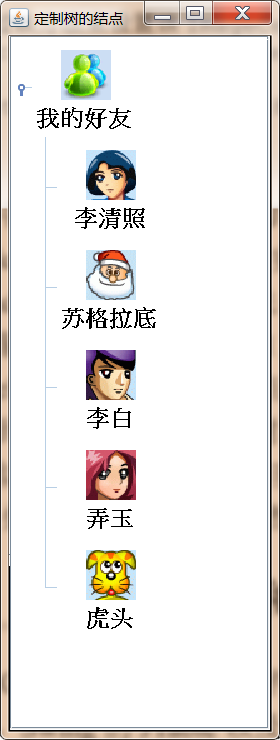
Demo code:
import cn.itcast.swing.util.ImagePathUtil;

import javax.swing.*;
import javax.swing.tree.DefaultMutableTreeNode;
import javax.swing.tree.TreeCellRenderer;
import java.awt.*;

public class CustomerTreeNode {

    JFrame jf = new JFrame("Custom tree nodes");

    JTree tree;

    //Define several initial nodes

    DefaultMutableTreeNode friends = new DefaultMutableTreeNode("My friend");
    DefaultMutableTreeNode qingzhao = new DefaultMutableTreeNode("Li Qingzhao");
    DefaultMutableTreeNode suge = new DefaultMutableTreeNode("Socrates");
    DefaultMutableTreeNode libai = new DefaultMutableTreeNode("Li Bai");
    DefaultMutableTreeNode nongyu = new DefaultMutableTreeNode("Nongyu");
    DefaultMutableTreeNode hutou = new DefaultMutableTreeNode("Tiger head");

    public void init() {

        friends.add(qingzhao);
        friends.add(suge);
        friends.add(libai);
        friends.add(nongyu);
        friends.add(hutou);

        tree = new JTree(friends);

        tree.setShowsRootHandles(true);
        tree.setRootVisible(true);


        tree.setCellRenderer(new ImageCellRenderer());


        jf.add(new JScrollPane(tree));
        jf.pack();
        jf.setDefaultCloseOperation(JFrame.EXIT_ON_CLOSE);
        jf.setVisible(true);

    }

    public static void main(String[] args) {
        new CustomerTreeNode().init();
    }


    class ImageCellRenderer extends JPanel implements TreeCellRenderer {

        private ImageIcon icon;
        private String name;
        //Defines the background color when drawing cells
        private Color background;
        //Defines the foreground color when drawing cells
        private Color foreground;


        @Override
        public Component getTreeCellRendererComponent(JTree tree, Object value, boolean selected, boolean expanded, boolean leaf, int row, boolean hasFocus) {
            icon = new ImageIcon(ImagePathUtil.getRealPath("10\\" + value + ".gif"));

            name = value.toString();

            background = hasFocus ? new Color(140, 200, 235) : new Color(255, 255, 255);
            foreground = hasFocus ? new Color(255,255,3) : new Color(0,0,0);
            //Returns the current JPanel as the node
            return this;
        }

        //Rewrite paintComponent to change the appearance of JPanel

        @Override
        protected void paintComponent(Graphics g) {
            int imageWidth = icon.getImage().getWidth(null);
            int imageHeight = icon.getImage().getHeight(null);
            g.setColor(background);
            g.fillRect(0,0,getWidth(),getHeight());

            g.setColor(foreground);
            //Draw friends Icon
            g.drawImage(icon.getImage(),getWidth()/2-imageWidth/2,10,null);

            //Draw friend name
            g.setFont(new Font("SansSerif",Font.BOLD,18));

            g.drawString(name,getWidth()/2-name.length()*10,imageHeight+30);

        }


        //Set the optimal size of the current component node
        @Override
        public Dimension getPreferredSize() {
            return new Dimension(80,80);
        }
    }
}
3.7 JTable and TableModel implementation table
Table is also a common component in GUI program. Table is a two-dimensional display area composed of multiple rows and columns. Swing's JTable and related classes provide this kind of table support. By using JTable and related classes, the program can not only create a table with simple code to display two-dimensional data, but also develop a table with rich functions, but also customize various display appearance and editing features for the table.
3.7.1 create a simple table
To create a simple table using JTable:
- Create a one-dimensional array to store the title of each column in the table
- Create a two-dimensional array to store each row of data in the table. Each one-dimensional array in the two-dimensional array represents a row of data in the table
- Create a JTable object according to the one-dimensional array and two-dimensional array created in step 1 and step 2
- Add JTable to other containers for display
Case:
Use JTable to achieve the following effect:
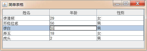
Demo code:
import javax.swing.*;

public class SimpleTable {

    JFrame jf = new JFrame("Simple table");

    JTable table;

    //Define a two-dimensional array as table data

    Object[][] tableData = {

            new Object[]{"Li Qingzhao",29,"female"},
            new Object[]{"Socrates",56,"male"},
            new Object[]{"Li Bai",35,"male"},
            new Object[]{"Nongyu",18,"female"},
            new Object[]{"Tiger head",2,"male"},

    };

    //Define a one-dimensional array as the column header
    Object[] columnTitle = {"full name","Age","Gender"};

    public void init(){
        //Create a JTable object with a two-dimensional array and a one-dimensional array

        table = new JTable(tableData,columnTitle);

        jf.add(new JScrollPane(table));
        jf.setDefaultCloseOperation(JFrame.EXIT_ON_CLOSE);
        jf.pack();
        jf.setVisible(true);
    }

    public static void main(String[] args) {
        new SimpleTable().init();
    }
}
The simple table implemented above has the following functions:
- When the table is not high enough to display all data rows, the table will automatically display a scroll bar.
- When you move the mouse to the delimiter between two columns, the mouse shape will become a resizable shape, indicating that users can freely adjust the size of table columns.
- When you press and drag on a table column, you can drag the entire column of the table to another location.
- When you click a cell, the system will automatically select the row where the cell is located.
- When you double-click a cell, the system will automatically enter the modification status of the cell.
JTable adjustment column:
JTable provides a setAutoResizeMode(int mode) method to adjust the format of the table. This method can receive the following values:
- JTable.AUTO_RESIZE_OFF: turn off the automatic adjustment function of the table. When the width of a column is adjusted, the width of other columns will not change;
- JTable.AUTO_RESIZE_NEXT_COLUMN: only adjust the width of the next column, and the width of other columns and tables will not change;
- JTable.AUTO_RESIZE_SUBSEQUENT_COLUMNS: average adjust the width of all columns behind the front row. The width of all columns and tables in front of the current column will not change. This is the default adjustment method
- JTable.AUTO_RESIZE_LAST_COLUMN: only the width of the last column is adjusted, and the width of other columns and tables will not change;
- JTable.AUTO_RESIZE_ALL_COLUMNS: average the width of all columns in the table, and the width of the table will not change
If you need to precisely control the width of each column, you can implement it through the TableColumn object. JTable uses TableColumn to represent each column in the table. All attributes of table columns in JTable, such as optimal width, adjustable width, minimum and maximum width, are saved in this TableColumn. In addition, TableColumn allows you to specify a specific cell plotter and cell editor for the column (which will be explained later). TableColumn has the following methods.
- setMaxWidth(int maxWidth): sets the maximum width of the column. If the specified maxWidth is less than the minimum width of the column, maxWidth is set to the minimum width.
- setMinWidth(int minWidth): sets the minimum width of the column.
- setPreferredWidth(int preferredWidth): sets the optimal width of the column.
- setResizable(boolean isResizable): sets whether the width of the column can be adjusted.
- sizeWidthToFit(): adjusts the width of the column to fit the width of its header cell.
JTable adjustment selection mode:
- Select row: the default selection method of JTable is to select rows. You can also call setRowSelectionAllowed(boolean rowSelectionAllowed) to modify it;
- Select column: call setColumnSelectionAllowed(boolean columnSelectionAllowed) method to modify the current JTable selection mode to column;
- Select cell: setCellSelectionEnabled(boolean cellSelectionEnabled), modify the current JTable selection mode to cell;
JTable adjust table selection status:
Similar to JList and JTree, JTable uses a ListSelectionModel to represent the selection status of the table. The program can control the selection mode of JTable through ListSelectionModel. JTable can be selected in the following three modes:
-
ListSelectionMode.MULTIPLE_INTERVAL_SELECTION: there are no restrictions. You can select any table cell in the table. This is the default selection mode. Multiple table cells can be selected with the help of Shi negative and Ctrl auxiliary keys.
-
ListSelectionMode.SINGLE_INTERVAL_SELECTION: select a single continuous area. This option can select multiple table cells, but multiple table cells must be continuous. Use the Shift assist key to select contiguous areas.
-
ListSelectionMode.SINGLE_SELECTION: only a single table cell can be selected.
Case:
The width adjustment, mode adjustment and status adjustment realized by JTable achieve the following effect:
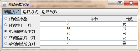
Demo code:
import javax.swing.*;
import javax.swing.table.TableColumn;

public class AdjustingWidth {

    JFrame jf = new JFrame("Adjust table width");

    JMenuBar menuBar = new JMenuBar();

    JMenu adjustModeMenu = new JMenu("arrange mode");
    JMenu selectUnitMenu = new JMenu("Select unit");
    JMenu selectModeMenu = new JMenu("Selection method");

    //Define 5 radio box buttons to control the width adjustment of the table
    JRadioButtonMenuItem[] adjustModeItem = new JRadioButtonMenuItem[5];

    //Define 3 radio box buttons to control the selection method of the table
    JRadioButtonMenuItem[] selectModeItem = new JRadioButtonMenuItem[3];

    //Define check menu items to control the selection unit
    JCheckBoxMenuItem rowsItem = new JCheckBoxMenuItem("Select row");
    JCheckBoxMenuItem columnItem = new JCheckBoxMenuItem("Select column");
    JCheckBoxMenuItem cellItem = new JCheckBoxMenuItem("Select cell");

    //Define button groups to realize radio selection
    ButtonGroup adjustBg = new ButtonGroup();
    ButtonGroup selectBg = new ButtonGroup();

    //Define an array of int type to save all width adjustment methods of the table

    int[] adjustModes = {
            JTable.AUTO_RESIZE_OFF,
            JTable.AUTO_RESIZE_NEXT_COLUMN,
            JTable.AUTO_RESIZE_SUBSEQUENT_COLUMNS,
            JTable.AUTO_RESIZE_LAST_COLUMN,
            JTable.AUTO_RESIZE_ALL_COLUMNS
    };


    //Define an int line array to save all the selection methods of the table
    int[] selectModes = {
            ListSelectionModel.MULTIPLE_INTERVAL_SELECTION,
            ListSelectionModel.SINGLE_INTERVAL_SELECTION,
            ListSelectionModel.SINGLE_SELECTION
    };

    //Declare JTable
    JTable table;

    //Define a two-dimensional array as table row data
    Object[][] tableData = {

            new Object[]{"Li Qingzhao",29,"female"},
            new Object[]{"Socrates",56,"male"},
            new Object[]{"Li Bai",35,"male"},
            new Object[]{"Nongyu",18,"female"},
            new Object[]{"Tiger head",2,"male"},

    };

    //Define a one-dimensional array as the column header
    Object[] columnTitle = {"full name","Age","Gender"};


    public void init(){

        //Create JTable object
        table  = new JTable(tableData,columnTitle);


        //-----------------Menu for setting table adjustment mode for window installation--------------------
        adjustModeItem[0] = new JRadioButtonMenuItem("Adjust table only");
        adjustModeItem[1] = new JRadioButtonMenuItem("Adjust next column only");
        adjustModeItem[2] = new JRadioButtonMenuItem("The average adjusted balance is as follows");
        adjustModeItem[3] = new JRadioButtonMenuItem("Adjust only the last column");
        adjustModeItem[4] = new JRadioButtonMenuItem("Average all columns");

        menuBar.add(adjustModeMenu);

        for (int i = 0; i < adjustModeItem.length; i++) {
            //The third menu item is selected by default, which corresponds to the default width adjustment method of the table
            if (i==2){
                adjustModeItem[i].setSelected(true);
            }
            adjustBg.add(adjustModeItem[i]);
            adjustModeMenu.add(adjustModeItem[i]);

            //Set up event listeners for menu items
            int index = i;
            adjustModeItem[i].addActionListener(e -> {
                if (adjustModeItem[index].isSelected()){
                    table.setAutoResizeMode(adjustModes[index]);
                }
            });
        }

        //---------------Menu for setting table selection for window installation-------------------
        selectModeItem[0] = new JRadioButtonMenuItem("unlimited");
        selectModeItem[1] = new JRadioButtonMenuItem("Separate continuous zone");
        selectModeItem[2] = new JRadioButtonMenuItem("Single choice");

        menuBar.add(selectModeMenu);

        for (int i = 0; i < selectModeItem.length; i++) {

            //The first menu item is selected by default, that is, the default selection method of the table
            if (i==0){
                selectModeItem[i].setSelected(true);
            }

            selectBg.add(selectModeItem[i]);
            selectModeMenu.add(selectModeItem[i]);


            int index = i;

            selectModeItem[i].addActionListener(e -> {

                if (selectModeItem[index].isSelected()){
                    table.getSelectionModel().setSelectionMode(selectModes[index]);
                }

            });

        }

        //---------------Add selection unit menu for window----------------------
        menuBar.add(selectUnitMenu);
        rowsItem.setSelected(table.getRowSelectionAllowed());
        columnItem.setSelected(table.getColumnSelectionAllowed());
        cellItem.setSelected(table.getCellSelectionEnabled());

        rowsItem.addActionListener(e -> {
            //Clear the selected status of the table
            table.clearSelection();
            //If the menu item is selected, the selection cell of the setting table is row
            table.setRowSelectionAllowed(rowsItem.isSelected());
            //If the selected row and column are selected at the same time, its essence is to select cells
            table.setCellSelectionEnabled(table.getCellSelectionEnabled());

        });

        selectUnitMenu.add(rowsItem);

        columnItem.addActionListener(e -> {
            //Clear the selected status of the table
            table.clearSelection();

            //If the menu item is selected, the selection cell of the setting table is column
            table.setColumnSelectionAllowed(columnItem.isSelected());
            ///If the selected row and column are selected at the same time, its essence is to select cells
            table.setCellSelectionEnabled(table.getCellSelectionEnabled());
        });

        selectUnitMenu.add(columnItem);

        cellItem.addActionListener(e -> {
            //Clear the selected status of the table
            table.clearSelection();

            //If the menu item is selected, set the selection cell of the table as cell
            table.setCellSelectionEnabled(cellItem.isSelected());
            ///The change of this option will affect the two menus of selecting row and column at the same time
            table.setRowSelectionAllowed(table.getRowSelectionAllowed());
            table.setColumnSelectionAllowed(table.getColumnSelectionAllowed());

        });

        selectUnitMenu.add(cellItem);

        jf.setJMenuBar(menuBar);

        //Obtain the three table columns of the table respectively, and set the minimum width, optimal width and maximum width of the three columns
        TableColumn nameColumn = table.getColumn(columnTitle[0]);
        nameColumn.setMinWidth(40);
        TableColumn ageColumn = table.getColumn(columnTitle[1]);
        ageColumn.setPreferredWidth(50);
        TableColumn genderColumn = table.getColumn(columnTitle[2]);
        genderColumn.setMaxWidth(50);

        jf.add(new JScrollPane(table));
        jf.pack();
        jf.setDefaultCloseOperation(JFrame.EXIT_ON_CLOSE);
        jf.setVisible(true);

    }

    public static void main(String[] args) {
        new AdjustingWidth().init();
    }

}
3.7.2 TableModel and listener
Similar to JList and JTree, JTable uses TableModel to save all status data in the table: similar to ListModel, TableModel does not force to save the data displayed in the table. Although what we saw in the previous program is to directly use a two-dimensional array to create JTable objects, you can also create tables through TableModel objects.
To use TableModel:
- The user-defined class inherits the AbstractTableModel abstract class and overrides the following methods:
int getColumnCount():Returns the number of table columns int getRowCount(): Returns the number of table rows Object getValueAt(int rowIndex, int columnIndex): return rowIndex that 's ok, column The value of the cell in the column String getColumnName(int columnIndex): return columnIndex Column name of the column boolean isCellEditable(int rowIndex, int columnIndex): set up rowIndex that 's ok, columnIndex Is the column cell editable setValueAt(Object aValue, int rowIndex, int columnIndex): set up rowIndex that 's ok, columnIndex The value of the column cell
- Create a custom class object and create a JTable object based on the object
Case:
- Connect to the database and display all the table names in the database in the drop-down list
- When you click a table name in the drop-down list, query the data of the table in the database, package the results into TableModel and display them with JTable
- Click a cell in the table to modify the data, which can modify the data in the database in real time
- Each time the data is modified, the modified information is printed into the text field below
Demo code:
import javax.swing.*;
import javax.swing.event.TableModelEvent;
import javax.swing.event.TableModelListener;
import javax.swing.table.AbstractTableModel;
import java.awt.*;
import java.awt.event.WindowAdapter;
import java.awt.event.WindowEvent;
import java.sql.*;

public class TableModelTest {
    JFrame jf = new JFrame("Data table management tool");

    JScrollPane scrollPane;
    ResultSetTableModel model;

    //JComboBox for loading data tables
    JComboBox<String> tableNames = new JComboBox<>();
    JTextArea changeMsg = new JTextArea(4, 80);

    ResultSet rs;

    Connection conn;
    Statement stmt;

    public void init() {
        //Add a listening event for JComboBox. This method will be triggered when the user selects a data table
        tableNames.addActionListener(e -> {

            try {
                //If the JScrollPane loaded with JTable is not empty
                if (scrollPane != null) {
                    //Delete table from main window
                    jf.remove(scrollPane);
                }

                //Get the table name of the data table managed by the user view from JComboBox
                String tableName = (String) tableNames.getSelectedItem();

                //If the result set is not empty, close the result set
                if (rs != null) {
                    rs.close();
                }

                String query = "select * from " + tableName;
                //Query the data table selected by the user
                rs = stmt.executeQuery(query);
                //Create a TableModel object using the queried ResultSet
                model = new ResultSetTableModel(rs);

                //Add a listener for the TableModel to listen for user modifications
                model.addTableModelListener(new TableModelListener() {
                    @Override
                    public void tableChanged(TableModelEvent e) {
                        int row = e.getFirstRow();
                        int column = e.getColumn();
                        changeMsg.append("Modified columns:" + column + ",Modified row:" + row + ",Modified value:" + model.getValueAt(row, column)+".\n");
                    }
                });

                //Create JTable using TableModel
                JTable table = new JTable(model);

                scrollPane = new JScrollPane(table);
                jf.add(scrollPane);
                jf.validate();

            } catch (SQLException e1) {
                e1.printStackTrace();
            }

        });

        JPanel p = new JPanel();
        p.add(tableNames);
        jf.add(p, BorderLayout.NORTH);
        jf.add(new JScrollPane(changeMsg), BorderLayout.SOUTH);


        //--------------Database related operations--------------------
        try {
            //Get database connection
            conn = getConn();
            //Gets the metaData object of the database
            DatabaseMetaData metaData = conn.getMetaData();


            //Cursors can be moved up and down, and tables in the database can be updated with the result set
            stmt = conn.createStatement(ResultSet.TYPE_SCROLL_INSENSITIVE,ResultSet.CONCUR_UPDATABLE);


            //Query all tables in the database
            ResultSet tables = metaData.getTables(null, null, null, new String[]{"TABLE"});

            //Add all tables to JCombox
            while(tables.next()){
                tableNames.addItem(tables.getString(3));
            }
            tables.close();

        } catch (ClassNotFoundException e) {
            e.printStackTrace();
        } catch (SQLException e) {
            e.printStackTrace();
        }

        //Add window events for JFrame
        jf.addWindowListener(new WindowAdapter() {
            @Override
            public void windowClosing(WindowEvent e) {
                if (conn!=null){
                    try {
                        conn.close();
                    } catch (SQLException e1) {

                    }
                }
            }
        });

        jf.pack();
        jf.setDefaultCloseOperation(JFrame.EXIT_ON_CLOSE);
        jf.setVisible(true);

    }

    public static void main(String[] args) {
        new TableModelTest().init();
    }


    public Connection getConn() throws ClassNotFoundException, SQLException {
        Class.forName("com.mysql.jdbc.Driver");

        return DriverManager.getConnection("jdbc:mysql://localhost:3306/test", "root", "root");
    }


    class ResultSetTableModel extends AbstractTableModel {


        private ResultSet rs;
        private ResultSetMetaData rsmd;

        //Constructor to initialize rs and rsmd attributes
        public ResultSetTableModel(ResultSet aResultSet) {
            this.rs = aResultSet;
            try {
                rsmd = rs.getMetaData();
            } catch (SQLException e) {
                e.printStackTrace();
            }
        }

        //Override the getColumnName method to set the column name for the table
        @Override
        public String getColumnName(int column) {
            //Column is the label of the table column, starting from 0. When rsmd obtains the column, the label starts from 1, so column+1 is required
            try {
                return rsmd.getColumnName(column + 1);
            } catch (SQLException e) {
                e.printStackTrace();
                return "";
            }
        }

        //Override the getValueAt() method to set the value of the specified cell in the table
        @Override
        public Object getValueAt(int rowIndex, int columnIndex) {

            try {
                //Move the cursor to the specified row. The row number in the swing table starts from 0, but the row number in the cursor starts from 1, so it needs to be corrected
                rs.absolute(rowIndex+1);
                return rs.getObject(columnIndex + 1);
            } catch (SQLException e) {
                e.printStackTrace();
                return null;
            }

        }

        //Override the getRowCount() method to set the number of rows of the TableModel
        @Override
        public int getRowCount() {
            try {
                rs.last();
                return rs.getRow();
            } catch (SQLException e) {
                e.printStackTrace();
                return 0;
            }

        }

        //Override the getColumnCount() method to set the number of columns in the table
        @Override
        public int getColumnCount() {
            try {
                return rsmd.getColumnCount();
            } catch (SQLException e) {
                e.printStackTrace();
                return 0;
            }
        }

        //Override the isEditable() method to make each cell editable


        @Override
        public boolean isCellEditable(int rowIndex, int columnIndex) {
            return true;
        }

        //Override the setValueAt() method, which is triggered when the user edits a cell


        @Override
        public void setValueAt(Object aValue, int rowIndex, int columnIndex) {

            try {
                //Position the cursor to the corresponding number of rows
                rs.absolute(rowIndex+1);
                //Modify the value of the corresponding cell
                rs.updateObject(columnIndex + 1, aValue);
                //Submit modification
                rs.updateRow();
                //Trigger cell modification event
                fireTableCellUpdated(rowIndex, columnIndex);

            } catch (SQLException e) {
                e.printStackTrace();
            }

        }
    }
}
Not only can users extend the AbstractTableModel abstract class, Swing itself also provides a DefaultTableModel implementation class for AbstractTableModel. Programs can create JTable objects by using the DefaultTableModel implementation class. After creating a JTable object through the DefaultTableModel object, you can call the methods it provides to add data rows, insert data rows, delete data rows, and move data rows. DefaultTableModel provides the following methods to control data row operations:
addColumn(Object columnName)/addColumn(Object columnName, Object[] columnData):Add a column addRow(Object[] rowData): Add a row insertRow(int row, Object[] rowData): Inserts a row at the specified location removeRow(int row): Delete a row moveRow(int start, int end, int to): Move data rows within the specified range
3.7.3 TableColumnModel and listener
JTable uses TableColumnModel to save the status data of all data columns of the table. If the program needs to access the status information of all columns of JTable, it can be realized by obtaining the TableColumnModel of the JTable. TableColumnModel provides the following methods to add, delete and move data columns:
- addColumn(TableColumn aColumn): this method is used to add a column to the TableModel. This method is mainly used to display the originally hidden data columns.
- moveColumn(int columnIndex, int newIndex): this method is used to move the specified column to another location.
- Removecolumn (tablecolumn): this method is used to delete the specified column from the TableModel. In fact, this method does not really delete the specified column, but hides the column in the TableColumnModel to make it invisible.
JTable also provides a similar method to complete column operation, but its bottom layer is still completed through TableColumnModel.
Case:
Use DefaultTableModel and TableColumnModel to complete the following effect:
Demo code:
import javax.swing.*;
import javax.swing.table.DefaultTableModel;
import javax.swing.table.TableColumn;
import javax.swing.table.TableColumnModel;
import java.awt.*;
import java.util.ArrayList;

public class DefaultTableModelTest {

    JFrame mainWin = new JFrame("Manage data rows and columns");

    final int COLUMN_COUNT = 5;

    DefaultTableModel model;

    JTable table;
    //A List collection that holds hidden columns
    ArrayList<TableColumn> hiddenColumns = new ArrayList<>();

    public void init(){

        //Create a DefaultTableModel with 5 rows and 5 columns
        model = new DefaultTableModel(COLUMN_COUNT,COLUMN_COUNT);

        //Set content for each cell
        for (int i = 0; i < COLUMN_COUNT; i++) {
            for (int j = 0; j < COLUMN_COUNT; j++) {
                model.setValueAt("Old cell value"+i+" "+j,i,j);

            }
        }

        //Create table
        table = new JTable(model);
        mainWin.add(new JScrollPane(table), BorderLayout.CENTER);

        //Install menus for windows
        JMenuBar menuBar = new JMenuBar();
        mainWin.setJMenuBar(menuBar);
        JMenu tableMenu = new JMenu("Administration");
        menuBar.add(tableMenu);

        JMenuItem hideColumnsItem = new JMenuItem("Hide selected columns");
        hideColumnsItem.addActionListener(e -> {
            //Gets the index of all selected columns
            int[] selectedColumns = table.getSelectedColumns();
            TableColumnModel columnModel = table.getColumnModel();
            //Hide each selected column in turn and save the hidden columns using the hideColumns collection

            for (int i = 0; i < selectedColumns.length; i++) {
                //Gets the column object TableColumn
                TableColumn column = columnModel.getColumn(selectedColumns[i]);
                //Hide specified column
                table.removeColumn(column);

                //Save the hidden columns to ensure that they can be displayed later
                hiddenColumns.add(column);
            }
        });

        tableMenu.add(hideColumnsItem);

        JMenuItem showColumsItem = new JMenuItem("Show hidden columns");
        showColumsItem.addActionListener(e -> {

            for (TableColumn column : hiddenColumns) {
                table.addColumn(column);
            }

            //Empty hidden column collection
            hiddenColumns.clear();

        });

        tableMenu.add(showColumsItem);

        JMenuItem addColumnItem = new JMenuItem("Insert selected column");
        addColumnItem.addActionListener(e -> {
            //Gets the index of all selected columns
            int[] selectedColumns = table.getSelectedColumns();
            TableColumnModel columnModel = table.getColumnModel();
            //Insert selected columns in sequence
            for (int i = selectedColumns.length-1; i >=0; i--) {
                TableColumn column = columnModel.getColumn(selectedColumns[i]);
                table.addColumn(column);

            }
        });

        tableMenu.add(addColumnItem);


        JMenuItem addRowItem = new JMenuItem("Add row");
        addRowItem.addActionListener(e -> {
            //Create a String array as the content of the new row
            String[] newCells = new String[COLUMN_COUNT];
            for (int i = 0; i < newCells.length; i++) {
                newCells[i] = "The value of the new cell"+model.getRowCount()+" "+i;
            }

            //Add a new row to table
            model.addRow(newCells);
        });

        tableMenu.add(addRowItem);

        JMenuItem removeRowsItem = new JMenuItem("Delete selected row");

        removeRowsItem.addActionListener(e -> {
            //Gets the selected row
            int[] selectedRows = table.getSelectedRows();

            //Delete each row in turn
            for (int i = selectedRows.length-1; i >=0; i--) {
                model.removeRow(selectedRows[i]);
            }

        });

        tableMenu.add(removeRowsItem);

        mainWin.pack();
        mainWin.setDefaultCloseOperation(JFrame.EXIT_ON_CLOSE);
        mainWin.setVisible(true);

    }


    public static void main(String[] args) {
        new DefaultTableModelTest().init();
    }

}
If the program needs to monitor the change of column status in JTable, such as the addition, deletion, movement and other changes of listening columns, it must use the TableColumnModel object corresponding to the JTable, which provides an addColumnModelListener() method to add a listener. The listener interface includes the following methods:
- columnAdded(TableColumnModelEvent e): this method will be triggered when a data column is added to the TableColumnModel.
- Column Margin changed (changeevent): this method will be triggered when the column state changes due to the change of page Margin.
- columnMoved(TableColumnModelEvent e): this method will be triggered when the data column in the TableColumnModel is moved.
- columnRemoved(TableColumnModelEvent e): this method will be triggered when the data column in the TableColumnModel is deleted.
- columnSelectionChanged(ListSelectionEvent e): this method will be triggered when the selection mode of the table is changed.
However, the data columns of a table usually need a program to control the addition and deletion. User operations usually cannot directly add or delete data columns for the table, so it is rare to use a listener to listen to the changes of TableColumnModel.
3.7.4 realize column sorting
The table implemented with JTable does not realize the function of sorting according to the specified column, but developers can use the AbstractTableModel class to realize this function. Because the TableModel does not force the data in the table to be saved, JTable can generate tables based on the TableModel as long as the TableModel implements getValueAt(), getColumnCount() and getRowCount(). Therefore, you can create a SortableTableModel implementation class, which can wrap the original TableModel and implement the function of sorting according to the specified column.
The SortableTableModel implementation class created by the program will wrap the original TableModel, but it does not actually save any data. It will delegate all method implementations to the original TableModel. SortableTableModel only saves the row index of each row in the original TableModel. When the program sorts the specified column of SortableTableModel, it actually only introduces sorting to the row index in SortableTableModel. As a result, the row index of the data row in SortableTableModel is inconsistent with the row index of the data row in the original TableModel, Therefore, the methods involving row index of TableModel need to be transformed accordingly. The following program implements the SortableTableModel class and uses this class to sort the table according to the specified column.
Case:
Realize the following functions:
Double click the column header to sort the column from small to large
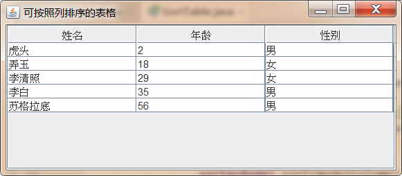
Demo code:
import javax.swing.*;
import javax.swing.table.AbstractTableModel;
import javax.swing.table.TableModel;
import java.awt.event.MouseAdapter;
import java.awt.event.MouseEvent;
import java.util.Arrays;

public class SortTable {

    JFrame jf = new JFrame("A table that can be sorted by column");

    //Define a two-dimensional array as table data

    Object[][] tableData = {

            new Object[]{"Li Qingzhao",29,"female"},
            new Object[]{"Socrates",56,"male"},
            new Object[]{"Li Bai",35,"male"},
            new Object[]{"Nongyu",18,"female"},
            new Object[]{"Tiger head",2,"male"},

    };

    //Define a one-dimensional array as the column header
    Object[] columnTitle = {"full name","Age","Gender"};

    JTable table = new JTable(tableData,columnTitle);

    //Encapsulate the TableModel in the original table into a SortTableModel object
    SortTableModel sorterModel = new SortTableModel(table.getModel());

    public void init(){
        //Use the wrapped SortTableModel object as the JTable model object
        table.setModel(sorterModel);

        //Add a mouse listener to the column header of each column
        table.getTableHeader().addMouseListener(new MouseAdapter() {
            @Override
            public void mouseClicked(MouseEvent e) {
                //If the number of clicks is less than 2, it returns instead of double clicking
                if (e.getClickCount()<2){
                    return;
                }

                //Find the index of the column where the mouse double-click event is located
                int tableColumn = table.columnAtPoint(e.getPoint());

                //Convert the column index in JTable into the column index in the corresponding TableModel
                int modelColumn = table.convertColumnIndexToModel(tableColumn);

                //Sorts according to the specified column
                sorterModel.sort(modelColumn);
            }
        });

        jf.add(new JScrollPane(table));
        jf.pack();
        jf.setDefaultCloseOperation(JFrame.EXIT_ON_CLOSE);
        jf.setVisible(true);
    }


    public static void main(String[] args) {
        new SortTable().init();
    }


    //Customize SortTableModel and enhance the original TableModel

    class SortTableModel extends AbstractTableModel{

        private TableModel model;
        private int sortColumn;
        private Row[] rows;

        public SortTableModel(TableModel model){
            this.model = model;
            rows = new Row[model.getRowCount()];
            //Save the index of each Row of records in the original TableModel with Row array
            for (int i = 0; i < rows.length; i++) {
                rows[i] = new Row(i);
            }

        }

        //Implement sorting according to the specified column
        public void sort(int c){
            sortColumn = c;
            Arrays.sort(rows);
            //Event triggering data change
            fireTableDataChanged();
        }

        //The following three methods need to access the data in the model, so they involve the index conversion between the data in the model and the encapsulated model data. The program uses rows to complete this conversion

        @Override
        public Object getValueAt(int rowIndex, int columnIndex) {
            return model.getValueAt(rows[rowIndex].index,columnIndex);
        }

        @Override
        public boolean isCellEditable(int rowIndex, int columnIndex) {
            return isCellEditable(rows[rowIndex].index,columnIndex);
        }

        @Override
        public void setValueAt(Object aValue, int rowIndex, int columnIndex) {
            model.setValueAt(aValue,rows[rowIndex].index,columnIndex);
        }

        //The implementation of the following method delegates the method of the model to the original encapsulated model


        @Override
        public int getRowCount() {

            return model.getRowCount();
        }

        @Override
        public int getColumnCount() {
            return model.getColumnCount();
        }


        @Override
        public String getColumnName(int column) {
            return model.getColumnName(column);
        }

        @Override
        public Class<?> getColumnClass(int columnIndex) {
            return model.getColumnClass(columnIndex);
        }

        private class Row implements Comparable<Row>{
            //The index stores the index of each row of records in the encapsulated Model
            public int index;

            public Row(int index) {
                this.index = index;
            }

            //Realize the size comparison between two rows
            @Override
            public int compareTo(Row o) {
                Object a = model.getValueAt(index, sortColumn);
                Object b = model.getValueAt(o.index, sortColumn);

                if (a instanceof Comparable){
                    return ((Comparable) a).compareTo(b);
                }else{
                    return a.toString().compareTo(b.toString());
                }
            }
        }
    }

}
3.7.5 draw cell contents
The cell contents of all the tables seen above are universal character strings. In fact, the cell contents of the table can also be more complex contents. JTable uses TableCellRenderer to draw cells. Swing provides an implementation class for the interface: DefaultTableCellRenderer. The cell renderer can draw the following three types of cell values (the type of cell value is determined according to the getcolornnclass() method of its TableModel):
- Icon: the default cell plotter will draw the cell value of this type into the icon represented by the icon object.
- Boolean: the default cell plotter will draw the cell value of this type as a check button.
- Object: the default cell plotter draws the string returned by the toString() method of the object in the cell.
By default, if the program directly uses a two-dimensional array or Vector to create JTable, the program will use the anonymous inner class of JTable or DefaultTableModel as the model Object of the table, and the return value of getColumnClass() method of the two tablemodels is Object. This means that even if the type of the value in the two-dimensional array is Icon, the getColumnClass() method of the two default TableModel implementation classes always returns Object, which will cause the default cell plotter to treat the Icon value as the Object value
Management 11 just draws the string returned by its toString() method.
In order for the default cell plotter to draw Icon type values and Boolean type values into multiple borders, the TableModel used when creating JTable must not adopt the default TableModel, but must adopt the extended TableModel class, as shown below:
//Define a subclass of DefaultTableModel
class ExtendedTableModel extends DefaultTableModel{
    ...
    //Override the getColumnClass method to return the real data type of each column according to the first value of each column
        public class getColumnClass(int c){
            return getValueAt(0,c).getClass();
        }

    ...

}
After the above ExtendedTableModel class is provided, the program should first create an ExtendedTableModel object, and then use the object to create JTable, so as to ensure that the getColumnClass() method of the JTable model object will return the real data type of each column, and the default cell plotter will draw the cell value of Icon type as an Icon, Draw cell values of Boolean type as check boxes.
If you want the program to use your own customized cell renderer, you must implement your own cell renderer, and the cell renderer must implement the TableCellRenderer interface. It is completely similar to the previous TreeCellRenderer interface, which only contains a gettablecellrendercomponent () method, and the Component returned by this method will be used as the Component drawn by the specified cell.
Once you have implemented your own cell plotter, you must also install the cell plotter on the specified JTable object. There are two ways to install the cell plotter for the specified JTable object:
- Local mode (column level): call the setCellRenderer() method of TableColumn to install the specified cell plotter for the specified column.
- Global mode (table level): call the setDefaultRendererO method of JTable to install the cell plotter for the specified JTable object. The setDefaultRendererO method needs to pass in two parameters, namely, column type and cell plotter, indicating that the cell plotter will only be used for data columns of the specified type.
Case:
Use TableCellRenderer and TableModel to achieve the following effect:
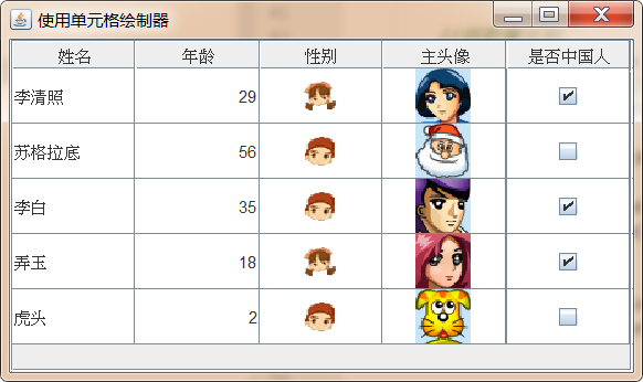
Demo code:
import cn.itcast.swing.util.ImagePathUtil;

import javax.swing.*;
import javax.swing.table.DefaultTableModel;
import javax.swing.table.TableCellRenderer;
import javax.swing.table.TableColumn;
import java.awt.*;

public class TableCellRendererTest {

    JFrame jf = new JFrame("Using the cell plotter");

    JTable table;

    //Define a two-dimensional array as table data

    Object[][] tableData = {

            new Object[]{"Li Qingzhao",29,"female",new ImageIcon(ImagePathUtil.getRealPath("11\\3.gif")),true},
            new Object[]{"Socrates",56,"male",new ImageIcon(ImagePathUtil.getRealPath("11\\1.gif")),false},
            new Object[]{"Li Bai",35,"male",new ImageIcon(ImagePathUtil.getRealPath("11\\4.gif")),true},
            new Object[]{"Nongyu",18,"female",new ImageIcon(ImagePathUtil.getRealPath("11\\2.gif")),true},
            new Object[]{"Tiger head",2,"male",new ImageIcon(ImagePathUtil.getRealPath("11\\5.gif")),false},

    };

    //Define a one-dimensional array as the column header
    String[] columnTitle = {"full name","Age","Gender","Main Avatar","Are you Chinese"};

    public void init(){
        //Create an ExtendedTableModel object with a two-dimensional array and a one-dimensional array
        ExtendedTableModel model = new ExtendedTableModel(columnTitle,tableData);

        //Create JTable
        table = new JTable(model);

        table.setRowSelectionAllowed(false);
        table.setRowHeight(40);

        //Get the third column
        TableColumn column = table.getColumnModel().getColumn(2);
        //Use a custom cell plotter for the third column
        column.setCellRenderer(new GenderTableCellRenderer());

        jf.add(new JScrollPane(table));
        jf.pack();
        jf.setDefaultCloseOperation(JFrame.EXIT_ON_CLOSE);
        jf.setVisible(true);
    }

    public static void main(String[] args) {
        new TableCellRendererTest().init();
    }

    //Custom ExtendedTableModel object
    class ExtendedTableModel extends DefaultTableModel{

        //Re provide a constructor whose implementation is delegated to the DefaultTableModel parent class
        public  ExtendedTableModel(String[] columnNames,Object[][] cells){
            super(cells,columnNames);
        }

        //Override the getColumnClass method to return its real data type according to the first value of each column

        @Override
        public Class<?> getColumnClass(int columnIndex) {
            return getValueAt(0,columnIndex).getClass();
        }
    }

    //Custom cell plotter
    class GenderTableCellRenderer extends JPanel implements TableCellRenderer {
        private String cellValue;
        //Defines the width and height of the icon
        final int ICON_WIDTH = 23;
        final int ICON_HEIGHT = 21;


        @Override
        public Component getTableCellRendererComponent(JTable table, Object value, boolean isSelected, boolean hasFocus, int row, int column) {
            cellValue = (String) value;

            //Sets the drawing border of the selected state
            if (hasFocus){
                setBorder(UIManager.getBorder("Table.focusCellHighlightBorder"));
            }else{
                setBorder(null);
            }
            return this;
        }

        //Override the paint method to draw the contents of the cell
        @Override
        public void paint(Graphics g) {
            //If the contents of the table are male or female, draw a male icon
            if (cellValue.equals("male") || cellValue.equals("male")){
                drawImage(g,new ImageIcon(ImagePathUtil.getRealPath("11\\male.gif")).getImage());
            }

            //If the content of the table is nv or female, draw a female icon
            if (cellValue.equals("female") || cellValue.equals("female")){
                drawImage(g,new ImageIcon(ImagePathUtil.getRealPath("11\\female.gif")).getImage());
            }
        }

        private void drawImage(Graphics g,Image image){
            g.drawImage(image,(getWidth()-ICON_WIDTH)/2,(getHeight()-ICON_HEIGHT)/2,null);
        }
    }
}
3.7.6 editing cell contents
If the user double clicks the specified cell of the JTable table, the system will start editing the contents of the cell. By default, the system will use the text box to edit the contents of the cell. Similarly, if the user double clicks the JTree node, the text box will also be used to edit the contents of the node by default.
However, if the cell content is not text content, the user certainly does not want to use the text editor to edit the cell content, because this editing method is very non intuitive and the user experience is quite poor. In order to avoid this situation, you can implement your own cell editor, which can provide users with a better operation interface.
The cell editor implementing JTable should implement TableCellEditor interface. Swing provides TableCellEditor with DefaultCellEditor implementation class. There are three DefaultCellEditor classes
Constructors, which use text boxes, checkboxes, and JComboBox as cell editors, respectively. The most common case is to use text box editors if the cell value is Boolean
Type, the system uses the check box editor by default. If you want to specify that a column uses JComboBox as the cell editor, you need to explicitly create a JComboBox instance, and then use this instance to create the DefaultCellEditor editor.
To use the DefaultCellEditor:
- Custom class, inherit DefaultCellEditor, and override getTableCellEditorComponent() method;
- Create custom class object
- Install cell editor for JTable
Local installation: through TableColumn of setEditor()Method to complete the installation, just for a column.
Global installation: calling JTable of setDefaultEditor()Method to install the default cell editor for the table. This method requires two parameters, namely, column type and cell editor. These two parameters indicate that the cell editor is used for data columns of the specified type.
Case:
Use TableCellEditor and TableModel to complete the following effect:
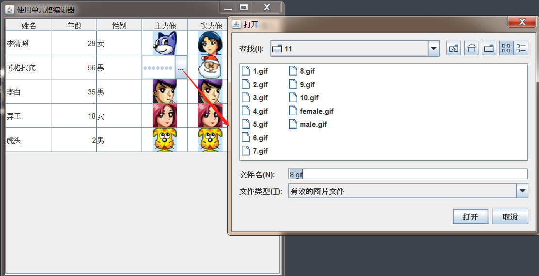
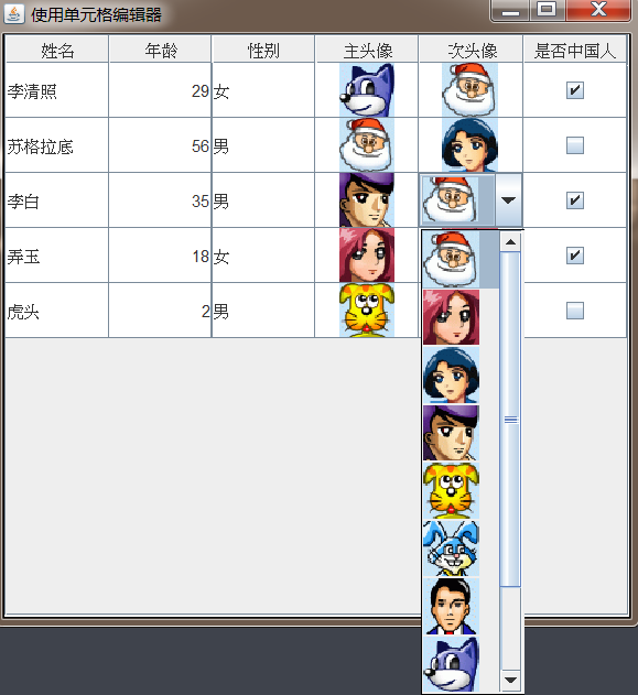
Demo code:
import cn.itcast.swing.util.ImagePathUtil;

import javax.swing.*;
import javax.swing.filechooser.FileFilter;
import javax.swing.table.DefaultTableModel;
import javax.swing.table.TableColumn;
import java.awt.*;
import java.io.File;

public class TableCellEditorTest {
    JFrame jf = new JFrame("Using the cell editor");

    JTable table;

    //Define a two-dimensional array as table data

    Object[][] tableData = {

            new Object[]{"Li Qingzhao",29,"female",new ImageIcon(ImagePathUtil.getRealPath("11\\3.gif")),new ImageIcon(ImagePathUtil.getRealPath("11\\3.gif")),true},
            new Object[]{"Socrates",56,"male",new ImageIcon(ImagePathUtil.getRealPath("11\\1.gif")),new ImageIcon(ImagePathUtil.getRealPath("11\\1.gif")),false},
            new Object[]{"Li Bai",35,"male",new ImageIcon(ImagePathUtil.getRealPath("11\\4.gif")),new ImageIcon(ImagePathUtil.getRealPath("11\\4.gif")),true},
            new Object[]{"Nongyu",18,"female",new ImageIcon(ImagePathUtil.getRealPath("11\\2.gif")),new ImageIcon(ImagePathUtil.getRealPath("11\\2.gif")),true},
            new Object[]{"Tiger head",2,"male",new ImageIcon(ImagePathUtil.getRealPath("11\\5.gif")),new ImageIcon(ImagePathUtil.getRealPath("11\\5.gif")),false},

    };

    //Define a one-dimensional array as the column header
    String[] columnTitle = {"full name","Age","Gender","Main Avatar","Second avatar","Are you Chinese"};


    public void init(){
        ExtendedTableModel model = new ExtendedTableModel(columnTitle,tableData);

        table  =  new JTable(model);

        table.setRowSelectionAllowed(false);
        table.setRowHeight(40);

        //Specifies the default editor for the table
        table.setDefaultEditor(ImageIcon.class,new ImageCellEditor());

        //Get column 5
        TableColumn column = table.getColumnModel().getColumn(4);
        //Create a JComboBox object and add multiple icon list items
        JComboBox<ImageIcon> editCombo = new JComboBox<>();
        for (int i = 1; i <= 10; i++) {
            editCombo.addItem(new ImageIcon(ImagePathUtil.getRealPath("11\\"+i+".gif")));
        }

        //Set column 5 to use the DefaultCellEditor based on JComboBox
        column.setCellEditor(new DefaultCellEditor(editCombo));

        jf.add(new JScrollPane(table));
        jf.pack();
        jf.setDefaultCloseOperation(JFrame.EXIT_ON_CLOSE);
        jf.setVisible(true);
    }


    public static void main(String[] args) {
        new TableCellEditorTest().init();
    }


    //Custom ExtendedTableModel object
    class ExtendedTableModel extends DefaultTableModel {

        //Re provide a constructor whose implementation is delegated to the DefaultTableModel parent class
        public  ExtendedTableModel(String[] columnNames,Object[][] cells){
            super(cells,columnNames);
        }

        //Override the getColumnClass method to return its real data type according to the first value of each column

        @Override
        public Class<?> getColumnClass(int columnIndex) {
            return getValueAt(0,columnIndex).getClass();
        }
    }

    //Extend DefaultCellEditor to implement TableCellEditor
    class ImageCellEditor extends DefaultCellEditor{

        //Define file selector
        private JFileChooser fDialog = new JFileChooser();
        //Define text fields
        private JTextField field = new JPasswordField(15);
        //Define button
        private JButton button = new JButton("...");


        public ImageCellEditor() {
            //Because DefaultCellEditor does not have a parameterless constructor
            //Therefore, the constructor that calls the parent class with parameters is shown here
            super(new JTextField());
            initEditor();
        }

        private void initEditor() {
            //Prohibit editing
            field.setEnabled(false);
            //Add a listener to the button. When the user clicks the button,
            //A file selector will appear allowing the user to select the icon file
            button.addActionListener(e->{
                fDialog.setCurrentDirectory(new File(ImagePathUtil.getRealPath("11")));
                int result = fDialog.showOpenDialog(null);

                if (result==JFileChooser.CANCEL_OPTION){
                    //The user clicked cancel
                    super.cancelCellEditing();
                    return;
                }else{
                    //The user clicked the OK button
                    field.setText(ImagePathUtil.getRealPath("11\\"+fDialog.getSelectedFile().getName()));
                    button.getParent().transferFocus();
                }
            });

            //Install a file filter for the file selector
            fDialog.addChoosableFileFilter(new FileFilter() {
                @Override
                public boolean accept(File f) {
                    if (f.isDirectory()){
                        return true;
                    }

                    String extension = Utils.getExtension(f);
                    if (extension!=null){
                        if (extension.equals(Utils.tiff)
                            || extension.equals(Utils.tif)
                            || extension.equals(Utils.gif)
                            || extension.equals(Utils.jpeg)
                            || extension.equals(Utils.jpg)
                            || extension.equals(Utils.png)

                        ){
                            return true;
                        }else {
                            return false;
                        }
                    }

                    return false;
                }

                @Override
                public String getDescription() {
                    return "Valid picture file";
                }
            });

            fDialog.setAcceptAllFileFilterUsed(false);
        }

        //Override the getTableCellEditorComponent method to draw the cell component


        @Override
        public Component getTableCellEditorComponent(JTable table, Object value, boolean isSelected, int row, int column) {
            this.button.setPreferredSize(new Dimension(20,20));
            JPanel panel = new JPanel();
            panel.setLayout(new BorderLayout());
            field.setText(value.toString());
            panel.add(this.field,BorderLayout.CENTER);
            panel.add(this.button,BorderLayout.EAST);

            return panel;
        }

        //Override the getCellEditorValue method to fill in the contents of the cell
        @Override
        public Object getCellEditorValue() {
            return new ImageIcon(field.getText());
        }


    }

}
class Utils{
    public final static String jpeg = "jpeg";
    public final static String jpg = "jpg";
    public final static String gif = "gif";
    public final static String tiff = "tiff";
    public final static String tif = "tif";
    public final static String png = "png";

    public static String getExtension(File f){
        String ext = null;
        String s = f.getName();
        int i = s.lastIndexOf('.');
        if (i>0 && i<s.length()-1){
            ext=s.substring(i+1).toLowerCase();
        }
        return ext;
    }
}