Button ripple
We often use Android phones. We know that when I click this button, there will be ripples around the button. This effect has a good user experience. So how can we use JavaScript to achieve it
Realization idea
The idea of our code implementation is that we first use css to make a one-time animation. Then we use js to dynamically obtain the relative position of the user clicking the button, and then add appropriate animated elements at the specified position to play css ripple effects
code implementation
css code
button {
   position: relative;
    overflow: hidden;
    margin: auto;
    padding: 1rem 2rem;
    color: #fff;
    background: #6200ee;
    font-family: "Roboto", sans-serif;
    border-radius: 0.25rem;
    box-shadow: 0 0 0.5rem rgba(0, 0, 0, 0.3);
    outline: 0;
    border: 0;
    cursor: pointer;
}

span.ripple {
    position: absolute;
    border-radius: 50%;
    transform: scale(0);
    opacity: 1;
    background-color: rgba(255, 255, 255, 0.7);
    animation: ripple 600ms linear;
}

@keyframes ripple {
  to {
        transform: scale(4);
        opacity: 0;
    }
}
html
<button id="ripple" onclick="submit()">BUTTON</button>
js
 var createRipple=function (event) {
    const button = event.currentTarget;
    const rippleSize = Math.max(button.clientWidth, button.clientHeight)
    const moved = rippleSize / 2;
    const circle = document.createElement("span")
    circle.style.width = circle.style.height = `${rippleSize}px`
    circle.style.top = `${event.clientY - button.offsetTop - moved}px`
    circle.style.left = `${event.clientX - button.offsetLeft - moved}px`
    circle.classList.add("ripple")
    const isExist = button.getElementsByClassName("ripple")[0]
    if (isExist) {
        isExist.remove()
    }
    button.append(circle)
}
document.getElementById("ripple").addEventListener("click",createRipple)
function submit(){
    console.log("The button is clicked")
}
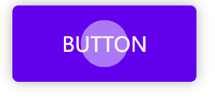
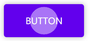
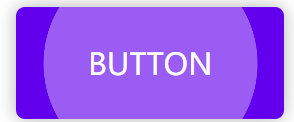
Effect achieved:
Code interpretation
css uses absolute positioning for the sapn tag, positioning the span tag on the button, but the specific position and width of the span element have not been set. We also set a ripple effect on span to change it from scale(0) to scale(10), and the opacity from 1 to 0. This animation is executed only once.
Corresponding code:
span.ripple {
    position: absolute;
    border-radius: 50%;
    transform: scale(0);
    opacity: 1;
    background-color: rgba(255, 255, 255, 0.7);
    animation: ripple 600ms linear;
}

@keyframes ripple {
  to {
        transform: scale(4);
        opacity: 0;
    }
}
Note: span Ripple is an attribute selector, equivalent to span[class = "ripple"]
First, we create a span tag
const circle = document.createElement("span")
Then we use js to obtain the width and height of the button, that is, clientWidth and clientHeight, and then we take the longer one as the width and height of the span label (Note: the span label is square, and it becomes circular after setting border radius: 50%)
//Take the longer width in button as the width of span
const rippleSize = Math.max(button.clientWidth, button.clientHeight)
circle.style.width = circle.style.height = `${rippleSize}px`
Secondly, we next calculate the position where the span label should be positioned on the button. In order to ensure that the mouse cursor is in the center of the span circle, we need to subtract half of the span label to ensure the center alignment. (don't worry about the scaling function scale. It scales by reference to the center. We can safely subtract half of the real span width and height.)
circle.style.top = `${event.clientY - button.offsetTop - moved}px`
circle.style.left = `${event.clientX - button.offsetLeft - moved}px`
Finally, we add the class name ripple to the span tag
circle.classList.add("ripple")
Add this span label to the inside of the button. Note that before each addition, remove span and then add span
After the explanation, you can understand the code carefully. The key point is to understand that the animation is only executed once. We rely on constantly removing the span tag that adds an animation to achieve the animation effect.
Note: when clicking, first remove the existing span tag to ensure that span in the button is always a