Reading catalog
- 1, Component open source address and API description
- 2, Component effect example
- 3, Use example
- 4, Source download
- 5, Summary
text
Foreword: I shared two bootstrap drop-down box components, such as two bootstrap mutiselect components, the interface rendering effect is slightly poor; For another example, some compatibility problems of select2 and the value assignment of multiple selections have plagued bloggers and many garden friends. The drop-down box in the project has long been replaced with this component introduced today
1, Component open source address and API description
Bootstrap select open source address: https://github.com/silviomoreto/bootstrap-select
Bootstrap select usage example: http://silviomoreto.github.io/bootstrap-select/examples/
Bootstrap select document description: http://silviomoreto.github.io/bootstrap-select/options/
2, Component effect example
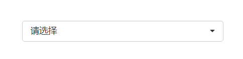
At first sight

Multi selection effect

Configurable search function

Group selected

Set the maximum number of selected items to 2

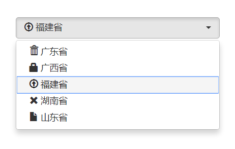
Customize the description Title, for example, we define it as "please select a province"

In some cases, if the number of multiple selections is large, we can display "thumbnail mode". For example, when more than two items are selected

custom style


Display icon with text
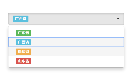
Show colored labels

Expand to display the maximum number of configurable items. It is better to display 3 items at most

Select all and invert

The above are some common functions. For more effects, you can see the official examples!
3, Use example
1. Basic example
Since it is bootstrap select, the component must depend on bootstrap, and bootstrap depends on jquery. Therefore, the following files must be referenced when using the component.
<link href="Content/bootstrap/css/bootstrap.min.css" rel="stylesheet" />
<link href="Content/bootstrap-select/css/bootstrap-select.min.css" rel="stylesheet" />

<script src="Content/jquery-1.9.1.min.js"></script>
<script src="Content/bootstrap/js/bootstrap.min.js"></script>
<script src="Content/bootstrap-select/js/bootstrap-select.min.js"></script>
<script src="Content/bootstrap-select/js/i18n/defaults-zh_CN.min.js"></script>
The last file is "defaults zh"_ CN. Min.js is not required. It needs to be referenced only when there is culture in the component.
It is easier to use. You can initialize directly using class without any js
Add a select picker style to a select tag.
If you choose more, you don't have to say more
<select class="selectpicker" multiple>
    <option value="1">Guangdong Province</option>
    <option value="2">Guangxi Province</option>
    <option value="3">Fujian Province</option>
    <option value="4">Hunan Province</option>
    <option value="5">Shandong Province</option>
</select>
2. Other effect examples
Add search function to components
<select class="selectpicker" multiple data-live-search="true">
    <option value="1">Guangdong Province</option>
    <option value="2">Guangxi Province</option>
    <option value="3">Fujian Province</option>
    <option value="4">Hunan Province</option>
    <option value="5">Shandong Province</option>
</select>
Option grouping
<select class="form-control selectpicker" data-live-search="true" multiple>
        <optgroup label="Guangdong Province">
                <option value="1">Guangzhou City</option>
                <option value="2">Shenzhen City</option>
                <option value="3">Zhuhai</option>
         </optgroup>
          <optgroup label="Guangxi">
                  <option value="1">Nanning</option>
                  <option value="2">city in Guangxi</option>
                  <option value="3">Guilin City</option>
           </optgroup>
           <optgroup label="Shandong">
                   <option value="1">Yantai</option>
                   <option value="2">Qingdao</option>
                   <option value="3">Jinan</option>
             </optgroup>
</select>
Set the maximum number of selected items to 2
<select class="selectpicker" multiple data-live-search="true" data-max-options="2">
    <option value="1">Guangdong Province</option>
    <option value="2">Guangxi Province</option>
    <option value="3">Fujian Province</option>
    <option value="4">Hunan Province</option>
    <option value="5">Shandong Province</option>
</select>
In the abbreviated mode, for example, when the selected value is greater than 3, only the number of selected items is displayed. Note that this attribute is only effective for multiple selections
<select class="selectpicker" multiple data-live-search="true" data-selected-text-format="count > 3">
    <option value="1">Guangdong Province</option>
    <option value="2">Guangxi Province</option>
    <option value="3">Fujian Province</option>
    <option value="4">Hunan Province</option>
    <option value="5">Shandong Province</option>
</select>
Show colored labels
<select class="form-control selectpicker" title="Please select a province" multiple>
                        <option data-content="<span class='label label-success'>Guangdong Province</span>">Guangdong Province</option>
                        <option data-content="<span class='label label-info'>Guangxi Province</span>">Guangxi Province</option>
                        <option data-content="<span class='label label-warning'>Fujian Province</span>">Fujian Province</option>
                        <option data-content="<span class='label label-danger'>Shandong Province</span>">Shandong Province</option>
</select>
3. Component value assignment
The above are some things about the initialization of components. Generally, we need to value and assign values to components. How should we operate.
3.1 component value
Keep the original jquery method for component values, such as var value = $('#sel') val(); Is this simple? It should be noted that if multiple choices are made, the value variable obtained here is an array variable, such as ['1 ',' 2 ',' 3 '].
3.2 component assignment
Component assignment needs to be changed slightly if you directly $('#sel') val('1'); This assignment will be invalid. The correct assignment method is:
$('.selectpicker').selectpicker('val', '1');In some usage scenarios of cascading selection, it is often necessary to trigger the change event of the component during assignment. We can do this.
$('.selectpicker').selectpicker('val', '1').trigger("change");The same is true for multi-choice assignment
$('.selectpicker').selectpicker('val', ['1','2','3']).trigger("change");4. Other uses of components
Select all:
$('.selectpicker').selectpicker('selectAll'); Reverse selection:
$('.selectpicker').selectpicker('deselectAll'); Adapt to phone mode:
$('.selectpicker').selectpicker('mobile'); Component disable:
$('.disable-example').prop('disabled', true);
$('.disable-example').selectpicker('refresh');
Component enable:
$('.disable-example').prop('disabled', false);
$('.disable-example').selectpicker('refresh');
Component destruction:
$('.selectpicker').selectpicker('destroy');5. Component encapsulation
There are so many introductions about component initialization above, which are all initialized through class='selectpicker '. In many cases, our select options are dynamically obtained and then initialized. Therefore, bloggers carefully look for the api to see if there is remote data acquisition. Unfortunately, the component does not support this method of remote data acquisition. It doesn't matter. How difficult is it for us to encapsulate an ajax request and then construct the option dynamically? Here we have to mention the original article on encapsulating js components. We follow That article Just encapsulate one. A reference is given below.
(function ($) {
    //1. Define the jquery extension method bootstrapSelect
   $.fn.bootstrapSelect = function (options, param) {
       if (typeof options == 'string') {
           return $.fn.bootstrapSelect.methods[options](this, param);
       }
       //2. Merge the parameters passed during the call with the default parameter
       options = $.extend({}, $.fn.bootstrapSelect.defaults, options || {});
       //3. Add default value
       var target = $(this);
       if (!target.hasClass("selectpicker")) target.addClass("selectpicker");
       target.attr('valuefield', options.valueField);
       target.attr('textfield', options.textField);
       target.empty();
       var option = $('<option></option>');
       option.attr('value', '');
       option.text(options.placeholder);
       target.append(option);
       //4. Judge whether the parameter list passed by the user contains the data set. If so, you don't need to send ajax to get data from the background. Otherwise, you don't need to send ajax to get data from the background
       if (options.data) {
           init(target, options.data);
       }
       else {
           //var param = {};
           options.onBeforeLoad.call(target, options.param);
           if (!options.url) return;
           $.getJSON(options.url, options.param, function (data) {
               init(target, data);
           });
       }
       function init(target, data) {
           $.each(data, function (i, item) {
               var option = $('<option></option>');
               option.attr('value', item[options.valueField]);
               option.text(item[options.textField]);
               target.append(option);
           });
           options.onLoadSuccess.call(target);
       }
       target.unbind("change");
       target.on("change", function (e) {
           if (options.onChange)
               return options.onChange(target.val());
       });
   }

   //5. If a string is passed, it means to call the method.
   $.fn.bootstrapSelect.methods = {
       getValue: function (jq) {
           return jq.val();
       },
       setValue: function (jq, param) {
           jq.val(param);
       },
       load: function (jq, url) {
           $.getJSON(url, function (data) {
               jq.empty();
               var option = $('<option></option>');
               option.attr('value', '');
               option.text('Please select');
               jq.append(option);
               $.each(data, function (i, item) {
                   var option = $('<option></option>');
                   option.attr('value', item[jq.attr('valuefield')]);
                   option.text(item[jq.attr('textfield')]);
                   jq.append(option);
               });
           });
       }
   };

   //6. Default parameter list
   $.fn.bootstrapSelect.defaults = {
       url: null,
       param: null,
       data: null,
       valueField: 'value',
       textField: 'text',
       placeholder: 'Please select',

   };

   //initialization
   $(".selectpicker").each(function () {
    var target = $(this);
    target.attr("title", $.fn.select.defaults.placeholder);
    target.selectpicker();
});
})(jQuery);
After such encapsulation, we can directly use the following code to initialize the component.
$('#sel').bootstrapSelect({
    url:'/a/b',
    data: {},
    valueField: 'value',
    textField: 'text',
});