Day 6 of BOM and DOM learning
Today's learning objectives
- Mobile web effects
1. Touch screen events
1.1 overview of touch screen events
-
Browser compatibility: the mobile browser has good compatibility and can safely write code using native js
-
Features of mobile terminal: touch event
-
The touch object represents a touch point
-
Common touch screen events
| Touch Event | explain |
|---|---|
| touchstart | Triggered when a finger touches a DOM element |
| touchmove | Triggered when a finger slides over a DOM element |
| touchend | Triggered when a finger moves away from a DOM element |
Examples
<!DOCTYPE html>
<html lang="en">
<head>
    <meta charset="UTF-8">
    <meta http-equiv="X-UA-Compatible" content="IE=edge">
    <meta name="viewport" content="width=device-width, initial-scale=1.0">
    <title>Document</title>
    <style>
        div{
            height: 200px;
            width: 200px;
            background-color: pink;
        }
    </style>
</head>
<body>
    <div></div>

    <script>
        var div=document.querySelector('div');
        // 1. Finger touch event
        div.addEventListener('touchstart',function(){
            console.log('Fingers start to touch');
        })

        // 2. Continuous finger touch

        div.addEventListener('touchmove',function(){
            console.log('Continuous finger touch');
        })

        // 3. Move your fingers away
        div.addEventListener('touchend',function(){
            console.log('Finger away');
        })
    </script>
</body>
</html>
- design sketch
1.2 touch event object
-
Touchstart, touchmove and touchend all have their own event objects
-
List of commonly used objects
Touch list explain touches A list of all fingers that are touching the screen targetTouches A list of fingers that are touching the current DOM element changedTouches A list of changes in the state of a finger, such as from nothing to something, or from something to nothing
Examples
<!DOCTYPE html>
<html lang="en">
<head>
    <meta charset="UTF-8">
    <meta http-equiv="X-UA-Compatible" content="IE=edge">
    <meta name="viewport" content="width=device-width, initial-scale=1.0">
    <title>Document</title>
    <style>
        div{
            height: 200px;
            width: 200px;
            background-color: pink;
        }
    </style>
</head>
<body>
    <div></div>

    <script>
        var div=document.querySelector('div');
        // 1. Finger touch event
        div.addEventListener('touchstart',function(e){
            // console.log('finger starts touching ');

            // 1. Print a list of all fingers
            console.log(e.touches);
            // 2. Print a list of all fingers touching DOM elements
            console.log(e.targetTouches);
            // 3. Print a list of fingers whose status has changed
            console.log(e.changedTouches);
        })

        // 2. Continuous finger touch

        div.addEventListener('touchmove',function(){
            // console.log('finger continuous touch ');
        })

        // 3. Move your fingers away
        div.addEventListener('touchend',function(e){
            // console.log('finger away ');

            // 3. When the finger leaves, only the list of changedTouches has a value
            console.log(e.touches);
            console.log(e.targetTouches);
            console.log(e.changedTouches);
        })
    </script>
</body>
</html>
- design sketch
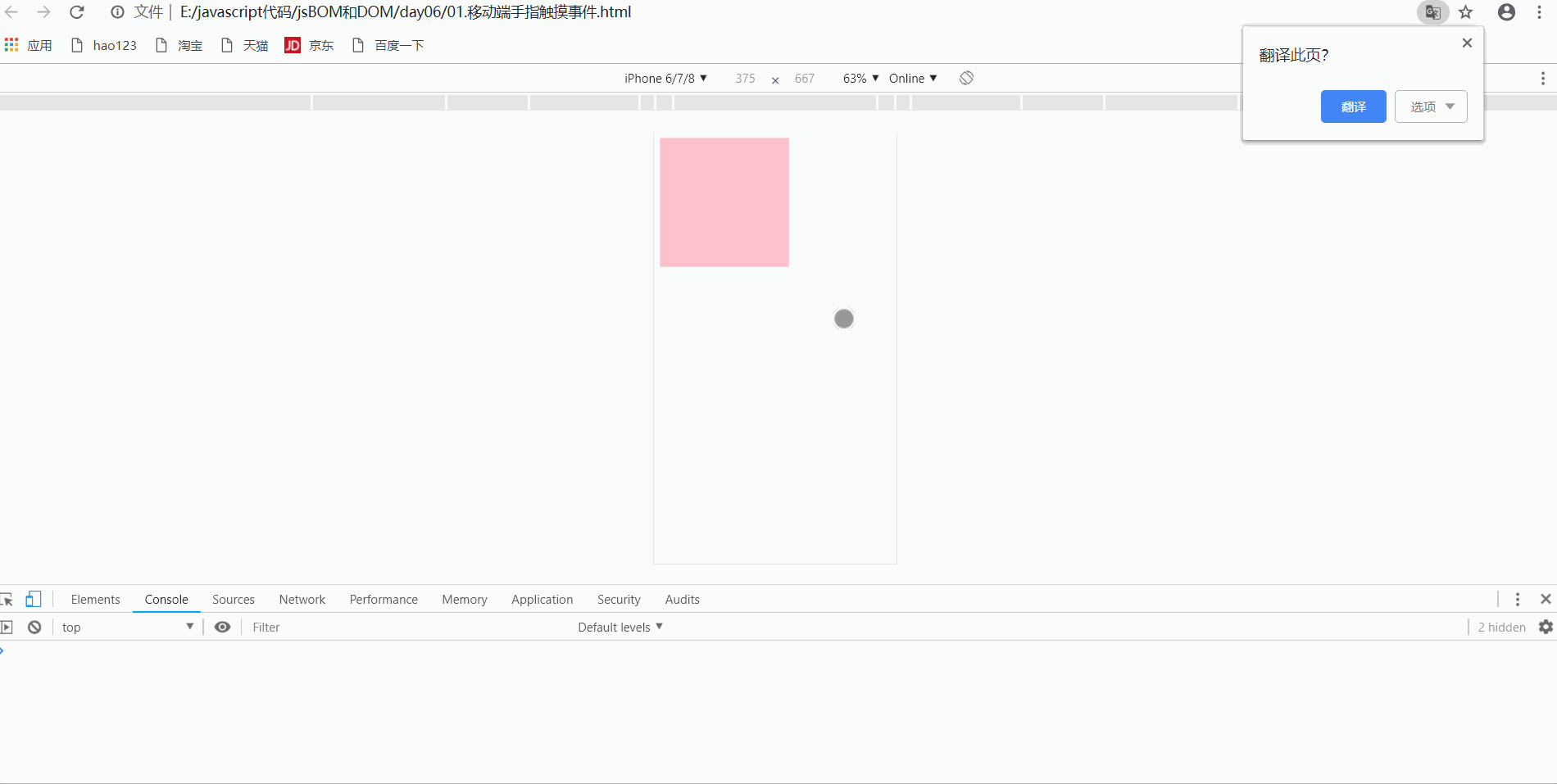
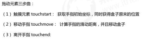
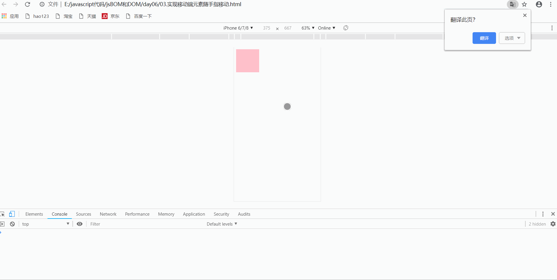
1.3 drag elements at mobile end
- thinking
Examples
<!DOCTYPE html>
<html lang="en">
<head>
    <meta charset="UTF-8">
    <meta http-equiv="X-UA-Compatible" content="IE=edge">
    <meta name="viewport" content="width=device-width, initial-scale=1.0">
    <title>Document</title>
    <style>
        div{
            position: absolute;
            width: 100px;
            height: 100px;
            background-color: pink;
        }
    </style>
</head>
<body>
    <div></div>

    <script>
        var div=document.querySelector('div');

        // 1. Get the current position of the mouse
        var mouseX=0;
        var mouseY=0;

        // 2. Get the current position of the box
        var boxX=0;
        var boxY=0;

        // Get start coordinates
        div.addEventListener('touchstart',function(e){
            // Get the starting coordinates when touching
            mouseX=e.targetTouches[0].pageX;
            mouseY=e.targetTouches[0].pageY;

            boxX=this.offsetLeft;
            boxY=this.offsetTop;
        })

        div.addEventListener('touchmove',function(e){
            // Finger movement to obtain real-time coordinates
           var moveX=e.targetTouches[0].pageX-mouseX;
            var moveY=e.targetTouches[0].pageY-mouseY;

            // Box movement

            console.log(boxX);
            console.log(moveX);
            this.style.left=boxX+moveX+'px';
            this.style.top=boxY+moveY+'px';

            // Default behavior to prevent screen scrolling
            e.preventDefault();
        })
    </script>
</body>
</html>
- design sketch
Attention
- The finger movement here will cause bubbles and trigger screen scrolling. You need to set e.preventDefault() to prevent bubbles
2. Common special effects of mobile terminal
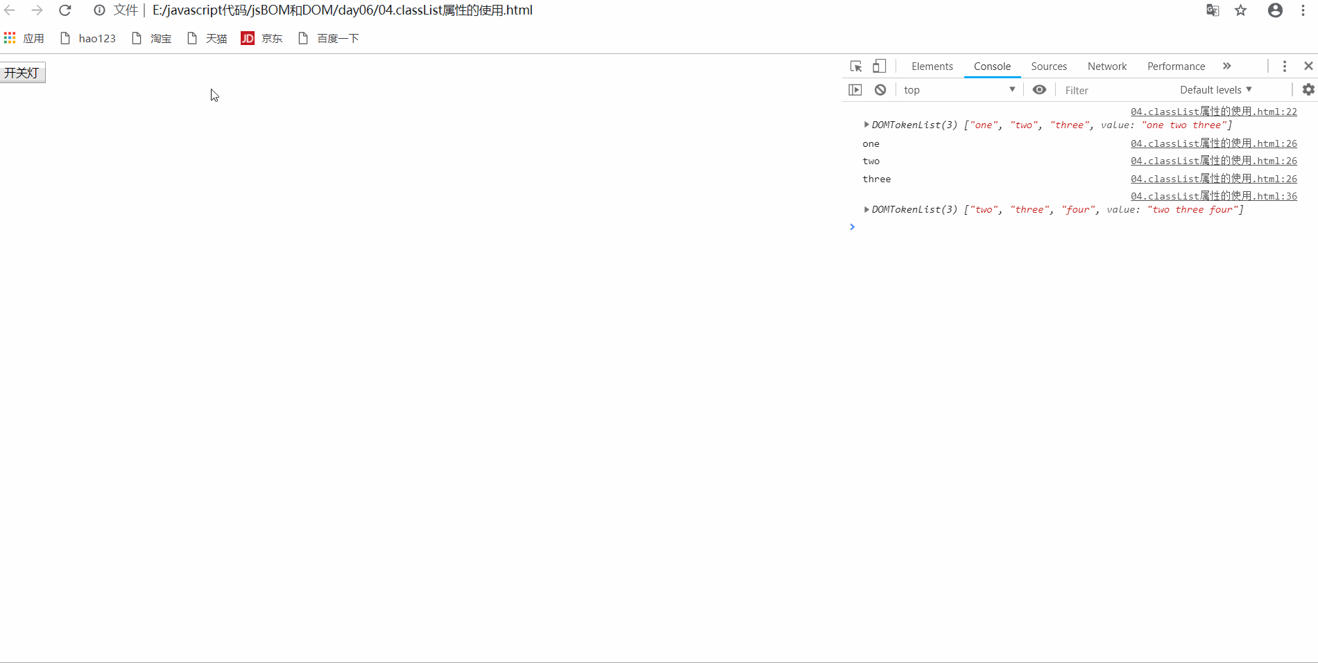
2.1 clsssList attribute
- h5 add a new attribute and return the class name of the element, which is supported by ie10 or above
- It is used to add, remove and switch CSS classes in elements. There are the following methods
| method | use |
|---|---|
| Add class | element.classList.add('class name ') |
| Remove class | element.classList.remove('class name ') |
| Switch class | element.classList.toggle('class name ') |
- Description of switching class: if the class name in parentheses exists in the current element, the class name will be removed; if it does not exist, the class name will be added
Examples
<!DOCTYPE html>
<html lang="en">
<head>
    <meta charset="UTF-8">
    <meta http-equiv="X-UA-Compatible" content="IE=edge">
    <meta name="viewport" content="width=device-width, initial-scale=1.0">
    <title>Document</title>
    <style>
        .bg{
            background-color: #000;
        }
    </style>
</head>
<body>
    <button>Switch light</button>
    <div class="one two three"></div>
    <script>
        var div=document.querySelector('div');

        // Get pseudo array of class name, classList, ie10 or above

        console.log(div.classList);

        // Get each class name through array method
        for(var i=0;i<div.classList.length;i++){
            console.log(div.classList[i]);
        }

        // Add class name

        div.classList.add('four');

        // Remove class name
        div.classList.remove('one');

        console.log(div.classList);

        // Switch the class name once (if the class name exists, remove the class name; if the class name does not exist, add the class name)
        var btn=document.querySelector('button');
        btn.addEventListener('click',function(){
            // Switch class name
            document.body.classList.toggle('bg');
        })
    </script>
</body>
</html>
- design sketch
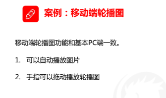
2.2 rotation diagram of mobile terminal
Difference between mobile terminal and pc terminal
- The mobile terminal has good compatibility, and some good methods can be used
- The mobile terminal needs two additional pictures and the pc terminal needs one
- The pc end is a left-right click button, and the fingers of the mobile end slide
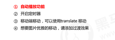
Development ideas
Examples
- Rotation chart html
<!-- banner Map area -->
        <div class="banner">
            <ul>
                <li><a href="#"><img src="./uploads/item_2.png" alt=""></a></li>
                <li><a href="#"><img src="./uploads/item_3.png" alt=""></a></li>
                <li><a href="#"><img src="./uploads/item_4.png" alt=""></a></li>
            </ul>


            <ol>

            </ol>
        </div>
- Rotation chart less
// In the banner chart area, it is better to specify the height to locate the small origin in the back without deviation
    .banner{
        position: relative;
        height: (160/@rootsize);
        // overflow: visible;

        overflow: hidden;

        ul{
            width: 600%;
            height: 100%;

            // To display the second picture
            margin-left: -100%;

            li{
                display: block;
                width: (375/@rootsize);
                float: left;
                margin: 0;
                padding: 0;
            }
        }

        ol{
            margin: 0;
            padding: 0;
            list-style: none;
            z-index: 100;
            position: absolute;
            left: 50%;
            transform: translateX(-50%);
            bottom: (5/@rootsize);
            height: (18/@rootsize);
            border-radius: (9/@rootsize);
            li{
                float: left;
                width: (12/@rootsize);
                height: (12/@rootsize);
                margin: (3/@rootsize);
                border-radius: 50%;
                border: 1px solid #fff;
                box-sizing: border-box;
                // background-color: #fff;


            }

            .current{
                background-color: #fff;
            }
        }
    }
- Rotation chart js
window.addEventListener('load',function(){
// alert(11);
var banner=this.document.querySelector('.banner');
// console.log(banner);
var ul=banner.querySelector('ul');
var ol=banner.querySelector('ol');
// Cycle to create round robin dots
for(var i=0;i<ul.children.length;i++){
var li=this.document.createElement('li');
li.setAttribute('index',i);
ol.appendChild(li);
}
// Set the current property for the first picture
ol.children[0].className='current';
// There is a difference between the seamless rotation of the mobile terminal and the pc terminal to prevent the first one from sliding left and leaving a blank, and a picture is also added in front of the first one
var copy1=ul.children[0].cloneNode(true);
var copy2=ul.children[ul.children.length-1].cloneNode(true);
ul.appendChild(copy1);
ul.insertBefore(copy2,ul.children[0]);
// Set the automatic picture scrolling, timer + css3 displacement (translate)
// Gets the size of the focus box
var b_width=banner.clientWidth;
// console.log(b_width);
var index=0;
var timer=this.setInterval(function(){
index++;
// Set transform transition
ul.style.transition='all .3s';
ul.style.transform='translateX('+(-b_width*index) +'px)'
},2000);
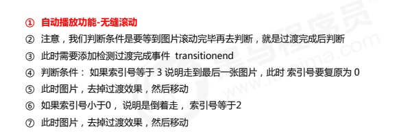
// Judge whether the transition is completed. If so, perform the operation
ul.addEventListener('transitionend', function() {
// Seamless rolling
if (index >= 3) {
index = 0;
// console.log(index);
// Remove the transition effect, so that our ul can jump to the target position quickly
ul.style.transition = 'none';
// Use the latest index number multiplied by the width to scroll the picture
var translatex = -index * b_width;
ul.style.transform = 'translateX(' + translatex + 'px)';
} else if (index < 0) {
index = 2;
ul.style.transition = 'none';
// Use the latest index number multiplied by the width to scroll the picture
var translatex = -index * b_width;
ul.style.transform = 'translateX(' + translatex + 'px)';
}
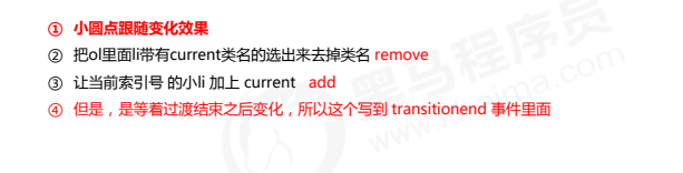
// Detect the change of small round points after transition reception
// Remove the current small dots and realize small dot switching
ol.querySelector('li.current').classList.remove('current');
ol.children[index].classList.add('current');
})
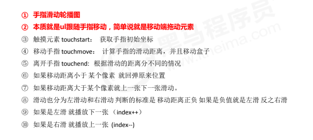
// Finger sliding to realize the rotation map switching
var mouseX=0;
var moveX=0;
var liStep=ul.children[0].clientWidth/7;
// Define a variable to judge whether the user moves
var touch=false;
ul.addEventListener('touchstart',function(e){
// Touch your finger and stop the timer
clearInterval(timer);
timer=null;
mouseX=e.targetTouches[0].pageX;
})
// Finger slide carousel
ul.addEventListener('touchmove',function(e){
// Mouse movement distance
moveX=e.targetTouches[0].pageX-mouseX;
// translateX distance
var translatex=(-b_width*index)+moveX;
ul.style.transform = 'translateX(' + translatex + 'px)';
touch=true;
// Cancels the default scroll screen behavior
e.preventDefault();
})
ul.addEventListener('touchend',function(){
if(touch){
if(Math.abs(moveX)>liStep){
// Greater than 0, play the previous one
if(moveX>0){
index--;
}else if(moveX<0){
// Play next
index++;
}
}
var translatex=-index*b_width;
ul.style.transition='all .3s';
ul.style.transform = 'translateX(' + translatex + 'px)';
}
// The finger leaves and the timer starts
timer=setInterval(function(){
index++;
// Set transform transition
ul.style.transition='all .3s';
ul.style.transform='translateX('+(-b_width*index) +'px)'
},2000);
})
})
- design sketch
2.3 click delay solution
-
The click event on the mobile terminal will have a delay of 300ms because double tap to zoom on the mobile terminal screen
-
Solution
- Disable scaling. The browser disables the default double-click zoom behavior and removes the 300ms click delay
- Use touch event to encapsulate this event to solve the delay of 300ms
-
principle
- Encapsulation function
<!DOCTYPE html>
<html lang="en">
<head>
<meta charset="UTF-8">
<meta http-equiv="X-UA-Compatible" content="IE=edge">
<meta name="viewport" content="width=device-width, initial-scale=1.0">
<title>Document</title>
</head>
<body>
<script>
//Encapsulate tap to solve click 300ms delay
function tap (obj, callback) {
var isMove = false;
var startTime = 0; // Record the time variable when touching
obj.addEventListener('touchstart', function (e) {
startTime = Date.now(); // Record touch time
});
obj.addEventListener('touchmove', function (e) {
isMove = true; // See if there is sliding. Sliding counts as dragging, not clicking
});
obj.addEventListener('touchend', function (e) {
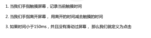
if (!isMove && (Date.now() - startTime) < 150) { // Click if the finger touch and departure time is less than 150ms
callback && callback(); // Execute callback function
}
isMove = false; // Reverse reset
startTime = 0;
});
}
//call
tap(div, function(){
// Execute callback function
});
</script>
</body>
</html>
2.4 fastclick plug-in
- Solve 300ms delay
- Website:< GitHub - ftlabs/fastclick: Polyfill is used to eliminate click delays on browsers with touch UI>
2.4.1 use of plug-ins
- Import js file
- Use js files according to syntax specifications
- Operation after importing js file: add this code to the new script tag
if ('addEventListener' in document) {
            document.addEventListener('DOMContentLoaded', function() {
                FastClick.attach(document.body);
            }, false);
        }
2.5 swiper plug-in (carousel plug-in)
-
Official website:< Swiper Chinese network - carousel slide js plug-in, H5 page front-end development>
-
usage method
- Introducing plug-ins
<!-- introduce swiper js file --> <script src="js/swiper.min.js"></script> <!-- Introduce our own js file --> <script src="js/index.js"></script>- Copy the html structure in the demo
<!-- Swiper Be careful not to change the structure and class name inside --> <div class="swiper-container"> <div class="swiper-wrapper"> <div class="swiper-slide"> <img src="upload/banner.dpg" alt=""> </div> <div class="swiper-slide"> <img src="upload/banner1.dpg" alt=""> </div> <div class="swiper-slide"> <img src="upload/banner2.dpg" alt=""> </div> <div class="swiper-slide"> <img src="upload/banner3.dpg" alt=""> </div> </div> <!-- Add Pagination --> <div class="swiper-pagination"></div>- Copy related css Styles
.swiper-slide { text-align: center; font-size: 18px; background: #fff; /* Center slide text vertically */ display: -webkit-box; display: -ms-flexbox; display: -webkit-flex; display: flex; -webkit-box-pack: center; -ms-flex-pack: center; -webkit-justify-content: center; justify-content: center; -webkit-box-align: center; -ms-flex-align: center; -webkit-align-items: center; align-items: center; } .swiper-pagination-bullet { background: #fff!important; }- Copy related js styles
window.addEventListener('load', function() {
    var swiper = new Swiper('.swiper-container', {
        spaceBetween: 30,
        centeredSlides: true,
        autoplay: {
            delay: 5000,
            disableOnInteraction: false,
        },
        pagination: {
            el: '.swiper-pagination',
            clickable: true,
        },
        navigation: {
            nextEl: '.swiper-button-next',
            prevEl: '.swiper-button-prev',
        },
    });
})
Usage review
- Website:< Swiper usage - swiper Chinese website>
2.6 common plug-ins of other mobile terminals
-
superslide: <SuperSlide | TouchSlide official website boasting chairman (superslide2.com) >(various effects of web pages)
-
iscroll: <GitHub - CubIQ / iscoll: smooth network scrolling >(rotation chart)
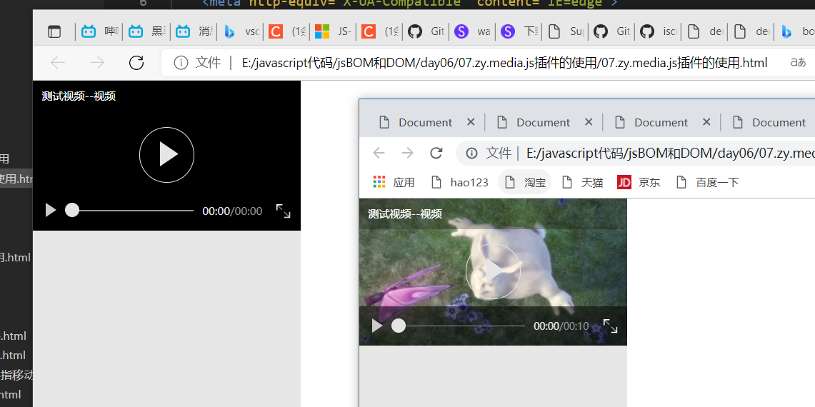
2.7 mobile video plug-in (zy.media.js)
- h5 video tag is added, but the support of browser is different
- The supported formats can be solved by source
- The style and appearance of the player will have different results in different browsers
- Solution
- Use ZY media. JS plug-in to achieve the unity of effect
<!DOCTYPE html>
<html lang="en">
<head>
<meta charset="UTF-8">
<meta http-equiv="X-UA-Compatible" content="IE=edge">
<meta name="viewport" content="width=device-width, initial-scale=1.0">
<title>Document</title>
<!-- Import style sheet -->
<link rel="stylesheet" href="./zy.media.min.css">
<!-- Copy style -->
<style type="text/css">
#modelView {
background-color: #DDDDDD;
z-index: 0;
opacity: 0.7;
height: 100%;
width: 100%;
position: relative;
}
.playvideo {
padding-top: auto;
z-index: 9999;
position: relative;
width: 300px;
height: 200px;
}
.zy_media {
z-index: 999999999
}
</style>
</head>
<body>
<!-- Copy video box -->
<div class="playvideo">
<div class="zy_media">
<video data-config='{"mediaTitle": "Test video--video"}'>
<source src="mov.mp4" type="video/mp4">
Your browser does not support HTML5 video
</video>
</div>
<div id="modelView"> </div>
</div>
<!-- 1.introduce js plug-in unit -->
<script src="zy.media.min.js"></script>
<script>
zymedia('video', {
autoplay: true
});
</script>
</body>
</html>
- design sketch
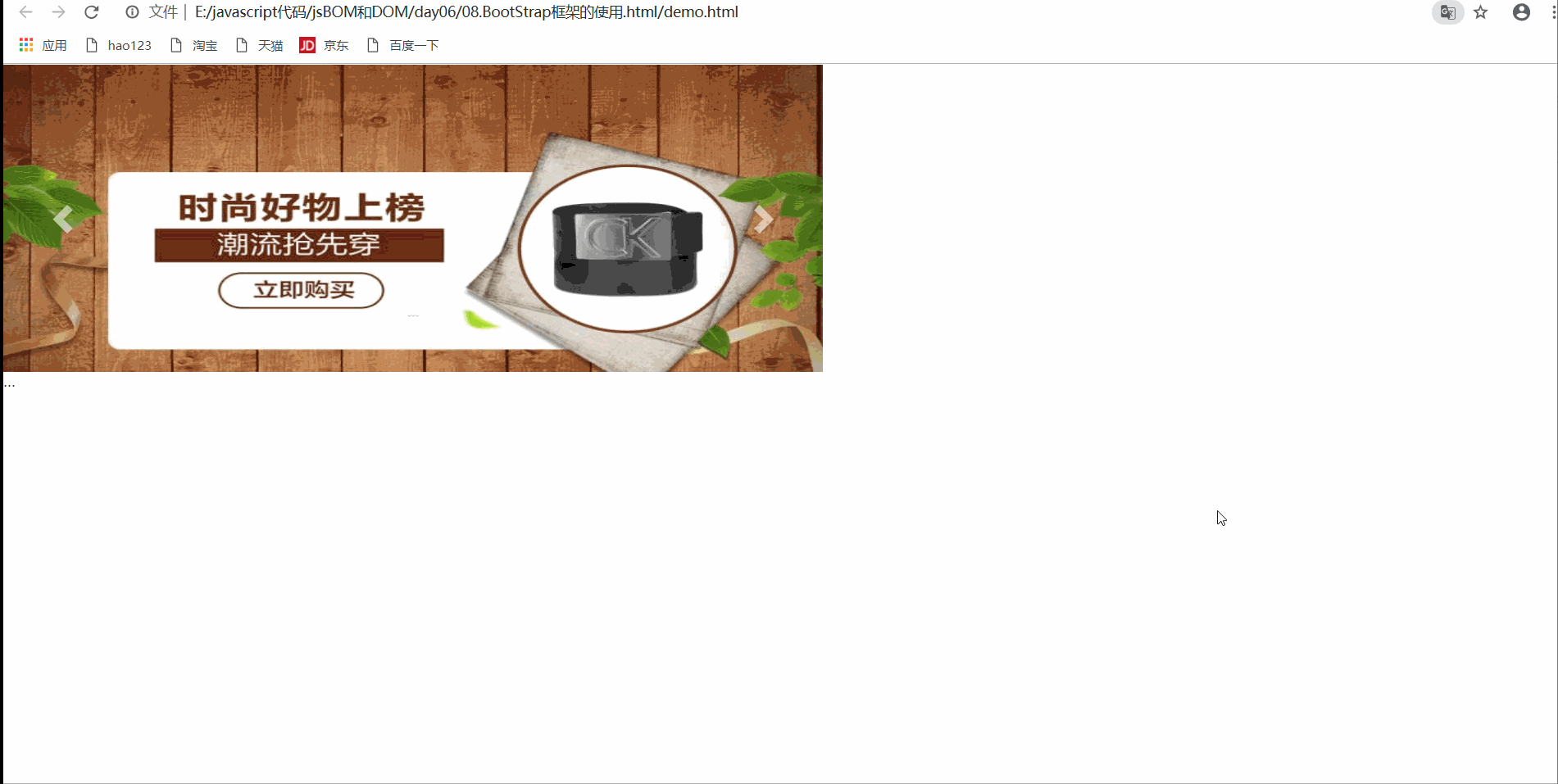
4. Common development framework of mobile terminal
- Bootstrap review
Example (rotation chart)
<!DOCTYPE html>
<html lang="en">

<head>
    <meta charset="UTF-8">
    <meta http-equiv="X-UA-Compatible" content="IE=edge">
    <meta name="viewport" content="width=device-width, initial-scale=1.0">
    <title>Document</title>
    <link rel="stylesheet" href="./bootstrap/css/bootstrap.min.css">
    <script src="./bootstrap/js/jquery.min.js"></script>
    <script src="./bootstrap/js/bootstrap.min.js"></script>
    <style>
        .focus {
            width: 800px;
            height: 300px;
            background-color: pink;
        }

        .carousel .item img,
        .carousel {
            width: 100%;
            height: 300px;
        }
    </style>

</head>

<body>
    <!-- Focus part -->
    <div class="focus">
        <div id="carousel-example-generic" class="carousel slide" data-ride="carousel">
            <!-- Indicators -->
            <ol class="carousel-indicators">
                <li data-target="#carousel-example-generic" data-slide-to="0" class="active"></li>
                <li data-target="#carousel-example-generic" data-slide-to="1"></li>
                <li data-target="#carousel-example-generic" data-slide-to="2"></li>
                <li data-target="#carousel-example-generic" data-slide-to="3"></li>
            </ol>

            <!-- Wrapper for slides -->
            <div class="carousel-inner" role="listbox">
                <div class="item active">
                    <img src="./upload/banner1.jpg" alt="...">
                    <div class="carousel-caption">
                        ...
                    </div>
                </div>
                <div class="item">
                    <img src="./upload/banner2.jpg" alt="...">
                    <div class="carousel-caption">
                        ...
                    </div>
                </div>
                <div class="item">
                    <img src="./upload/banner3.jpg" alt="...">
                    <div class="carousel-caption">
                        ...
                    </div>
                </div>
                <div class="item">
                    <img src="./upload/banner(1).jpg" alt="...">
                    <div class="carousel-caption">
                        ...
                    </div>
                </div>
                ...
            </div>

            <!-- Controls -->
            <a class="left carousel-control" href="#carousel-example-generic" role="button" data-slide="prev">
                <span class="glyphicon glyphicon-chevron-left" aria-hidden="true"></span>
                <span class="sr-only">Previous</span>
            </a>
            <a class="right carousel-control" href="#carousel-example-generic" role="button" data-slide="next">
                <span class="glyphicon glyphicon-chevron-right" aria-hidden="true"></span>
                <span class="sr-only">Next</span>
            </a>
        </div>
    </div>

    <script>
        $('.carousel').carousel({
            interval: 1000
        })
    </script>
</body>

</html>
- design sketch
5. Local storage
5.1 characteristics of local storage
- The data is stored in the user browser
- Setting, easy to read data, page refresh data is not lost
- Large capacity, with sessionStorage capacity of 5m and localStorage capacity of 20m
- Only strings can be stored, and the object can be JSON Store after stringify()
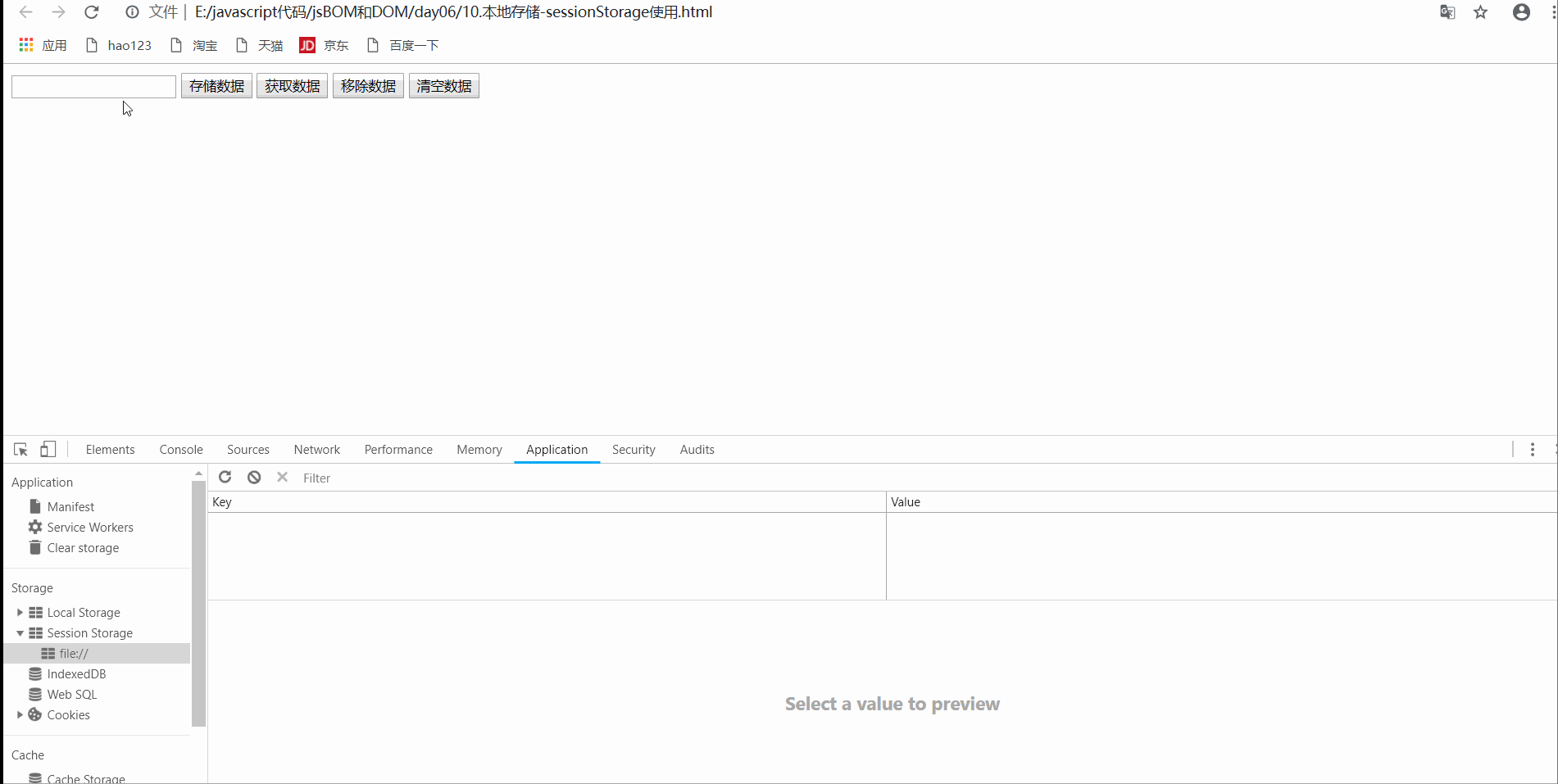
5.2 window.sessionStorage
- characteristic
- Lifecycle closes the browser window
- Data in the same window can be shared
- Stored as key value pairs
| operation | usage |
|---|---|
| Store data | sessionStorage.setItem(key,value) |
| get data | sessionStorage.getItem(key) |
| Remove data | sessionStorage.removeItem(key) |
| Clear data (use with caution) | sessionStorage.clear() |
Examples
<!DOCTYPE html>
<html lang="en">

<head>
    <meta charset="UTF-8">
    <meta http-equiv="X-UA-Compatible" content="IE=edge">
    <meta name="viewport" content="width=device-width, initial-scale=1.0">
    <title>Document</title>
</head>

<body>
    <input type="text">
    <button class="set">Store data</button>
    <button class="get">get data</button>
    <button class="remove">Remove data</button>
    <button class="del">wipe data </button>

    <script>
        var ipt = document.querySelector('input');
        var set = document.querySelector('.set');
        var get = document.querySelector('.get');
        var remove = document.querySelector('.remove');
        var del = document.querySelector('.del');

        // 1. Store data
        set.addEventListener('click', function() {
            sessionStorage.setItem('uname', ipt.value);
            sessionStorage.setItem('psw', ipt.value);
        })

        // 2. Obtain data
        get.addEventListener('click', function() {
            var aData = sessionStorage.getItem('uname');
            console.log(aData);
        })

        // 3. Remove data. This is to delete one item at a time. You can set to delete multiple items
        remove.addEventListener('click', function() {
            sessionStorage.removeItem('uname');
        })

        // 4. Clear all data
        del.addEventListener('click', function() {
            sessionStorage.clear();
        })
    </script>
</body>

</html>
- design sketch
5.3 window.localStorage
characteristic
- The lifecycle takes effect permanently, and the closed page also exists unless it is manually deleted
- Multiple windows (pages) can be shared
- Key value pair storage
| operation | usage |
|---|---|
| Store data | localStorage.setItem(key,value) |
| get data | localStorage.getItem(key) |
| Remove data | localStorage.removeItem(key) |
| Clear data (use with caution) | localStorage.clear() |
Examples
- localStorage usage
<!DOCTYPE html>
<html lang="en">

<head>
    <meta charset="UTF-8">
    <meta http-equiv="X-UA-Compatible" content="IE=edge">
    <meta name="viewport" content="width=device-width, initial-scale=1.0">
    <title>Document</title>
</head>

<body>
    <input type="text">
    <button class="set">Store data</button>
    <button class="get">get data</button>
    <button class="remove">Remove data</button>
    <button class="del">wipe data </button>

    <script>
        var ipt = document.querySelector('input');
        var set = document.querySelector('.set');
        var get = document.querySelector('.get');
        var remove = document.querySelector('.remove');
        var del = document.querySelector('.del');

        // 1. Store data
        set.addEventListener('click', function() {
            localStorage.setItem('uname', ipt.value);
            localStorage.setItem('psw', ipt.value);
        })

        // 2. Obtain data
        get.addEventListener('click', function() {
            var aData = localStorage.getItem('uname');
            console.log(aData);
        })

        // 3. Remove data. This is to delete one item at a time. You can set to delete multiple items
        remove.addEventListener('click', function() {
            localStorage.removeItem('uname');
        })

        // 4. Clear all data
        del.addEventListener('click', function() {
            localStorage.clear();
        })
    </script>
</body>

</html>
- Data sharing test
<!DOCTYPE html>
<html lang="en">

<head>
    <meta charset="UTF-8">
    <meta http-equiv="X-UA-Compatible" content="IE=edge">
    <meta name="viewport" content="width=device-width, initial-scale=1.0">
    <title>Document</title>
</head>

<body>
    <script>
        // data sharing

        var rtn = localStorage.getItem('uname');
        console.log(rtn);
    </script>
</body>

</html>
- design sketch
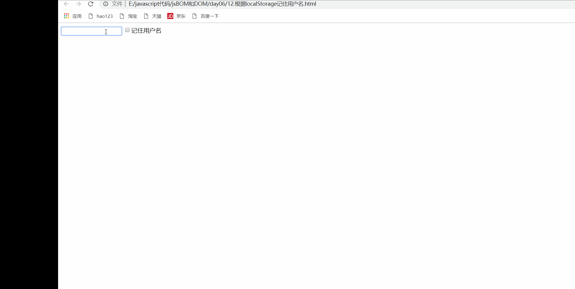
5.4 remember user name cases
<!DOCTYPE html>
<html lang="en">

<head>
    <meta charset="UTF-8">
    <meta http-equiv="X-UA-Compatible" content="IE=edge">
    <meta name="viewport" content="width=device-width, initial-scale=1.0">
    <title>Document</title>
</head>

<body>
    <input type="text" id="username"> <input type="checkbox" name="" id="remeber">Remember user name

    <script>
        var username = document.querySelector('#username');
        var remeber = document.querySelector('#remeber');
        console.log(username);
        if (localStorage.getItem('username')) {
            username.value = localStorage.getItem('username');
            remeber.checked = true;
        }

        remeber.addEventListener('change', function() {
            if (remeber.checked) {
                localStorage.setItem('username', username.value);
            } else {
                localStorage.removeItem('username');
            }
        })
    </script>
</body>

</html>
- design sketch