K-nearest neighbor algorithm implemented by numpy
K nearest neighbor (KNN)
As the saying goes, it's called birds of a feather flock together. In the classification algorithm, this sentence is true.
Let's imagine a scene like this. One day, potatoes came to the fields and looked at the green plants all over the mountains. There were corn, potatoes, dog tail flowers, trumpet flowers, and various grasses. Potatoes could not help but feel relaxed and happy. But suddenly, potatoes found that they didn't know many plants, but only knew that they were corn, potatoes, dog tail flowers In (potato is not a fool) not very real ha ha ha. But imagine potato is a computer. Computers are big fools. Let's think about how potatoes can distinguish these plants.
Potatoes already know the appearance of some plants such as corn and potatoes. He carefully measured the height, leaf length and branch diameter of these plants, as follows (the data is compiled, potatoes are not measured, bad potatoes),
| Height (cm) | Ye Chang (cm) | Branch diameter (cm) | type |
|---|---|---|---|
| 185 | 30 | 5 | Corn |
| 50 | 8 | 2 | Potato |
| 20 | 20 | 1 | grass |
| ... | ... | ... | ... |
According to these data, how can potatoes distinguish corn, potatoes and grass? Of course, it looks like
Now potato saw a new plant, its height is 170cm, leaf length 20cm, main stem diameter 6cm, so potato guessed that the plant is corn.
Let's forget about the unreliable story and the unreliable data. Let's go back to our K-nearest neighbor algorithm. How does it work? We have a training sample set (the plant data that potatoes already know), and each data of the sample set has been calibrated (potatoes know the plant type), that is, we know each data and classification of the sample set. For the new data without calibration (plants unknown to potatoes), the characteristics of the new data are compared with each data in the sample set, and the classification label of the data most similar to the new data in the sample set is selected as the classification label. However, we can't simply choose the most similar data classification as the result, because if there is a special data point (such as corn growing at a lower level, or grass growing at a higher level), it will get the result that deviates from the general situation.
To solve this problem, we choose k most similar data, and then take the classification with the largest number of K data as the result. In fact, it is voting, the minority is subject to the majority, where k is the K-K in K neighborhood, which is usually no more than 20.
Forged data
Potatoes are not measured, so we generate a set of data for our classification task.
Let's assume that
| type | Height (cm) | Ye Chang (cm) | Branch diameter (cm) |
|---|---|---|---|
| Corn | 150~190 | 40~70 | 2~4 |
| Potato | 30~60 | 7~10 | 1~2 |
| grass | 10~40 | 10~40 | 0~1 |
We use numpy's random number module to generate data in these ranges and add some wrong data as interference points. Then we can see that for k-nearest neighbor algorithm, these interference points will be eliminated.
import numpy as np
import pandas as pd
import matplotlib.pyplot as plt
plt.rcParams['font.sans-serif'] = ['SimHei']
# Data generation
train_num = 200
test_num = 100
config = {
    'Corn': [[150, 190], [40, 70], [2,4]],
    'Potato': [[30, 60], [7, 10], [1, 2]],
    'grass': [[10, 40], [10, 40], [0, 1]]
}
plants = list(config.keys())
dataset = pd.DataFrame(columns=['height(cm)', 'Leaf length(cm)', 'Stem diameter(cm)', 'type'])
index = 0
# Natural
for p in config:
    for i in range(int(train_num/3-3)):
        row = []
        for  j, [min_val, max_val] in enumerate(config[p]):
            v = round(np.random.rand()*(max_val-min_val)+min_val, 2)
            while v in dataset[dataset.columns[j]]:
                v = round(np.random.rand()*(max_val-min_val)+min_val, 2)
            row.append(v)
        row.append(p)
        dataset.loc[index] = row
        index +=  1
# Wrong data
for i in range(train_num - index):
    k = np.random.randint(3)
    p = plants[k]
    row = []
    for  j, [min_val, max_val] in enumerate(config[p]):
        v = round(np.random.rand()*(max_val-min_val)+min_val, 2)
        while v in dataset[dataset.columns[j]]:
            v = round(np.random.rand()*(max_val-min_val)+min_val, 2)
        row.append(v)
    row.append(plants[(k+1)%3])
    dataset.loc[index] = row
    index+=1
# dataset = dataset.infer_objects()
dataset = dataset.reindex(np.random.permutation(len(dataset)))
dataset.reset_index(drop=True, inplace=True)
dataset.iloc[:int(train_num), :-1].to_csv('potato_train_data.csv', index=False)
dataset.iloc[:int(train_num):, [-1]].to_csv('potato_train_label.csv', index=False)
Here, only the training data set is generated, and the test data is similar to this
Data visualization
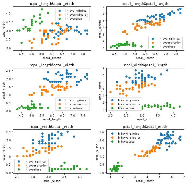
We can see the distribution of data points by drawing a scatter diagram of the data of two dimensions.
def visualize(dataset, labels, features, classes, fig_size=(10, 10), layout=None):
    plt.figure(figsize=fig_size)
    index = 1
    if layout == None:
        layout = [len(features), 1]
    for i in range(len(features)):
        for j in range(i+1, len(features)):
            p = plt.subplot(layout[0], layout[1], index)
            plt.subplots_adjust(hspace=0.4)
            p.set_title(features[i]+'&'+features[j])
            p.set_xlabel(features[i])
            p.set_ylabel(features[j])
            for k in range(len(classes)):
                p.scatter(dataset[labels==k, i], dataset[labels==k, j], label=classes[k])
            p.legend()
            index += 1
    plt.show()

dataset = pd.read_csv('potato_train_data.csv')
labels = pd.read_csv('potato_train_label.csv')
features = list(dataset.keys())
classes = np.array(['Corn', 'Potato', 'grass'])
for i in range(3):
    labels.loc[labels['type']==classes[i], 'type'] = i
dataset = dataset.values
labels = labels['type'].values
visualize(dataset, labels, features, classes)
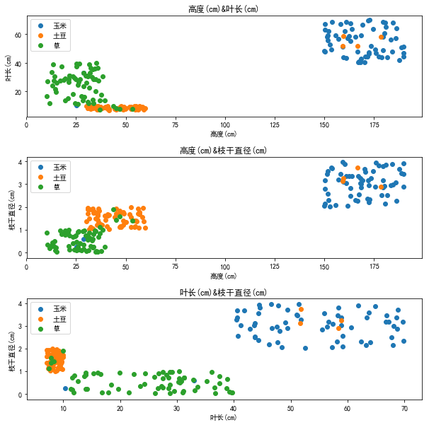
From the figure, we can see that our forged data are distributed in a cluster, and we can also see that our interference points are in the wrong places
KNN algorithm implementation
As we said before, we need to find the k data most similar to the data to be classified. How can we measure the similarity? Here we use the Euclidean distance to measure the distance of features.
DIS=∑i=1n(xi−yi)2DIS=\sqrt{\sum^n_{i=1}(x_i-y_i)^2}DIS=i=1∑n(xi−yi)2
Where [x][x][x] is the data feature to be classified and [y][y][y] is the data feature of the data set. Write the function to calculate the Euclidean distance as follows,
def euc_dis(data, dataset):
    diff = np.tile(data, [len(dataset), 1])
    dis = (diff - dataset) ** 2
    dis = dis.sum(axis=1) # Sum each line
    dis = dis**0.5
    return dis
Then we can write the function of knn,
'''
data: input,shape:size*features
dataset: Training data set
labels: Dataset label
k: k value
dis_func: distance function
'''
def classify(data, dataset, labels, diff_func, k):
    r = np.zeros(len(data), dtype=np.int)
    for i, d in enumerate(data):
        diff = diff_func(d, dataset)
        diff_sort_arg = diff.argsort() #Sort get index
        label_count = {}
        # Calculate the most categories of k data
        for l in labels[diff_sort_arg[:k]]:
            label_count[l] = label_count.get(l, 0) + 1
        r[i] = sorted(label_count.items(), key=lambda a: a[1], reverse=True)[0][0]
    return r
test
Use the test data we generated before to test our knn
%%time
test_dataset = pd.read_csv('potato_test_data.csv').values
test_labels = pd.read_csv('potato_test_label.csv')
for i in range(3):
    test_labels.loc[test_labels['type']==classes[i], 'type'] = i
test_labels = test_labels['type'].values
predicted = classify(test_dataset,
                        dataset, labels, euc_dis, 20)
print('Total test data:%d'%len(test_labels))
print('Accuracy rate:%.2f%%'%((predicted==test_labels).sum()/len(test_labels)*100))
print('Error test:')
for i, p in enumerate(predicted):
    if p != test_labels[i]:
        print(test_dataset[i])
Total test data: 100
Accuracy: 97.00%
Error test:
[38.73 11.85 0.15]
[36.67 11.31 0.57]
[3.706e+01 1.388e+01 1.000e-02]
CPU times: user 31.2 ms, sys: 628 µs, total: 31.8 ms
Wall time: 45.5 ms
When we take k value as 20, the accuracy is 99%. When we try other k values,
| k | Accuracy rate |
|---|---|
| 1 | 98% |
| 5 | 99% |
| 10 | 97% |
| 20 | 97% |
It can be seen that the results of different k values are slightly different, but because the amount of data here is small and unrepresentative, especially the value of k is taken as 1, which is actually wrong. The reason is that as mentioned in our principle part, the anti-interference ability will be very poor. Generally speaking, we can take the value of 5-20.
Decision boundary
We say that knn determines the classification value of the data to be classified by looking for the data similar to the data to be classified in the data set, so what is the classification area division in the feature space? Decision boundary is the boundary of classification area in feature space.
def draw_boundary(dataset, labels, features, classes, k=20, step=0.1,\
                  fig_size=(10, 10), layout=None):
    plt.figure(figsize=fig_size)
    index = 1
    if layout == None:
        layout = [len(features), 1]
    for i in range(len(features)):
        for j in range(i+1, len(features)):
            p = plt.subplot(layout[0], layout[1], index)
            plt.subplots_adjust(hspace=0.4)
            p.set_title(features[i]+'&'+features[j])
            p.set_xlabel(features[i])
            p.set_ylabel(features[j])
            X = np.arange(np.min(dataset[:, i]), np.max(dataset[:, i])+step, step)
            Y = np.arange(np.min(dataset[:, j]), np.max(dataset[:, j])+step, step)
            X_G, Y_G = np.meshgrid(X, Y)
            Z = np.zeros([len(Y), len(X)])
            for m, x in enumerate(X):
                for n, y in enumerate(Y):
                    Z[n, m] = classify([[x, y]], dataset[:, [i, j]],
                                      labels, euc_dis, k)[0]
            plt.contourf(X_G, Y_G, Z, cmap=plt.cm.RdYlBu)
            for i_c in range(len(classes)):
                p.scatter(dataset[labels==i_c, i], dataset[labels==i_c, j], label=classes[i_c])
            p.legend()
            index += 1
    plt.show()

draw_boundary(dataset, labels, features, classes)
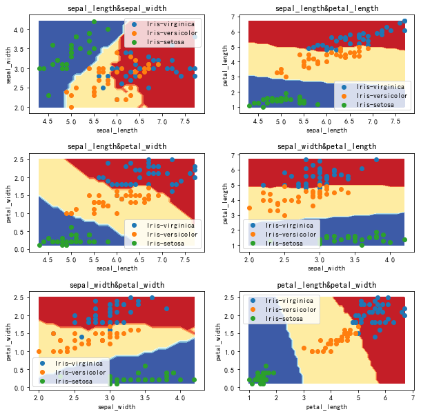
We use two features to draw decision boundary in two-dimensional space. The results are as follows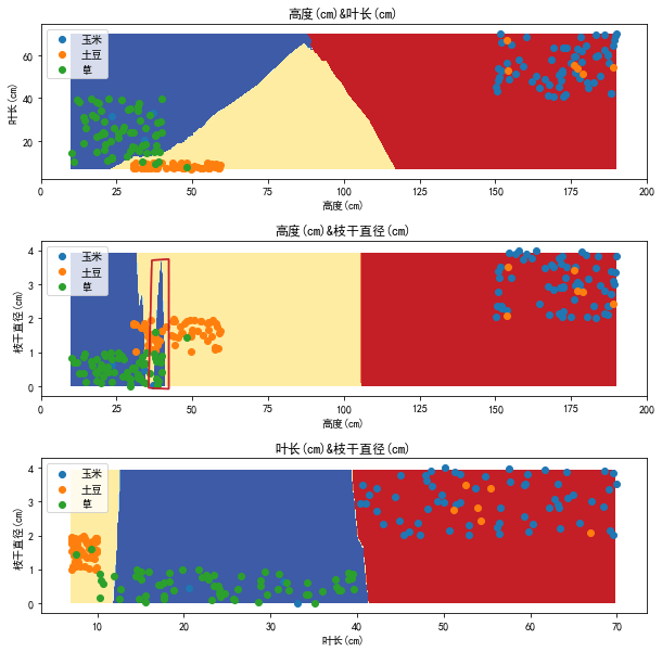
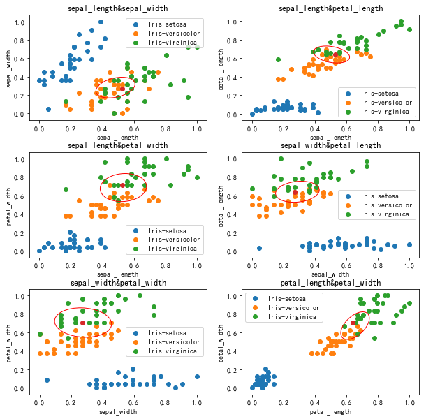
It can be seen that the decision boundary in the two-dimensional feature plane roughly conforms to the distribution of feature points, but there are some wrong strip areas, such as the area in the red line circle in the figure. What causes this?
normalization
Let's look at the following data:
| index | height |
|---|---|
| A | 10 |
| B | 15 |
| index | height |
|---|---|
| M | 100 |
| N | 105 |
So is A more similar to B or M more similar to N? Let's draw A picture
We can see that at the same scale, M and N are more similar visually, but in fact, they are all 5. Here we can think of a similar concept. What we need to see is absolute value or relative value. Do we need to scale to the same scale?
When we calculate the Euclidean distance of the sample, we calculate the sum of the squares of the differences of several features. In the forged data, the range of height value is far larger than the leaf length and diameter, so when we calculate the distance, the contribution of height to the result is far greater than the leaf length and diameter, that is, the weight of height is greater.
Draw 20 points closest to the test point in the sample set, as shown below,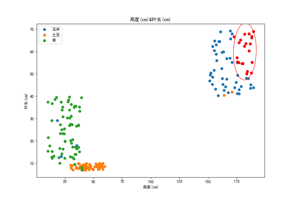
It can be seen that these points are distributed more and more unevenly in the direction of leaf length, and we think the weight of these features should be the same.
So, we need to normalize the features,
normalized=dataset−minrangenormalized=\frac{dataset-min}{range}normalized=rangedataset−min
Scale feature to [0, 1]
def normalize(dataset):
    min_vals = dataset.min(axis=0)
    max_vals = dataset.max(axis=0)
    ranges = max_vals - min_vals
    normalized = (dataset - min_vals) / ranges
    return normalized, min_vals, ranges
The normalization function will return the minimum value and range. After normalizing the data set, we need to normalize the test data in the same way.
normalized_dataset, min_vals, ranges = normalize(dataset)
normalized_test = (test_dataset - min_vals) / ranges
What is the accuracy after normalization?
Total test data: 100
Accuracy: 100.00%
Error test:
CPU times: user 34.4 ms, sys: 0 ns, total: 34.4 ms
Wall time: 50.1 ms
Let's look at the decision boundary: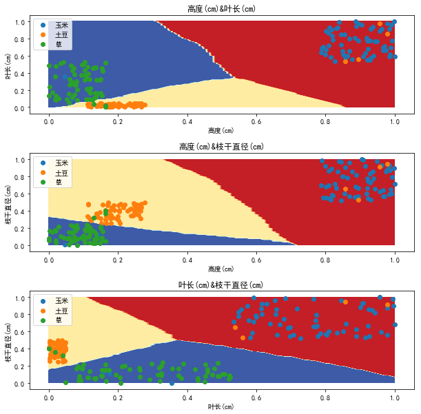
As you can see, the decision boundary has become more beautiful
At this time, the nearest 20 points in the sample set are as follows: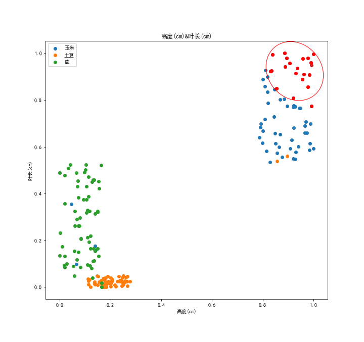
As you can see, the points are more evenly distributed on both axes.
This is the function of normalization, which makes the function of each feature in the distance in the form of percentage. Of course, sometimes we have other options.
Code for drawing confidence ellipse 1:
def confidence_ellipse(x, y, ax, n_std=3.0, facecolor='none', **kwargs):
    if x.size != y.size:
        raise ValueError("x and y must be the same size")

    cov = np.cov(x, y)
    pearson = cov[0, 1]/np.sqrt(cov[0, 0] * cov[1, 1])
    # Using a special case to obtain the eigenvalues of this
    # two-dimensionl dataset.
    ell_radius_x = np.sqrt(1 + pearson)
    ell_radius_y = np.sqrt(1 - pearson)
    ellipse = Ellipse((0, 0),
        width=ell_radius_x * 2,
        height=ell_radius_y * 2,
        facecolor=facecolor,
        **kwargs)

    # Calculating the stdandard deviation of x from
    # the squareroot of the variance and multiplying
    # with the given number of standard deviations.
    scale_x = np.sqrt(cov[0, 0]) * n_std
    mean_x = np.mean(x)

    # calculating the stdandard deviation of y ...
    scale_y = np.sqrt(cov[1, 1]) * n_std
    mean_y = np.mean(y)

    transf = transforms.Affine2D() \
        .rotate_deg(45) \
        .scale(scale_x, scale_y) \
        .translate(mean_x, mean_y)

    ellipse.set_transform(transf + ax.transData)
    return ax.add_patch(ellipse)
Something about knn
So far, we have almost completed the implementation of knn ~
Let's take a look at some features of knn:
- knn is not sensitive to abnormal data and will not affect the results due to a small number of wrong data. Remember the wrong data we added when we forged the data before, guys can try. Even if our test point is the wrong data itself, the final result is correct. Because knn itself is a kind of decision-making in which the minority is subordinate to the majority
- knn does not need to make special assumptions on data, which is not reflected in our implementation process, but we will realize this later in our study
- The calculation of knn is very large. Potato is impressed by this point. The amount of knn calculation depends entirely on the size of the data set. Each classification needs to traverse the data in the data set once plus sorting. We can clearly feel this when drawing the decision boundary above.
- knn consumes a lot of memory. We need to save the data set itself for classification at all times in operation. When the data set is large, the memory consumption will be large. At this time, 3 and 4 themselves become the main factors restricting the data set to become larger.
- knn can't get the internal information of data set, and can only infer the classification from the numerical approach itself. We can't use knn to understand the characteristics of data itself, or knn is just an algorithm rather than a model.
- knn is not good at dealing with complex decision-making boundary. knn is to get the equal weight similarity of all features, so the features with similar range will also have an impact on the results. At the same time, the data processing with unclear boundary is not good.
Iris dataset trial
After the baptism of our forged data, our knn classification function has been born. Next, we will use Iris data set to make the final test of our knn classification function.
visualization
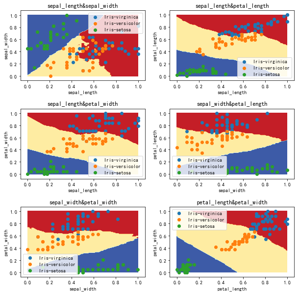
Decision boundary (not normalized) k=20
Test result (not normalized) k=20
Total test data: 50
Accuracy: 96.00%
Error test:
[6.7 3. 5. 1.7]
[6. 3. 4.8 1.8]
CPU times: user 21 ms, sys: 5.21 ms, total: 26.2 ms
Wall time: 27.3 ms
K data point decision (not unified) k=20
Decision boundary (normalization)
Test results (normalized)
Total test data: 50
Accuracy: 96.00%
Bad data:
[0.65714286 0.41666667 0.6779661 0.66666667]
[0.48571429 0.25 0.77966102 0.54166667]
CPU times: user 3.09 ms, sys: 2.99 ms, total: 6.08 ms
Wall time: 5.58 ms
K data point decision (normalization) k=20
conclusion
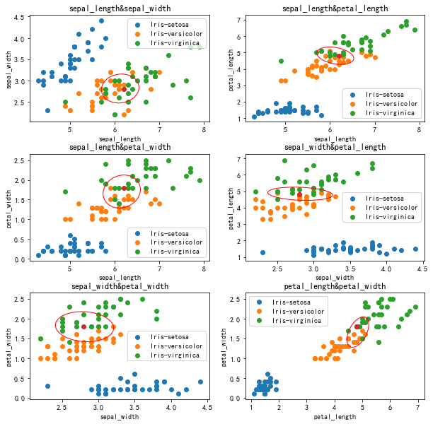
The results of iris normalization are not much better. Firstly, the data volume of iris dataset is small, while the two features of sepal length and sepal width, iris versicolor and iris virginica, almost overlap each other, while several iris flowers are densely distributed at the boundary of other features.
The effect of normalization on Iris dataset is limited because of its uniform distribution.
It is verified here that knn is not good for the data with complex boundary and high hybrid degree. 2
All the code (jupyter notebook) can be found in Download here Yo ~
-
Come from Example of matplotlib: plot a confidence ellipse of a two dimensional dataset , principle we will learn later ↩︎
-
Referring to the people's post and Telecommunications Press, machine learning practice, translated by Peter Harrington, Li Rui, Li Peng, Qu Yadong, Wang Bin ↩︎

