
1, Introduction
Last week, I interviewed a little partner who graduated from a certain training institution to apply for the position of front-end engineer. The resume said that he was proficient in html5+css3, and could write the rotation chart, navigation bar and so on. The first impression was good. During the interview, I asked several simple technical knowledge. One is how to center the text vertically? One is to write a layout style similar to the head? I just wanted to test my partner's basic knowledge about flex flexible layout, but I was not very satisfied with the interview results (I also asked some basic knowledge about JS and Vue mentioned in my resume). When I first started the div+css layout, the vertical centering problem has been bothering me. It's hard for thieves to get high. Since I met flex, mom, it's really fragrant Taking advantage of the new year's Day holiday, summarize your understanding of flex's flexible layout and deepen your memory.
2, What is Flex layout?
Flex layout is a new scheme proposed by W3C in 2009, which can easily, completely and responsively realize various page layouts.
Flex is the abbreviation of Flexible Box, which means "flexible layout", and is used to provide maximum flexibility for box model.
Flex layout is more suitable for one-dimensional layout (one row or one column layout). It's cool to use and always use.
3, Play Flex layout
(1) Initial knowledge of "container" and "project"
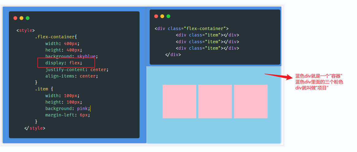
As can be seen from the above figure, as long as display:flex is set for the element, the element becomes a "container", and the child element of the element becomes a "project".
(2) First knowledge of "spindle" and "cross axis"
The main axis and cross axis can be simply understood as horizontal and vertical directions. By default, the main axis corresponds to the horizontal direction and the cross axis corresponds to the vertical direction, but this correspondence can be modified (through the flex direction attribute). In many cases, we do need to modify it. Next, let's look at the magical properties of the "container".
(3) Properties of the container
The container has six CSS properties:
1. flex-direction (Set spindle direction)
2. flex-wrap (Set line wrap mode)
3. flex-flow (flex-direction And flex-wrap Abbreviation of)
4. justify-content (Sets the alignment of child elements in the principal axis direction)
5. align-items (Sets the alignment of child elements on the cross axis)
6. align-content (Set the alignment of multiple rows of child elements on the cross axis. Note: only multiple rows of child elements take effect)
Let's specify the values and meanings of each attribute
1. Flex direction sets the direction of the spindle
flex-direction: row(default-The spindle runs horizontally from left to right)
flex-direction: column(Spindle (from top to bottom in vertical direction)
flex-direction: row-reverse(The spindle runs horizontally from right to left)
flex-direction: column-reverse(Spindle (from bottom to top in vertical direction)
2. Flex wrap if a line cannot be placed, set the line feed method
flex-wrap: nowrap(default-nowrap )
flex-wrap: wrap(Allow line breaks)
flex-wrap: wrap-reverse(Allow reverse wrapping-Reverse line feed means that the first line is below and arranged from bottom to top)
3. Flex flow is the abbreviation of flex direction and flex wrap. The default value is row nowrap
flex-flow: row nowrap
4. Justify content sub element alignment in the spindle direction
justify-content: flex-start (The child elements are aligned along the starting direction of the principal axis)
justify-content: flex-end (Child elements are aligned along the end of the principal axis)
justify-content: center (Child elements are centered horizontally in the direction of the principal axis)
justify-content: space-between (Child elements are aligned at both ends in the direction of the principal axis, and the spacing between items is equal)
justify-content: space-around (The sub elements are evenly arranged in the direction of the main axis, and the same space is allocated around each element)
5. Alignment of align items sub elements on the cross axis
align-items: flex-start (Child elements are aligned in the direction of the starting point on the cross axis)
align-items: flex-end (Child elements are aligned in the end direction on the cross axis)
align-items: center (Child elements are centered on the cross axis)
align-items: baseline (Child elements are aligned with the text baseline in the direction of the cross axis)
align-items: stretch (This property is the default if the item is not set to height or set to auto,Will occupy the height of the entire container)
6. Align content: the alignment of multiple lines of child elements on the cross axis. Note: only multiple lines of child elements are effective
align-content: flex-start (Start alignment)
align-content: flex-end (End segment alignment)
align-content: center (Center alignment)
align-content: space-between (Equally spaced uniform distribution)
align-content: space-around (Equidistant uniform distribution)
align-content: stretch (Stretched Alignment )
(4) Properties of the project
The project has 6 CSS properties:
1. order (Set the arrangement order of items. The smaller the value, the higher the value. You can set a negative value, which is 0 by default)
2. flex-grow (Defines the magnification of the project and how to allocate the remaining space. The default is 0)
3. flex-shrink (Define the reduction scale of the project. If there is insufficient space, the project will be reduced. The default is 1)
4. flex-basis (Defines the initial length of the project)
5. flex (flex-grow,flex-shrink,flex-basis Abbreviation of)
6. align-self (Set the alignment of the item)
1.order sets the arrangement order of items. The smaller the value, the higher the value. You can set a negative value, which is 0 by default
order: <integer> integer
2. The elastic extension ratio of flex grow sub container, simply understood, is to allocate the remaining space to the sub container in proportion
flex-grow: <number> The default value is 0
3. Proportion of elastic shrinkage of flex shrink sub container. The simple understanding is that when you exceed the part of the sub container, the corresponding value will be subtracted from the sub container according to the corresponding proportion. If the flex shrink attribute of all items is 1, it will be reduced by the same proportion when the space is insufficient. If the flex shrink attribute of one item is 0 and all other items are 1, the former will not shrink when the space is insufficient.
4. The flex basis attribute defines the main size occupied by the project before allocating excess space. Based on this attribute, the browser calculates whether the spindle has excess space. Its default value is auto, the original size of the project.flex-grow: <number>
flex-grow: <length> |auto
5. The flex attribute is short for flex grow, flex shrink and flex basis. The default value is 0 1 auto. The last two properties are optional
flex: 0 1 auto
6. The align self attribute allows a single item to have a different alignment from other items, and can override the align items attribute. The default value is auto, which means that it inherits the align items attribute of the parent element. If there is no parent element, it is equivalent to stretch
align-self: auto (Inherits the of the parent element align-items attribute)
align-self: flex-start (Start alignment)
align-self: flex-end (End to end alignment)
align-self: center (Center alignment)
align-self: baseline (Baseline alignment)
align-self: stretch (Stretched Alignment )
4, Summary
After systematically sorting out the attributes related to the flex layout, I have gained a lot. The flex layout is not complex and easy to use. It is convenient for me to quickly locate the required attributes in the future. At the same time, I hope it can help you "far away". If there is any mistake or imprecision, please be sure to correct it!