Today, let's talk about several map drawing methods I often use in my daily work and life. Next, I will introduce the map drawing methods of these visual libraries. Of course, there are many excellent class libraries for drawing beautiful visual maps. There is no way to list them one by one
pyecharts,plotly,folium,bokeh,basemap,geopandas,cartopy
Boken
Firstly, we introduce Boken's method of drawing map
Bokeh supports the creation of basic map visualization and map visualization based on processing geographic data
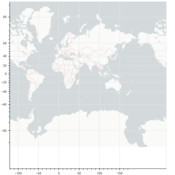
Draw a map of the world
from bokeh.plotting import figure, show
from bokeh.tile_providers import CARTODBPOSITRON, get_provider
from bokeh.io import output_notebook


output_notebook()
tile_provider = get_provider(CARTODBPOSITRON)

p = figure(x_range=(-2000000, 6000000), y_range=(-1000000, 7000000),
           x_axis_type="mercator", y_axis_type="mercator")
p.add_tile(tile_provider)

show(p)
Draw another map of China
from bokeh.plotting import curdoc, figure
from bokeh.models import GeoJSONDataSource
from bokeh.io import show

# Read the map data of China and send it to GeoJSONDataSource
with open("china.json", encoding="utf8") as f:
    geo_source = GeoJSONDataSource(geojson=f.read())
# Set a canvas
p = figure(width=500, height=500)
# Using the patches function and geo_source draw map
p.patches(xs='xs', ys='ys', source=geo_source)
show(p)
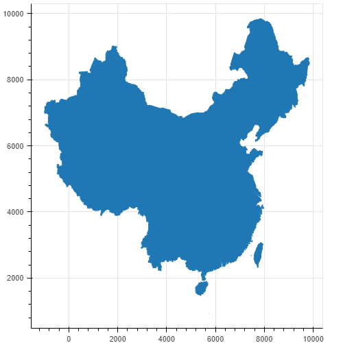
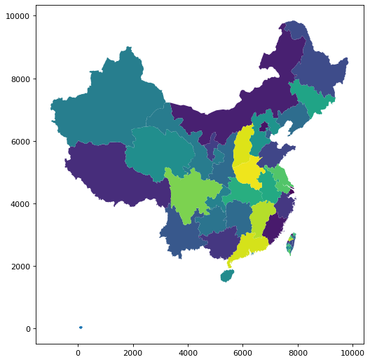
It is also very convenient for us to draw the map through GEO geographic data, but the map looks monotonous. We draw different provinces into different colors to see
with open("china.json", encoding="utf8") as f:
    data = json.loads(f.read())
# Judge whether it is Beijing data
def isBeijing(district):
    if 'beijing' in district['properties']['woe-name'].lower():
        return True
    return False
# data['features'] = list(filter(isInLondon, data['features']))
# Filter data
# Add a color attribute for each region
for i in range(len(data['features'])):
    data['features'][i]['properties']['color'] = ['red', 'blue', 'yellow', 'orange', 'gray', 'purple'][i % 6]
    data['features'][i]['properties']['number'] = random.randint(0, 20_000)
geo_source = GeoJSONDataSource(geojson=json.dumps(data))
p = figure(width=500, height=500, tooltips="@name, number: @number")
p.patches(xs='xs', ys='ys', fill_alpha=0.7,
        line_color='white',
        line_width=0.5,
        color="color",   # Add a color attribute, where "color" corresponds to the color attribute of each region
        source=geo_source)
p.axis.axis_label = None
p.axis.visible = False
p.grid.grid_line_color = None

show(p)
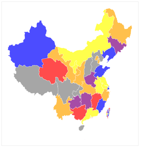
It can be seen that there is already an internal flavor. The only drawback is that the 13th segment of the South China Sea is not displayed
geopandas
GeoPandas is a map visualization tool based on Pandas. Its data structure is completely inherited from Pandas. It is very friendly to students familiar with master pan
Or draw a map of the world first
import pandas as pd
import geopandas
import matplotlib.pyplot as plt
%matplotlib inline

world = geopandas.read_file(geopandas.datasets.get_path('naturalearth_lowres'))
world.plot()
plt.show()
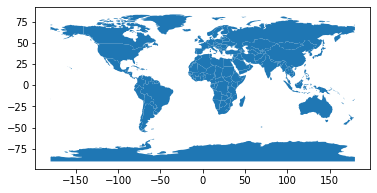
This is also a classic picture on the official website of geopandas. You can see that it is very simple. Except for the import code, the map is drawn in only three lines
Now let's continue to draw the map of China. This time, we add the information of Jiuduan line
china_nine = geopandas.read_file(r"geojson/Nine segment line GS(2019)1719 number.geojson")
china = geopandas.read_file('china-new.json')
fig, ax = plt.subplots(figsize=(12, 8),dpi=80)
ax = china.plot(ax=ax, column='number')
ax = china_nine.plot(ax=ax)
plt.show()
We reused the previously processed china.json data. The number field is randomly generated test data, and the effect is comparable to that of Bokeh
plotly
Next, let's introduce plot, which is also a very useful Python visualization tool. If we want to draw map information, we need to install the following dependencies
!pip install geopandas==0.3.0
!pip install pyshp==1.2.10
!pip install shapely==1.6.3
Next, let's draw a world map
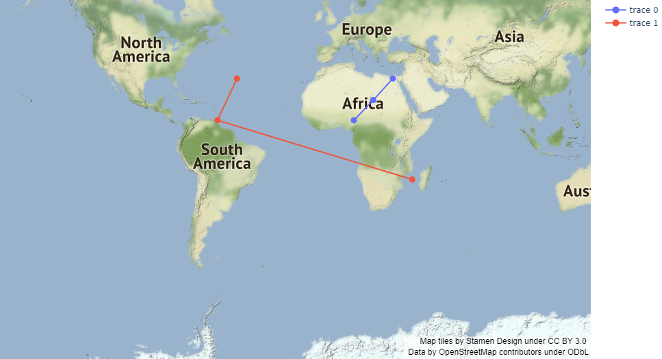
import plotly.graph_objects as go

fig = go.Figure(go.Scattermapbox(
    mode = "markers+lines",
    lon = [10, 20, 30],
    lat = [10, 20,30],
    marker = {'size': 10}))

fig.add_trace(go.Scattermapbox(
    mode = "markers+lines",
    lon = [-50, -60,40],
    lat = [30, 10, -20],
    marker = {'size': 10}))

fig.update_layout(
    margin ={'l':0,'t':0,'b':0,'r':0},
    mapbox = {
        'center': {'lon': 113.65000, 'lat': 34.76667},
        'style': "stamen-terrain",
        'center': {'lon': -20, 'lat': -20},
        'zoom': 1})

fig.show()
Here we use the underlying API plot.graph_ Objects. Choroplethmapbox
Let's continue to draw a map of China using an advanced API, plot. Express. Choropleth_ mapbox
import pandas as pd
import plotly.express as px
import numpy as np
import json

with open(r"china_province.geojson", encoding='utf8') as f:
    provinces_map = json.load(f)

df = pd.read_csv(r'data.csv')
df.diagnosis = df.diagnosis.map(np.log)

fig = px.choropleth_mapbox(
    df,
    geojson=provinces_map,
    color='diagnosis',
    locations="region",
    featureidkey="properties.NL_NAME_1",
    mapbox_style="carto-darkmatter",
    color_continuous_scale='viridis',
    center={"lat": 37.110573, "lon": 106.493924},
    zoom=3,
)
fig.show()
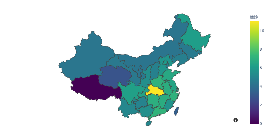
It can be seen that the interactive map drawn is still very beautiful, but the rendering speed is somewhat moving. It depends on your personal needs. If you have requirements for rendering speed, Ployly may not be the best choice~
Cartopy/Basemap
The reason why the two libraries are put together is that they are based on Matplotlib. With the no maintenance of Python 2, Basemap is also abandoned by Matplotlib, and Cartopy becomes a regular. Next, we mainly introduce the Cartopy tool
Cartopy makes use of the powerful PROJ.4, NumPy and Shapely libraries, and builds a programming interface on Matplotlib to create and publish high-quality maps
Let's draw a map of the world first
%matplotlib inline
import cartopy.crs as ccrs
import matplotlib.pyplot as plt

ax = plt.axes(projection=ccrs.PlateCarree())
ax.coastlines()

plt.show()
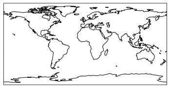
This is a very classic and common world map drawn by cartopy. The form is relatively simple. Let's enhance the map below
import datetime
import matplotlib.pyplot as plt
import cartopy.crs as ccrs
from cartopy.feature.nightshade import Nightshade


fig = plt.figure(figsize=(10, 5))
ax = fig.add_subplot(1, 1, 1, projection=ccrs.PlateCarree())

date = datetime.datetime(2021, 12, 2, 21)

ax.set_title(f'Night time shading for {date}')
ax.stock_img()
ax.add_feature(Nightshade(date, alpha=0.2))
plt.show()
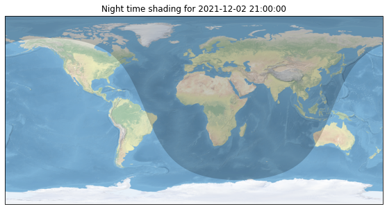
Through the above code, we have drawn the day and night map of the current time world, which is still very strong
Let's continue to draw a map of China
import cartopy.io.shapereader as shpreader
import numpy as np
import matplotlib.pyplot as plt
import cartopy.crs as ccrs
import cartopy.feature as cfeature
from cartopy.mpl.gridliner import LONGITUDE_FORMATTER, LATITUDE_FORMATTER
from cartopy.mpl.ticker import LongitudeFormatter, LatitudeFormatter
import cartopy.io.shapereader as shapereader
import matplotlib.ticker as mticker
#Load China region shp from file
shpfile = shapereader.Reader(r'ne_10m_admin_0_countries_chn\ne_10m_admin_0_countries_chn.shp')
# Set figure size
fig = plt.figure(figsize=[8, 5.5])
# Set the projection mode and draw the main drawing
ax = plt.axes(projection=ccrs.PlateCarree(central_longitude=180))
ax.add_geometries(
        shpfile.geometries(),
        ccrs.PlateCarree())
ax.set_extent([70, 140, 0, 55],crs=ccrs.PlateCarree())
plt.show()
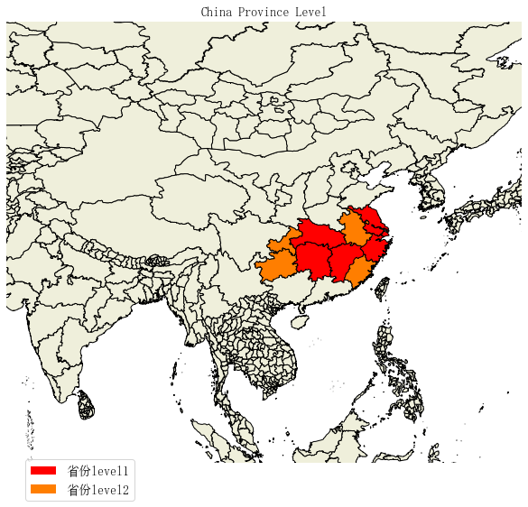
The biggest feature of cartopy mapping is its high flexibility. The corresponding cost is that it will be more difficult to write code. For example, if we want to fill different colors in different provinces, we need to write a little more code
import matplotlib.patches as mpatches
import matplotlib.pyplot as plt
from matplotlib.font_manager import FontProperties
import shapely.geometry as sgeom

import cartopy.crs as ccrs
import cartopy.io.shapereader as shpreader

font = FontProperties(fname=r"c:\windows\fonts\simsun.ttc", size=14)

def sample_data():
#    lons = [110, 115, 120, 122, 124 ]
    lons = [124, 122, 120, 115, 110 ]
    lats = [33, 32, 28, 30, 28 ]
    return lons, lats

#ax = plt.axes([0, 0, 1, 1], projection=ccrs.LambertConformal())
ax = plt.axes(projection=ccrs.PlateCarree())


ax.set_extent([70, 140, 0, 55],crs=ccrs.Geodetic())

shapename = 'admin_1_states_provinces'
states_shp = shpreader.natural_earth(resolution='10m', category='cultural', name=shapename)


lons, lats = sample_data()

# to get the effect of having just the states without a map "background"
# turn off the outline and background patches
ax.background_patch.set_visible(False)
ax.outline_patch.set_visible(False)

plt.title(u'China Province Level', fontproperties=font)

# turn the lons and lats into a shapely LineString
track = sgeom.LineString(zip(lons, lats))

track_buffer = track.buffer(1)

for state in shpreader.Reader(states_shp).geometries():
    # pick a default color for the land with a black outline,
    # this will change if the storm intersects with our track
    facecolor = [0.9375, 0.9375, 0.859375]
    edgecolor = 'black'

    if state.intersects(track):
        facecolor = 'red'
    elif state.intersects(track_buffer):
        facecolor = '#FF7E00'

    ax.add_geometries([state], ccrs.PlateCarree(),
                      facecolor=facecolor, edgecolor=edgecolor)


# make two proxy artists to add to a legend
direct_hit = mpatches.Rectangle((0, 0), 1, 1, facecolor="red")
within_2_deg = mpatches.Rectangle((0, 0), 1, 1, facecolor="#FF7E00")
labels = [u'province level1',
          'province level2']
plt.legend([direct_hit, within_2_deg], labels,
           loc='lower left', bbox_to_anchor=(0.025, -0.1), fancybox=True, prop=font)
ax.figure.set_size_inches(14, 9)
plt.show()
folium
folium is an advanced map drawing tool based on the data application ability of Python ecosystem and the mapping ability of Leaflet.js library. It can flexibly customize the drawing area and show more diverse forms by manipulating data in Python and then visualizing it in Leaflet map
The first is to draw a world map in three lines of code
import folium


# define the world map
world_map = folium.Map()
# display world map
world_map
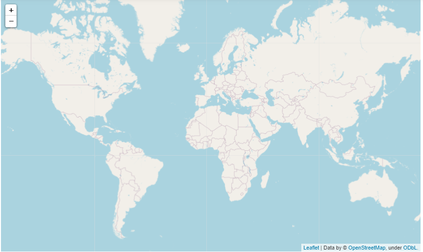
Next, draw a map of China
# Draw boundary
import json

df = pd.read_csv(r'plotly-choropleth-mapbox-demo-master/data.csv')
# read china border
with open(r"plotly-choropleth-mapbox-demo-master/china_province.geojson", encoding='utf8') as f:
    china = json.load(f)

chn_map = folium.Map(location=[40, 100], zoom_start=4)


folium.Choropleth(
    geo_data=china,
    name="choropleth",
    data=df,
    columns=["region", "diagnosis"],
    key_on="properties.NL_NAME_1",
    fill_color="YlGn",
    fill_opacity=0.7,
    line_opacity=0.2,
    legend_name="New crown diagnosis",
).add_to(chn_map)

folium.LayerControl().add_to(chn_map)

chn_map
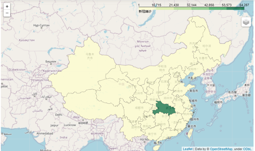
As a professional map tool, it not only has fast rendering speed, but also has a very high degree of customization, which is worth trying
PyEcharts
Finally, we introduce PyEcharts, a domestic excellent visualization tool
Map the world
from pyecharts import options as opts
from pyecharts.charts import Map
from pyecharts.faker import Faker


c = (
    Map()
    .add("test data", [list(z) for z in zip(Faker.country, Faker.values())], "world")
    .set_series_opts(label_opts=opts.LabelOpts(is_show=False))
    .set_global_opts(
        title_opts=opts.TitleOpts(title="Map-World map"),
        visualmap_opts=opts.VisualMapOpts(max_=200),
    )
)
c.render_notebook()
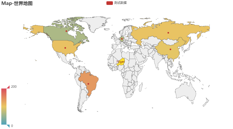
One advantage of drawing a map through Pyecharts is that we don't need to process GEO files. We can automatically match the country name to the map directly, which is very convenient
Then draw a map of China
c = (
    Map()
    .add("test data", [list(z) for z in zip(Faker.provinces, Faker.values())], "china")
    .set_global_opts(
        title_opts=opts.TitleOpts(title="Map-VisualMap(China)"),
        visualmap_opts=opts.VisualMapOpts(max_=200, is_piecewise=True),
    )
)
c.render_notebook()
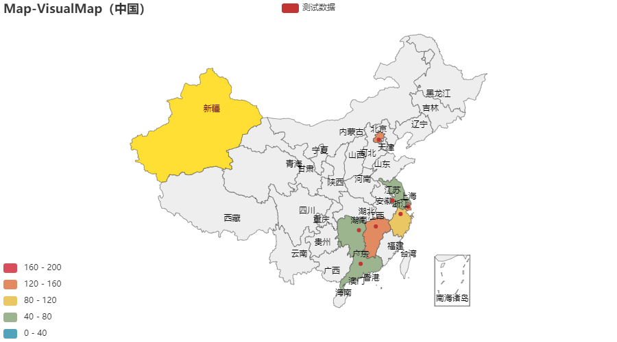
We only need to replace the parameters into "china", which can easily draw the map of china. It is awesome. Of course, there are many ways to play Pyecharts.
Based on the above examples, we can see that Pyecharts is the simplest way to draw maps, which is very suitable for novices to learn and use; folium and cartopy are better than degrees of freedom. As professional map tools, they leave unlimited possibilities to users; Plotly and Bokeh are more advanced visualization tools, which are better than more beautiful picture quality and more API calls perfect
Today, we introduced several commonly used class libraries for drawing maps. Each tool has its advantages and disadvantages. We just need to clarify the goal and explore carefully when choosing!
reference resources: https://gitee.com/kevinqqnj/cartopy_trial/blob/master/cartopy_province.py https://zhuanlan.zhihu.com/p/112324234