Problem scenario
How do you want to customize the color system in HandyControl?
How to add personal customized color resources to make them more in line with the HandyControl style?
problem analysis
Each time you select the theme skin in the Demo, you can adjust the style color system of the case. In fact, you replace a set of corresponding color system resource files every time. Because the resource is added in the dynamic resource mode, the key name of the corresponding resource is not changed
HandyControl resources are as follows:
- [color system] https://handyorg.gitee.io/handycontrol/basic_xaml/colors
- [brush] https://handyorg.gitee.io/handycontrol/basic_xaml/brushes/
Case skin change
default
dark colors
purple
Resource reference
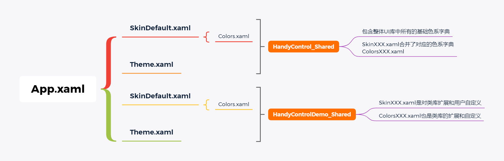
Take the case project app Xaml, as a system resource entry, has the following relationships
App.xaml:
    <Application.Resources>
        <ResourceDictionary>
            <ResourceDictionary.MergedDictionaries>
                <ResourceDictionary>
                    <ResourceDictionary.MergedDictionaries>
                        <ResourceDictionary Source="pack://application:,,,/HandyControl;component/Themes/SkinDefault.xaml"/>
                        <ResourceDictionary Source="Resources/Themes/SkinDefault.xaml"/>
                    </ResourceDictionary.MergedDictionaries>
                </ResourceDictionary>
                <ResourceDictionary>
                    <ResourceDictionary.MergedDictionaries>
                        <ResourceDictionary Source="pack://application:,,,/HandyControl;component/Themes/Theme.xaml"/>
                        <ResourceDictionary Source="Resources/Themes/Theme.xaml"/>
                    </ResourceDictionary.MergedDictionaries>
                </ResourceDictionary>
            </ResourceDictionary.MergedDictionaries>
            ......Omit irrelevant items.......
        </ResourceDictionary>
    </Application.Resources>
Graphical relationship
Resource composition
It is mainly divided into theme Xaml and skinxxx Xaml two types of resource dictionary files belong to HandyControl_Shared is the related color system and style resources of the HandyControl library. It belongs to the local case HandyControlDemo_Shared theme Xaml and skinxxx Xaml is not only an extension of the class library style and color system customization, but also a user-defined style. In a word, it is not available in the UI library. If required by the current project, it can be added locally
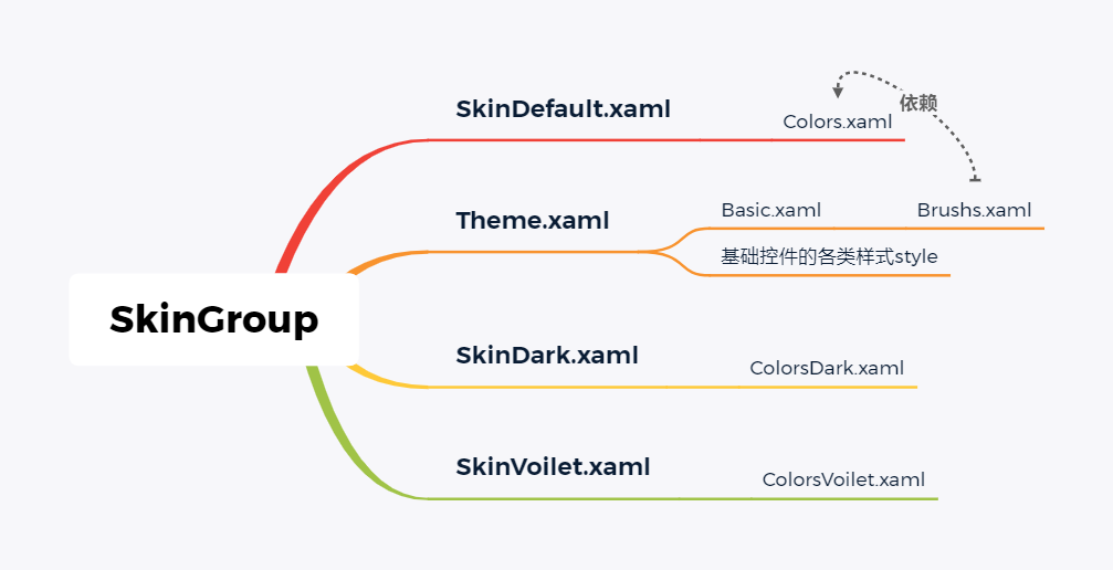
Color system and skin group
Each skin group is a complete set of running project skin, with at least one theme Xaml and skinxxx Xaml composition, in which the brush indirectly depends on different skinxxx Colorsxxx in XAML xaml
Solution
When the color of the resource group in the above figure is changed, the corresponding color of the resource group can not be changed. When the color of the resource group in the above figure is changed, the main purpose of changing the resource group is to ensure that the resource group can not be changed. When the color of the resource group is changed, the corresponding color of the resource group can not be changed, To achieve the purpose of replacing the skin color system
Replace default skin
Skindefault is used by default in the basic tutorial of HandyControl class library Xaml skin color system. If you want to select other color systems, you can modify app Resources to be merged in Xaml
Create project
Create a local case project called blog_hc_style, referring to the Nuget package of HandyControl. The version here is 3.2.0. Please read the official document [quick start] for basic configuration operations https://handyorg.gitee.io/handycontrol/quick_start/
App.xaml
<Application x:Class="blog_hc_style.App"
             xmlns="http://schemas.microsoft.com/winfx/2006/xaml/presentation"
             xmlns:x="http://schemas.microsoft.com/winfx/2006/xaml"
             xmlns:local="clr-namespace:blog_hc_style"
             StartupUri="MainWindow.xaml">
    <Application.Resources>
        <ResourceDictionary>
            <ResourceDictionary.MergedDictionaries>
                <ResourceDictionary>
                    <ResourceDictionary.MergedDictionaries>
                        <ResourceDictionary Source="pack://application:,,,/HandyControl;component/Themes/SkinDefault.xaml"/>
                        <ResourceDictionary Source="pack://application:,,,/HandyControl;component/Themes/Theme.xaml"/>
                    </ResourceDictionary.MergedDictionaries>
                </ResourceDictionary>
            </ResourceDictionary.MergedDictionaries>
        </ResourceDictionary>
    </Application.Resources>
</Application>
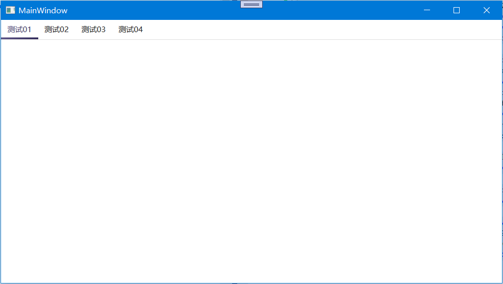
MainWindow.xaml
<Window x:Class="blog_hc_style.MainWindow"
        xmlns="http://schemas.microsoft.com/winfx/2006/xaml/presentation"
        xmlns:x="http://schemas.microsoft.com/winfx/2006/xaml"
        xmlns:d="http://schemas.microsoft.com/expression/blend/2008"
        xmlns:mc="http://schemas.openxmlformats.org/markup-compatibility/2006"
        xmlns:local="clr-namespace:blog_hc_style"
        mc:Ignorable="d"
        Title="MainWindow" Height="450" Width="800">
    <Grid>
        <TabControl>
            <TabItem Header="Test 01">
            </TabItem>
            <TabItem Header="Test 02">
            </TabItem>
            <TabItem Header="Test 03">
            </TabItem>
            <TabItem Header="Test 04">
            </TabItem>
        </TabControl>
    </Grid>
</Window>
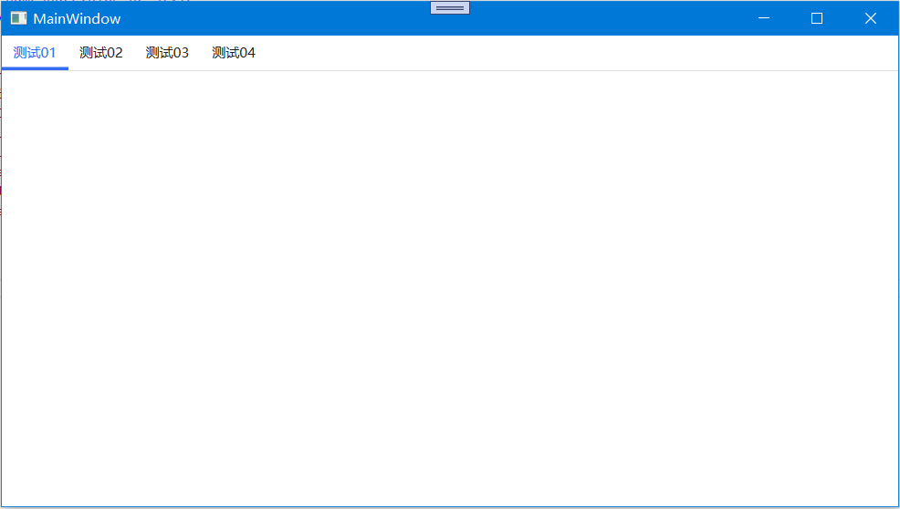
Operation effect
Modify resources
If you just want to replace the default color system, you can directly replace app Skinxxx mentioned above in XAML Xaml, OK
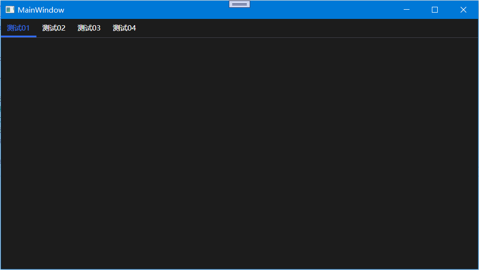
App.xaml, as follows, modify the color system to the Dark color system in the HandyControl library
    <Application.Resources>
        <ResourceDictionary>
            <ResourceDictionary.MergedDictionaries>
                <ResourceDictionary>
                    <ResourceDictionary.MergedDictionaries>
                        <!--merge Dark Is the target color system-->
                        <ResourceDictionary Source="pack://application:,,,/HandyControl;component/Themes/SkinDark.xaml"/>
                        <!--Replace original color system-->
                        <!--<ResourceDictionary Source="pack://application:,,,/HandyControl;component/Themes/SkinDefault.xaml"/>-->
                        <ResourceDictionary Source="pack://application:,,,/HandyControl;component/Themes/Theme.xaml"/>
                    </ResourceDictionary.MergedDictionaries>
                </ResourceDictionary>
            </ResourceDictionary.MergedDictionaries>
        </ResourceDictionary>
    </Application.Resources>
Operation effect
Customize local color system
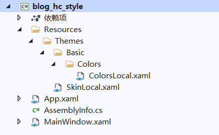
When customizing the local color system, you need to add the source code colors All contents in XAML are copied to the resource style file in the local project. The main purpose is to maintain the unity of color system and skin structure for future maintenance. The custom local color system is still transformed locally based on the above case project
Adjust color value
Create a new colorslocal Xaml and skinlocal xaml,ColorsLocal.xaml is used to store local color values, skinlocal Xaml is used as an intermediate layer for dictionary merging while ensuring the unity of directory structure
Copy HandyControl source code HandyControl_ Colors. In shared Xaml, the description of each color style can be viewed in [official document - color] https://handyorg.gitee.io/handycontrol/basic_xaml/colors/ , adjust the corresponding color value according to the purpose. The following is the style adjusted by the author
<ResourceDictionary xmlns="http://schemas.microsoft.com/winfx/2006/xaml/presentation"
                    xmlns:x="http://schemas.microsoft.com/winfx/2006/xaml"
                    xmlns:system="clr-namespace:System;assembly=mscorlib">

    <Color x:Key="LightPrimaryColor">#8b7fb6</Color>
    <Color x:Key="PrimaryColor">#5d5386</Color>
    <Color x:Key="DarkPrimaryColor">#312a59</Color>

    <Color x:Key="LightDangerColor">#ff6b70</Color>
    <Color x:Key="DangerColor">#db3340</Color>
    <Color x:Key="DarkDangerColor">#db3340</Color>

    <Color x:Key="LightWarningColor">#ffe158</Color>
    <Color x:Key="WarningColor">#e9af20</Color>
    <Color x:Key="DarkWarningColor">#e9af20</Color>

    <Color x:Key="LightInfoColor">#60d4ea</Color>
    <Color x:Key="InfoColor">#00bcd4</Color>
    <Color x:Key="DarkInfoColor">#00bcd4</Color>

    <Color x:Key="LightSuccessColor">#64da73</Color>
    <Color x:Key="SuccessColor">#2db84d</Color>
    <Color x:Key="DarkSuccessColor">#2db84d</Color>

    <Color x:Key="PrimaryTextColor">#212121</Color>
    <Color x:Key="SecondaryTextColor">#757575</Color>
    <Color x:Key="ThirdlyTextColor">#bdbdbd</Color>
    <Color x:Key="ReverseTextColor">#212121</Color>
    <Color x:Key="TextIconColor">White</Color>

    <Color x:Key="BorderColor">#e0e0e0</Color>
    <Color x:Key="SecondaryBorderColor">#e0e0e0</Color>
    <Color x:Key="BackgroundColor">#f1f2f7</Color>
    <Color x:Key="RegionColor">#ffffff</Color>
    <Color x:Key="SecondaryRegionColor">#f9f9f9</Color>
    <Color x:Key="ThirdlyRegionColor">White</Color>
    <Color x:Key="TitleColor">#326cf3</Color>
    <Color x:Key="SecondaryTitleColor">#326cf3</Color>

    <Color x:Key="DefaultColor">#f9f9f9</Color>
    <Color x:Key="DarkDefaultColor">#2c304d</Color>

    <Color x:Key="AccentColor">#f8491e</Color>
    <Color x:Key="DarkAccentColor">#f8491e</Color>

    <Color x:Key="DarkMaskColor">#20000000</Color>
    <Color x:Key="DarkOpacityColor">#40000000</Color>
    <system:UInt32 x:Key="BlurGradientValue">0x99FFFFFF</system:UInt32>
    <Color x:Key="PinkColor">#e76c90</Color>

</ResourceDictionary>
SkinLocal.xaml
<ResourceDictionary xmlns="http://schemas.microsoft.com/winfx/2006/xaml/presentation">
    <ResourceDictionary.MergedDictionaries>
        <ResourceDictionary Source="pack://application:,,,/blog_hc_style;component/Resources/Themes/Basic/Colors/ColorsLocal.xaml"/>
    </ResourceDictionary.MergedDictionaries>
</ResourceDictionary>
Replace color resources
Modify app Skindark. For merging resources in XAML Xaml is skinlocal xaml
<Application.Resources>
        <ResourceDictionary>
            <ResourceDictionary.MergedDictionaries>
                <ResourceDictionary>
                    <ResourceDictionary.MergedDictionaries>
                        <ResourceDictionary Source="pack://application:,,,/blog_hc_style;component/Resources/Themes/SkinLocal.xaml"/>
                        <!--merge Dark Is the target color system-->
                        <!--<ResourceDictionary Source="pack://application:,,,/HandyControl;component/Themes/SkinDark.xaml"/>-->
                        <!--Replace original color system-->
                        <!--<ResourceDictionary Source="pack://application:,,,/HandyControl;component/Themes/SkinDefault.xaml"/>-->
                        <ResourceDictionary Source="pack://application:,,,/HandyControl;component/Themes/Theme.xaml"/>
                    </ResourceDictionary.MergedDictionaries>
                </ResourceDictionary>
            </ResourceDictionary.MergedDictionaries>
        </ResourceDictionary>
 </Application.Resources>
Operation effect
Combined color value (not necessary)
As an optional operation, this operation is available for users to rewrite the brush color of existing controls as a whole (relatively simple and rough operation). Please see [official document - brush] for brush purpose https://handyorg.gitee.io/handycontrol/basic_xaml/brushes/ , such destructive modifications are recommended not to be easily applied in actual production when you are not familiar with HandyControl, which is easy to disrupt the internal color system layout of HandyControl
be careful
Many resources are not included in handycontrol DLL program concentration, if the buddy can see the corresponding resource style of the case, consider it can be used from the case, and the official account reply to the hcstyle case.
Follow up will continue to build HandyControl related series, and have related ideas. Please pay attention to the official account and leave a message: [HandyControl]