catalogue
Quick Overview
Here you can learn the most important things about LVGL. You should read it first to get a general impression, and then read the detailed transplant and summary part.
Start using simulator
It is strongly recommended to start in the simulator instead of porting LVGL to embedded hardware.
LVGL has been ported to many ides to ensure that you will find your favorite one. go to simulator Get ready to use projects that can run on your PC. In this way, you can save the migration temporarily and experience LVGL immediately.
Add LVGL to your project
The following steps show how to set up LVGL on an embedded system with a display and touch pad.
-
From GitHub download Or clone library git clone https://github.com/lvgl/lvgl.git
-
Copy the lvgl folder to your project
-
Copy lvgl/lv_conf_template.h is lv_conf.h next to the lvgl folder, change the first to make the contents of the file, union at least, and definition# if 01LV_HOR_RES_MAXLV_VER_RES_MAXLV_COLOR_DEPTH
-
Including LVGL / LVGL H where LVGL correlation functions need to be used.
-
In a timer or task lv_tick_inc(x) is called every x milliseconds (should be between 1 and 10). The internal timing of LVGL requires it. Alternatively, configure (see) so that LVGL can retrieve the current time directly. xLV_TICK_CUSTOMlv_conf.h
-
Name: lv_init()
-
Create a display buffer for LVGL. LVGL will first render the graphics here and seed the rendered image to the display. The buffer size can be set freely, but 1 / 10 screen size is a good starting point.
static lv_disp_buf_t disp_buf;
static lv_color_t buf[LV_HOR_RES_MAX * LV_VER_RES_MAX / 10];                     /*Declare a buffer for 1/10 screen size*/
lv_disp_buf_init(&disp_buf, buf, NULL, LV_HOR_RES_MAX * LV_VER_RES_MAX / 10);    /*Initialize the display buffer*/
-
Implement and register a function that can copy the rendered image to the display area:
lv_disp_drv_t disp_drv;               /*Descriptor of a display driver*/
lv_disp_drv_init(&disp_drv);          /*Basic initialization*/
disp_drv.flush_cb = my_disp_flush;    /*Set your driver function*/
disp_drv.buffer = &disp_buf;          /*Assign the buffer to the display*/
lv_disp_drv_register(&disp_drv);      /*Finally register the driver*/

void my_disp_flush(lv_disp_drv_t * disp, const lv_area_t * area, lv_color_t * color_p)
{
    int32_t x, y;
    for(y = area->y1; y <= area->y2; y++) {
        for(x = area->x1; x <= area->x2; x++) {
            set_pixel(x, y, *color_p);  /* Put a pixel to the display.*/
            color_p++;
        }
    }

    lv_disp_flush_ready(disp);         /* Indicate you are ready with the flushing*/
}
-
Implement and register a function that can read the input device. For example, for a touchpad:
lv_indev_drv_t indev_drv;                  /*Descriptor of a input device driver*/
lv_indev_drv_init(&indev_drv);             /*Basic initialization*/
indev_drv.type = LV_INDEV_TYPE_POINTER;    /*Touch pad is a pointer-like device*/
indev_drv.read_cb = my_touchpad_read;      /*Set your driver function*/
lv_indev_drv_register(&indev_drv);         /*Finally register the driver*/

bool my_touchpad_read(lv_indev_t * indev, lv_indev_data_t * data)
{
    data->state = touchpad_is_pressed() ? LV_INDEV_STATE_PR : LV_INDEV_STATE_REL;
    if(data->state == LV_INDEV_STATE_PR) touchpad_get_xy(&data->point.x, &data->point.y);

    return false; /*Return `false` because we are not buffering and no more data to read*/
}
-
lv_task_handler() is called periodically every few milliseconds in a main while(1) loop, timer interrupt, or operating system task. If necessary, it will redraw the screen, process input devices, etc.
For more detailed guidance, go to transplant part.
Learn basic knowledge
Gadgets
Graphical elements such as buttons, labels, sliders and charts are called objects or widgets in LVGL. go to Widget To see a complete list of available widgets.
Each object has a parent object that creates it. For example, if you create a label on a button, the button is the parent of the label. The child object moves with the parent object. If the parent object is deleted, the child object will also be deleted.
Children can only be visible on their parents. In other words, the children outside the parent are cut off.
A screen is the parent of "root". You can have any number of screens. To get the current screen, call lv_scr_act() and load the screen using lv_scr_load(scr1).
You can create a new object. It returns a variable that should be used as a reference to an object to set its parameters. The first parameter is the required parent, and the second parameter can be the object to copy (if not used). For example: LV_< type>_ create(parent, obj_to_copy)lv_obj_t *NULL
lv_obj_t * slider1 = lv_slider_create(lv_scr_act(), NULL);
You can use some basic attribute functions to set. For example: LV_ obj_ set_< paramters_ name>(obj, <value>)
lv_obj_set_x(btn1, 30);
lv_obj_set_y(btn1, 10);
lv_obj_set_size(btn1, 200, 50);
Objects also have type specific parameters that can be set through functions. For example: LV_< type>_ set_< paramters_ name>(obj, <value>)
lv_slider_set_value(slider1, 70, LV_ANIM_ON);
To view the full API, visit the widget's documentation or related header files (for example lvgl/src/lv_widgets/lv_slider.h).
activity
Event is used to inform the user whether something has happened to the object. You can assign a callback to an object. If the object is clicked, released, dragged, deleted, etc., the object will be called. It should look like this:
lv_obj_set_event_cb(btn, btn_event_cb);                 /*Assign a callback to the button*/

...

void btn_event_cb(lv_obj_t * btn, lv_event_t event)
{
    if(event == LV_EVENT_CLICKED) {
        printf("Clicked\n");
    }
}
stay Event overview Learn more about events in this section.
part
Widgets may be built from one or more parts. For example, a button has only one part called LV_BTN_PART_MAIN. However, one page With LV_PAGE_PART_BG,LV_PAGE_PART_SCROLLABLE,LV_PAGE_PART_SCROLLBAR and LV_PAGE_PART_EDGE_FLASG.
Some parts are virtual (they are not real objects, but dynamically drawn, such as the scroll bar of the page), but others are real (they are real objects, such as the scrollable part of the page).
Parts come into play when you want to style and state a given part of an object. (see below)
state
Objects can be in a combination of the following states:
-
LV_STATE_DEFAULT normal, release
-
LV_STATE_CHECKED toggles or selects
-
LV_STATE_FOCUSED focuses through the keyboard or encoder or clicks through the touch pad / mouse
-
LV_STATE_EDITED edited by encoder
-
LV_STATE_HOVERED mouse over (not supported now)
-
LV_STATE_PRESSED press
-
LV_STATE_DISABLED disabled or inactive
For example, if you press an object, it will automatically get LV_STATE_PRESSED state. When you release it, the state will be removed.
To get the current status, use It will return to the ed state. For example, this is the valid state of the check box: lv_obj_get_state(obj, part)ORLV_STATE_CHECKED | LV_STATE_PRESSED | LV_STATE_FOCUSED
style
You can assign styles to parts of an object to change its appearance. Styles can describe, for example, background color, border width, text font, and so on. stay here View the complete list.
Cascading style (similar to CSS). This means that you can add more styles to a part of the object. For example, style_btn can set a default button appearance and style_btn_red can override some attributes to make the button red-
Each style property you set is specific to a state. For example, you can create a LV_STATE_DEFAULT and set different background colors LV_STATE_PRESSED. The library finds the best match between the state of a given assembly and the available style attributes. For example, if an object is in a pressed state and a border width is specified for the pressed state, it will be used. However, if it is not specified for the pressed state, LV_STATE_DEFAULT is the width of the border that will be used. If not LV_STATE_DEFAULT if both define the border width, the default value will be used.
Some attributes (usually text related) can be inherited. This means that if a property is not set in an object, it will also search in its parent. For example, you can set the font once in the screen style, and each text inherits it by default.
Local style properties can also be added to objects.
theme
Themes are the default styles for objects. When you create an object, styles from the theme are automatically applied.
You can choose to be in lv_conf.h.
example
Button with label
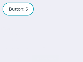
#include "../../lv_examples.h"

static void btn_event_cb(lv_obj_t * btn, lv_event_t event)
{
    if(event == LV_EVENT_CLICKED) {
        static uint8_t cnt = 0;
        cnt++;

        /*Get the first child of the button which is the label and change its text*/
        lv_obj_t * label = lv_obj_get_child(btn, NULL);
        lv_label_set_text_fmt(label, "Button: %d", cnt);
    }
}

/**
 * Create a button with a label and react on Click event.
 */
void lv_ex_get_started_1(void)
{
    lv_obj_t * btn = lv_btn_create(lv_scr_act(), NULL);     /*Add a button the current screen*/
    lv_obj_set_pos(btn, 10, 10);                            /*Set its position*/
    lv_obj_set_size(btn, 120, 50);                          /*Set its size*/
    lv_obj_set_event_cb(btn, btn_event_cb);                 /*Assign a callback to the button*/

    lv_obj_t * label = lv_label_create(btn, NULL);          /*Add a label to the button*/
    lv_label_set_text(label, "Button");                     /*Set the labels text*/
}
Style button
#include "../../lv_examples.h"


/**
 * Create styles from scratch for buttons.
 */
void lv_ex_get_started_2(void)
{
    static lv_style_t style_btn;
    static lv_style_t style_btn_red;

    /*Create a simple button style*/
    lv_style_init(&style_btn);
    lv_style_set_radius(&style_btn, LV_STATE_DEFAULT, 10);
    lv_style_set_bg_opa(&style_btn, LV_STATE_DEFAULT, LV_OPA_COVER);
    lv_style_set_bg_color(&style_btn, LV_STATE_DEFAULT, LV_COLOR_SILVER);
    lv_style_set_bg_grad_color(&style_btn, LV_STATE_DEFAULT, LV_COLOR_GRAY);
    lv_style_set_bg_grad_dir(&style_btn, LV_STATE_DEFAULT, LV_GRAD_DIR_VER);

    /*Swap the colors in pressed state*/
    lv_style_set_bg_color(&style_btn, LV_STATE_PRESSED, LV_COLOR_GRAY);
    lv_style_set_bg_grad_color(&style_btn, LV_STATE_PRESSED, LV_COLOR_SILVER);

    /*Add a border*/
    lv_style_set_border_color(&style_btn, LV_STATE_DEFAULT, LV_COLOR_WHITE);
    lv_style_set_border_opa(&style_btn, LV_STATE_DEFAULT, LV_OPA_70);
    lv_style_set_border_width(&style_btn, LV_STATE_DEFAULT, 2);

    /*Different border color in focused state*/
    lv_style_set_border_color(&style_btn, LV_STATE_FOCUSED, LV_COLOR_BLUE);
    lv_style_set_border_color(&style_btn, LV_STATE_FOCUSED | LV_STATE_PRESSED, LV_COLOR_NAVY);

    /*Set the text style*/
    lv_style_set_text_color(&style_btn, LV_STATE_DEFAULT, LV_COLOR_WHITE);

    /*Make the button smaller when pressed*/
    lv_style_set_transform_height(&style_btn, LV_STATE_PRESSED, -5);
    lv_style_set_transform_width(&style_btn, LV_STATE_PRESSED, -10);
#if LV_USE_ANIMATION
    /*Add a transition to the size change*/
    static lv_anim_path_t path;
    lv_anim_path_init(&path);
    lv_anim_path_set_cb(&path, lv_anim_path_overshoot);

    lv_style_set_transition_prop_1(&style_btn, LV_STATE_DEFAULT, LV_STYLE_TRANSFORM_HEIGHT);
    lv_style_set_transition_prop_2(&style_btn, LV_STATE_DEFAULT, LV_STYLE_TRANSFORM_WIDTH);
    lv_style_set_transition_time(&style_btn, LV_STATE_DEFAULT, 300);
    lv_style_set_transition_path(&style_btn, LV_STATE_DEFAULT, &path);
#endif

    /*Create a red style. Change only some colors.*/
    lv_style_init(&style_btn_red);
    lv_style_set_bg_color(&style_btn_red, LV_STATE_DEFAULT, LV_COLOR_RED);
    lv_style_set_bg_grad_color(&style_btn_red, LV_STATE_DEFAULT, LV_COLOR_MAROON);
    lv_style_set_bg_color(&style_btn_red, LV_STATE_PRESSED, LV_COLOR_MAROON);
    lv_style_set_bg_grad_color(&style_btn_red, LV_STATE_PRESSED, LV_COLOR_RED);
    lv_style_set_text_color(&style_btn_red, LV_STATE_DEFAULT, LV_COLOR_WHITE);
#if LV_USE_BTN
    /*Create buttons and use the new styles*/
    lv_obj_t * btn = lv_btn_create(lv_scr_act(), NULL);     /*Add a button the current screen*/
    lv_obj_set_pos(btn, 10, 10);                            /*Set its position*/
    lv_obj_set_size(btn, 120, 50);                          /*Set its size*/
    lv_obj_reset_style_list(btn, LV_BTN_PART_MAIN);         /*Remove the styles coming from the theme*/
    lv_obj_add_style(btn, LV_BTN_PART_MAIN, &style_btn);

    lv_obj_t * label = lv_label_create(btn, NULL);          /*Add a label to the button*/
    lv_label_set_text(label, "Button");                     /*Set the labels text*/

    /*Create a new button*/
    lv_obj_t * btn2 = lv_btn_create(lv_scr_act(), btn);
    lv_obj_set_pos(btn2, 10, 80);
    lv_obj_set_size(btn2, 120, 50);                             /*Set its size*/
    lv_obj_reset_style_list(btn2, LV_BTN_PART_MAIN);         /*Remove the styles coming from the theme*/
    lv_obj_add_style(btn2, LV_BTN_PART_MAIN, &style_btn);
    lv_obj_add_style(btn2, LV_BTN_PART_MAIN, &style_btn_red);   /*Add the red style on top of the current */
    lv_obj_set_style_local_radius(btn2, LV_BTN_PART_MAIN, LV_STATE_DEFAULT, LV_RADIUS_CIRCLE); /*Add a local style*/

    label = lv_label_create(btn2, NULL);          /*Add a label to the button*/
    lv_label_set_text(label, "Button 2");                     /*Set the labels text*/
#endif
}
Slider and alignment
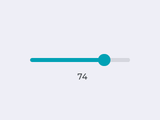
#include "../../lv_examples.h"

static lv_obj_t * label;

static void slider_event_cb(lv_obj_t * slider, lv_event_t event)
{
    if(event == LV_EVENT_VALUE_CHANGED) {
        /*Refresh the text*/
        lv_label_set_text_fmt(label, "%d", lv_slider_get_value(slider));
    }
}

/**
 * Create a slider and write its value on a label.
 */
void lv_ex_get_started_3(void)
{
    /* Create a slider in the center of the display */
    lv_obj_t * slider = lv_slider_create(lv_scr_act(), NULL);
    lv_obj_set_width(slider, 200);                        /*Set the width*/
    lv_obj_align(slider, NULL, LV_ALIGN_CENTER, 0, 0);    /*Align to the center of the parent (screen)*/
    lv_obj_set_event_cb(slider, slider_event_cb);         /*Assign an event function*/

    /* Create a label below the slider */
    label = lv_label_create(lv_scr_act(), NULL);
    lv_label_set_text(label, "0");
    lv_obj_set_auto_realign(slider, true);                          /*To keep center alignment when the width of the text changes*/
    lv_obj_align(label, slider, LV_ALIGN_OUT_BOTTOM_MID, 0, 20);    /*Align below the slider*/
}
Micropython
Learn about Micro Python More information.
# Create a Button and a Label
scr = lv.obj()
btn = lv.btn(scr)
btn.align(lv.scr_act(), lv.ALIGN.CENTER, 0, 0)
label = lv.label(btn)
label.set_text("Button")

# Load the screen
lv.scr_load(scr)