Shape is an indispensable part of xml drawing. This article will show its usage through a set of examples.
(1) Preservation and Reference
Save location:
res/drawable/filename.xml, file name used as resource ID.
Quote:
Use R.drawable.filename in a java file
Use @ [package:]drawable/filename in the xml file
Here's an example to illustrate. First, create an xml file named shape_round_rect under the res/drawable folder, which reads as follows:
<?xml version="1.0" encoding="utf-8"?>
<shape xmlns:android="http://schemas.android.com/apk/res/android"
    android:shape="rectangle">
    <corners android:radius="40dip"/>
    <solid android:color="#8800ffff"/>

</shape>
This creates a rounded rectangle resource. There are two ways to use it:
(1) Reference resources in xml
android:background="@drawable/shape_round_rect"Simply set it to the background of a view.
(2) Reference resources in code
TextView textView = (TextView)findViewById(R.id.text_view);
Drawable drawable = getResources().getDrawableForDensity(R.drawable.shape_round_rect,(int)getResources().getDisplayMetrics().density,null);
textView.setBackground(drawable);
Note: In the lower version, getDrawable() is directly used instead of getDrawable ForDensity ().
The results are as follows: 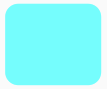
(2) Create shape resources
First, set the root tag of XML to shape and define the XML namespace as follows:
<shape
xmlns:android="http://schemas.android.com/apk/res/android">
</shape>
Next, look at the properties under the shape tag:
android:shape=["rectangle" | "oval" | "line" | "ring"]The first three are rectangle, ellipse and straight line, which are not explained too much, focusing on ring. The following attributes are valid only for rings:
android:innerRadius="integer"The radius of inner ring is expressed by dimension value.
android:innerRadiusRatio="integer"The ratio of the width of the ring to the radius of the inner ring is 9 by default, that is, the radius of the inner ring equals the width of the ring divided by 9. This property is overwritten by innerRadius.
android:thickness="integer"The thickness of the ring is expressed by the size value.
android:thicknessRatio="integer"The ratio of ring width to ring thickness is 3 by default, that is, the ring thickness is equal to the ring width divided by 3. This property is overwritten by thickness.
android:useLevel=["true" | "false"]This should normally be "false", otherwise the shape will not be displayed.
Let's look at an example:
<?xml version="1.0" encoding="utf-8"?>
<shape xmlns:android="http://schemas.android.com/apk/res/android"
    android:shape="ring"
    android:useLevel="false"
    android:innerRadiusRatio="4"
    android:thicknessRatio="4">
    <solid android:color="#00ffff"/>
</shape>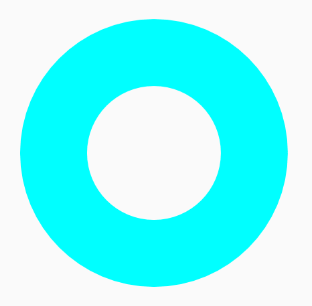
There are so many attributes under the shape tag. Next, let's look at several sub-tags of the shape.
<solid
    android:color="color" />
For filling in color, the attribute has only one color, either input # AARRGGBB value or # RRGGBB value.
<corners
    android:radius="integer"
    android:topLeftRadius="integer"
    android:topRightRadius="integer"
    android:bottomLeftRadius="integer"
    android:bottomRightRadius="integer" />
It is used to create rounded corners for shapes, only when the shape is rectangular. The radius attribute defines the radius of all corners, and the other four correspond to the radius of the four corners of the rectangle, respectively. Note that radius will be covered by the last four. The rounded rectangle at the beginning is implemented with this subtag.
<gradient
    android:type=["linear" | "radial" | "sweep"]
    android:angle="integer"
    android:centerX="float"
    android:centerY="float"
    android:centerColor="integer"
    android:endColor="color"
    android:gradientRadius="integer"
    android:startColor="color"
    android:useLevel=["true" | "false"] />
This property is slightly more, but some of it is only valid in a particular type. First look at type:
android:type=["linear" | "radial" | "sweep"]There are three types: linear, radiation and scanning.
android:startColor="color"
android:centerColor="integer"
android:endColor="color"
Define the color of the start, middle, and end positions. This is similar to the key frame in animation. The color will change gradually according to this order.
android:centerX="float"
android:centerY="float"
Define the position of the gradient center and take the value between 0 and 1.
android:angle="integer"To define a gradient angle, it must be a multiple of 45. 0 from left to right and 90 from bottom to top. The default value is 0.
android:gradientRadius="integer"Radiation radius is valid only when type is radial.
Next, let's look at a few examples (only one case code is posted):
1. Linear gradient, angle 0-45-90:
<?xml version="1.0" encoding="utf-8"?>
<shape xmlns:android="http://schemas.android.com/apk/res/android"
    android:shape="rectangle">
    <corners android:radius="40dip"/>
    <gradient
        android:type="linear"
        android:angle="0"
        android:startColor="#ff0000"
        android:centerColor="#00ff00"
        android:endColor="#0000ff"/>
</shape>
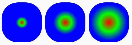
2. Radiation gradually changes and radius gradually increases.
<?xml version="1.0" encoding="utf-8"?>
<shape xmlns:android="http://schemas.android.com/apk/res/android"
    android:shape="rectangle">
    <corners android:radius="40dip"/>
    <gradient
        android:type="radial"
        android:gradientRadius="15dp"
        android:startColor="#ff0000"
        android:centerColor="#00ff00"
        android:endColor="#0000ff"/>
</shape>
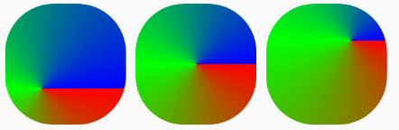
3. Scanning gradient with different centers:
<?xml version="1.0" encoding="utf-8"?>
<shape xmlns:android="http://schemas.android.com/apk/res/android"
    android:shape="rectangle">
    <corners android:radius="40dip"/>
    <gradient
        android:type="sweep"
        android:centerX="0.3"
        android:centerY="0.7"
        android:startColor="#ff0000"
        android:centerColor="#00ff00"
        android:endColor="#0000ff"/>
</shape>
This is where the gradient tag is introduced. Let's look at the padding and size attributes below.
<padding
    android:left="integer"
    android:top="integer"
    android:right="integer"
    android:bottom="integer" />
<size
    android:width="integer"
    android:height="integer" />
Represents dimensions and margins, respectively. These two attributes, which I don't think is necessary to set when making resources, are also used in the same way as View, so they are not introduced.
Finally, stroke:
<stroke
    android:width="integer"
    android:color="color"
    android:dashWidth="integer"
    android:dashGap="integer" />
Used to make dotted or solid border. The four attributes are line width, color, length of each stroke and the interval between the two strokes. Direct examples:
<?xml version="1.0" encoding="utf-8"?>
<shape xmlns:android="http://schemas.android.com/apk/res/android">
    <stroke
        android:width="10dp"
        android:color="#00ffff"
        android:dashGap="4dp"
        android:dashWidth="8dp"/>
</shape>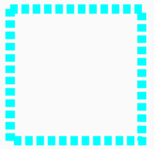
The above content is basically the whole content of Shape resources, mastering the production of Shape resources is very helpful to achieve a more beautiful UI.