Task05
This study refers to Datawhale open source learning: https://github.com/datawhalechina/fantastic-matplotlib
The content is generally derived from the original text and adjusted in combination with their own learning ideas.
Personal summary: 1. There are four common style methods: predefined style, custom style, rcparams and matplot librc files. 2, There are two common color methods: five monochrome colors and colormap multicolor
5. Style and color
This chapter introduces the use of styles and colors in matplotlib. There are four common styles: predefined styles, custom styles, rcparams and matplot librc files. There are two common color methods: five monochrome colors and colormap multicolor.
5.1. Drawing style
Drawing style is an overall style of a drawing.
5.1.1. Predefined styles
matplotlib provides many built-in styles for users to use. Just enter the name of the style you want to use at the beginning of the python script.
import matplotlib as mpl
import matplotlib.pyplot as plt
import numpy as np

plt.style.use('default')
plt.plot([1,2,3,4],[2,3,4,5])
matplotlib has 26 rich styles to choose from.
print(plt.style.available)
['Solarize_Light2', '_classic_test_patch', 'bmh', 'classic', 'dark_background', 'fast', 'fivethirtyeight', 'ggplot', 'grayscale', 'seaborn', 'seaborn-bright', 'seaborn-colorblind', 'seaborn-dark', 'seaborn-dark-palette', 'seaborn-darkgrid', 'seaborn-deep', 'seaborn-muted', 'seaborn-notebook', 'seaborn-paper', 'seaborn-pastel', 'seaborn-poster', 'seaborn-talk', 'seaborn-ticks', 'seaborn-white', 'seaborn-whitegrid', 'tableau-colorblind10']
5.1.2. Custom style
Create a style list with the suffix mplstyle under any path, edit the file and add the following style contents
> axes.titlesize : 24
axes.labelsize : 20
lines.linewidth : 3
lines.markersize : 10
xtick.labelsize : 16
ytick.labelsize : 16
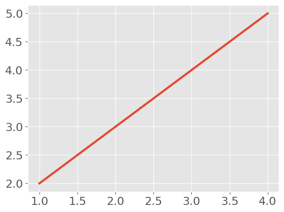
After referencing the custom stylesheet, observe the chart changes.
plt.style.use('file/presentation.mplstyle')
plt.plot([1,2,3,4],[2,3,4,5])
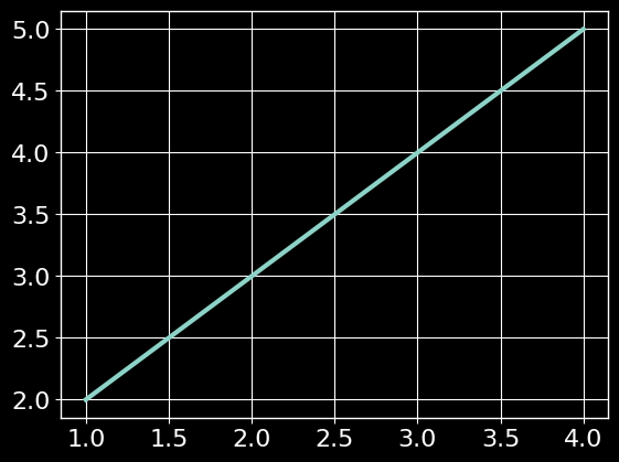
matplotlib supports the reference of mixed styles. You only need to enter a style list when referencing. If several styles involve the same parameter, the style sheet on the right will overwrite the style sheet on the left.
plt.style.use(['dark_background', 'file/presentation.mplstyle'])
plt.plot([1,2,3,4],[2,3,4,5])
5.1.3. rcparams
You can also change the style by modifying the default rcparams setting. All rc settings are saved in a variable called matplotlib.rcParams.
After modification, you can see that the drawing style has changed.
plt.style.use('default') # Restore to default style
plt.plot([1,2,3,4],[2,3,4,5])

mpl.rcParams['lines.linewidth'] = 2
mpl.rcParams['lines.linestyle'] = '--'
plt.plot([1,2,3,4],[2,3,4,5])
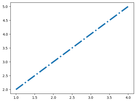
 You can also modify multiple styles at once.
mpl.rc('lines', linewidth=4, linestyle='-.')
plt.plot([1,2,3,4],[2,3,4,5])
5.1.4. matplotlibrc
Since matplotlib uses the matplotlibrc file to control the style, that is, the rc setting mentioned in the previous section, we can also change the style by modifying the matplotlibrc file.
# Find the path to the matplotlibrc file
mpl.matplotlib_fname()
After finding the path, you can edit the style file directly
5.2. Color setting
From the perspective of visual coding, color is divided into three visual channels: hue, brightness and saturation. In matplotlib, there are several ways to set colors:
5.2.1 RGB or RGBA
plt.style.use('default')
# The color is represented by floating-point numbers between [0,1], and the four components are (red, green, blue, alpha) in order, where alpha transparency can be omitted
plt.plot([1,2,3],[4,5,6],color=(0.1, 0.2, 0.5))
plt.plot([4,5,6],[1,2,3],color=(0.1, 0.2, 0.5, 0.5)

5.2.2 HEX RGB or RGBA
# It is represented by hexadecimal color code. Similarly, the last two digits represent transparency and can be omitted
plt.plot([1,2,3],[4,5,6],color='#0f0f0f')
plt.plot([4,5,6],[1,2,3],color='#0f0f0f80')
5.2.3 gray scale
# When there is only one value at [0,1], it indicates the gray scale
plt.plot([1,2,3],[4,5,6],color='0.5')
5.2.4 basic color of single character
# matplotlib has eight basic colors, which can be represented by a single string, namely 'B', 'g', 'R', 'C','m ',' y ',' k ',' W ', corresponding to the English abbreviations of blue, green, red, cyan, magenta, yellow, black, and white
plt.plot([1,2,3],[4,5,6],color='r')

5.2.5 color name
# matplotlib provides a color comparison table for querying the names corresponding to colors
plt.plot([1,2,3],[4,5,6],color='blue')


5.2.6 colormap
Colormap can configure a set of colors to express more information through color changes in visualization. In matplotlib, there are five types of colormap:
- Sequential. Gradually change the brightness and color gradually increase.
- Divergence. Change the brightness and saturation of two different colors, which meet with unsaturated colors in the middle; This value should be used when the plotted information has a key intermediate value (e.g. terrain) or the data deviates from zero.
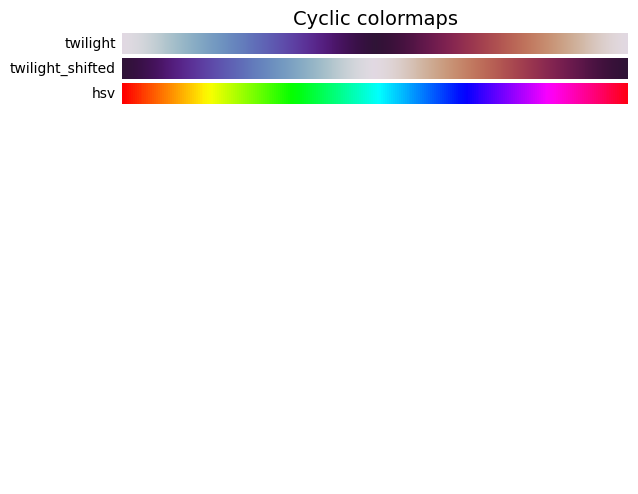
- Cycle. Change the brightness of two different colors and meet with unsaturated colors in the middle and at the beginning / end. The value used to wrap around at the endpoint, such as phase angle, wind direction, or time of day.
- Qualitative. Often variegated, used to represent information that has no sort or relationship.
- Miscellaneous. Some variegated combinations used in specific scenes, such as rainbow, ocean, terrain, etc.
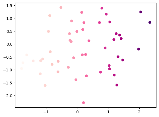
x = np.random.randn(50)
y = np.random.randn(50)
plt.scatter(x,y,c=x,cmap='RdPu')
task
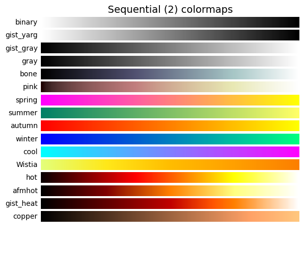
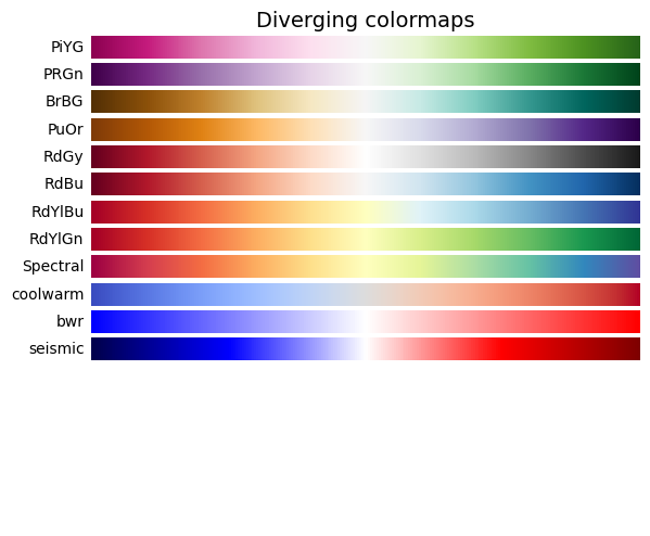
1) Check the official website of matplotlib to list the built-in colormap s of Sequential, diversifying, Cyclic, Qualitative and Miscellaneous, and show them in the form of code drawing
import numpy as np
import matplotlib.pyplot as plt
from collections import OrderedDict
cmaps = OrderedDict()
cmaps['Sequential'] = [
'Greys', 'Purples', 'Blues', 'Greens', 'Oranges', 'Reds',
'YlOrBr', 'YlOrRd', 'OrRd', 'PuRd', 'RdPu', 'BuPu',
'GnBu', 'PuBu', 'YlGnBu', 'PuBuGn', 'BuGn', 'YlGn']
cmaps['Sequential (2)'] = [
'binary', 'gist_yarg', 'gist_gray', 'gray', 'bone', 'pink',
'spring', 'summer', 'autumn', 'winter', 'cool', 'Wistia',
'hot', 'afmhot', 'gist_heat', 'copper']
cmaps['Diverging'] = [
'PiYG', 'PRGn', 'BrBG', 'PuOr', 'RdGy', 'RdBu',
'RdYlBu', 'RdYlGn', 'Spectral', 'coolwarm', 'bwr', 'seismic']
cmaps['Cyclic'] = ['twilight', 'twilight_shifted', 'hsv']
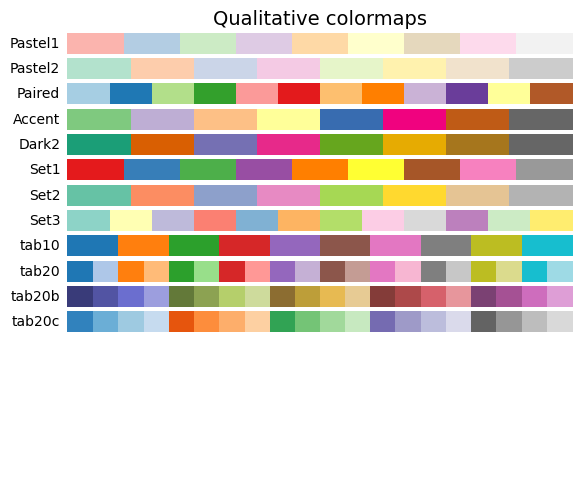
cmaps['Qualitative'] = ['Pastel1', 'Pastel2', 'Paired', 'Accent',
'Dark2', 'Set1', 'Set2', 'Set3',
'tab10', 'tab20', 'tab20b', 'tab20c']
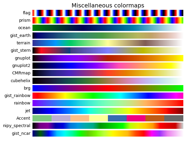
cmaps['Miscellaneous'] = [
'flag', 'prism', 'ocean', 'gist_earth', 'terrain', 'gist_stern',
'gnuplot', 'gnuplot2', 'CMRmap', 'cubehelix', 'brg',
'gist_rainbow', 'rainbow', 'jet', 'Accent', 'nipy_spectral',
'gist_ncar']
nrows = max(len(cmap_list) for cmap_category, cmap_list in cmaps.items())
gradient = np.linspace(0, 1, 256)
gradient = np.vstack((gradient, gradient))
def plot_color_gradients(cmap_category, cmap_list, nrows):
fig, axes = plt.subplots(nrows=nrows)
fig.subplots_adjust(top=0.95, bottom=0.01, left=0.2, right=0.99)
axes[0].set_title(cmap_category + ' colormaps', fontsize=14)
for ax, name in zip(axes, cmap_list):
ax.imshow(gradient, aspect='auto', cmap=plt.get_cmap(name))
pos = list(ax.get_position().bounds)
x_text = pos[0] - 0.01
y_text = pos[1] + pos[3]/2.
fig.text(x_text, y_text, name, va='center', ha='right', fontsize=10)
for ax in axes:
ax.set_axis_off()
for cmap_category, cmap_list in cmaps.items():
plot_color_gradients(cmap_category, cmap_list, nrows)
plt.show()

2) Learn how to customize the colormap, apply it to any dataset, and draw an image. Note that the type of colormap should match the characteristics of the dataset, and make a simple explanation
import numpy as np
import matplotlib.pyplot as plt
from matplotlib.colors import ListedColormap

cmap = ListedColormap(['r','b','g'])
x = np.random.rand(1,1,50)
y = np.random.rand(1,1,50)

plt.scatter(x,y,c=x,cmap=cmap)
