catalogue
Dependencies used:
import matplotlib.pyplot as plt
import numpy as np
import pandas as pd
from matplotlib import font_manager  # Import font


if __name__ == '__main__':
    # Drawing function
    plt.show()
1. Line chart
# Line chart 1
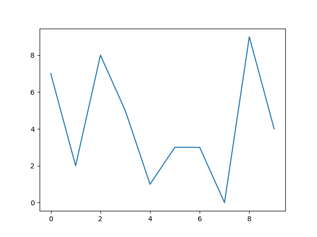
def line_chart_one():
y = [np.random.randint(0, 10) for x in range(10)]
x = range(10)
plt.plot(x, y)
# plt.plot can only pass the value of Y axis. If you only pass the value of Y axis, the X axis will use range (0, the length of Y) by default
# plt. The x and y parameters of plot cannot be passed as keyword parameters, but only as location parameters.# plt.plot can only pass the value of Y axis. If you only pass the value of Y axis, the X axis will use range (0, the length of Y) by default
# plt. The x and y parameters of plot cannot be passed as keyword parameters, but only as location parameters.
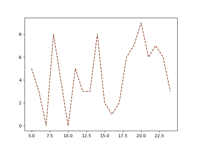
def line_chart_two():
    my_data = {
        "a": range(5, 25),
        "b": [np.random.randint(0, 10) for x in range(20)]
    }
    my_data = pd.DataFrame(data=my_data)
    plt.plot("a", "b", "--", data=my_data, color="#893f23")
    # plt. The data parameter in plot can be a dictionary or DataFrame object, and then specify the name of this column in x and y, then plot will be read automatically.
    # Here is a detail. Because x, y and FMT are all in front, if only x and y are passed, ambiguity may occur,
    # At this time, we can pass in an empty parameter as the parameter of fmt, and there will be no warning. If the parameter is fmt, there will be no warning.
# plt. The data parameter in plot can be a dictionary or DataFrame object, and then specify the name of this column in x and y, and plot will be read automatically.
#Here is a detail. Because x, y and FMT are all in front, if only x and y are passed, ambiguity may occur,
#At this time, we can pass in an empty parameter as the parameter of fmt, and there will be no warning.
Style:
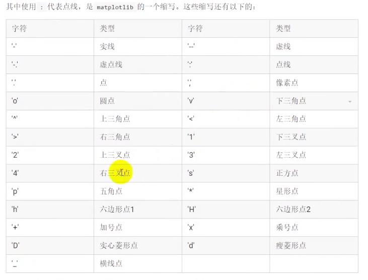
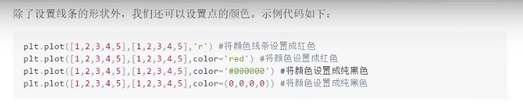
plt. The fmt parameter of plot can set the style and color of lines.
plt. The color of plot can be set in letters, hexadecimal, or rgba.
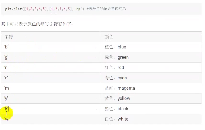
def line_chart_three():
    y1 = [np.random.randint(0, 10) for x in range(10)]
    y2 = [np.random.randint(0, 10) for x in range(10)]
    lines = plt.plot(range(10), y1, range(10), y2)
    line = lines[0]
    line.set_color("r")
    line.set_linewidth(4)
    line.set_alpha(0.5)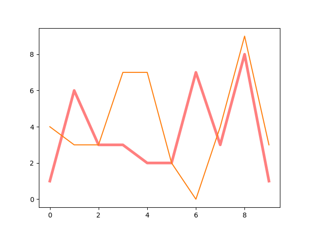
Set font
def line_chart_four():
    y = [np.random.randint(10) for x in range(10)]
    font = font_manager.FontProperties(fname=r"C:\Windows\Fonts\simsun.ttc", size=20)
    plt.plot(y)
    plt.title("Line chart", fontproperties=font)
Axis setting
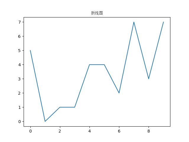
def line_chart_five():
    avenger = [np.random.randint(10, 50) for x in range(20)]
    plt.figure(figsize=(15, 5))
    plt.plot(avenger, marker="o")
    font = font_manager.FontProperties(fname=r"C:\Windows\Fonts\simsun.ttc")
    font.set_size(10)
    plt.grid(True)
    plt.xticks(range(20), ["The first%d day" % x for x in range(1, 21)], fontproperties=font)
    plt.xlabel("Days", fontproperties=font)
    plt.ylabel("Box office (unit: 10000)", fontproperties=font)
    plt.title("Random number data", fontproperties=font)
The title is through PLT Title.
The scale is set through xticks and yticks. Xticks and yticks need to pass two parameters. The first parameter, ticks, is not important as long as it is consistent with the amount of data. The second parameter, label, is used to set the text display on each scale, which is more important.
The name of the axis is set by xlabel and ylabel.
The default plot does not support Chinese. If you want to support Chinese, you should create a font object 'Matplotlib font_ manageer. Fontproperties', and then specify the 'fname' parameter, which requires a specific path. Here is another small detail. There is a garbled code in front of the copied font string. Remember to remove it.
Use of marker and annotate
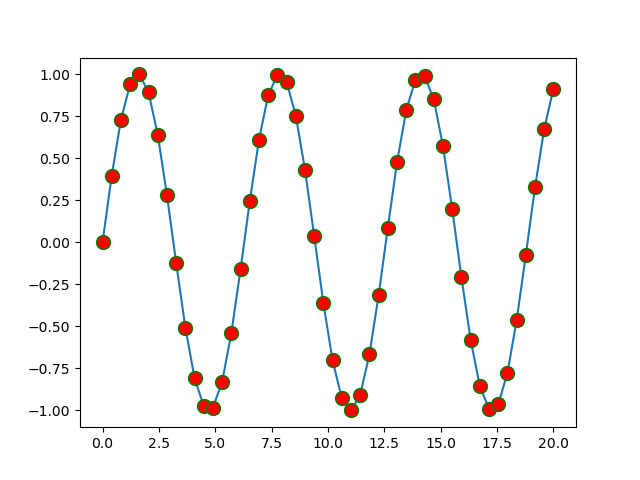
def line_chart_six():
    x = np.linspace(0, 20, 50)
    y = np.sin(x)
    plt.plot(x, y, marker="o", markerfacecolor="r", markersize=10, markeredgecolor="g")
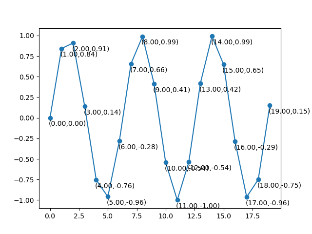
def line_chart_seven():
    y = np.sin(np.arange(20))
    plt.plot(y, marker="o")
    # plt.annotate("(0,0)", xy=(0, 0), xytext=(-0.5, -0.8),
    #              arrowprops={"width": 10, "headwidth": 16, "headlength": 20, "shrink": 0.3, "facecolor": "r",
    #                          "edgecolor": "y"})
    for index, value in enumerate(y):
        plt.annotate("(%.2f,%.2f)" % (index, value), xy=(index, value), xytext=(index - 0.1, value - 0.1))
    # plt. When plotting, you can set the style of coordinate points through the marker parameter. markerfacecolor represents the color of the point
    # Markredgecolor represents the color of the boundary and markersize represents the size of the point
    # plt.annotate(text,xy,xxytext,arrowprops) is used for text annotation. Text represents the text to be annotated,
    # xy represents the coordinate point to be annotated, xytext represents the coordinate point of the text, and arrowprops represents some attributes of the arrow
# plt. When plotting, you can set the style of coordinate points through the marker parameter. markerfacecolor represents the color of the point, markredgecolor represents the color of the boundary, and markersize represents the size of the point.
# plt.annotate(text,xy,xxytext,arrowprops) is used for text annotation. Text represents the text to be annotated, xy represents the coordinate point to be annotated, xytext represents the coordinate point of the text, and arrowprops represents some attributes of the arrow.
Sketchpad settings
def line_chart_eight():
    plt.figure(figsize=(10, 5), facecolor="r", edgecolor="k", linewidth=2, frameon=True)  # Axes
    plt.plot(np.arange(5, 20))
    plt.savefig("./x.png")
    # ax = plt.gca()
    # ax.set_facecolor('y')
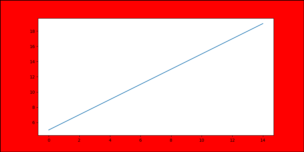
#Style of Sketchpad: by calling PLT Figure. This function call must be completed before all drawings.
# figsize: the size of the drawing board is a tuple. The first parameter is width and the second parameter is height. The unit is inches.
# facecolor: palette color. Pay attention to distinguish the background color of Axes.
# edgecolor: border color. The default width of the border is zero, so you need to set linewidth=2 when using it
# dpi: pixels, that is, pixels in an inch. The default is 100. If you want to increase the resolution, you can set the dpi larger
# keep picture: PLT Savefig or save directly
Draw multiple graphs
Method 1:
def line_chart_nine():
    x = np.linspace(0, 20)
    # plt.plot(x, np.sin(x), x, np.cos(x))
    plt.plot(x, np.sin(x))
    plt.plot(x, np.cos(x))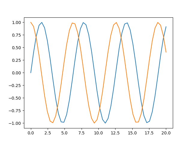
Method 2 (draw multiple subgraphs):
(1)subplot
def line_chart_ten():
    values = np.arange(20)
    plt.subplot(221)  # First position of 2 rows and 2 columns
    plt.plot(values)
    plt.plot(values ** 2)
    plt.subplot(222)
    plt.plot(np.sin(values), "r")
    plt.subplot(223)
    plt.plot(np.cos(values), "b")
    plt.subplot(224)
    plt.plot(np.tan(values), 'y')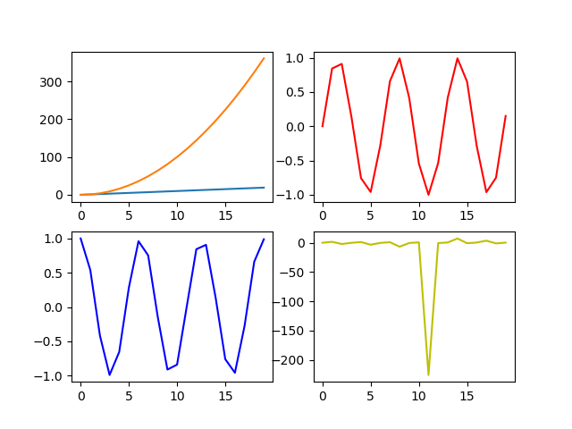
(2)subplots
def line_chart_eleven():
    values = np.linspace(0, 20)
    plt.style.use("seaborn")
    fig, axes = plt.subplots(2, 2, sharex=True)  # Axes
    ax1 = axes[0, 0]
    ax1.plot(values)
    ax2 = axes[0, 1]
    ax2.plot(np.sin(values), c="y")
    ax3 = axes[1, 0]
    ax3.plot(np.cos(values), c='b')
    ax3.plot(np.tan(values))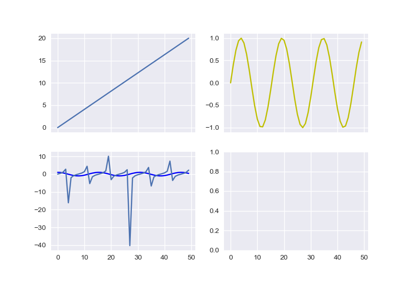
#If you want to draw multiple polylines on a graph, just pass multiple x and y in plot directly, or call the plot method multiple times
 #If you want to draw multiple subgraphs (Axes objects) on a palette, you can use PLT Subplot or plot Subplots method.
# plt.subplt:plt.subplot(221) the first number represents the number of rows, the second number represents the column, and the third represents the number of subgraphs.
#Everything drawn after using subplot is on the current subgraph until a new subplot appears

# plt.subplots: fig,axes=plt.subplots(2,2,sharex=True), the first representative line,
#The second represents the column. This method draws all subgraphs at one time, but there is nothing on the subgraph,
#We need to draw with its return value. axes is the object of the subgraph.
2. Bar chart
Vertical bar chart
def bar_chart_one():
    font = font_manager.FontProperties(fname=r"C:\Windows\Fonts\simsun.ttc")
    movies = {
        "Wandering the earth": 4.78,
        "Gallop life": 15.77,
        "Crazy aliens": 20.83,
        "King of comedy": 6.10,
        "Clean government": 1.10,
        "Detective Pu Songling": 1.49,
        "Piggy page has passed the new year.": 1.22,
        "Bear haunt-primeval ages": 6.71
    }
    x = list(movies.keys())
    y = list(movies.values())
    plt.figure(figsize=(15, 5))
    # plt.bar(x, y, width=-0.3, align="edge", color="r", edgecolor='k')
    movie_df = pd.DataFrame(data={"names": list(movies.keys()), "tickets": list(movies.values())})
    plt.bar("names", "tickets", data=movie_df)
    plt.xticks(fontproperties=font, size=12)
    plt.yticks(range(0, 45, 5), ["%d Hundred million" % x for x in range(0, 45, 5)], fontproperties=font, size=12)
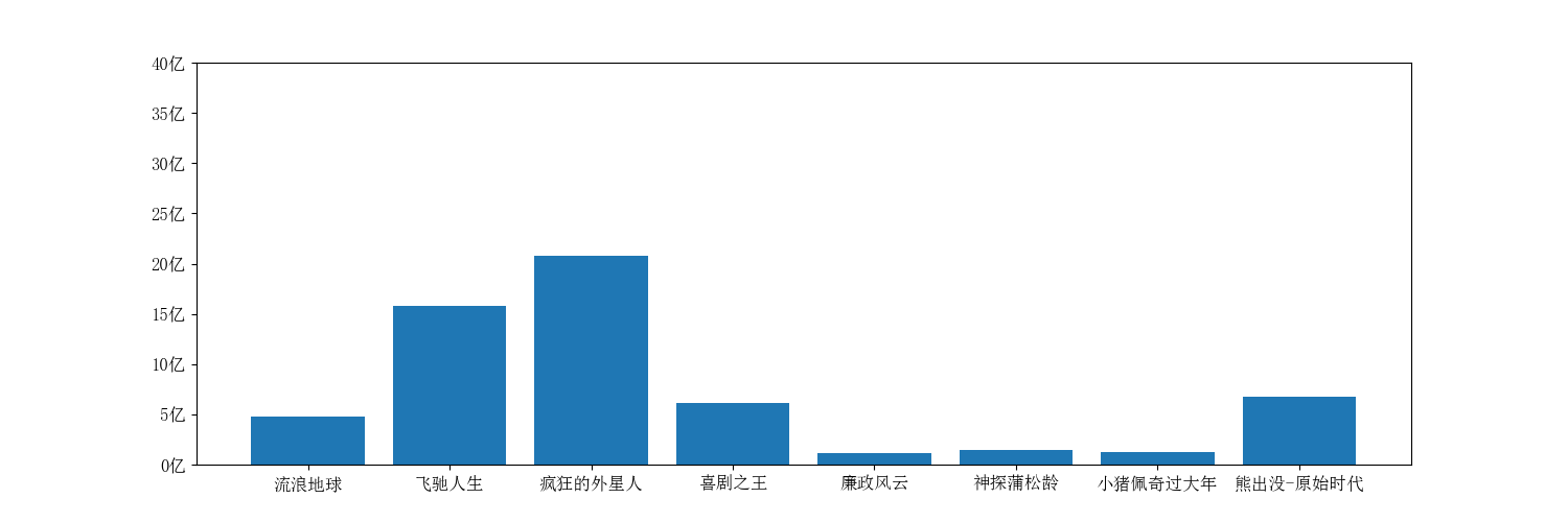
#The bar graph is drawn using PLT Bar method. This method has many parameters.
# X: coordinates on the x-axis, which can be a list / array / string.
# Y: coordinates on the y-axis, which can be a list / array / string.
# data: if data is passed, x and y can be key s in data. For example, data is a
# DataFrame object, then x and y are the names of a column of the DataFrame object
Horizontal bar chart
def bar_chart_two():
    font = font_manager.FontProperties(fname=r"C:\Windows\Fonts\simsun.ttc")
    movies = {
        "Wandering the earth": 4.78,
        "Gallop life": 15.77,
        "Crazy aliens": 20.83,
        "King of comedy": 6.10,
        "Clean government": 1.10,
        "Detective Pu Songling": 1.49,
        "Piggy page has passed the new year.": 1.22,
        "Bear haunt-primeval ages": 6.71
    }
    x = list(movies.keys())
    y = list(movies.values())
    plt.barh(x, y)
    plt.yticks(fontproperties=font, size=10)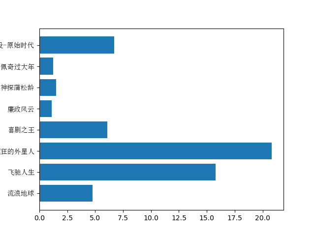
#plt.barh(x,y) draws a horizontal bar chart, which is equivalent to displaying X and Y interchangeably. Other parameters are similar.
Grouped bar chart
def bar_chart_three():
    font = font_manager.FontProperties(fname=r"C:\Windows\Fonts\simsun.ttc")
    movies = {
        "Wandering the earth": [2.01, 4.59, 7.99, 11.83, 16],
        "Gallop life": [3.19, 5.08, 6.73, 8.10, 9.35],
        "Crazy aliens": [4.07, 6.92, 9.30, 11.29, 13.03],
        "King of comedy": [2.73, 3.79, 4.45, 4.83, 5.11],
        "Clean government": [0.56, 0.74, 0.83, 0.88, 0.92],
        "Detective Pu Songling": [0.66, 0.95, 1.10, 1.17, 1.23],
        "Piggy page has passed the new year.": [0.58, 0.81, 0.94, 1.01, 1.07],
        "Bear haunt-primeval ages": [1.13, 1.96, 2.73, 3.42, 4.05]
    }
    plt.figure(figsize=(15, 5))
    movie_df = pd.DataFrame(movies)
    xticks = np.arange(0, len(movies) * 1.5, 1.5)
    bar_width = 0.15
    for index in movie_df.index:
        plt.bar(xticks + (-2 + index) * bar_width, movie_df.iloc[index], width=bar_width, label="The first%d Day box office" % (index + 1))
    plt.xticks(xticks, movie_df.columns, fontproperties=font, size=12)
    font.set_size(12)
    plt.grid()
    plt.legend(prop=font)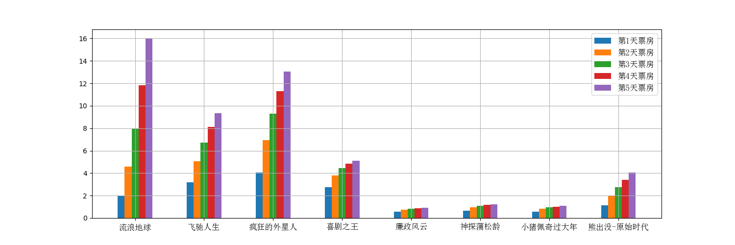
Stacked bar chart
def bar_chart_four():
    menMeans = (20, 35, 30, 35, 27)
    womenMeans = (25, 32, 34, 20, 25)
    groupNames = ("G1", "G2", "G3", "G4", "G5")
    plt.bar(groupNames, menMeans, label="male")
    plt.bar(groupNames, womenMeans, bottom=menMeans, label="female")
    plt.legend()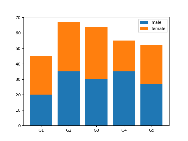
# you can use the bottom parameter to set the distance to pan up.
3. Histogram
def histogram_chart_one():
    durations = [131, 98, 125, 131, 124, 139, 131, 117, 128, 108, 135, 138, 131,
                 102, 107, 114, 119, 128, 121, 142, 127, 130, 124, 101, 110, 116,
                 88, 100, 105, 138, 98, 125, 131, 124, 139, 131, 117, 128, 108, 135]
    plt.figure(figsize=(15, 5))
    nums, bins, patches = plt.hist(durations, 20, edgecolor='k')
    plt.xticks(bins, bins)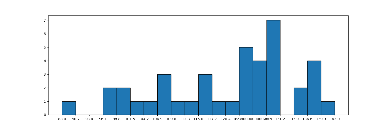
def histogram_chart_two():
    durations = [131, 98, 125, 131, 124, 139, 131, 117, 128, 108, 135, 138, 131,
                 102, 107, 114, 119, 128, 121, 142, 127, 130, 124, 101, 110, 116,
                 88, 100, 105, 138, 98, 125, 131, 124, 139, 131, 117, 128, 108, 135]
    plt.figure(figsize=(15, 5))
    nums, bins, patches = plt.hist(durations, [101, 111, 121, 131, 141, 151, 161], edgecolor='k', density=True)
    plt.xticks(bins, bins)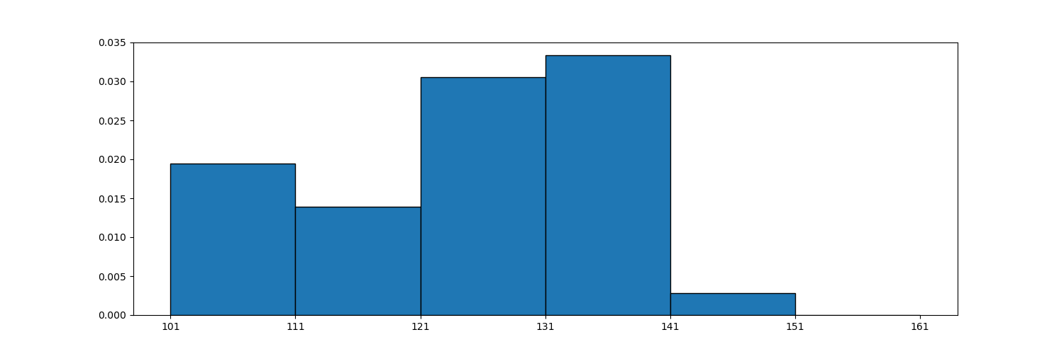
def histogram_chart_three():
    durations = [131, 98, 125, 131, 124, 139, 131, 117, 128, 108, 135, 138, 131,
                 102, 107, 114, 119, 128, 121, 142, 127, 130, 124, 101, 110, 116,
                 88, 100, 105, 138, 98, 125, 131, 124, 139, 131, 117, 128, 108, 135]
    plt.figure(figsize=(15, 5))
    nums, bins, patches = plt.hist(durations, 20, edgecolor='k', cumulative=True)
    plt.xticks(bins, bins)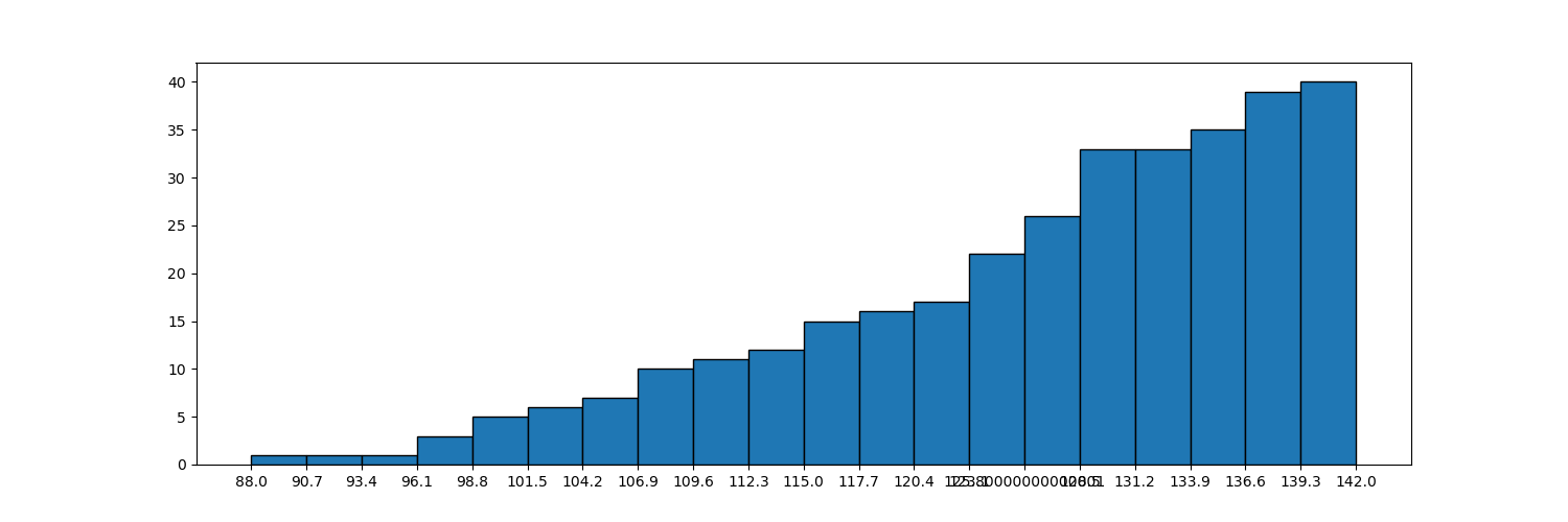
def histogram_chart_four():
    durations = [131, 98, 125, 131, 124, 139, 131, 117, 128, 108, 135, 138, 131,
                 102, 107, 114, 119, 128, 121, 142, 127, 130, 124, 101, 110, 116,
                 88, 100, 105, 138, 98, 125, 131, 124, 139, 131, 117, 128, 108, 135]
    plt.figure(figsize=(15, 5))
    nums, bins, patches = plt.hist(durations, 20, range=(0, 160), edgecolor='k')
    plt.xticks(bins, bins)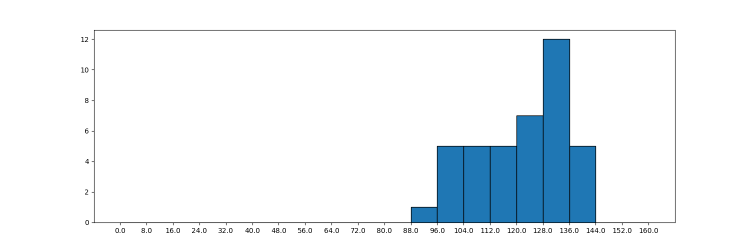
PLT is used for histogram drawing Hist (): histogram histogram
| plt.hist() method properties | explain |
| x | Arrays or sequences that can loop. Histograms are grouped from this array. |
| bins | Number or sequence. The number indicates how many groups are divided, and the sequence indicates that the interval is divided according to the sequence. For example, the division interval of [1,21,41] is [1,20], [21,40) closed on the left and open on the right. |
| range | Tuple or None. If it is a tuple, specify the maximum and minimum values of the x partition interval. If bins is a sequence, the range is not set and has no effect. |
| density | The default is False. If it is set to True, each bar does not represent the number, but "frequency / group distance" (the number of sample data falling in each group is called frequency, and the frequency is divided by the total number of samples. |
| cumulative | If both this parameter and density are equal to True, the first parameter of the return value will be accumulated continuously and finally equal to '1'. |
| Returned parameters | explain |
| nums | If it is an ordinary histogram, it is the number in the interval. If it is a frequency histogram, it is the density (density calculation method: number / total number / span). |
| bins | The range of each interval. |
| pathces | The object of each bar. |
4. Scatter diagram
def scatter_chart_one():
    data = pd.read_csv("./titanic.csv")
    data2 = data[data['sex'] == "female"]
    data = data[data['sex'] == "male"]
    age = data['age']
    fare = data['fare']
    mean = age.mean()
    fare_mean = fare.mean()
    plt.scatter(age, fare, s=age, marker="^", alpha=0.5)
    plt.axvline(mean, linewidth=1, c="r")
    plt.axhline(fare_mean, linewidth=2, c='g')

    female_age = data2['age']
    female_fare = data2['fare']
    plt.scatter(female_age, female_fare, s=female_age, marker="^", c='y', alpha=0.5)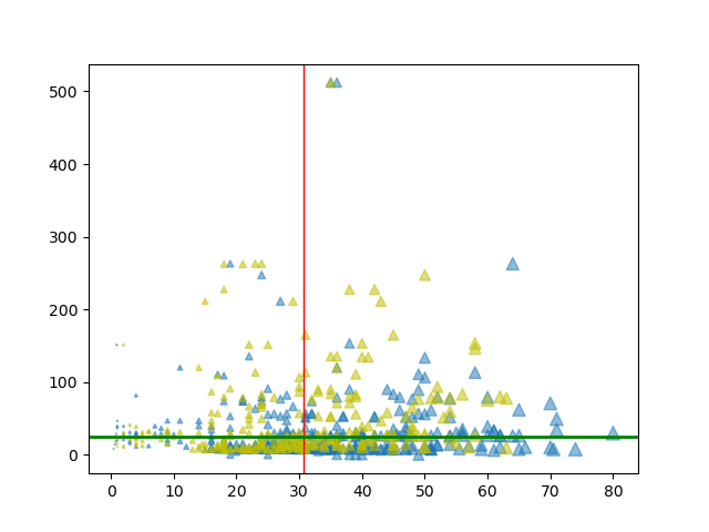
| attribute | explain |
| s | For scatter size, you can set a fixed value and a list. When listing, the size is determined according to the size of the list element. |
| marker | For the shape of scatter points, see style for details |
| alpha | transparency |
| .axvline | Vertical separation line. The first parameter is the separation value, linewidth is the line width, and c is the color |
5. Pie chart
def pie_chart_one():
    font = font_manager.FontProperties(fname=r"C:\Windows\Fonts\simsun.ttc")
    oses = {
        "windows7": 60.86,
        "windows10": 18.46,
        "windows8": 3.61,
        "windows xp": 10.3,
        "mac os": 6.78,
        "other": 1.12
    }
    patches, texts, auto_texts = plt.pie(oses.values(), autopct="%.2f%%", labels=oses.keys(),
                                         textprops={"fontproperties": font}, shadow=True,
                                         explode=(0, 0.1, 0, 0, 0.1, 0))
    for auto_text in auto_texts:
        auto_text.set_color("w")
        auto_text.set_size(8)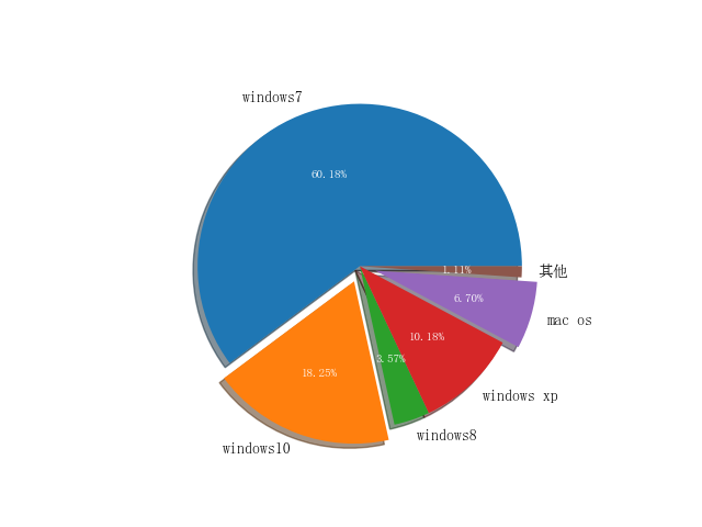
| attribute | explain |
| autopct | '%. 2f%%' means to keep two decimal places |
| label | Tag name |
| textprops | Set text properties |
| shadow | The default is False, and shadows are displayed when it is equal to True |
| explode | Pass in the same number of tuples as the tag name, and each element represents the spacing |
| patches | This refers to the pie chart object |
| auto_texts | This refers to the tuple of text, which can be used to set the text style |
6. Box diagram
def boxplot_chart_one():
    data = np.random.rand(100) * 100
    data = np.append(data, np.array([-120, 150]))
    plt.boxplot(data, sym="^", vert=False, widths=[0.1], labels='A', meanline=True, showmeans=True)
def boxplot_chart_two():
    font = font_manager.FontProperties(fname=r"C:\Windows\Fonts\simsun.ttc")
    height = [[176, 175, 180, 165, 164, 160, 158, 190, 191, 183, 110],
              [166, 155, 170, 175, 174, 180, 198, 190, 191, 183, 300],
              [200, 180, 180, 175, 162, 160, 159, 199, 187, 185, 150]]
    plt.figure(figsize=(15, 5))
    plt.boxplot(height)
    plt.xticks(range(1, 4), ["Class one", "Class two", "Class three"], fontproperties=font)
| attribute | describe |
| x | Data of box diagram to be drawn |
| notch | Whether to display the confidence interval. The default is False. When True, a gap is displayed on the box |
| sym | The symbol of outlier indicates that it is a small dot by default. |
| vert | Whether it is vertical. The default is False |
| whis | The upper and lower limit coefficient is 1.5 by default. Generally between 1.5 and 3.0 |
| position | Location of each box |
| widths | Width of each box |
| labels | label of each box |
| meanline and showmeans | If both are True, an average is drawn |
7. Radar chart
def radar_chart_one():
    font = font_manager.FontProperties(fname=r"C:\Windows\Fonts\simsun.ttc")
    properties = ["output", 'KDA', "development", "Regiment war", "existence"]
    values = [40, 91, 44, 90, 95, 40]
    theta = np.linspace(0, 2 * np.pi, 6)
    plt.polar(theta, values)
    plt.fill(theta, values)
Subgraph creation
(1)
def radar_chart_two():
    properties = ["output", 'KDA', "development", "Regiment war", "existence"]
    values = [40, 91, 44, 90, 95, 40]
    theta = np.linspace(0, 2 * np.pi, 6)
    axes = plt.subplot(111, projection="polar")
    axes.plot(theta, values)
    axes.fill(theta, values)
(2)
def radar_chart_three():
    properties = ["output", 'KDA', "development", "Regiment war", "existence"]
    values = [40, 91, 44, 90, 95, 40]
    theta = np.linspace(0, 2 * np.pi, 6)
    figure, axes = plt.subplots(1, 1, subplot_kw={"projection": 'polar'})
    axes.plot(theta, values)
This method creates the view before drawing.
(3)
def radar_chart_four():
    properties = ["output", 'KDA', "development", "Regiment war", "existence"]
    values = [40, 91, 44, 90, 95, 40]
    theta = np.linspace(0, 2 * np.pi, 6)
    fig = plt.figure(figsize=(10, 10))
    axes = fig.add_subplot(111, polar=True)
    axes.plot(theta, values)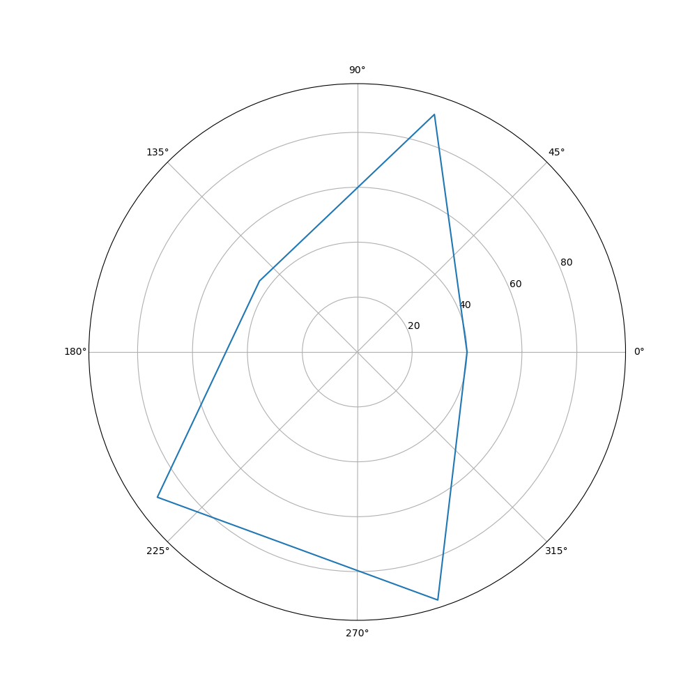
Conclusion!