1. matplotlib Foundation
Draw a polygraph
Commonly used is matplotlib.pyplot module
Every time you execute plt. plot (abscissa, ordinate, color=","linestyle="--"), you add a curve.
Know how to execute plt.show() and draw the final curve
>>> import matplotlib as mpl
>>> import matplotlib.pyplot as plt
>>> x = np.linspace(0, 10, 100)
>>> x
array([ 0. , 0.1010101 , 0.2020202 , 0.3030303 , 0.4040404 ,
0.50505051, 0.60606061, 0.70707071, 0.80808081, 0.90909091,
1.01010101, 1.11111111, 1.21212121, 1.31313131, 1.41414141,
1.51515152, 1.61616162, 1.71717172, 1.81818182, 1.91919192,
2.02020202, 2.12121212, 2.22222222, 2.32323232, 2.42424242,
2.52525253, 2.62626263, 2.72727273, 2.82828283, 2.92929293,
3.03030303, 3.13131313, 3.23232323, 3.33333333, 3.43434343,
3.53535354, 3.63636364, 3.73737374, 3.83838384, 3.93939394,
4.04040404, 4.14141414, 4.24242424, 4.34343434, 4.44444444,
4.54545455, 4.64646465, 4.74747475, 4.84848485, 4.94949495,
5.05050505, 5.15151515, 5.25252525, 5.35353535, 5.45454545,
5.55555556, 5.65656566, 5.75757576, 5.85858586, 5.95959596,
6.06060606, 6.16161616, 6.26262626, 6.36363636, 6.46464646,
6.56565657, 6.66666667, 6.76767677, 6.86868687, 6.96969697,
7.07070707, 7.17171717, 7.27272727, 7.37373737, 7.47474747,
7.57575758, 7.67676768, 7.77777778, 7.87878788, 7.97979798,
8.08080808, 8.18181818, 8.28282828, 8.38383838, 8.48484848,
8.58585859, 8.68686869, 8.78787879, 8.88888889, 8.98989899,
9.09090909, 9.19191919, 9.29292929, 9.39393939, 9.49494949,
9.5959596 , 9.6969697 , 9.7979798 , 9.8989899 , 10. ])
>>> y = np.sin(x)
>>> y
array([ 0. , 0.10083842, 0.20064886, 0.2984138 , 0.39313661,
0.48385164, 0.56963411, 0.64960951, 0.72296256, 0.78894546,
0.84688556, 0.8961922 , 0.93636273, 0.96698762, 0.98775469,
0.99845223, 0.99897117, 0.98930624, 0.96955595, 0.93992165,
0.90070545, 0.85230712, 0.79522006, 0.73002623, 0.65739025,
0.57805259, 0.49282204, 0.40256749, 0.30820902, 0.21070855,
0.11106004, 0.01027934, -0.09060615, -0.19056796, -0.28858706,
-0.38366419, -0.47483011, -0.56115544, -0.64176014, -0.7158225 ,
-0.7825875 , -0.84137452, -0.89158426, -0.93270486, -0.96431712,
-0.98609877, -0.99782778, -0.99938456, -0.99075324, -0.97202182,
-0.94338126, -0.90512352, -0.85763861, -0.80141062, -0.73701276,
-0.66510151, -0.58640998, -0.50174037, -0.41195583, -0.31797166,
-0.22074597, -0.12126992, -0.0205576 , 0.0803643 , 0.18046693,
0.27872982, 0.37415123, 0.46575841, 0.55261747, 0.63384295,
0.7086068 , 0.77614685, 0.83577457, 0.8868821 , 0.92894843,
0.96154471, 0.98433866, 0.99709789, 0.99969234, 0.99209556,
0.97438499, 0.94674118, 0.90944594, 0.86287948, 0.8075165 ,
0.74392141, 0.6727425 , 0.59470541, 0.51060568, 0.42130064,
0.32770071, 0.23076008, 0.13146699, 0.03083368, -0.07011396,
-0.17034683, -0.26884313, -0.36459873, -0.45663749, -0.54402111])
>>> plt.plot(x, y)
[<matplotlib.lines.Line2D object at 0x7f6f2e0df128>]
>>> plt.show()
######Draw multiple curves
>>> siny = y.copy()
>>> cosy = np.cos(x)
>>> cosy
array([ 1. , 0.99490282, 0.97966323, 0.95443659, 0.91948007,
0.87515004, 0.8218984 , 0.76026803, 0.69088721, 0.61446323,
0.53177518, 0.44366602, 0.35103397, 0.25482335, 0.15601496,
0.0556161 , -0.04534973, -0.14585325, -0.24486989, -0.34139023,
-0.43443032, -0.52304166, -0.60632092, -0.68341913, -0.75355031,
-0.81599952, -0.87013012, -0.91539031, -0.95131866, -0.97754893,
-0.9938137 , -0.99994717, -0.9958868 , -0.981674 , -0.95745366,
-0.92347268, -0.88007748, -0.82771044, -0.76690542, -0.69828229,
-0.6225406 , -0.54045251, -0.45285485, -0.36064061, -0.26474988,
-0.16616018, -0.06587659, 0.03507857, 0.13567613, 0.23489055,
0.33171042, 0.4251487 , 0.51425287, 0.59811455, 0.67587883,
0.74675295, 0.8100144 , 0.86501827, 0.91120382, 0.94810022,
0.97533134, 0.99261957, 0.99978867, 0.99676556, 0.98358105,
0.96036956, 0.9273677 , 0.88491192, 0.83343502, 0.77346177,
0.70560358, 0.63055219, 0.54907273, 0.46199582, 0.37020915,
0.27464844, 0.17628785, 0.07613012, -0.0248037 , -0.12548467,
-0.2248864 , -0.32199555, -0.41582217, -0.50540974, -0.58984498,
-0.66826712, -0.7398767 , -0.8039437 , -0.859815 , -0.90692104,
-0.94478159, -0.97301068, -0.99132055, -0.99952453, -0.99753899,
-0.98538417, -0.96318398, -0.93116473, -0.88965286, -0.83907153])
>>> plt.plot(x, siny)
[<matplotlib.lines.Line2D object at 0x7f6f2e89b0b8>]
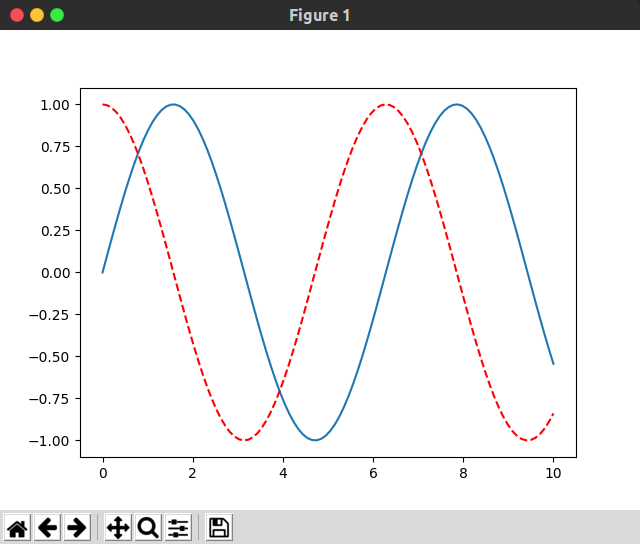
########Specify curve color, style
>>> plt.plot(x, siny)
[<matplotlib.lines.Line2D object at 0x7f6f2e7e3518>]
>>> plt.plot(x, cosy, color="red", linestyle="--")
[<matplotlib.lines.Line2D object at 0x7f6f2e7e3898>]
>>> plt.show()
>>>
The range of horizontal and vertical axes can be adjusted:
plt.xlim(-5, 15)
plt.ylim(-2, 2)
It can also be adjusted at the same time (the first two are x and the last two are y-axis):
ply.axis([-1, 11, -2, 2])
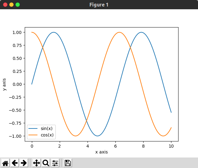
For label settings of coordinate axes:
plt.xlabel("x axis")
plt.ylabel("y value")
For the description of the curve:
plt.plot(x, siny, label="sin(x)")
plt.legend()# must be added before show to display label
>>> plt.plot(x, siny, label="sin(x)")
[<matplotlib.lines.Line2D object at 0x7f6f2d7cbcf8>]
>>> plt.plot(x, cosy, label="cos(x)")
[<matplotlib.lines.Line2D object at 0x7f6f2d7cbe48>]
>>> plt.xlabel("x axis")
Text(0.5, 0, 'x axis')
>>> plt.ylabel("y axis")
Text(0, 0.5, 'y axis')
####The following sentence must be added to show label!!!
>>> plt.legend()
<matplotlib.legend.Legend object at 0x7f6f2d7d34a8>
>>>plt.title("welcome!")#Title the whole picture

>>> plt.show()
>>>
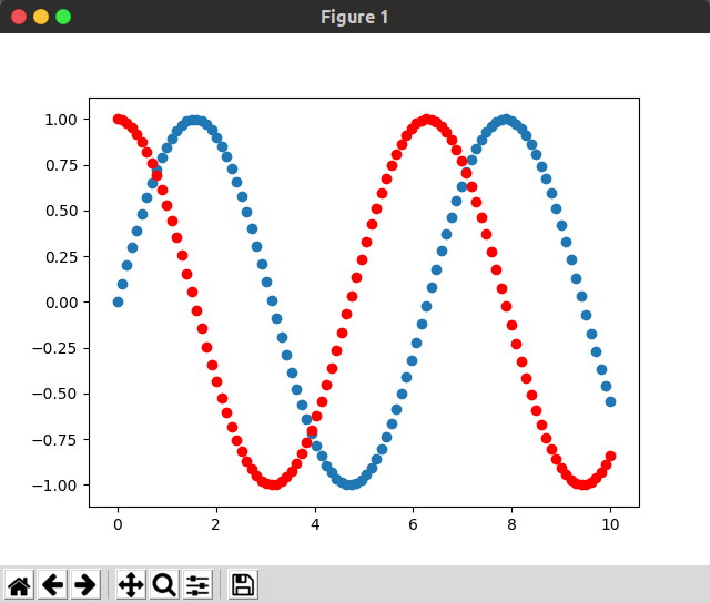
Drawing scatter plots
The usage grammar of polygons and scatter graphs is basically the same, but they become plt.scatter()
>>> plt.scatter(x, siny)
<matplotlib.collections.PathCollection object at 0x7f6f2d7f80f0>
>>> plt.scatter(x, cosy, color="red")
<matplotlib.collections.PathCollection object at 0x7f6f2e73dd68>
>>> plt.show()
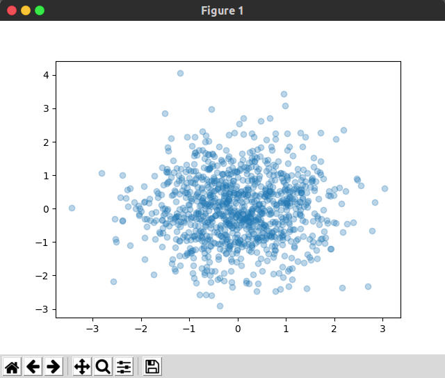
But the scenarios used in polyline and scatter plots are different:
The horizontal axis of a polyline is a feature and the vertical axis is a value.
The horizontal and vertical axes of scatter plots are all features, so scatter plots are generally used as follows:
Where the alpha parameter represents the transparency of the drawn point
>>> x = np.random.normal(0, 1, 1000)
>>> y = np.random.normal(0, 1, 1000)
>>> plt.scatter(x, y, alpha="0.3")
<matplotlib.collections.PathCollection object at 0x7f6f2e0df4e0>
>>> plt.show()
2. Reading Data and Simple Data Exploration
Taking iris data set as an example, it is stored in the form of dictionary in datasets.
keys() allows you to see which fields they have
>>> from sklearn import datasets
>>> iris = datasets.load_iris()
>>> iris.keys()
dict_keys(['data', 'target', 'target_names', 'DESCR', 'feature_names', 'filename'])
The introduction of iris data set can be printed out:
A total of 150 samples
Each sample has four characteristics
There are three categories.
>>> print(iris.DESCR)
.. _iris_dataset:

Iris plants dataset
--------------------

**Data Set Characteristics:**

    :Number of Instances: 150 (50 in each of three classes)
    :Number of Attributes: 4 numeric, predictive attributes and the class
    :Attribute Information:
        - sepal length in cm
        - sepal width in cm
        - petal length in cm
        - petal width in cm
        - class:
                - Iris-Setosa
                - Iris-Versicolour
                - Iris-Virginica
Relevant Data View
#Look at the shape of the sample data, a total of 150 samples, each containing four attributes
>>> iris.data.shape
(150, 4)


#View labels for sample data
>>> iris.target_names
array(['setosa', 'versicolor', 'virginica'], dtype='<U10')
>>> iris.target.shape
(150,)
>>> iris.target
array([0, 0, 0, 0, 0, 0, 0, 0, 0, 0, 0, 0, 0, 0, 0, 0, 0, 0, 0, 0, 0, 0,
       0, 0, 0, 0, 0, 0, 0, 0, 0, 0, 0, 0, 0, 0, 0, 0, 0, 0, 0, 0, 0, 0,
       0, 0, 0, 0, 0, 0, 1, 1, 1, 1, 1, 1, 1, 1, 1, 1, 1, 1, 1, 1, 1, 1,
       1, 1, 1, 1, 1, 1, 1, 1, 1, 1, 1, 1, 1, 1, 1, 1, 1, 1, 1, 1, 1, 1,
       1, 1, 1, 1, 1, 1, 1, 1, 1, 1, 1, 1, 2, 2, 2, 2, 2, 2, 2, 2, 2, 2,
       2, 2, 2, 2, 2, 2, 2, 2, 2, 2, 2, 2, 2, 2, 2, 2, 2, 2, 2, 2, 2, 2,
       2, 2, 2, 2, 2, 2, 2, 2, 2, 2, 2, 2, 2, 2, 2, 2, 2, 2])
>>>
Data Processing and Drawing
Based on the first two features, the distribution of categories was observed.
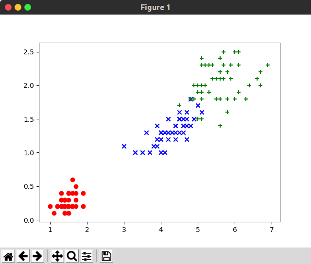
>>> y = iris.target
>>> y.shape
(150,)

>>> X = iris.data
>>> X.shape
(150, 4)

>>> X_be = X[:,:2]
>>> X_be.shape
(150, 2)

>>> plt.scatter(X_be[y==0, 0], X_be[y==0, 1], color="red", marker="o")
<matplotlib.collections.PathCollection object at 0x7f6efc3e5a58>
>>> plt.scatter(X_be[y==1, 0], X_be[y==1, 1], color="blue", marker="x")
<matplotlib.collections.PathCollection object at 0x7f6efc3e5d68>
>>> plt.scatter(X_be[y==2, 0], X_be[y==2, 1], color="green", marker="+")
<matplotlib.collections.PathCollection object at 0x7f6efc3e5eb8>

>>> plt.show()
>>>

It can be seen that the first two features can be well separated from the first and the second, but the second and the third can not be well separated.
Next, the distribution of categories is observed only based on the latter two features:
>>> X_af = X[:, 2:]
>>> X_af.shape
(150, 2)

>>> plt.scatter(X_af[y==0, 0], X_af[y==0, 1], color="red", marker="o")
<matplotlib.collections.PathCollection object at 0x7f6efc3e5470>
>>> plt.scatter(X_af[y==1, 0], X_af[y==1, 1], color="blue", marker="x")
<matplotlib.collections.PathCollection object at 0x7f6efc3e5d68>
>>> plt.scatter(X_af[y==2, 0], X_af[y==2, 1], color="green", marker="+")
<matplotlib.collections.PathCollection object at 0x7f6efc38ce80>

>>> plt.show()
It can be seen that for iris dataset, the latter two features are more discriminant for classification.