Welcome to focus on Python, data analysis, data mining and fun tools!
In recent years, Python visualization libraries have emerged one after another. From Matplotlib to pyechards, data visualization is also widely used, which can be almost applied to various fields such as natural science, engineering technology, finance, communication and commerce.
Recently, when I visited Github, I found a new visualization Library: cufflinks. I had a good experience. Its biggest features are: simple use, beautiful graphics and less code. You can draw very beautiful graphics with only one or two lines of code. Welcome to collect and learn, like praise and support.
Github link: https://github.com/santosjorge/cufflinks
Let's have a look!
1. Simple usage
The cufflinks library is mainly used in combination with dataFrame data. The drawing function is dataFrame.iplot. Just remember this, but there are many parameters in the iPlot function. Some parameters are described as follows:
kind: Type of diagram, e.g scatter,pie,histogram etc.
mode: lines,markers,lines+markers,Represents polyline, point, polyline and point respectively
colors: The color corresponding to the track
dash: The virtual real line corresponding to the trajectory, solid,dash,dashdot Three kinds
width: Track thickness
xTitle: Abscissa name
yTitle: The name of the ordinate
title: Title of chart
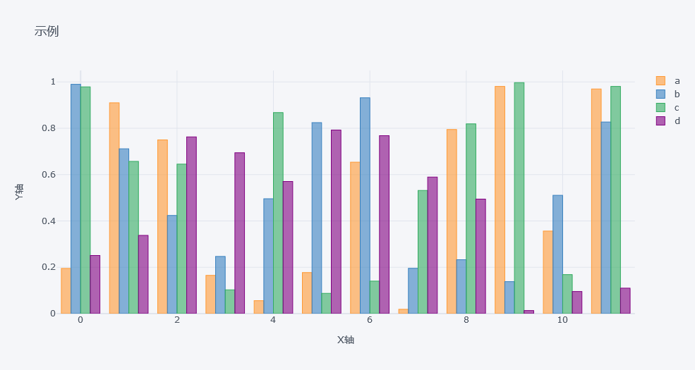
As shown in the following figure, df is the randomly generated dataFrame data, kind='bar 'represents the histogram, title represents the title, xTitle names the X axis, and yTitle names the Y axis:
import pandas as pd
import numpy as np
import cufflinks as cf
df=pd.DataFrame(np.random.rand(12, 4), columns=['a', 'b', 'c', 'd'])
df.iplot(kind ='bar',title='Example', xTitle = 'X axis', yTitle ='Y axis')
2. A small amount of code can draw very beautiful graphics
cufflinks provides us with rich theme styles and supports seven themes, including polar, pearl, Henan, solar, ggplot, space and white.
Line chart
cf.datagen.lines(4,10).iplot(mode='lines+markers',theme='solar')
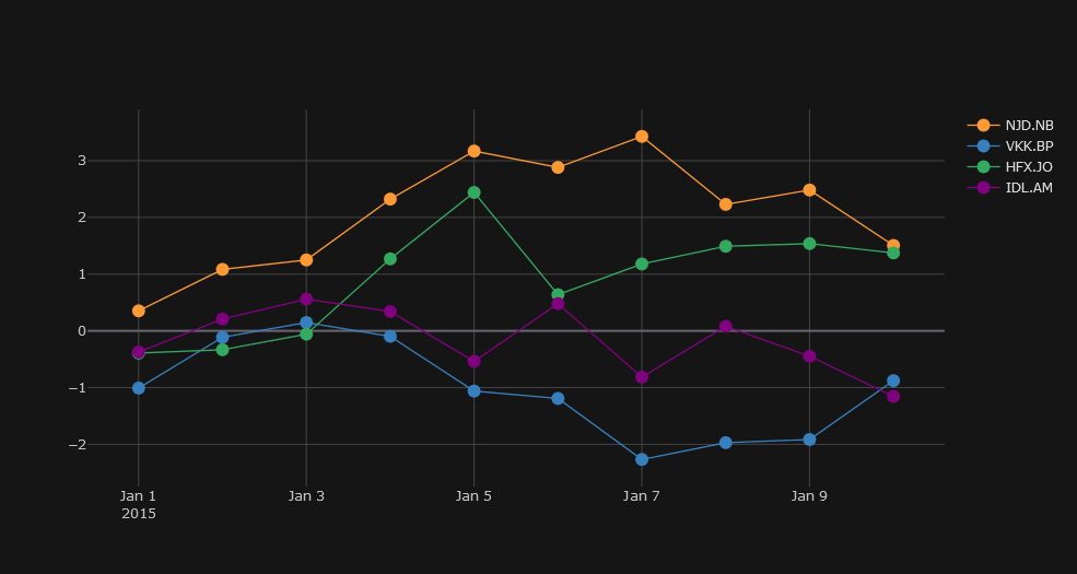
cufflinks uses datagen to generate random numbers. figure is defined as lines. The specific form of cf.datagen.lines(2,10) is as follows:
cf.datagen.lines(2,10) #2 for 2 groups, 10 for 10 days
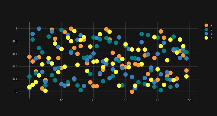
Scatter diagram
df = pd.DataFrame(np.random.rand(50, 4), columns=['a', 'b', 'c', 'd'])
df.iplot(kind='scatter',mode='markers',colors=['orange','teal','blue','yellow'],size=20,theme='solar')
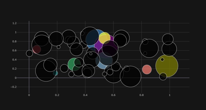
Bubble Diagram
df.iplot(kind='bubble',x='a',y='b',size='c',theme='solar')
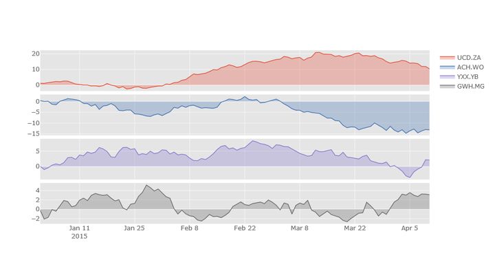
subplots subgraph
df=cf.datagen.lines(4)
df.iplot(subplots=True,shape=(4,1),shared_xaxes=True,vertical_spacing=.02,fill=True,theme='ggplot')
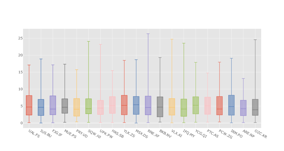
Box diagram
cf.datagen.box(20).iplot(kind='box',legend=False,theme='ggplot')
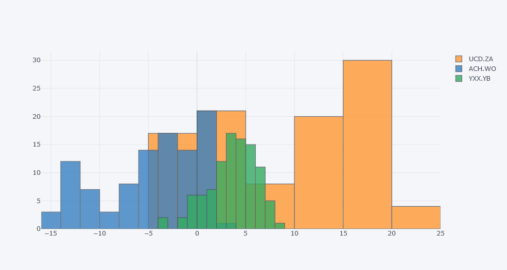
histogram
df.iloc[:,0:3].iplot(kind='histogram')
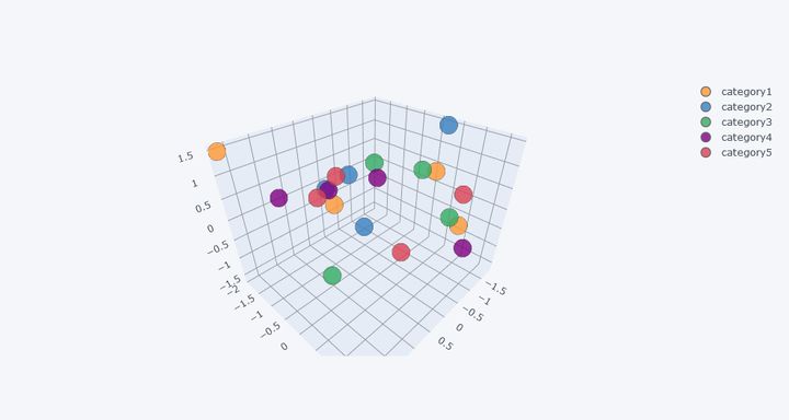
3D diagram
cf.datagen.scatter3d(5,4).iplot(kind='scatter3d',x='x',y='y',z='z',text='text',categories='categories')
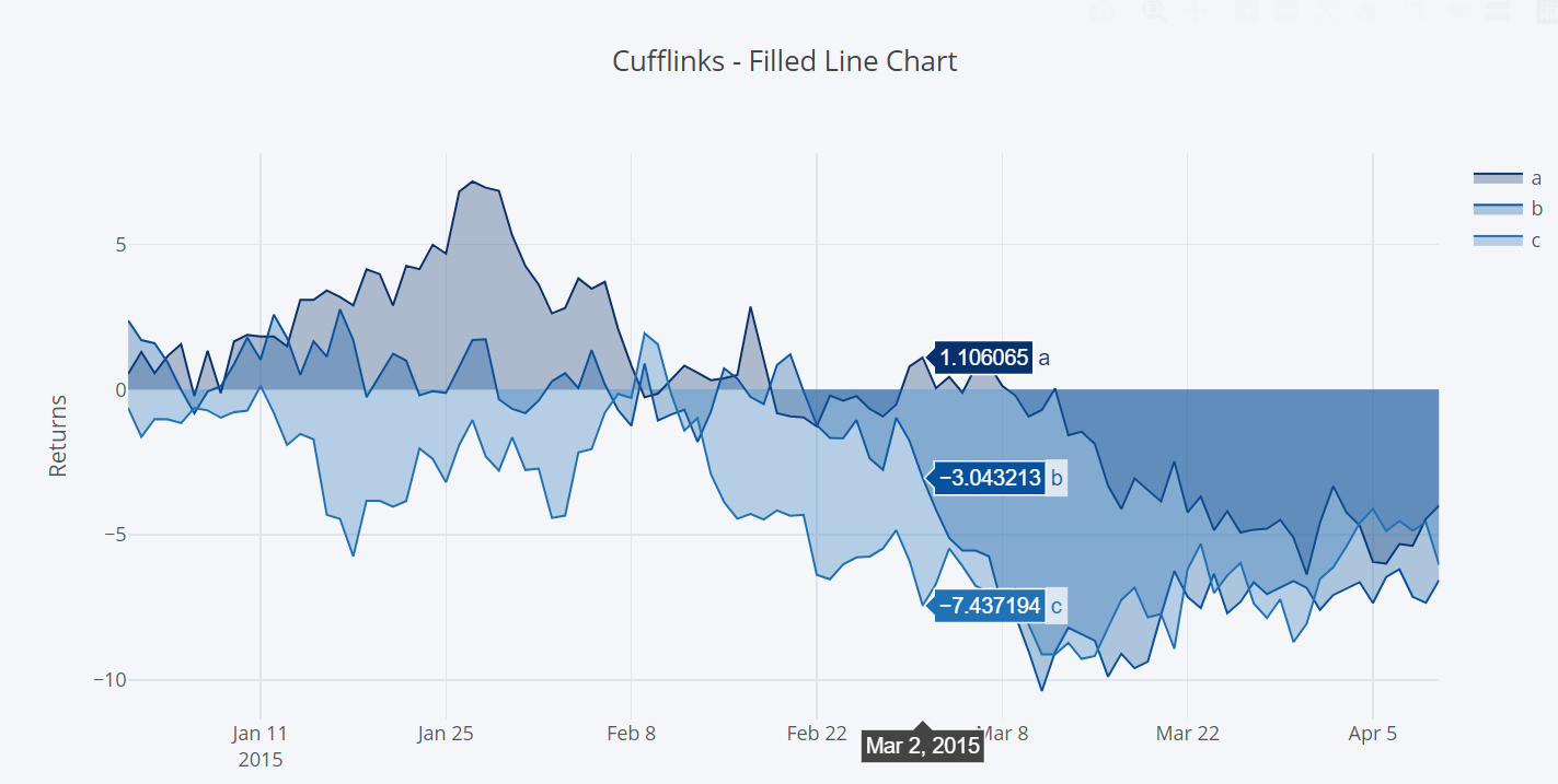
Linear graph
cf.datagen.lines(3).iplot(kind='scatter',xTitle='Dates',yTitle='Returns',title='Cufflinks - Filled Line Chart', colorscale='-blues',fill=True)
The cufflinks library also has richer drawing functions. You can explore and learn on the above Github.
Technical exchange
Welcome to reprint, collect, gain, praise and support!

At present, a technical exchange group has been opened, with more than 2000 group friends. The best way to add notes is: source + Interest direction, which is convenient to find like-minded friends
- Method ① send the following pictures to wechat, long press identification, and the background replies: add group;
- Method ②: add micro signal: Python 666, remarks: from CSDN
- WeChat search official account: Python learning and data mining, background reply: add group