🥳 Welcome interested partners to do something meaningful together! Translator: Rick Ma
I launched a weekly translation program, Warehouse address,Access address
There is still a shortage of like-minded partners. They are purely personal interests. Of course, they will also help to improve English and front-end skills. Requirements: English is not too bad, github is proficient, persistent, modest and responsible for what you do.
If you want to participate, you can wx You can also send issue messages to the warehouse. My blog also has specific personal contact information: daodaolee.cn
I wonder if you often consider whether new projects should be adapted to the mobile terminal or the desktop terminal first? Recently, I launched a vote on this item on Twitter, with a total of 648 votes, as follows:
- Mobile priority: 33.3%
- Desktop priority: 21.9%
- Mixed: 24.7%
In the following, we will understand the meaning of each method and some responsive design techniques, and then discuss whether these methods are applicable today.
Introduction: the meaning of mobile priority and desktop priority
Mobile first means that in website development, we first write CSS with smaller viewport size, and then use CSS media query to optimize the experience of large viewports
Consider the following examples:
.section {
    padding: 2rem 1rem;
}

@media (min-width: 62.5rem) {
    .section {
        display: flex;
        align-items: center;
        gap: 1rem;
        padding: 4rem 2rem;
    }
}
We have configured a padding attribute for mobile devices. When the viewport size is large enough, it should be an elastic box with larger padding
This is just a simple example. Imagine that we have a large enough website or mobile APP, then we will set up much more things.
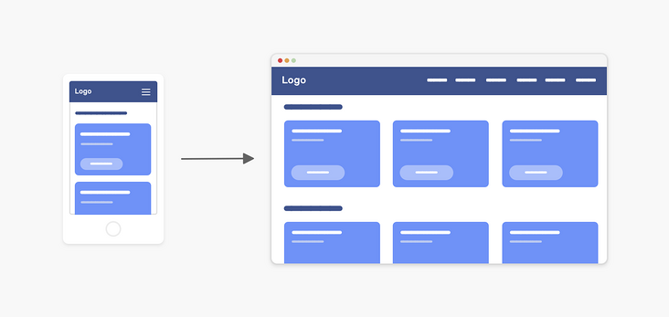
When we take the desktop first approach, the opposite is true
.section {
    display: flex;
    align-items: center;
    gap: 1rem;
    padding: 4rem 2rem;
}

@media (max-width: 62.5rem) {
    .section {
        display: block;
        padding: 2rem 1rem;
    }
}
We first write CSS for larger viewports, and then use media queries to change CSS for smaller viewports
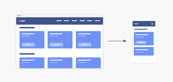
What is the development process of mobile first?
Do you like to develop directly from browser F12 to mobile device instead of adapting to the desktop? Or do you prefer both at the same time? That is, while giving priority to writing mobile device styles, it also adapts to the viewport size of the desktop.
These are two situations I can imagine:
- First deal with the CSS styles of all pages of the mobile device, and finally adapt to the desktop
- At the same time, for each page or component on the mobile end, the large viewport shall be adapted first.
Which one do you usually use? For me, the second method is more suitable for me, which can make me focus more on my current component or page, and reduce the mistakes in writing CSS.
When you use the first method, you may rewrite CSS for tablet or desktop. Let's take a look at the following figure:
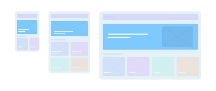
Let's take it hero selector as an example:
.hero {
  display: flex;
  align-items: flex-end;
  background-image: url('hero.jpg');
  background-size: cover;
  background-repeat: no-repeat;
}

.hero__title {
  font-size: 1rem;
}

.hero__thumb {
  display: none;
}

@media (min-width: 60rem) {
  .hero {
    align-items: center;
    background-image: initial;
    background-color: #7ecaff;
  }

  .hero__title {
    font-size: 2rem;
  }

  .hero__thumb {
    max-width: 320px;
    display: block;
  }
}
As written in the above code The hero selector has a background picture on the mobile side, and a solid color background on the desktop side, with a picture on the far right. As you can see, this is the preferred CSS style of the mobile terminal. We don't have much to rewrite except font size and background.
So where is the navigation? How will the mobile priority be written?
.nav {
    position: fixed;
    left: 0;
    top: 0;
    width: 100%;
    height: 100%;
    overflow-y: auto;
    padding-top: 2rem; /* Gap of navigation button */
}

.nav__toggle {
    position: absolute;
    right: 1rem;
    top: 1rem;
}

.nav__item {
    padding: 1rem;
    display: block;
}

.nav__item:not(:last-child) {
    border-bottom: 1px solid #fff;
}

/* Desktop style */
@media (min-width: 60rem) {
    .nav {
        position: initial;
        width: initial;
        height: initial;
        overflow-y: initial;
        display: flex;
        align-items: center;
        padding-top: 0;
        background-color: blue;
    }

    .nav__toggle {
        display: none;
    }

    .nav__item:hover {
        color: blue;
        background-color: initial;
    }

    .nav__item:not(:last-child) {
        border-bottom: 0;
        border-left: 1px solid #fff;
    }
}
I don't know if you can see that the style to be rewritten on the desktop is probably the same as the existing style on the mobile terminal, which is not a good thing.
In addition, sometimes some inexplicable problems are caused by CSS features. For example, I hope to start from nav_ Delete border bottom from item.
.nav__item {
    border-bottom: 0;
}
This does not work because the not pseudo class has a higher priority in this case
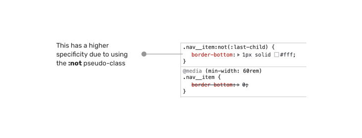
Use the following methods to make it effective:
.nav .nav__item {
    border-bottom: 0;
}

/* perhaps */

.nav__item:not(:last-child) {
    border-bottom: 0;
    border-left: 1px solid #fff;
}
What is the desktop priority development process?
Still the case of the navigation bar, let's take a look at the desktop first scheme?
.nav {
    display: flex;
    align-items: center;
    background-color: blue;
}

.nav__toggle {
    position: absolute;
    right: 1rem;
    top: 1rem;
}

.nav__item {
    padding: 1rem;
    display: block;
}

.nav__item:hover {
    color: blue;
    background-color: initial;
}

.nav__item:not(:last-child) {
    border-bottom: 0;
    border-left: 1px solid #fff;
}

@media (max-width: 25rem) {
    .nav {
        display: block;
        position: fixed;
        left: 0;
        top: 0;
        width: 100%;
        height: 100%;
        overflow-y: auto;
        padding-top: 2rem; /* Space for the toggle */
    }

    .nav__toggle {
        display: block;
    }

    .nav__item:not(:last-child) {
        border-bottom: 1px solid #fff;
    }
}
When the desktop side comes first, we can see that the number of coverage is much less than that of the mobile side. Isn't that interesting? The main reason is that we reviewed all the specific styles of a specific viewport through the max width of the media query.
I advocate that we should first write CSS styles for the desktop, and then adapt to the mobile.
From the comparison chart below, we can see that writing CSS style with desktop first looks shorter and there is no unnecessary repetition (well, he has a little ~ ~)
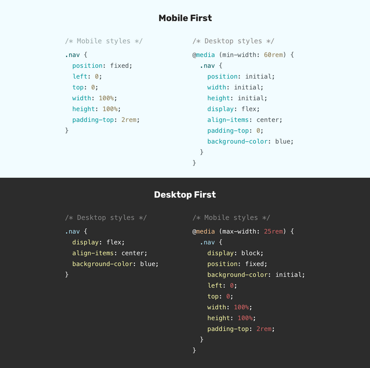
Only primary school students make choices, and adults need both
For me, I don't want to stick to any method. And I prefer to try to combine the two methods.
This means that we need to write basic styles first, and then consider what will happen on the mobile terminal and desktop terminal?
I like where Elad Shechter is This article Mentioned in.
Let's take an abstract example:
.nav {
    /* Base style: does not involve any window size */
}

/* Desktop style */
@media (min-width: 800px) {
    .nav { ... }
}

/* Mobile end style */
@media (max-width: 799px) {
    .nav { ... }
}
As you can see, the range of media query corresponds to different window sizes, which means that we won't do anything to override the properties. This approach is useful for components that look completely different on the mobile side and the desktop side. In our example, it is navigation.
However, for such as < section >, there is little difference between the mobile end and the desktop end, and the hybrid method does not play a great role
.section {
    padding: 1rem;
}

/* Desktop style */
@media (min-width: 800px) {
    .section {
        padding: 2rem 1rem;
    }
}
How should I handle responsive design
Sometimes, I think it's not so important to discuss mobile first or desktop first, because modern CSS provides us with a way to write responsive layout CSS styles with less CSS code
Having said that, I think the debate between mobile first and desktop first will be limited to showing or hiding elements in specific viewports. Except for those pages or components that are particularly complex and vary greatly in a particular viewport.
Let's find a real case to illustrate these concepts:
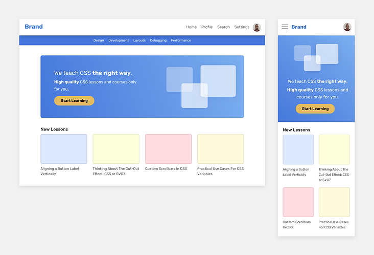
There are some different components on mobile devices and desktop devices, such as navigation bar and title, and there are only slight differences in the rest. For titles, we can determine the style design in a specific viewport through the mixed use of Min width and max width.
However, < section > and article grids need to use basic styles, and then use min width where necessary.
Let go of your mind and don't lock him up in a cage. This is just a design at hand. I don't need to do it strictly in my way. Now let's show more details
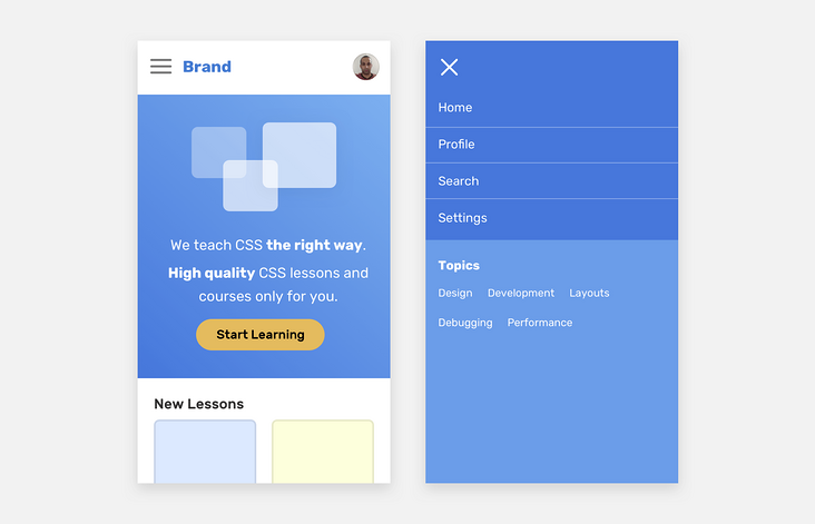
If the title and navigation adopt the mobile first method, a large number of CSS properties will be repeated, which is not the way we advocate. Here's my idea:
.header {
    /* Base style */
}

/* Desktop style */
@media (min-width: 1000px) {
    .nav__toggle,
    .nav__close {
        display: none;
    }
}

/* Mobile end style */
@media (max-width: 999px) {
    .nav {
        position: fixed;
        left: 0;
        top: 0;
        width: 100%;
        height: 100%;
        background-color: #4777dB;
    }
}
For the < section > section, we use elastic boxes to handle the styles of rows and columns, and can also be used to reorder or move elements
<section class="hero">
    <div class="wrapper">
        <img src="thumb.jpg" alt="" />
        <h2><!-- Headline --></h2>
        <p><!-- Description --></p>
    </div>
</section>
.hero {
display: flex;
flex-direction: column;
}
@media (min-width: 1000px) {
flex-direction: row;
}
@media (max-width: 999px) {
.hero__thumb {
order: -1;
}
}Here, I only use the attribute order:-1 once in the max width range.
I can do this:
.hero__thumb {
    order: -1;
}

@media (min-width: 1000px) {
    .hero__thumb {
        order: initial;
    }
}
What about? I don't see the repetition, ha ha ha~
In addition, please note that if order is used in the elastic box, the visual order will not match the DOM order in HTML
In the following visual chart, I explain how to choose mobile first or desktop first:
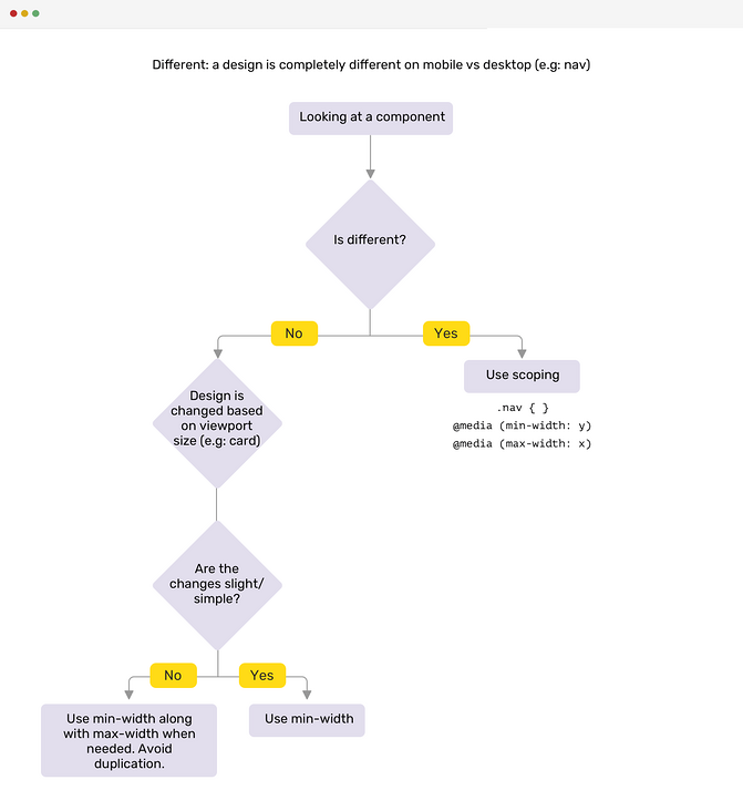
Avoid double breakpoint media queries
Using the same viewport size for min width and max width can cause unimaginable problems.
@media (max-width: 500px) {
    .nav {
        display: none;
    }
}

@media (min-width: 500px) {
    .nav__toggle {
        display: none;
    }
}
The above code seems to be seamless, but in most cases, you will forget to test an important breakpoint: 500px, that is, the pixel interval between the two breakpoints. At this breakpoint, the navigation and expand buttons are not visible.
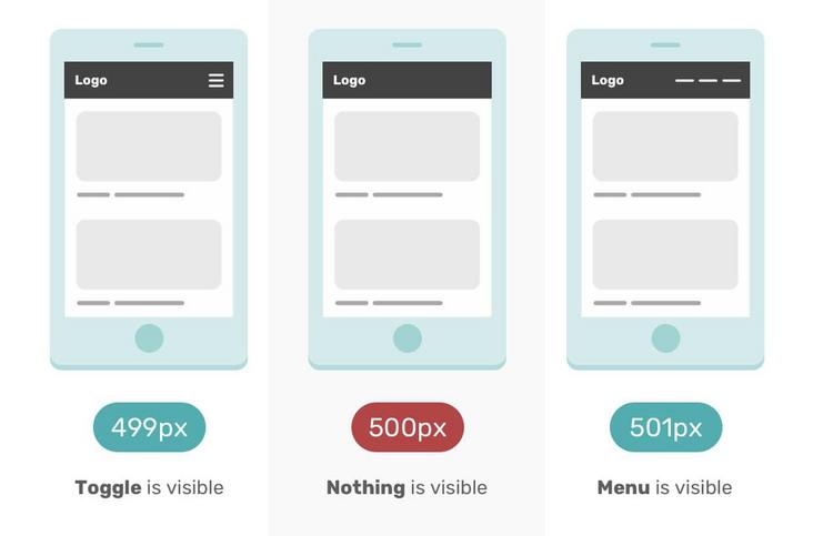
In the mobile mode of F12, if 500px is not entered manually, it is difficult to find this problem.
To prevent this problem, try to avoid using the same value in Min width and max width.
@media (max-width: 499px) {
    .nav {
        display: none;
    }
}

@media (min-width: 500px) {
    .nav__toggle {
        display: none;
    }
}
Do you think I found this problem?
Hahaha, actually I'm from Debugging CSS Borrowed from this book.
What do designers think of mobile first
I am also a designer. Frankly, I don't like mobile first design.
- Mobile first design drawings are limited and it is difficult to give full play to creativity
- Dealing with excessive design is annoying because you have to scroll the design up and down
The desktop first design is much better. At least for me, it can immediately try my new ideas, and I don't need to scroll up and down frequently to see what's unreasonable in the design.
Modern CSS reduces the need to think about mobile first or desktop first
There are many current and upcoming CSS features that will make responsive design easier to implement
Flexbox Wrapping
In Geoffrey Crofte's article How to make a responsive card for media queries In, he explored how to make responsive cards without using media queries. I will explain his basic concepts here. You can also choose to read the original text for more details.
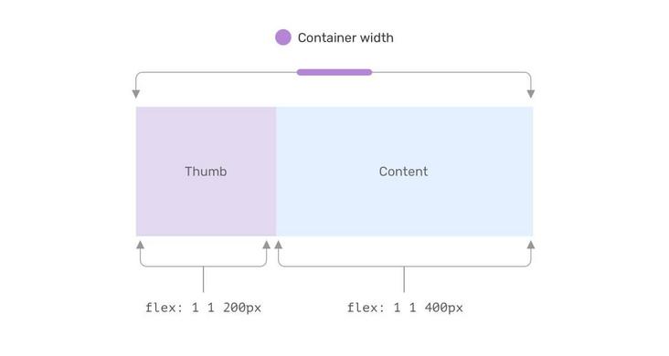
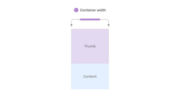
Setting a fixed flex base value and allowing item s to grow and scale when needed can implement a responsive component without media query.
This example shows how the card looks when there is not enough space
CSS grid layout and minmax function
Thanks to CSS Grid, we can have a responsive grid layout that does not rely on media queries. Consider the following example:
.wrapper {
  display: grid;
  grid-template-columns: repeat(auto-fit, minmax(200px, 1fr));
  grid-gap: 1rem;
}
This is a responsive grid that provides a minimum width of 200px for each project.
If there is no CSS grid, we need to use media query to change the element width according to the viewport.
stay this paper Learn more about CSS Gird and Minmax()
Viewport units and clamp functions
The combination of viewport units and clamp function can effectively reduce the use of font size, padding, margin and other element sizes.
.title {
    font-size: clamp(16px, (1rem + 5vw), 50px);
}

.hero {
    padding: clamp(2rem, 10vmax, 10rem) 1rem;
}

.sidebar {
    flex-basis: max(30vw, 150px);
}
Container query
CSS new feature container query is now available under Chrome. With them, we can do a lot of things without using media query.
Consider the following examples:
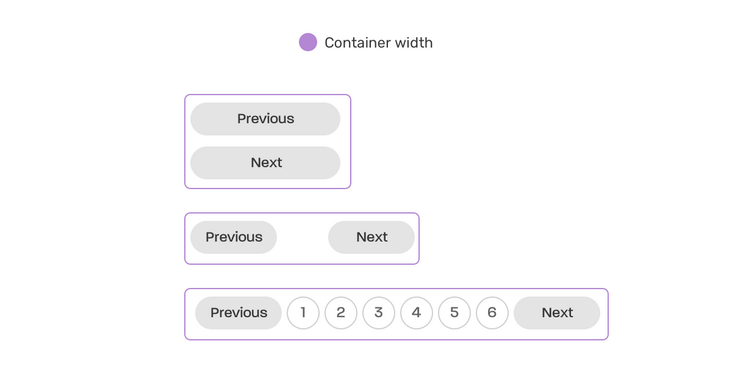
This is a responsive paging based on container width. No media query is required!
.wrapper {
  contain: layout inline-size;
}

@container (min-width: 250px) {
  .pagination {
    display: flex;
    flex-wrap: wrap;
    gap: 0.5rem;
  }

  .pagination li:not(:last-child) {
    margin-bottom: 0;
  }
}

@container (min-width: 500px) {
  .pagination {
    justify-content: center;
  }

  .pagination__item {
    display: block;
  }
}
As I showed, modern CSS allows us to make responsive layouts without media queries. So the question is, do we still need to consider the question of mobile first or desktop first?