1. Adaptive Layout (BFC Trigger)
Left fixed and right adaptive:
  .left {
            width: 200px;
            height: 200px;
            background-color: green;
            float: left;
        }

        .right {
            height: 300px;
            background-color: red;
            overflow: hidden;
            /* When overflow:hidden is set to the element, the element constructs the BFC, triggering the element of the BFC to not intersect with the floating element. */
        }


<div class="left"></div>
<div class="right"></div>
Fixed on the right and adaptive on the left:
 .left {
            width: 200px;
            height: 200px;
            background-color: green;
            float: right;
        }

 .right {
            height: 300px;
            background-color: red;
            overflow: hidden;
            /* When overflow:hidden is set to the element, the element constructs the BFC, triggering the element of the BFC to not intersect with the floating element. */
        }


<div class="left"></div>
<div class="right"></div>
Fixed mid-adaptive on both sides:
.left,
.right {
            width: 200px;
            height: 200px;
            background-color: green;
        }
.left {
            float: left;
        }
.right {
            float: right;
        }

.center {
            height: 300px;
            background-color: red;
            overflow: hidden; /* Triggering BFC*/
        }

 <div class="left"></div>
 <div class="right"></div>
 <div class="center"></div>
2. touch events
Four new events related to finger touch have been added to the mobile terminal.
// touch start: triggered when the finger is placed on the screen
 // Touch move: The finger slides on the screen to trigger (triggers many times)
// Touch end: Triggered when the finger leaves the screen
 // Touch cancel: Triggered when the system cancels a touch event, such as a phone call
After each touch event is triggered, an event object is generated, in which changedTouches record the information of finger sliding.
e.touches;//Fingers on the current screen
e.targetTouches;//Fingers on the current dom element.
e.changedTouches;//A finger that changes when touched.
Each touch in these lists consists of touch objects, which contain touch information. The main attributes are as follows:
clientX / clientY: //Location of touch points relative to browser windows
pageX / pageY:     //The position of the touch point relative to the page
<script>
        var box = document.querySelector('.box');
        //Binding touch events
        //Define variables to record touch screen data
        var  startX = 0; //Record the coordinate value of finger contact
        var  moveX = 0; //Recording the Current Moving Coordinate Value of Fingers
        var  distancX = 0; //Record the difference between the current finger position and the starting position

        box.addEventListener('touchstart', function (e) {
            console.log('start');
            startX = e.targetTouches[0].clientX;
            // console.log(startX);
        })

        box.addEventListener('touchmove', function (e) {
            console.log('move');
            //Moving touch screen to get current finger movement distance
            moveX = e.targetTouches[0].clientX;
            // console.log(moveX);
            //Calculating distance difference
            distancX = moveX - startX;
            // console.log(distancX);
        })

        box.addEventListener('touchend', function (e) {
            console.log('end');
            //The end of the touch screen is to determine the user's sliding direction.
            if (distancX > 0) {
                console.log('Right Slide');
            }

            if(distancX < 0) {
                console.log('Left Slide');
            }
             //Data Reset
             startX = 0;
             moveX = 0;
             distancX = 0;
        })
</script>
After the mobile touch screen, the touch event will be triggered first, and after 300 ms, the click event will be triggered. There will be performance problems in the mobile click event.
Optimize:
It is logical to click on a touch event, and it is necessary to judge that the user's behavior is a click event.
The judgment in touch is click event condition:
The finger did not move on the screen during the touch screen process; the time of touch screen was less than 150 ms.
3. About tap events and click events
1) Click events are very useful on the pc side, but there will be a delay of about 300 ms on the mobile side, which will affect the user's experience. 300 ms is used to judge whether to double-click or long-press events. Only when no subsequent action occurs, click events will be triggered.
2) tap event will trigger if touched lightly and experience better.
/*
 * The user experience needs to be improved due to the delayed click event on the mobile side, which has a delay of about 300.
 * Hope to encapsulate a corresponding faster tap event with touch event
 *
 * touch judges the click event as a condition:
 *
 * 1. The finger does not move from the beginning of the touch screen to the end of the touch screen.
 * 2. The time to touch the screen is less than 150 ms*
 *
 * Satisfying the above two conditions can be considered to trigger the click event.
 * */
/*
*  Plug-in function:
*   Moving click events optimized for binding specified elements - - tap events
*   Parameters:
*   obj:To bind elements of optimized click events
*   callback: What action to perform when clicking event triggers
* */

var itcast={
    tap:function(obj,callback){
        if(typeof obj=='object'){ //Determine whether the incoming obj is an object

            var startTime=0;//Record start events
            var isMove=false; //Does the record move?

            obj.addEventListener('touchstart',function(){
                startTime=Date.now(); //Get the current timestamp
            });

            obj.addEventListener('touchmove',function(){
               isMove=true; //Record movement

            });

            obj.addEventListener('touchend',function(e){
                //Determine whether click conditions are met
                if(!isMove&&Date.now()-startTime<150){
                    //tap click event trigger
                    //if(callback){
                    //    callback();
                    //}
                    callback&&callback(e);
                }

                //Data Reset
                isMove=false;
                startTime=0;
            });
        }
    }
}
4. Introduction to zepto framework
Zepto is a lightweight JavaScript library for modern advanced browsers, which has a similar api to jquery. If you can use jquery, you can also use zepto.
github address (https://github.com/madrobby/zepto )
Chinese Documents (http://www.css88.com/doc/zeptojs_api/ )
The difference between zepto and jquery
-
jquery is aimed at the pc side, mainly used to solve browser compatibility problems, zepto is mainly aimed at the mobile side.
-
zepto is lighter and smaller than jquery
-
zepto encapsulates some mobile-side gesture events
Basic use of zepto
Zepto is basically the same as jquery. Zepto is modular. If you need a function, you need to import a zepto file.
<script src="zepto/zepto.js"></script>
<script src="zepto/event.js"></script>
<script src="zepto/fx.js"></script>
<script>
  $(function () {
    $(".box").addClass("demo");

    $("button").on("click", function () {
      $(".box").animate({width:500}, 1000);
    });
  });
</script>
zepto gesture event
zepto encapsulates some common gesture events according to touch start touch move touch end
tap     // Touch events, used instead of click events on the mobile side, because click events have a 300 ms delay in the old version
	    //The problem of penetration fastclick:
swipe  //Trigger when finger slides
swipeLeft    //Left slide
swipeRight   //Right slip
swipeUp      //Up slide
swipeDown    //Slide downward
5. Responsive Pages
What is responsive layout?
Response layout is a concept proposed by Ethan Marcotte in May 2010. In short, a website can be compatible with multiple terminals (mobile phones, tablets, pc computers, watches, televisions) - rather than a specific version for each terminal. This concept was born to solve the problem of mobile Internet browsing.
Why a responsive layout?
-
With the maturity of mobile interconnection, web pages developed on PC can no longer meet the requirements of mobile devices.
-
The usual practice is to make a specific version for the mobile end.
-
If there are more and more terminals, there will be more and more versions to be developed (the popularity of large screen devices)
-
Responsive Layout: A Web site can be compatible with multiple terminals (saving development costs)
Advantage:
Flexibility for different resolution devices
It can quickly solve the problem of multi-device display adaptation.
Disadvantages:
Compatible with all kinds of equipment, heavy workload and low efficiency
Code burdensome, there will be hidden useless elements, longer loading time
In fact, this is a compromise design solution, which is affected by many factors and can not achieve the best results.
To some extent, the original layout structure of the website has been changed, and users will be confused.
Responsive development status:
-
If there are already PC websites, then we will not use responsive development, but develop a system for mobile terminals (such as Jingdong, Taobao).
-
More and more responding development is adopted on new sites.
-
In China, responsive development is not particularly popular. But responsive development is the trend of the times and will become more and more popular.
Comparisons between Responsive Development and Mobile web Development
| Development mode | Mobile web development + pc development | Responsive development |
|---|---|---|
| Reference scenarios | In general, there are already PC-side websites, only need to develop mobile-side websites independently. | For some new websites, and requirements for mobile adaptation |
| Development | Strong pertinence and high development efficiency | Compatible with various terminals, low efficiency |
| Adaptation | Can only be adapted to mobile or PC, pad experience is poor | Various terminals can be adapted |
| efficiency | Simple code, fast loading | Code is relatively complex and slow to load |
Responsive: A page that can be perfectly laid out on any device;
Web pages are required to detect device screens - > width - > width (most importantly, width)
How to dynamically detect the current device screen width:
1 - can be dynamically retrieved with js
New Media Query Technology in 2-css3
Function of Media Query Technology: It can dynamically detect the current device width and load different styles to the box according to different device width.
6. Media Inquiry
Media Query is a new attribute proposed by CSS. Through media query, the width of screen can be queried to specify the layout of a web page in a certain width range.
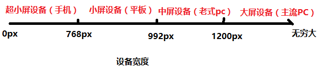
Equipment Classification
| classification | Width range |
|---|---|
| Large screen equipment | >1200px |
| Medium screen equipment | 992px~1200px |
| Small screen equipment | 768px~992px |
| Ultra-small screen equipment | < 768px |
Use of Media Query
Requirement: Principle of Responsive Development: Using Media Query to realize the layout and style switching of different terminals.
<!--
Demand:
    Large screen device (> 1200px) version heart: 1170px background color: red
    Mid-screen device (992-1200) version heart: 970px background color: blue
    Small screen device (768-992) version heart: 750px background color: yellow
    Ultra-small screen device (< 768px) version heart: 100% background color: green
-->
Media query grammar:
/*Query screen*/
@media screen and condition {
}

/*The Writing of Conditions*/
/*min-width:As long as the screen width exceeds this value, the device style will take effect.*/
/*max-width:As long as the screen width is less than this value, the device style will take effect.*/
@media screen and (min-width: 1200px) {
  .container {
    width: 1170px;
    background-color: red;
  }
}

@media screen and (min-width: 992px) and (max-width: 1200px) {
  .container {
    width: 970px;
    background-color: blue;
  }
}

@media screen and (min-width: 768px) and (max-width: 992px) {
  .container {
    width: 750px;
    background-color: yellow;
  }
}

@media screen and (max-width: 768px) {
  .container {
    width: 100%;
    background-color: green;
  }
}
Disadvantage: Now there is only one div. To make a responsive layout, we need so much code, which is very troublesome, so we will use more responsive frameworks, such as bootstrap.
7. bootstrap framework
bootstrap Chinese Network (http://www.bootcss.com/ )
Writing native response layouts can be cumbersome. In practice, bootstrap framework - > grid system is used.
Bootstrap, from Twitter, is a popular front-end framework. Bootstrap is based on HTML, CSS, JAVASCRIPT. It is concise and flexible, which makes Web development faster.
Characteristic:
-
Components are concise and generous, code specification is concise and user-defined.
-
Bootstrap is developed on the basis of HTML5 and CSS3. It is more personalized and personalized on the basis of jQuery, forming a unique website style and compatible with most jQuery plug-ins.
-
Bootstrap contains a wealth of Web components, according to these components, you can quickly build a beautiful, fully functional website.
Advantage:
-
Have your own ecosphere, constantly update iteration
-
Provides a set of concise, intuitive and powerful components
-
Standardized HTML+CSS Coding Specification
-
It makes development simpler and improves development efficiency.
-
Extensibility, although the interface component style has been defined, we can also customize and modify the default style.
Edition:
-
2.x.x Stop Maintenance
-
Advantages: Good compatibility
-
Disadvantage: Code is not concise enough, function is not perfect enough
-
-
3.x.x is currently the most widely used
-
Advantages: stable, inclined to develop responsive layout, mobile device priority WEB project
-
Disadvantage: Give up IE67, support IE8, but the interface effect is not friendly
-
-
4.x.x Test Phase
Basic template
Description of directory structure:
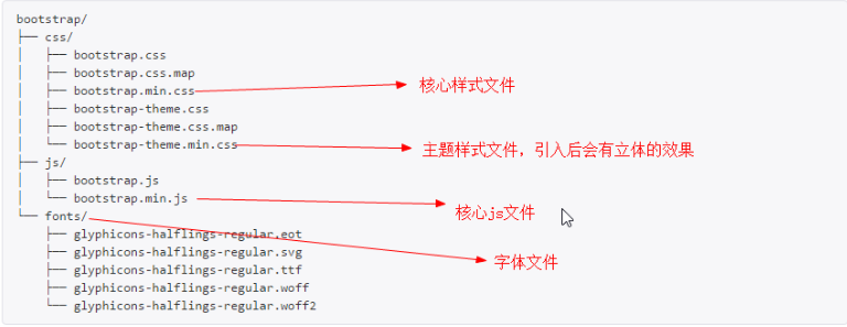
<!DOCTYPE html>
<!--Use HTML5 Documents, in simplified Chinese-->
<html lang="zh-CN">
<head>
  <!--meta1. Use utf-8 Code-->
  <meta charset="utf-8">
  <!--meta2. The current page is in the IE When accessing browsers, use the latest ie Browser Kernel Rendering-->
  <meta http-equiv="X-UA-Compatible" content="IE=edge">
  <!--meta3. Viewport settings-->
  <meta name="viewport" content="width=device-width, initial-scale=1, user-scalable=no">
  <!-- The above three meta Label*Must*Put it first and everything else must follow! -->
  <title>bootstrap Basic template</title>

  <!--Introduce bootstrap Core Style File-->
  <link href="lib/bootstrap/css/bootstrap.min.css" rel="stylesheet">

  <!-- html5shiv It is used to solve the problem. IE8 The following browsers are not supported HTML5 Semantic tagging -->
  <!--respond It is used to solve the problem. IE8 The following browsers do not support media queries. Note: respond I won't support it file Protocol Opening-->
  <!--Conditional Notes: IE Browser-specific-->
  <!--[if lt IE 9]>
  <script src="lib/html5shiv/html5shiv.min.js"></script>
  <script src="http://cdn.bootcss.com/respond.js/1.4.2/respond.min.js"></script>
  <![endif]-->
</head>
<body>
<h1>Hello, World!</h1>

<!--bootstrap Dependence and jquery,So we need to bootstrap Previous introduction jquery file-->
<script src="lib/jquery/jquery-1.12.4.js"></script>
<!--Introduce bootstrap Core js file-->
<script src="lib/bootstrap/js/bootstrap.min.js"></script>
</body>
</html>
Global Style
normalize.css
Normalize.css is an alternative to CSS reset. After hundreds of hours of effort at @necolas and @jon_neal to study the differences in default styles among different browsers, the project finally became what it is now.
Official website (http://necolas.github.io/normalize.css/ )
github website (https://github.com/necolas/normalize.css )
The characteristics of normalize:
-
Protect the default styles of useful browsers instead of removing them altogether
-
General Style: Provides for most HTML elements
-
Fix bug s in browsers and ensure consistency among browsers
-
Optimizing CSS Availability: With a few tips
Normalize.css supports ultra-multi-browsers, including mobile browsers, while generalizing HTML5 elements, typesetting, listing, embedded content, forms and tables. Although this project is based on the principle of generalization, we use more practical defaults where appropriate.
Container container
Bootstrap needs to wrap A. container container for page content and raster systems. The default padding value is 15px.
container classes are used for containers with fixed widths and supporting responsive layouts.
<div class="container">
  ...
</div>
The container-fluid class is used for containers that are 100% wide and occupy all viewport s.
<div class="container-fluid">
  ...
</div>
grid system
A grid system, also known as a grid system
-
row is used to offset the padding value of 15 PX in the. container container container
-
You can nest column s in. row
Classes commonly used in raster systems (12 columns in total)
| Class name | Example | explain |
|---|---|---|
| .col-xs-xx | .col-xs-6 | Effectiveness of Ultra-Small Screen (and above) |
| .col-sm-xx | .col-sm-6 | Effective on small screen (and above) |
| .col-md-xx | .col-md-6 | Effective on medium screen (and above) |
| .col-lg-xx | .col-lg-3 | Big screen and effect, 1/4 |
| .col-lg-xx | .col-lg-4 | Big screen and effect, 1/3 |
| .col-lg-xx | .col-lg-6 | Big screen and effect, 1/2 |
Responsive grids:
lg: 4: 4: 4
md: 5:  2:  5
sm: 3: 6: 3
xs: 1: 10 : 1
<div class="row">
   <div class="col-lg-4 col-md-5 col-sm-3 col-xs-1">1</div>
   <div class="col-lg-4 col-md-2 col-sm-6 col-xs-10">2</div>
   <div class="col-lg-4 col-md-5 col-sm-3  col-xs-1">3</div>
</div>
Column nesting:
<div class="col-lg-4">
      <! - The raster system is ubiquitous, so long as the parent box is wide, the raster system can be used - >.
      <div class="row">
        <div class="col-lg-6"></div>
        <div class="col-lg-6"></div>
      </div>
    </div>
Column offset:
<! -- Use the. col-md-offset-* class to offset columns to the right. >
<div class="row">
  <div class="col-lg-3"></div>
  Col-lg-offset-3: Under the big screen, the div will shift three units to the right - > 3.
  <div class="col-lg-6 col-lg-offset-3"></div>
</div>
<h4>Column offset: col-*-offset-n(Global right migration)</h4>
<!-- Column migration -->
<div class="row">
<div class="col-lg-4 col-lg-offset-4"></div>
<div class="col-lg-2"></div>
</div>
<!-- Left to right -->
<h4>col-xs-push-n Push right n column col-xs-pull-n Pull left n Column (migration is current column)</h4>
<h4></h4>
<div class="row">
<div class="col-xs-4 col-xs-push-2">1</div>
<div class="col-xs-2 col-xs-pull-4">2</div>
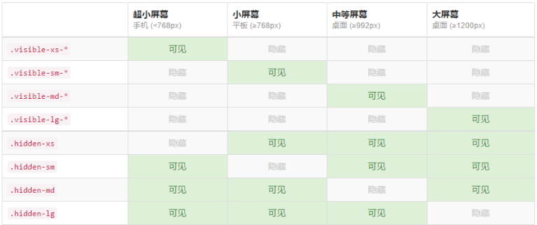
</div>Responsive tools (hidden-related properties are recommended)
Other
Bootstrap has so many built-in things that it's impossible to talk about each in detail, but the bootstrap document is concise and clear, so when we use the relevant things, we can refer to the document in detail.
Introduce Icon Font template to css file:
@font-face {
  	font-family: 'iconfont';
    src: url('iconfont.eot');
    src: url('iconfont.eot?#iefix') format('embedded-opentype'),
    url('iconfont.woff') format('woff'),
    url('iconfont.ttf') format('truetype'),
    url('iconfont.svg#iconfont') format('svg');
}
<style>
/*Introduce icon fonts to pages*/
@font-face {
font-family:'my-font';
src: url('font/iconfont.eot');
src: url('font/iconfont.eot?#iefix') format('embedded-opentype'),
url('font/iconfont.woff') format('woff'),
url('font/iconfont.ttf') format('truetype'),
url('font/iconfont.svg#iconfont') format('svg');
}
h1 {
font-family:'my-font';
}
.car::before {
/*  */
content:"\e605";
font-family:'my-font';
}
.pig::before {
content: "\e66b";
font-family:'my-font';
}
</style>
</head>
<body>
<p class="car"></p>
<h1 class="car"></h1>
<em class="pig"></em>
</body>8. REM
Contrast of various layout features
Due to the variety of mobile phones on the market, the screen types of mobile terminals are very confusing, such as 320px 360px 375px 384px 480px 640px. In development, artists usually only provide 750px or 640px design drafts, which requires us to adapt to all screens through one design draft.
Usually the solutions are as follows:
-
Streaming Layout: You can fit all kinds of screens, but the display effect is not very friendly on the big screen. Even so, because of the high development efficiency and low cost, there are still many companies using streaming layout, such as Amazon ,JD.COM ,Ctrip
-
Responsive layout: There are few large-scale websites in China, the main reason is that the work is big and the maintainability is not good. So generally, small and medium-sized portals or blog sites will adopt the response type, because this can save costs.
-
rem layout: rem can achieve wide and high adaptive layout. At present, rem layout is used in: TaoBao , Suning
What is rem?
rem (font size of the root element) is a unit of font size relative to the root element. It is a relative unit.
em (font size of the element) is a unit of font size relative to the current element. It is also a relative unit.
html{
  font-size:16px;
}
body {
  font-size:20px;
}
div.em {
  /*em Computation refers to font-size of the current element. If not set, it inherits from the parent box by default.*/
  width:2em;
  height:2em;
  background-color:red;
}
/*rem The calculation is based on font-size of html*/
div.rem {
  width:2rem;
  height:2rem;
  background-color:blue;
}
rem and response formula
Because rem's benchmark is the font size of the root element html, we only need to set font-size of HTML on different screens to adapt to different screens.
rem and Media Query
Multiple terminals can be adapted with rem in conjunction with media queries
 @media (min-width: 320px) {
      html {
        /*font-size: 100/750 * 320px*/
        font-size: 42.67px;
      }
    }
    @media (min-width: 375px) {
      html {
        font-size: 50px;;
      }
    }
    @media (min-width: 414px) {
      html {
        font-size: 55.2px;;
      }
    }
    @media (min-width: 480px) {
      html {
        font-size: 64px;;
      }
    }
    @media (min-width: 640px) {
      html {
        font-size: 85.33px;
      }
    }
    @media (min-width: 750px) {
      html {
        font-size: 100px;;
      }
    }
Advantages: Use media query adaptation, fast speed.
Disadvantage: When adapting to multiple terminals, you need to add response code.
rem and javascript
The width of the visual area is obtained by javascript, the font-size value is calculated, and multiple terminals can also be adapted.
Use rem for layout steps:
Set 1rem = 100px based on design layout;
1 - Convert all units on the page to rem
 2 - Dynamic detection of screen width to change rem value
var base = 100;
var design = 750;

function responsive() {
  var pageWidth = window.innerWidth;

  if ( pageWidth <= 320 ) {
    pageWidth = 320;
  }

  if ( pageWidth >= 750 ) {
    pageWidth = 750;
  }

  var size = base / design * pageWidth;
  document.documentElement.style.fontSize = size + "px";
}

responsive();
window.addEventListener("resize", responsive);
Advantages: Direct adaptation to all terminals
Disadvantage: The font-size value of html must be set before the page is loaded, otherwise the text size will be changed.
9. Use of swiper plug-ins
Official website: https://3.swiper.com.cn/