*Ps: Notes from Mu class tutorial
▶ Upper and lower column layout
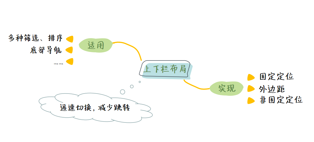
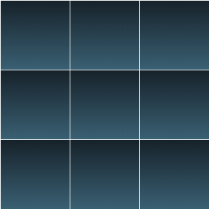
1. Chinese layout css Library
- Example demonstration
<!DOCTYPE html>
<html>
<head>
  <meta charset="UTF-8">
  <meta name="viewport" content="width=device-width, initial-scale=1.0">
  <title>Document</title>
  <!-- Use it here link Label introduction Chinese layout -->
  <link rel="stylesheet" href="https://cdn.jsdelivr.net/npm/chinese-layout">
  <!-- Use it here link Chinese gradient for labels -->
  <link rel="stylesheet" href="https://cdn.jsdelivr.net/npm/chinese-gradient">
  <style>
    /* Clear default style */
    * { padding: 0; margin: 0; }
    html, body { height: 100%; }   /* Make html and body display in full screen */
    body {
      display: grid;   /* First set the grid layout on the parent element */
      grid: var(--Upper and lower columns);
      gap: 5px;    /* Give a proper spacing */
    }
    /* Upper and lower columns */
    .top, .bottom {

      height: 60px;   /* Give a height or open it with content, otherwise the height will become 0 */
      background: var(--purple gray);    /* Give me a nice gradient */
    }
    /* middle */
    .center {
      /* The middle will be adaptive according to the height of the upper and lower columns, so there is no need to write the height */

      background: var(--Aurora green);   /* Give me a nice gradient */
      overflow-y: auto  /* If the vertical direction is exceeded, a scroll bar will appear */
    }
  </style>
</head>
<body>
  <div class="top"></div>
  <div class="center"></div>
  <div class="bottom"></div>
</body>
</html>
The effects are as follows:
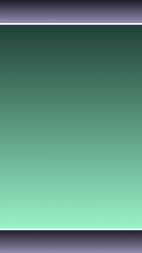
.
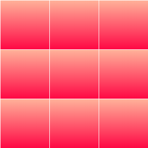
2. Fixed positioning
Fix the upper and lower columns at specific positions on the screen, and then add appropriate upper and lower margins to the main box:
<!DOCTYPE html>
<html lang="en">
<head>
  <meta charset="UTF-8">
  <meta name="viewport" content="width=device-width, initial-scale=1.0">
  <title>Document</title>
  <!-- Use it here link Chinese gradient for labels -->
  <link rel="stylesheet" href="https://cdn.jsdelivr.net/npm/chinese-gradient">
  <style>
    /* Clear default style */
    * { padding: 0; margin: 0; }
    html, body { height: 100% }    /* Make html and body display in full screen */
    body { position: relative; }   /* Set parent element to relative positioning */
    /* The column above */
    .top {
      position: fixed;   /* Set to fixed positioning */
      top: 0;    /* 0 from the upper left */
      left: 0;
      width: 100%;   /* The width is spread all over the screen */
      height: 80px;    /* Give me a proper height */
      background: var(--Aurora green);    /* Green background */
    }
    .main {
      margin: 90px 0;    /* Give a proper top and bottom margin */
      height: 1000px;   /* Give me a proper height */
      background: var(--scene of debauchery);    /* Gradient background */
    }
    /* The column below */
    .bottom {
      position: fixed;    /* Set to fixed positioning */
      bottom: 0;   /* 0 from the lower left */
      left: 0;
      width: 100%;    /* The width is spread all over the screen */
      height: 80px;    /* Give me a proper height */
      background: var(--Mango yellow);      /* Yellow background */
    }
    div {
      color: white;  /* White text */
      font-size: 30px ;  /* font size */
    }
  </style>
</head>
<body>
  <div class="top">No matter how you slide the screen, I'm fixed</div>
  <div class="main">
    Top of main box
  </div>
  <div class="bottom">No matter how you slide the screen, I'm fixed</div>
</body>
</html>
The effects are as follows:
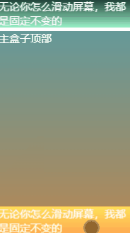
.
3. Effect of outer margin
margin: 90px 0; —— Add appropriate top and bottom margins.
Removing the outer margin is equivalent to extending the box to the top and bottom. Because the upper and lower columns use fixed positioning, the fixed positioning will cause the elements to leave the default document flow, that is, the upper and lower columns do not occupy any space in the default document flow, so the upper text and the lower text will be blocked.
So we should give the main box a proper upper and lower margin to bypass the blocked part.
.
4. Non fixed positioning
Attribute: overflow-y: auto
The use of non fixed positioning here is the same as that of LV shaped layout, except for the lower column.
 ...
  <style>
    /* Clear default style */
    * { padding: 0; margin: 0; }
    html, body { height: 100% }    /* Make html and body display in full screen */
    /* The column above */
    .top {
      height: 10%;    /* Set a suitable height */
      background: var(--indigo);    /* Blue background */
    }
    /* Main display area */
    .main {
      height: 80%;   /* Give me a proper height */
      overflow-y: auto;    /* Overflow in the vertical direction is set to automatic */
    }
    .child {
      height: 1000px;
      background: var(--Sky blue);    /* Give me a nice gradient */
    }
    /* The column below */
    .bottom {
      height: 10%;   /* Set a suitable height */
      background: var(--Sapphire blue);    /* Blue background */
    }
    /* Default style for box */
    div {
      font-size: 30px;
      color: white;
    }
  </style>
  ...
<body>
  <div class="top"></div>
  <div class="main">
    <div class="child"></div>
  </div>
  <div class="bottom"></div>
</body>
The effects are as follows:

.
5. Simple example of upper and lower column layout
- Example demonstration
<!DOCTYPE html>
<html lang="en">
<head>
  <meta charset="UTF-8">
  <meta name="viewport" content="width=device-width, initial-scale=1.0">
  <title>Document</title>
  <!-- Use it here link Chinese gradient for labels -->
  <link rel="stylesheet" href="https://cdn.jsdelivr.net/npm/chinese-gradient">
  <style>
    /* Clear default style */
    * { padding: 0; margin: 0; }
    html, body { height: 100% }    /* Make html and body display in full screen */
    /* The column above */
    .top {
      position: fixed;    /* Set to fixed positioning */
      top: 0;     /* 0 from the upper left */
      left: 0;
      width: 100%;  /* The width is spread all over the screen */
      height: 80px;  /* Give me a proper height */
      opacity: 0;    /* Make it transparent */
      background: var(--Sapphire blue)    /* Blue background */
    }
    .main {
      margin-bottom: 80px;   /* Give a proper bottom margin */
      height: 1000px;    /* Give me a proper height */
      background: var(--Sky blue)    /* Gradient background */
    }
    /* The column below */
    .bottom {
      position: fixed;    /* Set to fixed positioning */
      bottom: 0;
      left: 0;
      width: 100%;    /* Full screen width */
      height: 80px;    /* Give me a proper height */
      background: var(--indigo)    /* Blue background */
    }
  </style>
</head>
<body>
  <div class="top"></div>
  <div class="main"></div>
  <div class="bottom"></div>

  <script>
    /* Get fixed bar*/
    const dom = document.getElementsByClassName('top')[0]
    window.addEventListener('scroll', _ => {
      /* Get offset value*/
      const top = document.documentElement.scrollTop
      /* Set an appropriate range*/
      if (top <= 150) {
        /* For the calculation of opacity, the transparency changes with the offset value from start to 1*/
        const opacity = top / 150
        /* Make the transparency of the upper column become the calculated transparency*/
        dom.style.opacity = opacity
      } else {
        /* Make it completely opaque after moving a certain range*/
        dom.style.opacity = 1
      }
    })
  </script>
</body>
</html>
The effects are as follows:

Ps: there is no need to add margin to the main box here, because the upper column is completely transparent at the top and will not cover the content.
Practical examples:
With the scrolling of the page, the text in the upper column has a gradual effect; This effect will not only appear cleaner when you first enter the page, but also enrich the interest of interaction.
.
▶ Jiugong grid layout
Jiugong grid is very common in our life, such as wechat client payment home page, circle of friends, microblog, etc., which are all applied to Jiugong grid layout.
.
1. Chinese layout css Library
- Example demonstration
<!DOCTYPE html>
<html lang="en">
<head>
  <meta charset="UTF-8">
  <meta name="viewport" content="width=device-width, initial-scale=1.0">
  <title>Document</title>
  <!-- Use it here link Label introduction Chinese layout -->
  <link rel="stylesheet" href="https://cdn.jsdelivr.net/npm/chinese-layout">
  <!-- Use it here link Chinese gradient for labels -->
  <link rel="stylesheet" href="https://cdn.jsdelivr.net/npm/chinese-gradient">
  <style>
    /* Clear default style */
    * { padding: 0; margin: 0 }
    ul { list-style: none }
    html, body, ul { height: 100% }   /* Full screen display */
    /* Write Jiugong grid on parent element */
    ul {
      display: grid;
      grid: var(--squared paper for practicing calligraphy);
      gap: 5px
    }
    /* Color child elements */
    li {
      background: var(--Aurora green)
    }
  </style>
</head>
<body>
  <ul>
    <li></li>
    <li></li>
    <li></li>
    <li></li>
    <li></li>
    <li></li>
    <li></li>
    <li></li>
    <li></li>
  </ul>
</body>
</html>
The effects are as follows:
.
2. Grid layout
Grid layout is a layout method gradually rising in recent years, and its function is very powerful.
Two popular grid introductory tutorials:
  <style>
    /* Clear default style */
    * { padding: 0; margin: 0; }
    html, body, ul { height: 100% }  /* Full screen display */
    /* Parent element */
    ul {
      list-style: none;  /* Clear default style */
      display: grid;  /* Make it display in grid mode */
      grid: repeat(3, 1fr) / repeat(3, 1fr);  /* Cut it into three rows and three columns */
      gap: 3px    /* Set an appropriate spacing */
    }
    /* Child element */
    li {
      background: var(--Mango yellow)   /* Yellow gradient */
    }
  </style>
  ...
  <ul>
    <li></li>
    <li></li>
    <li></li>
    <li></li>
    <li></li>
    <li></li>
    <li></li>
    <li></li>
    <li></li>
  </ul>
The effects are as follows:
.
3. Table layout
  <style>
  /* Clear default style */
    * { padding: 0; margin: 0; }
    html, body, ul { height: 100% }     /* Full screen display */
    /* Parent element */
    ul {
      width: 100%;    /* Give me a suitable width */
      list-style: none;   /* Clear default style */
      display: table;    /* Make it display in table mode */
      border-spacing: 3px    /* Set spacing */
    }
    /* Child element */
    li {
      display: table-row    /* Make it display in table row mode */
    }
    /* Grandson element */
    div {
      display: table-cell;     /* Make it display in table cell mode */
      background: var(--Lake blue)      /* Blue gradient */
    }
  </style>
  ...
  <ul>
    <li>
      <div></div>
      <div></div>
      <div></div>
    </li>
    <li>
      <div></div>
      <div></div>
      <div></div>
    </li>
    <li>
      <div></div>
      <div></div>
      <div></div>
    </li>
  </ul>
The effects are as follows:
In some cases where the table layout is suitable but not a table, you can use the display attribute to simulate the behavior of the table:
- display: table; It is equivalent to changing the behavior of elements into < Table > < / Table >;
- display: inline-table; It is equivalent to changing the behavior of elements into < Table > < / Table > of in-line element version;
- display: table-row; It is equivalent to changing the behavior of elements into < tr > < / TR >;
- display: table-column; It is equivalent to changing the behavior of elements into < col > < / COL >;
- display: table-cell; It is equivalent to changing the behavior of elements into < td > < / td > or < th > < / th >;
- display: table-caption; It is equivalent to changing the behavior of the element into < caption > < / caption >.
.
4. Flexible layout
  <style>
   /* Clear default style */
    * { padding: 0; margin: 0; }
    html, body, ul { height: 100% }  /* Full screen display */
    /* Parent element */
    ul {
      list-style: none;   /* Clear default style */
      display: flex;     /* Display as elastic layout */
      flex-flow: wrap;   /* Allow line breaks */
    }
    /* Child element */
    li {
      width: 33%;    /* The width and height are 33%*/
      height: 33%;
      margin: .5px;     /* Give a suitable outer margin */
      background: var(--Dai LAN)    /* Dark blue gradient */
    }
  </style>
...
  <ul>
    <li></li>
    <li></li>
    <li></li>
    <li></li>
    <li></li>
    <li></li>
    <li></li>
    <li></li>
    <li></li>
  </ul>
The effects are as follows:
- flex-flow: wrap; Allow line breaks
In the case of flex Jiugong grid, a very important point is to wrap the elastic box (no line wrapping by default).
.
5. Left floating method
- Example demonstration
  <style>
    /* Clear default style */
    * { padding: 0; margin: 0; }
    html, body, ul { height: 100% }   /* Full screen display */
    /* Parent element */
    ul {
      list-style: none;  /* Clear default style */
    }
    /* Pseudo element */
    ul::after {
      display: block;   /* Display as block level elements */
      content: '';   /* Content is empty */
      clear: both;  /* Clear float */
    }
    /* Child element */
    li {
      width: 33%;  /* The width and height are 33%*/
      height: 33%;
      float: left;  /* Left float */
      margin: .5px;   /* Give a suitable outer margin */
      background: var(--palpitate with excitement)   /* Pink gradient */
    }
  </style>
...
  <ul>
    <li></li>
    <li></li>
    <li></li>
    <li></li>
    <li></li>
    <li></li>
    <li></li>
    <li></li>
    <li></li>
  </ul>
The effects are as follows:
.
6. Frame Jiugong grid
Define the same border style for all sub boxes and view it in the implementation mode here.
- Example demonstration
<!DOCTYPE html>
<html lang="en">
<head>
  <meta charset="UTF-8">
  <meta name="viewport" content="width=device-width, initial-scale=1.0">
  <title>Document</title>
  <!-- Use it here link Chinese gradient for labels -->
  <link rel="stylesheet" href="https://cdn.jsdelivr.net/npm/chinese-gradient">
  <style>
    /* Clear default style */
    * { padding: 0; margin: 0; }
    html, body, ul { height: 100% }  /* Full screen display */
    /* Parent element */
    ul {
      list-style: none;      /* Clear default style */
      display: grid;   /* Display as grid layout */
      grid: repeat(3, 1fr) / repeat(3, 1fr);    /* They are divided into three rows and three columns */
      gap: 20px;      /* Give a proper spacing */
      padding-right: 20px;  /* Add bottom right inner margin */
      padding-bottom: 20px;
      box-sizing: border-box;   /* Set box model */
      border-right: 2px solid black;    /* Bottom right border of two pixels */
      border-bottom: 2px solid black;
      animation: clear-gap 5s ease-out infinite alternate    /* Call animation */
    }
    /* Child element */
    li {
      border-top: 2px solid black;  /* Top left border of two pixels */
      border-left: 2px solid black;
    }
    /* Define animation */
    @keyframes clear-gap {
      to { gap: 0; padding: 0 }
    }
  </style>
</head>
<body>
  <ul>
    <li></li>
    <li></li>
    <li></li>
    <li></li>
    <li></li>
    <li></li>
    <li></li>
    <li></li>
    <li></li>
  </ul>
</body>
</html>
7. Example of Jiugong grid layout( Classic interview questions)
In fact, sometimes the interview does not ask some basic questions as you think, such as:
- Please talk about your understanding of CSS box model
- What do you know about flex layout
- Do you know grid layout
- What happens when the outer margin of an element is negative
- How to control the upper and lower levels when elements overlap
- How to center horizontally and vertically
- What is event bubbling
- How to control the element style of a specific location (such as the style of an even number of locations)
- How to determine which element the event is bubbling from
- Which CSS attribute value can reduce the repeated definition of color values
In this way, the efficiency will be relatively low, and only one excellent interview question is needed to examine all the above questions.
The requirements are as follows:
- The numbers in each grid of the border Jiugong grid should be centered
- The border and numbers turn red when the mouse passes
- The number in the grid is centered by flex
- Click on the Jiugong grid and the corresponding number will pop up
You can try to practice by yourself. Refer to the code points for details here.